Pie charts are a popular way to visualize data, especially when it comes to representing proportions or percentages.
Tableau makes it simple to create informative pie charts that can help convey information in a digestible format.
To make a pie chart in Tableau, select Pie in the Marks card. Then, drag and drop your desired dimension and measure onto the Rows and Columns shelf. This will create a basic pie chart in Tableau. You can then customize the pie chart to your liking.

Read on as we guide you through the process of creating a pie chart in Tableau step by step.
We will show you examples and demonstrations that will help you decide which are the best situations to create a pie chart to display your data.
Let’s get into it!

What is a Pie Chart
A pie chart is a circular chart that visualizes data as slices, each representing a proportion of the whole. It is an effective way to display the relationships between different parts of a dataset.
Pie charts are helpful for comparing the sizes of different categories to gain insights into which parts may be overrepresented or underrepresented in the data.
4 Steps to Create Pie Charts
In this section, we will go over 4 simple steps to create Tableau pie charts.


Step 1: Select Pie in Marks Card
After you load your data source, go to a Tableau worksheet and select Pie in the Marks card.
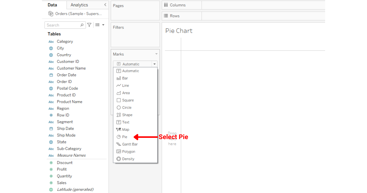
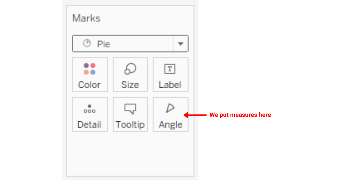
When you select Pie in the Marks card, you will see a new property called Angle. This is where we typically put our measures when creating pie charts.
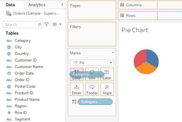
Step 2: Selecting Dimension
The next step is to select a dimension for your Tableau pie chart. The dimensions will serve as categories for division.
After selecting a dimension, drag and drop it to the Color Marks card.
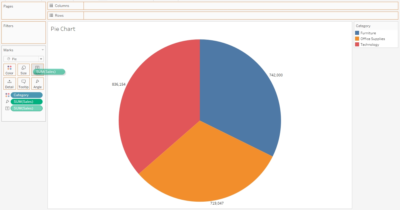
In the example below, we have selected Category as our dimension.
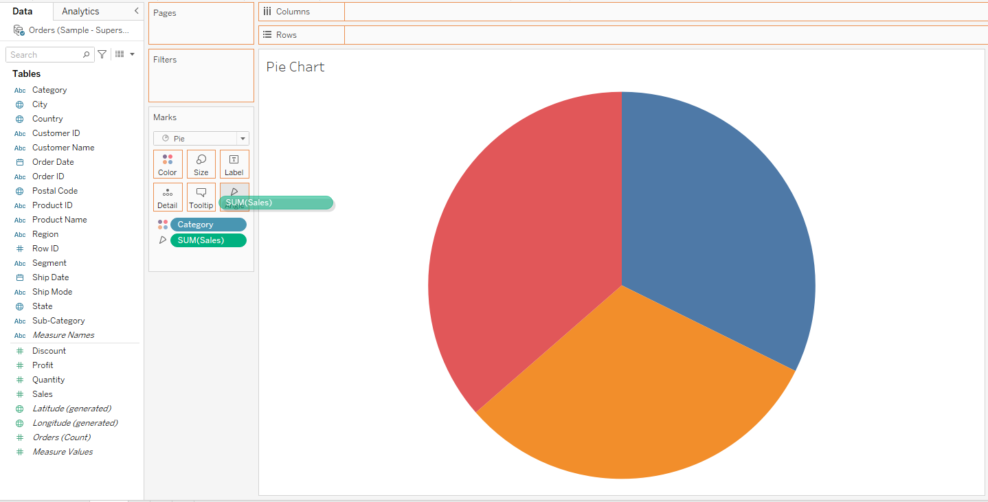
Step 3: Selecting Measure
After selecting your dimension, you must select measure values for your pie chart.
The measure will divide the pie chart into proportions accordingly.
In the example below, we have selected sales as the measure for our pie chart.
Step 4: Customizing The Graph
To make your graph look more appealing, you can drag and drop the sales measure onto the Label Marks card.
This will label the division of your pie chart.
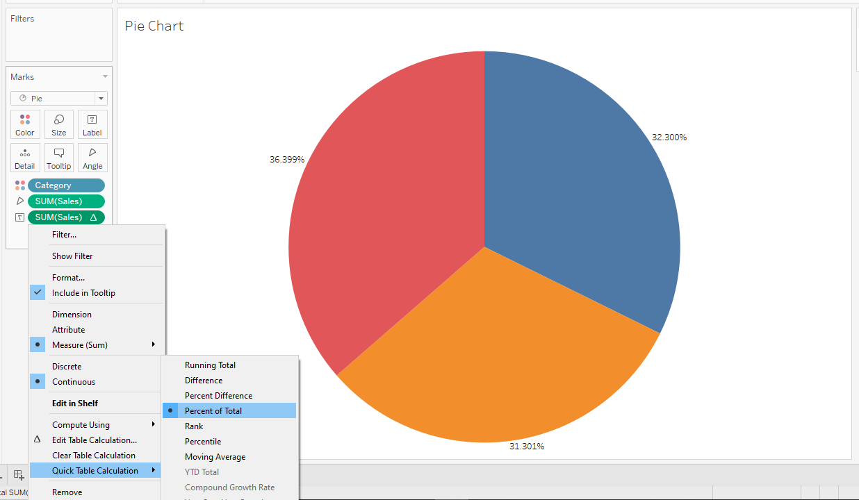
You can also make the labels to be percentages. This will help you easily interpret the proportions.
To do this, you can click the drop-down option on the Sales measure and select the Percent of Total in Quick Table Calculation.
You can keep customizing your pie chart till you get your desired output.
Read on and we will show you when it is best to use a pie chart.
When to Use a Pie Chart
Pie charts are simple yet powerful tools, but knowing when to use them can make a big difference in how your information is received.


Following are some of the scenarios where you should use a pie chart:
1. Comparing Parts of a Whole
One of the best times to use a pie chart is when you want to display data as parts of a whole or when comparing data. If your data represents categories or sections of a single entity, a pie chart is ideal.
For example, if you’re displaying data from various companies in a particular sector, a pie chart can visually represent each company’s share of the entire market.
2. Few Categories
Pie charts work best with a limited number of categories. If you’ve got 2-5 categories, it’s easy for the viewer to quickly grasp the relationship between them.
Once you start adding more slices to your pie, it can become confusing and harder to differentiate between segments.
3. Percentage Breakdown
When the main interest lies in the percentage breakdown of categories, a pie chart is a go-to choice.
It clearly showcases which segment takes up what proportion of the whole.
4. Avoiding Clutter
If you’re looking for a clear, concise way to represent data without lots of gridlines, numbers, or text, then a pie chart can be an excellent choice.
It provides a visual simplicity that can’t be beaten.
How to Integrate Pie Charts into Dashboards
Integrating pie charts into your dashboards can give your audience valuable insights and make your data more accessible.
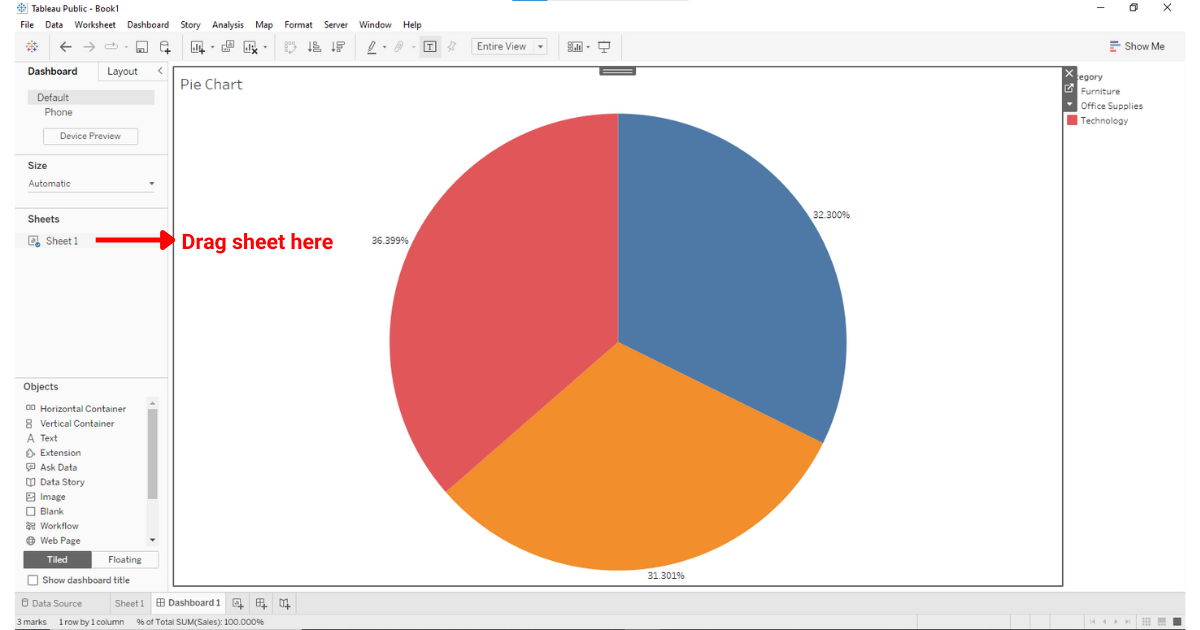
You can integrate your pie chart into your Tableau dashboard by going to the Dashboard tab and dragging the sheet containing your pie chart onto the dashboard canvas. You can resize and position it according to your layout preferences.
To make your pie chart interactive in the dashboard, you can use actions that are triggered by user interactions, such as clicking on a pie slice.
Actions can be linked with other sheets in your dashboard to display detailed information, filter data, or reveal additional visualizations based on the selected pie slice.
To add an action to your pie chart, follow these steps:
Step 1: Navigate to the Dashboard tab
Ensure you are on the dashboard where your pie chart is placed.
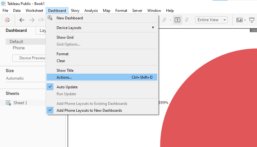
Step 2: Select Dashboard > Actions
This will open the Actions dialog box.
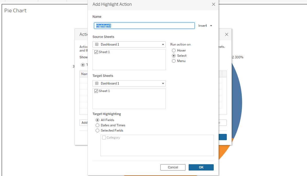
Step 3: Add an action
Click “Add Action” and choose the type of action you want to create (e.g., Filter, Highlight, or URL).

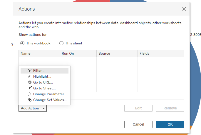
Step 4: Configure the action
Select the source sheet (your pie chart) and the target sheet(s) to which the action should apply. Customize the settings to obtain the desired interaction behavior.
With these steps, you can create and integrate an interactive pie chart into your Tableau dashboard.
Explore the future of data tech by watching the following video:
Final Thoughts
Pie charts can be a game-changer in your data visualization journey, especially in a powerful tool like Tableau. This is because they distill complex information into easily digestible visuals.
By learning how to craft these charts in Tableau, you equip yourself with a tool that speaks to audiences at a glance.
While other visualization forms have their merits, the simplicity and clarity of a pie chart often make it the preferred choice for a variety of scenarios.
Learning how to make pie charts will allow you to enhance your ability to communicate and connect through data.
Frequently Asked Questions
In this section, you will find some frequently asked questions you may have when making Pie charts in Tableau.

How can I create a donut chart in Tableau?
To create a donut chart in Tableau, first create a pie chart.
Then, drag the “Number of Records” measure to the “Size” mark on the Marks section.
Select the “Drop Field” option and drop it on “Size” in the Sum(Number of Records) pill.
Adjust the size to create a hole in the center of the pie chart, turning it into a donut chart.
What is the method to display percentages with multiple measures in a pie chart?
To display percentages with multiple measures in a pie chart, create a calculated field for each measure by dividing the measure value by the total sum of all measures.
Then, use these calculated fields in your pie chart. Format the labels to display as percentages.
How can I resize a pie chart on a Mac?
To resize a pie chart on a Mac, hold down the “ñ” and “z” keys and then press the “B” key to make the chart bigger or the “Shift” and “B” keys simultaneously to make the chart smaller.
What are the steps to showcase count distinct in a pie chart?
To showcase the count distinct in a pie chart, create a calculated field using the COUNTD function to calculate the distinct count of your desired dimension.
Then, use this calculated field as your measure in the pie chart.
Is it possible to create a 3D pie chart?
Tableau does not support 3D pie charts natively.
However, you can create 2D pie charts using the available chart options and strive for clarity and usability.
How can I add labels with lines to a pie chart in Tableau?
To add labels with lines to a pie chart in Tableau, first create a pie chart as usual.
Then, drag the desired label dimension from the Data pane to the “Label” mark on the Marks card.
If you wish to customize the label lines, you can do so by selecting the “Label” mark on the Marks card and adjusting the options in the “Alignment” and “Lines” sections within the “Label” dialog.