A common task in almost all Tableau projects is to create a table. Data analysts frequently use tables to represent summaries of data and processes with ease. This is highly important when working with large volumes of data.
To create a Table in Tableau, you can:
- Open Tableau and connect to your data source.
- Drag desired dimensions to the Rows shelf to define rows.
- Drag additional dimensions or measures to the Columns shelf, and use formatting options to refine the table’s appearance.
- Explained in full detail below
In this article, we’ll walk you through the process of creating a table in Tableau, including connecting to your data source, selecting dimensions and measures, and customizing your table’s appearance.

Let’s Begin!

Building a Basic Table in Tableau in 4 Simple Steps
Before you start creating a simple table, you should navigate to the “Connect” pane to link your source data.
Once you are connected, you can follow these 4 simple steps listed below to create a basic table in Tableau:
- Choosing Your Data
- Defining Rows
- Adding Columns
- Converting to Table

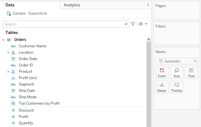
Step 1: Choosing Your Data
Start by identifying which data points you want to showcase in your table.
After choosing your data, navigate to the Data Pane on the left, where you’ll find your Dimensions (categorical attributes like names, dates, or IDs) and Measures (quantifiable metrics like sales, counts, or averages).
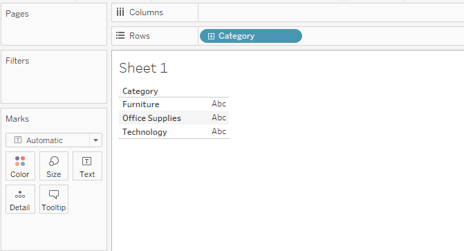
Step 2: Defining Rows
In this step, you must click and drag your chosen dimension (e.g., ‘Product Name’ or ‘Date’) to the Rows shelf.

This action will create a list in your main canvas area.
You can continue to drag additional dimensions to the Rows shelf to expand the depth of your table.
Tableau will nest these dimensions, providing a hierarchical view.
Step 3: Adding Columns
Now, drag your chosen measure to the Columns shelf. This will populate columns corresponding to the rows you’ve defined.
We have chosen the company’s sales and company’s total number of orders.
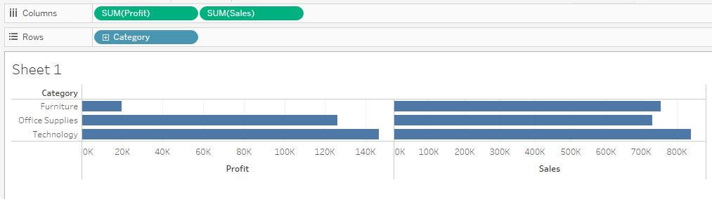
You can add multiple measures to the Columns shelf to provide a more comprehensive view of your data.
Furthermore, you can use different functions in your tables, such as the most common right and left function.
Step 4: Converting to Table
Tableau automatically creates a line chart or bar graph from the input data, depending on your settings.
After adding columns, you must change your view from graphs to text tables.
To do this, click on Show Me at the top right corner of the table.
Then, click on Text Tables.
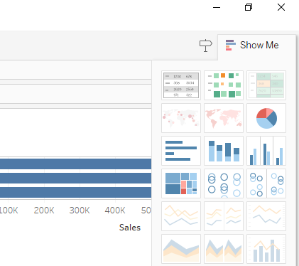
This will convert the graph into a table as shown below:
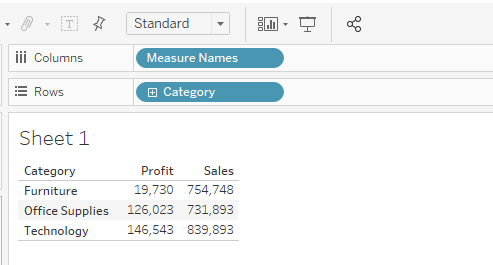
With these 4 simple steps, you can create a basic table in Tableau.
In the next section, we will explore how you can enhance your tables to make them look more aesthetically pleasing.
How to Enhance Tableau Tables
After building a basic table, enhancing its features can greatly improve its effectiveness.

We’ve listed some tips below to help you elevate your table:
- Sorting a Table
- Adding Totals and Subtotals
- Adding Interactive Features
- Grouping and Hierarchies

1. Sorting a Table
Sorting data makes it easier for viewers to understand patterns and hierarchies.
To sort data in Tableau, click on the header of a column or row to sort the data automatically.
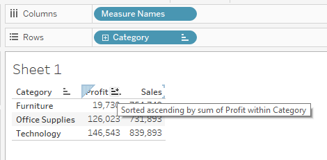
The sort order can be ascending, descending, or even custom based on a specific order you’d like to define.
2. Adding Totals and Subtotals
Totals and subtotals give you a quick insight into aggregated data.
To add totals to your data table, you can choose the Analysis menu and select ‘Totals’ to add grand totals.
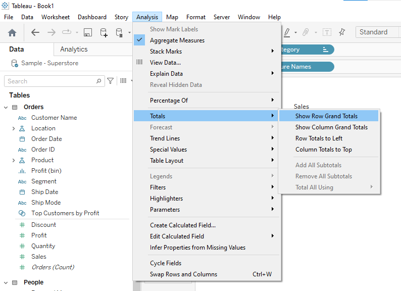
The grand total in most cases will be an auto-generated field along the row axis, but you can change it to the column axis as well.
For subtotals, drag a second dimension to the Rows shelf and then choose ‘Subtotals’ from the Analysis menu.
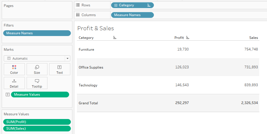
The column called profit now has a grand total row.
3. Adding Interactive Features
Interactivity is an important feature of appealing visualization and dashboards. You can add filters and tooltips to your visualizations to make them interactive.
This is especially helpful when doing a monthly and yearly breakdown of data.
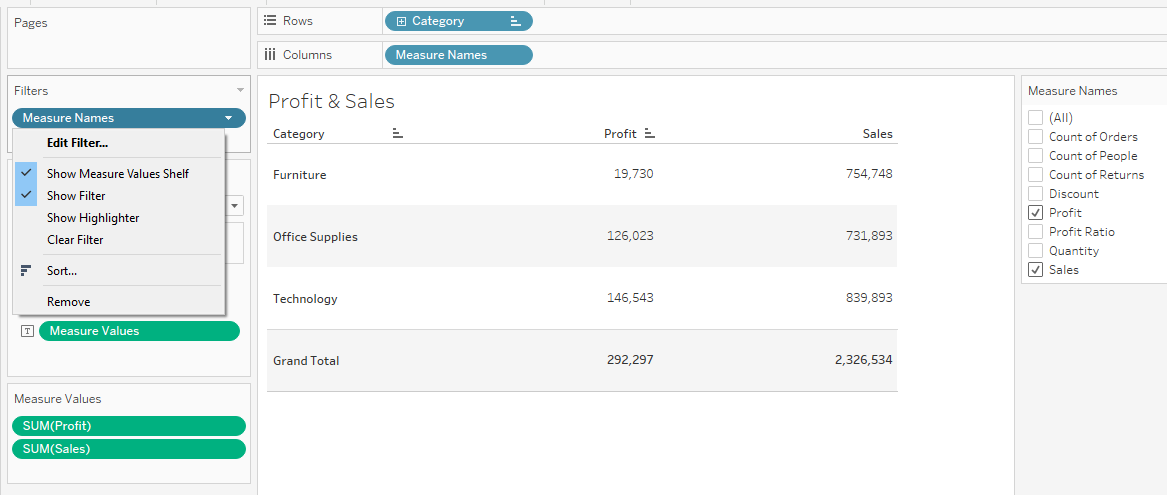
1. Adding Filter to a Table
Filters allow users to focus on specific parts of the data.
To add a filter, drag a dimension or measure to the ‘Filters’ shelf and then show the filter control on the worksheet.
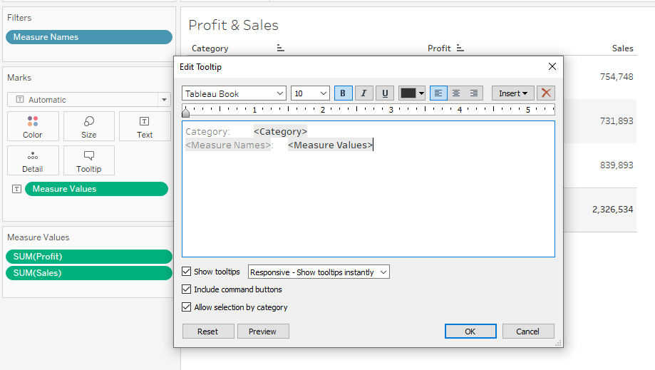
2. Adding Tooltip to a Table
Tooltips provide additional information when hovering over a data point.
When you create a table, Tableau will automatically add a tooltip to the table. However, it is important that you customize these as Tableau might add redundant information to the tooltips.
To customize a Tableau tooltip, click on Tooltip. A dialog box opens where you can select your desired options.
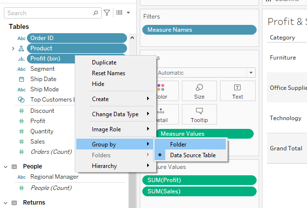
4. Grouping and Hierarchies
You can group related data to reduce complexity.
If you have two separate custom fields, you can group them by assigning them a common group name.
To do this, select multiple values, right-click, and choose ‘Group’.
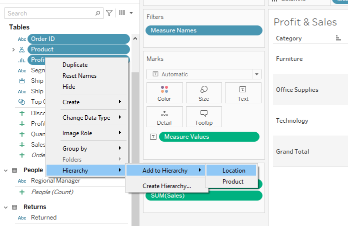
You can create hierarchies to allow users to drill down into more detailed data levels.

To achieve this, drag one dimension on top of another to automatically form a hierarchy.
Learn more about the recent transformations in the world of data by watching the following video:
Final Thoughts
Creating a table in Tableau allows you to unlock the full potential of data.
As a data analyst, you’re equipping yourself with the power to present data compellingly by mastering this skill.
Why learn it? Because in today’s data-driven world, the ability to simplify complex datasets is invaluable.
By using Tableau, you don’t just visualize data; you tell its story.
This expertise adds immense value, whether you’re making business decisions, presenting findings, or trying to understand trends.
Frequently Asked Questions
In this section, you’ll find some frequently asked questions you may have when creating a table in Tableau.

How can I design a table in Tableau?
To design a table in Tableau, you can start by dragging dimensions onto the Rows and Columns shelves.
Make use of the formatting pane to adjust fonts, colors, row heights, and column widths.
Enhance your table by adding row padding, which should be between 0.5 to 1.0 times the font size above and below the text.
What are the steps to create a table with multiple columns in Tableau?
To create a table with multiple columns in Tableau, follow these steps:
- Open Tableau and connect to your data source.
- Drag dimensions and measures to the Rows and Columns shelves.
- Adjust the order of dimensions and measures in the shelves to define the column structure.
- Use the column divider lines to resize individual columns as needed.
How do I customize a table in Tableau?
To customize a table in Tableau, use the formatting pane to adjust font styles, sizes, and colors for the entire table or specific cells.
You can also modify row heights, column widths, and cell borders.
Use the tooltip settings to customize the appearance and content of tooltips that appear when hovering over cells.
What are the best table dashboard examples in Tableau?
Some of the best table dashboard examples in Tableau include tables that:
- Display a clear and easily understood structure with relevant dimensions and measures.
- Utilize easy-to-read fonts and colors to emphasize important data points.
- Incorporate tooltips or annotations to provide additional context for specific data points.
- Adapt well to different screen sizes and resolutions.
You can visit the Tableau Public Gallery for inspiration on creating compelling table dashboards.
How to perform table calculations in Tableau?
Perform table calculations in Tableau by:
- Right-clicking the measure you want to apply a calculation to.
- Choosing ‘Quick Table Calculation’ from the context menu.
- Selecting the appropriate calculation option, such as running total or percent difference.
You can also create custom table calculations using the calculated field editor, where you can define your own formulas and apply them to specific dimensions and measures.
How can I remove ‘Abc’ from a text table in Tableau?
To remove the ‘Abc’ placeholder text from a text table in Tableau, follow these steps:
- Drag the desired measure or dimension to the Text shelf in the Marks card.
- If the ‘Abc’ placeholder persists, right-click on the measure or dimension in the Text shelf and select ‘Clear’ to remove it.
- Lastly, verify that no additional text elements with the placeholder ‘Abc’ are left on the Text shelf.