So, you’ve started using Tableau and seen “Measure,” but unsure about what it is and how to use it?
Well, now it’s time to learn the basic fundamentals of the software and get a good understanding, so you can create some killer data visualizations.
In Tableau, a measure is a numerical value that represents a quantifiable metric in your data, such as sales, profit, or quantity. Measures are used to perform calculations and aggregate data. They are typically displayed as continuous, quantitative values in Tableau visualizations.

In this article, we’ll provide an in-depth explanation of measures in Tableau, including their key characteristics and their use in calculations and aggregations, and show you how to work with them in your data visualizations.
Let’s get started!

What is The Difference Between Dimension and Measure
One term that frequently comes up with measures is dimension.
In Tableau, a dimension is a field or category used to organize, segment, and categorize your data. You can think of dimensions as the descriptive parts of your data, such as names, dates, or geographical data. These are qualitative values in your dataset.
On the other hand, measure values are fields that contain quantifiable data, which can be measured and subjected to mathematical operations.
Think of measures as the numbers or metrics in your data, such as sales amounts, profit margins, or quantities sold. Measures can be both continuous and discrete fields in your data set.

4 Ways How to Use Measures in Tableau
Measures in Tableau are central to performing data analysis and creating visualizations.
Following are some of the ways you can use measures in Tableau:
Basic Aggregations
Creating Calculated Fields
Trend Lines and Forecasting
Creating Bins and Histograms

1. How to Use Measures For Basic Aggregation
You can perform basic mathematical operations like sum, average, median, count, and more.
Tableau allows you to drag and drop a measure value into a view, and then you can choose the type of aggregation you want.
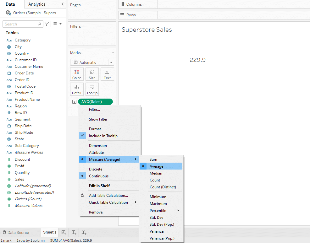
For example, let’s say you are working with a sample dataset from a superstore that includes a measure named Sales. If you want to understand the average sales made by the superstore, you can drag the Sales measure into your visualization pane.
Then, you can choose the Average aggregation to calculate the average sales.
2. How to Use Measure For Creating Calculated Fields
You can create new data from existing measures by defining your calculations.
This is useful when you need to create ratios, differences, or custom aggregations that are not directly available in your dataset.
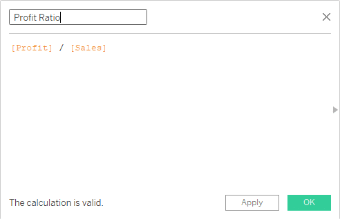
Let’s say you want to find the profit ratio from the measures in your dataset. You can do this by creating a calculated field.
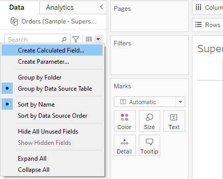
Right-click in the data pane on the left side and select “Create Calculated Field.”
In the calculation editor, you can write your formula. For the profit ratio, the formula would be:
[Profit] / [Sales]This formula divides the Profit measure by the Sales measure for each row in your dataset.
Drag your newly created calculated field, “Profit Ratio,” into your view just like you would with any other field.
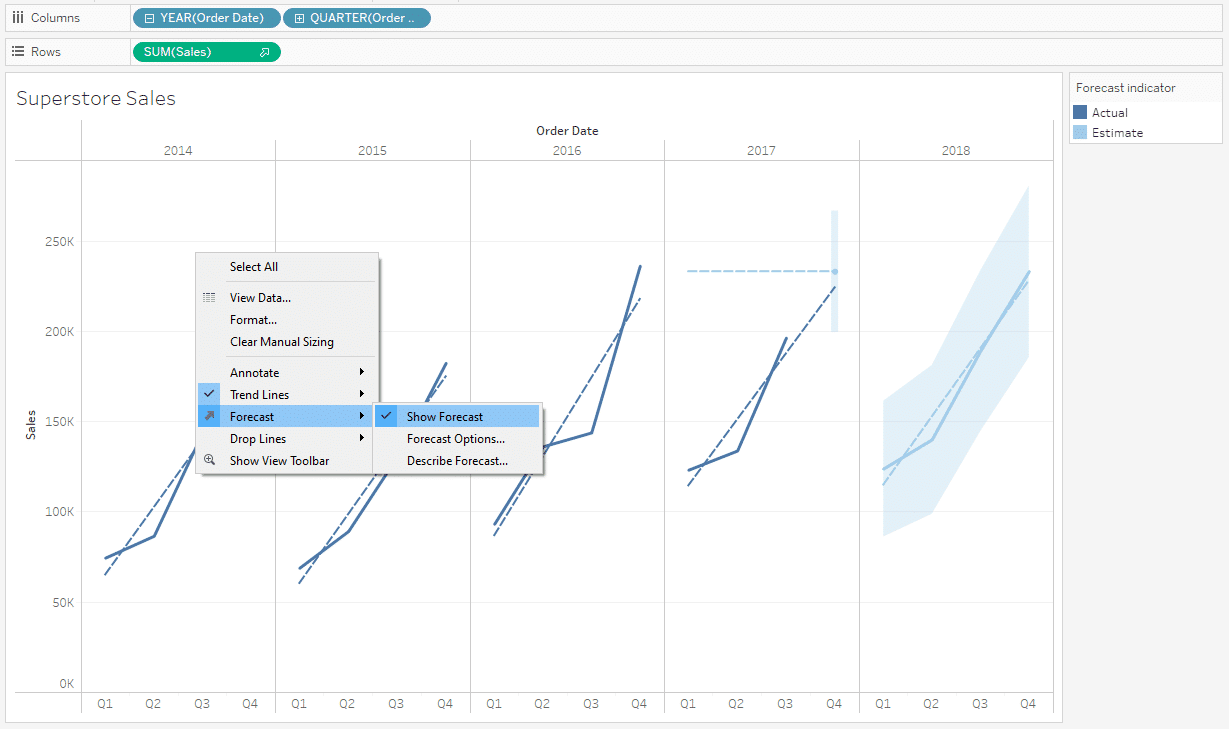
3. How to Use Measure For Trend Lines and Forecasting
You can use measures to create trend lines or perform forecasting on your visualizations.
This can help in understanding the direction of your data points or predicting future values.

Drag the time dimension values (e.g., ‘Order Date’) to the columns shelf and the measure (e.g., ‘Sales’) to the rows shelf. This will create a line chart showing sales over time.
You can add a trend line by right-clicking on the visualization and selecting ‘Trend Lines’ > ‘Show Trend Lines’. Tableau will automatically add the best-fit line for your data.
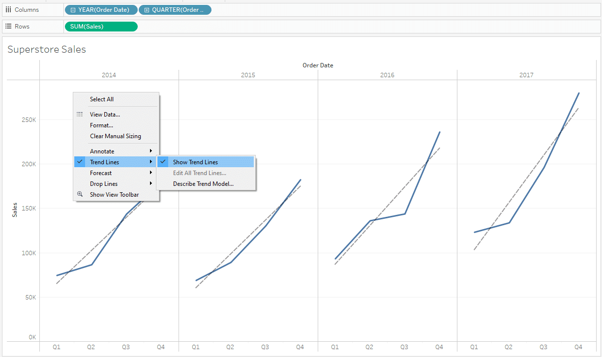
If you want to forecast future sales, you can right-click on the visualization and select ‘Forecast’ > ‘Show Forecast’.
4. How to Use Measures For Creating Bins and Histograms
You can use measures to create bins, which can then be used to build histograms. This is useful for understanding the distribution of your data.
Let’s say you have a dataset from a superstore, and you’re interested in analyzing the distribution of sales amounts, which is an integer data type.
Right-click on the ‘Sales’ measure in the data pane and select “Create Bins.”

In the “Create Bins” dialog, specify the size of each bin. For example, if you set the bin size to 100, Tableau will create bins like $0-$100, $100-$200, and so on.
Click “OK” to create the bins.
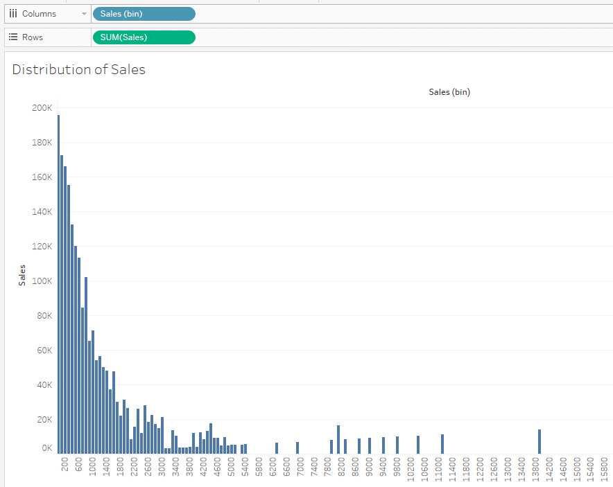
Drag the newly created ‘Sales (bin)’ field to the Columns shelf.
Drag the measure you want to count, like ‘Sales’, to the Rows shelf. Tableau will automatically aggregate this measure as a count.
The above are just four use cases of measures in Tableau. They form the basis of all data analysis and visualization in Tableau.
Learn the future of Data Tech by watching the following video:
Final Thoughts
Understanding measures in Tableau is essential for anyone looking to make the most of this powerful data visualization tool. As we’ve explored in this article, measures represent the quantitative values in your dataset, such as sales, profit, or quantity.
They can be aggregated, used in calculations, and displayed as continuous fields in your visualizations. By grasping the concept of measures and their role in Tableau, you’ll be better equipped to create insightful and meaningful visualizations that drive informed decision-making.
Whether you’re a beginner or an experienced user, mastering measures will undoubtedly enhance your Tableau journey and enable you to unlock the full potential of your data.
Frequently Asked Questions
In this section, you will find some frequently asked questions you may have when working with measures in Tableau.
What are the differences between a dimension and a measure in Tableau?
Dimensions are qualitative data fields that provide context and can be used to segment and categorize data. They are often discrete and are typically represented by blue pills in Tableau.
Measures, on the other hand, are quantitative data fields that provide numerical values for analysis.
They can be aggregated and are often continuous, represented by green pills in Tableau.
How are measures used in Tableau visualizations?
Measures are used to create quantitative visualizations in Tableau. When measures are placed on the Rows, Columns, Pages, or Marks card, they are displayed as continuous axes, allowing for the creation of various chart types, such as line charts, bar charts, and scatter plots.

What are some examples of measures in Tableau?
Common examples of measures in Tableau include:
Sales: The total revenue generated from product sales.
Profit: The net income derived from sales after accounting for costs.
Quantity: The number of units sold or purchased.
Discount: The percentage or amount of money deducted from the original price.
Shipping Cost: The expenses associated with shipping and delivering products.
Customer Count: The number of unique customers or transactions.
How to create a measure in Tableau?
To create a measure in Tableau, follow these steps:
Connect to your data source.
In the Data pane, locate the field that contains your quantitative data, such as sales or profit.
Drag the field from the Dimensions area to the Measures area in the Data pane.
How can I calculate the percentage change in Tableau?
To calculate the percentage change in Tableau, you can use the following formula in a calculated field:
(LOOKUP(SUM([Measure]),-1) / SUM([Measure])) – 1Replace [Measure] with the name of the measure you want to calculate the percentage change for. This formula uses the LOOKUP function to compare the current value with the previous one and calculates the percentage change.