
In today’s blog post, I’m going to do another review of one of the submissions we had in the Power BI challenge. This one was from Brian Julius, one of our Enterprise DNA experts doing incredible work in our community and also with the challenges, allowing all participants to learn so much about high-quality analytical solutions. I’m going to provide a couple of data visualization tips that Brian used in his submission. You may watch the full video of this tutorial at the bottom of this blog.
Power BI has the ability to create complete solutions based on analytics.
Power BI introduced something that wasn’t possible before with Excel, PowerPoint, and other tools of old. In my view, Brian’s submission highlighted Power BI’s strengths because it offered navigation features, the highlighting of key insights, and the ability to drill down into granular detail.

I want to highlight these three awesome data visualization tips that you should be using within your reports. You don’t have to use them exactly the same way, but they can make your reporting application more compelling, and your consumers more engaged in what you’re showing them.

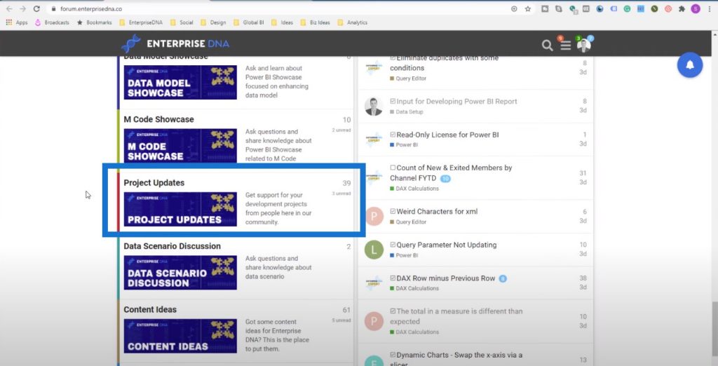
There are so many formula techniques that Brian used here, but I’m not going to cover everything in this tutorial. If you want to learn more about how Brian developed this, check out the Enterprise DNA forum. We’ve created a category in the forum called Project Updates where participants in the Power BI challenges get to write about how they worked through the challenge.
These challenges have been one of the best things we’ve done in Enterprise DNA. I’m learning so much from the techniques used in the challenges and they have rejuvenated my passion for Power BI. Brian showcased some incredible work, and I want to showcase how good his stuff is and how much you can learn from it.
Navigating The Report
One of the great things that I like about Brian’s report is the navigation. Within the updated Power BI apps, you can have a navigation effectively on the left-hand side of the online service.
Whether you need to always do this is debatable, but it looks so much better from an application point of view. Brian showed us how to click on a certain section of the report and be dynamically taken there through bookmarks that you can set up in your report.

When I click on Data Validity, this is what I see:
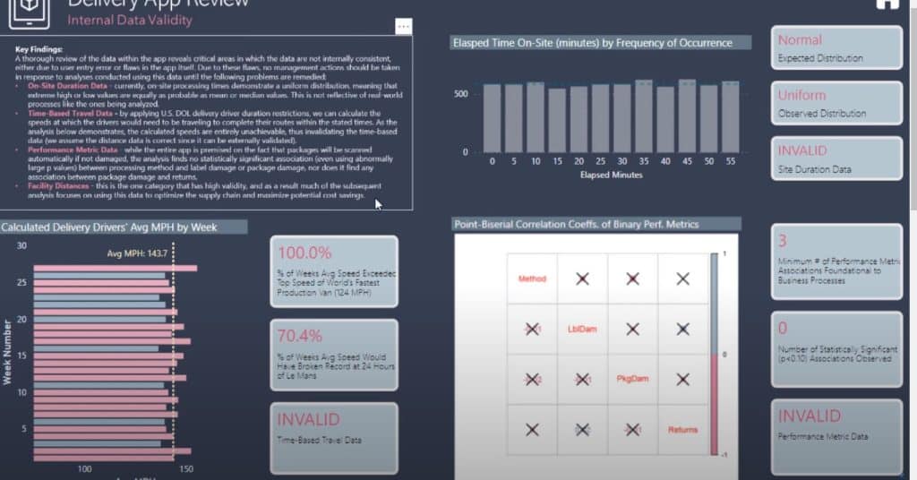
Most of us can get caught up in just having charts in our reports. But in some cases, it’s a good idea to have some written text like you would have done in PowerPoint. In Power BI, you can still do this. It can be static like the text in the upper left corner of the image above.

But it can also be dynamic. You can create dynamic text within your Power BI reports. This adds an additional color to your insights that might not be visible to consumers if you’re just showing them charts.
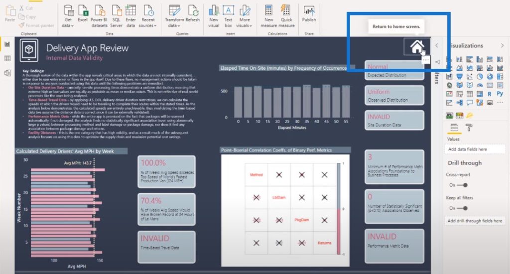
We can navigate back to the main page with this simple Home icon.
Using Custom Visuals
Another great way that Brian has showcased key insights is through the use of a custom visual. In here, he used a custom visual called Card with States created by OKVIZ. You can also use a card visual and then add some texts.
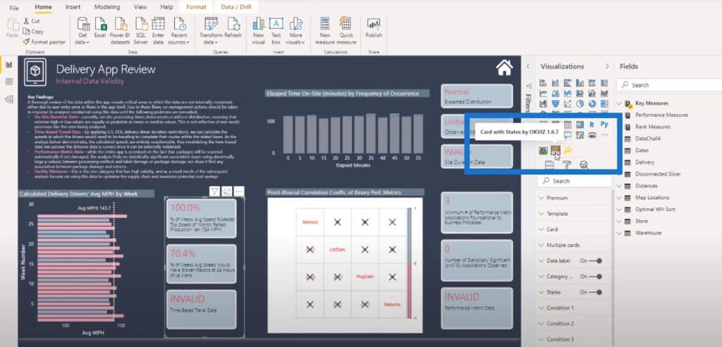
What I like here is that more information is being given about the metric itself.
We can see that the visualization pane already has a card visual function. You might think to just use this function for this technique.
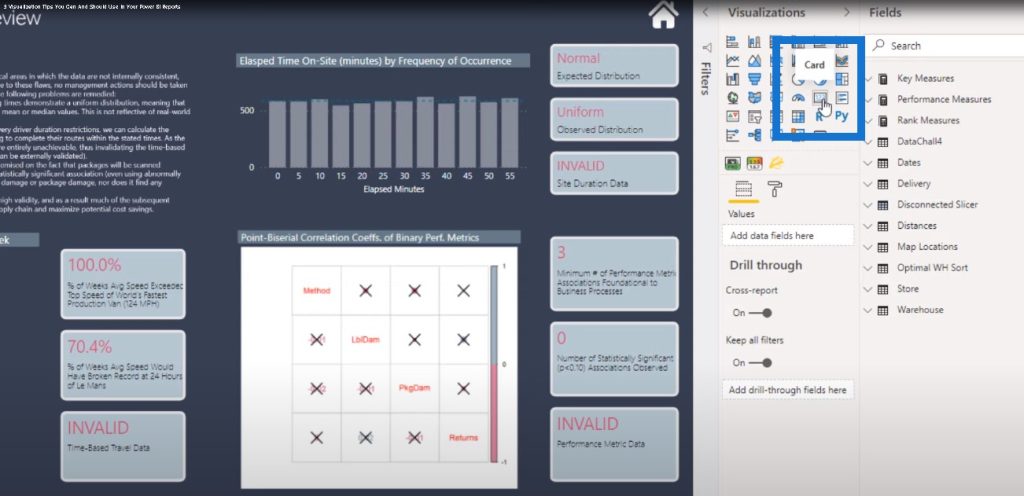
But Brian, in this particular submission, added some text so that the consumer can quickly evaluate what these numbers mean.
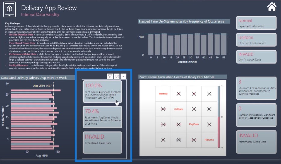
He used this technique quite extensively in this report page, which adds a lot of value. If you just see 100% and some title, it won’t be as descriptive.
I like the extent in which it’s done since it doesn’t take up too much room in the report. The report is still consumable and not overloaded with information.
Adding A Toggle Button
I also want to talk about the Delivery App Review page. There are some interesting insights going on in here that were achieved using techniques and formula.
We currently have a table view, which shows us a table.
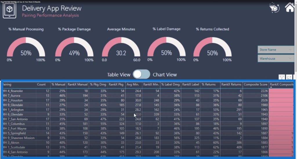
But what if you want to dynamically look at a chart? You can click on the toggle button in the middle.
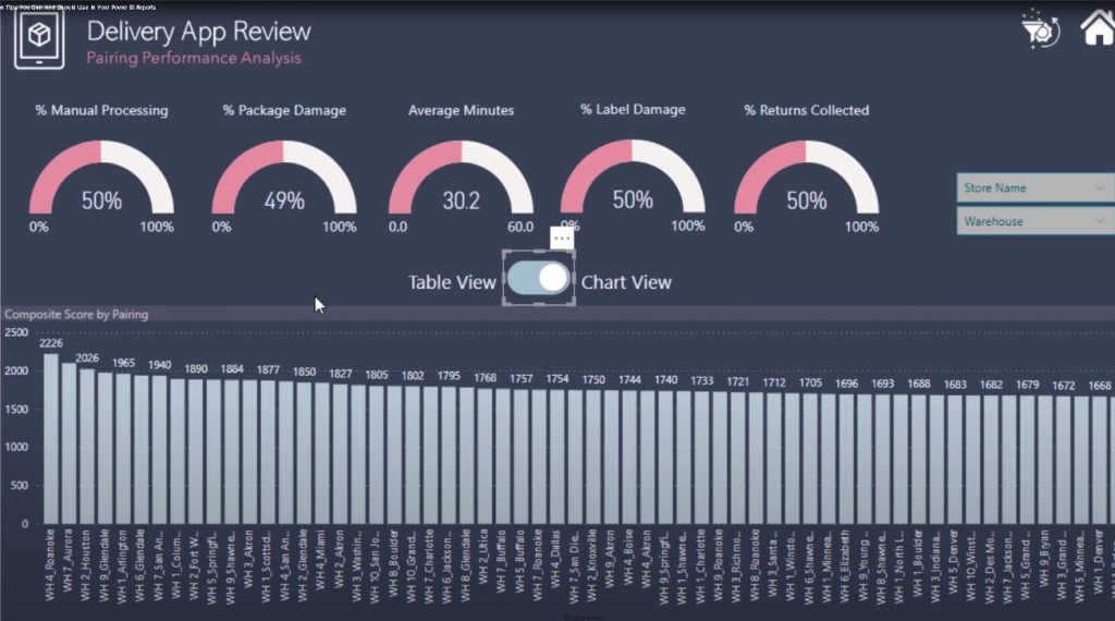
Brian came up with an icon that can change the view from table to chart. How did he do this? It’s actually simpler than you think.
This is not a dynamic chart. Brian created two different pages: the performance table and the performance graph.
It looks like a dynamic part of the report page, but it’s actually just a different page. All he’s done is to create two pages that look exactly the same: one with the table and another with the chart. Then he inserted two different images, one with the divider on the left-hand side, and then another on the right-hand side.
If someone clicks on the left side of the toggle, it will go to the performance table. If someone clicks on the right, it will go to the performance graph.

***** Related Links *****
How To Add Custom Icons Into Your Power BI Reports
How To Control The Interactions Of Your Visuals In Power BI
Custom Conditional Formatting Techniques In Power BI
Conclusion
These are the three data visualization tips that I wanted to talk about in this blog post. Brian’s work is an example of some of the great stuff coming out of the Power BI challenges.
Just a reminder, if you want to read how Brian did this, check it out in the forum where he goes through everything that he did.
I hope you enjoyed these data visualization tips. Some of them are hard and some are easy, but they make a big difference on how you can engage your consumers. Don’t forget to subscribe to Enterprise DNA TV to learn more visualization tips like these.
All the best,
Sam
[youtube https://www.youtube.com/watch?v=LUevMk9Q0eU?rel=0&w=784&h=441]


