With Tableau, you can visualize your data in several ways. One type of chart you’ll frequently use is the Tableau heat map.
A heat map in Tableau is an effective way to visualize large datasets and uncover patterns, trends, or concentrations of data points.
Using Tableau, you can create heat maps that enable you to identify areas with higher or lower densities of data points so you can draw conclusions.

To create a heat map in Tableau:
- Drag and drop the desired dimensions and measures onto the Rows and Columns shelves.
- Next, from the “Show Me” panel, select the “Heat Map” visualization type.
You can adjust color palettes and ranges as needed to enhance data visualization. This method will provide a color-coded representation of your data, allowing for quick insights into data concentration and patterns.
Read on, and let us show you how to do it step by step.

Let’s get started!
Basics of Heat Maps in Tableau
Let’s take a quick review of heat maps in Tableau. The basics discussed here will help you better understand the concepts discussed in this article.

What is a Heat Map?
A heat map is a data visualization technique that uses color intensity to represent the concentration or density of data points in a particular area.

Heat maps allow you to easily identify patterns and trends within your data by using colors.
You can create heat maps using different measures and dimensions. It provides you with a powerful tool to explore and analyze your dataset.
Why You Should Use Heat Maps?
Detailed below are some of the reasons why you should be using heat maps for representing your data.
- Visual clarity: Heat maps use color coding to represent the concentration of data points, making it easy to identify areas of high and low density at a glance.
This allows you to spot patterns and outliers in your data quickly. - Versatility: Heat maps can be applied to various data types, from geographical to categorical data.
This makes them highly adaptable and useful across different industries and use cases. - Efficiency: By combining multiple data points into a single view, heat maps can convey a large amount of information in a compact and digestible format.
This makes it easier to understand a huge data set and make informed decisions based on your findings.
Now that we’ve gone over the basics, let’s take a look at the steps to create a heat map in Tableau in the next section.
4 Steps to Create a Heat Map in Tableau
In this section, we’ll go over 4 steps of creating a heat map in Tableau. Specifically, we’ll go over the following:
- Open Tableau and Load Dataset
- Select Dimensions & Measures
- Selecting Text Lable
- Selecting Color Shelf Quantity Measure

Step 1: Open Tableau And Load Dataset
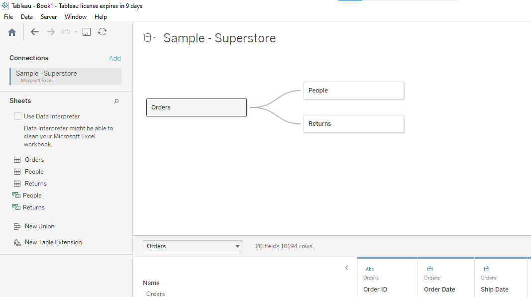
The first step is to open up Tableau and load your dataset.
To demonstrate creating a heat map, we have loaded the Sample Superstore Dataset, which comes as part of the Tableau software.
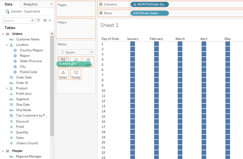
Step 2: Select Dimensions And Measures
The next step is to drag and drop one or more dimensions and measures onto the row and column shelf.
Suppose you want to determine which days in a month have the most profit. To do this:
1. Drag and drop the order date dimension onto the row shelf and select only the day from the entire date.
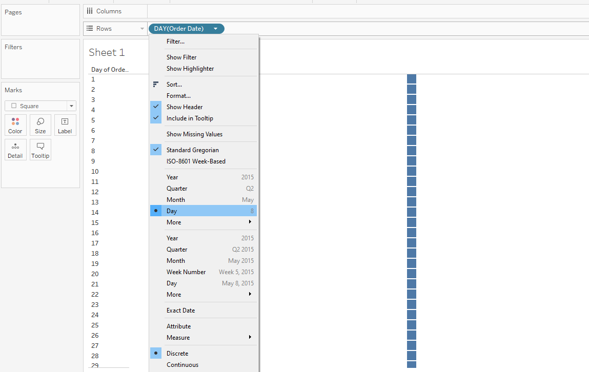
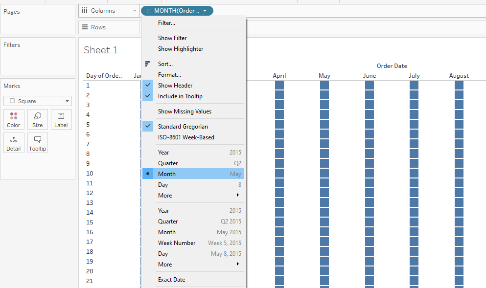
2. Drag and drop the order date dimension onto the column shelf and select only the month from the entire date.
Step 3: Selecting Text Label
Drag and drop the profit or sales measure onto the text label.
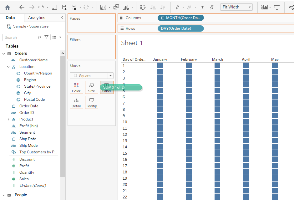
Step 4: Selecting Color Shelf Measure
Drag and drop the profit measure onto the color shelf.
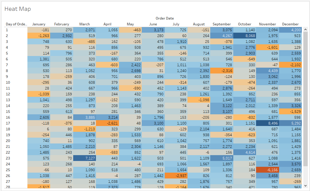
After following the above steps, you will get the following heat map:
Types of Heat Maps Available in Tableau
We’ll now explore two common types of heat maps in Tableau: Highlight Table and Density Map.

These heat maps help visualize and analyze data clearly by revealing patterns and trends within the data.

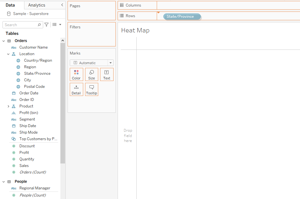
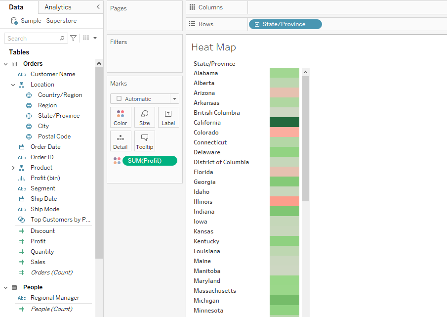
1. Highlight Table
Highlight tables are heat maps that use color to emphasize the differences in values within a matrix.
These tables are useful when working with data like sales figures, as they can quickly show the differences and trends amongst the data.
The heat map we created in the previous section is an example of a highlight table.
2. Density Map
A density map, also known as a heat map, is another type of visualization that displays data density or trends.
Density maps are useful when dealing with overlapping marks on a map, as they reveal relative concentrations and patterns that may otherwise be hidden.
Follow the steps given below to create a Density Map in Tableau:
Step 1: Drag and drop a geographical location onto the row or column shelf.
Step 2: Drag and drop one or two measures you want to visualize onto the color shelf.
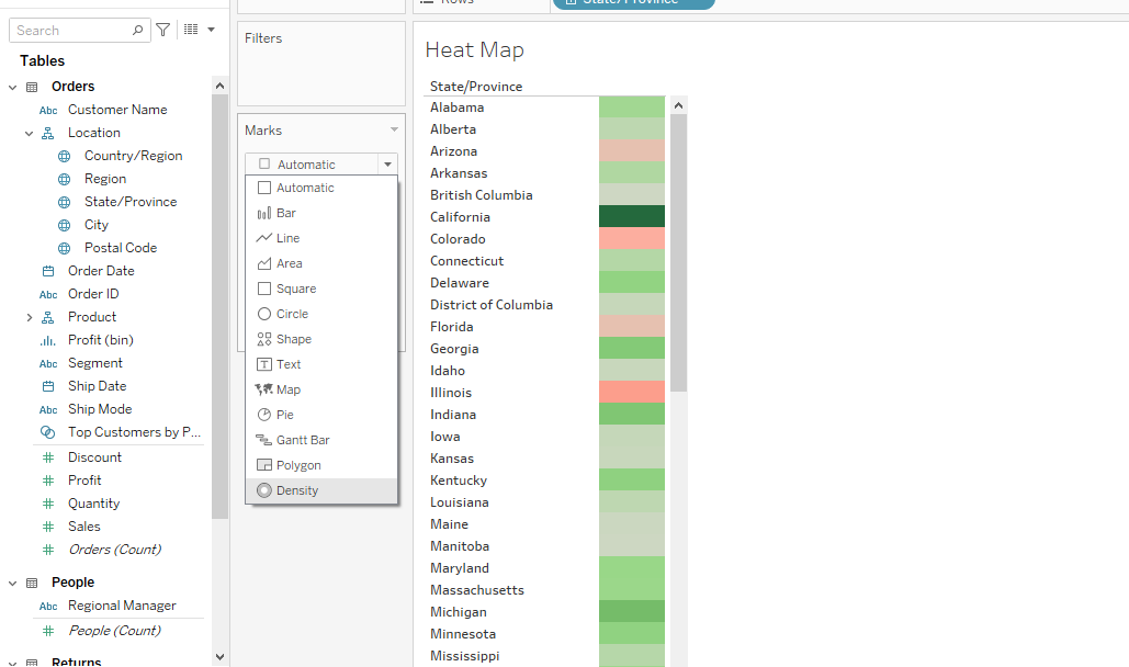
Step 3: Select Density in the Marks card.
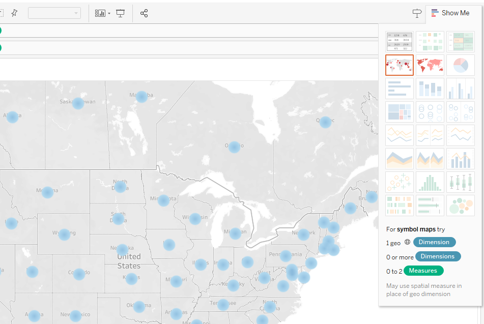
Step 4: Next, click on Show Me and select symbol maps. This will create density points on the map.
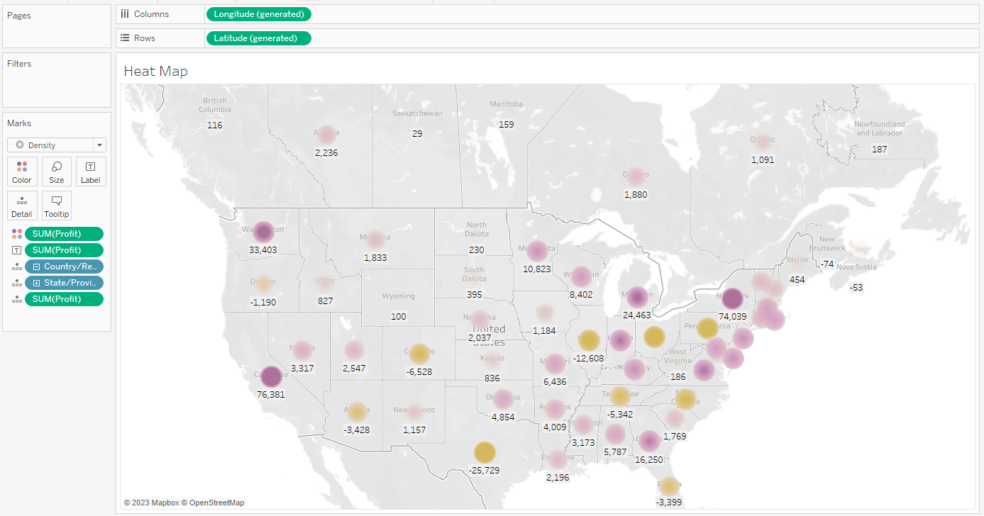
You can customize the chart according to your liking. The final density chart is given below:
You can learn more about the recent innovations in data tech by watching the following video:
Final Thoughts
Understanding how to create a heat map in Tableau is a powerful tool in your data analysis toolkit. This is because grasping complex data patterns instantly is invaluable in today’s data-driven world.
Heat maps allow you to do just that, offering a color-coded, intuitive snapshot of your data’s landscape.
By learning this skill, you can make faster, more informed decisions.
Moreover, presenting data in this visually appealing manner can be pivotal in business settings, making your presentations more engaging and comprehensible.
Effective presentation is one of the most important skills in the data science field.
Frequently Asked Questions
In this section, you’ll find some frequently asked questions you may have when creating Tableau heat maps.

How do I visualize geographic data in a heat map?
To visualize geographic data in a heat map, you ensure that your dataset has latitude and longitude information.
Drag the Latitude and Longitude fields onto the Rows and Columns shelves respectively.
Then, drag the same measure you want to represent as heat map colors onto the Color shelf. Adjust the color palette according to your preferences.
What are the steps to generate a heat map based on latitude and longitude?
- Ensure your dataset has latitude and longitude information.
- Drag the Latitude field onto the Rows shelf and the Longitude field onto the Columns shelf.
- Drag the measure you want to visualize onto the Color shelf.
- Choose a color palette and adjust its intensity.
- Optionally, customize your heat map by adjusting the size of the marks and adding labels or tool tips.
How can I create a density map in Tableau?
To create a density map in Tableau, select the “Density” mark type from the drop-down menu under “Marks.”
Afterward, drag your desired measures onto the Rows and Columns shelves.

Then, drag any relevant dimensions onto the Details shelf.
Finally, adjust the color palette as needed.
What is the process of creating a heat map using values?
- Drag your desired measures onto the Rows and Columns shelves.
- Add a relevant dimension, if necessary, to the Details shelf.
- In the “Show Me” panel, click the heat map icon.
- Customize your heat map by adjusting colors, mark size, and tooltips.
How can I highlight data in a table by column?
Create a table with row and column headers to highlight data in a table by column.
Then, drag your desired measure onto the Color shelf.
Choose a suitable color palette and adjust its intensity to emphasize the values of interest.