Maps help you visualize and understand geographic data and reveal spatial patterns within your dataset. They are particularly useful when working on big data projects.
Tableau offers mapping functionalities that cater to different types of geographic analyses.
To create a map in Tableau:

- Drag and drop the geographical field (like city, state, or country) to the Rows shelf. This action will automatically generate a map view.
- If you want to overlay quantitative data, simply drag that measure to the Color shelf under the Marks card.
- Adjust size, color, and detail levels to customize your map as needed.
Once satisfied, you can further enhance the map with filters, labels, and tooltips to provide more context to your audience.
But wait, there’s more.
Using Tableau’s mapping features, you can answer spatial questions and make data-driven decisions that address your objectives. In this article, you’ll learn how to make a map in Tableau. There will be examples to help you better understand the concepts.
Let’s jump in!
How to Create a Simple Map in Tableau

To create a simple custom maps in Tableau, follow the steps given below:
Step 1: Import Data
Open Tableau and connect to your data source that has geographical location data (like cities, states, zip codes, countries, latitude, and longitude).

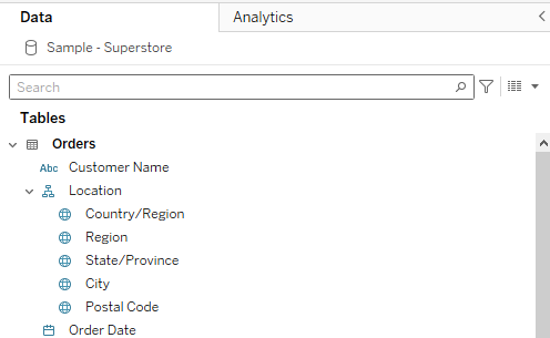
Step 2: Filling the Row Shelf
Once you are done importing, drag your geographical field (e.g., ‘City’ or ‘State’) to the Rows shelf.
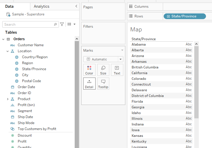
Step 3: Converting to Map
The next step is to convert your visual to a map. To do this, click on the drop-down menu in the Marks card and select map.
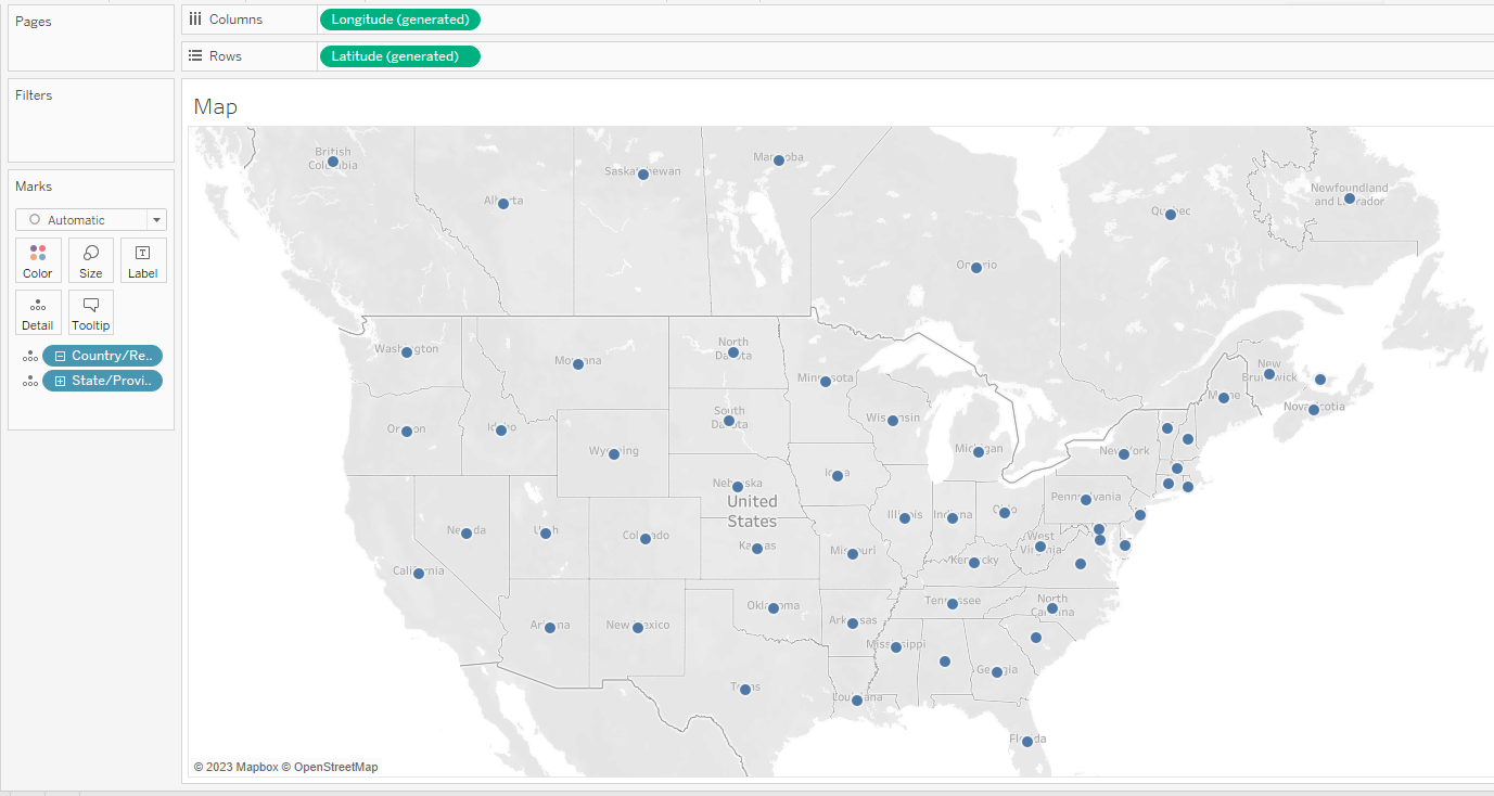
This will create a map in Tableau which will look like the following:
4 Popular Types of Maps in Tableau
You can create various map types in Tableau to visualize and analyze your geographic data. This section will help you understand the available map types and their use cases.
We’ll go over the following map types:
- Point Map
- Filled Map
- Heat Map
- Density Map

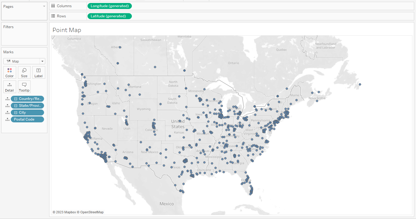
1. Point Map
A point map displays individual data points as symbols on the map. This type of map is useful when you want to show the location of specific items or events, such as store locations or crime incidents.
To create point distribution maps in Tableau, you’ll need one geographic dimension, such as latitude and longitude, or a combination of other geographic fields like city, state, and country.
The following is an example of a point distribution map in Tableau:
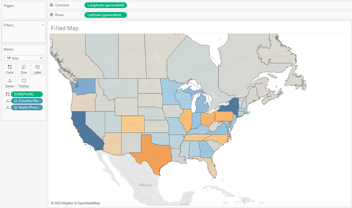
2. Filled Map
Filled maps in Tableau are a type of map visualization where geographical data is shaded or colored according to a measure.
This type of map is particularly useful for visualizing the geographic concentration of data, allowing for easy comparisons of a measure between different regions at a glance.
To create a filled map, drag a geographical dimension to the Rows shelf and a measure to the Color shelf on the Marks card.
Then, in the Marks card drop-down, you can select the “Filled Map” option. You’ll then see your geographical areas shaded according to your measure.
The filled background maps are shown below:
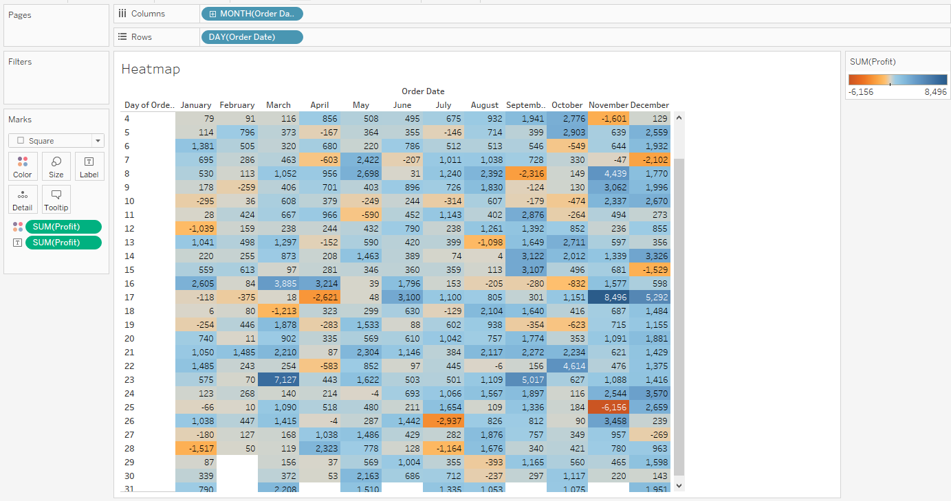
3. Heat Maps
A heat map uses color gradients to represent the magnitude or frequency of variables in a two-dimensional table.
It allows you to easily see patterns related to the intersection of two variables.

To create heat maps, drag one dimension to the Columns shelf and another dimension to the Rows shelf.
Then, drag a measure to the Color shelf on the Marks card.
You can choose the “Square” or “Text” mark type from the Marks drop-down to better visualize your heat map.
The heat background map is shown below:
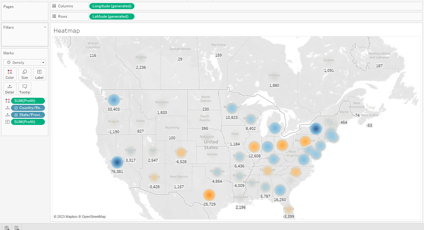
4. Density Map
A Density map in Tableau is used to display the concentration of data points in a geographic area or within a bounded context.
Density maps use color gradients to show areas with higher or lower concentrations of data points.
To create maps, drag your latitude and longitude coordinates or other relevant dimensions from the data pane to the Rows and/or Columns shelves, and then choose “Density” from the Marks card dropdown.
Then, drag a measure to the Color shelf to represent the density. Tableau will then generate a color gradient that indicates the density of data points in the view.
This will create proportional symbol maps with density, as shown below:
Learn more about the future of data tech by watching the following video:
Final Thoughts
Mastering the art of making maps in Tableau is an important skill when visualizing data. Maps allow you to bring data to life. Imagine being able to instantly pinpoint sales hotspots, or understand regional consumer behavior — all through easy-to-interpret maps.
Learning how to create these maps boosts your analytical prowess and amplifies your ability to make data-driven decisions.
Tableau’s map functionalities are versatile and user-friendly. It allows you to convey complex data in a manner that’s both effective and aesthetically pleasing.
The more you delve into it, the more valuable insights you can unearth. It will help you strategize better, whether in business, research, or even personal projects.
Frequently Asked Questions
In this section, you’ll find some frequently asked questions you may have when making maps in Tableau.

How do I add layers to a Tableau map?
To add layers to a Tableau map, create a map worksheet and add additional data through the Marks card.
Under the Layers section, click the “Add additional data layers” button and select the layer you want to add.
You can manage the visibility and transparency of each layer through the Layers menu. You can also create layered maps by blending multiple data sources or using a dual-axis map.
What are some Tableau map Dashboard best practices?
When creating a Tableau map dashboard, follow these best practices:
- Keep the focus on the most important data by using filters and highlighting.
- Utilize tooltips to provide additional information without cluttering the dashboard.
- Use appropriate colors that communicate values effectively and maintain accessibility.
- Set zoom levels wisely, allowing users to focus on the relevant geographic scope.
- Use map layers sparingly, keeping the visualization simple and easy to understand.
How can I create a Symbol map in Tableau?
To create a symbol map in Tableau:

- Connect to your data source containing geographic information.
- Drag the geographic dimension (e.g. Country, State, City) to the Rows or Columns shelf.
- From the “Show Me” panel, choose the Symbol Maps option.
- Customize your symbols, tooltips, and colors using the Marks card.
Why is my Tableau map not displaying data?
If your Tableau map is not displaying data, there could be several reasons:
- Your dataset lacks location information (e.g., name, latitude, longitude). Ensure your data source contains this information.
- Tableau is unable to geocode your data. Check for incorrect or missing geographic dimensions.
- The mapping is filtered or zoomed out too much. Adjust the filters and zoom level to display the desired data.
How do I create a county-level map in Tableau?
To create a county-level map in Tableau:
- Connect to your data source containing county information.
- Drag the county dimension to the Rows or Columns shelf.
- Select the Filled Map option from the “Show Me” panel.
- Customize the colors, tooltips, and filters using the Marks card and dashboard actions.
How do I change map colors based on values in Tableau?
To change the map colors based on values in Tableau:
- Drag the measure or dimension you want for color mapping onto the Color card on the Marks shelf.
- Click the Color card to access the color options.
- Choose an appropriate color palette to convey the desired information effectively.
- Adjust the color range, if needed, using the Advanced options for a continuous measure.