Tableau is a powerful data visualization tool that is revolutionizing the way organizations analyze and utilize their data. With the Tableau product suite, creating interactive dashboards and wrangling big data sets becomes a breeze.
You can easily share your different visualizations with others and streamline the whole preprocessing and transformation process.
Tableau software offers a range of features that enable you to connect to any data source, tap into AI/ML capabilities, and manage data governance. This means you can uncover meaningful insights, spot patterns, and make smart decisions. Plus, Tableau can be deployed in the cloud, on-premises, or seamlessly integrated with Salesforce CRM, giving you total flexibility.
When you jump into Tableau, get ready for a secure and flexible data analytics platform that’s perfect for both individuals and big enterprises. Its magic lies in turning data into actionable insights that tell a captivating story.
This is why Tableau has become a must-have tool for a modern data analyst.

So, What is Tableau Exactly?
Tableau is a visual visualization tool that empowers you to dive into your data by connecting to almost all static files, databases, or data warehouses.
It enables you to develop visualizations with a simple drag-and-drop interface and easily share your insights with a single click.
Starting with Tableau Desktop Professional, the company offers a range of other analytics tools, such as Tableau Server and Tableau Online, designed to help users collaborate more effectively and securely share their insights.
Additionally, a useful product alongside the Tableau software options is Tableau Prep.
Tableau Prep is a data preparation tool that allows users to simplify raw data by exploring, cleaning, and transforming operations for analysis and visualization purposes within Tableau Desktop.
Now, let’s get you started with Tableau.
Getting Started with Tableau
In this section, we will explore the basics of getting started with Tableau software and its various components: Tableau Desktop, Tableau Server, Tableau Online, Tableau Public, Tableau Reader and Tableau Prep.
Let’s dive into the world of business intelligence and start with Tableau Desktop.
- Tableau Desktop
Tableau Desktop is a BI tool for individuals who want to start working on visualizations. Whether you’re a data pro or an analyst that is new to the game, Tableau Desktop’s user-friendly interface and automation features empower you to explore, analyze, and present your data insights with ease.
With Tableau Desktop, you can effortlessly connect to different data platforms such as Tableau Server, Tableau Online, and Tableau Public. You can seamlessly extract data from these platforms and publish your interactive dashboards there, enabling easy sharing and collaboration with other users.
Plus, it offers an educational license, so you can use it for learning or academic purposes and take your data exploration skills to the next level. It’s a must-have tool for any data analyst!
Well, that is if you are not a Microsoft Power BI fan, but that is a conversation for another day.
To get started, you need to install the desktop application on your computer. Also, there is a 14-day full-access trial available if you are starting out.
You are literally 4 steps away from creating beautiful data visualizations. Follow the below steps to get started:
- Install the Tableau Desktop application on your computer.
- Connect to your data source(s).
- Build data visualizations by dragging and dropping elements onto the canvas.
- Save your workbooks locally as .twb or .twbx files or publish them to “Public”.
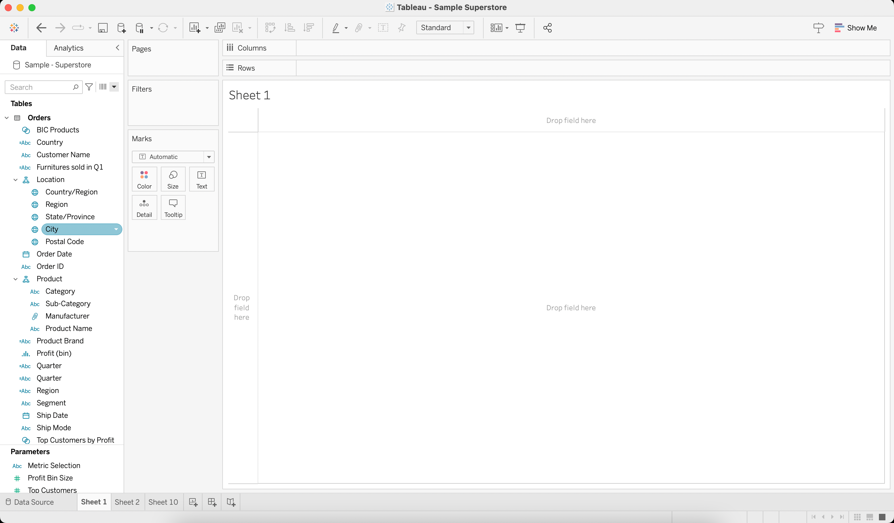
As you become more familiar with Tableau Desktop, you can take advantage of its advanced features, such as creating calculated fields, custom table calculations, and blending data from different sources.
Now let’s look at the Tableau server.
- Tableau Server
Tableau Server is an enterprise-grade platform that empowers organizations to securely share, collaborate, and distribute their Tableau work.
It offers a centralized server environment where users can publish their Tableau workbooks, accessible to authorized individuals within the organization. Unlike Tableau Desktop, which runs on individual machines, Tableau Server requires dedicated hardware to host the server infrastructure.
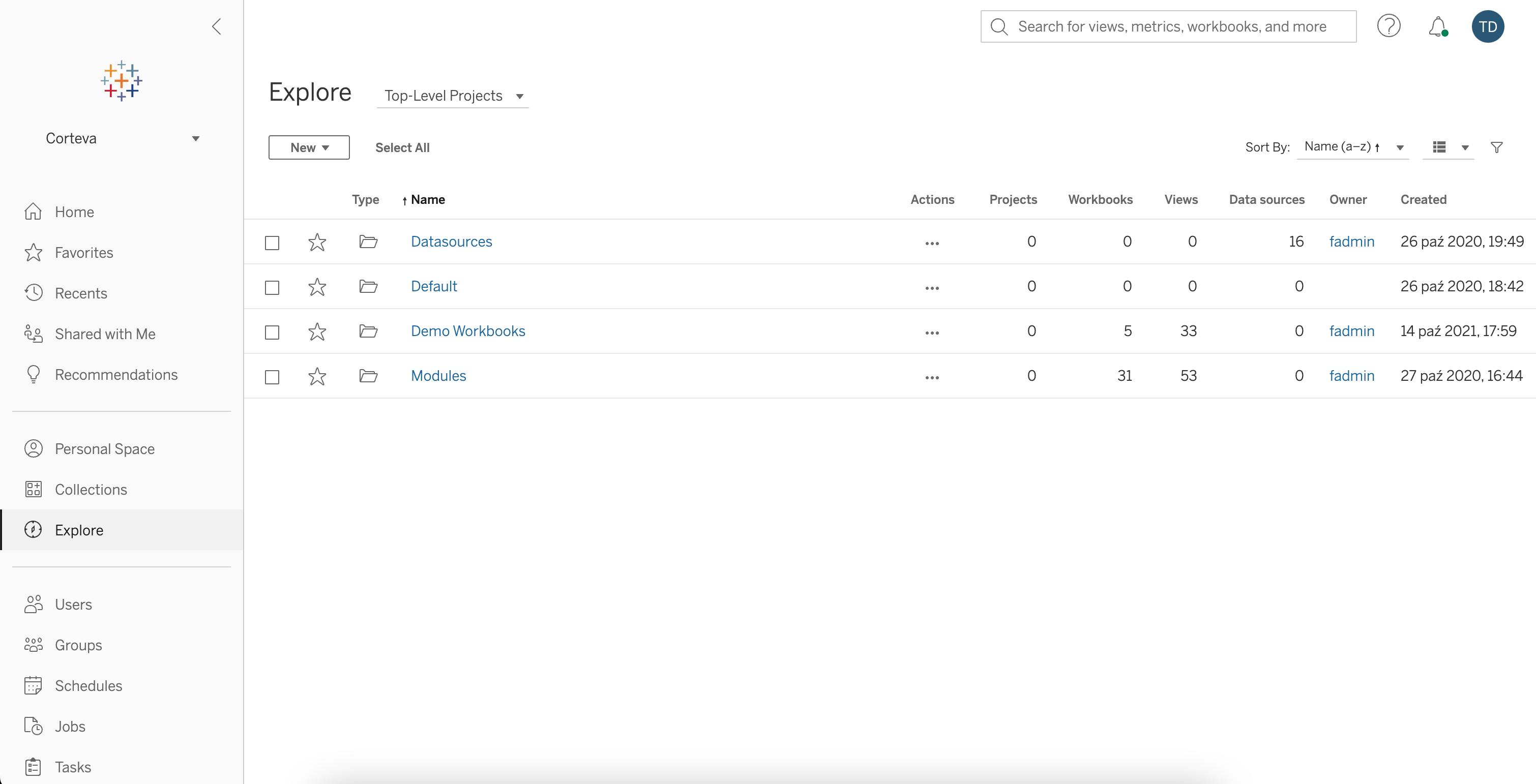
In order to get started with Tableau Server, ensure that you have:
- Access to a Tableau Server instance in the form of URL or web address (either through your organization or by setting up your own).
- An account on Tableau Server with necessary permissions (either Viewer or Explorer license).
- A Tableau Desktop Creator license to create workbooks and publish data sources.
Once you’re set-up, you can publish your workbooks to Tableau Server and collaborate with your team.
Now, let’s ditch the downloads and check out the Online option.
- Tableau Online
Tableau Online is a fully-hosted, cloud-based version of Tableau Server. This platform offers the same functionality as Tableau Server but does not require any installation or maintenance on your end.
Here’s how you can get started with Tableau Online:
- Sign up for a Tableau Online account or get access through your organization.
- Connect to a cloud-based data source or use Tableau Bridge for on-premises data.
- Publish your workbooks from Tableau Desktop to Tableau Online.
Tableau Online enables you to work with your team in real-time, seamlessly sharing data, visualizations, and insights across your organization.
Don’t want to signup and pay for anything out of your pocket?
Let’s check out Tableau Public.
- Tableau Public
Tableau Public is a free online sharing tool that allows users to publish and share interactive data visualizations on the web. With Tableau Public, you can connect to various data sources, create interactive dashboards, and publish them to Tableau’s Public cloud.
The visualizations published in Tableau’s Public cloud can be embedded in websites, blogs, or shared through social media, allowing a wide audience to explore and interact with the data.
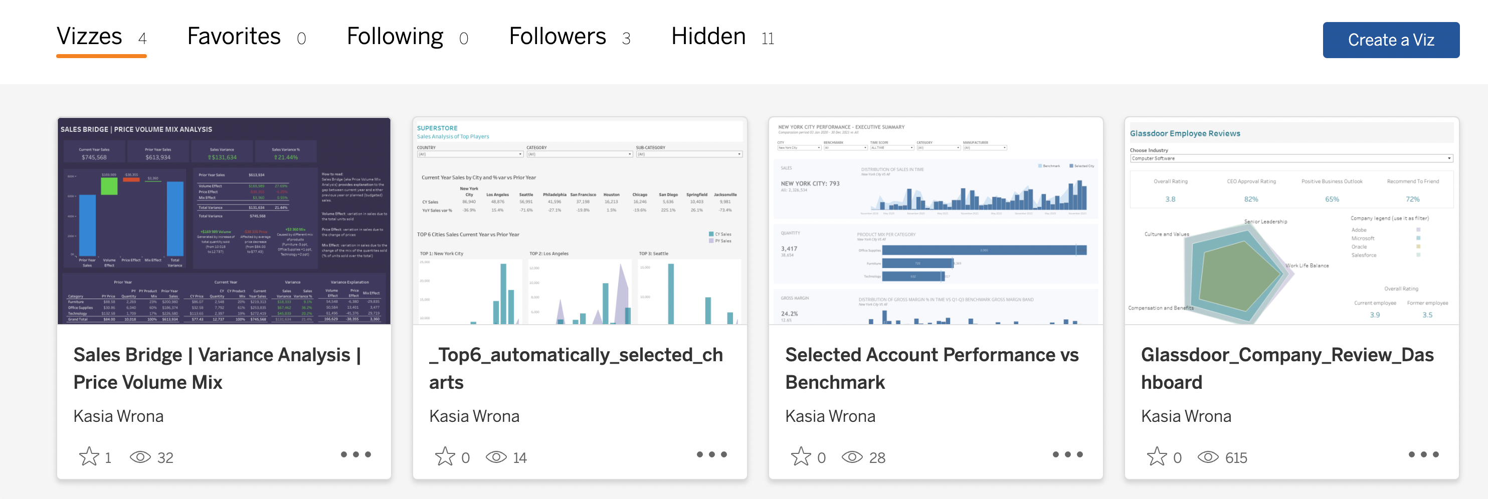
Additionally, the Public Gallery provides a space where users can discover and explore visualizations created by others, fostering a community-driven approach to data visualization.
Got access to Tableau, but your friends or colleagues don’t?
Welcome to Tableau Reader.
- Tableau Reader
Tableau Reader is a free application for sharing Tableau visualizations with others who may not have access to Tableau Desktop. This allows you to view and interact with the visualizations in a read-only format with .twbx extension.
With Tableau Reader, you can interact with dashboards and reports created in Tableau Desktop without needing a Tableau Desktop license.
Also, it enables you to perform explanatory analysis, apply filters and drill down into the details of the data.
When you are ready to get rolling, it’s time to prepare your data.
- Tableau Prep Builder
Tableau Prep Builder is a data preparation tool that helps you easily and efficiently prepare structured data for analysis and visualization.
It allows you to load raw data and perform tasks such as data cleaning, data shaping, data profiling, and creating calculated fields, all without the need for programming or technical skills.
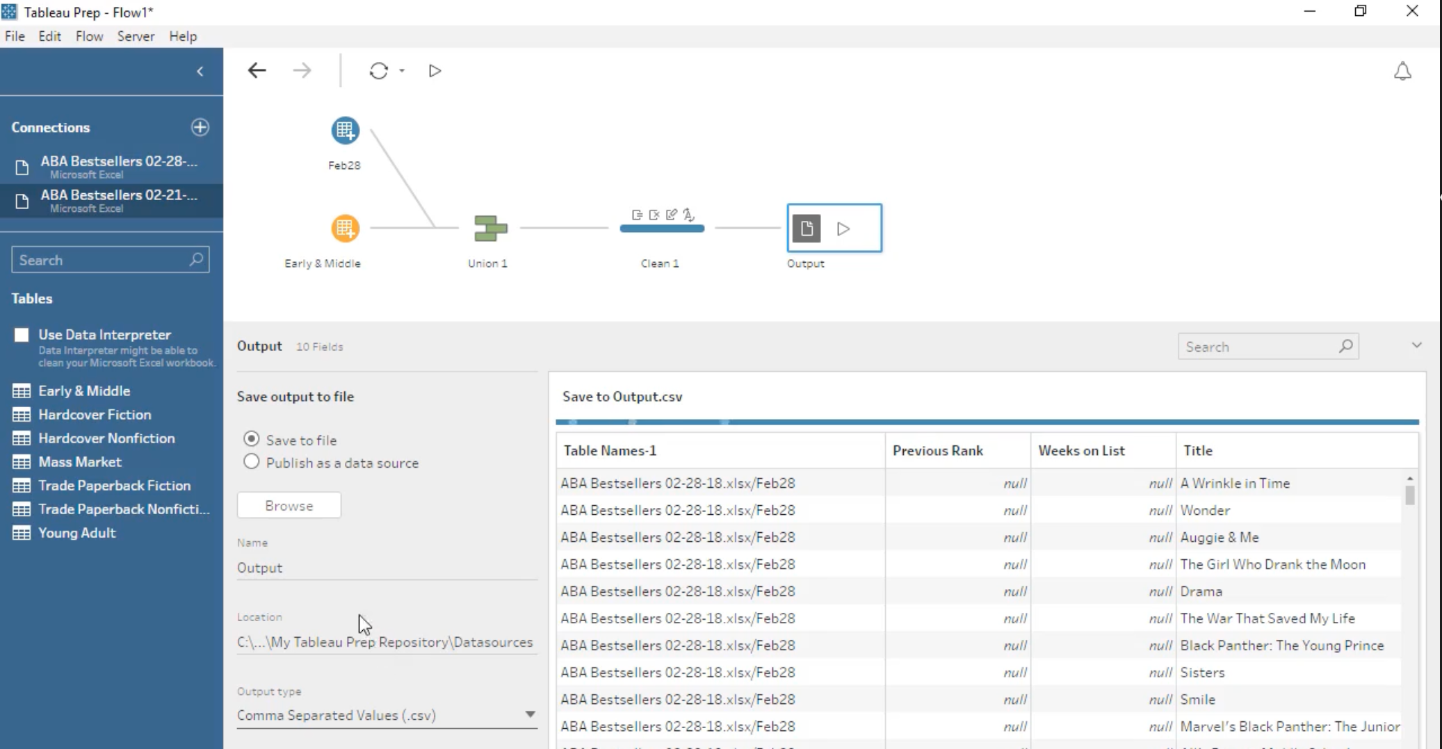
Having knowledge of the aforementioned tools empowers you to effectively manage the entire data flow process starting from raw data, progressing through interactive visualizations, and ultimately driving data-driven decision-making.
Let’s look deeper into Tableau’s core features.
Core Features of Tableau
In this section, we will start with visualizations and data sources and move through to calculated fields, dashboards, and stories.
Let’s get into it.
- Visualizations
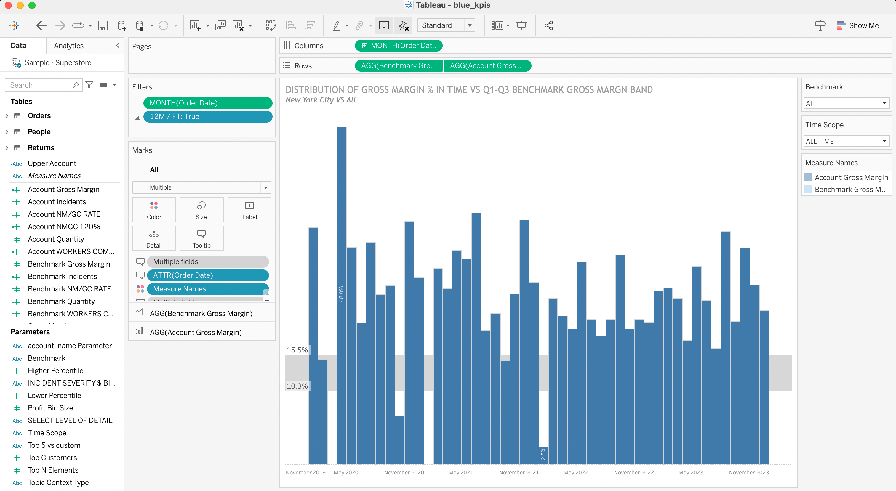
Tableau is all about visualizing. With the drag-and-drop functionality, you can quickly create visually appealing charts and graphs without any coding knowledge.
Furthermore, Tableau supports a wide range of visualization types, including:
- Pie Charts
- Bar Charts
- Line charts
- Histograms
- Treemaps
- Bullet Graphs
- Box & Whisker Plots
- Data Sources
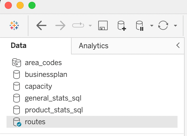
Connecting to multiple data sources is a key feature of Tableau. You can easily connect to data formats, including Excel, CSV, and SQL databases as well as cloud-based data warehouses such as Google Analytics, Amazon Web Services, and Salesforce.
There are over 100 data sources and API connectors available; more info can be found here.
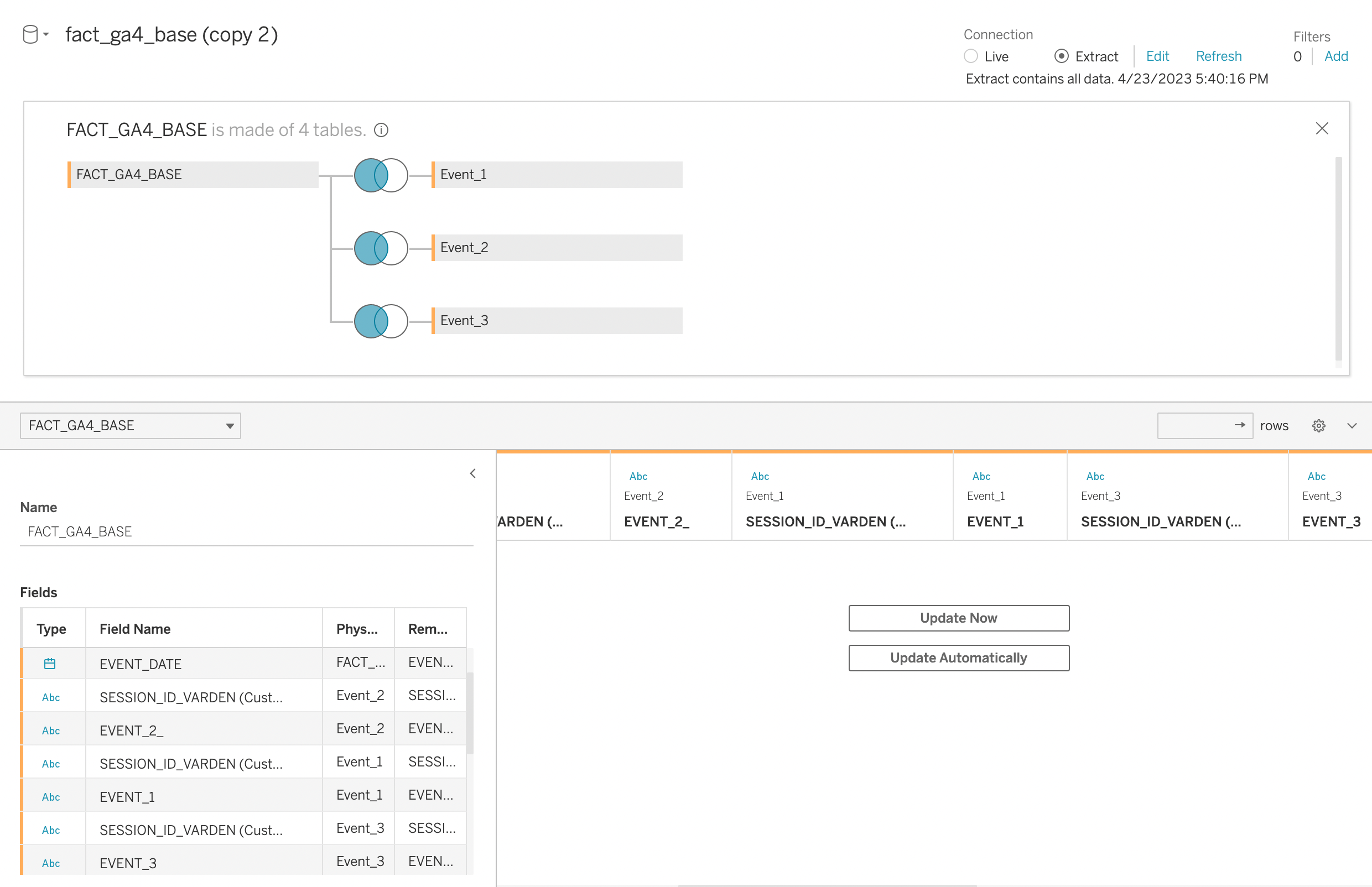
Tableau also supports data blending, meaning building visualizations based on multiple data sources.
- Calculated Fields
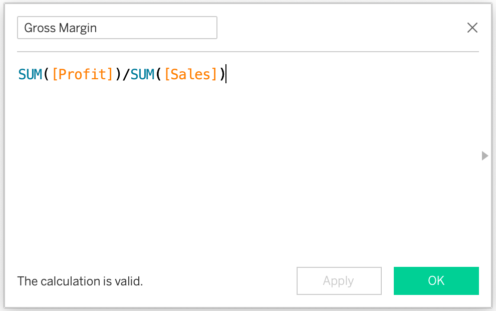
Tableau provides the ability to create calculated fields, which allows you to apply custom transformations.
With calculated fields, you can perform arithmetic operations, create conditional statements, and use various functions to manipulate and analyze your data.
- Dashboards and Stories
Dashboards created in Tableau are used to gather multiple visualizations into a single, unified view, providing you with at-a-glance data discovery.
You can also create interactive elements within your dashboard, such as filters and actions, to explore and analyze your data in real time.
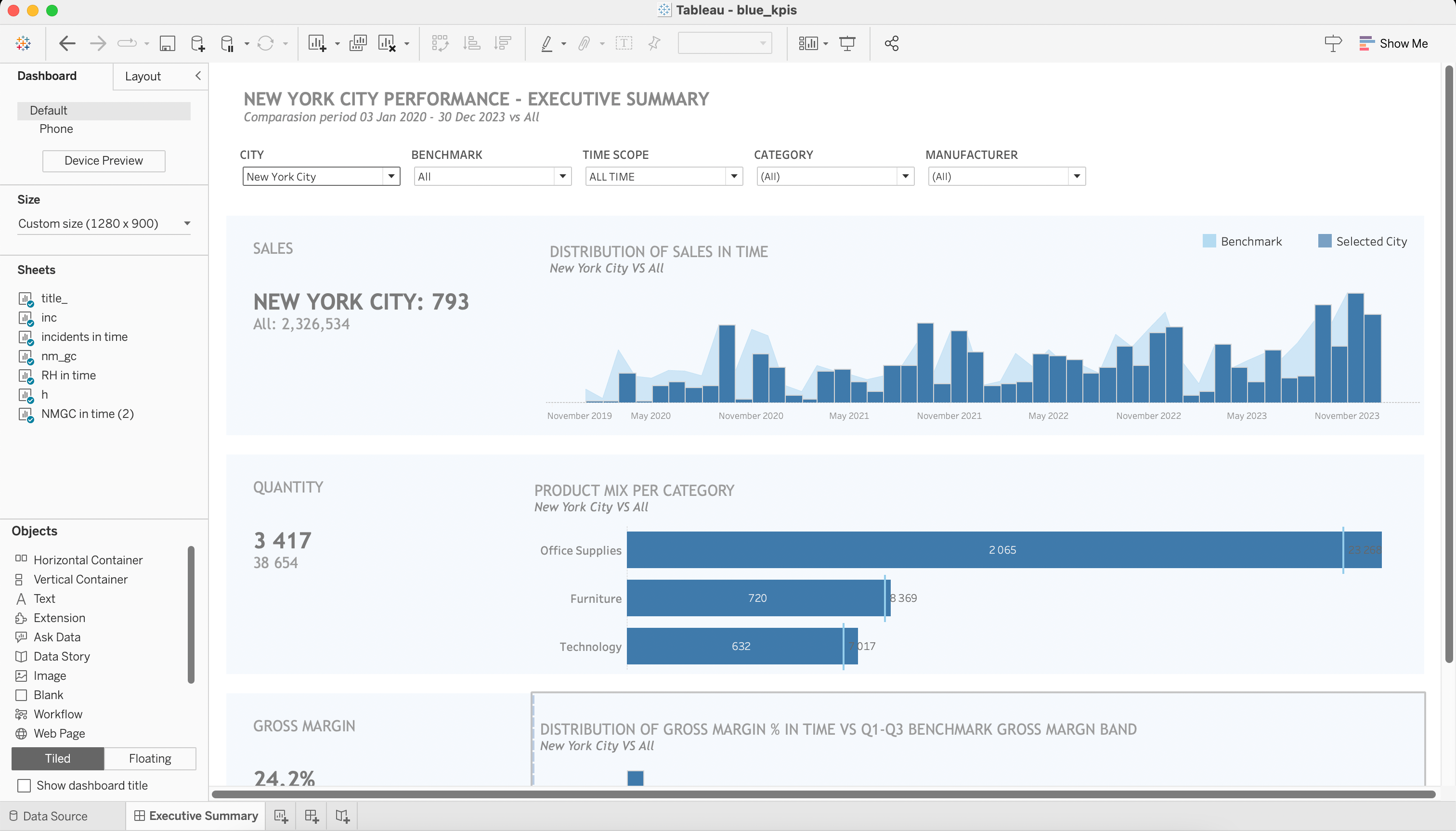
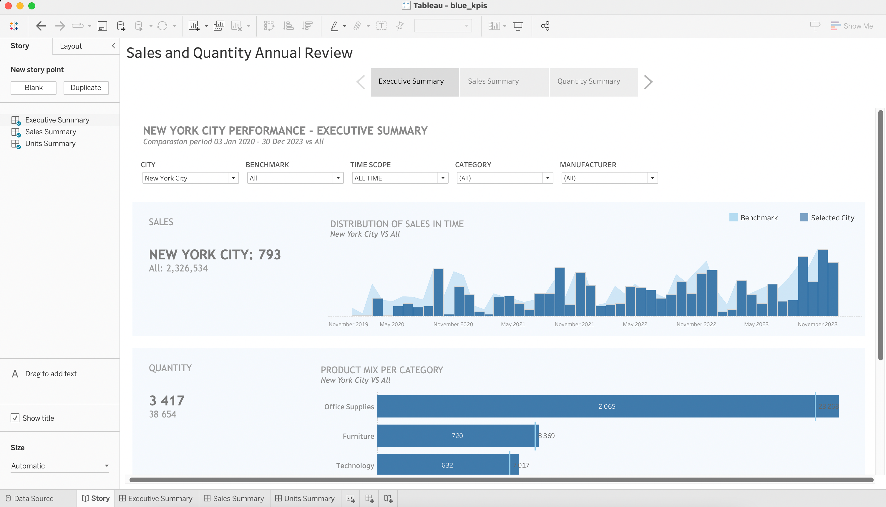
Tableau Story is another feature that enables you to present a sequence of dashboards, guiding your audience through a narrative and helping them to understand the insights derived from your data.
Now you’ve had an overview of Tableau, let’s dive deep and give a good understanding of the main desktop interface.
Exploring the Tableau Desktop Interface
Tableau is intuitive and fairly straightforward; let’s run through the basics to give you a good understanding of the main interface and the basic functionality.
The Tableau Desktop Window – 8 Areas of Importance
When launching Tableau Desktop, you are greeted with a clean and organized interface. The primary workspace consists of different areas designed to facilitate data exploration and visualization.
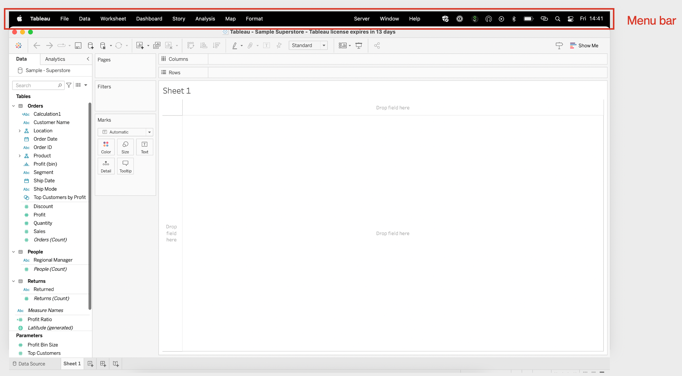
- The Menu Bar
At the top, you’ll find the menu bar, which houses various commands and options for working with your data.
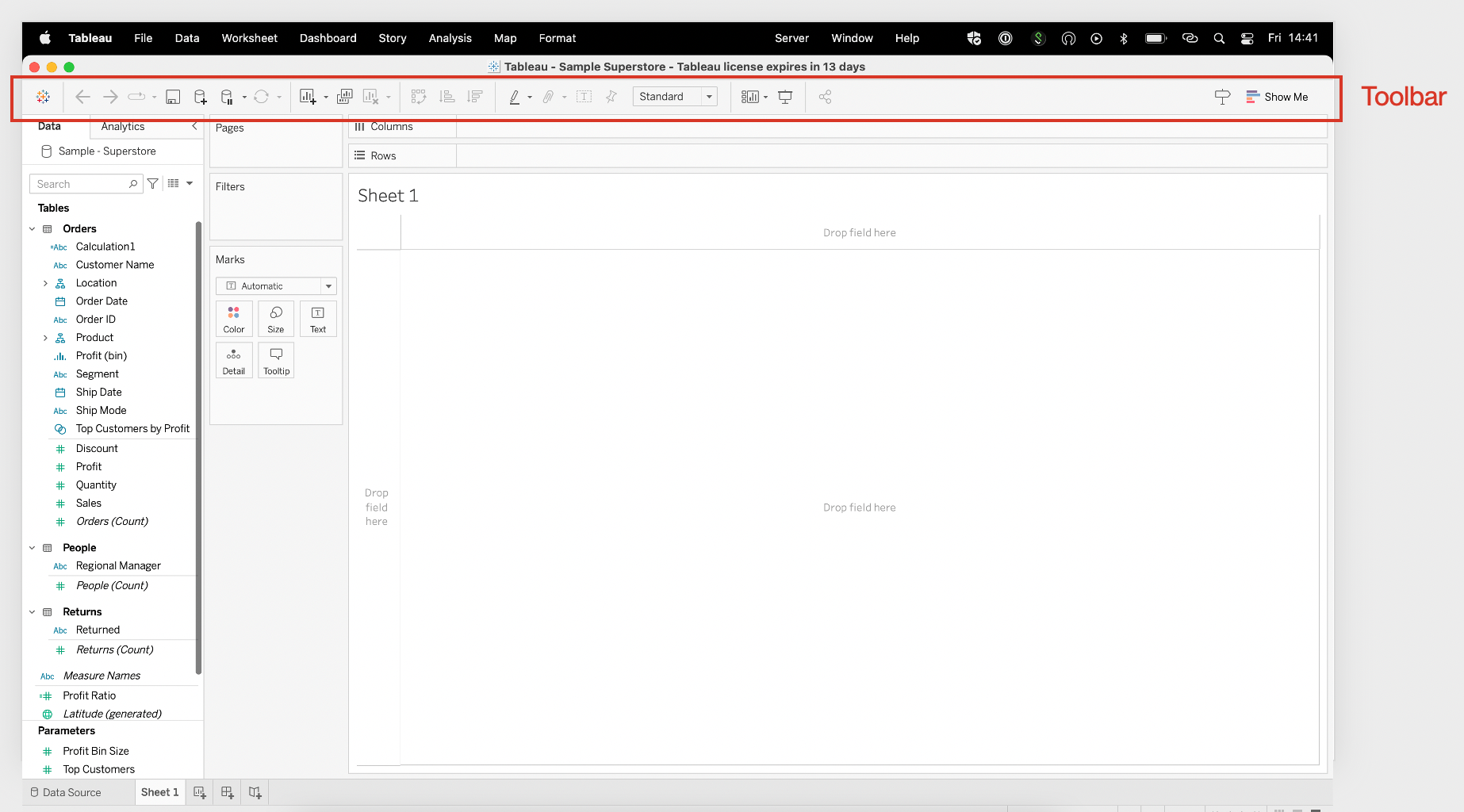
- The Toolbar
Below the menu bar, the toolbar provides quick access to frequently used features and actions.
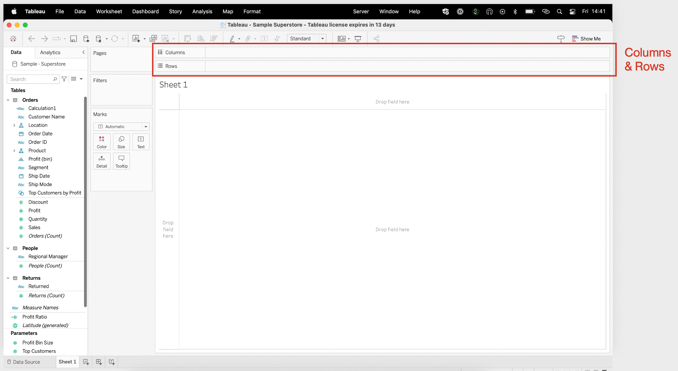
- The Columns & Rows Pane
The columns and rows pane(seen below) is vital for data organization. It allows you to select and arrange dimensions and measures, commonly referred to as “pills.”
By dragging and dropping pills into the Columns or Rows pane, you can define the structure and arrangement of your visualizations.
- Dimensions and Measures
Dimensions and measures originate from the loaded data source. Tableau automatically identifies the data type of in each field and categorizes them as dimensions or measures based on their characteristics.
This allows Tableau to understand the nature of the data and provide appropriate options for analysis and visualization.
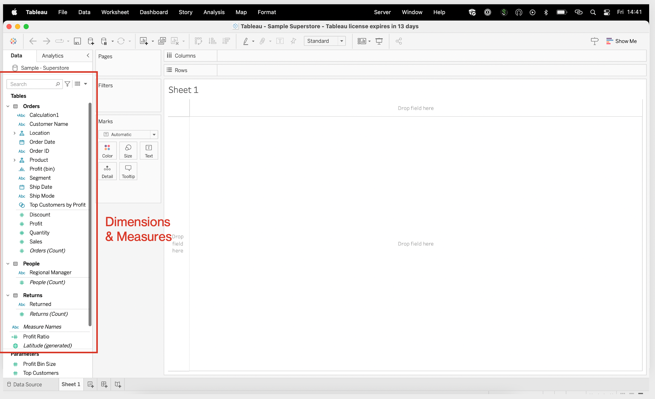
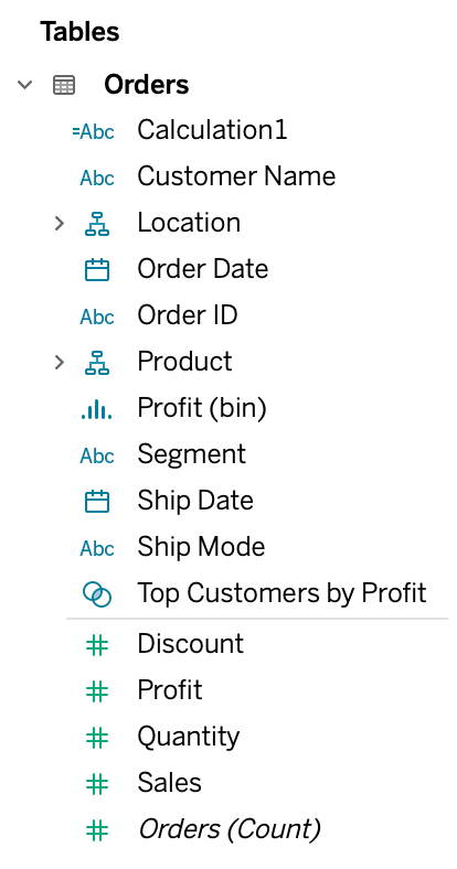
Understanding the distinction between green and blue columns is crucial for effective work with the Tableau interface. Blue columns represent dimensions and define the categorical aspect of the data, while green columns represent measures and quantify the numerical values.
By using the appropriate combination of dimensions and measures, you can create meaningful visualizations that showcase the relationships and patterns within your data.
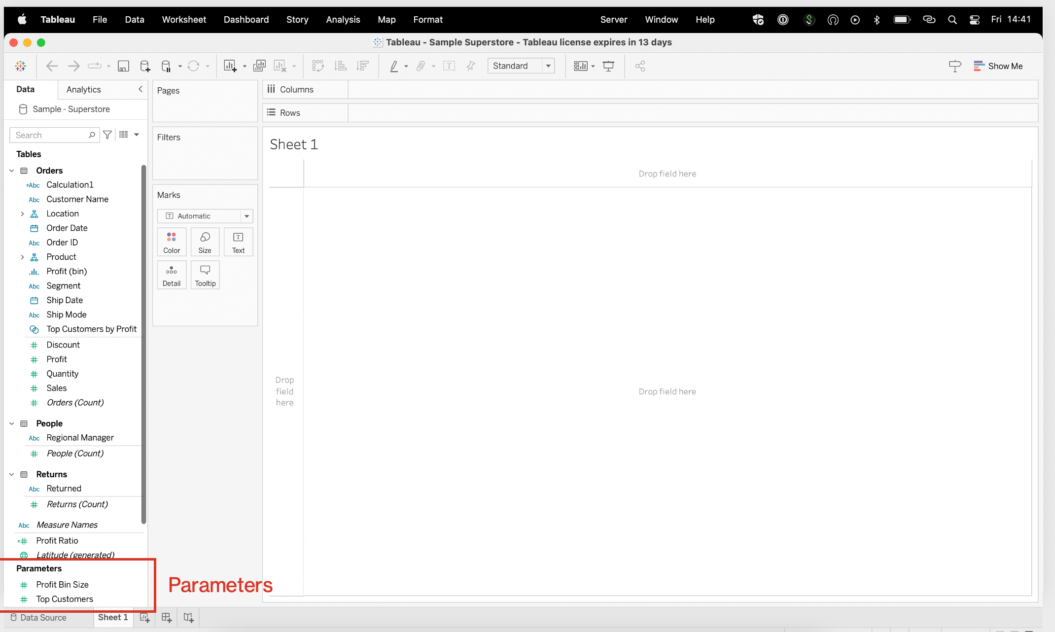
- Parameters
Parameters allow you to create dynamic controls that enable users to modify aspects of the visualization.
They are useful for exploring “what-if” scenarios or adjusting thresholds in real time.
Also, they offer flexibility and interactivity, allowing users to change parameters within a defined range and instantly see the impact on their visualizations.
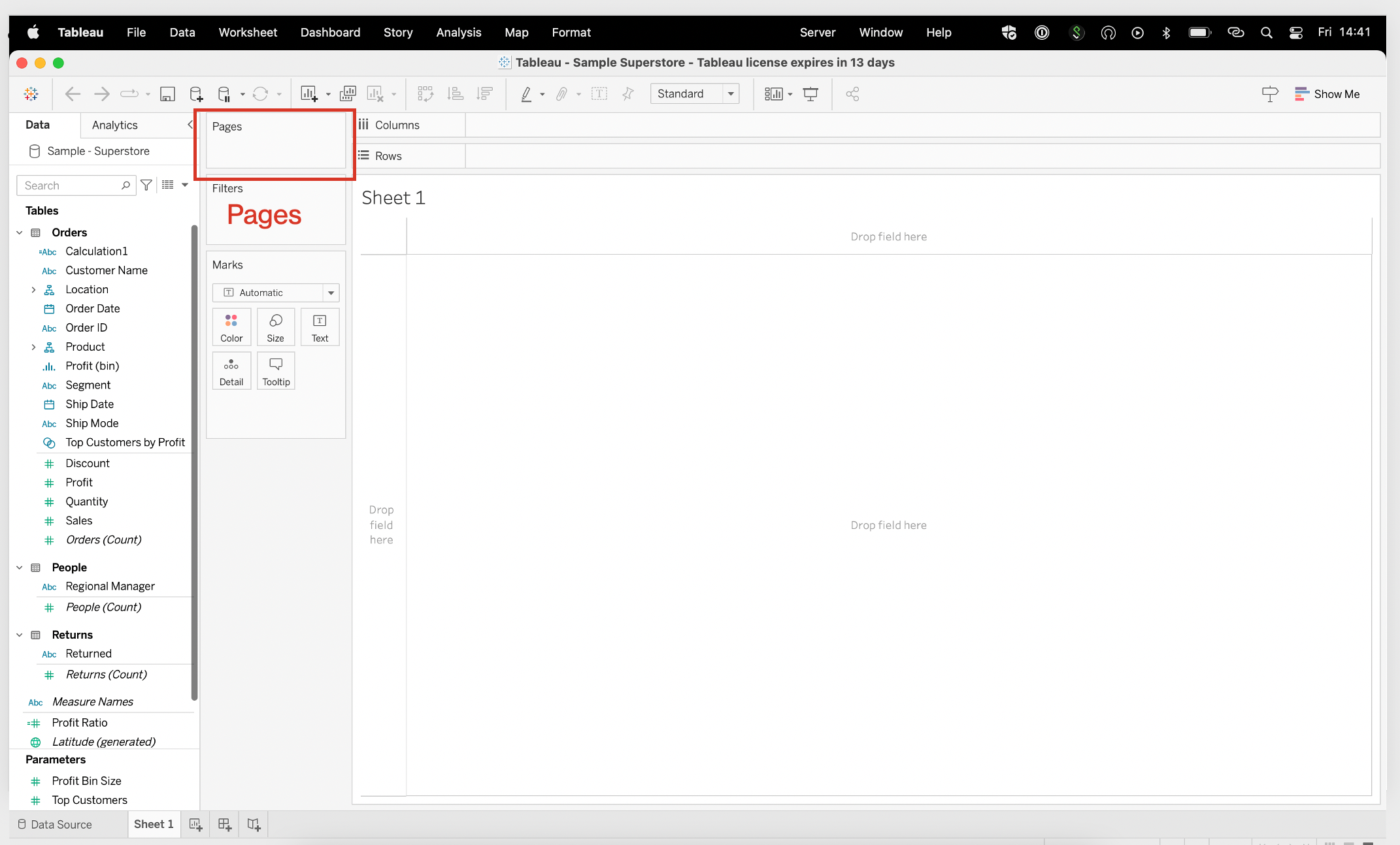
- Pages
The concept of pages in Tableau allows you to break down your data into separate pages or views based on a particular dimension. It enables you to create a series of visualizations, each representing a different subset of the same data, and then navigate through them using a defined dimension.
This feature is particularly useful when you want to explore data across different time periods or categories.
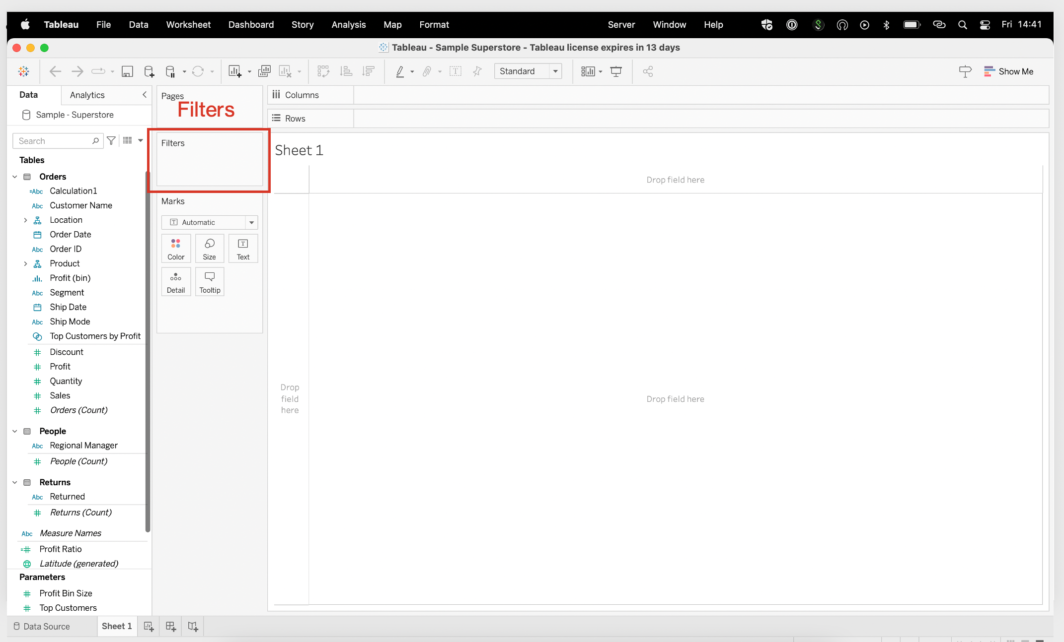
- Filters
Filters enable you to focus on specific subsets of data by defining conditions. You can filter data based on dimensions, measures, or even specific calculations.
Furthermore, filters helps you narrow down your analysis to the most relevant data points.
- Marks
The marks area in the Tableau interface refers to a section where you define how individual data points or marks are represented in your visualizations.
It allows you to specify the visual attributes, such as size, shape, color, and labels, for each mark on the chart.
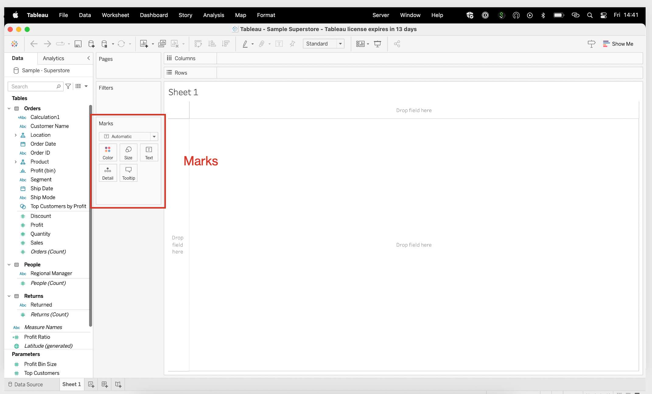
Overall the Tableau Desktop interface provides a well-organized and intuitive workspace for data analytics and visualization. The above elements enable you to structure your data, create dynamic controls and build insightful visualizations that convey your data story in a compelling manner.
Now you’ve had a basic overview, let’s look at some real-world uses cases for Tableau.
Use Cases for Tableau
In terms of real-world business problems, Tableau can be employed to tackle challenges across all industries.
For instance, in retail, Tableau can help optimize inventory management, analyze sales performance, and identify customer segmentation for targeted marketing strategies.
In healthcare, Tableau aids in analyzing patient data, real-time data analysis, and improving key performance indicators.
Additionally, Tableau can assist financial institutions in fraud detection, risk assessment, and generating detailed financial reports.
The flexibility and scalability of Tableau make it suitable for a wide range of applications, including marketing analytics, supply chain management, human resources, and more.
For organizations with sensitive data, Tableau’s permission control and security features are critical. And with Tableau Server and Tableau Online, administrators can set permissions on projects, workbooks, views, and folders to ensure data is only accessible to authorized users.
This ensures that privileged information remains secure while still allowing the right users access to the insights they need.
Overall, Tableau offers a range of powerful capabilities that enable users to explore and analyze business data in a user-friendly, visually appealing manner.
Ok, let’s get a little tricky and look at some advanced Tableau techniques.
Advanced Tableau Techniques
Beyond the basics of data visualization, Tableau offers a range of advanced techniques that enable users to push the boundaries of data analysis and statistical analysis.
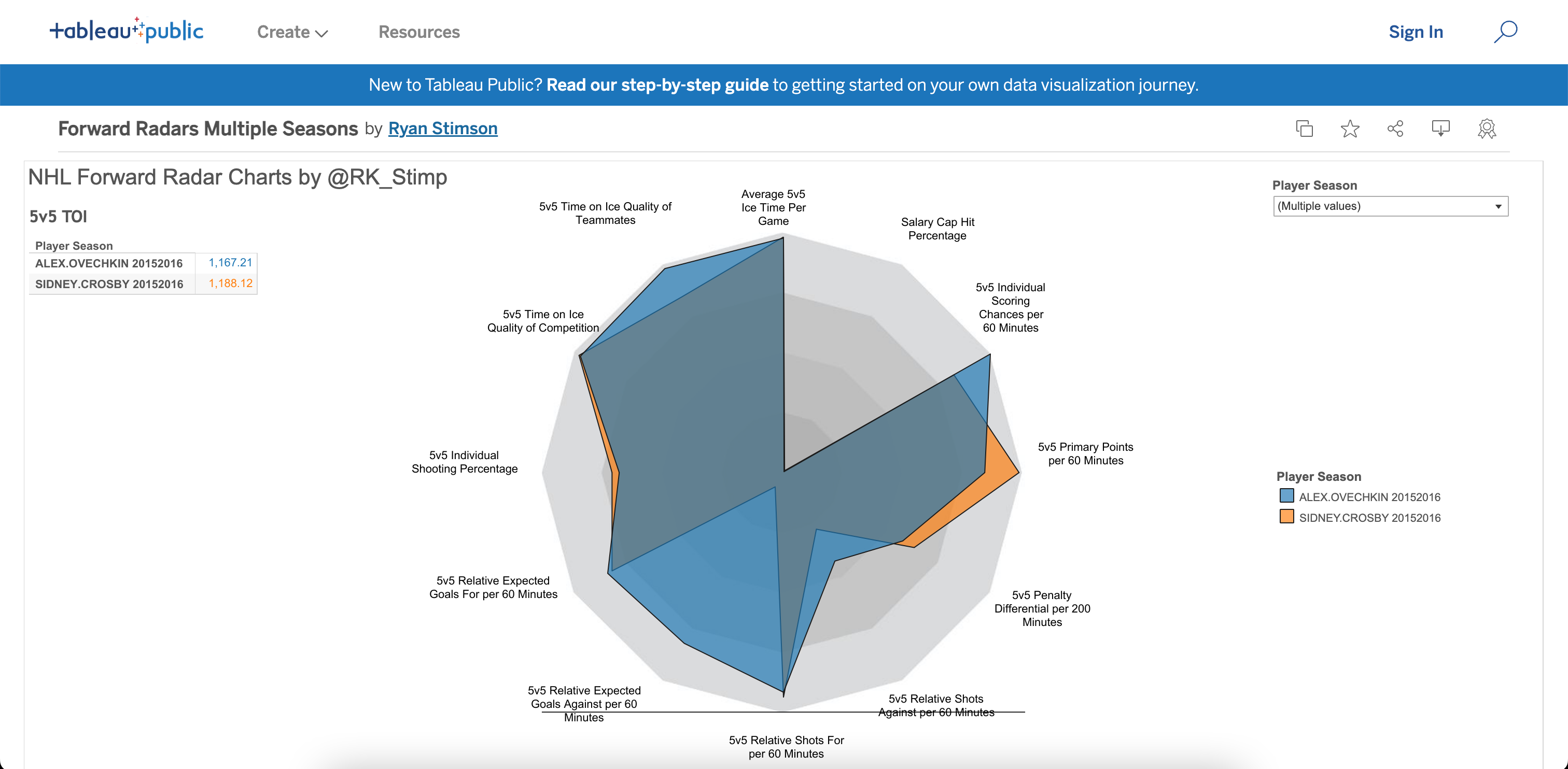
One such technique is the utilization of trigonometric functions to create customized dashboards like radar charts (see below).
By leveraging trigonometry, users can plot data points around a circular axis, allowing for a holistic representation of multidimensional data and facilitating comparisons across variables.
Few, that was a mouthful!
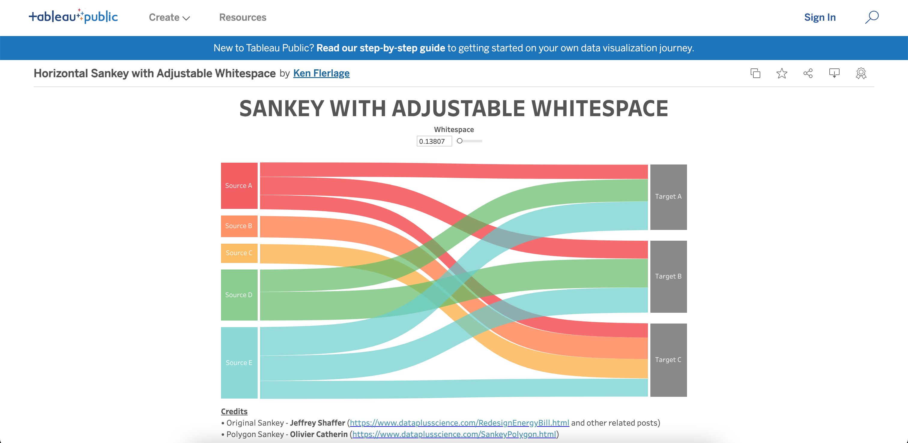
Another advanced technique involves the creation of Sankey charts, which visually illustrate flows and transitions between different categories or stages.
Also, Tableau provides extensions and custom templates that enable users to build Sankey charts, making it easier to analyze complex processes, such as customer journeys, supply chain dynamics, or energy consumption.
Furthermore, Tableau integrates with artificial intelligence (AI) solutions, allowing users to leverage machine learning algorithms and predictive analytics directly within the platform.
By incorporating AI models, users can gain deeper insights from their data, uncover hidden patterns, and make more accurate predictions.
This integration empowers users to go beyond traditional analysis and explore the potential of AI-driven decision-making.
Tableau’s extension capabilities offer another dimension of advanced techniques, and users can extend functionality by incorporating custom-built extensions and ready data connectors.
These data connectors enable users to tailor Tableau to their specific needs and connect to a source that is not natively supported, expanding the range of data sources that can be seamlessly integrated and analyzed within the platform.
By delving into advanced techniques like trigonometric functions for radar charts, the creation of Sankey diagrams, leveraging AI solutions, and utilizing extensions, Tableau users can elevate their data analysis capabilities to new heights.
These advanced techniques expand the possibilities for exploration, uncover deeper insights, and facilitate more sophisticated and impactful data storytelling.
Below is a great clip from Tableau featuring some awesome dashboard design tips.
With so many functions and visualization options, it can be daunting.
But, you are not alone.
One awesome thing about Tableau is the highly engaged community that surrounds it.
Tableau Community
The Tableau Community is a vibrant and diverse space where individuals come together to support and inspire one another on their Tableau journey.
With over a million active members, the community offers various resources to help you develop your data skills and establish valuable connections.
There are 2 solid benefits about the Tableau community:
- User Groups
User groups are an integral part of the Tableau Community.
With over 500 user groups worldwide, you can find like-minded people to collaborate with and share your Tableau experiences.
These groups provide an excellent opportunity for you to learn from others, share best practices, and expand your Tableau knowledge. To get involved:
- Search for local user groups: Look for groups in your area to attend in-person or virtual meetings.
- Join online forums: Participate in discussions and ask questions on Tableau-related topics.
- Create your own user group: If you can’t find a group that meets your needs, consider starting one and inviting others to join.
Now it’s time to get visual.
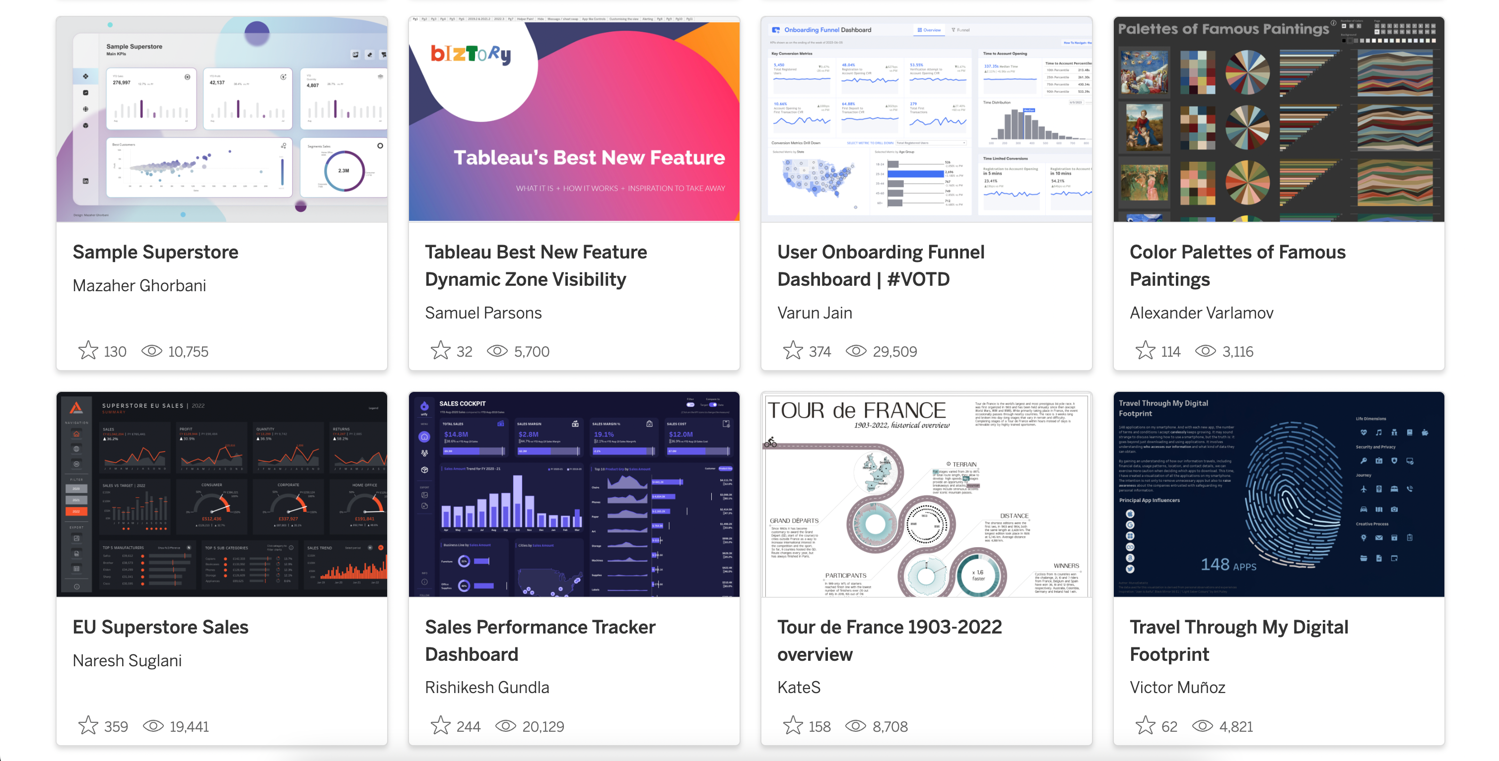
- Tableau Public Gallery
Tableau Public Gallery showcases a wide range of visually captivating and informative data visualizations created by Tableau users. This platform enables you to:
- Discover: Explore various data stories and learn about different industries and topics.
- Share: Publish your own visualizations and share your insights with others.
- Learn: Find inspiration and improve your skills by studying the work of other Tableau users.
By engaging with the Tableau Community, you’ll be well-positioned to elevate your data skills, develop valuable relationships, and learn from others.
I highly recommend it to supercharge your learning.
Tableau sounds great, but are there any alternatives?
Sure, there are; let’s have a look.
Alternatives to Tableau
As you now know, Tableau is a powerful business intelligence tool, but it’s not the only choice out there.
If you’re exploring alternatives, here are some of the top options available in the business intelligence industry.
- PowerBI is a popular choice for businesses already using Microsoft technologies. With its seamless integration with the Microsoft ecosystem, including Office 365 and Azure, Power BI provides robust data visualization, self-service analytics, and collaboration capabilities.
Also, It leverages familiar Microsoft interfaces and offers competitive pricing options, making it a formidable competitor to Tableau.
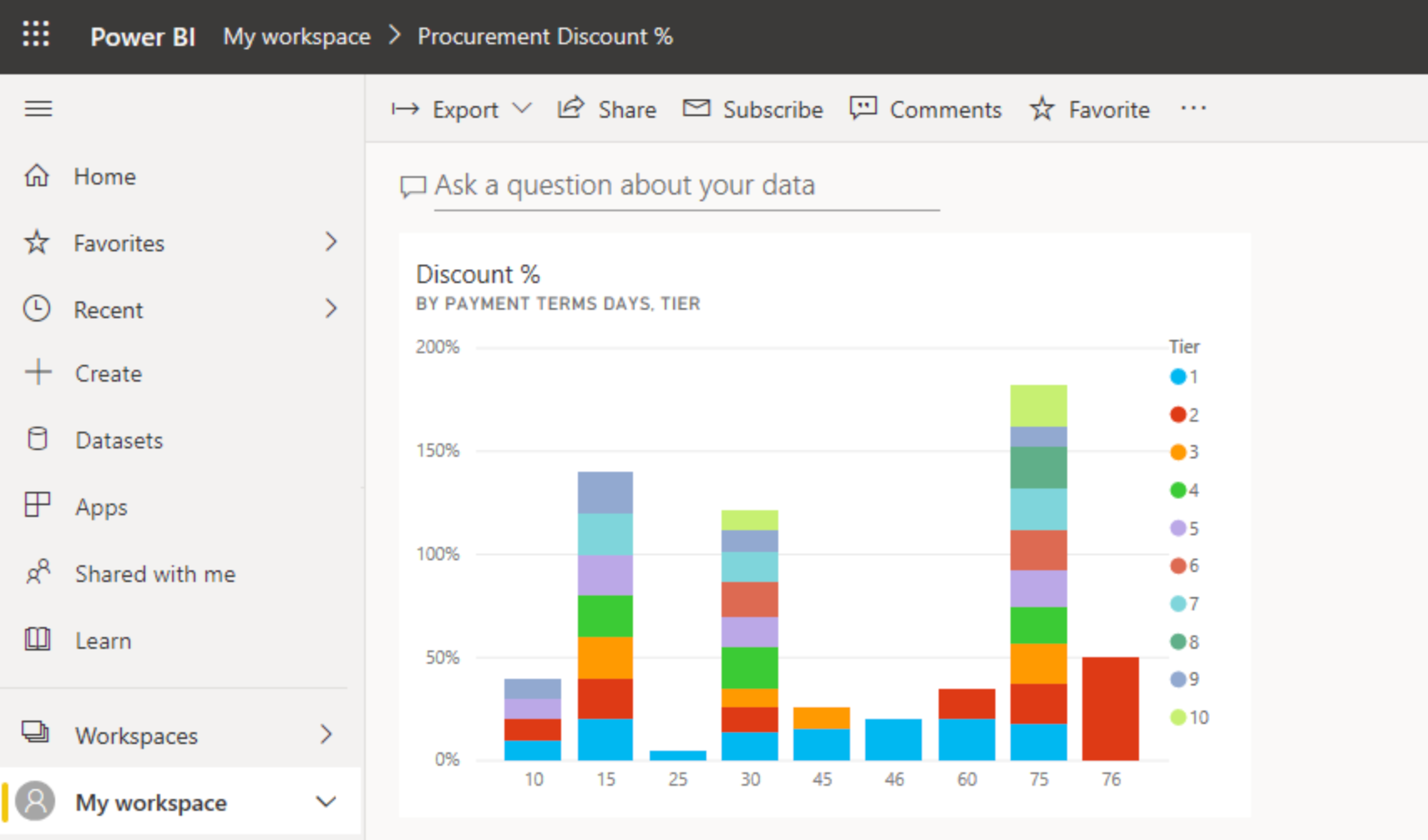
Check out this article below to get more insights into PowerBI.
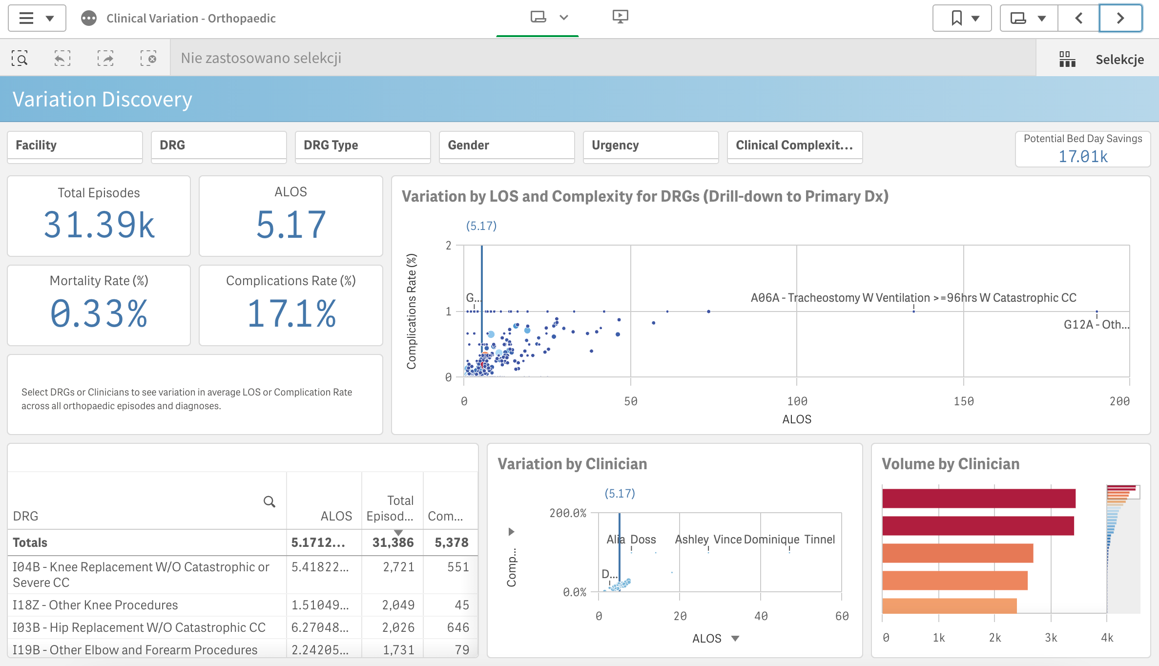
- QlikView is another prominent competitor in the data analytics space. It focuses on associative data indexing, enabling users to explore data dynamically without the need for pre-defined queries.
QlikView emphasizes its ability to provide real-time, interactive analytics and offers a comprehensive suite of business intelligence tools.
- Looker, which is part of the Google Cloud Platform, is a powerful data platform that offers a free license option for individuals to access and analyze their data.
It’s an example of a web application that allows users to conveniently access software through a browser without the need for complex installations.
With Looker’s integration into the Google Cloud Platform, users can leverage its robust data modeling capabilities, collaborate with teams, and unlock valuable insights from their data.
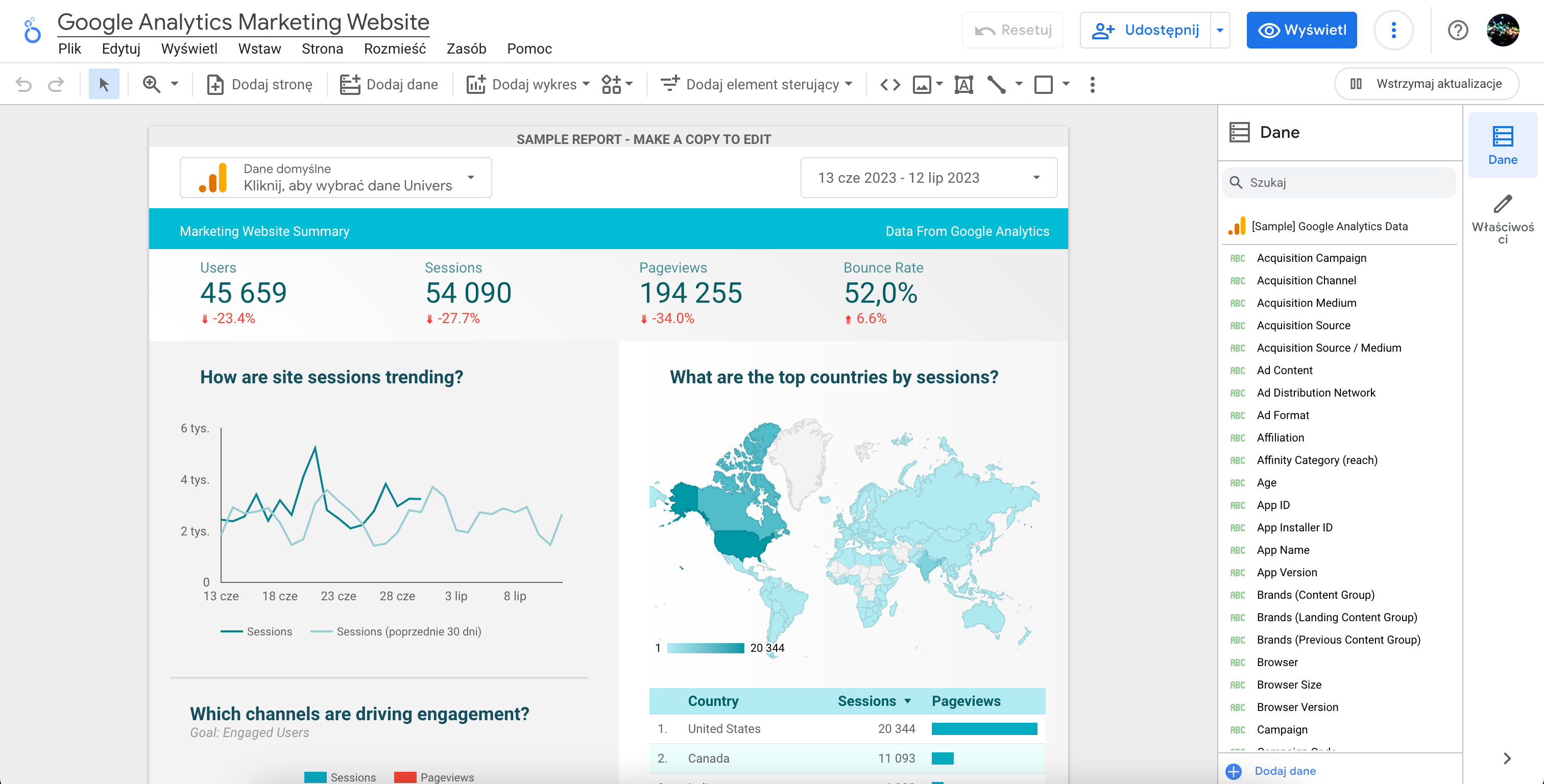
Remember to consider your specific requirements and preferences when choosing a business intelligence tool.
There’s no one-size-fits-all solution, but the options mentioned above cater to a range of needs and can help you make an informed decision.
Final Thoughts
To wrap things up, let’s delve into what the Tableau product suite is and what it truly offers. It’s not just another data analytics tool—it’s a transformative force (well, we like to say).
With its intuitive interface and robust charting capabilities, Tableau empowers you to create visualizations that unlock valuable insights from their data.
However, what Tableau is, really goes beyond visual appeal. Its purpose is to address real-world business challenges. From optimizing operations to driving growth and enabling data-driven decision-making, Tableau has the flexibility and functionality to analyze sales performance, track customer behavior, and identify market trends effectively.
Moreover, the Tableau product suite offers free solutions like Public and Reader. Tableau Public allows users to publish and share dashboards online, reaching a wider audience and promoting data-driven conversations.
Tableau Reader, on the other hand, enables users to open and explore Tableau visualizations created with Tableau Desktop, making it easy to share insights with colleagues or stakeholders who don’t have a Tableau license.
In summary, Tableau is a versatile and powerful tool that allows organizations to harness the full potential of their data. With its intuitive interface, extensive charting capabilities, and collaborative community, Tableau brings data visualization and analysis to a whole new level.
It enables better decision-making and empowers businesses to thrive in the data-driven era.
Happy data visualizing!
Frequently Asked Questions
How does Tableau compare to Excel?
Tableau and Excel are both powerful data analysis tools, but they have distinct differences.
Tableau data engine is SQL-based, allowing for efficient querying and processing of large datasets. It offers robust visualization capabilities and a flexible drag-and-drop interface, making it ideal for creating interactive dashboards. In Tableau, the smallest unit of modification is a column, enabling seamless data transformations.
On the other hand, Excel is widely used for spreadsheet-based calculations and offers extensive formula capabilities at the cell level, making it suitable for detailed calculations and individual data manipulation.
How hard is it to learn Tableau?
Learning Tableau can vary in difficulty depending on your prior experience with data analysis and visualization tools. For individuals familiar with concepts like data connections, dimensions, and measures, the learning curve may be relatively smooth.
Tableau provides a wealth of resources, including training materials, tutorials, and a supportive user community, which can expedite the learning process.
That said, mastering Tableau’s more advanced features and techniques, such as creating calculated fields, blending data, or leveraging complex calculations, will require additional time and practice.
Ultimately, the difficulty of learning Tableau is subjective and depends on your specific learning style, background, and the depth of knowledge you wish to acquire.
But, with dedication, practice, and the available learning resources, you can become proficient in Tableau and leverage its powerful capabilities to analyze and visualize data effectively.
Can students access Tableau for free?
Yes, students can access Tableau for free through the Tableau for Students program. This initiative provides qualifying students with a free one-year license for Tableau Desktop.
To apply for the program, students must submit proof of enrollment at an accredited educational institution.
