A stacked bar chart can be a powerful tool for data visualization, enabling you to compare multiple measures or categories at a single glance. Tableau allows you to create interactive and visually appealing stacked bar charts.
To make a stacked bar chart in Tableau, you have two options. The first option is to use a separate bar chart for each dimension. The second option is to use a separate bar for each dimension.
Both the options are almost similar; the only difference is the appearance of the final stacked bar chart.

In this article, we will demonstrate 2 simple ways to create a stacked bar chart in Tableau.
Read on, as we take a look at each option, accompanied by examples, to help you better understand the concepts.

What is a Stacked Bar Chart?
Before we create stacked bar charts, it is important that you understand the basics.
In Tableau, a stacked bar chart is a visualization where each bar represents a total measure, and individual segments (or colors) within the bar represent different dimensions or sub-categories of that measure.
This chart helps to understand the composition of data and compare these compositions across different categories or time periods.
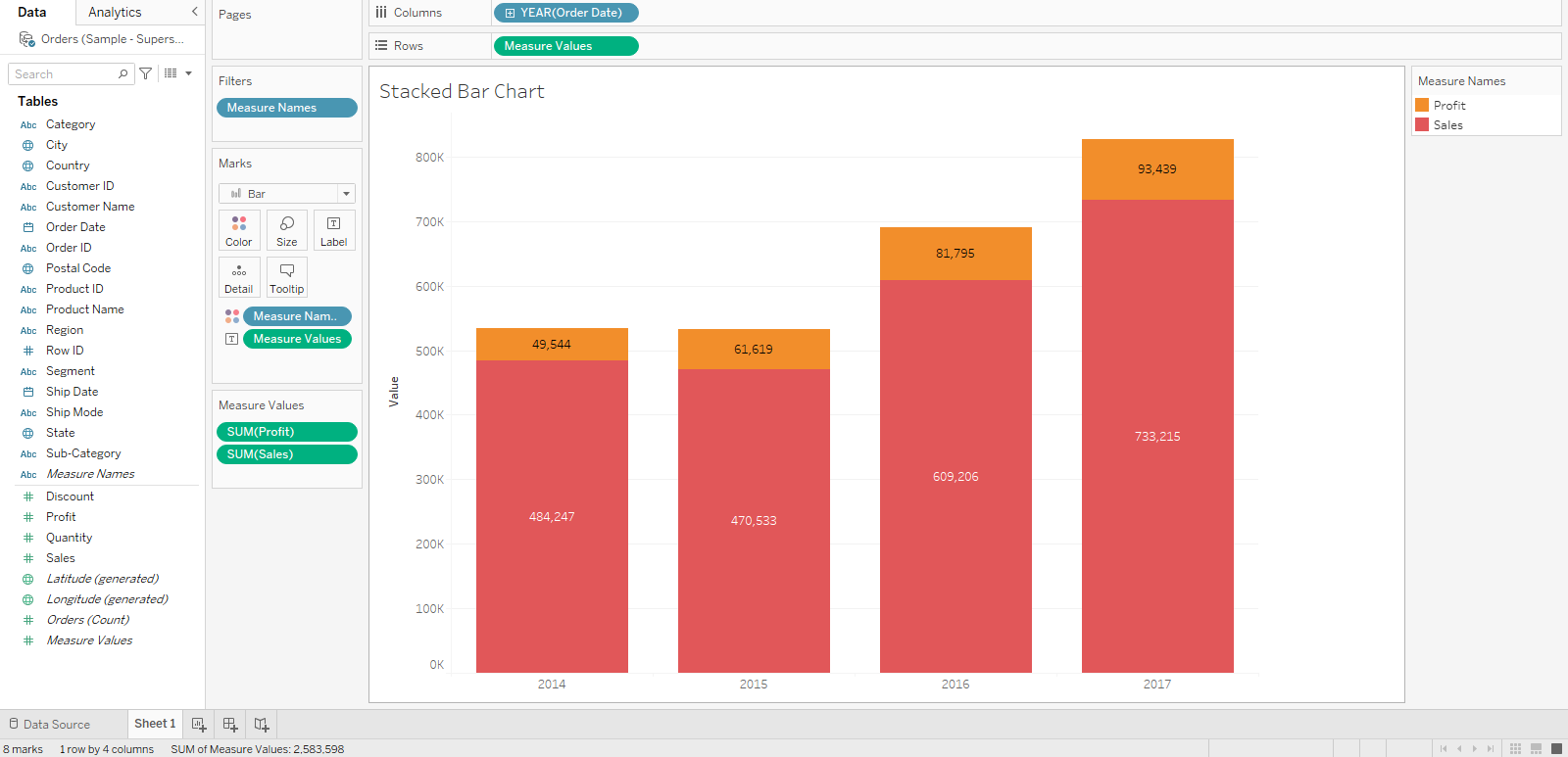
A simple stacked bar chart looks like the following:

In the section below, we will demonstrate two options for creating a stacked bar chart in Tableau.
2 Simple Ways to Create a Stacked Bar Chart
To create a stacked bar chart in Tableau, you can choose one of the following options:
- Use a separate bar for each dimension
- Use a separate bar for each measure

1. How to Use a Separate Bar For Each Dimension
To use a separate bar chart for each dimension, you can follow the steps given below:
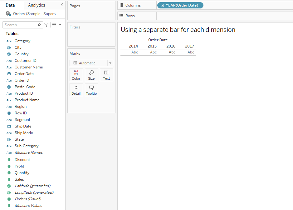
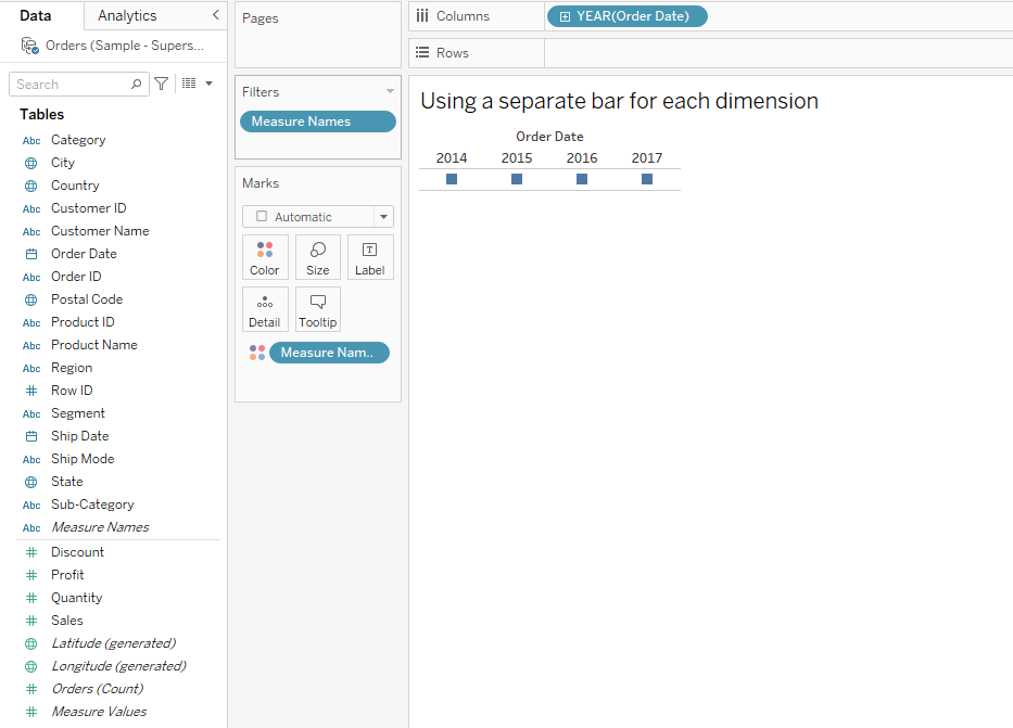
Step 1: Drag Dimension to Columns Shelf
The first is to drag a dimension to the Columns shelf.
The dimension we will be using for demonstration is Order Date.
After this step, your view should look like the following:
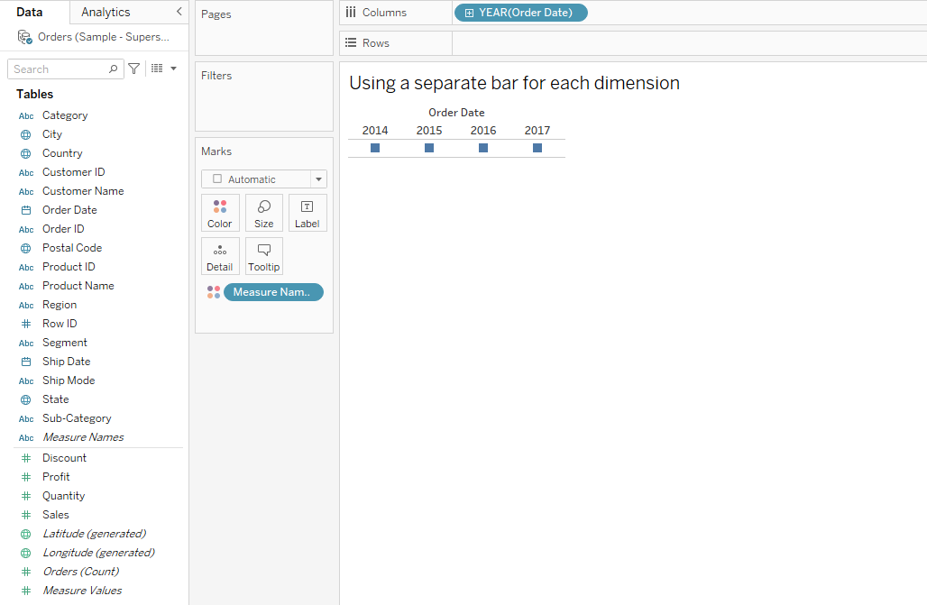
Step 2: Configuring Measure Names
The next step is to drag measure names to Colors on the Marks card.
After this step, your view should look like the following:
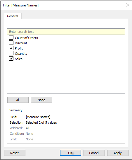
Step 3: Filtering Out Unnecessary Measures
When you drop measure names on the Color marks card, it imports all the measures to the view.
You should filter the measures and keep only your desired ones.
Click on the Measure Names on the Marks Card, and select Filter.
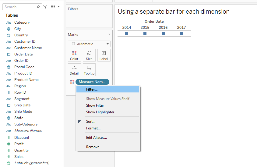
This will open up the filter menu, where you can filter out your desired columns.
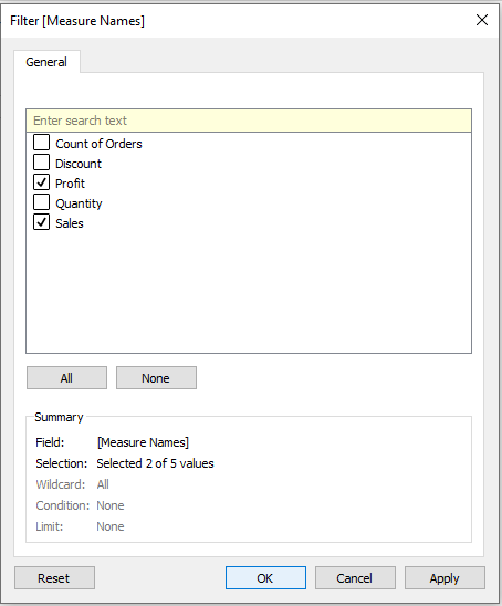
Select your desired data labels and then click OK.
After this step, your view should look like the following:
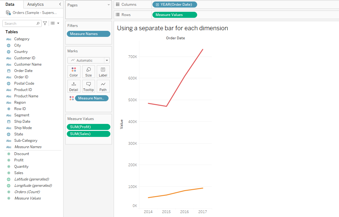
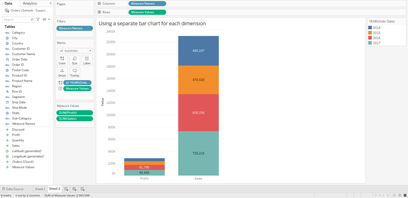
Step 4: Configuring Measure Values
Now time to bring measure values to the action.

You must drag measure values onto the Rows shelf.
After this step, your view should look like the following:
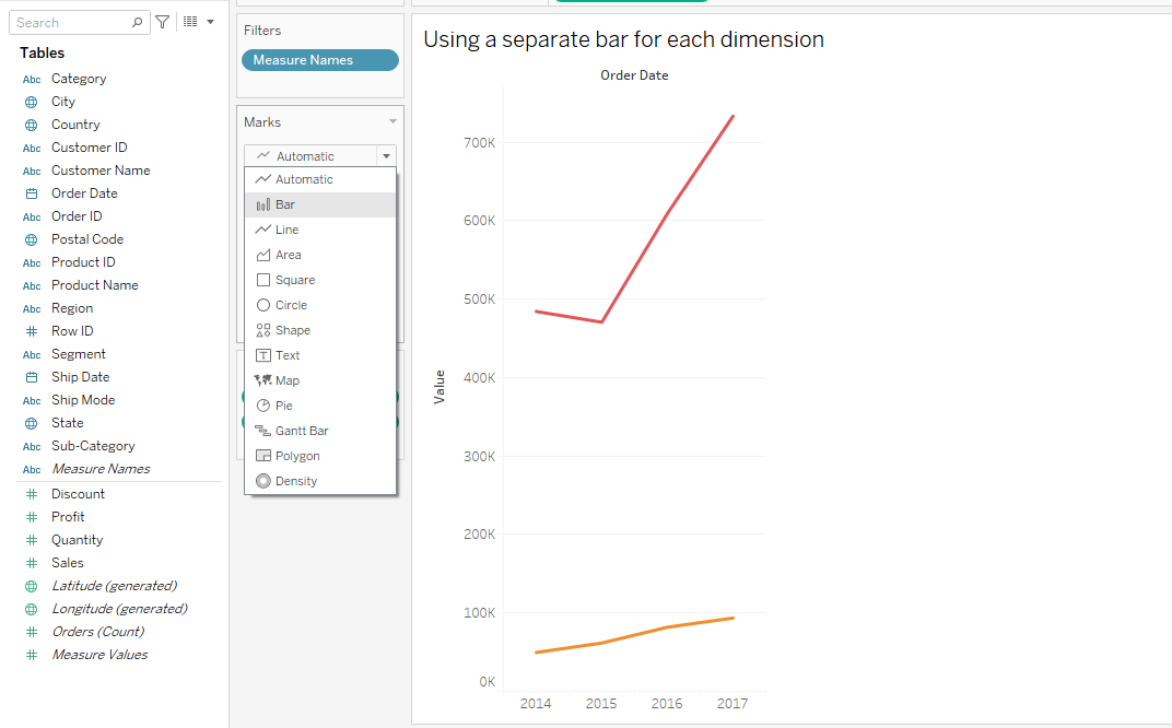
Step 5: Changing Chart Type
As you can see, the chart is currently a line chart; therefore, we must change the type to a bar chart.
To do this, click on the drop-down button below in the Marks section and select the stacked Bar chart option.
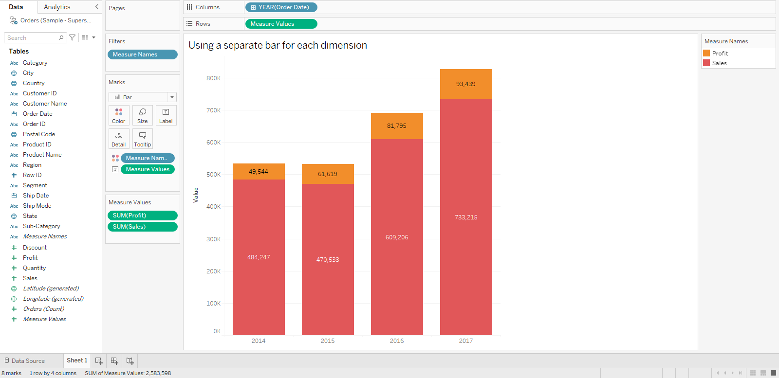
The final stacked bar chart will look like the following:
2. How to Use a Separate Bar For Each Measure
You can also use a separate bar chart for each measure.
To do this, you can follow the steps given below:
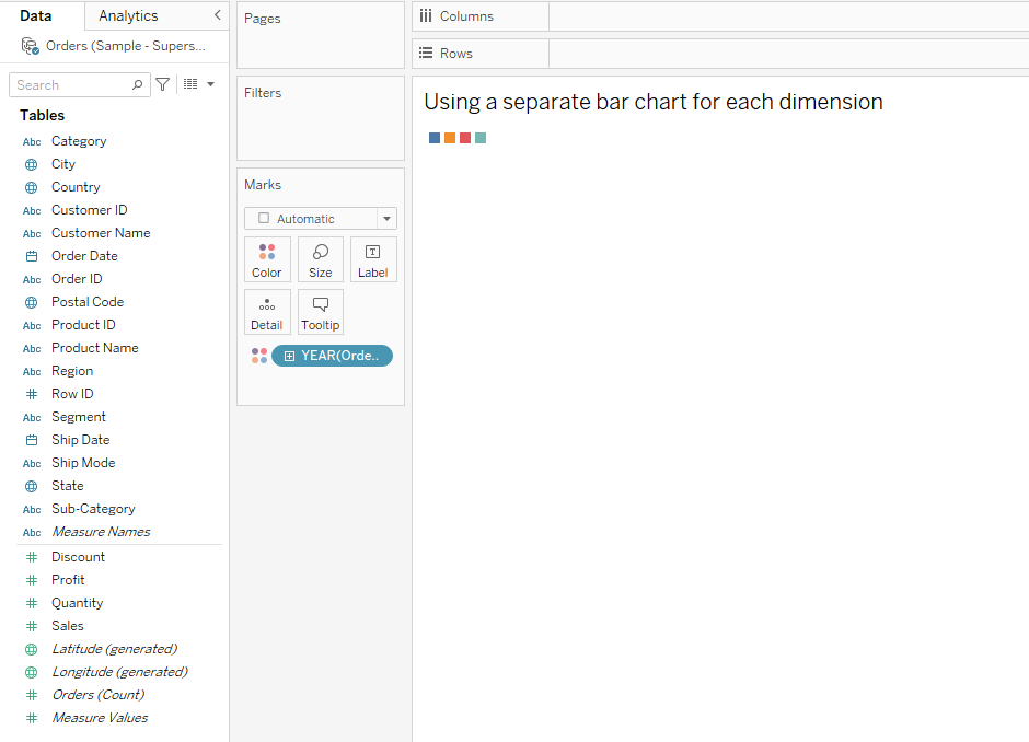
Step 1: Configuring The Dimension
The first step is to drag and drop your desired dimension to the Color shelf. For demonstration, we will use the Order Date as our dimension.
After repeating the above step, your view should look like the following:
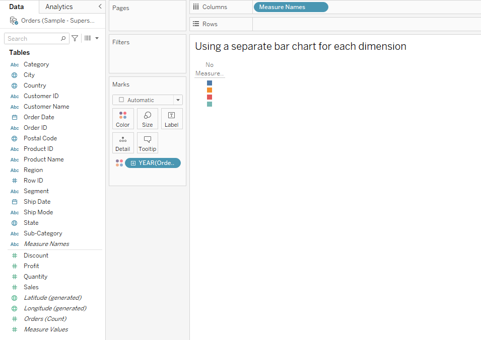
Step 2: Configuring Measure Names
The next step is to drag Measure Names to the Columns shelf.
Your view will look the following:
Step 3: Filter Measure Names
You must filter out the unnecessary measures from your view.
To do this, right-click on Measure Names on the Columns shelf.
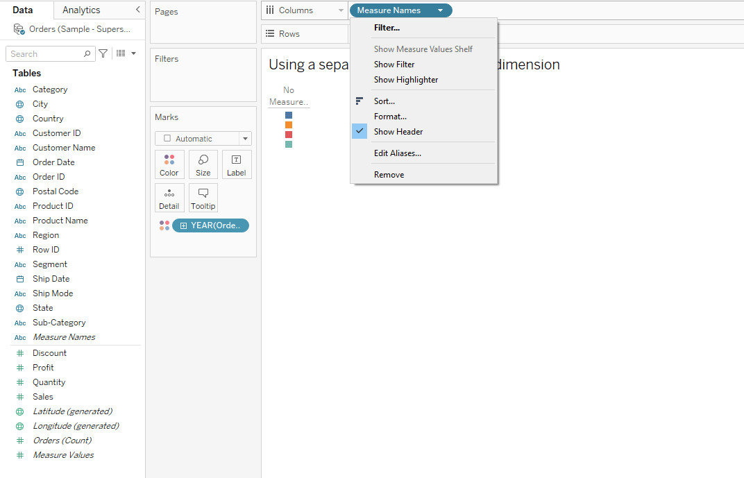
Select your desired data label value and then click OK.
Step 4: Configuring Measure Values
Next, drag and drop measure values to the Rows shelf.
The simple vertical bar chart will look like the following:
And there you have it, you have successfully used a separate bar chart for each measure.
Are you interested in learning Advanced Data Analytics (ADA)? Take a look at the following video:
Final Thoughts
A stacked bar chart is a powerful charting option for making comparisons.
In this data-driven age, the data you come across is most likely going to be intricate. You need more drilled-down versions to make sound comparisons within such data.

A stacked bar chart provides you with clarity on the composition of data, showing how individual segments contribute to a whole.
Learning how to make stacked bar charts amplifies your analysis and makes your presentations more engaging. This tool will help your data speak to its audience, ensuring your presentations are informative and intuitive.
Frequently Asked Questions
In this section, you will find some frequently asked questions you may have when making a stacked bar chart in Tableau.

How can I create a side-by-side stacked bar chart in Tableau?
To create a side-by-side stacked bar chart in Tableau, start by dragging the desired dimensions to the Rows and Columns shelves.
Next, drag a second dimension onto the Columns shelf, placing it before the existing dimension.
Finally, drag the measure you want to display onto the Rows shelf and adjust the chart type to “Stacked Bar” in the Marks card.
What are the steps to build a stacked column chart in Tableau?
- Open Tableau and connect to your data source.
- Drag the dimension you want to display on the X-axis (for example, Categories) onto Columns.
- Drag the measure you want to display on the Y-axis (for example, Sales) onto Rows.
- In the Marks card, choose “Bar” as the chart type.
- Drag a second dimension (for example, Subcategories) that you want to stack onto the Color shelf in the Marks card.
- Tableau will automatically create a stacked column chart for you.
How can I use multiple measures in a Tableau stacked bar chart?
To use multiple measures in a Tableau stacked bar chart, drag the “Measure Names” from your data pane onto the Colors shelf in the Marks card.
Right-click on “Measure Names”, select Filter, and choose the measures you want to display. This will stack the bars based on the selected measures.
What is the process for assigning different colors to a stacked bar chart in Tableau?
To assign different colors to a stacked bar chart in Tableau, follow these steps:
- Select the dimension or measure acting as the stacking variable on the Color shelf in the Marks card.
- Click the downward arrow on the Color shelf and select “Edit Colors.”
- Choose the desired color palette or create a custom one, and apply it to the selected variable.
- Click OK to apply the new colors to your stacked bar chart.
How do I make a grouped bar chart with multiple measures in Tableau?
To create a grouped bar chart with multiple measures in Tableau, follow these steps:
- Drag the dimension you want to group by onto the Columns shelf.
- Drag a second dimension you want to use for bars side by side, also onto the Columns shelf, and place it before the first dimension.
- Drag the measure you want to display onto Rows.
- In the Marks card, change the chart type to “Bar.”
- Drag “Measure Names” from your data pane onto the Colors shelf in the Marks card.
- Right-click on “Measure Names” in the Colors shelf, select Filter and choose the measures you want to display.
What are the steps to sort a stacked bar chart in Tableau?
- Click the dimension or measure you want to sort on the header of the chart (for example, Category).
- Open the context menu by clicking the downward arrow on the header.
- Choose the “Sort” option.
- In the Sort dialog, select the sorting method you want to use (for example, ascending, descending, or based on another field).
- Click OK to apply the sorting to your stacked bar chart.