Are you ready to use Tableau tooltips to level up your visualizations and make them more insightful and user-friendly?
One of the key features that sets Tableau apart is its interactivity, and tooltips play a crucial role in enhancing this interactivity.
Tableau tooltips are interactive elements that provide additional information about the data points being displayed on a visualization. They appear when you hover over a data point, offering a quick and concise way to understand the underlying data without cluttering the view.

This article will explain how to create and customize Tableau tooltips, offering examples and best practices to help you leverage this powerful feature.
By the end, you’ll have the knowledge and skills to design dynamic and informative tooltips for your Tableau visualizations.
Let’s dive in!

How to Create Tooltips in Tableau
In this section, you will learn how to create tooltips in Tableau.
The steps to create tooltips in Tableau are straightforward and can greatly improve the interactivity of your visualizations.
Follow the steps below to create a tooltip in Tableau:

Step 1: Create Your Visualization
First, you need to create a visualization (like a chart or graph) in Tableau.
Drag and drop the fields you want to visualize into the appropriate “Rows” and “Columns” sections of the workspace.
Step 2: Access Tooltip Options
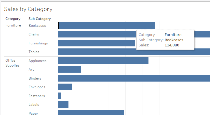
Once your basic visualization is ready, hover over any part of the visualization.
A tooltip will appear showing default information.
To customize this tooltip, go to the “Marks” card and click on the “Tooltip” button.
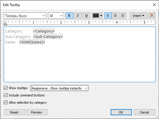
Step 3: Customize Tooltip Content
In the Tooltip editor, you can customize the text and information that appears.
You can add or remove fields by dragging them into or out of the tooltip editor.
Use the “Insert” menu to add dynamic fields (like measures or dimensions) to your tooltip. These fields will update automatically based on the data point being hovered over.
Step 4: Format Tooltip Text
You can format the text for clarity and emphasis, similar to a text editor. This includes bold, italic, underlining, and font size adjustments.
You can also change the alignment and color of the text.
Step 5: Include Visuals in Tooltips (Optional)
The sheet properties in Tableau also allow you to include visualizations within tooltips, known as Viz in Tooltip.
To do this, create a secondary visualization that you want to appear in the tooltip.
In the Tooltip editor of your primary visualization, place your cursor where you want the target worksheet to appear.
Click on Insert and then choose Sheets, selecting the target sheet.
After customizing your tooltip, click “OK” to save changes.

Hover over different parts of your visualization to test how the tooltip details appear and behave.
This embedded visualization will dynamically update based on the data point hovered over in the primary visualization.
How to Apply Conditional Formatting to Tooltips
Conditional formatting allows you to change the appearance of your tooltip based on certain conditions. This can help draw attention to important data points or make the tooltip more visually appealing.
To apply conditional formatting to a tooltip, follow these steps:
Step 1: Create Calculated Fields For Conditional Formatting
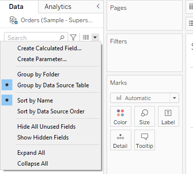
Go to the Data pane and right-click to create a new calculated field.
In the calculated field dialog, write an expression that defines your condition.
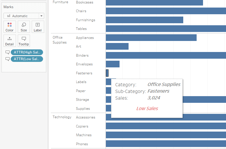
In our case, we will make 2 calculated fields, one for high sales and the other for low sales.
IF [Sales] > 100 THEN "High Sales" ELSE "" END
IF [Sales] <= 100 THEN "Low Sales" ELSE "" END
Step 2: Add The Calculated Fields to The Tooltip
Access the Marks card for the visualization.
Drag your newly created calculated fields to the ‘Tooltip’ shelf.
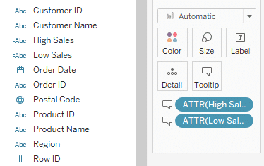
In the Marks card, you will see multiple marks for tooltips.
Step 3: Customize The Tooltip
On the Marks card, click on the Tooltip button.
In the Tooltip dialog box, you can now see the calculated field values you added.
For the High Sales, we’ll select a green color, and for the Low sales, we’ll select a red color.

Click ‘OK’ to save your tooltip.
Hover over different parts of your visualization to ensure that the conditional formatting in the tooltip is working as expected.
Want to enhance your Tableau skills? Learn Advanced Data Analytics from OpenAI by watching the following video:
Final Thoughts
Tableau tooltips are an essential feature that improves the interactivity and information presentation in your data visualizations. These dynamic elements provide valuable insights into your relevant data, ensuring that you make the most out of your visualizations.
Understanding how to use Tableau tooltips effectively empowers you to create more engaging and informative dashboards. With this knowledge, you can easily tailor your tooltips to meet the needs of your audience, delivering a more compelling data storytelling experience.
By investing time in mastering this feature, you’re taking a significant step toward becoming a proficient Tableau user.
And remember, data storytelling is not just about the data; it’s about creating an experience that resonates with your audience and leaves a lasting impression.

Frequently Asked Questions
In this section, you’ll find some frequently asked questions you may have when working with Tableau tooltips.
How do you add a calculated field to a tooltip?
To add a calculated field to a tooltip in Tableau, follow these steps:
Click on the Tooltip shelf in the Marks card.
Drag the calculated field from the Data pane onto the tooltip.
You can customize the appearance and format of the calculated field in the tooltip editor to show dynamic text values to the users.
How to create a chart with a different tooltip in Tableau?
To create a chart with a different tooltip in Tableau, you can follow these steps:
Create a new sheet with the desired chart type.
Click on the Tooltip shelf in the Marks card.
Customize the tooltip as needed for the new chart type.
What are the steps to show grand total in tooltip in Tableau?
To show the grand total in a tooltip in Tableau, follow these steps:
Click on the Tooltip shelf in the Marks card.
Drag the dimension or measure that represents the grand total onto the tooltip.
You can customize the appearance and format of the grand total in the tooltip editor.
How do you add a percentage to a tooltip in Tableau?
To add a percentage to a tooltip in Tableau, follow these steps:
Click on the Tooltip shelf in the Marks card.
Drag the desired measure onto the tooltip.
Right-click on the measure in the tooltip and select Quick Table Calculation > Percent of Total.
You can customize the appearance and format of the percentage in the tooltip editor.
What are the steps to create a custom tooltip in Tableau?
To create a custom tooltip in Tableau Desktop, follow these steps:
Click on the Tooltip shelf in the Marks card.
In the tooltip editor, customize the tooltip text and format as desired.
You can add fields, apply conditional formatting, and use dynamic content to create a custom tooltip that provides relevant information when a user hovers over it.