In Tableau, legends provide vital context to your visualizations by explaining the color, size, or shape encoding used to represent data elements.
The best part? Adding a legend is very straightforward.
To add a legend in Tableau:

Navigate to the worksheet where you want to add a legend.
Drag and drop your desired dimension or measure to the Marks card.
Choose the type of legend you want to add, such as color, size, shape, or label.
Customize the legend’s appearance and position as needed.
In this article, we’ll explore the different types of legends in Tableau, including color, size, and shape legends.
We’ll also discuss how to create custom legends, how to edit legends, and how to manage the appearance of legends in your visualizations.
Let’s dive in!
How to Add a Color Legend in Tableau
Color legends in Tableau help you understand the meaning behind different colors in your visualizations.
When you add a color legend, Tableau automatically displays it in your visualization, making it easier for your audience to interpret your data.
To add a color legend to your visualization in Tableau, follow these steps:

Step 1
Open the worksheet where you want to add the color legend.
Step 2
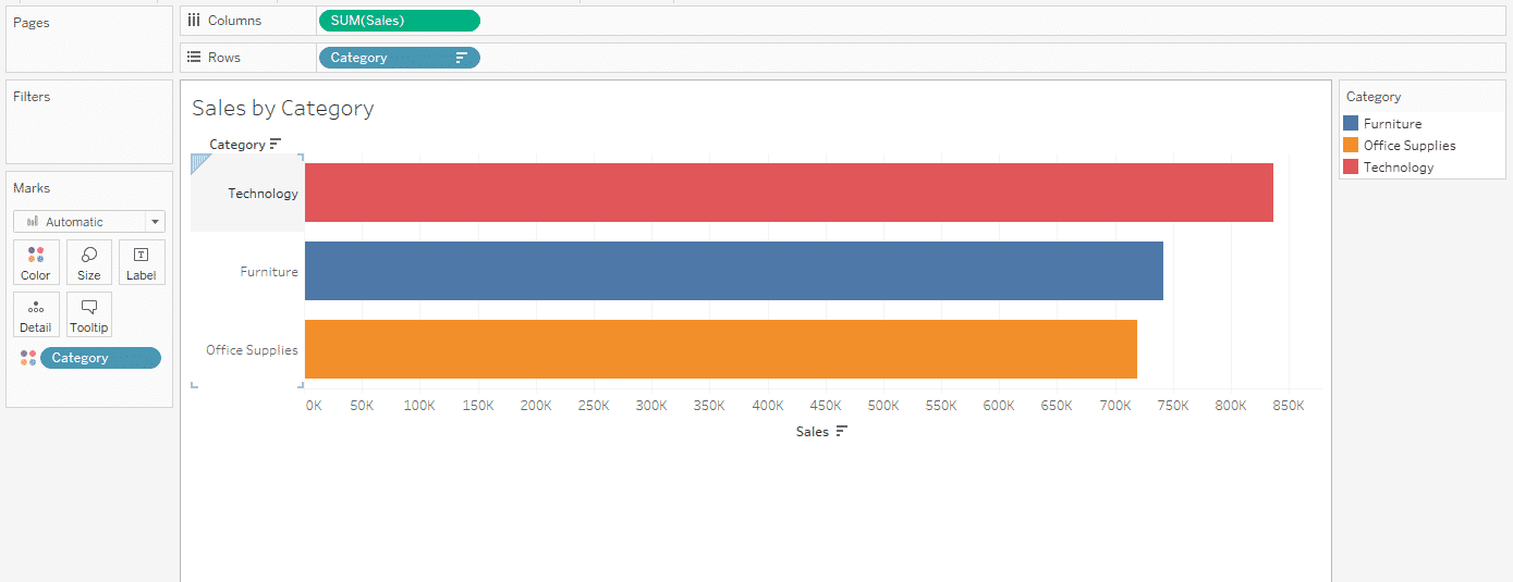
Drag and drop the dimension or measure you want to color code to the Color in the Marks Card.
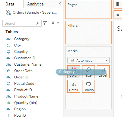
Tableau will automatically add a legend to your visualization.
Step 3
If needed, adjust the color palette by clicking on Color.
Change the colours according to your requirements and then click OK to finalize the legend.
By following these steps, you can easily add a color legend to your Tableau visualization to increase the overall clarity and understanding of your data.
How to Add a Size Legend in Tableau
In Tableau, size legends are used to represent the size of data points in a visualization. They are particularly useful when working with bubble charts or scatter plots.
Adding a size legend to your visualization helps you understand the meaning behind different sizes of data points.
To add a size legend to your visualization in Tableau, follow these steps:
Step 1
Open the worksheet where you want to add the size legend.
Step 2
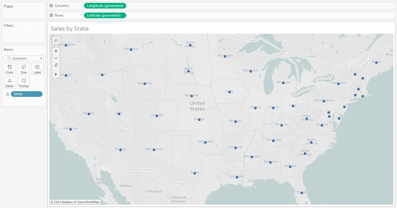
Drag and drop the measure you want to add as a legend to the Size in Marks card.
When you do this, Tableau will automatically add a size legend to your visualization.
Step 3
Next, adjust the size of your legend by clicking on the Size card.
Increase the size to fit your requirements.
Now your legend is finalized and your visualization will look similar to the following:


How to Add a Shape Legend in Tableau
You can use shape legends in Tableau to represent different categories or groups of data points in a visualization.
They are particularly useful when you want to differentiate data points based on specific attributes, such as product categories or customer segments.
To add a shape legend to your visualization in Tableau, follow these steps:
Step 1
Open the worksheet where you want to add the shape legend.
Step 2
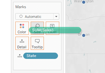
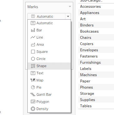
In the Marks card, change Automatic to Shapes.
Step 3
Drag the dimension you want to represent with shapes to the Shape mark in the Marks card.
For instance, if you want to assign shapes based on Product Category, drag the Category field to the Shape mark.
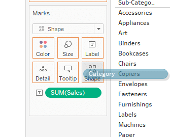
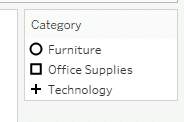
Tableau will assign default shapes, but you can customize them.
Click on the Shape mark. This will open the Shape Palette.
In the Shape Palette, you can assign specific shapes to each category. Click on a category, then choose a shape for it. Repeat this for each category.
After assigning shapes, a shape legend should automatically appear.
How to Add a Label Legend in Tableau
You can use Label legends in Tableau to provide additional information about data points in a visualization.
They are useful when you want to display specific values or names associated with data points, such as sales numbers or product names.
To add a label legend to your visualization in Tableau, follow these steps:
Step 1
Open the worksheet where you want to add the label legend.
Step 2
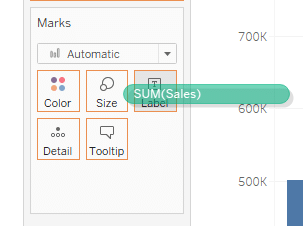
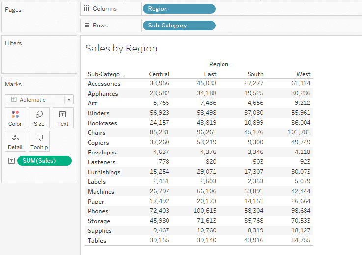
To add a label legend, drag and drop the Sales measure to the Label mark in the Marks card.
After this step, Tableau will add label legends on top of each bar.
Final Thoughts
Adding a legend to your Tableau visualization is crucial for conveying information effectively. It helps your audience interpret the data and understand the story you’re telling.
Tableau offers various legends, such as color, size, shape, and label legends, which you can use to make your visualizations more informative and engaging.
By learning how to add, edit, and manage these legends, you’ll be able to create compelling visualizations that effectively communicate your data insights.

If you’d like to learn more about the future of learning data analytics, check out our latest video below.
Frequently Asked Questions
In this section, you will find some frequently asked questions you may have when adding a legend in Tableau.
How do I create a dynamic legend in Tableau?
To create a dynamic legend in Tableau, you can use a parameter that allows users to switch between different dimensions.
One of the Tableau tips is to create a parameter that includes the dimensions you want to use in the legend. Then, use a calculated field that references the parameter to generate the legend.
You can then add this calculated field to the color shelf to display the legend dynamically.
How do I add a single legend to multiple charts in Tableau?
You can select legends for multiple charts in Tableau by creating a combined view.
To do this, start by creating the first chart and then drag the second chart onto the same worksheet.
Tableau will automatically combine the two charts into a single view, and you can then drag the legend to the desired location.
You can also use dashboard actions to make the legend interactive, allowing users to change the chart by clicking on different legend items.
What is the process for creating a continuous color legend in Tableau Desktop?
To create a continuous color legend in Tableau, start by dragging the desired measure to the color shelf. Tableau will automatically assign a color gradient to the measure, and a continuous color legend will be displayed.
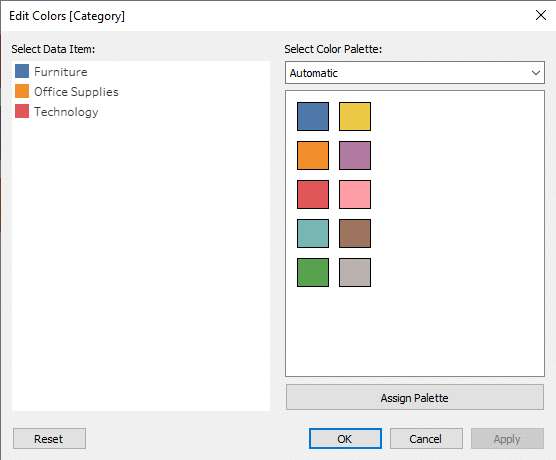
You can customize the color range and assign specific colors to different values by right-clicking on the measure in the color shelf and selecting “Edit Colors.”
In the “Edit Colors” dialog, you can choose from a variety of color palettes or create a custom color palette.
How can I customize the legend title in Tableau?
To customize the legend title in Tableau, click on the legend title to select it.
You can then use the formatting options in the “Marks” card to change the font, size, color, and alignment of the title.
You can also add a background color to the title by using the “Format” pane and selecting the “Background” option. Additionally, you can use a calculated field to create a dynamic legend title that changes based on user selections or filters.