Histograms allow you to visualize the distribution of data points across continuous variables such as time, age, or sales figures.
This data visualization tool helps you understand your data sets’ underlying trends and patterns, allowing for better decision-making and analysis.
To make a histogram in Tableau, you must have a continuous variable in your dataset. You must drag and drop a continuous variable to the canvas and then click on Show Me. This will open a range of charting options. Select histograms from the menu, and Tableau will create a histogram for you.

But wait, there’s more.
Once you have configured your histogram, you can customize it by adjusting the bin sizes, adding reference lines, and modifying the chart’s aesthetics to match your desired visual style.
In this article, we will walk you through the complete procedure of creating stunning histograms in Tableau. We will demonstrate each step with examples to help you better understand the concepts.
Let’s get into it!

Why Use a Histogram?
Before we dive into the steps for creating histograms, it is important to revisit why you would want to use a histogram.
A histogram is a graphical representation of the distribution of a continuous variable in the dataset. It is an estimate of the probability distribution of a continuous variable.

You may want to use histograms when:
- Visualizing Data Distribution
- Identifying Central Tendency
- Identifying Spread
- Detecting Outliers and Anomalies

2 Ways of Displaying Data in Histogram
There are two main ways of displaying data in a histogram:
- Count of values within bins: This shows the actual number of observations in each bin.
- Density of values (% of Total): This displays the percentage of observations in each bin relative to the total number of observations.
In the section below, we will demonstrate how you can represent data in a histogram as counts and percentages.

4 Steps to Create a Histogram in Tableau
After loading your desired dataset, follow the steps given below to create a histogram in Tableau.
Specifically, we will go over the following steps:
- Identifying a continuous variable
- Dropping the variable to the Canvas
- Opening the Show Me toolbar and selecting histogram
- Customizing the histogram

Step 1. Identifying a Continuous Variable
By definition, a histogram is the distribution of a continuous variable. Therefore, you must have a continuous variable in your dataset to create a histogram.
In Tableau, continuous variables are also known as measures. You can find all your continuous variables at the bottom left of the Tableau window.
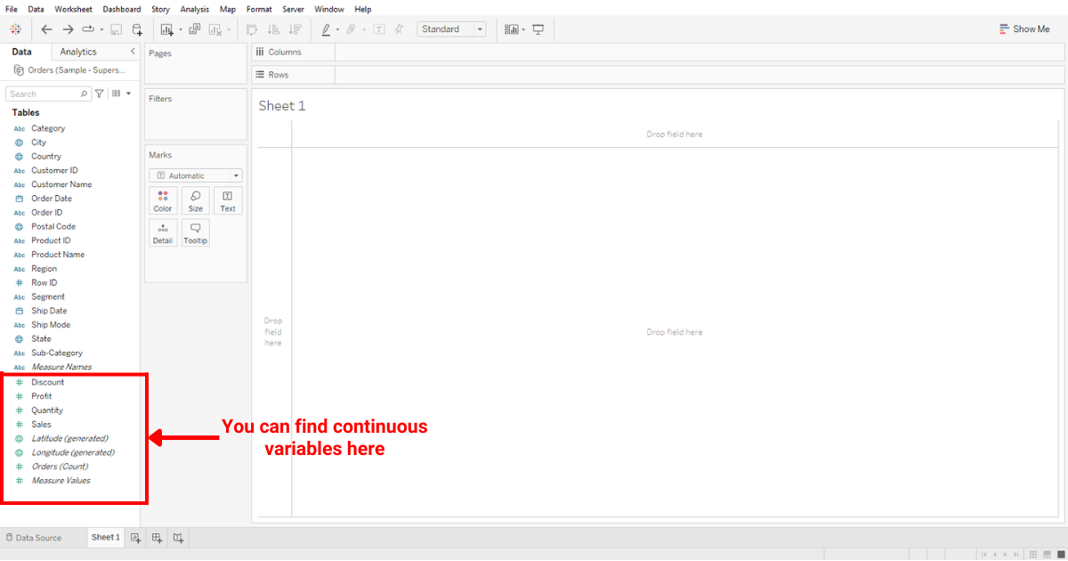
For demonstrations, we will use Quantity as our variable of choice.
Step 2: Dropping The Variable to The Canvas
After identifying your continuous variable, you must drop it into the canvas as shown below:
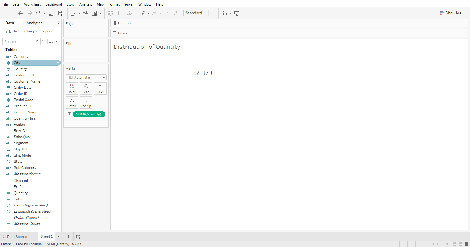
Tableau will display the total number of quantities after dropping the Quantity variable onto the canvas.
Let’s go ahead and convert this into a histogram chart.
Step 3: Opening The Show Me Toolbar And Selecting Histogram
You will see a Show Me button at the top-right corner of your screen. When you click on that, you will see a range of charting options that Tableau offers.
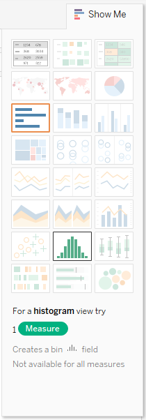
Here, you must click histogram.
Tableau will automatically create a histogram from the variable already present on the canvas.
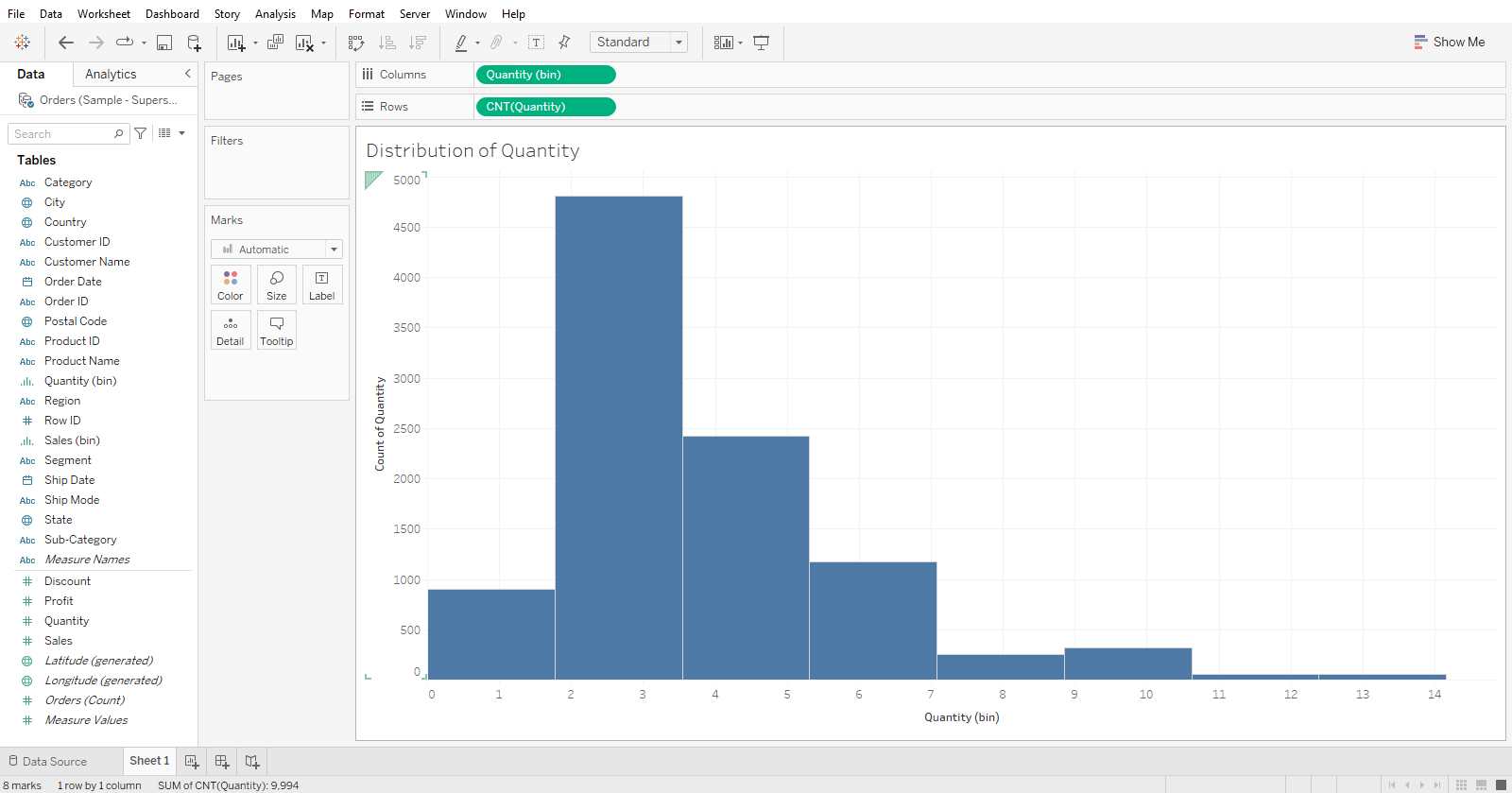
Step 4: Customizing the histogram
Now that you are done creating a histogram, let’s make it more appealing by making some customization.

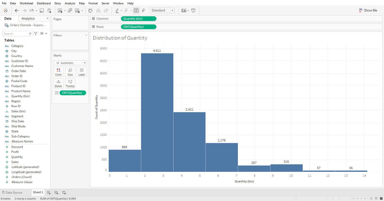
The first thing you can do is to display the count per bin. You can do this by dragging and dropping CNT(Quantity) to the Text Label in the Marks card. Once done, your view should look like the following:
You can also drill down on histograms by dividing each bin on some dimension in your dataset.
Suppose I want to see the contribution of each category per bin. You can do this by dragging and dropping the Category dimension to Color in the Marks Card.
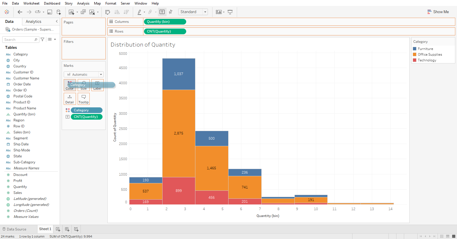
The histogram shows the contribution of the Quantity measure in each bin.
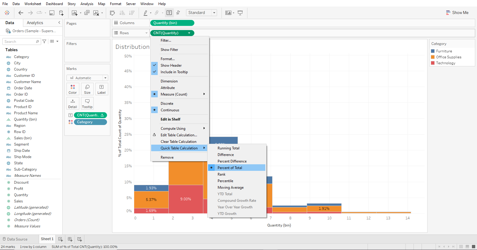
The next thing you can do is to convert the numbers inside the histograms. This will help make comparisons more easy for you.
To do this, right-click on CNT(Quantity), and select Quick Table Calculation. A table calculation dialog box will open. Click Percent of total.
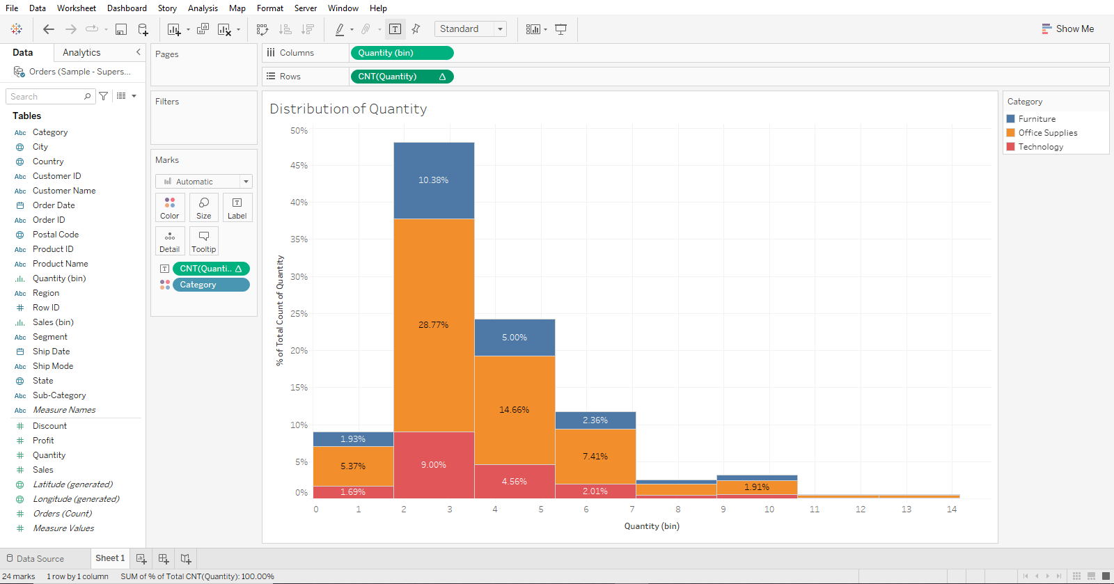
Your histogram should look like the following now:
You can keep customizing your histogram until you get your desired output.
Learn Advanced Data Analytics (ADA) and see how you can take your histograms and their interpretation to another level.
Final Thoughts
Histograms in Tableau are an essential data visualization tool. This is because when you can visualize your data’s frequency distribution, you’re better equipped to understand and interpret its nuances.
By learning how to make histograms in Tableau, you empower yourself to delve deeper into your data’s story. It allows you to recognize patterns, anomalies, and trends.
As you continue your journey with Tableau, you’ll find histograms useful for a range of applications. It adds more depth to your analytics.
Frequently Asked Questions
In this section, you will find some frequently asked questions you may have when making histograms in Tableau.

1. How to create bins for a histogram?
First, drag the desired measure to the Columns shelf to create bins of Tableau histograms. Then, right-click the measure and select “Create” > “Bins”.
In the “Create Bins” dialog box, specify your desired bin size and click “OK”. The bins will be created, and you can then drag the new “bin” field into the Histogram chart.
2. What is the process of making a histogram with multiple measures?
To make a histogram with multiple measures in Tableau, first create separate histograms for each measure and then combine them using the “Add to Dashboard” feature.
You can also use the “Analytics” pane to drag a reference line for each histogram, showing the data distribution for each measure.
3. How to customize bins in a Tableau histogram?
To customize bins in a Tableau histogram, right-click on the bin field on the Rows shelf and select “Edit”.
In the “Edit” dialog box, you can adjust the bin size and other parameters. You can also create calculated fields to customize the bin size using formulas.
4. What are the steps to create a distribution chart?
To create a distribution chart in Tableau, you should follow these steps:

- Connect to your data source.
- Choose the measure for which you want to create a distribution.
- Drag the chosen measure to either the Rows or Columns shelf.
- Select the chart type as “Histogram” from the “Show Me” panel.
- Customize the chart by adjusting the bin size and adding reference lines if required.
5. How to make a histogram with normal distribution?
To create a histogram with normal distribution in Tableau, you must overlay a normal distribution curve.
This can be done by creating a calculated field for the normal distribution function and adding it as a reference line or a second axis in the chart.
Adjust the parameters of the normal distribution function to match your data.
6. What differentiates a bar chart and a histogram in Tableau?
The main differences between a bar chart and a histogram in Tableau are their purposes and how the data is displayed.
A bar chart displays categorical data and is used to compare values across categories, while a histogram displays continuous numerical data and is used to show the distribution of values within a dataset.
In a bar chart, each bar represents a different category; in a histogram, each bar represents a range of values (called a bin) and their frequency in the dataset.