As part of a mini-series that I’m doing on Power BI’s November 2021 updates, I’d like to tackle the Sort Legend Power BI feature for today’s blog. It’s a nice functionality that they’ve added to the program, so I want to show where that resides, and talk about some of the nuances of how it works. You can watch the full video of this tutorial at the bottom of this blog.
How To Use The Sort Legend Power BI Feature
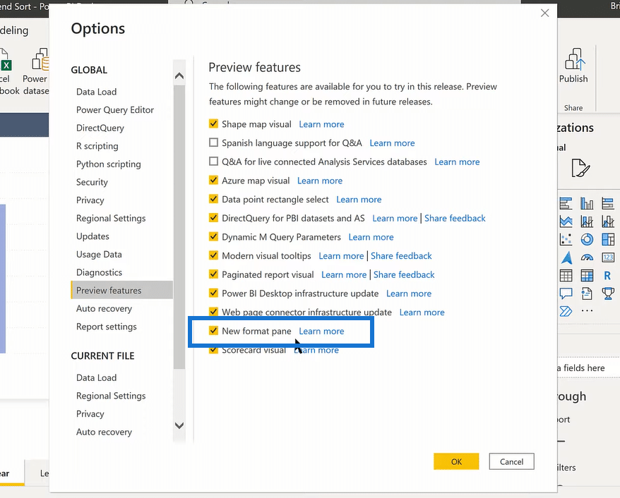
To access the new feature, we need to go to Options and Settings, Preview features, and then the New format pane.
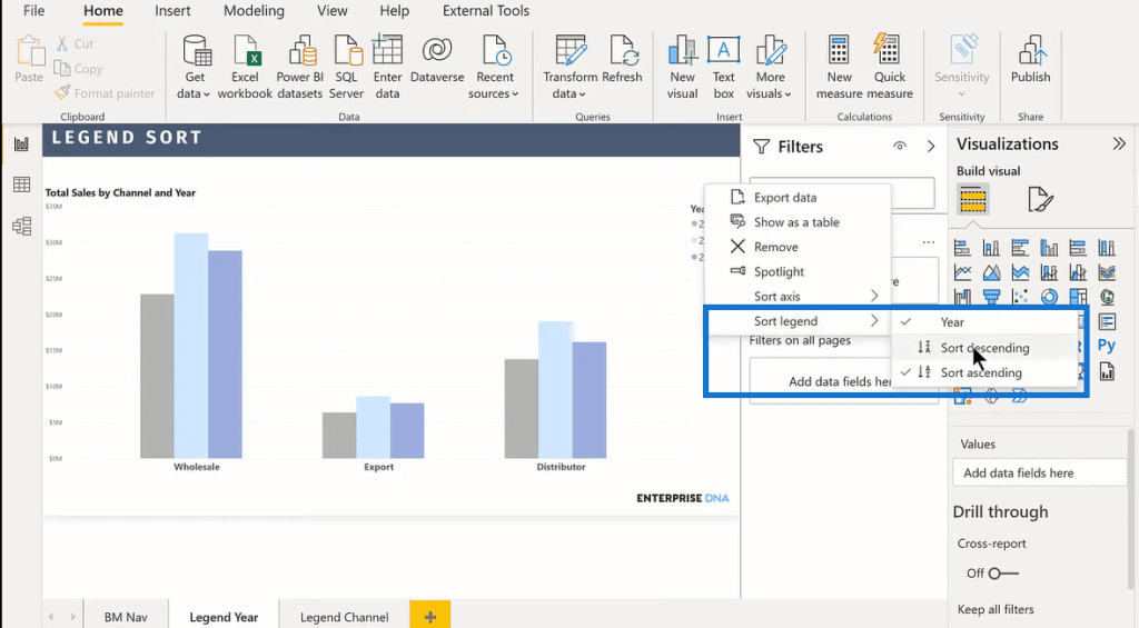
I’ve got a very simple column chart, showing Total Sales by channel and year from 2019-2021. What we can do now that we weren’t able to do before is to literally sort the legend either descending or ascending. When we click on that, it just flips the order.
I have here another chart with a different orientation of the same data, where instead of having the legend by year, I have the legend by channel and the year on the X-axis. The same thing works here. We click on the three dots on the upper right corner and then click on Sort legend, where we can flip the legend around.
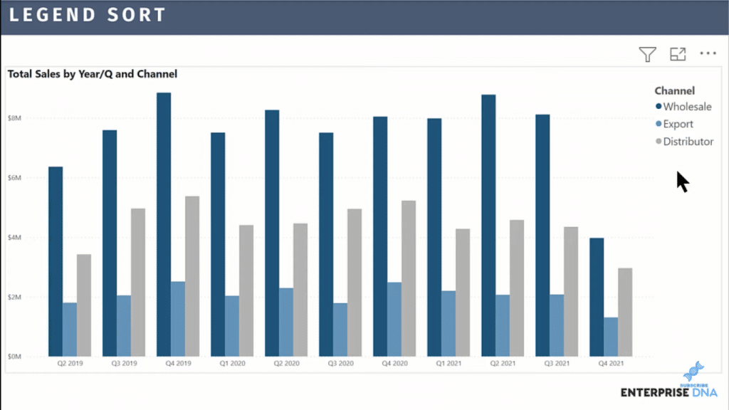
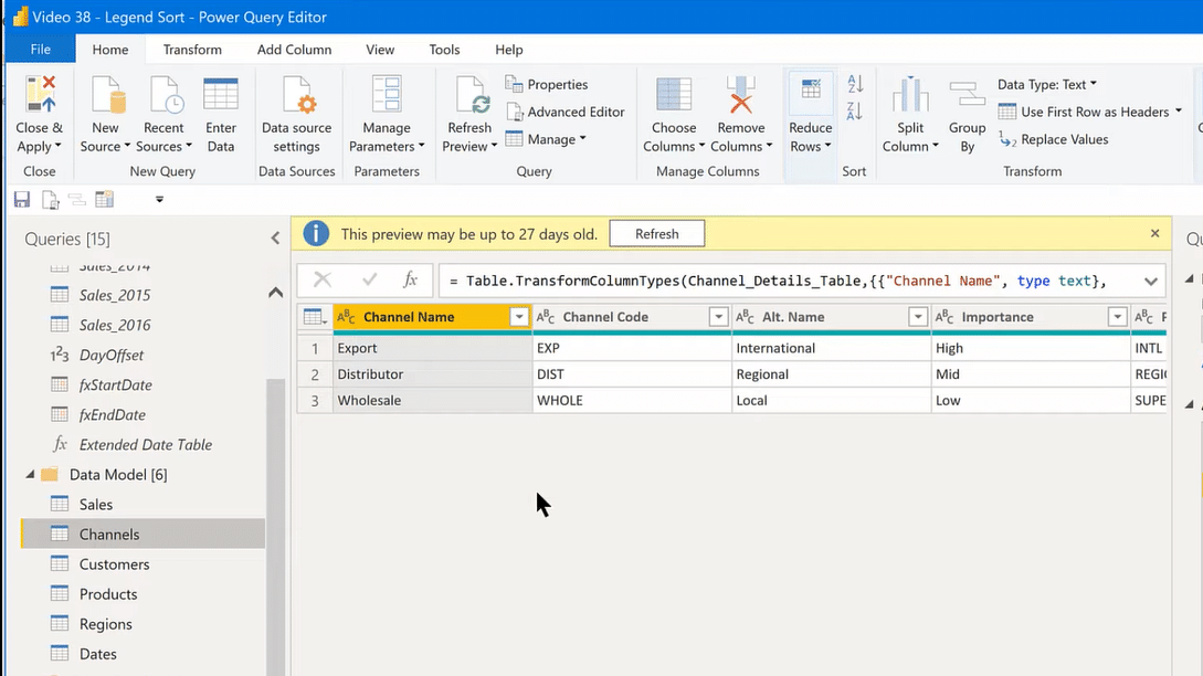
But now, the question is, what if we want to make Export first? There’s no custom order option in the Sort Legend, right? So if we want to customize the sort legend, we go to Transform data. Then, we go to our Channels.
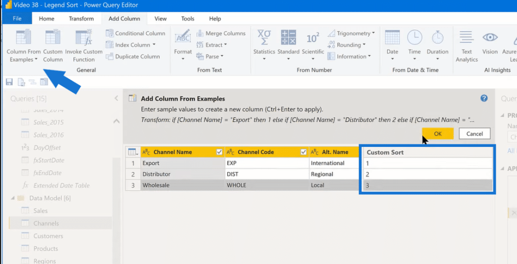
From here, we go Add Column, then Column From Examples. This is where we can do our customization. Let’s call this column, Custom Sort. We can have Export as number 1, Distributor as 2, and Wholesale as 3. Click OK. We can then change it to a whole number, then click Close & Apply.
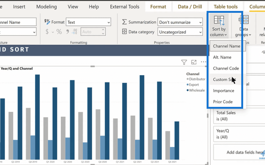
Back in our chart, we go to Sort by column, then select our Custom Sort.
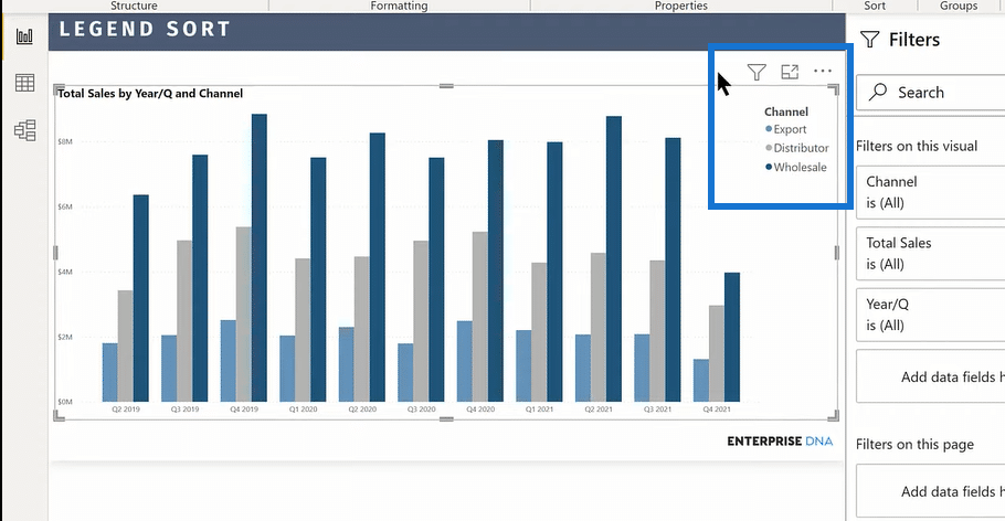
And so, we now have our desired order of the sort legend.
Another feature that I’d like to showcase, though not directly related to Sort Legend, is the X-axis, where we’ve got the full rich text formatting available. This enables us to make whatever changes we want to the X-axis, from font to color, to size.
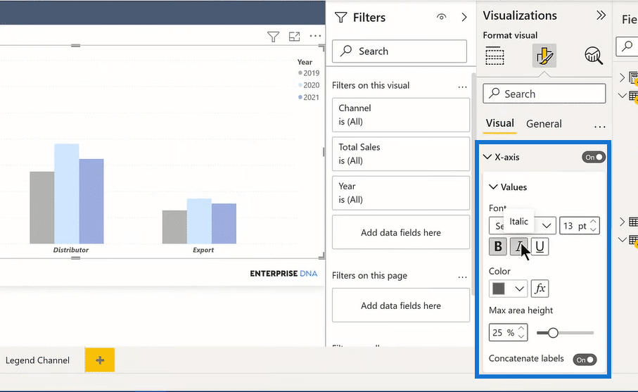
That used to be a pain to do before, but now everything is made fast and easy.
***** Related Links *****
Power BI Best Practice On Reports & Visualizations
Visualization Options In Power BI
Power BI Report Examples And Best Practices – Part 1
Conclusion
So, that’s all I wanted to show you in this blog. I think that the Sort Legend and the new format pane have some huge advantages over the previous ones. It may take some to get used to, but the features are quite helpful and save you a lot of time when developing your reports.
For more related content, check out the links below.
All the best!
Brian


