
I’m going to discuss some visualization options available in Power BI that can make a huge difference to your presentation even if you’re not creatively inclined when it comes to making PowerPoint dashboards or reports.
You can produce really good insights by combining the model that you have with DAX measures.
We’ve already created a few initial calculations and now we’ll start visualizing things. We want to create some valuable insights based on what we have created. You may watch the full video of this tutorial at the bottom of this blog.

Creating A Sales Report Using Visualizations
In the Insert tab, there’s a whole range of things that you can utilize in your reports.
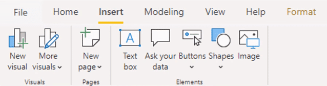
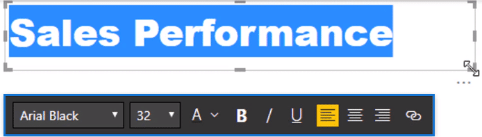
I’m going to start by creating a title called Sales Performance. I can change things like the font and font size with this bar.
For the visualizations, I’m going to use the Visualization pane here.
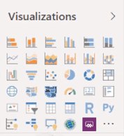
These are the inbuilt visualizations that Power BI has. It has pie charts, donut charts, stacked column charts, etc. which you’ve already used in Excel and other presentations.
You can combine all of these to present your necessary data in your reports.
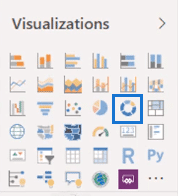
I’ll start off with a donut chart.
Usually, you can drag in columns or measures into the report, but I like to use this pane below.

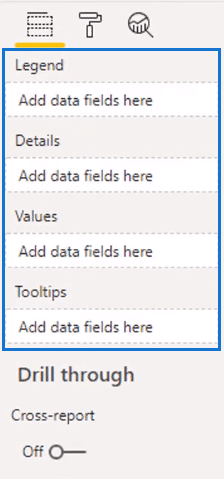
Here, I can simply place the measures into the right fields.
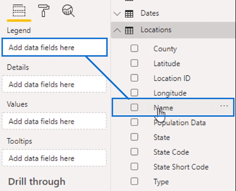
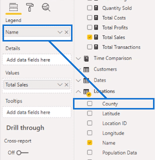
So I’m going to select Locations and drag Name to the Legend field.
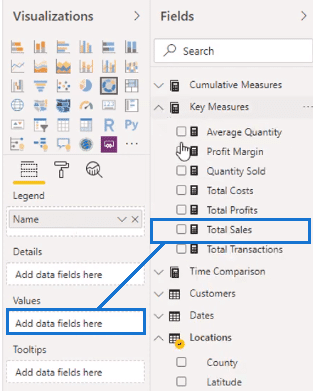
And then I’m going to grab my Total Sales and place it in the Values field.
Initially, the resulting chart has too much information.
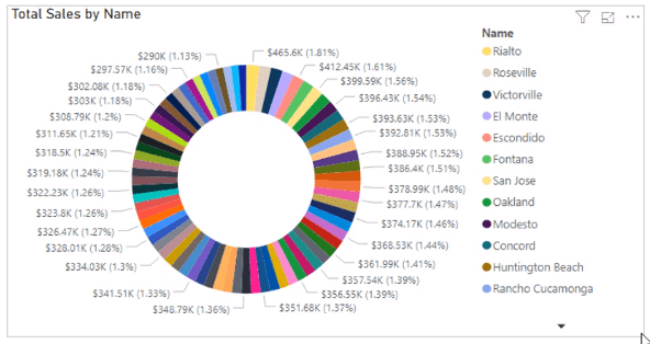
So I need to adjust the data fields.
I’ll replace Name with County here.
And then I can change the formatting. All the formatting of the visualizations is done within the Format section.
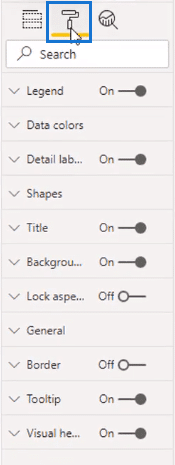
Here, you can change anything on a visualization like title, data colors, etc.
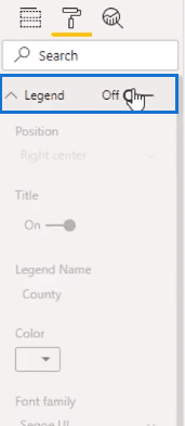
Now I’m going to turn off the legend.
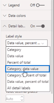
Then I’ll select Category, data value in the detail labels.
So now I have a summary of the key counties in my data set.

To me, it still looks busy but that’s okay. There are four counties that make up 50% of the data which makes it a reasonable visual.
I used County instead of Name because my aim to present a clean and simple visual. Having too much data makes it cluttered and complicated.
Duplicating And Formatting Similar Visualizations
Next, I’m going to make a visualization of my customers.
I’ll add Customer Name and Total Sales in the Values then turn it into a stacked bar chart.

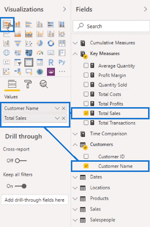
This is the outcome of the data.
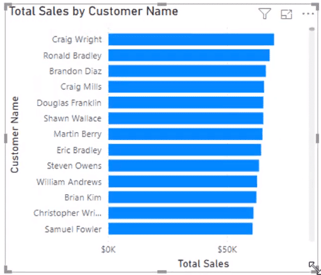
You’ll notice that the title and axes get created automatically. They’re from the data that you added in the fields section.
Now, I’m going to copy and paste the chart.
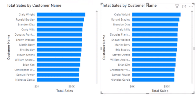
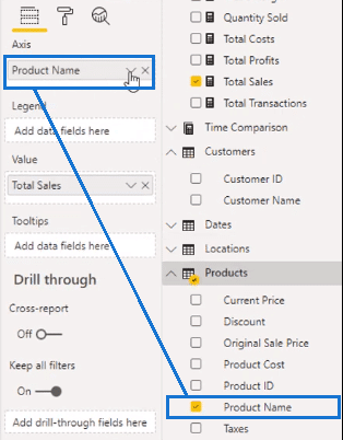
And then substitute Product Name in the copied chart.
You can also format them at the same time by holding down the Ctrl key and collect both visuals.
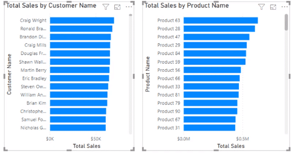
Then turn on data labels and disable the x-axis.
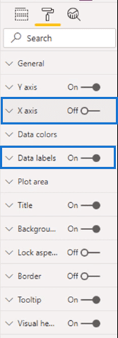
I’ll also disable the y-axis. Since I have the details from the data labels and the title, I don’t need it anymore.
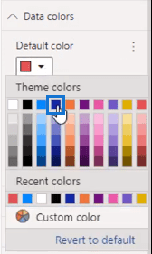
Then I’ll change the color of the duplicated chart.
Now I have two differentiated charts of similar visuals.

This is a quick way to generate visualizations by just a quick copy-and-paste.
Creating A Map Of Profits
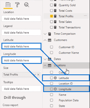
Next, I’m going to create a map. And I’m going to utilize Total Profits.
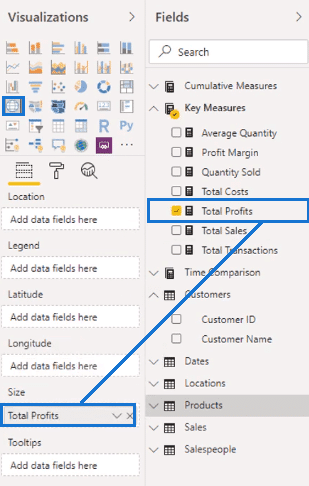
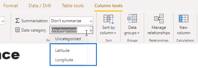
In my locations data set, I have Latitude and Longitude.
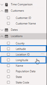
With these latitudes and longitudes, you want to label them as a certain data category, like an axis or representation. So, I’ll select Latitude as Latitude and Longitude as Longitude in the Data Category.
Then bring them to their corresponding fields.
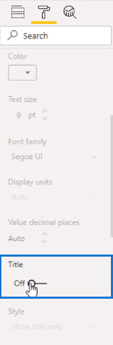
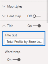
The title automatically created isn’t the most ideal so I’m going to change it into a simpler one. I’ll name it Total Profits by Store Location.
Now I have my California profits from different regions in the area.

Creating A Sales Visualization
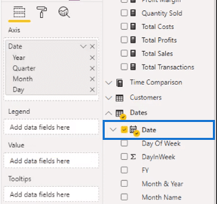
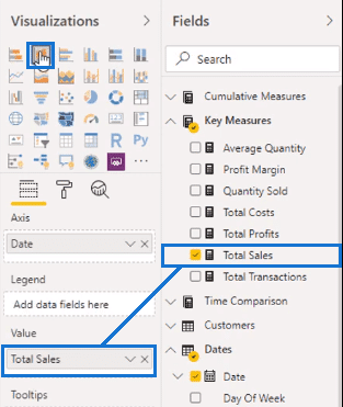
Next, I’m going to use Date for a new visualization and get rid of its hierarchy.
I’m going to place Total Sales in the Values and turn it into a stacked column chart.
And I’ll remove the axes’ titles.
Now I have a new visualization for my sales.


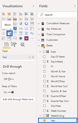
Creating A Slicer As A Filter
We currently don’t have any filters for our data, so I’m going to make a slicer out of Year.
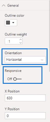
In the General pane, I’ll change the orientation to horizontal and disable responsive.
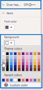
Then I’m going to get rid of the slicer header and change the background to a lighter gray.
Now we can start filtering the other visualizations by date.

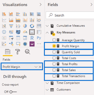
Making Key Figures Using Cards
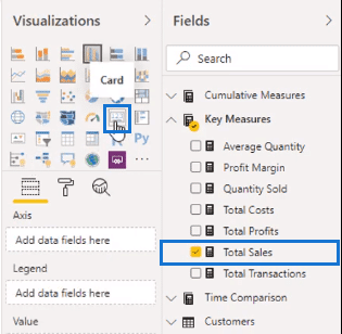
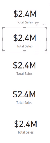
To finish things off, I’m going to place some key figures. To do that, I’m going to take Total Sales and turn it into a card.
Then I’ll copy the card five times.
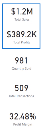
Then I’ll put Total Profits, Quantity Sold, Total Transactions, and Profit Margin in each duplicated card.
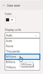
When clicking through the data, the numbers go from millions to thousands.
To remedy this, I’ll go to data label and select Millions. This will make the numbers more uniform.
Now we have different key figures to supplement our data.

Editing Interactions Within Visualization Options
When selecting a county, you’ll observe that the way the charts are interacting with each other is not optimal.

This is because the filtering is different. So, I’ll select Edit Interactions.
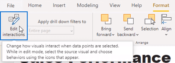
This will enable me to change the look of the charts in terms of what other visualizations look like.
I can click the small icon on the upper right to edit each visual. And I’ll do the same on every chart.
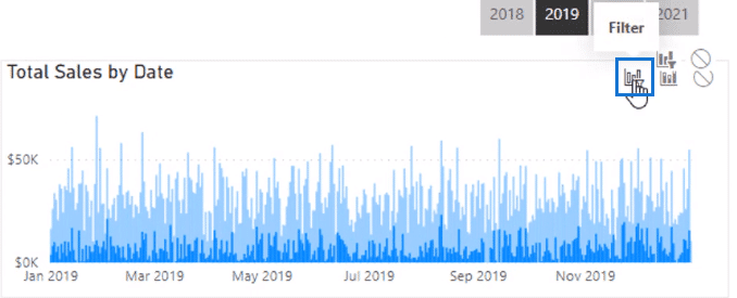
When I’m finished, you’ll see that the visualizations are more dynamic. Now it’s actually showing each individual selection.

Creating A New Slicer For Quarters
Observe the columns of the date table.

There is a Quarter and Year column yet no Quarter only column.

For example, I want to calculate my sales during a particular quarter in 2018. I could create a calculated column to do that but it’s easier to use the Power Query editor.
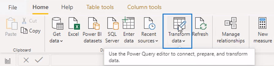
It’s a quicker way than having a calculated column. The Power Query editor updates the data in the calculations with the other transformations and doesn’t need any additional calculations.
In the editor, we have the quarter and year here.
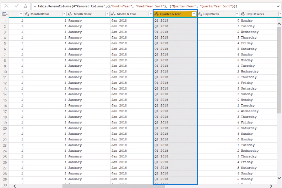
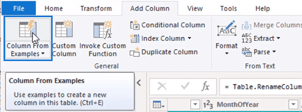
To add a column for quarters, I’ll use a feature called Column From Examples.
When you type in something, the editor will automatically work out what you want based on what you typed. When you typed in Q1, it automatically selected these results.
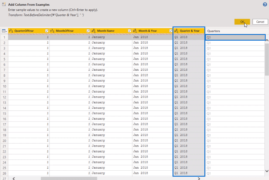
With this new column of quarters, I’m going to select Close and Apply.

Now the column I’ve created in the Power Query editor has translated into the date table.

Going back to the report, I’m going to copy and paste the slicer.

Then substitute the Year with Quarters, our newly created column.
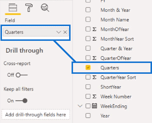
Now I have another slicer to filter the data set by.

*****Related Links*****
Using Color Schemes For Power BI Data Visualization
Power BI Data Bars In Visualization
How To Control The Interactions Of Your Visuals In Power BI
Conclusion
We’ve tackled a range of different visualization options in Power BI. You can see that there are unlimited possibilities to do with visualizations. It’s up to your preferences on how you want them to look.
Being able to make your own visualizations will help you improve the looks of your reports. It will help you create compelling insights that can help you greatly.
Best of luck.
Sam.

*****Learning Power BI?*****
FREE COURSE – Ultimate Beginners Guide To Power BI
FREE COURSE – Ultimate Beginners Guide To DAX
FREE – Power BI Resources
FREE – 60 Page DAX Reference Guide Download
Enterprise DNA Membership
Enterprise DNA Online
Enterprise DNA Events


