I think this is a good opportunity to run through why creating great visualizations is so important in Power BI. You may watch the full video of this tutorial at the bottom of this blog.
So many times I see reports unfortunately let down by the visualization components of developing within Power BI Desktop.
What I demonstrate in this tutorial is a number of techniques that you could leverage off or select to incorporate into your next Power BI visualizations, such as your reports and dashboards.
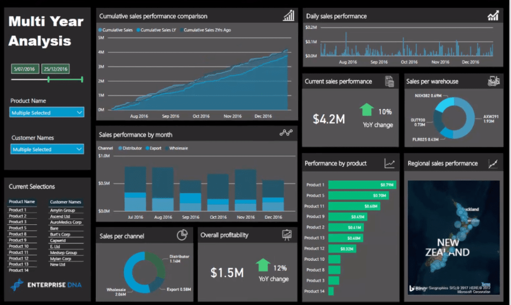
This showcase report actually came from a free workshop as part of the Enterprise DNA webinar series – Dashboard Makeover Session – Enterprise DNA Webinar Series. During this virtual workshop, I ran through how you can really develop some amazing reports in Power BI.
How This Dashboard Look Like Before
Let’s have a look at what this dashboard used to look before.
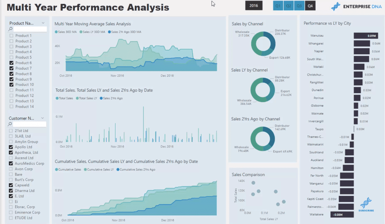
It may have some good insights and functionality but it doesn’t really have much appeal. I thought it needed to pop a little bit more on the screen. As you can see, the colors are quite dull and pale. It’s not to say that this looks poor, but I just thought I could make it look better.
One of the things that I’ve brought into my own report is darker backgrounds. I’m actually a big fan of darker backgrounds and the white coloring inside the chart.
I think it makes your reports stand out, making it visually appealing. It’s pleasing to the eyes compared to the pale colors in the charts. And that’s how I designed this dashboard in this demonstration.
Dashboard Functionality and Design
Now let’s have a look at the functionality and the design of this dashboard. I always make sure that my Power BI visualizations aren’t only compelling, but also functional and that everything is optimized.
One very important thing we are capable of doing here is that we can drill into any time period. I’ve actually narrowed down the entries of this entire report page for 2016, but we can go into any time frame.
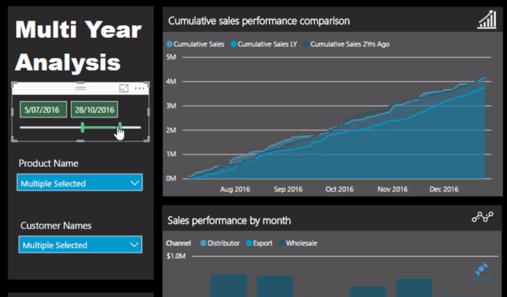
We’re viewing the current results over this year versus the ones from last year and the year before that. I’ve used a cumulative total pattern, which is the best way to identify trends.
Cumulative totals are great, especially when you’re doing time comparisons to identify divergence and trends or the change in trends.
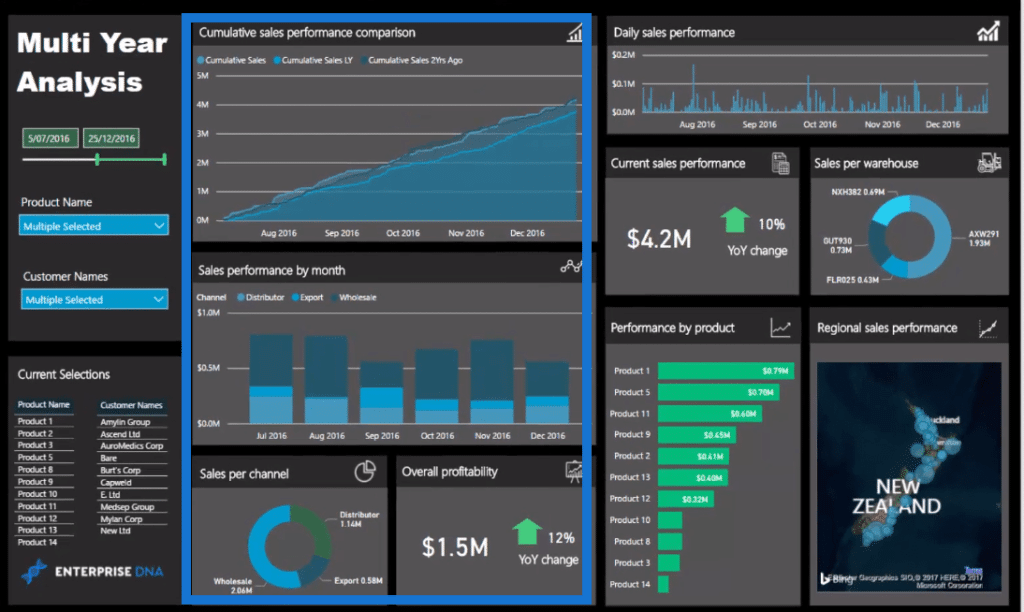
What’s great about this is that we can click through it and drill into our data.
The data model in the background does all the hard work.
The main thing that I like about what I changed in this dashboard is the really dark background and grids around the report. Grids are just awesome for reports like this; because they’re all aligned, they allow us to drill into a specific part of the report.
Moreover, all the titles are very detailed and they just stand out, so people know exactly what they’re looking for.
And over here at the left side, there’s also more functionality. It’s quite hard if we put our dimensions inside these slicers. It would be difficult to know what we’ve actually selected. So I used tables to dynamically show me what I have selected.
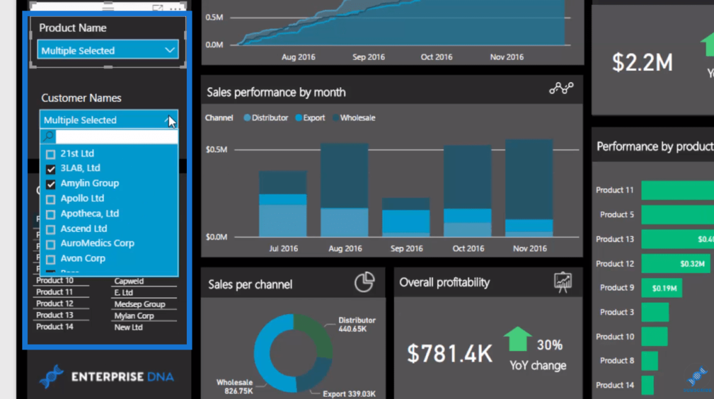
By doing so, I can jump in and out of any selection that will change up the report but I always know what is actually selected.
***** Related Links *****
How To Create Compelling Reports & Dashboards In Power BI
Using Great Color Schemes In Your Power BI Data Visualization
Background Design Plates – Power BI Visualization Technique
Conclusion
So that’s what you can do with Power BI visualizations. We’re now given this blank canvass that we can build on. We can layer different colors in the backgrounds and in the shapes within visualizations. You can make incredible dashboards with insights that are totally automated.
All these techniques combined can effectively shine a light on the key insights that we’re looking for from our analysis.
If you combine all of these things really effectively like what I go through in the video tutorial, you will be able to really create some compelling work that your teams, organizations, and managers are going to look at over and over again. That’s ultimately what you want with your Power BI reports.
You want to compel users and consumers to come and look at your reports on a regular basis because they’re so insightful and they look great!
If you need some more inspiration around what you can achieve in Power BI, check out the Enterprise DNA Showcase.
This showcase is constantly updated with new demos and reporting examples. You can also access all of these via becoming an Enterprise DNA Member. To learn more about membership check out the link below.
All the best!
Sam

[youtube https://www.youtube.com/watch?v=Wu9mAktNWQo?rel=0&w=784&h=441]


