In the world of data visualization, a picture is worth a thousand words, and when it comes to illustrating the distribution of data, stacked bar charts are your go-to artists.
To create a stacked bar chart in Excel, follow these 4 simple steps:
- Preparing Your Excel Data
- Choose the Stacked Bar Chart Type
- Format the Chart
- Customize the Chart
In this guide, we’ll show you the process of crafting impressive stacked bar charts in Excel and give you tips on solving any obstacles you may encounter.

Whether you’re a business analyst dissecting sales figures, or a professor simplifying complex data, mastering the art of creating stacked bar charts is a priceless skill.
Let’s dive in and get this done!

What is a Stacked Bar Chart?
A stacked bar chart is a type of visualization that allows you to compare different categories across multiple segments within each category.
It is an extension of a regular bar chart, where each bar is divided into subcategories.

In a stacked bar chart, each stacked bar represents the main categories, while the subcategories are represented by different segments within each bar.
The length of each segment is proportional to the value of the corresponding subcategory, making it easy to visualize and compare the contribution of each subcategory.

When Should You Use Stacked Bar Charts?

Stacked bar charts are particularly useful when you want to:
- Show Parts of a Whole: Use them to display how different categories or components make up a total. This is handy for budgets, sales breakdowns, and population compositions.
- Track Changes Over Time: Stacked bar charts can help you visualize how the parts change over multiple time periods, making it great for tracking trends.
Remember, they’re not the best choice for all situations, but when you need to highlight how components contribute to a whole or how they change over time, stacked bar charts shine.
Benefits of Using a Stacked Bar Chart in Excel

Stacked bar charts offer several advantages when it comes to visualizing data in Excel:
- Clarity and Simplicity: Stacked bar charts make complex data easy to understand. They provide a clear visual representation of how different categories or parts contribute to a total, helping your audience grasp the information quickly.
- Effective Comparison: These charts excel at enabling comparisons between different categories or groups. You can see at a glance which category is the largest or smallest, making it ideal for analyzing proportions.
- Visual Impact: Stacked bar charts are visually appealing, making the same data more engaging and memorable.
The use of colors can enhance the chart’s visual impact, making it easier for your audience to absorb the information. - Easy Data Interpretation: Stacked bar charts make it straightforward to interpret trends and changes over time.
By stacking the bars, you can track how the contributions of each category evolve, making them great for visualizing data trends.
Incorporating stacked bar charts in Excel can enhance your data presentations, making your information more accessible and impactful.
Now let’s show you how to create a stacked bar chart.
How to Create a Stacked Bar Chart in Excel
There are a number of steps to accomplish this task.
Here they are:
Step 1: Preparing Your Excel Data

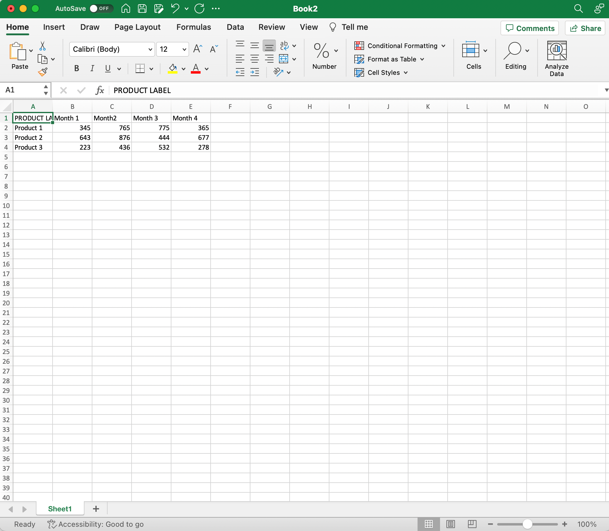
Before you start creating a stacked bar chart in Excel, it’s essential to prepare your data properly. Organizing your data in a clear and concise format will help you avoid potential issues during chart creation.
To create a simple stacked bar chart:
- Open Excel and input your data in a data table format. Your table should include distinct rows and columns, with each row representing a specific category and each column representing its respective value.
- Select the data range you want to include in your chart. The data range includes your table headers, which will become your chart’s axis labels.
Example: If you have sales data for three products and four months, your data range should contain five columns (including a column for month labels) and four rows (including a row for product labels).
Once your data is arranged in this format, Excel will automatically recognize it as a viable source for a stacked bar chart.
With your data prepared, you can now proceed to create an impressive and informative chart.
Step 2: Choose the Stacked Bar Chart Type
Step 1: Select your data
Click and drag your mouse to highlight the range of cells that contain the data you want to present in the chart.
Be sure to include both the headers and the data values.

Step 2: Choose the chart type
- Go to the Insert tab at the top of the Excel window.
- Find the Charts group. Here, you will see several chart options available.
- Click on the Bar Chart icon to display a list of chart types.
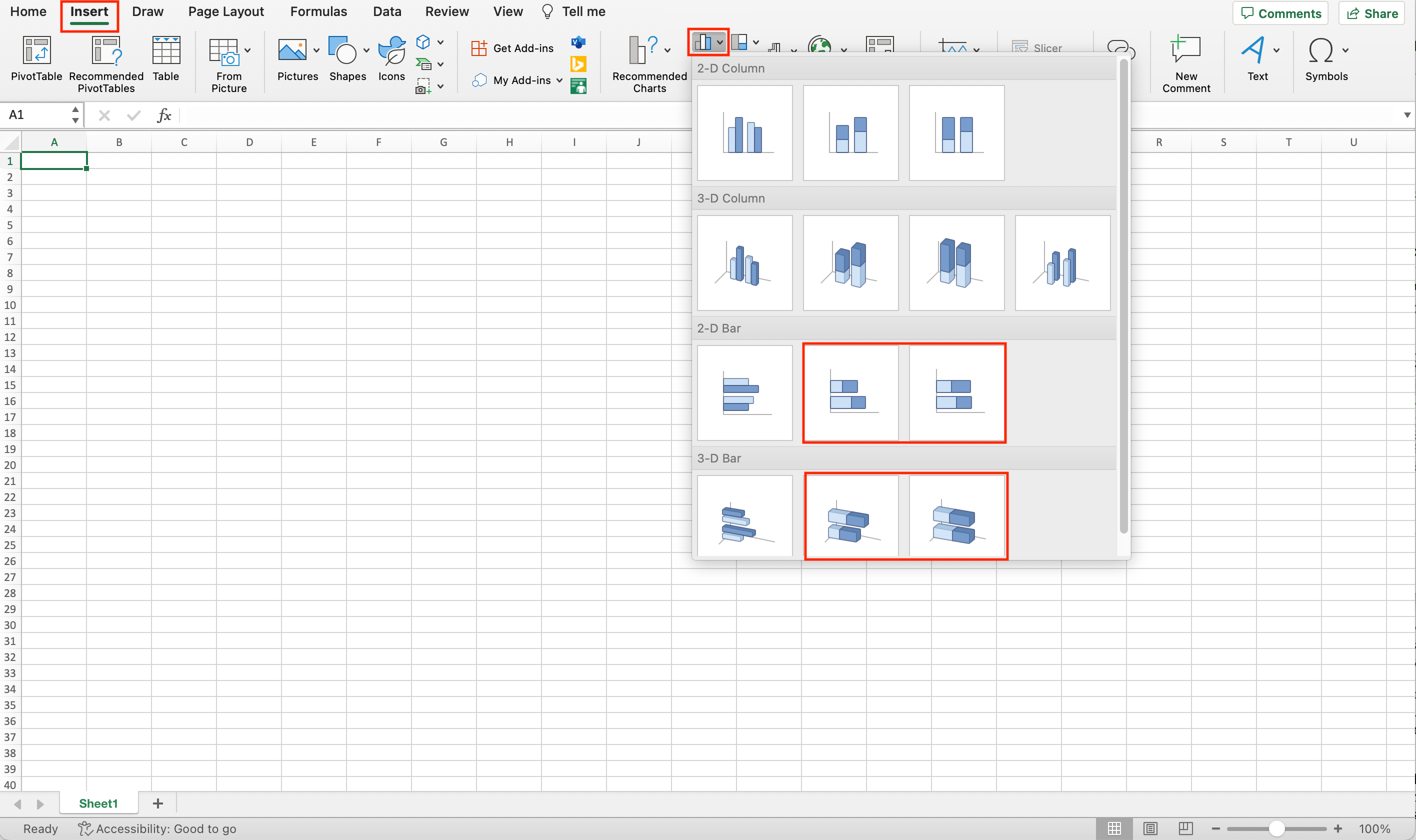
- Look for the stacked bar chart option. This will typically be represented by a small icon with a bar chart that has multiple sections stacked upon each other.
- Click on the desired icon to insert the chart.
Remember that stacked bar charts are particularly useful for visualizing data with multiple categories and subcategories.
By organizing your data effectively and selecting the appropriate chart type, you can confidently create a clear, informative stacked bar chart in Excel.

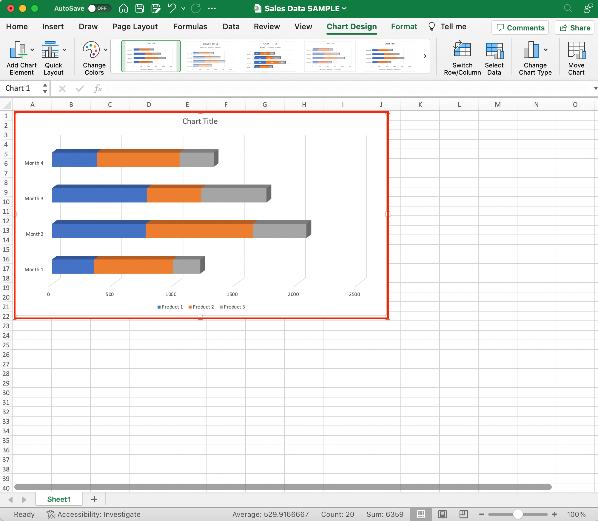
Step 3: Format the Chart
Once you have created a stacked bar chart in Excel, you may want to format it to make it more visually appealing and easier to understand.
Here are some steps to follow for formatting your chart:
Format Option 1: Customizing Colors
To change the color palette of your stacked bar chart:
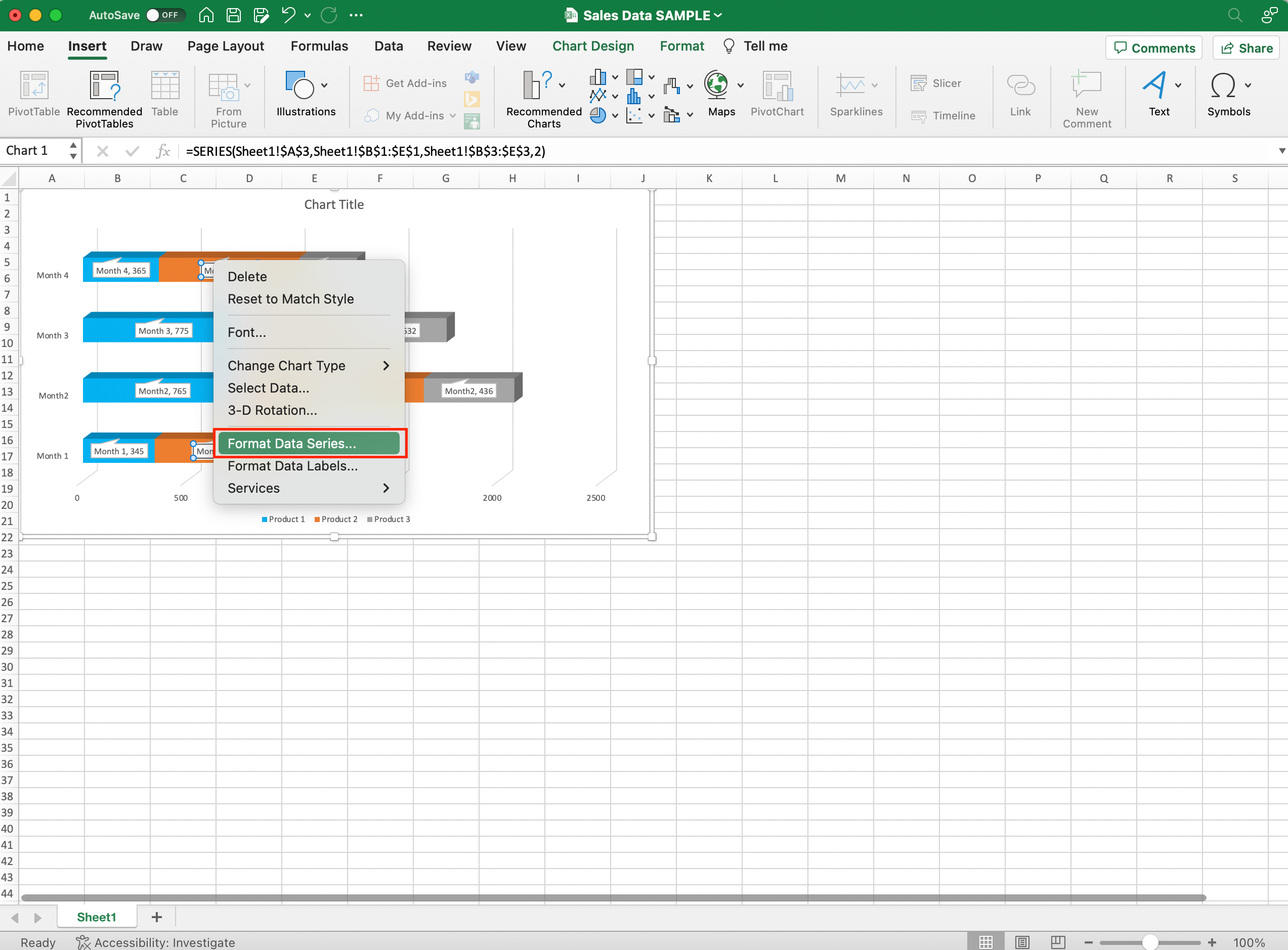
- Click on any data series within the chart. A colored border will appear around the selected series.
- Right-click and choose Format Data Series.
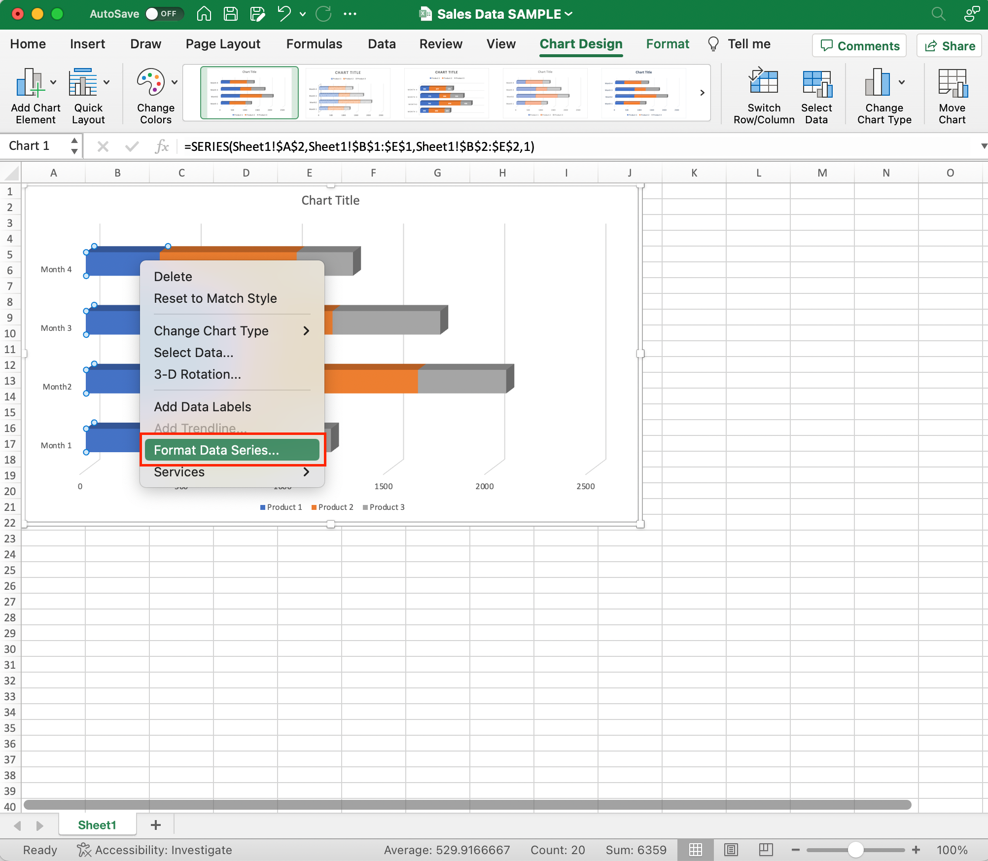
- Under the Fill tab, you can choose a new color for the selected data series.
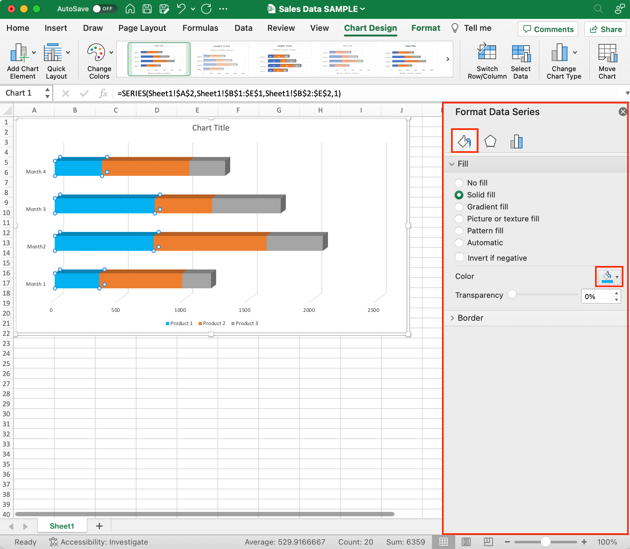
- Repeat this process for all the data series to achieve the desired color palette.
Format Option 2: Changing Text Styles
To modify the font, size, and style of text in the chart area:
- Click on the desired text.
- Right-click and choose Font.
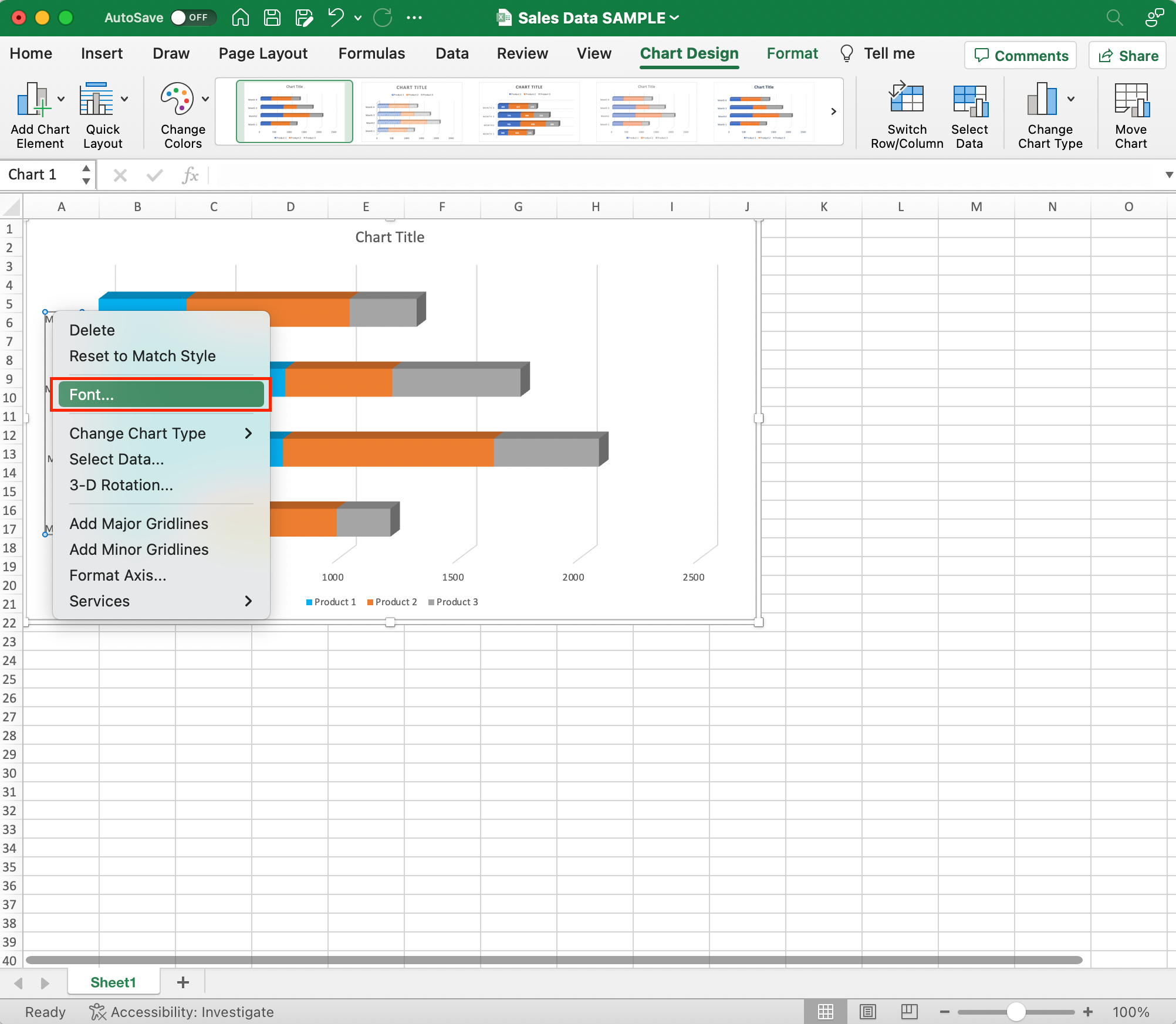
- In the resulting dialog box, you can customize the text font, size, style, and color.

Format Option 3: Displaying Percentages
If you want to display data as percentages instead of absolute values:
- Right-click the data series and choose Add Data Labels.
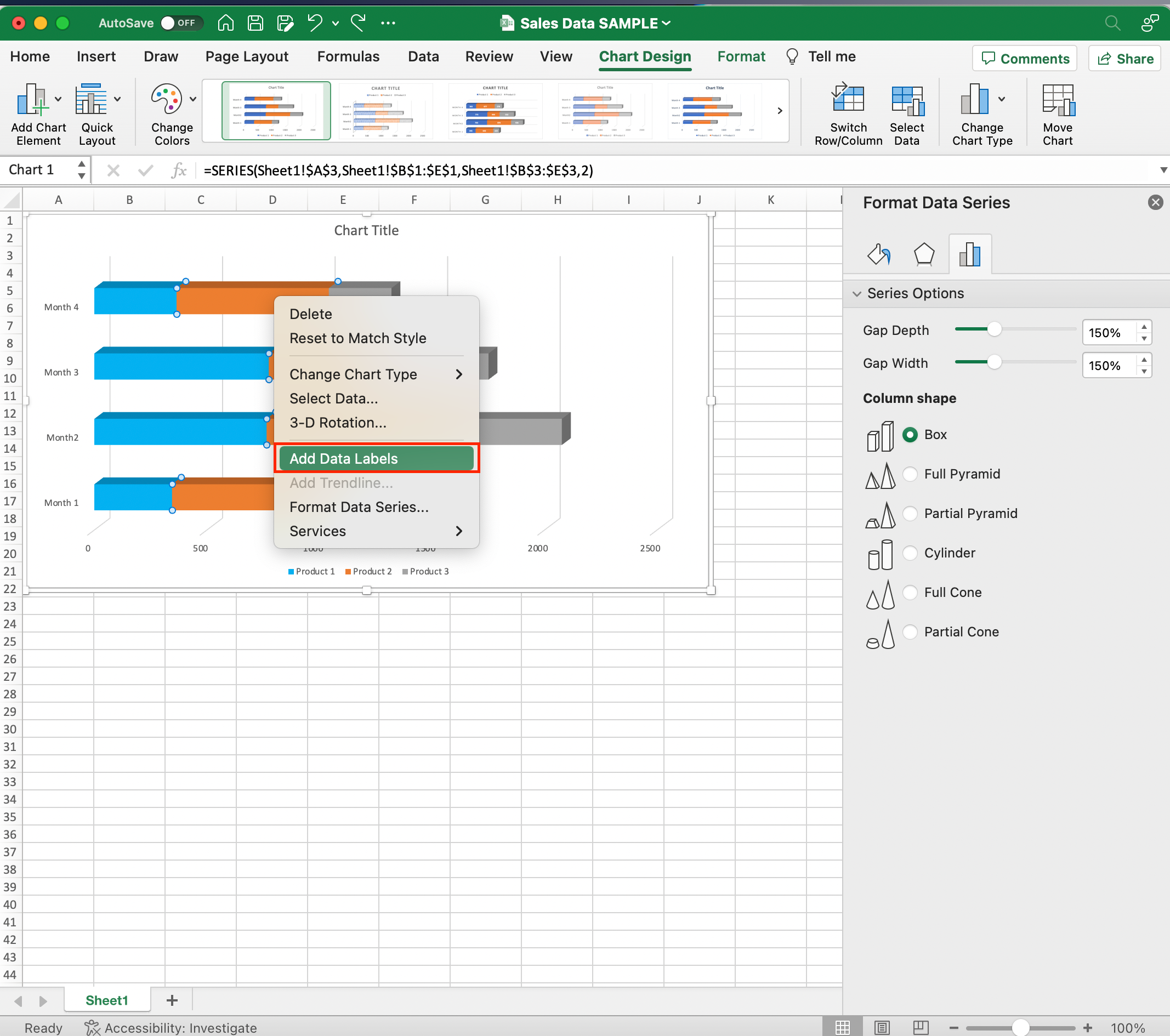
- Right-click the data labels and select Format Data Labels.
- In the Numbers tab, check the Percentage box.
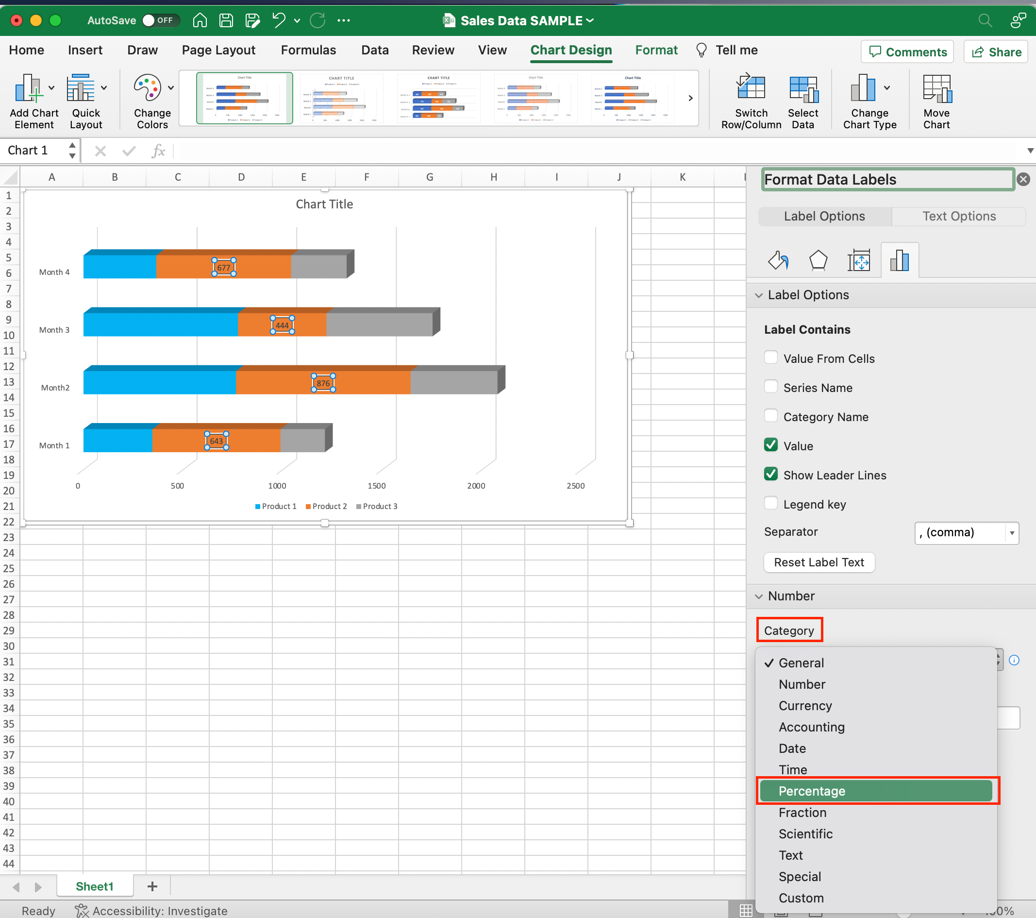
Excel will automatically calculate and display the percentages.
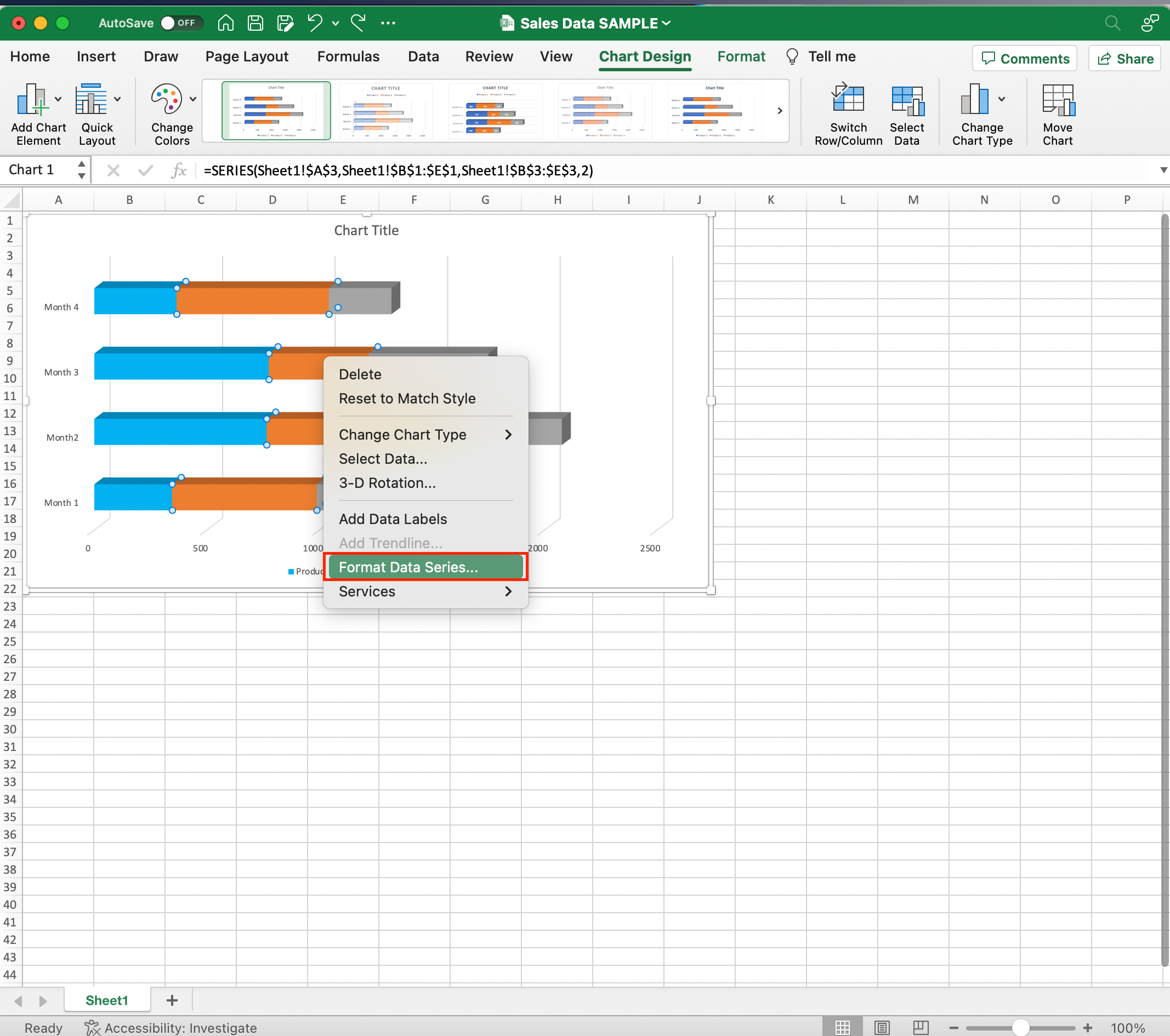
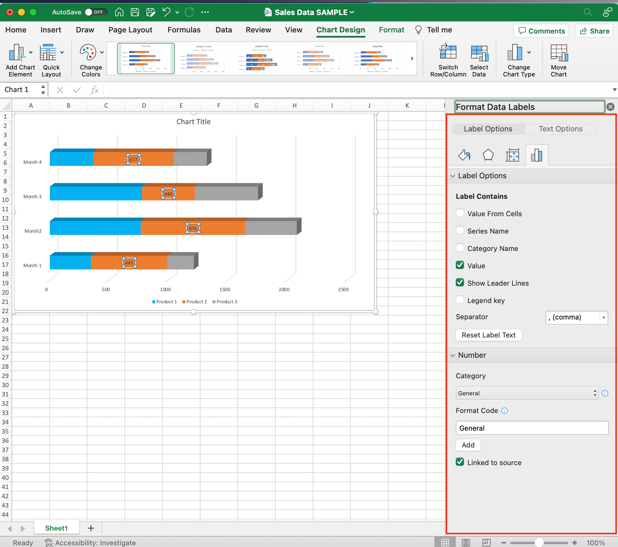
Format Option 4: Showing the Total Value
To display the total value of each category:
- Click on the data series that represents the highest portion of the stacked bar chart.
- Right-click and choose Add Data Labels. Excel will now display the absolute values for the top segment of each bar.
- Right-click on the new data labels and select Format Data Labels.
- In the Label Options tab, you can modify the number format, position, and text color.
Advanced Formatting
For further customization, you can explore the Chart Elements button located in the upper-right corner of the chart area.
This stacked bar chart menu provides additional options for customizing the chart, such as adding gridlines, adjusting the axis scale, and changing the plot area background color.
By following these steps, your stacked bar chart will be well-organized and visually appealing, providing clear insights into your data.
Step 4: Customize the Chart
Once you’ve created your stacked bar chart in Excel, you may want to customize its appearance to suit your needs better.
In this section, we will guide you through customizing various elements of your chart, such as titles, legend, and axes.
Customizing Option 1: Add Data Labels and Axis Titles
Data labels help display specific values, making it easier for the reader to understand the chart.
Axis titles provide context and help readers understand the data represented on each axis.
To add or modify data labels or axis titles:
- Click on your chart to activate the Chart Tools.
- In the Design tab, click on Add Chart Element.
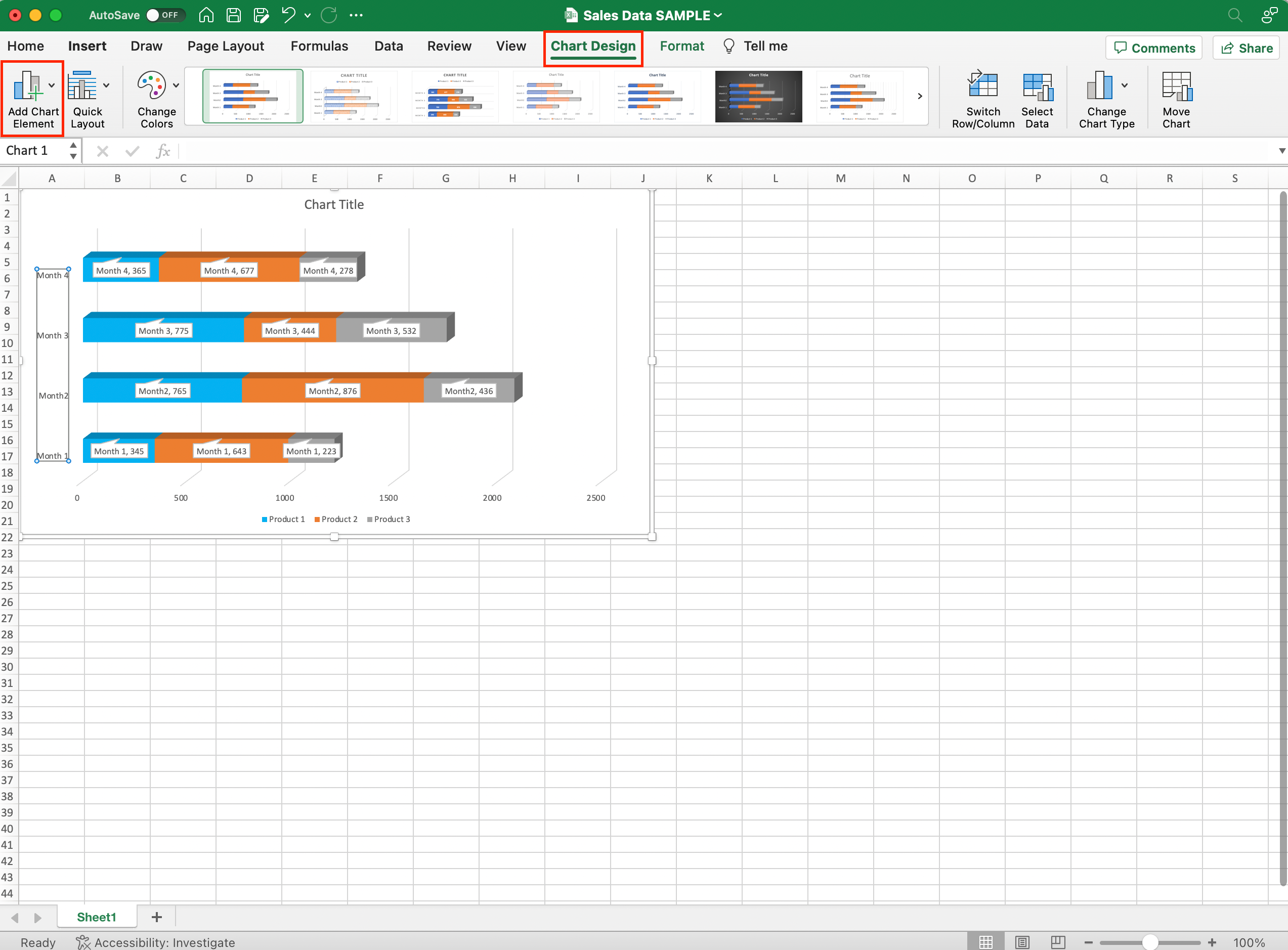
- Point to Data Labels and select your desired label position (e.g., inside end, outside end).
- For axis titles move your cursor to Axis Titles, and in the pop-out menu, select Primary Horizontal and/or Primary Vertical as needed.
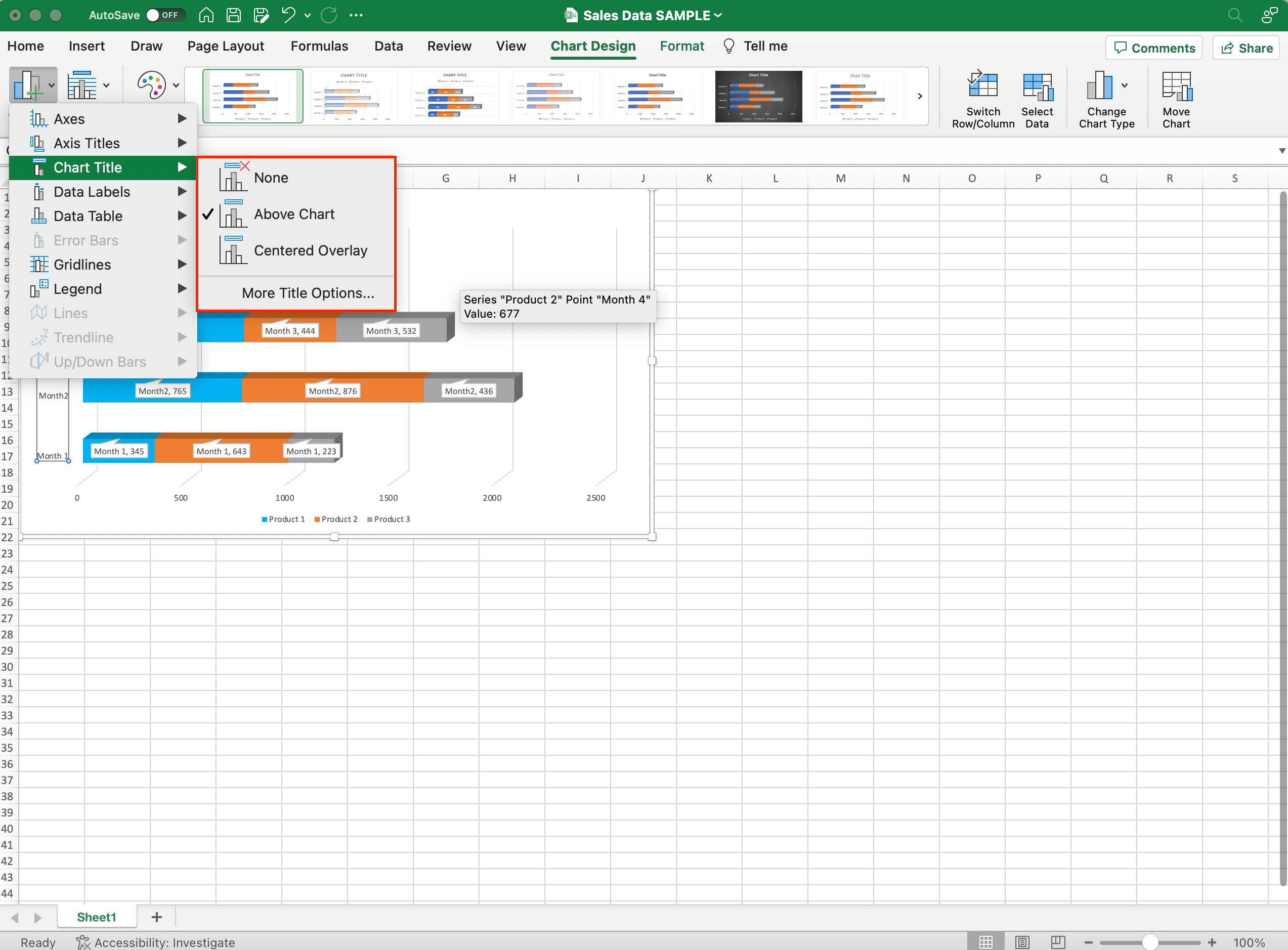
Customizing Option 2: Customizing the Chart Titles
To add or modify the chart title, follow these steps:
- Click on the chart to select it.
- Under the Chart Design tab, click on Add Chart Element.
- Choose Chart Title and select the desired location.
- Click on the chart title and edit the text.
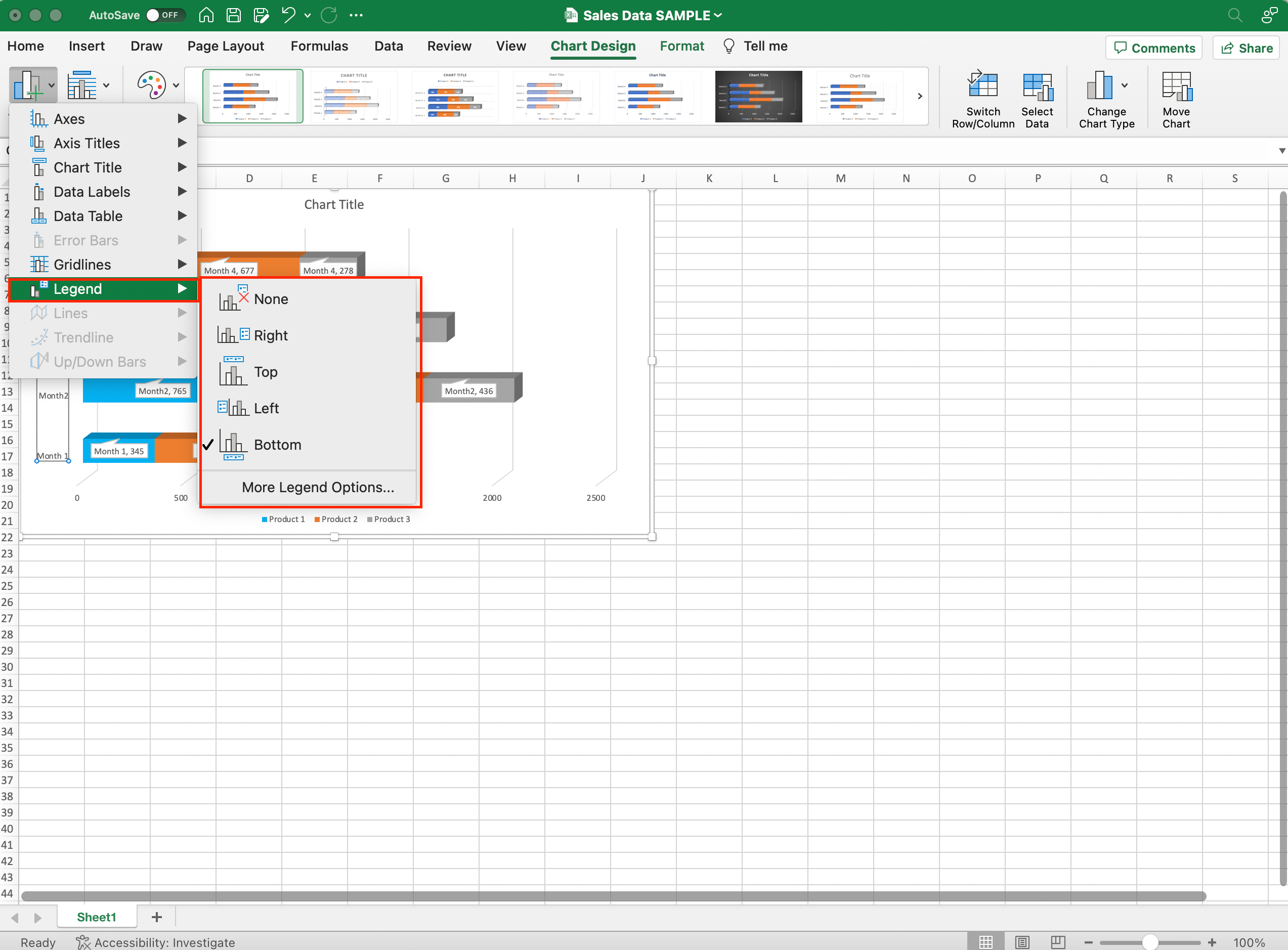
Customizing Option 3: Customizing the Legend
You can easily customize the legend by:
- Click on the chart to select it.
- Under the Chart Design tab, click on Add Chart Element.
- Choose Legend and select the desired location.
- To modify the legend entries or formatting, double-click the legend.
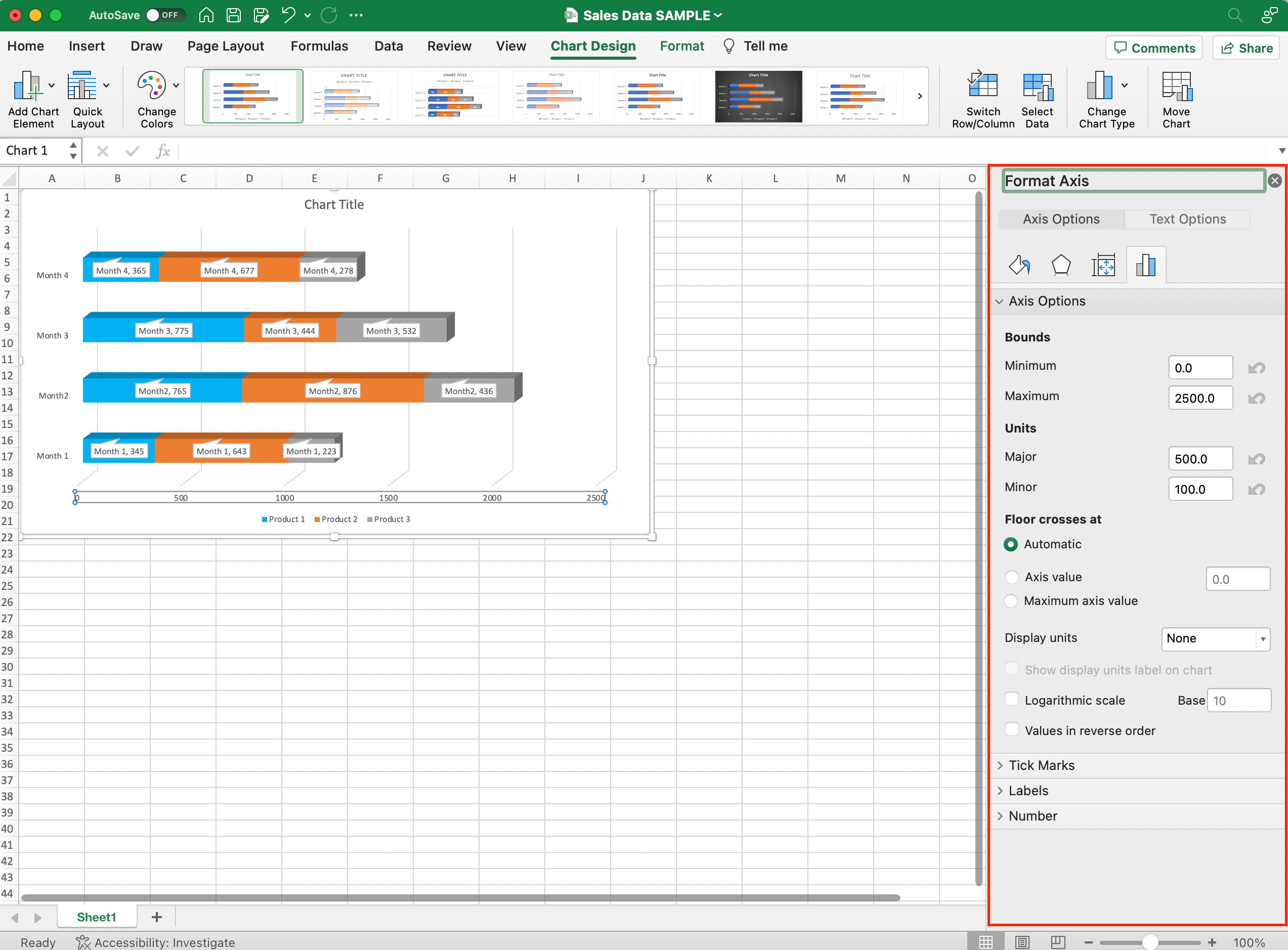
Customizing Option 4: Formatting the X-Axis
To format the x-axis, follow these steps:
- Click on the chart to select it.
- Double-click on the x-axis to open the Format Axis pane.
- Under the Axis Options category, you can customize several settings, such as the axis scale, tick marks, axis label positions, and number formats.
By following these steps, you will customize your stacked bar chart in Excel to match your preferences and make it easier to interpret the data.
Advanced Tips and Tricks
Creating a stacked chart in Excel is easy when you know some advanced tips and tricks.

This section will help you elevate your skills in customizing and efficiently making stacked bar charts using various features in Excel.
Advanced Tip 1: Adjust gap width for improved readability
To improve the readability of your chart, you may want to adjust the gap width between bars.
To do this:
- Simply right-click on a bar.
- Select Format Data Series.
- Adjust the gap width slider.
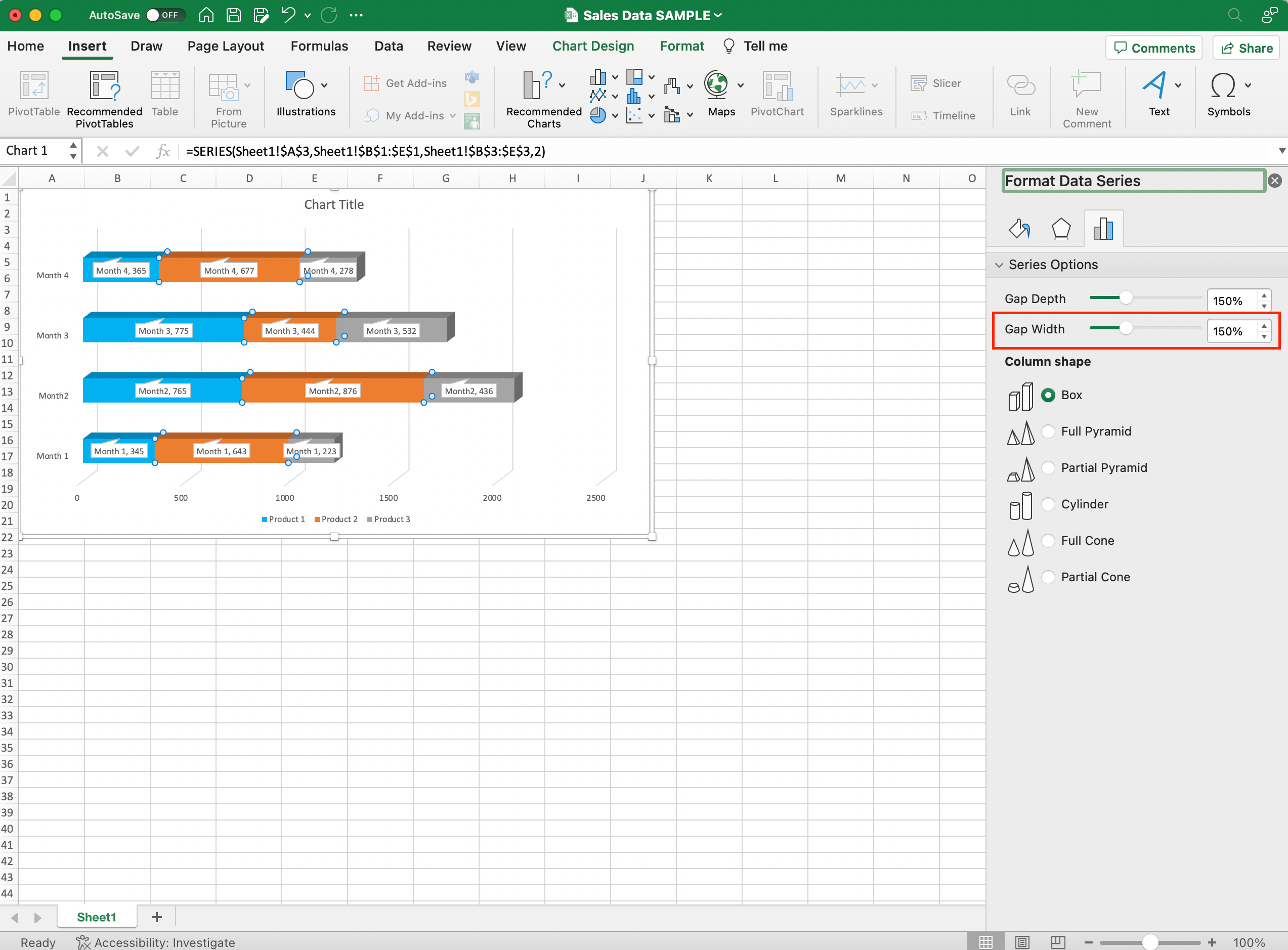
A smaller gap width creates a tighter, more cohesive visual, while a wider gap makes it easier to distinguish individual data points.
Advanced Tip 2: Leverage Excel templates for consistency
If you frequently create stacked bar charts, consider using an Excel template to save time and maintain consistency.
To simply save your customized chart as a template:
- Right-clicking on it.
- Select Save as Template.
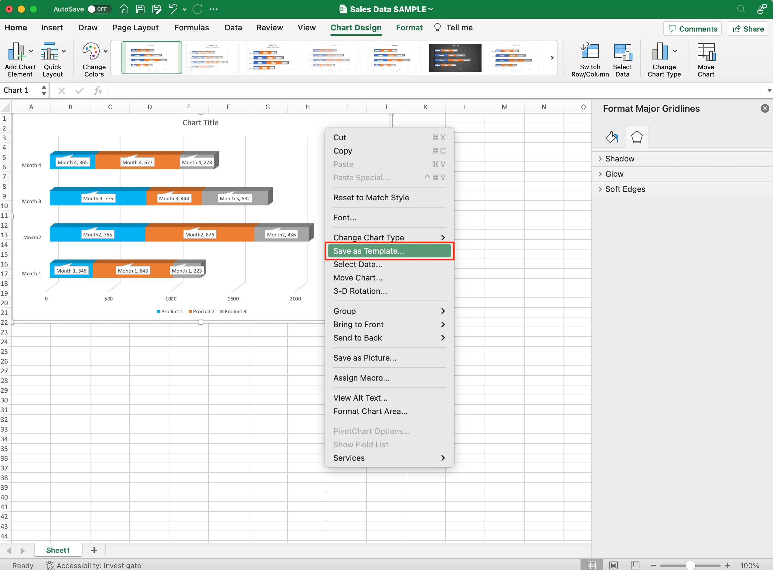
- Choose a location to save the file.
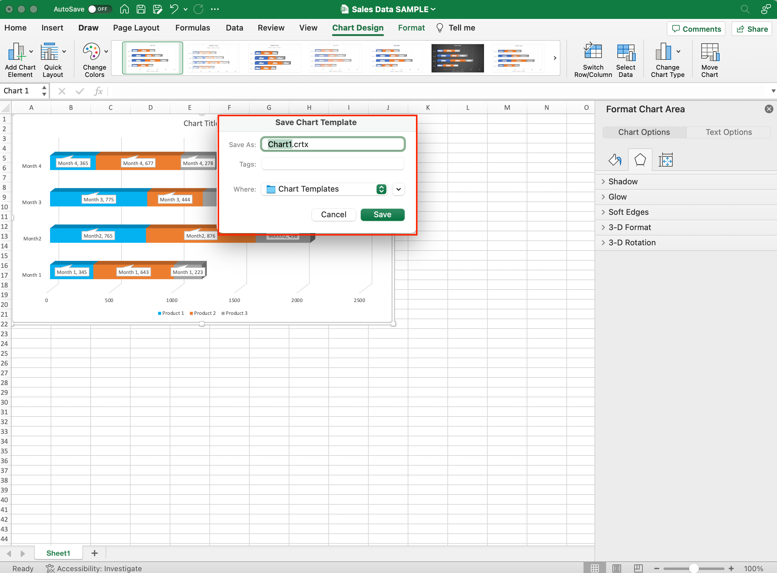
You can then quickly insert your saved template into new workbooks, eliminating the need to recreate and format the chart each time.
By utilizing these advanced tips and tricks, you can master the art of creating stacked bar charts in Excel that are visually appealing, easy to read, and efficiently created.
Final Thoughts
Congratulations! You’ve now unlocked the art of creating compelling stacked bar charts in Excel.
Armed with this newfound skill, you can turn your data into engaging visual narratives that captivate your audience and convey complex information with clarity.
Whether you’re a student, a professional, or simply someone passionate about data, these charts are your trusty companions on the journey to data-driven insights.
So go ahead, experiment, and let your data tell its story. With stacked bar charts in your repertoire, you’re equipped to make your data shine; happy charting!
Have you thought about using Frequency And Proportion Tables In Excel? Check out the below to learn more:
Frequently Asked Questions
What are the steps to create a vertical stacked bar chart in Excel?
To create a vertical stacked bar chart in Excel, follow these steps:
- Select your data.
- Click the “Insert” tab in the Ribbon.
- Choose “Column or Bar Chart” from the “Charts” group.
- Select “Stacked Column.” The vertical stacked bar chart will appear in your worksheet.
What is the process for making a horizontal stacked bar chart in Excel?
To create a horizontal stacked bar chart in Excel:
- Select your data.
- Click the “Insert” tab in the Ribbon.
- Choose “Column or Bar Chart” from the “Charts” group.
- Select “Stacked Bar.” The horizontal stacked bar chart will be displayed in your worksheet.
How to create a stacked bar chart in Excel with 2 or 3 variables?
To create a stacked bar chart in Excel with 2 or 3 variables:
- Organize your data with each variable in a separate column.
- Select the data, including the variables.
- Follow the steps mentioned in the first question to create a vertical or horizontal stacked bar chart.
The chart will display the 2 or 3 variables as separate series within each bar.
Where can I find a stacked bar chart Excel template?
For a stacked bar chart Excel template, you can:
- Visit the Microsoft Office template gallery online and search for “stacked bar chart.”
- Check templates embedded within Excel by clicking the “File” tab, then “New,” and searching for “stacked bar chart.” Choose and download a suitable template.
How can I create a stacked column chart in Excel?
To create stacked column charts in Excel, follow these steps:
- Select your data in Excel.
- Go to the “Insert” tab.
- Click on “Column Chart.”
- Choose the “Stacked Column” chart type from the options.
- Your stacked column chart will appear on the spreadsheet.