Making a stacked column chart with two y-axes in Excel helps you see your data better. It’s super useful when you have different data that need different scales.
The cool part is you can put lots of data on one chart, so it’s easy to see how things relate. Excel makes it look nice and helps you show off your data in a clear way. Your charts will totally impress everyone!
To create a stacked column chart with two Y-axes, you can:

- Prepare the data table.
- Select the entire data table, including headings.
- Create a stacked column chart.
- Select the data series that you want to move to the secondary vertical axis and right-click on it.
- Select “Format Data Series”.
- From the “Format Data Series” dialog box, select the “Secondary Axis” option.
Mastering the skill of making stacked column charts with two Y-axes can be really useful for understanding and presenting data. Excel makes this process easy, so anyone, regardless of their experience, can do it.
Let’s learn how to do it and use this graph to make our data more interesting and informative.

What are Stacked Column Charts
Stacked column charts help you to do the following:
- Compare parts of a whole
- Compare how parts of a whole change over time or across the categories
Take a look at the graph below:
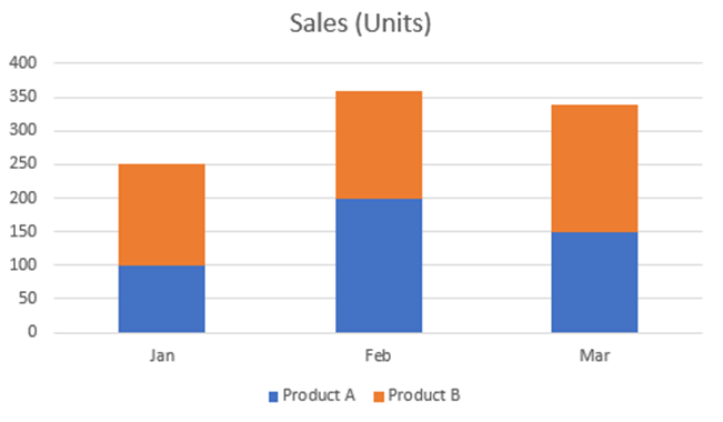
The graph lets you compare how much Product A and Product B are sold monthly. Plus, you can also see how the sales of both products change as time goes on.
In the above graph, there is only one x-axis and one y-axis.

Adding a secondary axis to a stacked column graph is useful when you have two sets of data that are measured in different units or not on the same scale.
It helps prevent one set of data from overwhelming or distorting the other. This way, you avoid any confusion and present your data more effectively.
You can create a stacked column graph with two Y-axes (dual axis chart) in Excel in the following two ways.
- Adding a secondary axis after creating a basic stacked column graph
- Creating a combo chart
Let’s see each method in detail way.
1) Adding a Secondary Axis After Creating a Basic Stacked Column Chart
This method is quite useful when you have already built a stacked column graph and you want separate primary and secondary columns of your graph for better data presentation.
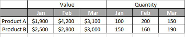
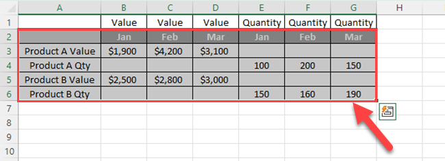
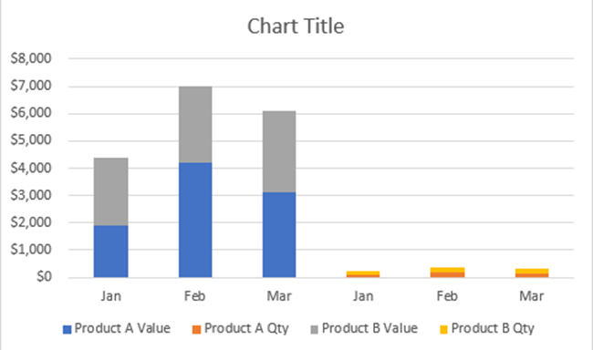
For example, in the below table, you can see the monthly sales value and monthly sales quantity.
If you create a basic stacked column graph for the above data values, it will look like this.
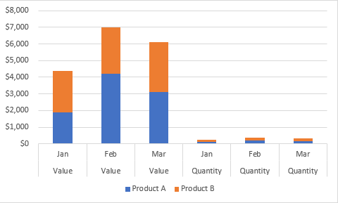
As you can see, quantities and values are not on the same scale, it is difficult to see the patterns of quantity.
Further, sales values are measured in dollars ($) and quantities are measured in units. So, you can’t use a common axis title.
However, you can create a stacked column graph where sales values are shown on the primary y-axis and the sales quantities are shown on the secondary axis.
Let’s break the process down into the following 4 steps:
- Creating a Basic Stacked Column Chart
- Adding a Secondary Axis
- Fine-Tuning the Chart
- Adjusting Number Formats and Units
1) How to Create a Basic Stacked Column Chart
You can follow the steps given below to create a chart with two-axis titles:
Step 1
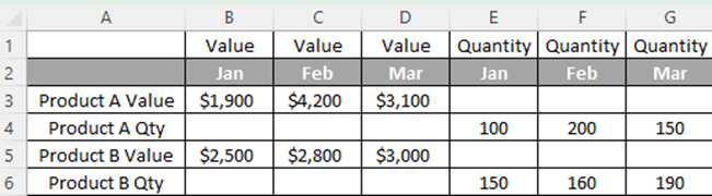
Arrange your data table as follows. You have to move secondary axis data to a new row.
Step 2
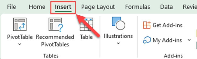
Select the range of cells containing your data, including the headers.
Step 3
Go to the Insert tab in the Excel ribbon.

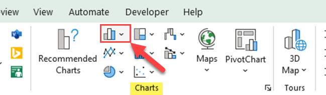
Step 4
Click on the Column or Bar Chart icon in the Charts group.
Step 5
Choose the Stacked Column from the options available.
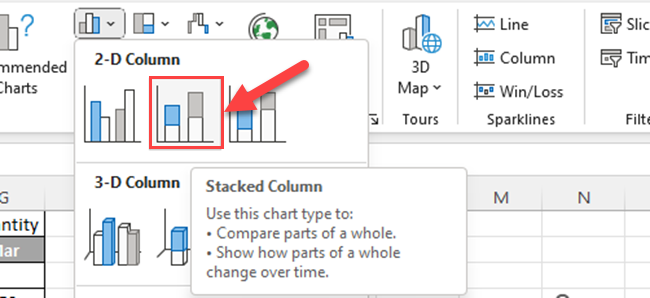
Then, you’ll get a stacked column chart like the one below.
2) How to Add a Secondary Axis
Next, you have to move quantities to the secondary axis. You can do it by following the steps given below:
Step 1
Select one of the quantity legends and right-click on it.
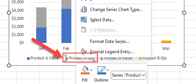
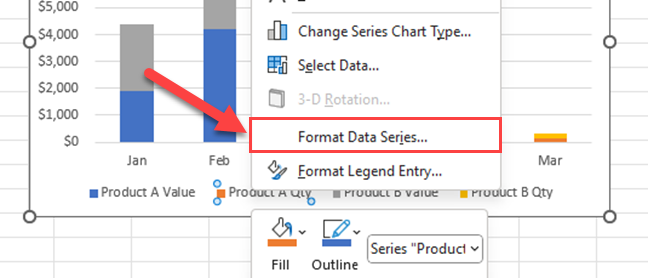
Step 2
Select “Format Data Series…” from the right-click menu.
Step 3
Select “Secondary Axis” from the series options.
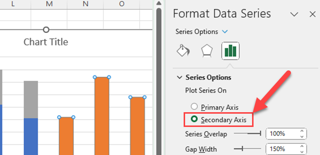
Step 4
Repeat the above three steps for all the data that you want to move out from the primary y-axis.
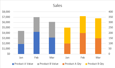
Then, you’ll get the stacked column chart with two y-axes as shown below.
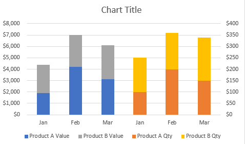
Your next step is to fine-tune the chart
3) How to Fine-Tune The Chart
After creating a stacked column chart with two y-axes in Excel, you can fine-tune it to make it more visually appealing and informative.
One aspect to consider is selecting the appropriate data to display on each axis, so the information is clearly conveyed to your audience.
To select data, click on your chart, and then click on the “Select Data” button that appears in the “Design” tab under “Chart Tools.”
From there, you can add, edit, or remove data series plotted on each axis.
Chart elements are another important factor in fine-tuning your chart.
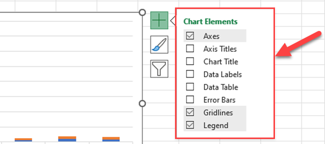
Adding or customizing elements such as axis labels, titles, gridlines, and legends can significantly improve the readability of your chart.
To access and modify chart elements, click on the “+” icon next to your chart or right-click the chart and choose “Add Chart Element.”
Choose the element you want to add or modify and use the options available to customize its appearance.
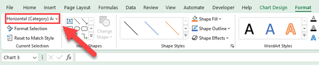
You can double-click on the chart elements of your graph and open the format window of each chart element.
You can also use the “Format” tab and use the dropdown menu from the “Current Selection” group.

4) How to Adjust Number Formats and Units
To create a stacked column chart with two y-axes in Excel, it is essential to adjust the numeric formats and units for clarity and consistency.
This section guides on customizing these settings to improve the chart’s readability.
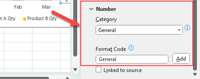
First, it is critical to adjust the number format. Excel offers different options for formatting numbers, such as currency, percentage, or scientific notation.
To access these options, right-click on the axis you want to change, select “Format Axis,” and expand the “Number” category.
From here, choose a format that best suits your data and ensures easy understanding for the viewers.
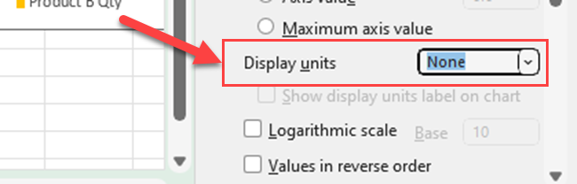
In some cases, it might be necessary to modify the numerical units.
For instance, if dealing with large values (e.g., thousands or millions), consider using a base unit like “K” for thousands or “M” for millions. Changing the base unit simplifies the chart while retaining the necessary information.
In the “Format Axis” option, you can do this under the “Display units” drop-down menu; select the appropriate unit and apply the changes.
Another crucial aspect is adjusting the bottom value of the axis to create a meaningful starting point.
In a stacked column chart, the bottom value is often set to zero to provide a clear and accurate representation of the data.
To customize this value, navigate to the “Format Axis” panel, and under the “Axis Options,” set the “Minimum” value accordingly.
Lastly, using distinct colors for each data series helps differentiate them visually.
For example, you can consider using blue for one series and another contrasting color for the other series.
To change the color of a series, click on the specific data series to select it, and then right-click to choose the “Format Data Series” option. Under “Fill & Line,” select the desired color from the “Fill” options.
After you format your graph with a primary axis and a secondary y-axis, it is more clear for the user.
2) How to Create a Combo Chart
Sometimes you may get a data set that has different units of measurement. In such situations, consider using a stacked column chart along with another chart type.
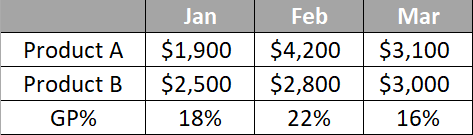
For example, in the below data set, you have sales values and overall gross profit percentages for each month.
Now, let’s see how to create a stack column graph for sales and show the gross profit percentages in the secondary axes.
Step 1
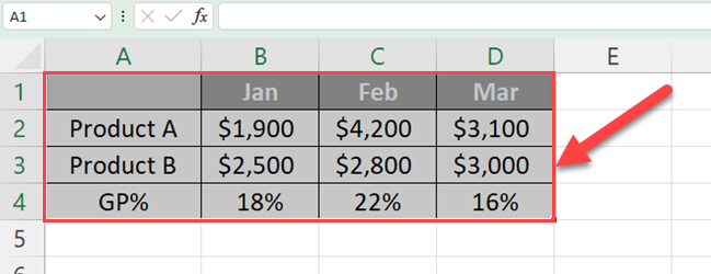
Select the data table including headers.
Step 2
Go to the “Insert tab”.
Step 3
Click on the “Combo charts” icon from the charts group.
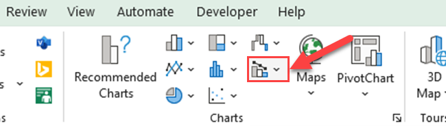
Step 4
Select “Create Custom combo chart…”.
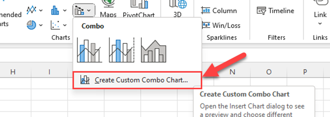
Then, you’ll see the “Insert chart” dialog box.
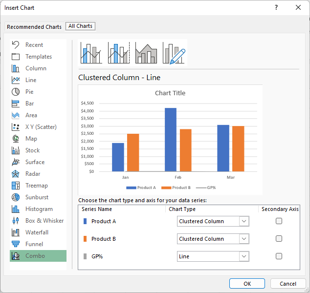
Step 5
Select chart types for each data series.
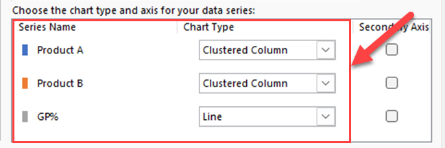
Step 6
Check the boxes of data series that you want to show in the secondary axis.
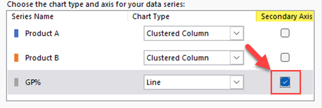
Step 7
Finally, click the OK button.
Now, you’ll get stacked column and line charts in one chart.
Learn filtering and joining data in Excel by watching the following video:
Final Thoughts
Making a stacked column chart with two Y-axes in Excel lets you compare two different sets of data using a picture.
You can either add the secondary axes after creating a stacked column graph or you can directly create a combo chart.
It’s important to set the Y-axes correctly by changing settings in “Format Axis.”
Remember to make things clearer by giving your chart a title, labeling the axes, and adding number labels. Also, consider changing colors and lines to make it easier to understand.
Always double-check your chart to make sure it shows the right information. This method helps you show data well, but you must be careful to avoid misunderstanding.
Frequently Asked Questions
In this section, you will find some frequently asked questions you may have when creating a stacked column chart in Excel.
How do I add a second Y-axis in Excel for a stacked column chart?
To add a second Y-axis in Excel for a stacked column chart, follow these steps:
- Select the chart to open the Chart Tools.
- Click on “Design” and then “Change Chart Type.”
- Choose “Combo” and then “Cluster Column – Line on Secondary Axis.”
- Select “Secondary Axis” for the data series you want to show on the second Y-axis.
- Ensure that the selected series is displayed as a line chart.
- Click “OK” to apply the changes.
What are the steps for creating a dual-axis line chart in Excel?
To create a dual-axis line chart in Excel, follow these steps:
- Create your chart as usual with one data series.
- Select the chart to open Chart Tools.
- Click on “Design” and then “Select Data.”
- Click on “Add” to add a new data series.
- Select the new data series and then click on “Format Data Series.”
- In the “Format Data Series” pane, under “Series Options,” select “Secondary Axis.”
- Click “Close” to finish.
Is it possible to have two Y-axes in a Google Sheets graph?
Yes, you can have two Y-axes in a Google Sheets graph. To do this, follow these steps:
- Create your chart as usual with one data series.
- Select the chart and click on the 3 vertical dots in the top right corner.
- Click on “Edit chart.”
- Under “Customize,” select “Series.”
- Scroll down and choose “Apply to: Series 2.”
- Check the box that says “Use a secondary axis.”
- Adjust the chart options to your liking and click “Close” to finish.
What is the process for creating a stacked clustered column chart with two Y-axes?
Creating a stacked clustered column chart with two Y-axes can be complex.
You may need to create a combination chart of a clustered column chart and a stacked column chart, or utilize third-party tools and add-ins that can provide this specialized chart type.
Can you explain how to add a secondary axis in Excel on a Mac?
To add a secondary axis in Excel on a Mac, follow these steps:
- Select your chart to reveal the Chart Design tab.
- Click on “Change Chart Type” in the Chart Design tab.
- Select “Combo” from the list of chart types.
- Choose the desired secondary axis chart type for the data series that you want to display on the secondary axis.
- Check the box that says “Secondary Axis” for the chosen data series.
- Click “OK” to apply the changes.