Have you heard of an Excel waterfall chart but are unsure how to create one and make it stand out?
Well, you’re in the right place.
This chart type is particularly useful for displaying financial data, such as profit and loss statements or balance sheets, where it can effectively illustrate the “flow” of positive and negative values.

To create a waterfall chart in Excel:
Arrange your data in columns with the base value, increases, and decreases.
Select the data and go to the ‘Insert’ tab.
Click on ‘Waterfall’ chart under the chart options.
Excel will automatically create the waterfall chart, which you can then customize as needed.
But, there is more to it.
In this article, we’ll provide a step-by-step guide to creating a Waterfall Chart in Excel, complete with examples and tips for customization.
So, whether you’re a beginner or a seasoned Excel user, you’ll find the information you need to produce professional and insightful Waterfall Charts for your data.
Let’s dive in!


What is a Waterfall Chart?
A waterfall chart is a data visualization tool that shows how positive and negative values in a dataset affect the cumulative total. It is useful for understanding the effect of different variables on a total value over time or across categories.
The chart is called a waterfall chart because the columns appear to float above or below the previous ones, creating a “waterfall” effect. They are also sometimes referred to as bridge charts.
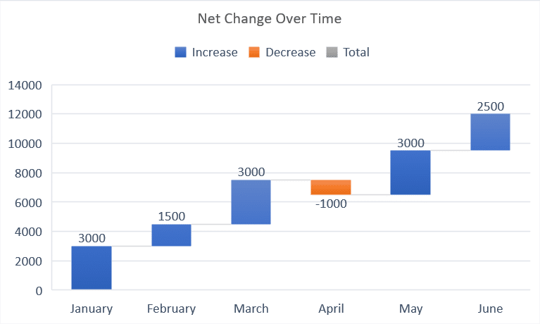
The following is an example of a typical waterfall chart:
3 Steps to Make a Waterfall Chart in Excel
In this section, we will go over 3 steps to creating waterfall charts in Excel.
The steps are given below:
Step 1: Prepare the Data
Ensure your data is structured, such as separate columns for time, increase in quantity, decrease in quantity, and net change.
Your data should look something like the following:
Step 2: Select The Data
Highlight the data range you want to include in the chart.
In our case, this would be the Month and Net Change columns.
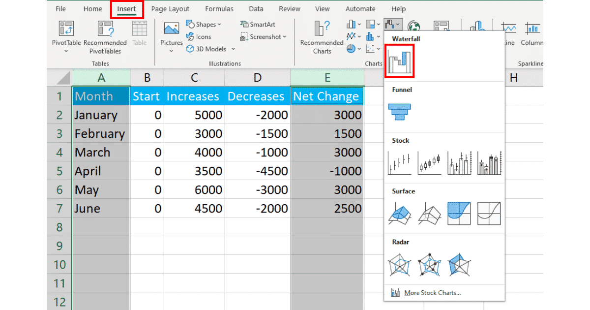
Step 3: Insert Waterfall Chart
Go to the Insert tab in the Excel ribbon.
Click on the Waterfall chart icon found in the Charts group.
Excel will generate a default waterfall chart.
Now, you can adjust the chart elements, layout, and style as needed. You can also change the starting and ending data points by restricting the range of your cells.
The horizontal axis represents time, whereas the vertical axis represents net change.
Step 4: Customizing The Chart
You can customize the chart according to your requirements.

To change the chart title, double-click on it and write a relevant title.
You can also choose a preset for your visualization by clicking on the chart, selecting Chart Design and choosing your desired design.
You can play around with customizing your chart with chart tools until you get your desired waterfall or bridge chart.
When to Use a Waterfall Chart in Excel
Sure, they look pretty, but like everything, there is a time and a place.
There are 5 situation in which the use of a waterfall chart is ideal:
Showing Financial Results: It is commonly used to display the components of financial statements, such as revenue, expenses, and net income.
Comparing Actual vs. Target Data: The chart can help you compare actual values to target values, revealing gaps and highlighting areas for improvement.
Illustrating Profit and Loss Scenarios: It is ideal for visualizing how individual elements contribute to a company’s profit or loss.
Presenting Stacked Data: The chart is effective in presenting stacked data in a visually appealing and easy-to-understand manner.

Got your chart look schmick and wan to take your Excel skills to the next level, learn how to count distinct values in Excel by watching the following video:
Final Thoughts
Waterfall charts in Excel are a powerful way to visualize changes in values over time or between categories.
By following the step-by-step guide in this article, you can create waterfall charts with ease, allowing you to gain deeper insights into your data and communicate your findings more effectively.
But, make sure you prepare your data correctly, select the appropriate chart type, and customize your chart to suit your needs.
With these techniques at your disposal, you can create professional and insightful waterfall charts that will enhance your data analysis and presentations.
Happy Waterfalling! (if that’s even a thing)
Frequently Asked Questions
In this section, you’ll find some frequently asked questions that you may have when creating a waterfall chart in Excel.

What is the purpose of a waterfall chart?
The purpose of a waterfall chart is to track the positive and negative changes in a value over time or between categories.
It helps to visualize the cumulative effect of these changes, making it easier to understand the overall trend and the individual contributions of each value. With dynamic waterfall charts, you data remains updated for stakeholders to review at all times, as long as the range is clearly defined.
How to create a waterfall chart with negative values?
To create waterfall chart with negative values, you can follow these steps:
Prepare your data with positive and negative values, including the starting value and the final total.
Select your data range, including the starting value, changes, and the final total.
From format data series pane, go to the Insert tab on the Excel ribbon and click on the Waterfall Chart icon.
Choose the appropriate waterfall chart type from the dropdown menu.
How to add data labels to a waterfall chart?
To add data labels to a waterfall chart, you can follow these steps:
Create a horizontal or vertical waterfall chart using the steps above.
Right-click on any column in the chart and select Add Data Labels.
You can then customize the data labels by right-clicking on them and selecting Format Data Labels.
What are the alternatives to a waterfall chart?
Some alternatives Excel charts to a waterfall chart include:
Column Chart: A basic column chart can be used to show changes in values over time or between categories.
Line Chart: A line chart is useful for displaying trends over time.
bar chart: Similar to a column chart, a bar chart is ideal for comparing values between categories.
Area Chart: An area chart is effective for visualizing the magnitude of values over time.