Class width is an essential component when organizing data into frequency tables. It helps to determine the range of values in each class or category.
To find the class width in Excel, use the formula (Max – Min) / n, where:
Max is the maximum value in the dataset.
Min is the minimum value in the dataset.
n is the number of classes.
Excel offers various functions to make it easy to calculate class width. The MAX and MIN functions will determine the highest and lowest values in your data set.

When you couple these functions with the simple math formulas in this article, you will soon be quickly creating frequency distribution tables.
Let’s go!
Understanding Class Width and Its Importance in Excel
Class width refers to the size of an interval or class in a dataset. There are three broad steps to calculate class width:
Find the range of the dataset by subtracting the minimum value from the maximum value.
Decide on the number of classes (n) you want in your frequency distribution.
Divide the range by the number of classes (n).

Role of Class Width in Frequency Distribution and Graphs
Class width plays a crucial role in creating frequency distribution tables and graphical representations of data, such as histograms.
A frequency distribution organizes your data into classes and displays how often each class occurs.
There are three ways that class width affects frequency distributions:

Selecting different class widths can highlight various trends or patterns in the data.
Predefining class width offers a consistent and fair comparison of different datasets.
Appropriate class widths help in understanding data better.
Keep in mind that choosing the number of classes and corresponding class widths is a trade-off between simplicity and granularity.
Too few classes may oversimplify the data, while too many classes might make it difficult to discern patterns and trends.
Now that we’ve gone over what class width does and its role in data analysis, let’s go over how to prepare your data for calculating class width in the next section.
2 Steps to Prepare Your Dataset in Excel
Before calculating class width in Excel, it is crucial to have your dataset ready. There are two stages to preparing the data:
Import your raw data into Excel.
Sort and organize the data.
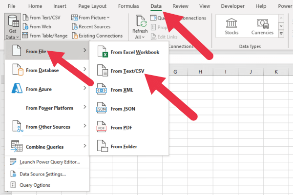
1. How to Import Raw Data
To import raw data from an external file into Excel, follow these simple steps:
Open a new Excel workbook.
Click on the cell where you want your dataset to start, such as A1.
From the data tab, select ‘Import External Data’ or ‘Get External Data.’
Browse to locate the file containing your data and import it into the spreadsheet.
Ensure all data points (scores or values representing your dataset) are in separate cells.
2. How to Sort And Organize Your Data
Once your raw data is in Excel, sorting and organizing it is essential for ease of calculation and analysis. Here’s how to sort your data:
Click on any cell inside your dataset to make it active.
Navigate to the ‘Data’ tab and click on ‘Sort.’
Choose the column representing your data points (scores) and select ‘Sort Smallest to Largest’ or ‘Sort Largest to Smallest.’
Click ‘OK.’ Excel will now organize your dataset in ascending or descending order according to your preference.

To better understand your data, you can consider the following organizational steps:
Categorize your data points into classes or bins, which will later define your class width.
Use conditional formatting to highlight specific values or patterns within your dataset.
Create a table structure in Excel to easily filter, analyze, and visualize your data.
With your raw data imported, sorted, and organized, you are now ready to calculate class width and further analyze your dataset in Excel.
Sample Data
This article will use sample data that represents the ages of participants in a survey.
These are the ages of the participants: 18, 21, 30, 35, 42, 48, 55, 62, 70, 75.
To follow along, copy these values into column A of a new spreadsheet and sort them in ascending order.
How to Calculate Class Width in Excel
Remember, these are the three broad steps:
Find minimum and maximum values of your data set.
Determine the number of classes.
Apply the class width formula.
Let’s work through an example in Excel.
1. Find Minimum and Maximum Values
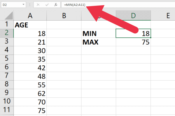
In Excel, you can use the MIN and MAX functions with these steps:
Select an empty cell and type =MIN(range), where range is the range of cells containing your data.
Press Enter to get the minimum value.
Select another empty cell and type =MAX(range).
Press Enter to get the maximum value.
This picture shows the calculations on the sample data. The minimum age is 18 and the maximum is 75.

2. Determine How Many Classes
Next, you need to determine the number of classes (n) for categorizing your data.
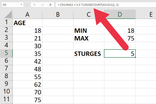
One common method is to use the Sturges’ Rule. This is a guideline to determine how many classes or categories to use when creating a frequency distribution table or histogram. It was proposed by Herbert A. Sturges in 1926.
This is the rule:
n = 1 + 3.3 * log10(N) where N is the number of data points.
To apply this in Excel:
Select an empty cell and type =1+3.3*LOG10(count(range)), replacing range with your data range.
Round up the result using =CEILING(value,1), where value is the cell with the result from step 1.
With our sample of ages in cells A2 to A11, the formula looks like this:
= 1 + 3.3 *LOG10(COUNT(A2:A11))
The result is 4.2 which rounds up to 5. This picture shows the formula combined with the CEILING function:
3. Apply the Class Width Formula
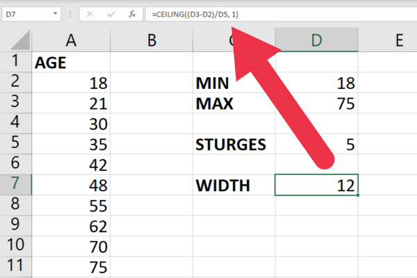
Now you have the necessary values to calculate the class width. Use the formula:
Class Width = (Max – Min) / n
In Excel, select an empty cell and type =(max-min)/n
Replace Max with the cell containing the maximum value.
Replace Min with the cell containing the minimum value.
Replace n with the cell containing the number of classes.
You can then round up the result using =CEILING(value, 1).
Using the sample data in the picture below, the formula is:
=CEILING((D3-D2)/D5, 1)
The result with our sample data rounds up to a class width of 12.
With these values, you can now create a frequency distribution table or histogram using intervals of the calculated class width, which is what we’re going to cover in the next section.
How to Create a Frequency Distribution Table
The next steps for creating a frequency distribution table are to:
Establish the upper and lower boundaries.
Find the class midpoints.
Create a frequency for each class.
Let’s break that down.
1. Establish Class Boundaries
To create the first class boundary:
Start with the lowest value in your dataset.
Add the class width to create the upper boundary for the first class interval.
For the next class intervals, use the consecutive values for the lower and upper boundaries adding the class width each time.
With our sample data, the minimum age is 18. The upper limit is 30 (18 + 12), so the first class will be 18-30.

These are the five class boundaries (lower and upper limits):
Class 1: 18-30 (covering ages 18 to 29)
Class 2: 30-42 (covering ages 30 to 41)
Class 3: 42-54 (covering ages 42 to 53)
Class 4: 54-66 (covering ages 54 to 65)
Class 5: 66-78 (covering ages 66 to 77)
2. Find Class Midpoints
Class midpoints are the central points of each class in a frequency distribution. To calculate the class midpoint for each class, you can use the following formula:
Midpoint = (Lower Boundary + Upper Boundary) / 2
Use this formula to fill the midpoint column in your frequency distribution table with the calculated midpoints for each class interval.
These are the midpoints for our consecutive classes:
Class 1 Midpoint: (18 + 30) / 2 = 24
Class 2 Midpoint: (30 + 42) / 2 = 36
Class 3 Midpoint: (42 + 54) / 2 = 48
Class 4 Midpoint: (54 + 66) / 2 = 60
Class 5 Midpoint: (66 + 78) / 2 = 72
3. Count the Frequency for Each Class
In Excel, you can use the FREQUENCY function to count the frequency for each class interval. This is the syntax:
=FREQUENCY(data_array, bins_array)
data_array is the range of your dataset.
bins_array is the range of your upper boundaries.
Follow these steps:
Select a range equal to the number of class intervals in your table and enter the formula.
Press Ctrl+Shift+Enter to display the frequency for each class interval.
Add the frequency values to your frequency distribution table.
This picture shows the sample data with the upper boundaries of the five classes in column B.
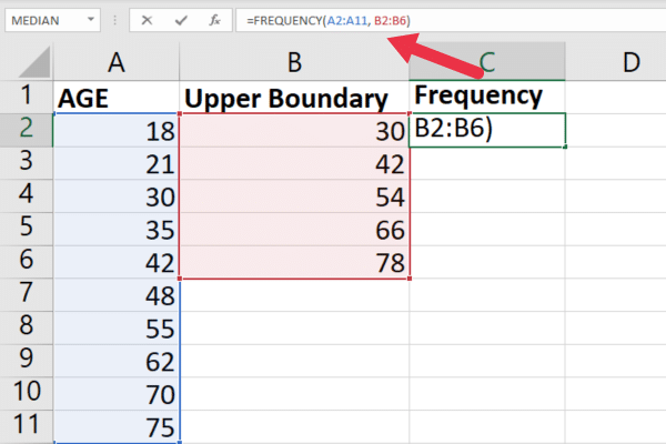
This formula has been input into cell C1.
=FREQUENCY(A2:A11, B2:B6)
The next step is to press Ctrl+Shift+Enter to enter the formula as an array formula.
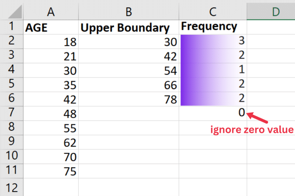
Excel surrounds the formula with curly braces {} to indicate that it’s an array formula.
You may get an extra category with a frequency of 0, which can be safely ignored. The Excel FREQUENCY function also looks for values that are exactly equal to the highest upper limit.
The sample data has no value equal to the final upper boundary, so an extra category of zero frequency is created.
Now that we have created a frequency distribution table, let’s look at ways you can visualize one in Excel in the next section.
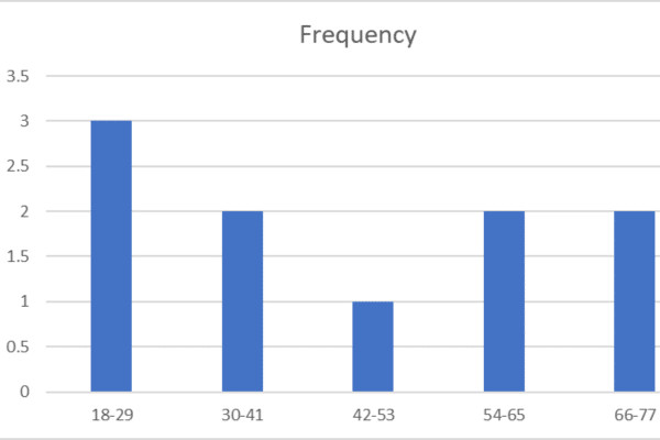
How to Visualize Your Frequency Distribution
To visualize your frequency distribution in Excel, you’ll first want to create a graph based on your frequency table.
Follow these steps:
Organize your data in a two-column table, with one column for the classes and another for their frequencies.
Select the entire data range, including the column headers.
Go to the Insert tab in the Excel toolbar.
Choose the appropriate graph type for your data, such as a column chart or a bar chart, from the Charts group in the toolbar.
Click on the chart type to insert the graph into your spreadsheet.
For our sample data, I clicked on the “Recommended Charts” option to have Excel determine the best choice.
Excel chose a Clustered Column bar chart, which is exactly what is needed for a histogram.
Once you’ve generated the chart, you may want to lock the cells that make up the data to avoid them being overwritten.
How to Customize The Graph
You can also customize the chart’s appearance further by changing the titles, colors, fonts, or other formatting options available in Excel.
Follow these steps:
Click on your graph to activate the Chart Design and Format tabs in the Excel toolbar.
Use the Chart Design tab to change the chart layout or style, add a chart title, and modify axis titles or data labels.
Utilize the Format tab to adjust the color scheme or formatting of elements within the graph.
You can also resize the graph and set the print area for optimum printed output.
3 Tips for Analyzing the Distribution Graph
Here are three tips for analyzing your distribution graph:
Examine the shape of the graph to identify any trends or patterns in the distribution, such as skewness or symmetry.
Look at the height of each column or bar to determine the relative frequency of each class.
Pay attention to the horizontal axis to evaluate the range and class width of your frequency distribution.
By following these steps and considering the features of your graph, you’ll be able to effectively visualize and analyze frequency distributions in Excel.
This allows you to make informed interpretations and decisions based on your data.
More About Frequency Distribution Tables
For a more complex example using Power BI, check out this article on using proportion and frequency tables in Excel.
This video walks through creating frequency and distribution charts:
Final Thoughts
Finding the class width and creating a frequency distribution table in Excel is a valuable skill when working with large datasets.
You have learned how to leverage Excel’s built-in functions and charting tools to analyze and visualize frequency tables in a simple and efficient manner.
This allows you to identify patterns and trends in your data that may otherwise be difficult to discern.
And just like that, you’re now well-equipped to calculate class width in Excel like a true champ! No more scratching your head over how to organize your data into neat, manageable classes.
Excel is a powerhouse brimming with hidden gems that can make your life so much easier. So, don’t stop here! Keep exploring, read our other guides on Excel, and most importantly, keep having fun with it.
Here’s to making ‘Excel-lent’ progress on your data journey!