Calculating relative frequency is a fundamental concept in statistics, providing valuable insights into data distribution.
In Excel, you can find relative frequency by dividing the frequency of each category by the total number of observations and then formatting the result as a percentage.
To find the relative frequency, first, calculate the frequency of each category or value using the COUNTIF function. Next, compute your dataset’s total number of observations using COUNTA (for any value) or COUNT (for numeric values only). Finally, divide the frequency of each category by the total number of observations to get the relative frequency.

In this article, we will walk you through the process of finding relative frequency, and we will go over multiple methods with demonstrations to help you better understand the concepts.
Let’s go!

What is a Relative Frequency?
If you know your stuff, feel free to scroll down, but for those of you new to this, relative frequency is a statistical measure that shows the proportion or percentage of times a value occurs in a dataset relative to the total number of observations.
It basically helps you to understand how frequently a specific event or value appears compared to the entire set of data.

Imagine you have a small dataset of colors chosen at random: Red, Blue, Red, Green, Red
To calculate the relative frequency of each color:
Total Observations: 5
Frequency of Red: 3 (because Red appears 3 times)
Relative Frequency of Red: Frequency of Red / Total Observations = 3 / 5 = 0.6 or 60%
This means Red makes up 60% of the dataset, indicating how common or frequent Red is compared to the total number of picks.

4 Methods to Find Relative Frequency in Excel
In this section, we will go over 4 methods to find the relative frequency in Excel.
The 4 methods are:
Using Basic Division
Using the FREQUENCY Function
Using PivotTable
Using COUNTIF and Helper Columns

Method 1: How to Find Relative Frequency Using Basic Division
This is the most straightforward way of finding relative frequency in Excel is using the basic division.
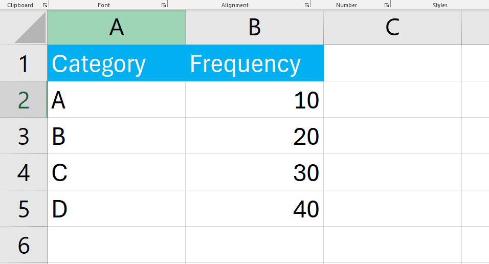
Suppose we have a set of data representing different categories and their corresponding frequencies.
To find relative frequency using this method, follow the steps given below:
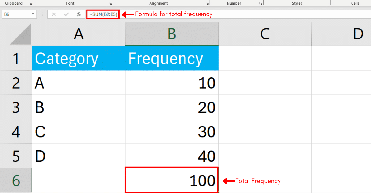
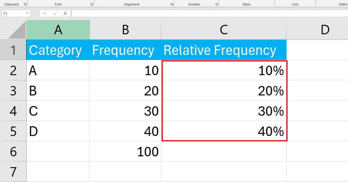
Step 1: Calculate the Total Frequency
Before calculating the relative frequencies, you need to find the total frequency of all categories combined. You can do this by using the SUM function in Excel.
The formula in our case will be:

=SUM(B2:B5)Enter the formula to Excel to find the total frequency in Excel.
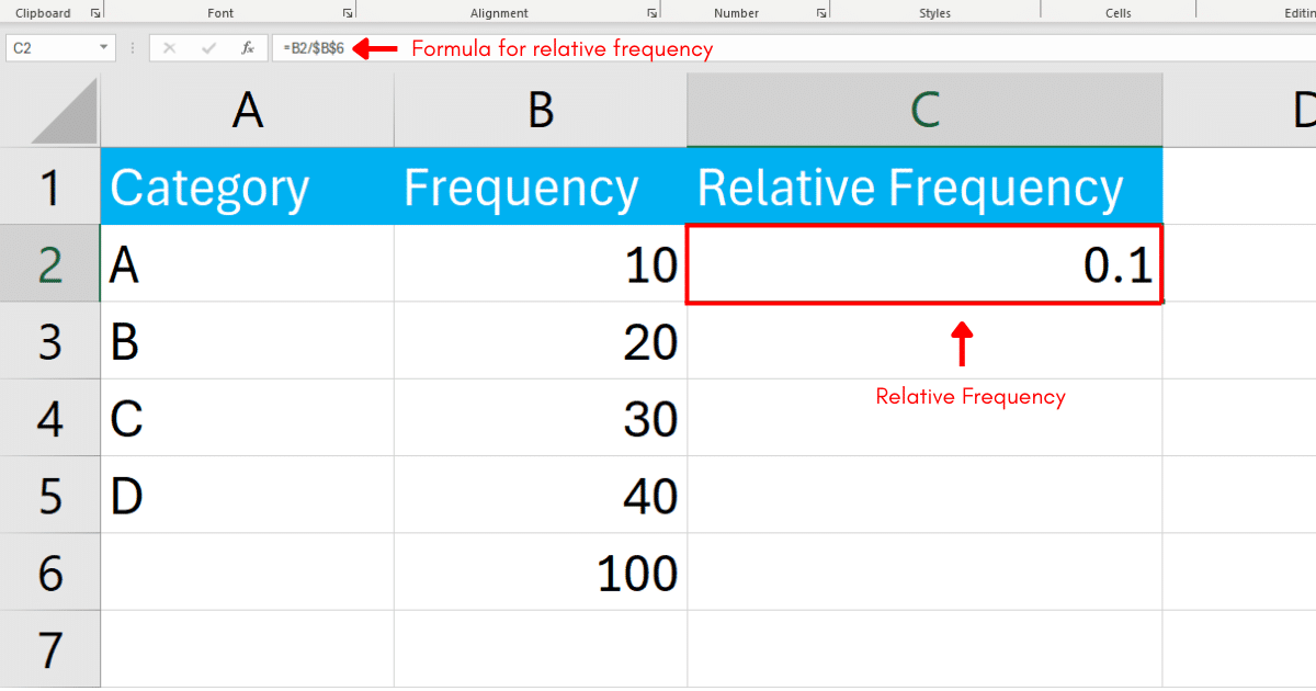
Step 2: Calculate The Relative Frequency
The relative frequency of each category is calculated by dividing the frequency of that category by the total frequency.
You can do this by entering a formula in a new column next to your frequencies.
In cell C2, enter the formula to calculate the relative frequency for the first category:
=B2/$B$6Press Enter and Excel will calculate the relative frequency.
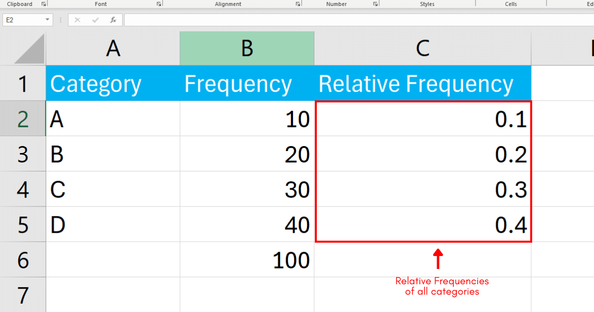
Drag the fill handle (the small square at the bottom right corner of the cell) down to fill the formula for the other categories in column C.
Step 3: Format As Percentages
You can also display relative frequencies as percentages.
To do this, select the cells in column C. Right-click and choose Format Cells.
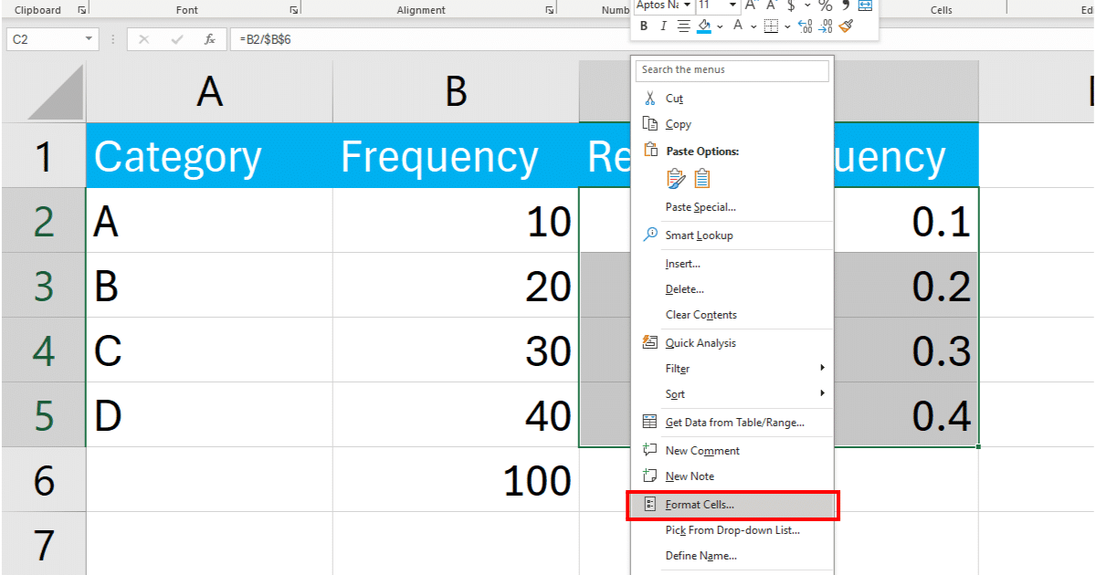
In the Format Cells dialog box, select ‘Percentage’ and specify the number of decimal places you want.
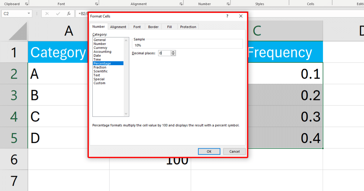
Click OK and Excel will display the relative frequencies as percentages.
Method 2: How to Find Relative Frequency Using The FREQUENCY Function
You can also use the FREQUENCY function to find the relative frequency in Excel.
The FREQUENCY function calculates how often values occur within a range of values and returns a vertical array of numbers.
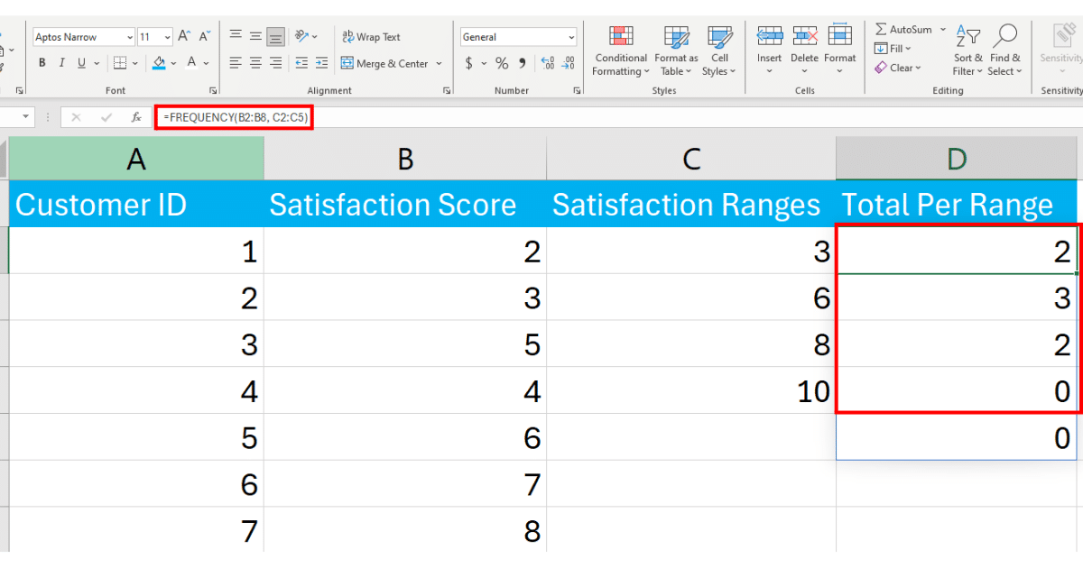
Assume we collected satisfaction scores for customers. The scores are distributed across a scale of 1 to 10.
Scores Distribution:
1-3: (Unsatisfied)
4-6: (Neutral)
7-8: (Satisfied)
9-10: (Highly Satisfied)
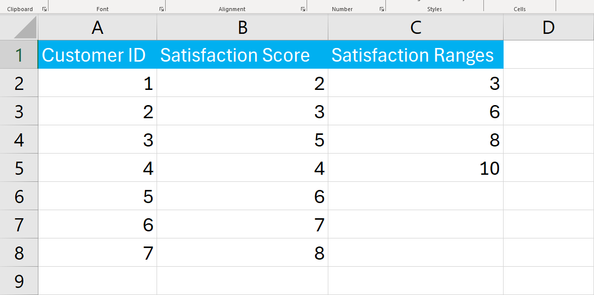
Column C contains the bins or scores distribution.
Enter the FREQUENCY formula in the formula bar:
=FREQUENCY(B2:B8, C2:C5)Press Enter.
This will calculate the total number of customers in each segment.
Next, calculate the total count of responses:
=COUNT(B2:B8)In Excel, the calculation looks like the following:

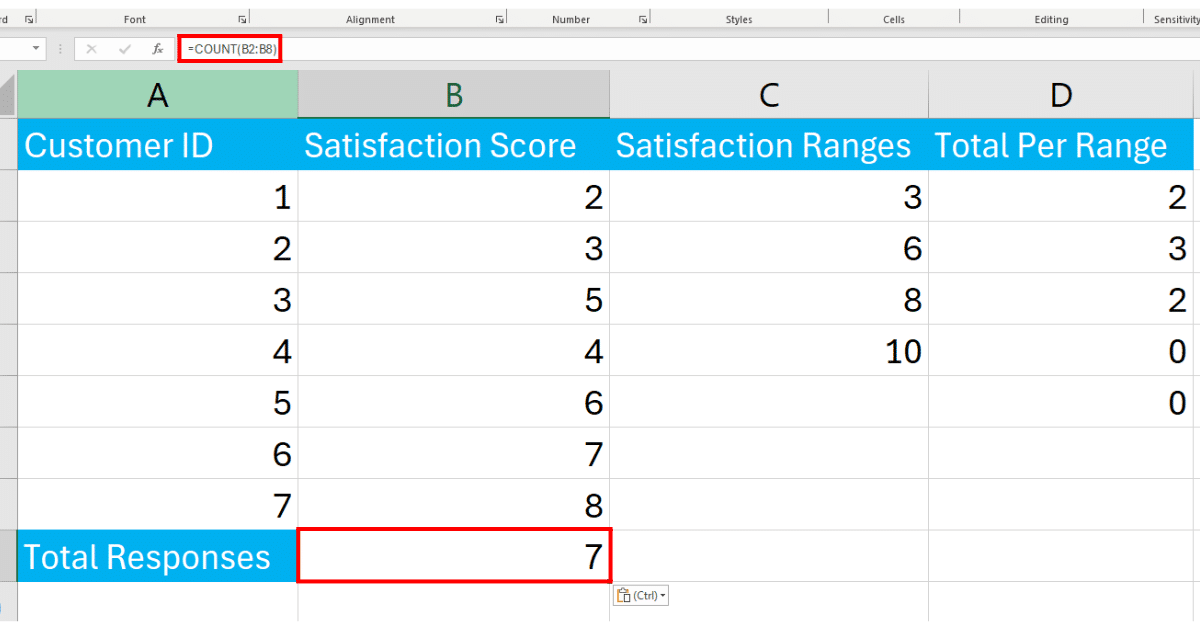
In cell E2 next to the first frequency result, calculate the relative frequency:
=D2/$B$9In Excel, the calculation looks like the following:

Drag down the formula from E2 to E5 cell references to apply it to all frequency results.
Method 3: How to Find Relative Frequency Using PivotTable
Another method to find the relative frequency in Excel is to use a Pivot Table.
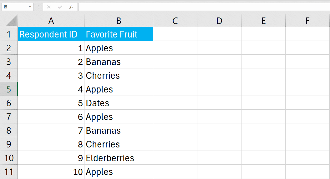
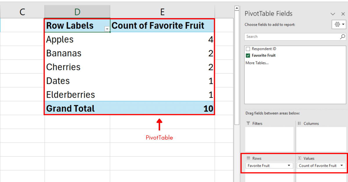
Suppose we have a survey of favorite fruits among a group of people. The dataset is given below:
Start by highlighting cells A1:B11. Go to the Insert tab and click PivotTable.
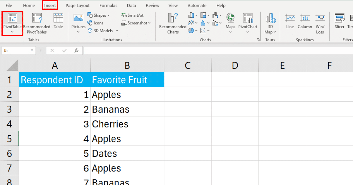
Choose to place the PivotTable in the same worksheet.
Click OK to insert the PivotTable.
Next, drag Favorite Fruit to the Rows area to list all unique fruits. Drag Favorite Fruit again to the Values area to count the number of times each fruit is listed.
To calculate relative frequencies, divide the total number of fruits by the total number per fruit.
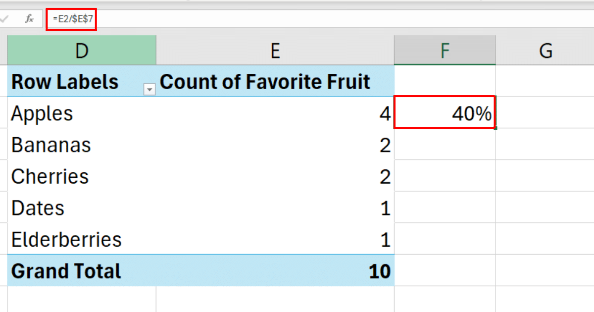
Drag this formula down to apply it to all fruits in the PivotTable.
The final output will be:
Method 4: How to Find Relative Frequency Using COUNTIF With Helper Column
You can also find the relative frequency using the COUNTIF function with helper columns.
This approach involves creating additional columns next to your original data to calculate frequencies and relative frequencies.
Follow the steps below to find relative frequency using COUNTIF with helper columns:
Step 1: Create a Frequency Table
Next to your original data, create a table that lists each unique fruit once.
Then, use a count formula to determine the frequency of each fruit.
The formula will be:
=COUNTIF($B$2:$B$11, "Apples")In Excel, the calculations looks like the following:
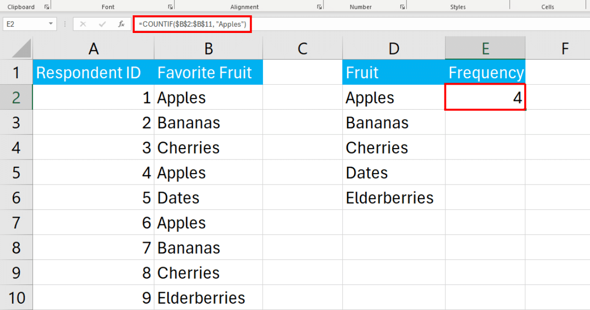
Find the frequency of the rest of the fruits as well to complete the frequency table.
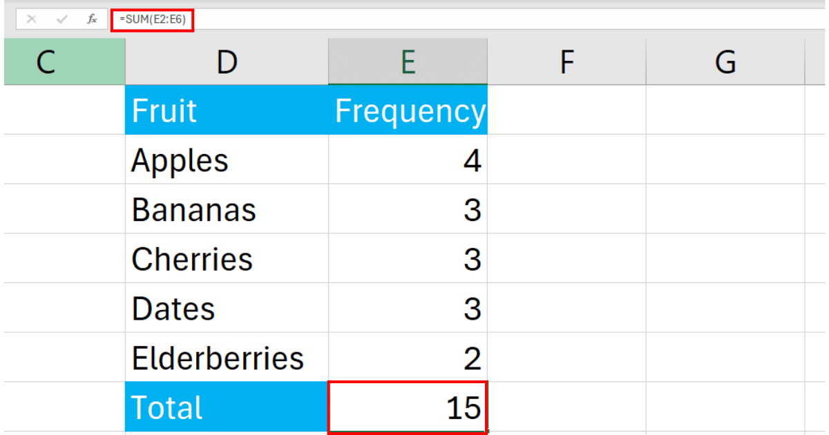
Step 2: Calculate Total Frequency
Below your frequency table, calculate the cumulative frequency using the SUM function.
=SUM(E2:E6)In Excel, the calculation looks like the following:
Step 3: Calculate Relative Frequencies
Next to your frequency column, create another column for relative frequencies.
The formula for relative frequency will be:
=E2/$E$7Where E7 is static cell reference.
In Excel, the calculation looks like the following:
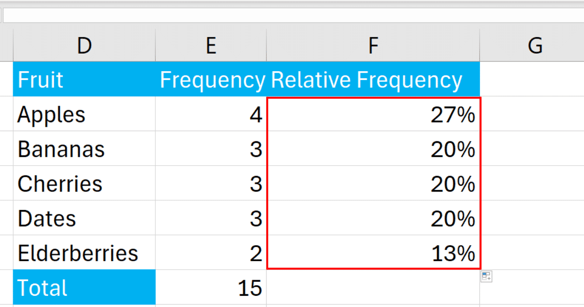
Use the fill handle to drag the formula down to apply it to the rest of the column as well.
The final output will be:
How to Visualize Relative Frequency
Visualizing relative frequency in your data can provide insightful and easily digestible information.
Excel offers several ways to create visual representations, such as bar charts, pie charts, and histograms, which are particularly useful for displaying the distribution of data.
Follow the steps below to visualize relative frequency:
Step 1: Prepare Your Data with Relative Frequencies
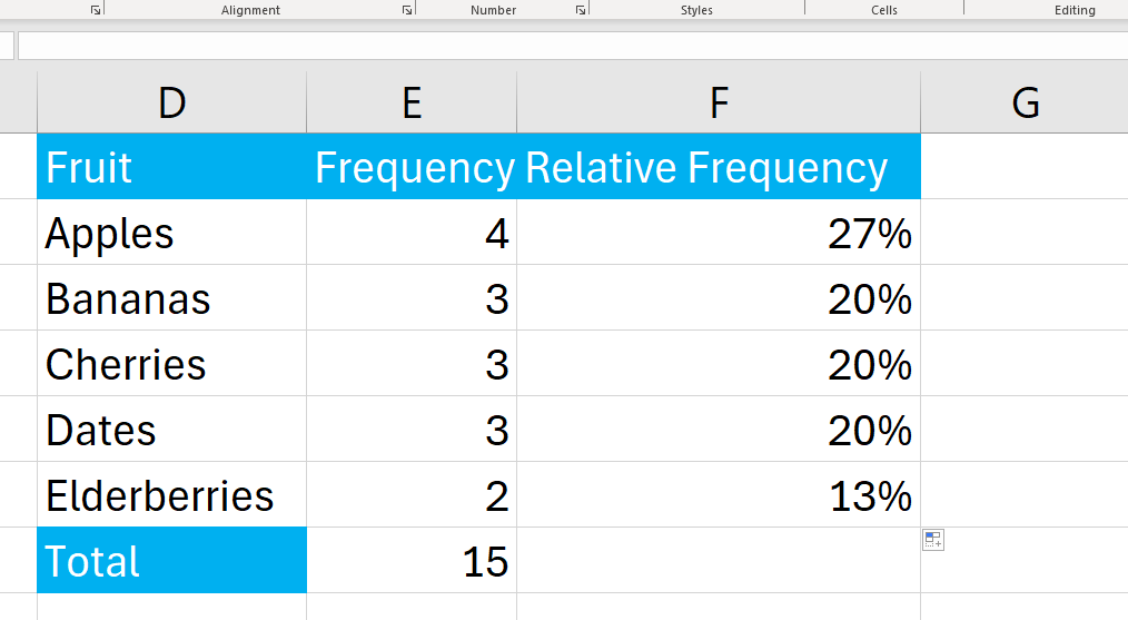
Assuming you have followed the steps to calculate the relative frequency distribution table using helper columns, your Excel sheet might look something like this:
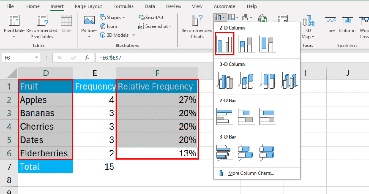
Step 2: Insert a Bar Chart
Highlight the fruits cell range and their corresponding relative frequency column.
Go to the Insert tab, click on the Bar Chart icon, and choose the style of bar chart you prefer. A 2-D bar chart is often a clear choice for displaying this type of data.
After inserting the chart, you can use the Chart Design and Format tabs to customize its appearance such as axis labels.
Apart from bar charts, you can also create relative frequency histograms, pie charts, and line charts to show relative frequencies.
Learn how to filter data using anti-join in Excel with Power Query by watching the following video:
Final Thoughts
Finding relative frequency in Excel is a crucial skill that enables you to understand data distribution.
The process involves creating a frequency distribution, calculating the relative frequency using appropriate formulas, and representing the data in a meaningful way, such as with a bar chart or histogram.
By following the step-by-step instructions in this article, you can confidently calculate and visualize relative frequencies in Excel. This will not only enhance your data analysis capabilities but also improve your ability to draw valuable insights from the data at hand.
So, keep practicing and exploring the various Excel features and functions mentioned in this article to gain a deeper understanding of relative frequency and other statistical concepts.
Happy number crunching!
Frequently Asked Questions
In this section, you will find some frequently asked questions you may have when finding the relative frequency in Excel.
How do you get the relative frequency in Excel?
To get the relative frequency in Excel, divide the frequency of each item by the total count.
You can use the formula COUNTIF(range, criteria) to count the number of occurrences of each item, and then divide this count by the total count.
How do you calculate relative frequency in Excel for two columns?
To calculate the relative frequency in two columns, you can combine the above methods.
First, get the frequency for each item in the first column using the COUNTIFS function, and then divide the count by the total count of the second column.
What is the relative frequency formula in Excel?
The relative frequency formula involves getting the frequency of each item in a data column and then dividing that frequency by the total count of the data sample.
You can use two functions – COUNTIF and SUM – for this.
For more detail, please refer to the section “Step 2: Calculating the Relative Frequency With Microsoft EXCEL” in the article.
Step 1: Make A Frequency Table
Step 2 Calculating the Relative Frequency With Microsoft Excel
How to calculate cumulative relative frequency when using Excel
To calculate the cumulative relative frequency in Excel:
Calculate the relative frequency for each item in a data sample as described above (using COUNTIF and dividing by the total count).
Now, create a new column in the PivotTable.
In the new column, calculate the cumulative relative frequency by adding the relative frequencies of all previous items to the relative frequency of the current item.
How to use relative frequency formula in tables and charts?
You can use the relative frequency formula in tables and charts as follows:
Create a PivotTable as shown above.
You can then create a bar chart or a pie chart using the relative frequencies as the data source.
For Pie Charts: After choosing your chart type, go to “Show Labels” in the chart options and select “Percentage.” This will display the relative frequencies as percentages in the pie chart.
For Bar Charts: You can also display the percentages in the bar charts by clicking on the “Chart Tools” tab in the ribbon and selecting “Insert Data Labels.” Then, choose the “Design” tab and click on “Data Labels,” and select the “Outside End” option.
Create them as shown in the above sections.
Use Pie charts to display data as a whole and show relative frequencies to make comparisons visually.