
In this blog, I’ll show you a really easy and unique visualization technique that you can do in Power BI. Here I use stacked column charts and dynamic filters to make this work seamlessly. You may watch the full video of this tutorial at the bottom of this blog.
This example came from a Power BI challenge that we held at Enterprise DNA, and this was one of my submissions. The challenge was around an HR consultation process, and the visualization technique enables me to show a change from one state to another.
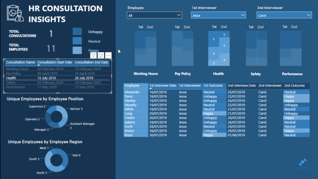
What I mean by “one state to another state” is that there were two interviews per consultation (when I say state, I mean, regions). So, one state was the first interview, and another state was the second interview. I wanted to create a visualization that would showcase the change in how people felt about the consultation for each state.

This visualization technique is significant because it could be used in many different scenarios. It took a bit of out-of-the-box thinking around visualizations to actually showcase data like this in a more compelling way.
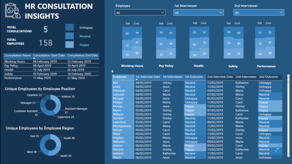
Showing Change In One State To Another State
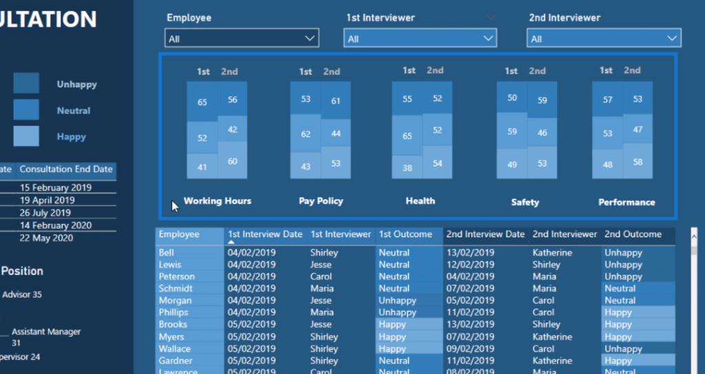
What I’m talking about here is the top layer of the report. Here, we have working hours, pay policy, health, safety, and performance. We have the first and second interviews, and the numbers under them represent the feelings (unhappy, neutral, happy) of the people during the interview, respectively.
The report is also dynamic. If I select a particular interviewer, for example, the page will update accordingly. Moreover, we also have some granular details about each individual down below.
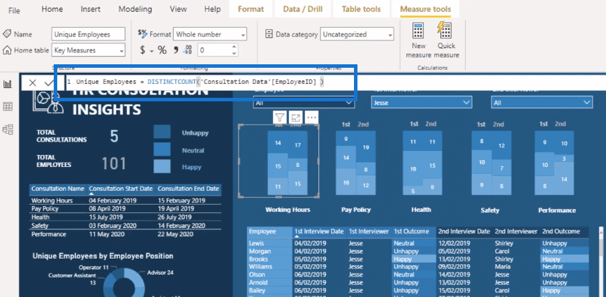
I’ve used a couple of features. I placed stacked column charts next to each other. Then, I made a simple calculation using DISTINCTCOUNT to count the number of employees.
Then, I filtered it by outcome (first, second), and this filter created the legend.
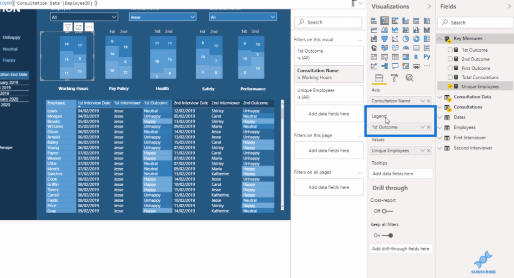
I haven’t done any fancy formulas here. I just used column charts and the filter function, and I turned off almost everything around the visualization.

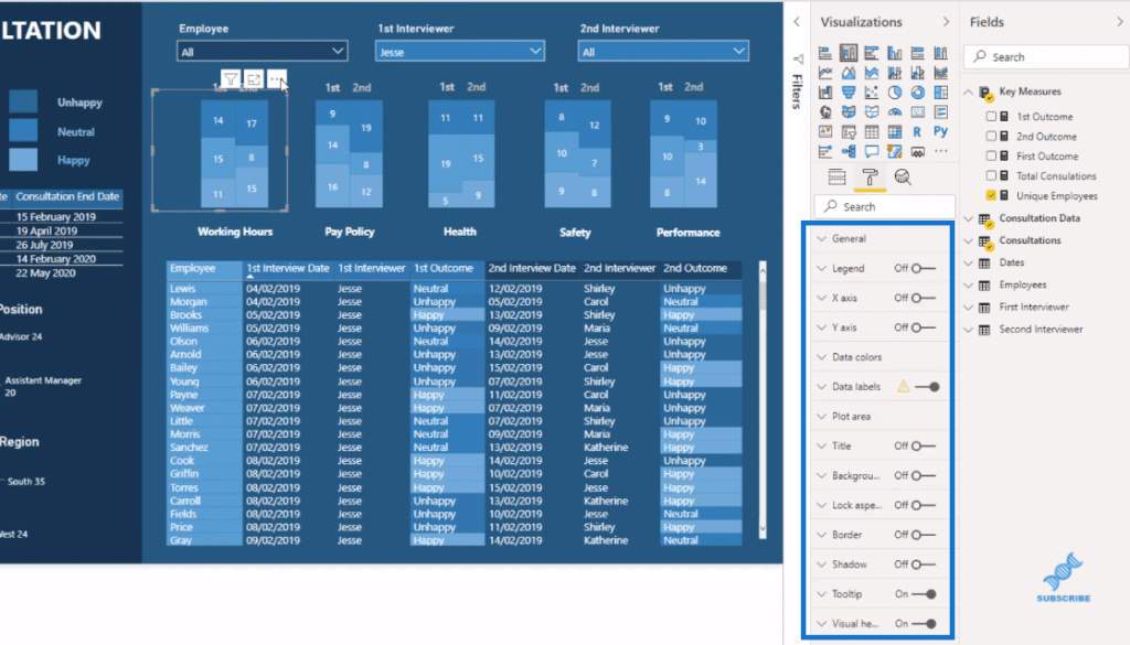
Visualization Technique: Grouping & Aligning Visuals
I created the column charts individually and aligned both visualizations together. I grouped them together, so I can multi-select things.
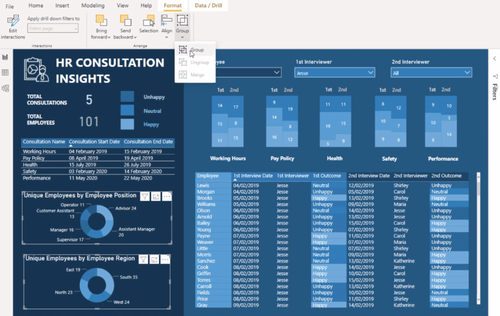
To do this, I go to Format, then click on Group. Once I do that, I can move the visualizations around together. I just “copy and paste” them to create the rest of the interview categories (pay policy, health, etc.). Then, I change the filters on each different interview.
Visualization Technique: Dynamic Filtering
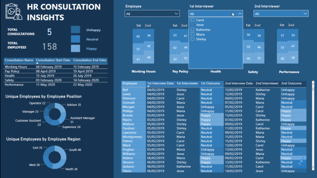
This report is dynamic because of the filtering that I placed in the filtering area. So, when I select a particular item in any of the visualizations here, the rest of the page updates the results that it will show.
For instance, if I select one of the consultations, Health, you can see that it’s now only showing the results for Health.
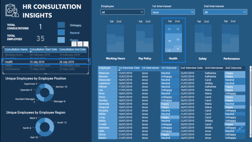
I can place another filter here as well, and so we can get really granular on the results. We have below the results for the Health consultation with Jesse as the first interviewer and Carol as the second interviewer.
***** Related Links *****
Using Filter Fields & Visual Interactions To Create Compelling Visualizations In Power BI
How To Use The Built-in Analytics For Power BI Scatter Charts
Power BI Shape Map Visualization For Spatial Analysis
Conclusion
This is my way of being creative and thinking outside the box with the visualizations in my Power BI reports and showcase insights in a compelling and unique way.
It takes a bit of imagination to create something like this. I hope that I’ve inspired you to implement this visualization technique in your own reports and not just rely on the visualization palette.
There are far more options out there for you in terms of what you can achieve visually, and that’s what’s going to engage your consumers more.
If you want to have a play around with this particular report, check out the Enterprise DNA Showcase page.
All the best!
Sam


