In this tutorial, you’ll learn how to sort and filter a bar chart in your paginated reports.

After setting up the basic elements in your bar chart, the next thing you need to do is apply a filter and sort out its series data.
This tutorial will show how to filter a bar chart with the Month field in your dataset.
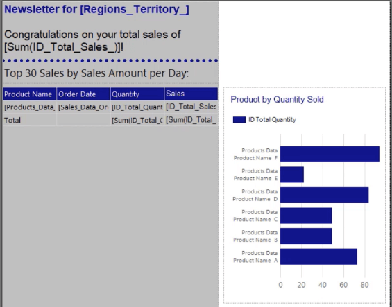
Filtering The Bar Chart Data In Paginated Reports
Dataset
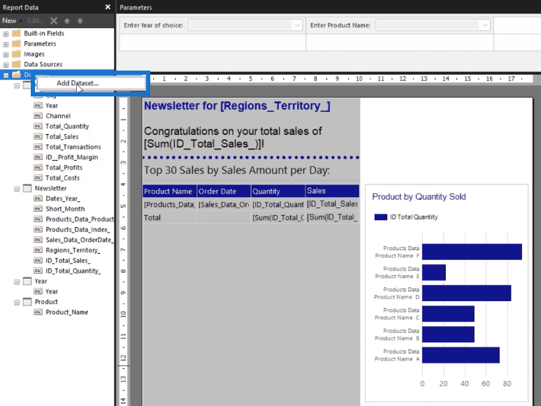
Right-click on your Dataset folder and select Add Dataset.
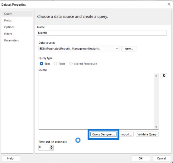
In the Dataset Properties wizard, click Query Designer.
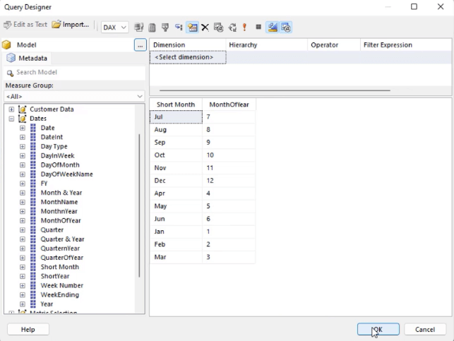
Drag the ShortMonth and MonthOfYear fields to the blank space and select Click to execute the query.
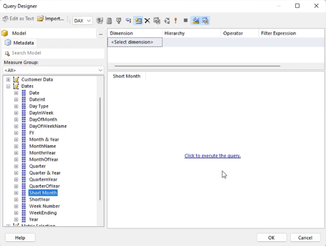
The MonthOfYear field allows you to easily set rules when creating the Month filter. Once done, click OK.
In the Query box, you need to add the ORDER BY keyword so that the query will sort the months in ascending order.
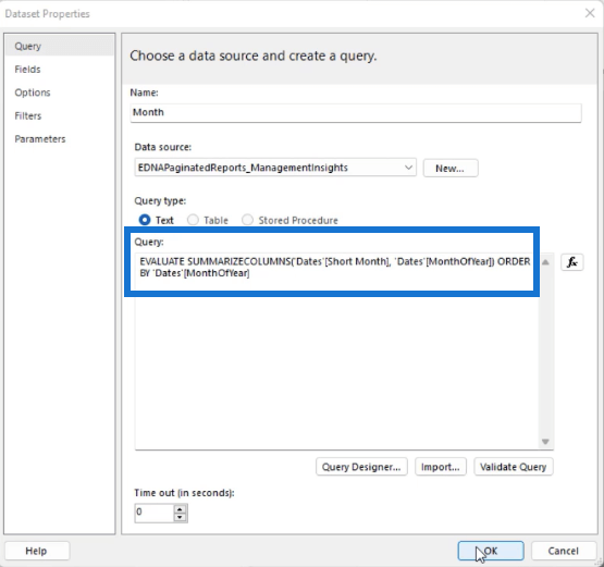
You can click the Validate Query button to know whether there are errors in your query. If none, click OK.
Parameter
After you’ve added the Month dataset, the next thing you need to do is add a parameter.
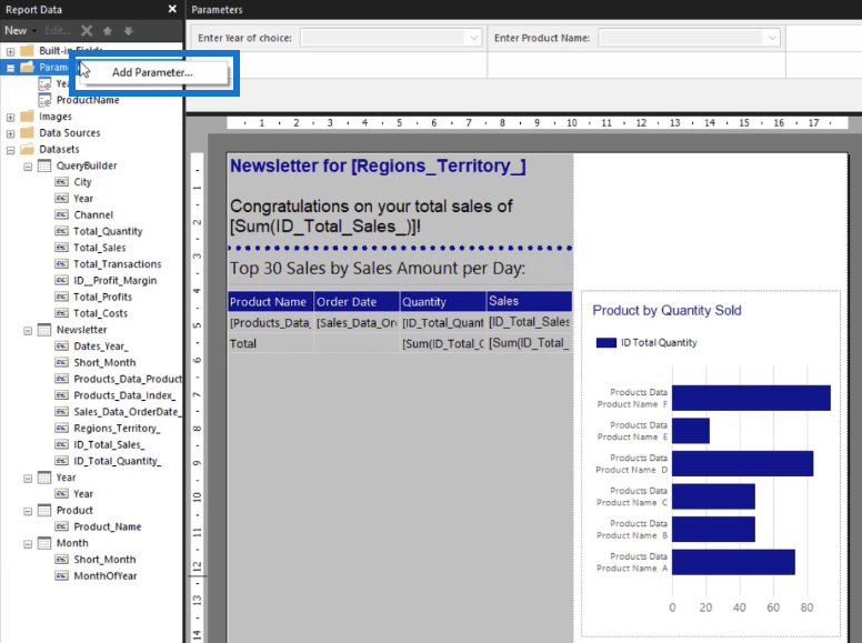
Right-click the Parameter folder and select Add Parameter.
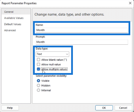
Change the Name to “Month” and check the Allow multiple values option.
In the Available Values tab, select Get values from a query. Set Dataset to Month, and the Value and Label fields to Short_Month. Then, click OK.
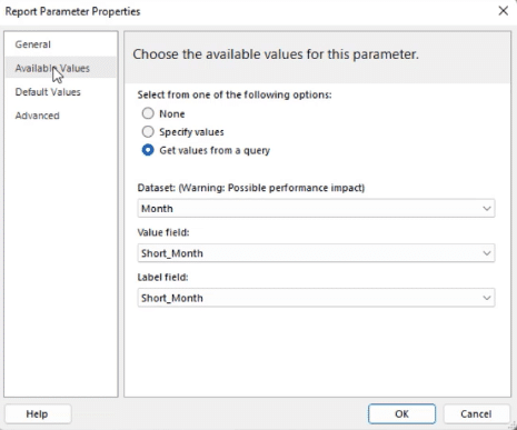
In the Parameters pane in Report Builder, you’ll see that a Month filter has been added.

Filter
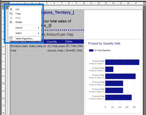
To apply the month filter to your report, click on the gray square found on the upper-left corner of your report page and select Tablix Properties.
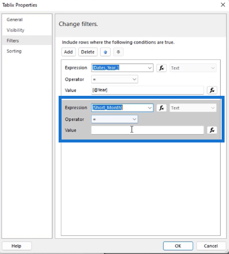
In the Tablix Properties wizard, go to the Filters tab and click Add. Select Short_Month as the Expression, then click the fx button to open the Expression Builder.
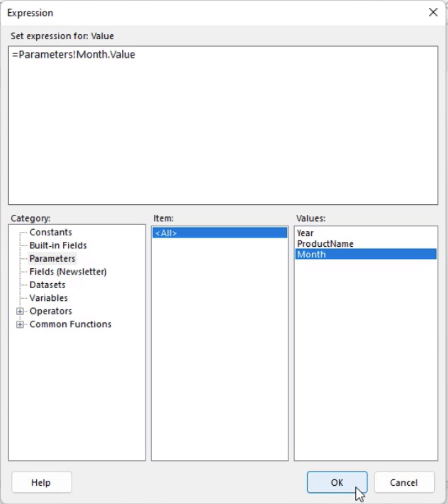
Select the Month parameter as the value for the Short_Month expression.
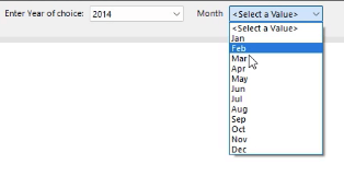
When you run the report, you’ll now be able to use the Month filter to choose which months you want shown in your report.
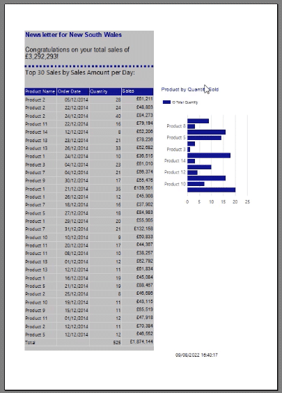
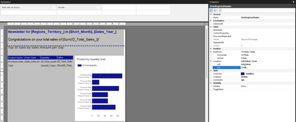
You can make further formatting adjustments to your paginated report to make it easier for end users to read it. You can adjust the position, size, and style of each element. Be consistent with the background and text colors so that the report looks cohesive.
Sorting Series Data In Paginated Reports
In the current report, you can see that the bar chart’s y-axis doesn’t show the complete list of the product names.
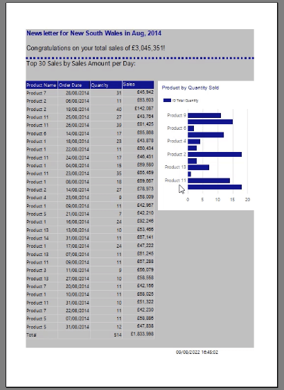
To fix this, right-click on your vertical axis and select Vertical Axis Properties.
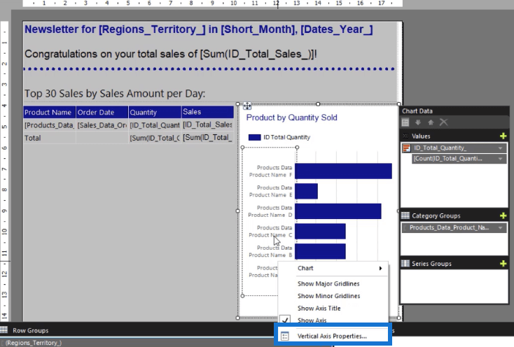
Change the Interval to 1 and click OK.
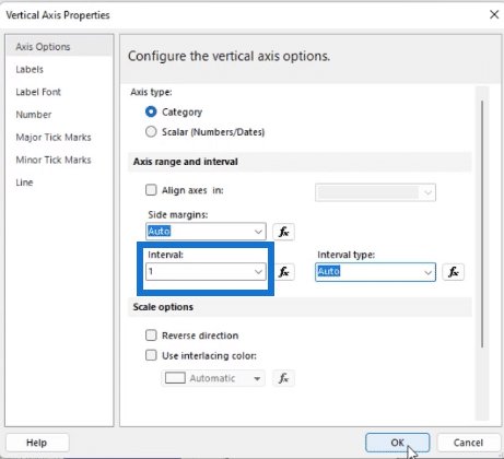
To sort the series data according to the total amount, change the Total Quantity value in the Chart Data to Sum.
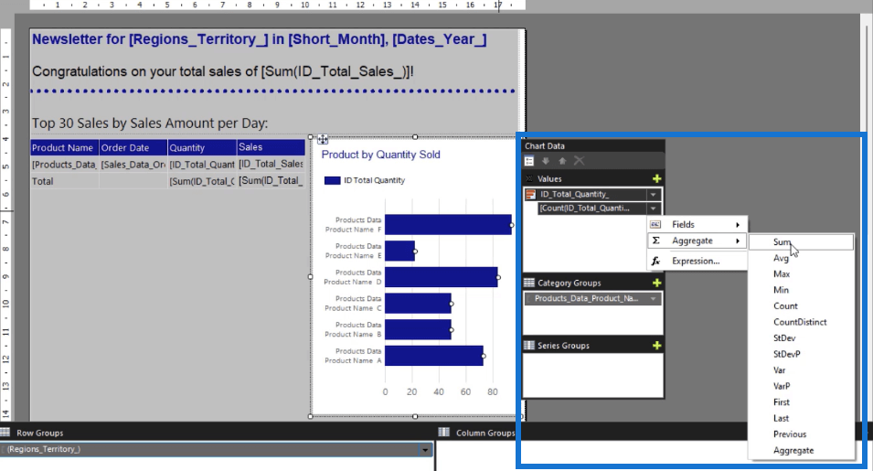
Then, click the drop-down arrow of the Product Data Category and select Category Group Properties.
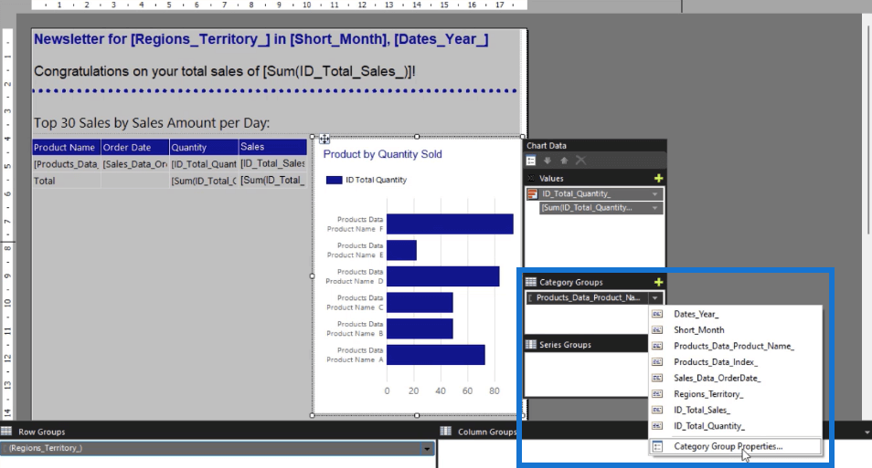
Go to the Sorting tab and click the fx button to launch the Expression Builder.
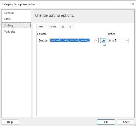
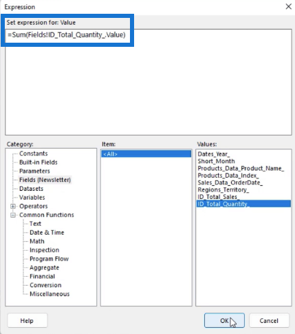
In the Aggregate Category, double-click Sum. Then, go to the Parameter Category and select the Total Quantity. Once done, click OK.
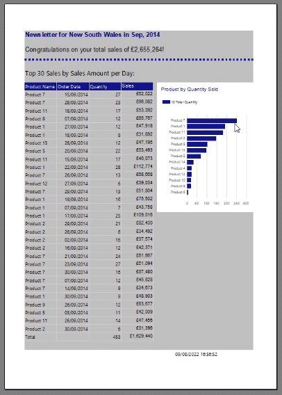
When you run the report, you’ll see that all the product names now appear in the bar chart and they’re sorted in descending order according to the Total Quantity.
***** Related Links *****
Create A Paginated Report: Adding Texts & Images
Report Builder In Power BI: Formatting Objects & Visualizations
How To Create A SSRS Bar Chart: An Introduction
Conclusion
When it comes to making paginated reports, it’s not enough to simply present data in a table. It’s recommended to complement tables and matrices with visualizations so that users can acquire a brief understanding of the report with just a quick glance.
A bar chart is one of the most common visualizations to use when transforming data into figure form. The great thing about creating it in Report Builder is the ability to make it dynamic. By adding filters, end users can fine tune the data by excluding information they don’t need.
All the best,
Sue Bayes


