In this post, we will look at how we can customize the bar charts in Power BI reports using native visuals, custom visuals, and Charticulator. You can watch the full video of this tutorial at the bottom of this blog.
We have limitations when we try to place bar charts in a tight or congested space. This was a problem I encountered in one of my reports, where I had to place a bar chart in a tiny space. The problem with the bar chart was that it had long descriptions instead of short ones.
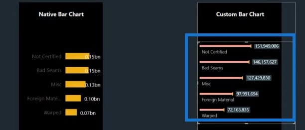
In this example, we already have a native bar chart from Power BI and a custom bar chart from the marketplace. For the third one, we will set up a bar chart using Charticulator later on.
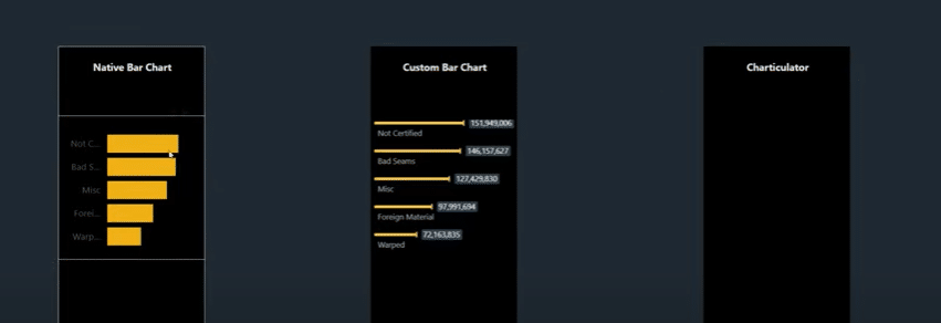
Native Bar Charts In Power BI
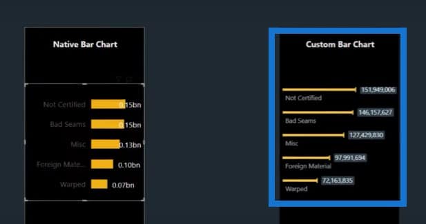
As you can see in the native visual, we can not see the description when it is long or located in a small space. This is what the native bar chart looks like if we turn on the data labels.

Let’s do some customization in the native bar chart to see if we can make it better. We can go to Y-axis and change the chart to its maximum size.
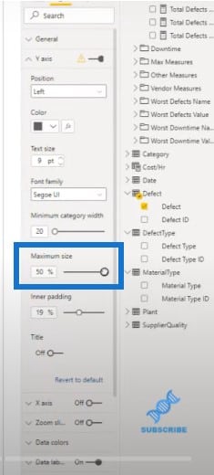
When we set the size to its maximum, we can now see the description, but the bars are still very short. This chart doesn’t look good at all.
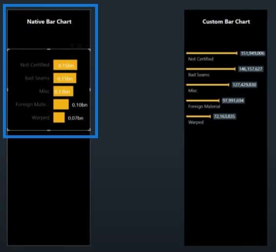
Custom Bar Charts In Power BI
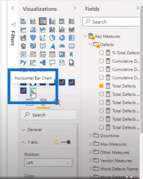
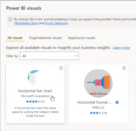
With the custom bar chart, we used the Horizontal Bar Chart, which is available at the marketplace.
We can achieve something like this, which looks way better than the native bar chart.
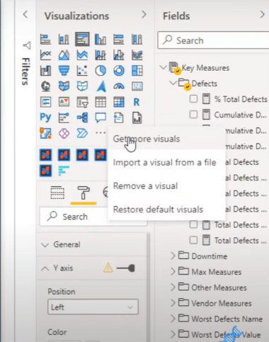
To get the Horizontal Bar Chart, just click on the three dots at the bottom of the Visualizations pane, then click on Get more visuals.
You can see the Horizontal Bar Chart from the marketplace. This is the one I’m using in my report right now.
I’ll show you how we can set this up. Let’s start with a blank canvas.
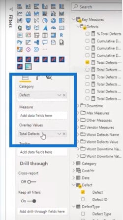
Then let’s add Defect for our category and Total Defects for our measure.
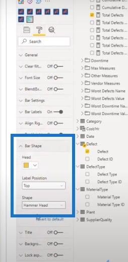
With the Horizontal Bar Chart, there are a lot of custom shapes to choose from. The one I’m using is called hammer shape.
We can go to the Visualization section and go to Bar Shape to change the shape of the chart.
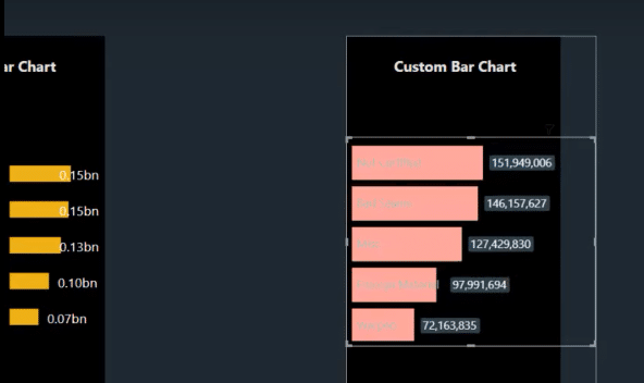
We can change it to bars.
We can also change it to lines only.
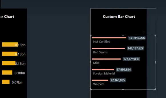
Or we can use a lollipop-style shape.
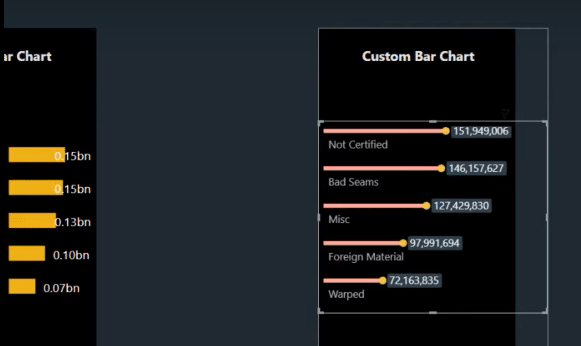
But for this one, I’m using the hammerhead shape because it looks very clean and not as bulky as a bar chart. The problem with this one is that I cannot customize the data labels.
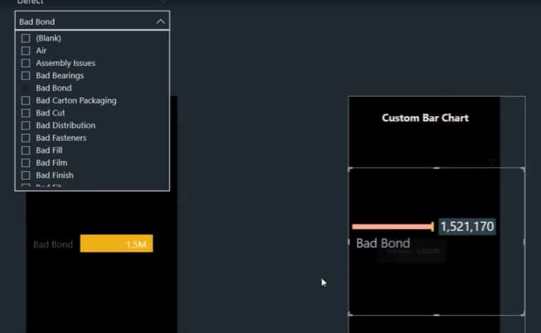
If I go to Bar labels, I cannot decrease the size of these labels. So whenever I filter with the slicer, the data labels become very big.
Using Charticulator To Create Bar Charts In Power BI
We can create the same type of visualization with Charticulator, which is also available at the marketplace.
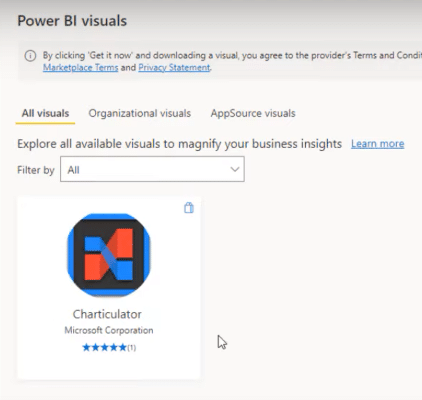
Once we have the custom visual, let’s pin it to the Visualization pane.
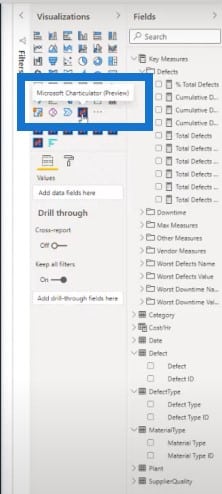
Now we can click on the visual.
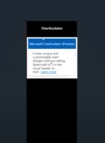
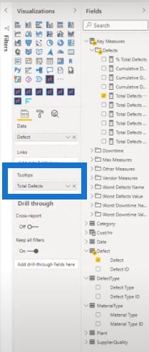
Then click on the three dots, click on Edit, and place some values. In this case, I will place Defect and Total Defects, which are the measures we are using for this analysis.
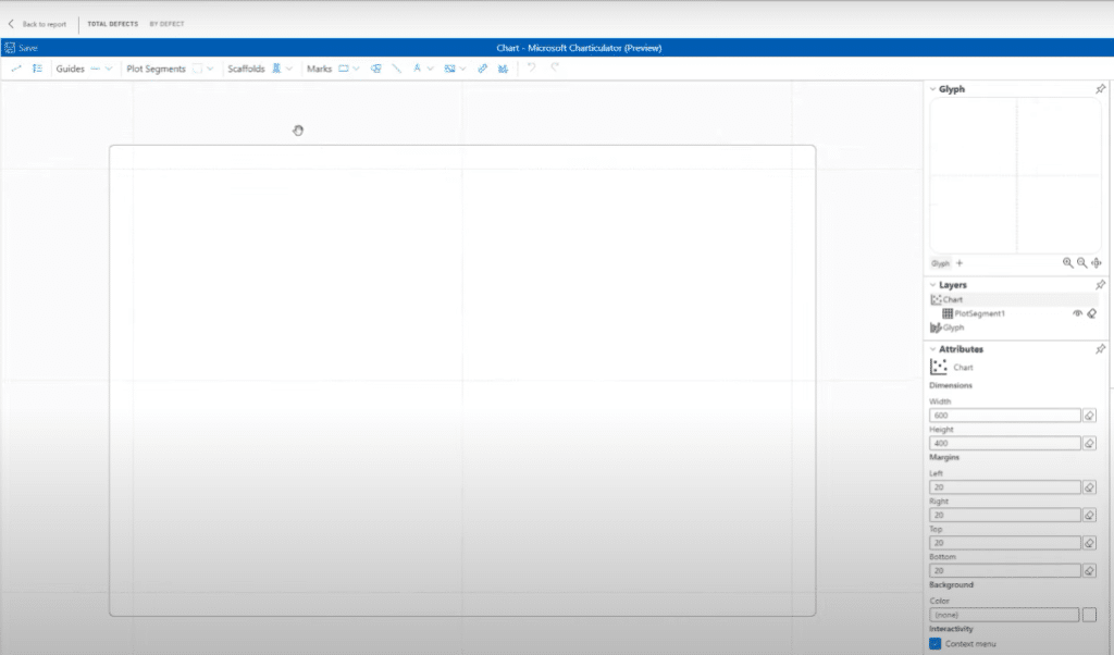
And now we have a blank canvas where we can create a hammerhead chart.
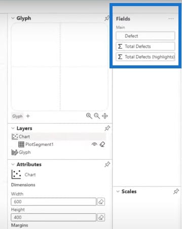
We have to bring in the data section. In the Fields section, we have Defect and Total Defects, which we will use for this visual.
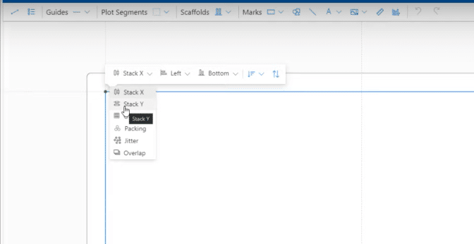
First, we have to click on this glyph or plot segment, and stack it with Stack Y because we are trying to create a bar chart, and not a column chart.
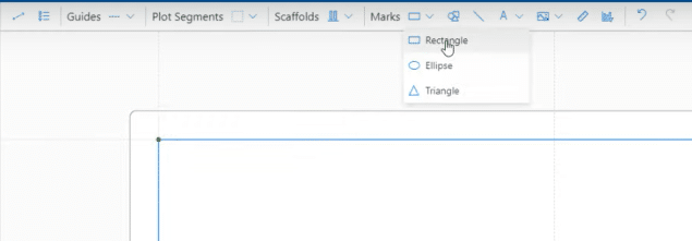
Next, we have to bring in the shape by using a rectangle.
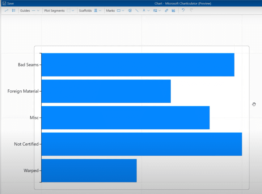
The next step is to bring in the category on Y-axis and our measure on the grid section.
Fixing The Sorting Issue
When we attempt to sort this in ascending or descending order based on the Total Defects value, it does not work.
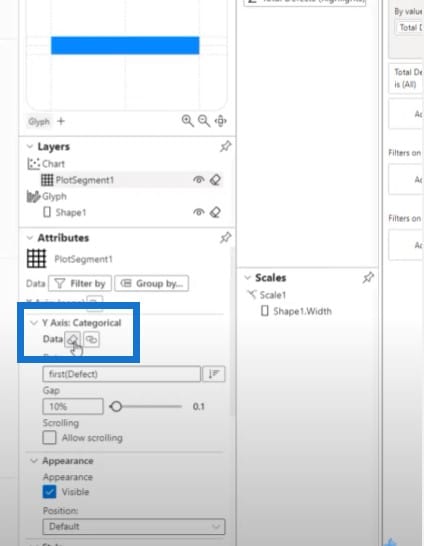
It wasn’t a problem previously, but now it is. So I had to click on plot segment, go to Y axis, and clear everything from this section so I can sort it anyway I want.
Reducing The Height of Bar Charts
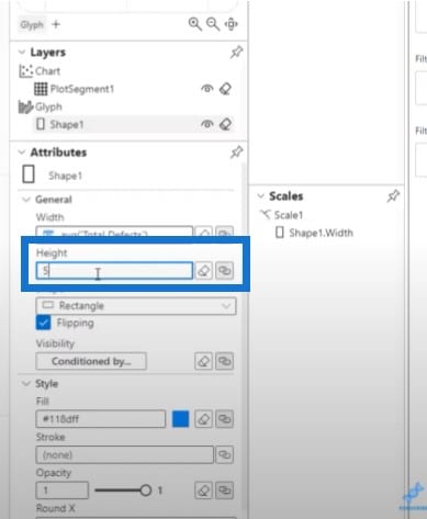
Our second task is to reduce the height of these bar charts. Go to Shape then Height to change the size into 5.
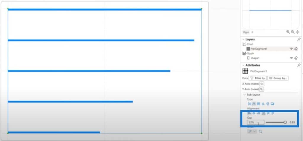
Then let’s go to plot segment and play around with the gap between the shapes.
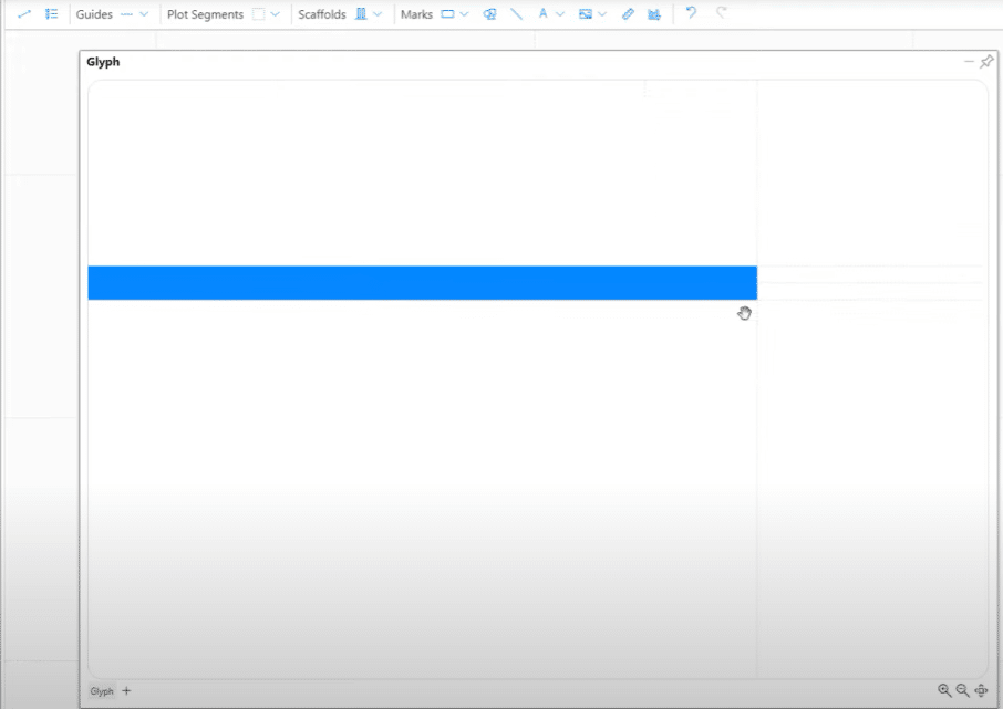
Next, we have to create a hammer shape. We need to maximize the glyph by clicking on the AutoZoom.
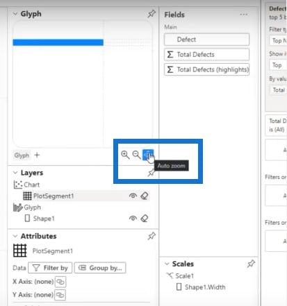
But what I find useful is to create the glyph as a separate window, and maximize the size of this window so I can zoom in and see everything clearly.
Creating The Hammer Shape
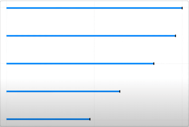
To create the hammerhead shape, I can draw the line and increase the line width.

When we exit out of this glyph window, we now we have a hammerhead-style shaped bar chart.
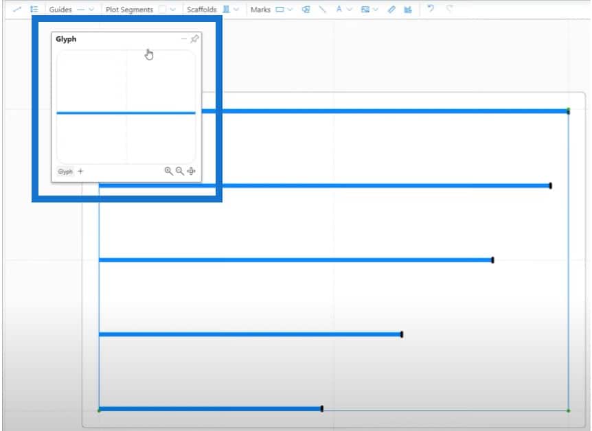
After creating the shape, we have to bring in our categories and data labels. To bring in the categories, I’ll show it again as a separate window and maximize it so it is easier for me to align it properly.
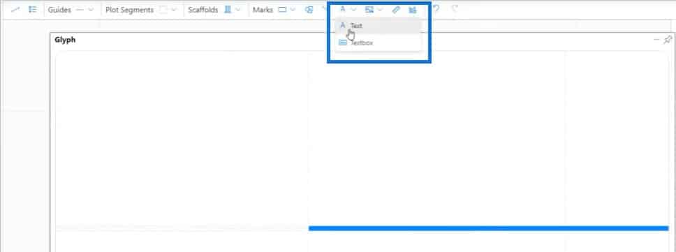
Let’s bring in the text.
Then bring it in the center of the shape and then align it to the left.
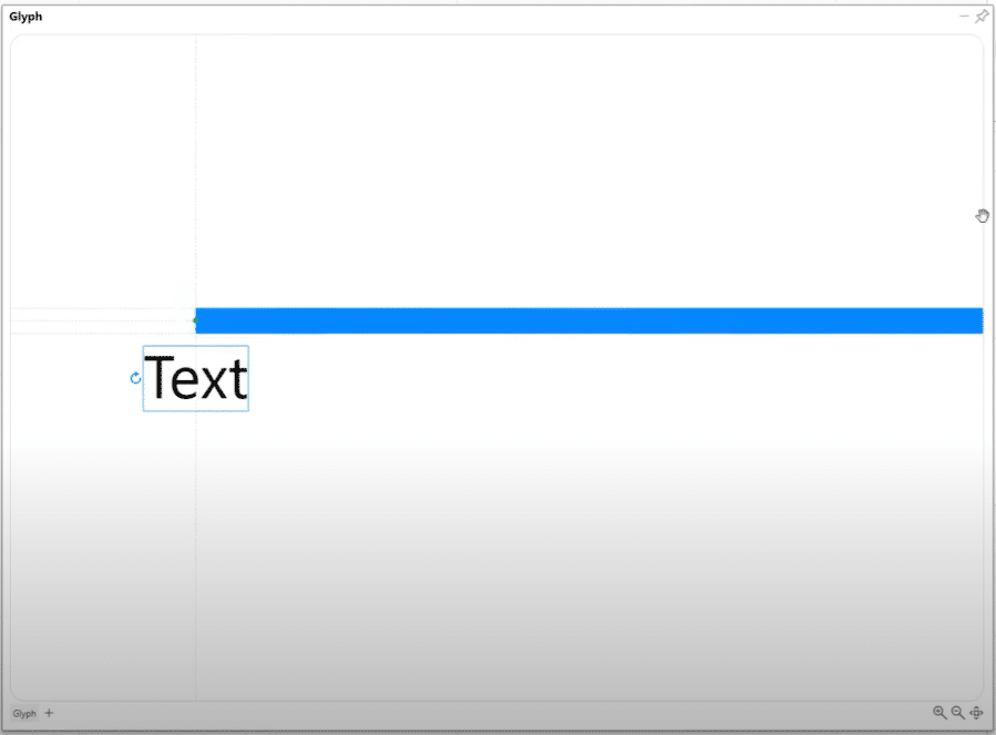
Let’s bring in our categories and adjust the size of the text.
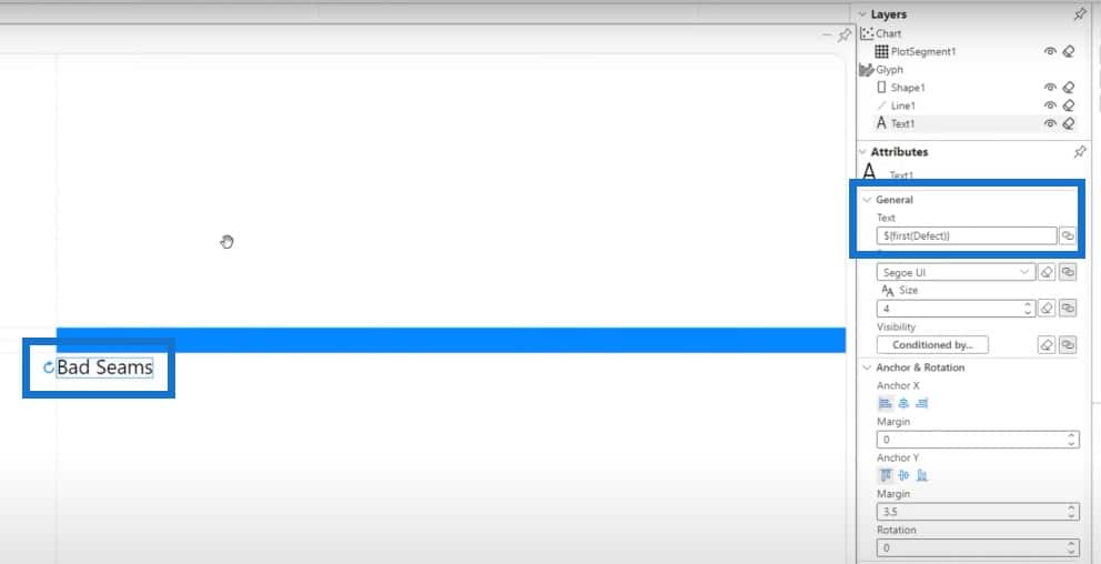
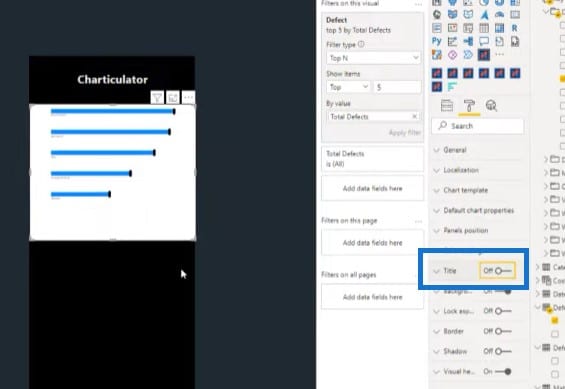
Another benefit to using Charticulator inside the Power BI desktop is that you can save it, then go back to see the results.

I can turn on and turn off the title for the Charticulator visual, just like the first two.
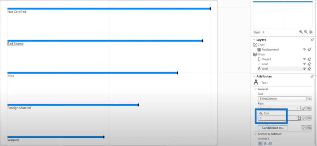
Let’s go back to the edit section. Since our text values are really small, we can increase the size.
The next thing we have to do is to bring in our data labels. Again, we can go to a separate window and maximize it to see everything clearly. Then can click on Text.
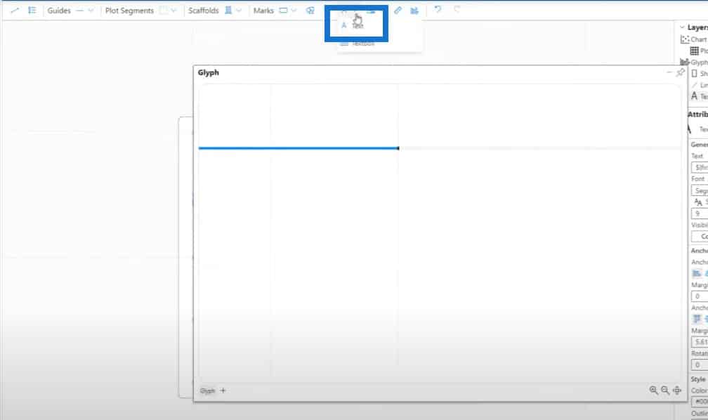
These orange lines means that it is properly aligned.
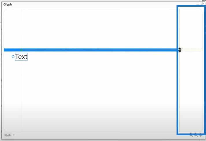
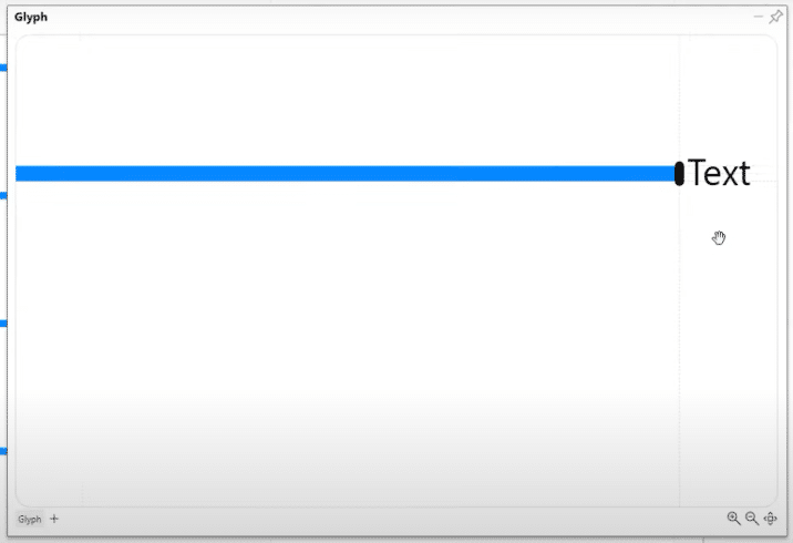
Once we release the mouse button, the text will be aligned.
Formatting Data Labels For Bar Charts In Power BI
For the data labels, we’re using Total Defects.
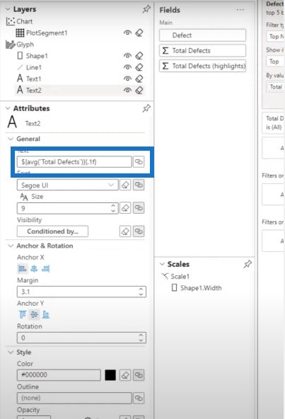
We have to make sure that the data labels are properly formatted in our visual, and we need to bring in the $ sign.
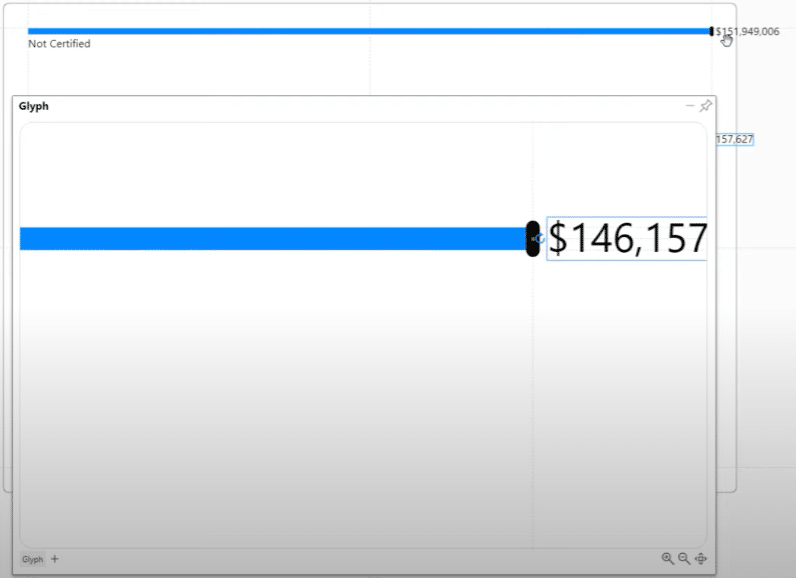
The problem now is that the labels are not inside the canvas, so we need to drag the values properly inside.
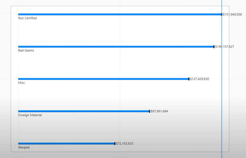
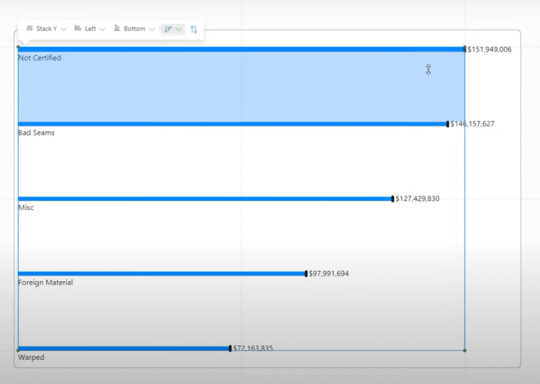
Customizing The Color Of The Bar Chart
We can also change the colors inside the chart because our background is dark. For the shape, I’ll be using yellow and for the line, I can use orange.
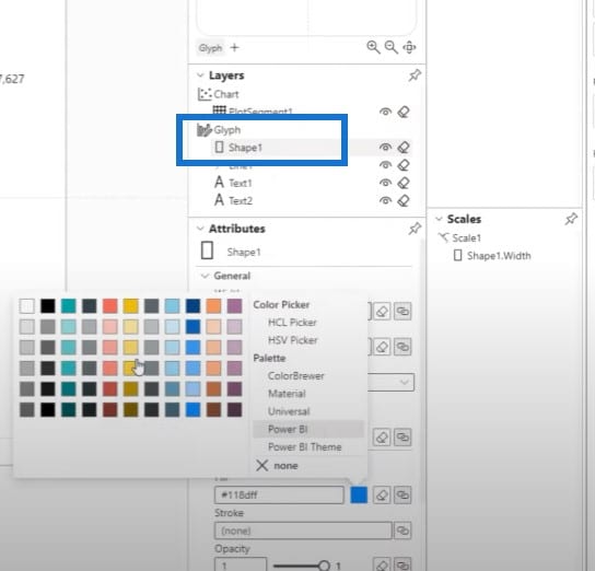
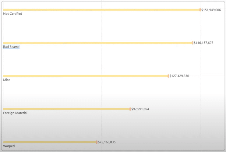
I will use white for the text value, save the changes I made, and then test it in the report.

Let’s test the bar chart using the slicer.
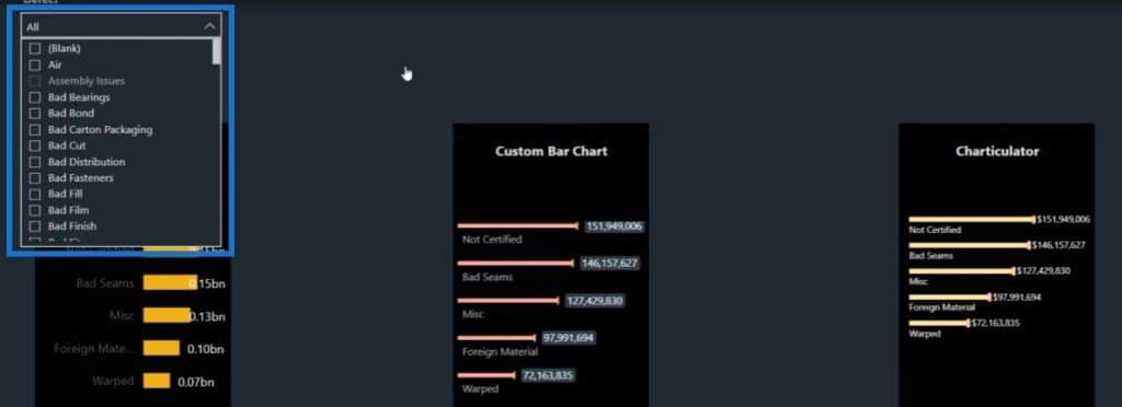
When you select something from the slicer, it doesn’t automatically enlarge the data labels when we try to slice and dice the report.

***** Related Links *****
Comparison Bar Charts With Charticulator In Power BI
Fill Bar Chart – A Bar Chart Variety For Power BI Reports
Create A Bar Chart Visualization With Charticulator
Conclusion
When you have to create a bar chart in a very tight space, you can go ahead and create it using Charticulator. If you enjoyed the content covered in this particular tutorial, please subscribe to the Enterprise DNA TV channel.
We have a huge amount of content coming out all the time from myself and a range of content creators, all of whom are dedicated to improving the way that you use Power BI and the Power Platform.
Lastly, check out the rest of Enterprise DNA’s website for plenty of resources and further learning that you can access very easily.
Mudassir


