Matplotlib is a popular Python library for creating visualizations, specifically 2D plots and graphs. There are many plots available in matplotlib and scatterplots are useful for visualizing data points in two dimensions. The size of the markers representing data points can be adjusted to help differentiate between data points or to emphasize certain aspects of the data.
To change the marker size in matplotlib scatter plots, you can use the scatter() function with the “s” parameter. This parameter allows you to set the size of the markers. It could be as a single integer value for all data points or as a list of values for individual data points.

The marker size in Matplotlib scatterplots is measured in points squared, which may be different from the typical pixel units of other graphic software. Being familiar with how to adjust marker size can improve your customization and effectiveness of Matplotlib scatterplots.

In this article, we’ll go over the process of changing the marker size in matplotlib scatter plot. We’ve also added examples to help you better understand the concepts. Let’s get into it!
Understanding the Basics of Matplotlib Scatter Plot
Before we dive into the code for changing marker size in a matplotlib scatter plot, let’s quickly review some basic terms that you should be familiar with!

What is Matplotlib?
Matplotlib is a popular library for creating visualizations in Python. It offers you a wide range of plotting options, including scatterplots, bar charts, line plots, and more.
The library is designed for flexibility. It allows you to customize your plots, including marker size, color, and style, to produce professional-looking visualizations.
What are Scatterplots?
Scatterplots are useful for visualizing the relationship between two variables in a dataset. In a scatterplot, each data point is represented as a marker plotted along the X and Y axes according to their corresponding values.
These plots can help identify trends, correlations, or outliers within data, making them valuable for analysis and interpretation. With Matplotlib, creating a scatterplot is simple using the scatter() function.

What are Markers?
Markers represent individual data points in a Matplotlib scatterplot. You can customize a marker’s size, color, and style to emphasize specific aspects or patterns of your data.
By understanding the basics of Matplotlib, scatterplots, and markers, you can create customized, visually appealing plots. You can also visualize and analyze relationships within your data by adjusting marker sizes.
Now that we’ve reviewed the basics, let’s look at how you can set the marker size of a Matplotlib scatterplot.
How to Adjust Marker Size in Matplotlib
Adjusting the marker size in a Matplotlib scatterplot helps visualize data points easily. It also helps customize the overall appearance of your plot.
There are two main methods to control the size of markers in your scatter plot:
- Using the markersize parameter
- The s keyword argument
1. How to Customize Marker Size with the MarkerSize Parameter
You can use the markersize parameter with the plot() function to change the size of markers in your scatterplot.
It defines the size of markers in the plot by setting a single value for all data points.
The following is an example of using the markersize parameter:
import matplotlib.pyplot as plt
# Sample data points
x = [1, 2, 3, 4, 5]
y = [2, 4, 6, 8, 10]
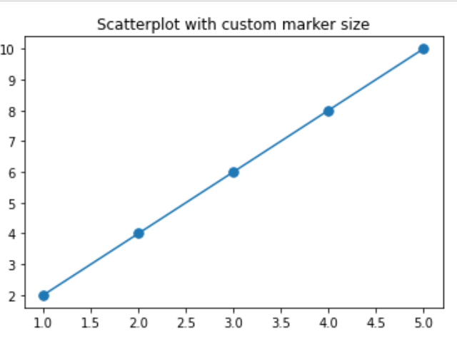
# Plotting the scatterplot with custom marker size
plt.plot(x, y, marker='.', markersize=15)
# Display the scatterplot
plt.show()This code plots a graph using the matplotlib library in Python. It creates a line plot of ‘x’ against ‘y’ with data points marked by dots, and then displays this plot.
The ‘x’ and ‘y’ are lists of numbers representing coordinates of the same number for each data point on the graph.
The markersize argument for all data points has the same length. This makes the markers in the scatterplot larger and more noticeable.
The output of the above code will be the following:
However, take a look at the scatter plot with the default marker size:
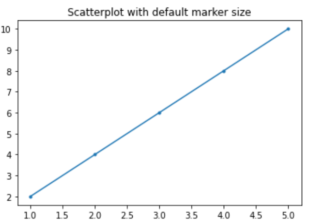
In the images above, you can see that the adjusted marker size is more noticeable compared to the default marker size.
2. How to Change Marker Size Using the “S” Keyword Argument
You can use the s keyword argument with the scatter method to adjust the size of markers in your scatter plot.

You can either set a single size for all data points or provide arrays of size values for each data point.
The following is an example using the s keyword argument:
import matplotlib.pyplot as plt
import numpy as np
# Sample data points
x = [1, 2, 3, 4, 5]
y = [2, 4, 6, 8, 10]
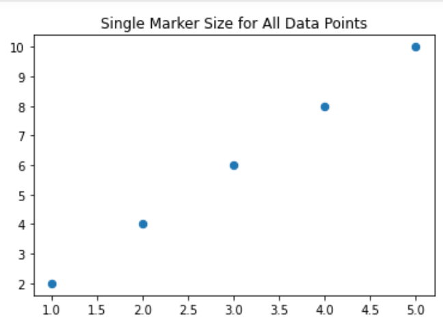
# Example of setting a single marker size for all data points
plt.scatter(x, y, s=40)
# Display the scatterplot
plt.show()
This Python code uses the matplotlib library to create a scatter plot with ‘x’ and ‘y’ as coordinates for the data points.
Each element is represented with the same size in points. The plt.show() function then displays this scatter plot.
The output of the above code is:
To set different sizes for each data point, you can create an array of size values and use it with the s parameter:
# Random size values for each data point
sizes = np.array([15, 30, 45, 60, 75])

# Plotting the scatterplot with different marker sizes
plt.scatter(x, y, s=sizes)

# Display the scatterplot
plt.show()
This Python code uses the matplotlib library to create a scatter plot with ‘x’ and ‘y’ as coordinates for the data points. However, unlike the previous examples, each data point has a unique size.
The ‘sizes’ array contains the sizes for each data point. We pass this array to the s argument. After creating the scatter plot, the ‘plt.show()’ function is used to display it.
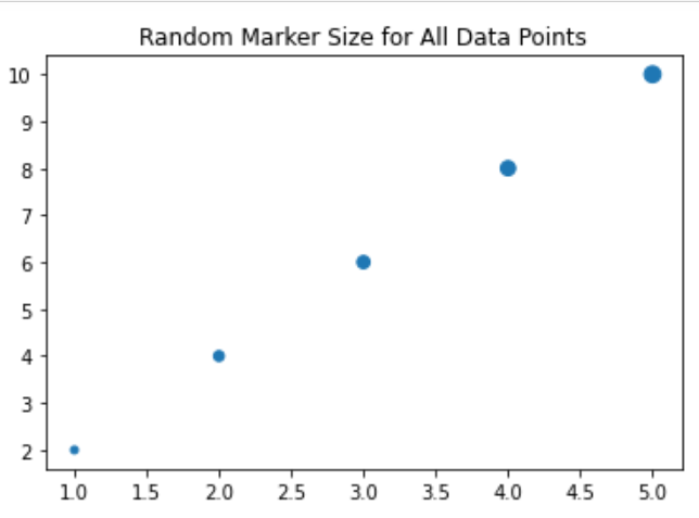
The s argument offers you flexibility in adjusting marker sizes. It makes it easier to create customized scatterplots in Matplotlib.
Further Customization of Scatterplots in Mathplotlib
We’ll now explore how to customize the appearance of scatterplots in Matplotlib. This includes changing colors, colormap, marker styles, and line widths.
1. How to Customize Colors and Colormaps
Matplotlib allows you to change both the marker color and the edge color of scatterplot markers.
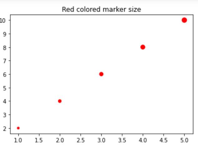
To modify the marker color, you can set the c parameter within the scatter() function to a color, such as ‘red’, ‘blue’, or a tuple representing an RGB color.
For example, to set the marker color to red:
import matplotlib.pyplot as plt
import numpy as np

# Sample data points
x = [1, 2, 3, 4, 5]
y = [2, 4, 6, 8, 10]

# Random size values for each data point
sizes = np.array([15, 30, 45, 60, 75])

# Plotting the scatterplot with different marker sizes and red color
plt.scatter(x, y, s=sizes, c='red')

# Display the scatterplot
plt.show()
In this code, the parameter c in plt.scatter() sets the color of the markers. The string ‘red’ makes the markers red. You can replace ‘red’ with any color you like (for instance, ‘blue’, ‘green’, etc.).
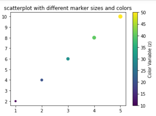
You can also use a colormap method to color your markers based on a third variable. To do this, you can pass an array-like object representing the variable values to the c parameter and set the cmap parameter to your desired colormap like ‘viridis’, ‘plasma’, or ‘inferno’.
For instance:
import matplotlib.pyplot as plt
import numpy as np

# Sample data points
x = [1, 2, 3, 4, 5]
y = [2, 4, 6, 8, 10]
z = [10, 20, 30, 40, 50]  # This will be our color variable

# Random size values for each data point
sizes = np.array([15, 30, 45, 60, 75])

# Plotting the scatterplot with different marker sizes and colors based on 'z'
plt.scatter(x, y, s=sizes, c=z, cmap='viridis')

# Add a colorbar to the plot to represent the 'z' variable
plt.colorbar(label='Color Variable (z)')

# Display the scatterplot
plt.show()
In this code, the c parameter in plt.scatter() is set to z, which is an array-like object that represents the colors of the markers. The cmap parameter is set to ‘viridis’, which is a type of colormap.
The color of each marker corresponds to a value in z, as per the ‘viridis’ colormap. The plt.colorbar() function adds a colorbar to the plot that shows how the marker colors correspond to the z values.
2. How to Change Marker Styles and Line Widths
Matplotlib offers various marker styles for scatterplots.
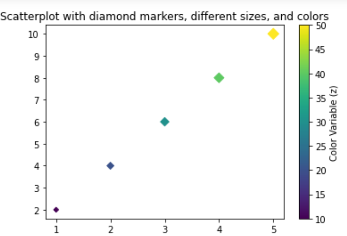
To change the marker style, you can set the marker parameter within the scatter() function.

Some common marker styles are ‘o’ for circles, ‘s’ for squares, and ‘D’ for diamonds.
The following example shows you how to do that:
import matplotlib.pyplot as plt
import numpy as np

# Sample data points
x = [1, 2, 3, 4, 5]
y = [2, 4, 6, 8, 10]
z = [10, 20, 30, 40, 50]  # This will be our color variable

# Random size values for each data point
sizes = np.array([15, 30, 45, 60, 75])

# Plotting the scatterplot with diamond markers, different sizes, and colors based on 'z'
plt.scatter(x, y, s=sizes, c=z, cmap='viridis', marker='D')

# Add a colorbar to the plot to represent the 'z' variable
plt.colorbar(label='Color Variable (z)')

# Display the scatterplot
plt.show()
In this code, we use the marker parameter in plt.scatter() to change the marker style. The string ‘D’ makes the markers diamond-shaped.
You can replace ‘D’ with ‘o’ for circles, ‘s’ for squares, ‘.’ for points, etc. You can refer to Matplotlib’s documentation for a comprehensive list of marker styles.
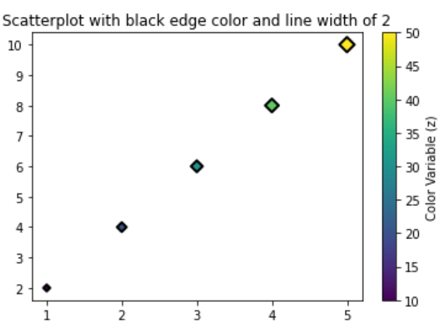
Matplotlib also lets you change the line width of marker edges. This can enhance the appearance of your plot. To modify the marker edge’ color and line width, you can set the edgecolors and linewidths parameters within the scatter() function.
For instance:
import matplotlib.pyplot as plt
import numpy as np

# Sample data points
x = [1, 2, 3, 4, 5]
y = [2, 4, 6, 8, 10]
z = [10, 20, 30, 40, 50]  # This will be our color variable

# Random size values for each data point
sizes = np.array([15, 30, 45, 60, 75])

# Plotting the scatterplot with diamond markers, different sizes, colors based on 'z', black edge color and line width of 2
plt.scatter(x, y, s=sizes, c=z, cmap='viridis', marker='D', edgecolors='black', linewidths=2)

# Add a colorbar to the plot to represent the 'z' variable
plt.colorbar(label='Color Variable (z)')

# Display the scatterplot
plt.show()
In this code, we’ve added the edgecolors and linewidths parameters to plt.scatter(). The edgecolors parameter is set to ‘black’, which makes the edges of the markers black. The linewidths parameter is set to 2, which makes the line width of the marker edges 2 units wide.
You can customize scatterplot appearance in Matplotlib by altering colors and colormaps, as well as marker styles and line widths. These options will enable you to create more visually appealing and informative plots.
Advanced Customization Techniques for Marker Sizes
In this section, we’ll also look at some advanced customization techniques for marker sizes in matplotlib scatterplots. These techniques include:
- Customizing plot with RCParams
- Annotating points and Applying legends
1. Customizing Plot with RCParams
RCParams allow you to configure global properties of your matplotlib plots. It is a dictionary-like object that makes it simple to change the default settings for your plots.
For instance, to change the default marker sizes, you can update the scatter.marker and lines.markersize RCParams.
The following example shows you how to customize plots with RCParams:
import matplotlib.pyplot as plt
import numpy as np

# Setting global properties
plt.rcParams['scatter.marker'] = 'o'
plt.rcParams['lines.markersize'] = 10

# Sample data points
x = [1, 2, 3, 4, 5]
y = [2, 4, 6, 8, 10]
z = [10, 20, 30, 40, 50]  # This will be our color variable

# Random size values for each data point
sizes = np.array([15, 30, 45, 60, 75])

# Plotting the scatterplot with the default marker size defined in RCParams
plt.scatter(x, y, c=z, cmap='viridis')

# Add a colorbar to the plot to represent the 'z' variable
plt.colorbar(label='Color Variable (z)')

# Display the scatterplot
plt.show()
In this code, we use plt.rcParams to change the default scatter marker to ‘o’ (circle) and the default line marker size to 10.
These settings will apply to all plots created after these lines of code.
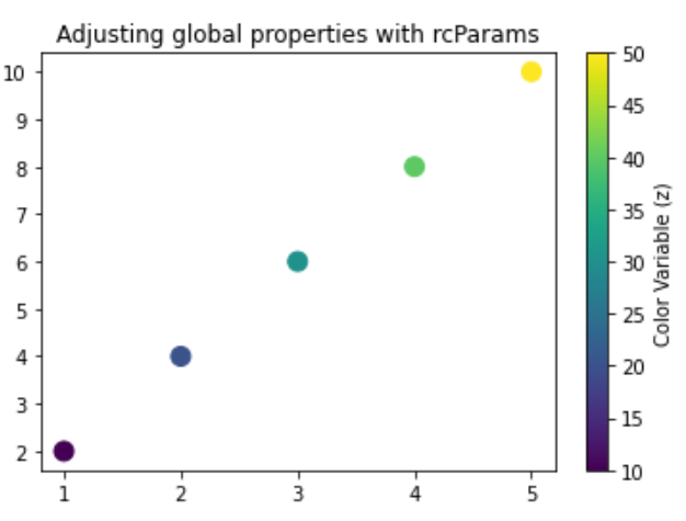
The scatter.marker and lines.markersize are some of many configurable properties in Matplotlib’s RCParams. You can customize font size, line width, color, figure size and many more.
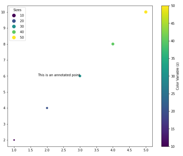
2. Annotating Points and Applying Legends
It’s also helpful to provide additional information about specific points within your scatterplot. You can use the text function to achieve this.
The following example shows you how you can do that:
import matplotlib.pyplot as plt
import numpy as np

# Sample data points
x = [1, 2, 3, 4, 5]
y = [2, 4, 6, 8, 10]
z = [10, 20, 30, 40, 50]  # This will be our color variable

# Random size values for each data point
sizes = np.array([15, 30, 45, 60, 75])

# Plotting the scatterplot with different marker sizes and colors based on 'z'
scatter = plt.scatter(x, y, s=sizes, c=z, cmap='viridis')

# Annotating a point
plt.text(x[2], y[2], 'This is an annotated point', ha='right')

# Add a colorbar to the plot to represent the 'z' variable
plt.colorbar(label='Color Variable (z)')

# Add a legend for the scatterplot
plt.legend(*scatter.legend_elements(), title="Sizes")

# Display the scatterplot
plt.show()
In this code, we use plt.text() to add a text annotation at the coordinates (x[2], y[2]). The string ‘This is an annotated point’ is the text that will be displayed. The ha parameter is used to align the text.
We also use scatter.legend_elements() to generate a legend for the scatter plot. The asterisk (*) in *scatter.legend_elements() is used to unpack the values returned by legend_elements().
The title parameter sets the title of the legend to ‘sizes’ NumPy array. This legend shows the correlation between the sizes of the points and their colors.
Final Thoughts
Understanding how to adjust the marker size in your scatter plots is crucial in enhancing your data visualization skills.
By varying marker size, you can add another layer of information to your plot. This means that you’re not just limited to representing data along the x and y axes — you’re also showcasing differences or trends through the sizes of the scatter markers.
Learning to adjust marker size will improve your ability to effectively communicate your data. It aids in emphasizing certain data points, making comparisons more evident. It makes your plots more engaging and easier to understand.
With a myriad of options for customizing plots, Matplotlib allows for endless possibilities in data visualization. As you continue your data science journey, harness these tools to tell more compelling stories with your data. Happy plotting!
Frequently Asked Questions
In this section, you’ll find some questions that you might have when changing marker size of matplotlib scatter plot.
Q: How do I change the size of the scatter plot markers in Matplotlib?
A: You can change the marker size using the ‘s’ parameter in the plt.scatter() function. For example, plt.scatter(x, y, s=50) sets the marker size to 50.
Q: How do I change the color of scatter plot markers based on a third variable?
A: You can set the ‘c’ parameter in the plt.scatter() function to your third variable and use the ‘cmap’ parameter to set your desired colormap.
Q: What are some common marker styles in Matplotlib and how can I use them?
A: Some common styles are ‘o’ for circles, ‘s’ for squares, and ‘D’ for diamonds. You can set the marker style using the ‘marker’ parameter in the plt.scatter() function.
Q: How can I change the line width and color of the scatter plot marker edges?
A: You can use the ‘linewidths’ and ‘edgecolors’ parameters in the plt.scatter() function to change the line width and color of marker edges respectively.
Q: How do I use RCParams to change global properties of my plots?
A: RCParams is a dictionary-like object which allows you to set global properties of your plots. For example, plt.rcParams[‘lines.linewidth’] = 2 sets the global line width to 2.
To learn more about plots in Python, check the following video out: