
In this tutorial, you’ll learn what Charticulator is and how it can improve your Power BI report. This is an introduction of the Charticulator tool, an alternative visual creator for the native custom visual in Power BI.
Charticulator is a Microsoft Research project that lets you present your data through charts and visuals. It transforms your dataset into visualizations, making them easier to read and understand.
However, you have to be very specific in providing data to the tool because it’s not very flexible in accepting datasets. If you provide the incorrect dataset, the visuals won’t work in Power BI.

Inside The Charticulator Tool
To use this tool, go to charticulator.com and click Launch Charticulator.

Make sure that the dataset you’re going to open is in the .csv format because Charticulator doesn’t accept any other format.
This is the sample data that will be used:
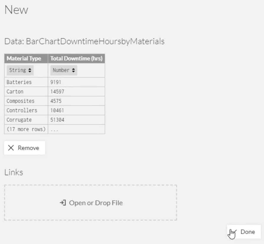
Once you click Done, the workspace will be shown and you’ll see two canvas for the visuals.
The big canvas on the right is the actual canvas where you’ll see the end results of your visuals; the small one on the left is where you provide different graphs and input types of criteria to reflect on the actual canvas. The small canvas is called the Glyph section; this is where you’ll create the shape of your charts.
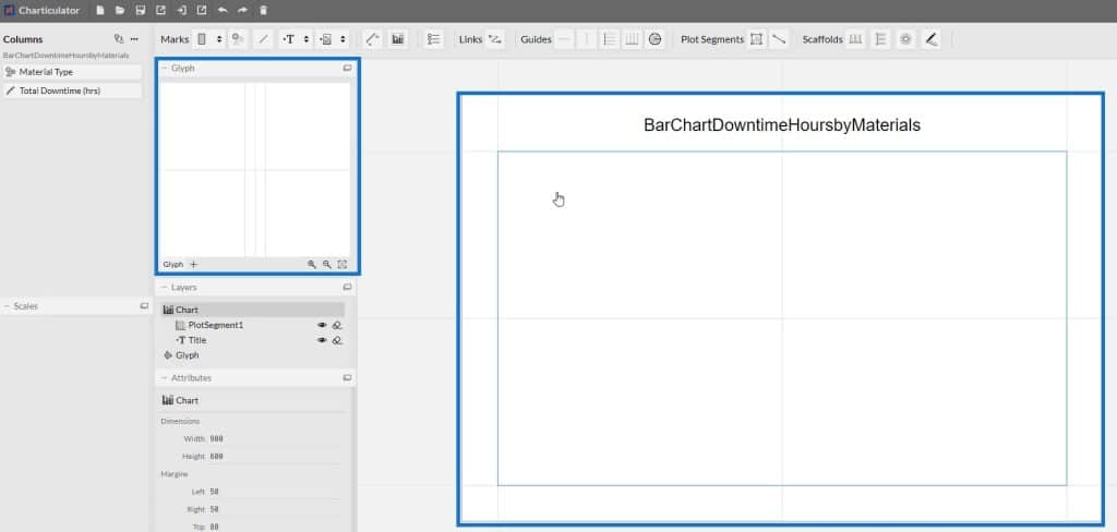
In the actual canvas, there is a default plot for the X and Y-axes. You can define segments by deleting the default and creating a new one through the Line button found in the Plot Segments section.


The Scaffolds section is where you create Horizontal and Vertical Line Charts, Polar Charts, and other similar charts.

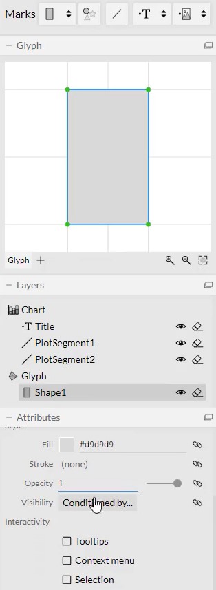
The section below the Glyph is where you modify the settings of your charts. If you drag a shape in the Glyph, you can adjust the size, color, and other details of the visual.
You can save your work in the website and open it anytime for future use and reference. You can also export your visuals as Image, HTML, Charticulator Template, and Power BI Custom Visual.
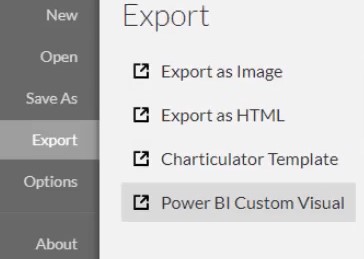
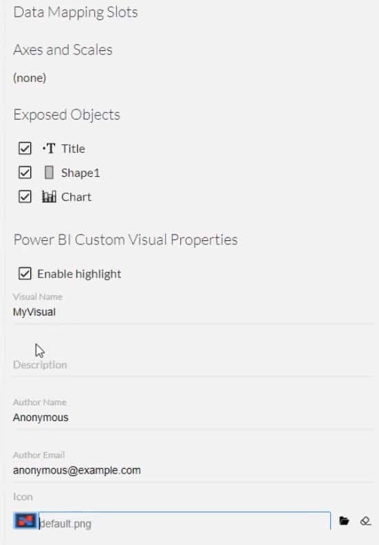
If you choose to click Power BI Custom Visual, you’ll see other export settings like Data Mapping Slots, Axes and Scales, Exposed Objects, and Power BI Custom Visual Properties. In the Power BI Custom Visual Properties, it is important to ensure that the visual name doesn’t have spaces.
***** Related Links *****
Power BI Desktop Update: The Charticulator Visual
Power BI Dashboard Designs: Visuals And Effects
The Importance Of Creating Compelling Power BI Visualizations
Conclusion
Charticulator is an alternative tool for the Power BI Custom Visual. It can turn your data into charts and visualizations, and allows you to easily create efficient visuals. It’s faster than the custom visual inside Power BI because you only need to input a sample data set to start creating a visualization.
You’ll learn basic and advanced visuals as you go along and use Charticulator. Learn more about this tool by going through this module in the Enterprise DNA website.
Mudassir


