In this tutorial, you’ll learn how to create comparison bar charts in Power BI. It is a bar chart that shows two different values on a single category. This helps you see and compare values in your data report. You’ll also see how Charticulator can easily create this type of visuals.
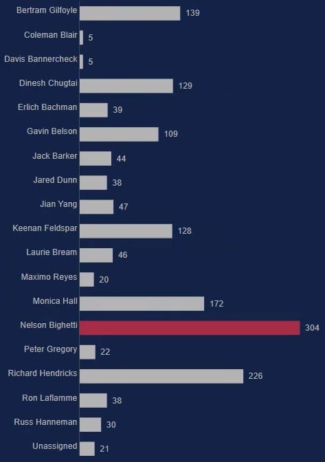
This is a sample bar chart that was created in the previous blog post. We will also be using this to create the comparison bar chart in Charticulator.
Create A Dataset And Launch Charticulator
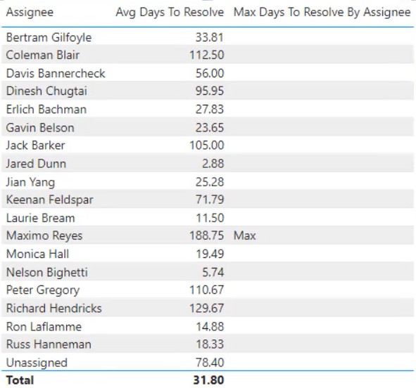
First, create a dataset with the categories and measures that you will use. For this example, the Assignee, Avg Days To Resolve, and Max Days to Resolve By Assignee are used.
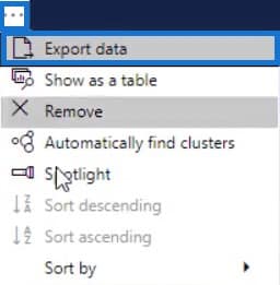
Next, click the three dots on the top of the dataset and select Export Data. Make sure that the data type is a CSV file before exporting.
Once done, go to charticulator.com to open Charticulator. Click Launch Charticulator and open the exported data file. It will then redirect you to the canvas.
Set Up The Bar For The Comparison Chart
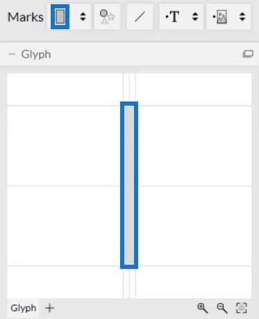
Create a rectangle chart by dragging the rectangle shape from Marks to Glyph.
Then, click Stack Y to change the position of the bars.

Place the Assignee to the Y-Axis of the canvas and the Avg Days to Resolve to the width of the Glyph.
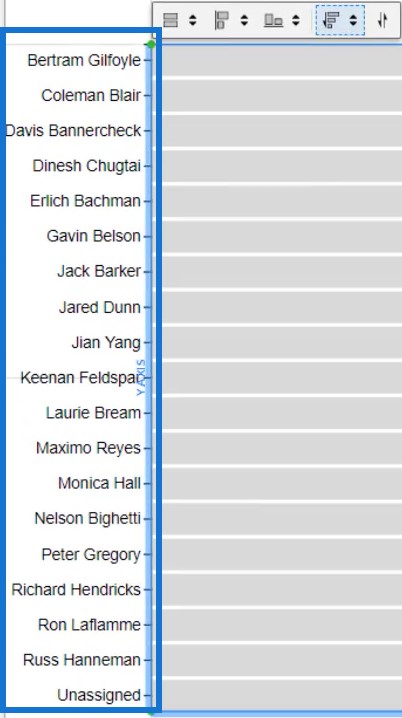
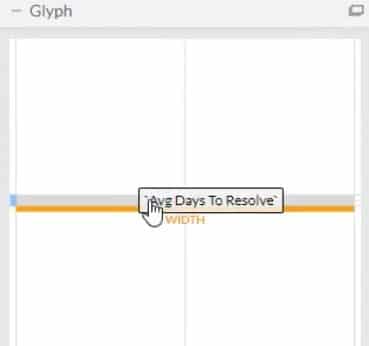
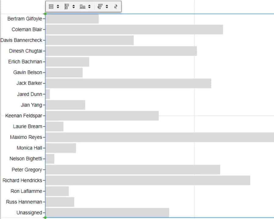
The visual will now look like this.
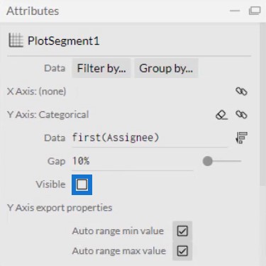
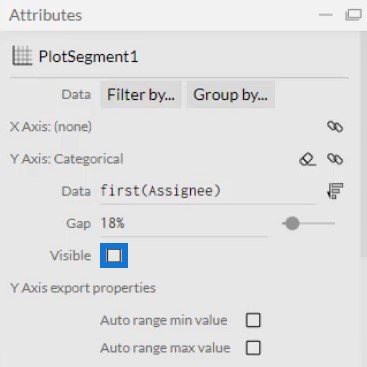
Next, click PlotSegment1 to open the attributes of the chart. Uncheck the Visible box to remove the categories in the Y-Axis.
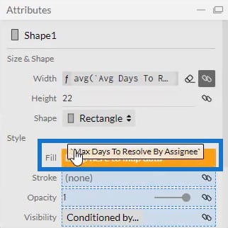
After that, click Shape1 to open its attributes and place Max Days To Resolve By Assignee to the Fill Style.
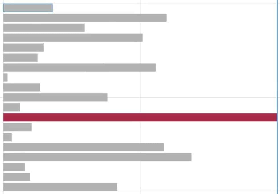
You can see that the colors of the bars are the same except for the maximum value. You may change the colors of the bars depending on what you want or to match your previous charts.
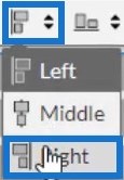
Now, you need to transfer the bar charts to the right side of the canvas. To do that, click the second panel of settings above the canvas and select Right.
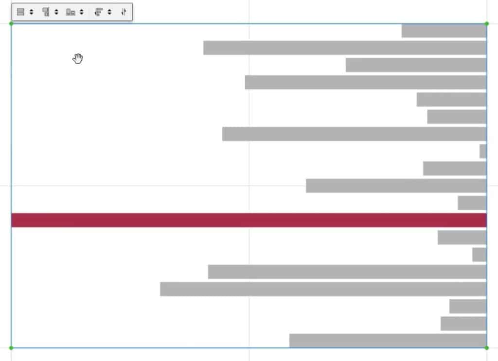
The chart will then transfer to the right end.
Export Chart File And Input Data
Once done, save the bar chart. Next, click the export button and select Power BI Custom Visual.
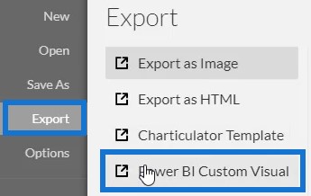
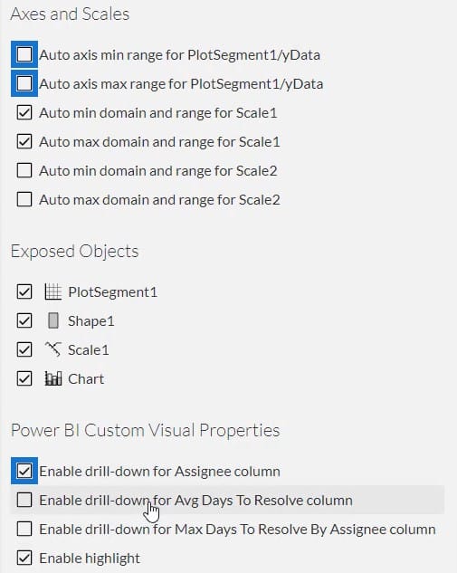
Before you export the file, you need to uncheck the first two boxes in Axes and Scales so that the axes won’t change when a new filter context is selected. Then, click the first box in the Power BI Custom Visual Properties to enable drill-down for the Assignee column. After that, add a visual name and click Power BI Custom Visual to export the file.
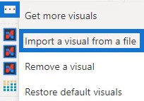
Now, open Power BI to import the file. Click the three dots below Visualizations and select Import a visual from a file.
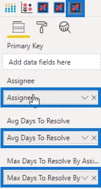
Next, click on the Charticulator button with the visual name and place Assignee, Avg Days To Resolve, and Max Days To Resolve By Assignee to their corresponding Field sections.
Once done, adjust the margins of the chart to align them with the previous bar chart. Lastly, match the two bar charts by removing the title and background. After that, you’ll now have a comparison bar chart that looks like this.
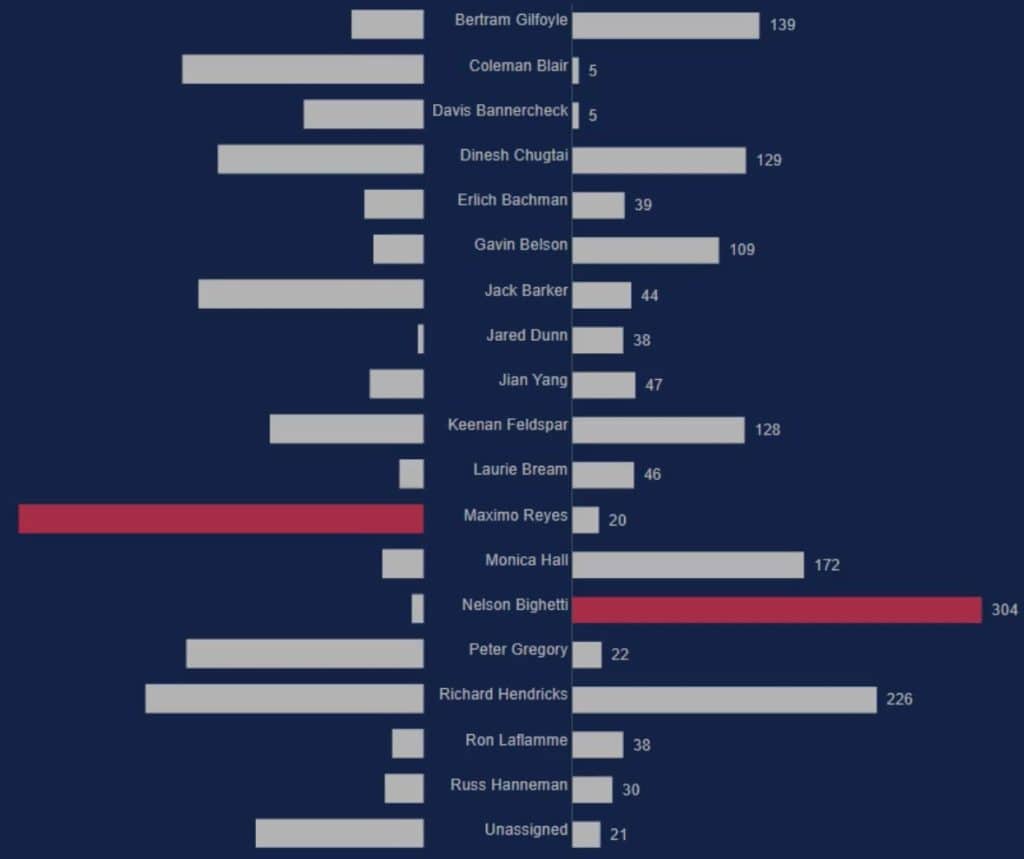
Finalize Details Of The Comparison Bar Chart
If you want to place your categories at the center of both bars, go to the Charticulator website and open the previous bar chart. Click PlotSegments1 and uncheck the Visible box in the Attributes to remove the categories in the Y-Axis.
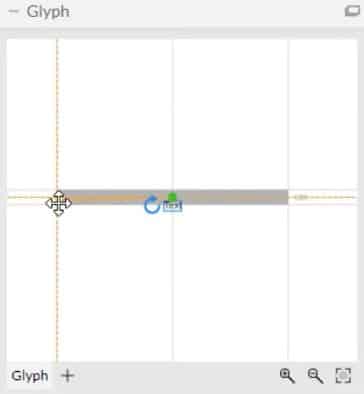
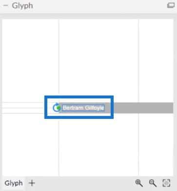
Next, bring Text to the Glyph and align it to the left edge of the rectangle.
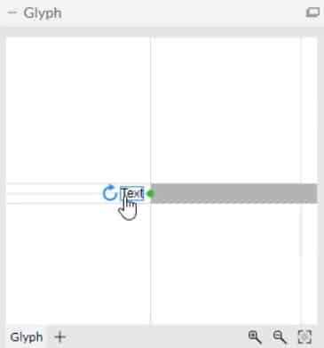
Then, drag Text to the left side of the bar and adjust it to a distance that you prefer.
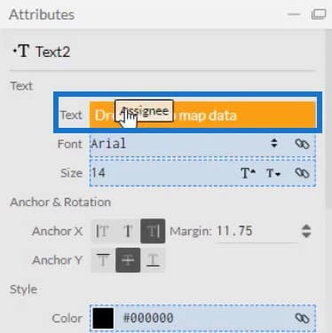
Bring Assignee to the Text section in Text2’s Attributes and change other settings to complement the other bar chart.
You can now see that there is a small space between the categories and the bars.
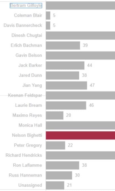
Next, save the chart and export it to Power BI Custom Visual. Import the file inside Power BI and adjust the margins of the chart to match with the other bar chart. Your visualization will now look like this.
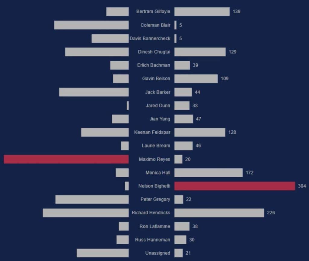
Next, filter the visual so that when you click a bar it will show the bar that it is compared to. Go to the Format tab and click on Edit interactions.

Then select the Filter button of the charts.


If you click a bar, the chart will only show the bar that it is compared to.

Another way to use comparison bar charts is to put the categories inside the bars. To do that, you need to move the Text inside the bar and adjust the font’s size and color. Then, export and import it to Power BI Custom Visual.
This is what the chart looks like.
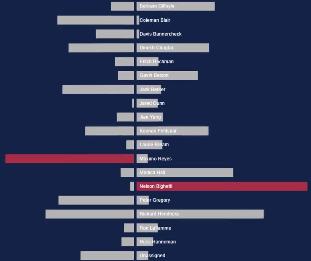
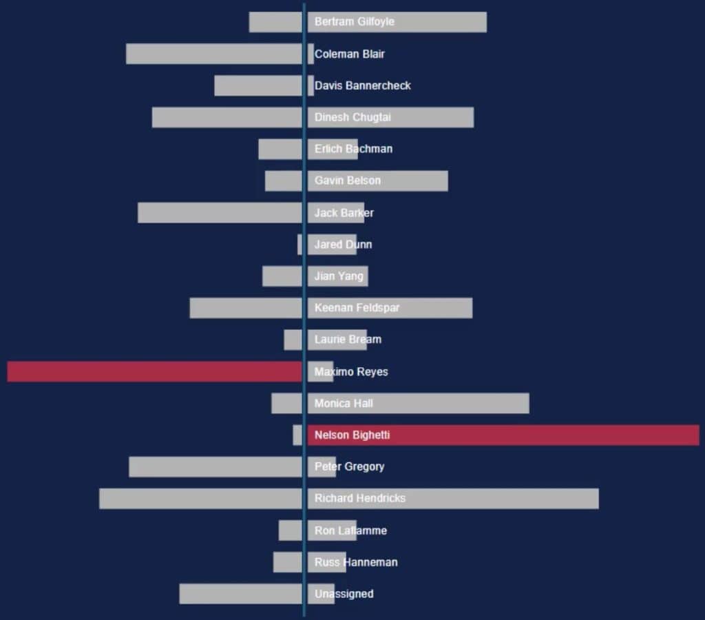
You may also add a line between the bars to make it more distinguishable.
***** Related Links *****
Custom Bar Chart In Power BI: Varieties And Modification
Power BI Desktop Update: The Charticulator Visual
Data Visualization Technique | Power BI Dynamic Visuals
Conclusion
A comparison bar chart provides a better way to compare two values. It saves space in your canvas because it maximizes its space for two results. This chart can easily be made using the Charticulator tool.
If you want to learn how to create comparison bar charts, go to the Charticulator website and practice with your dataset. You may also look through our Charticulator-related module for more techniques about visualizations.
Mudassir


