
In this tutorial, you’ll learn some fundamental design practices that can help you tell a better data-driven story for your dashboard in Power BI. Power BI dashboards are used to communicate insights. It tells a story through visualizations. Therefore, it is vital to have the proper data visualization to efficiently highlight the insights for your audience.
Defining Colors For Your Dashboard In Power BI
The first thing that you should keep in mind is to use consistent colors just like what I did in my report here. As you can see, I used 1 color for my headings.

The colors that I used are the same across the other pages of my report.
If you use various color combinations in your report, it will look like a kid’s work in their coloring book. Sometimes, the story that you want to tell gets mixed up among all the colors. So, it’s very important to use a maximum of 2-4 colors in your report.
In case you want to use only one color, you can use one with varying hues. For example, here you can see that the color of the leftmost bar is a darker color. Then, the next bar has a lighter color. However, they all belong to the same color family.
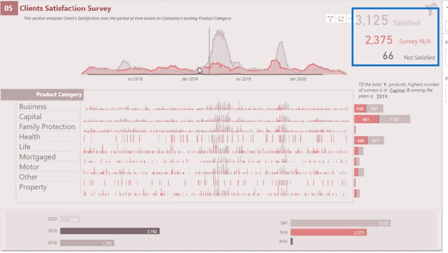
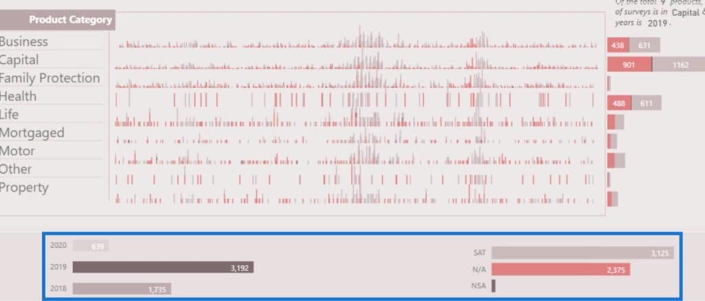
If you’re trying to use different colors, make sure that you explicitly define what those colors mean. For example, in this report, I used different colors for the visualization. The other one is lighter, the other one is red, and the line at the bottom is a bit darker.
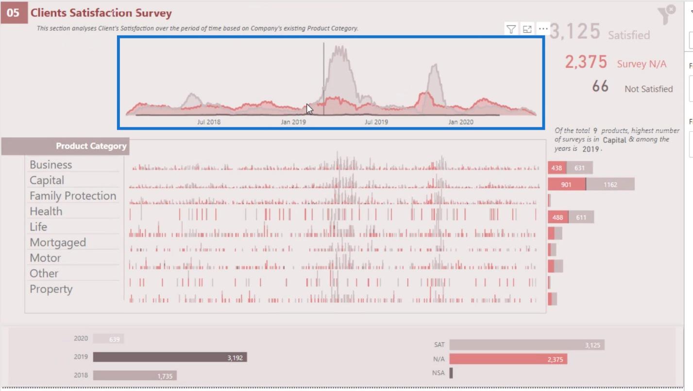
Even though they have different colors, I explicitly defined them over here. The lighter color belongs to a number of satisfied customers, the red color is for survey data, and the darker color is for the number of unsatisfied customers.
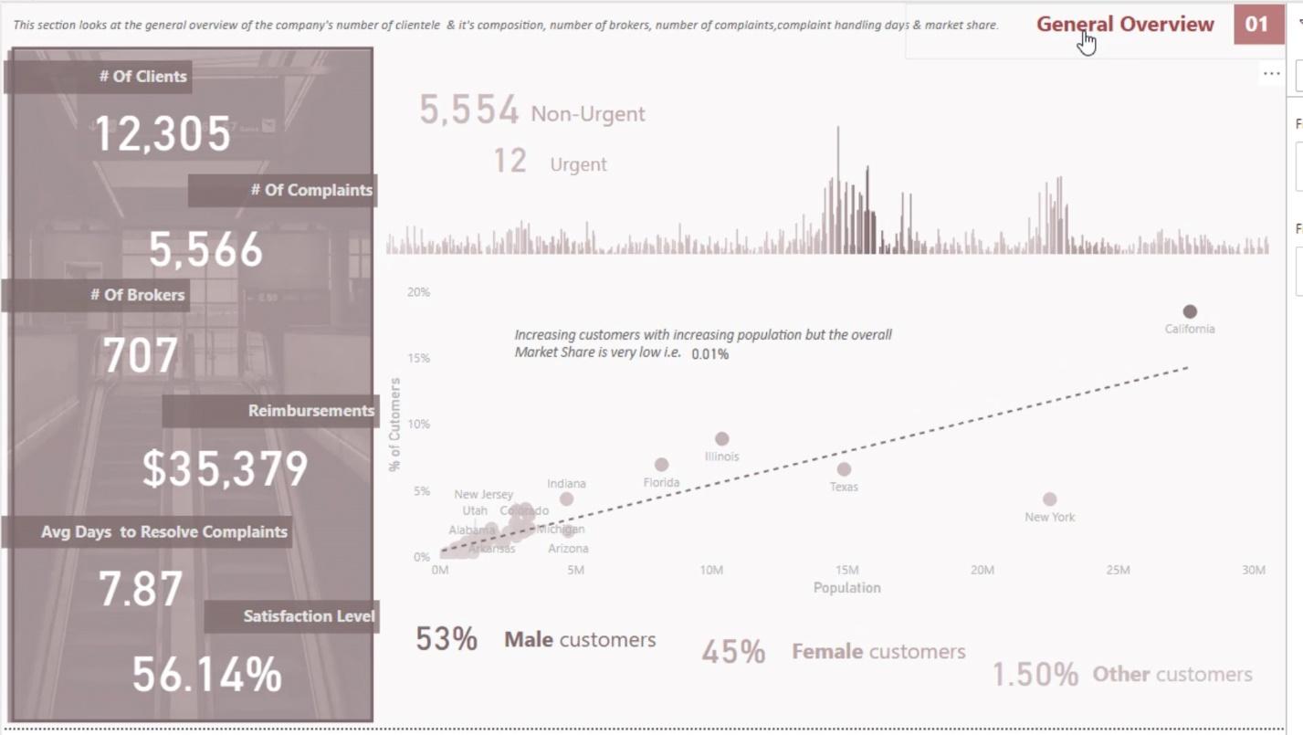
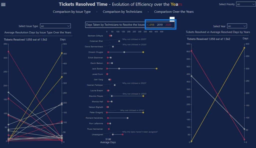
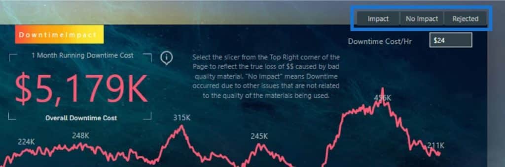
Here’s another example where I explicitly defined the year 2018 with the yellow color, 2019 with the gray color, and 2020 with the red color in the report page.
I also used a mixture of those colors in this heading here. This will provide people the idea that these colors are used to define individual colors in this report.


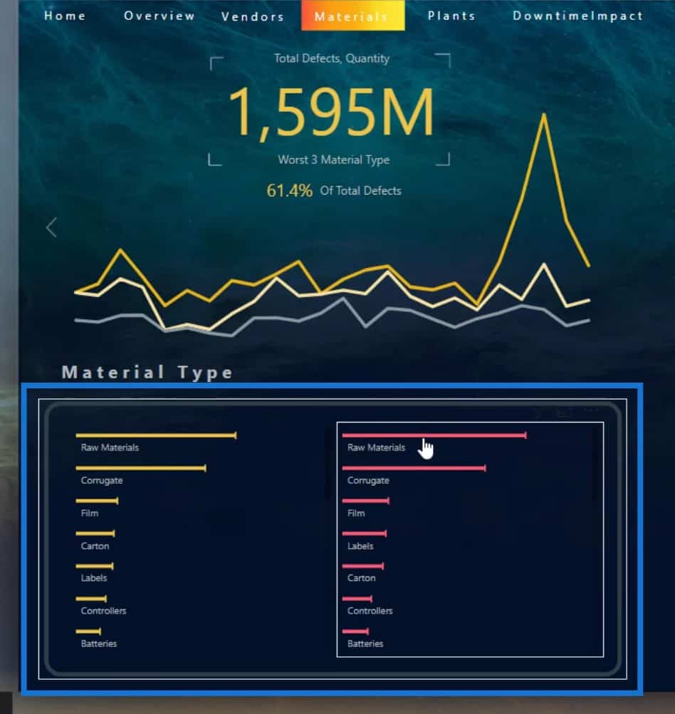
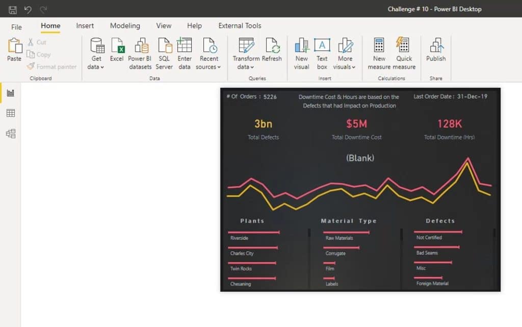
Here’s another example that’s related to the previous one. As you can see, I used a yellow color for the Defects data.
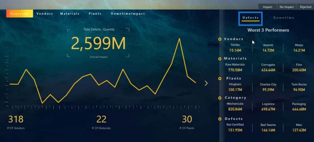
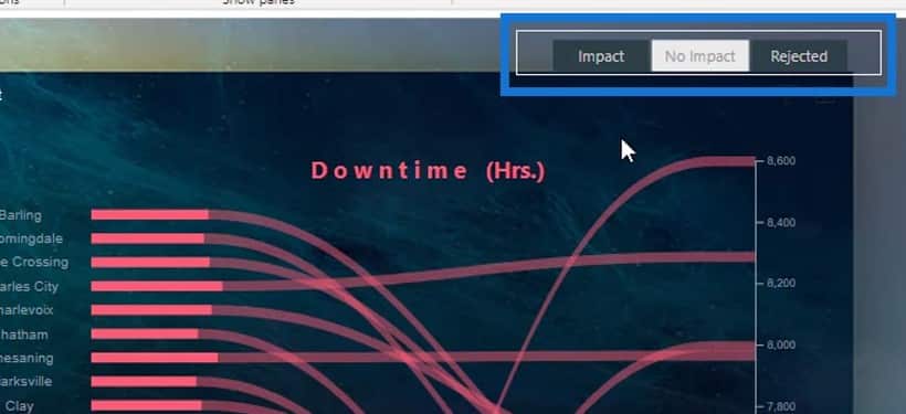
Then, I used the red or pinkish color to define the Downtime data.
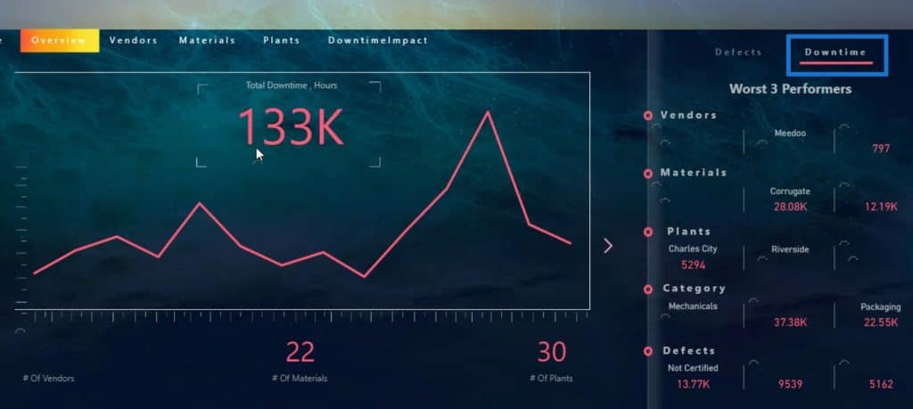
In this certain navigation button, I used a gradient color with a combination of yellow, red, and pink colors. This corresponds to the colors that I used in this report.

And that is how you can define colors in your report.
Organization Of Visuals In Your Power BI Dashboards
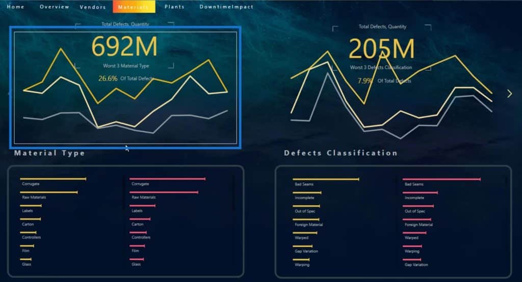
The next good dashboard design practice that I want to discuss is the organization of your visuals, and how it should always interact with the other visuals in your report.
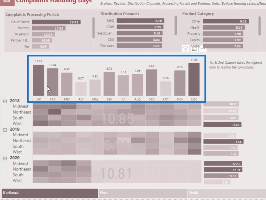
For example, this part of my report represents the overall trend for the number of conducted surveys.
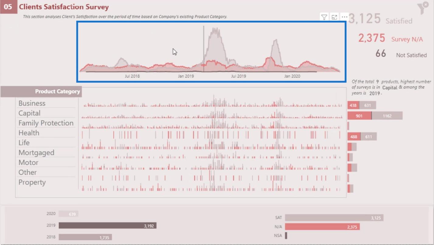
On the other hand, this is the individual trend across the Product Category.
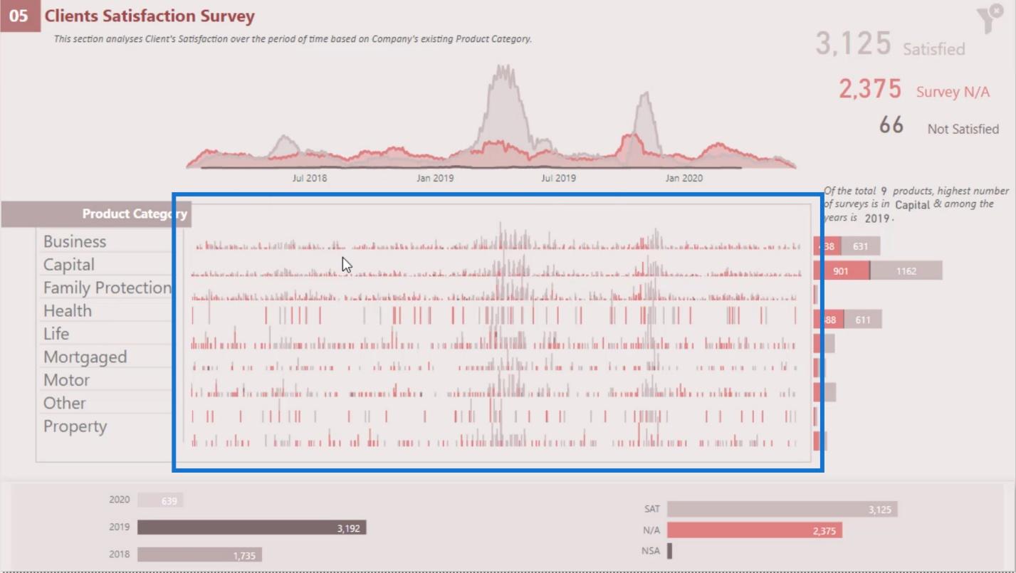
As you can see, the individual trend is interacting with all the visuals in this report page.
Here’s another example where I’m showing the trend by Material Type. This indicates the top 3 worst materials that have the highest number of defects and their trend.
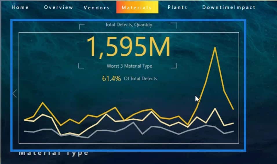
The top 3 materials are in this section, which are the Raw Materials, Corrugate, and Film.
They can be changed dynamically as well. For example, if I change the year to 2018, you’ll see that the top 3 materials are now Corrugate, Raw Materials, and Labels.
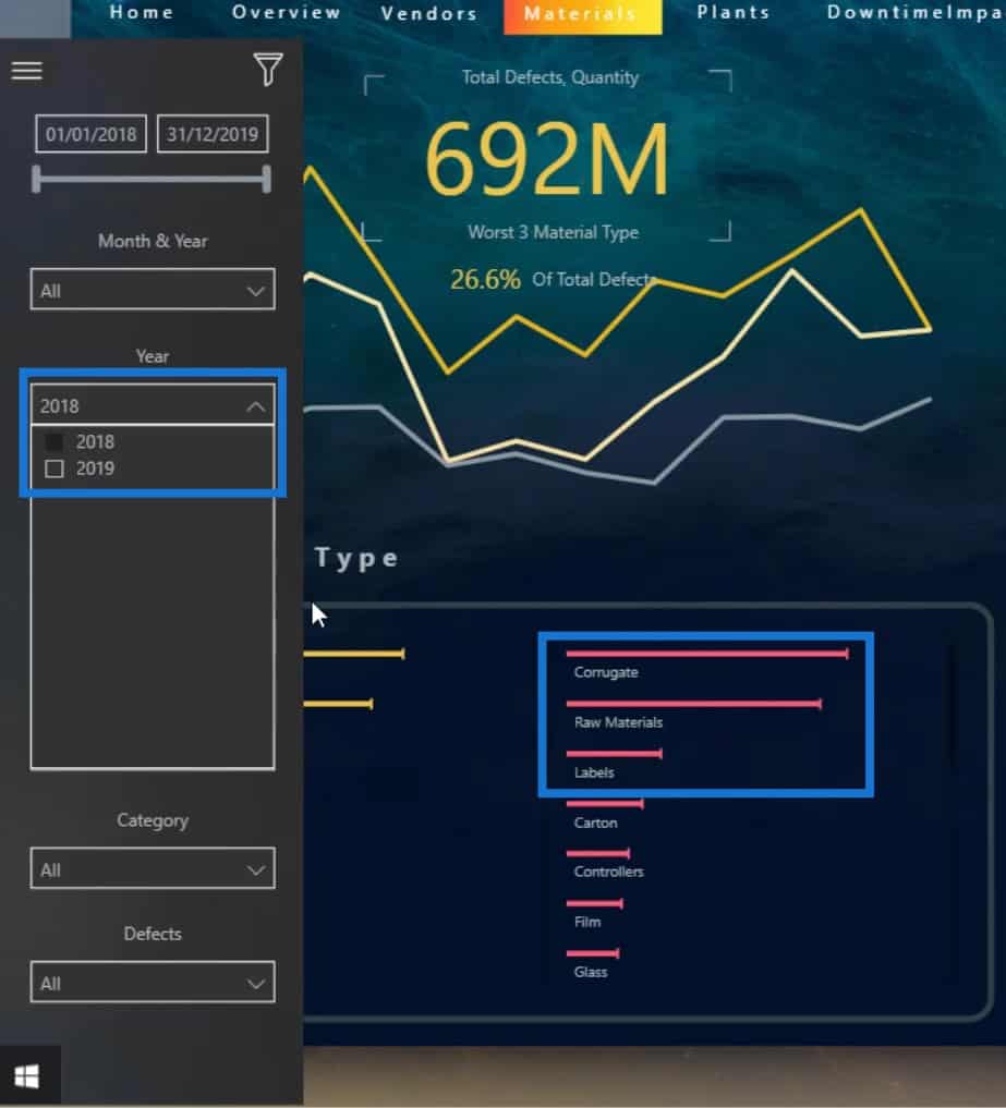
You’ll also see that the trend changed based on the output from the Material Type. Hence, these visuals are interacting with each other.
Choosing The Proper Visualizations For Your Dashboard In Power BI
Another important aspect that you need to keep in mind is learning about the types of visualizations that you’re going to use. For instance, you might have a lot of categories just like my table here where I have 318 vendors.
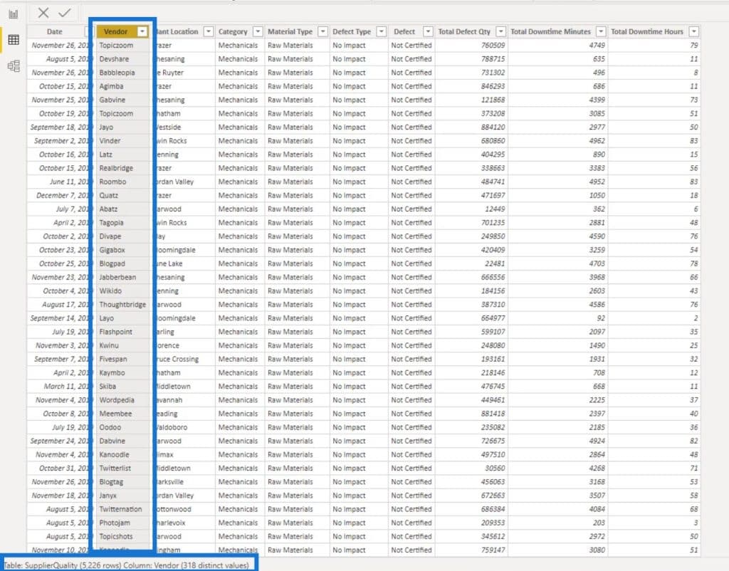
If I use a line chart and indicate the number of vendors through a legend, it will get too crowded. The line chart won’t be able to support that number of categories.
As an example, I created a page here where I used a line chart for displaying my vendors. Consequently, it indicated that there are too many values and it’s not showing all of my data. This visualization is not that good and helpful because there’s no story or information at all.

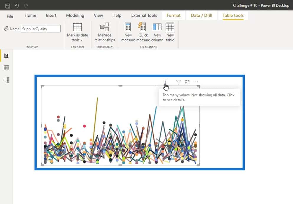
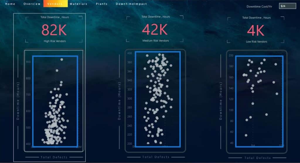
In cases like this, you can use scatter charts instead because they can have a lot of category types.
Adding Tooltips For Your Dashboard In Power BI
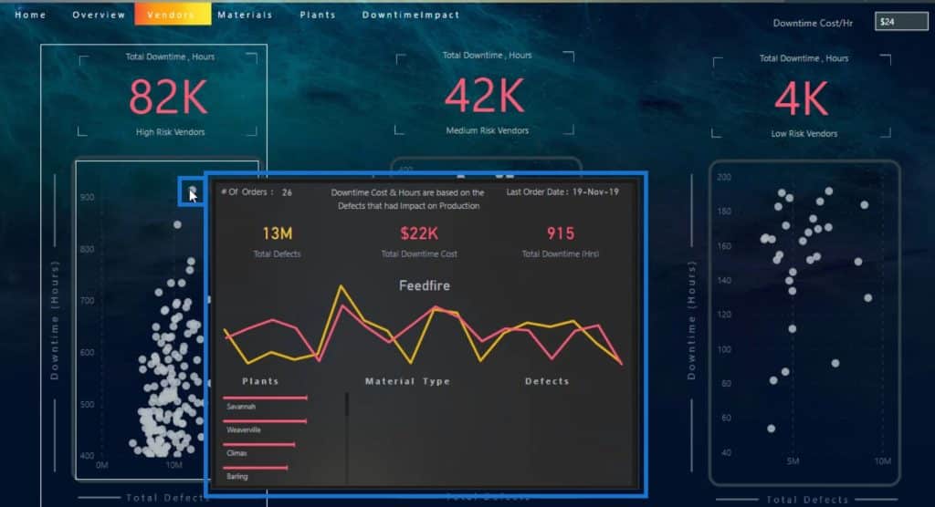
Another thing that you can do when designing your Power BI dashboard is to add tooltips. Adding tooltips are also useful when using scatter charts. As you can see in this example, we can’t see any information at all.
However, if I hover over a certain plot, I can see the essential information about it because I added a tooltip.
The good thing about tooltips is that we can use custom tooltips from the marketplace, and the visuals can be designed in Charticulator as well.
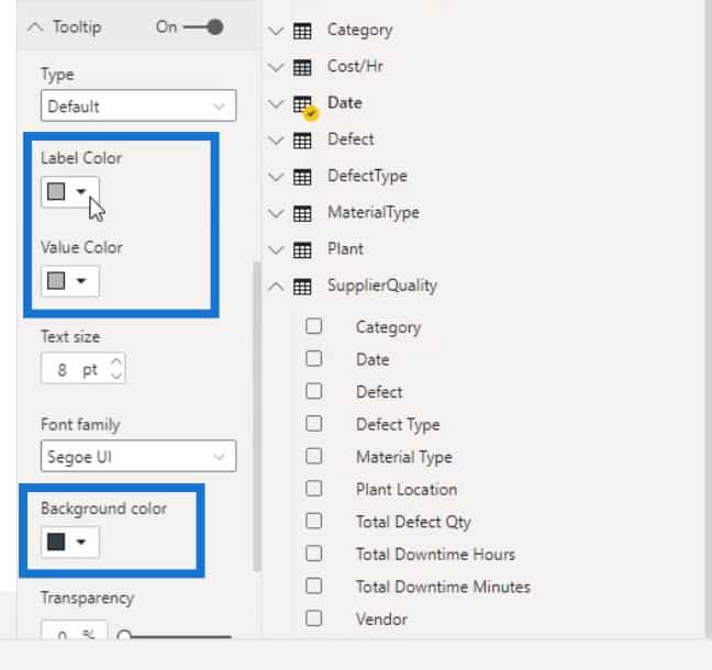
You can also change the color of your tooltip. To do that, go to the Tooltip section under the Format pane. Here, you can change your tooltip’s background, label, and value color.
Creating Custom Tooltips
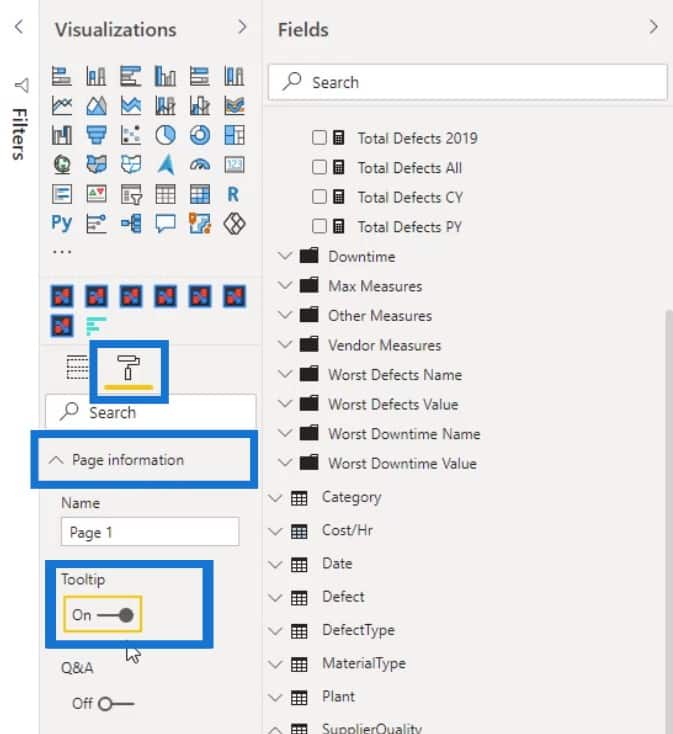
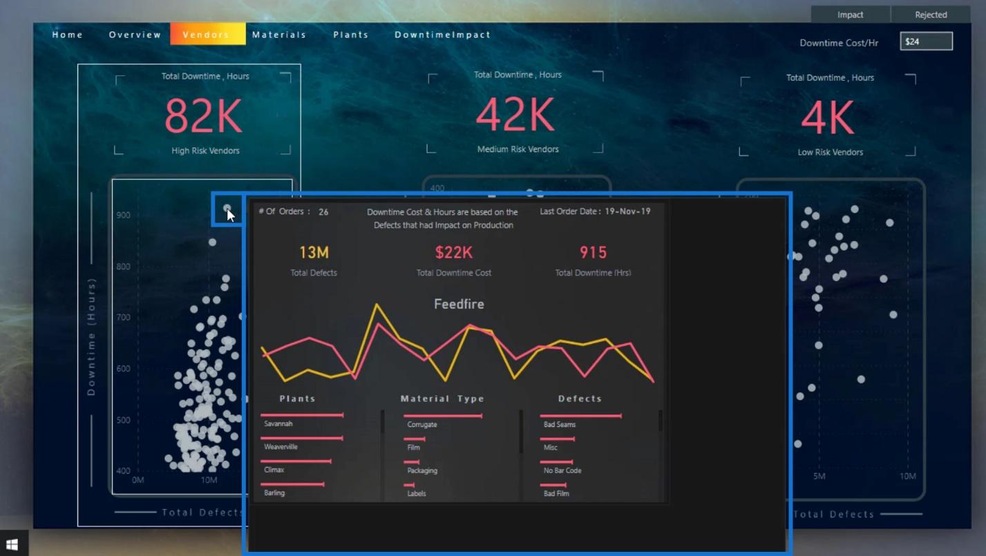
One of the cool features of tooltips is that you can create a report page and turn it as a custom tooltip as shown in the image.
You can do this by creating a separate page. In the separate page, go to the Format pane, and enable the Tooltip option under the Page information.
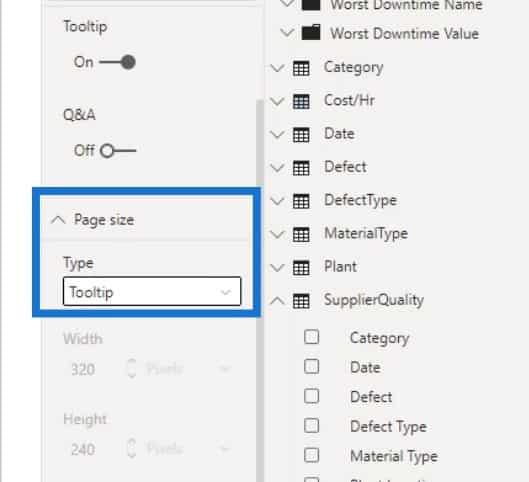
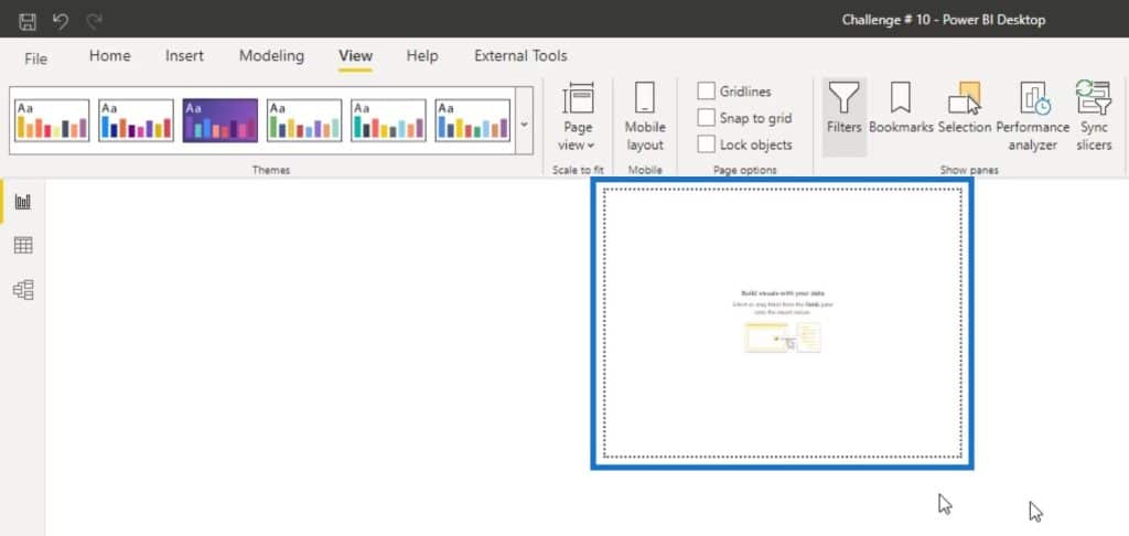
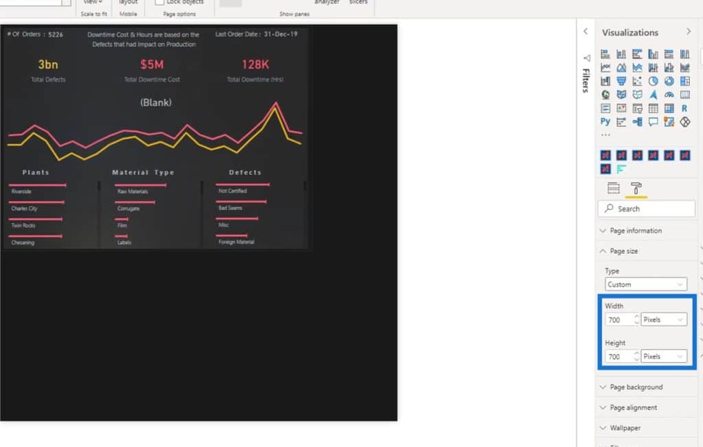
Then, to make the size similar to a tooltip, select Tooltip for the Type option under the Page size.
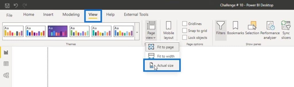
After that, go to the View tab, and select the Actual size option under the Page view to choose a tooltip view.
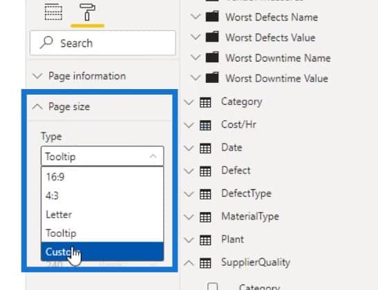
By default, the size of a tooltip is small.
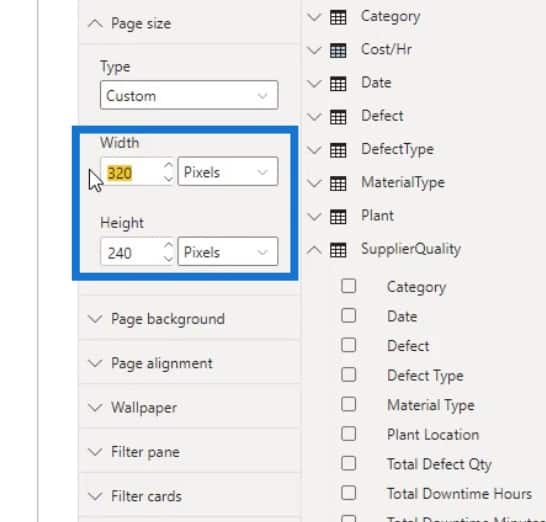
To customize this, just go to the Page size again and select the Custom type.
You can then increase the width and height of the tooltip.
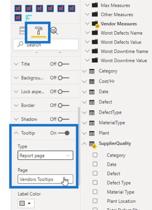
Now, that custom page is ready to be used as a tooltip on your report. Just select the visual where you want to use it. Then, go to the Format pane. Look for the Tooltip, set the Type to Report page, and select the page name that you want to use as a Tooltip under the Page field.
If you change the size of your custom tooltip, it will also automatically change on your visual’s tooltip. For example, I’ll change the size of this custom page tooltip here.
If I hover over its corresponding plot, you’ll see that the size of the tooltip changed as well.
Adding A Drill Through Page For Your Dashboard In Power BI
A drill through is used to create a page in your report that focuses on a specific entity so people can get details that are filtered for that context.
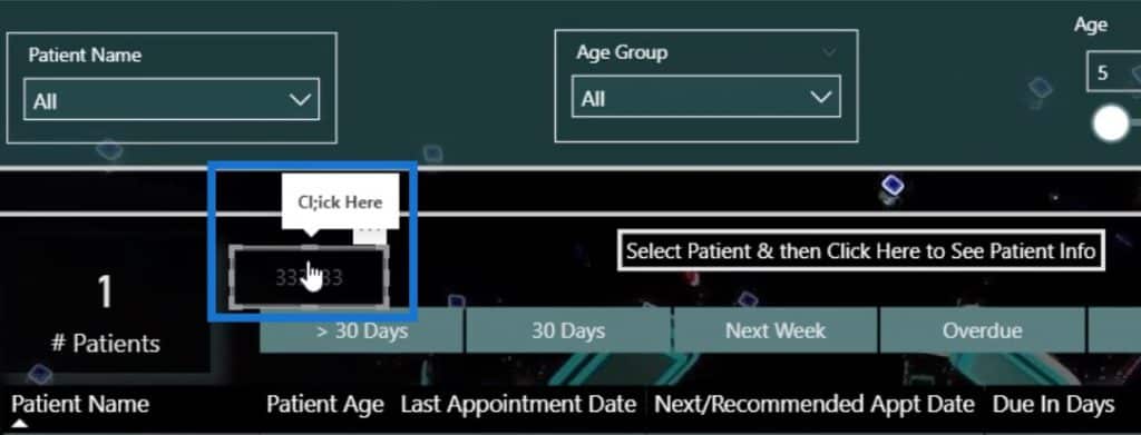
To add a drill through in your report, you can use a button to show the end-user that you have to click on that button to work on the drill through page.

You can also right click on a data and select Drill through.
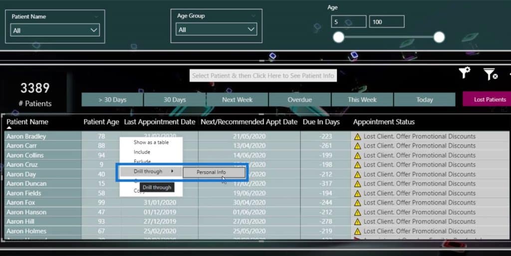
Or, you can select this particular data, then click on the button to go to the drill through page.
It’s not difficult to setup a drill through page. Just go to Insert tab, and click on the Blank button.

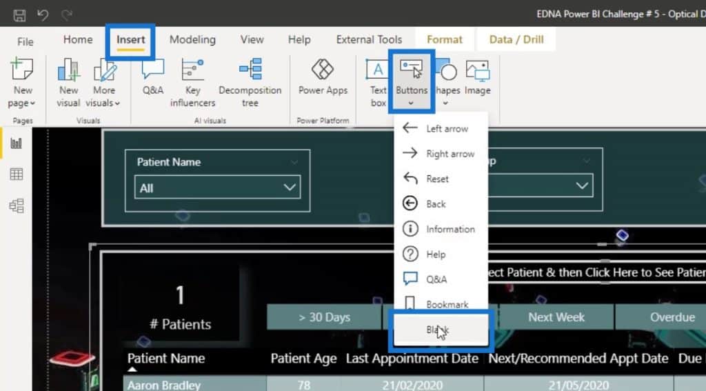
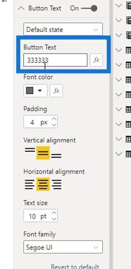
Then, define it on the Button Text field under the Visualizations pane.
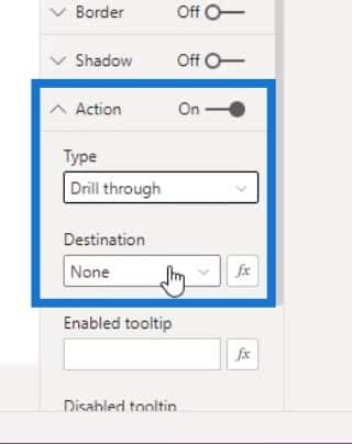
After that, enable the Action option, set the Type to Drill through option, and set the Destination.
If you haven’t selected anything yet, the button will look like this.

If you select an item or data, it will look like this. This indicates that you have to click on it to go to the Drill through page.

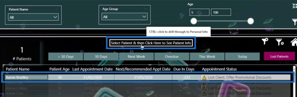
You can also add a tooltip by going to the Enable tooltip under Action. For example, let’s type “Click Here”.
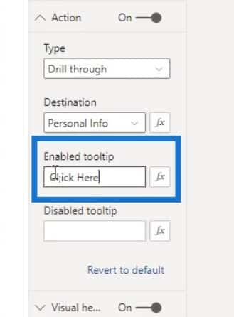
If I hover over here, you can see that it shows “Click Here”. With this, the end user will know that they need to click this in order to go to the drill through page.
Adding Extra Information For Your Visualization
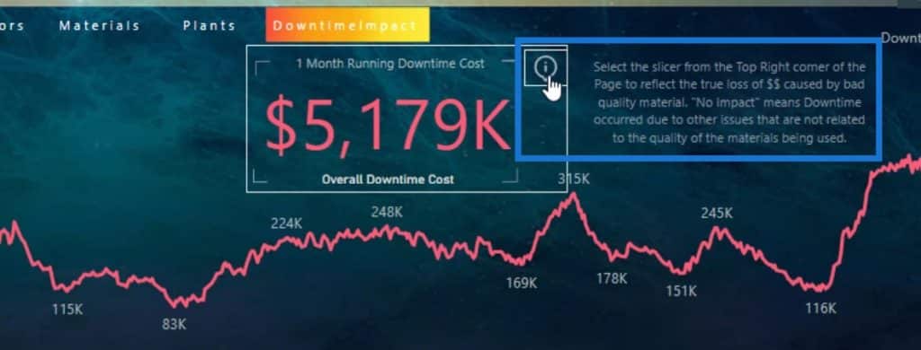
You can also give additional details if your visualization is complex. For example, in this report page here, it’s difficult to understand what the Average Open Days means.
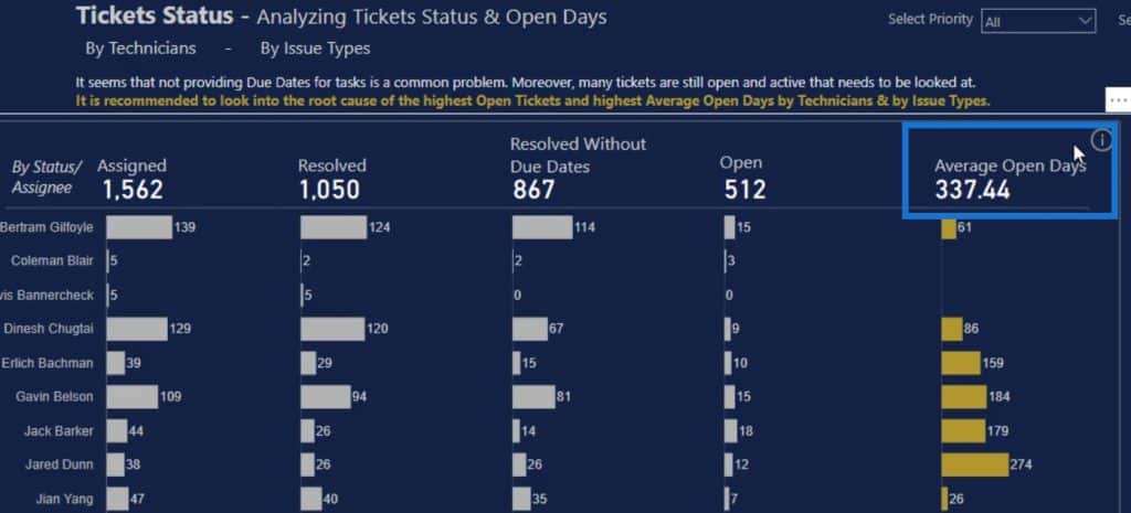
So, I added an icon that will display additional information upon clicking on it.
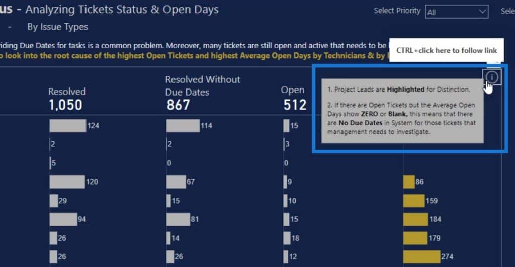
I also added that information icon in my report here.
Using Minimal Number Of Slicers
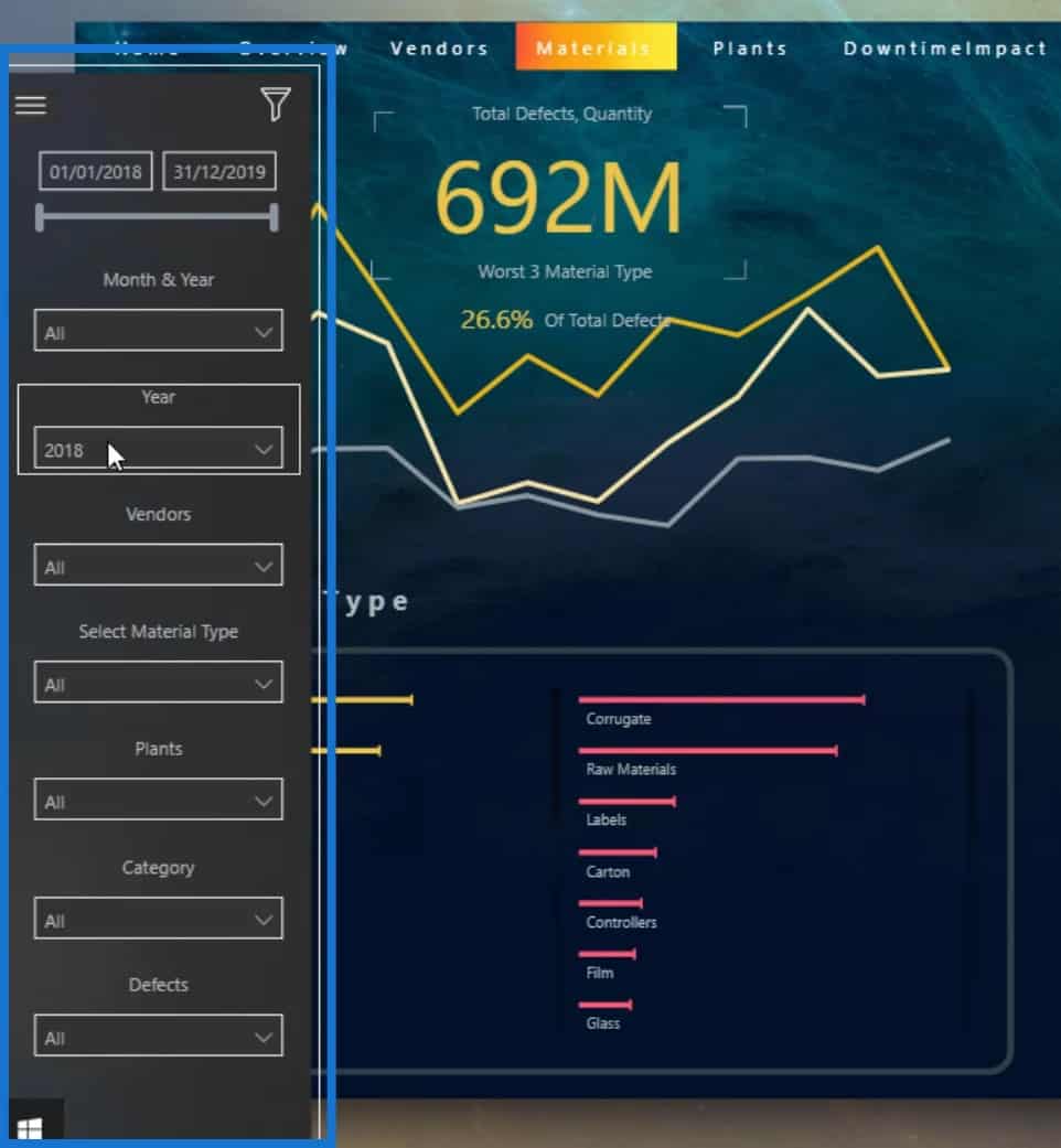
Keep the number of slicers to a minimum on the report page. I usually try to only put the most important slicer on the report.
For example, I only placed one slicer in this report.
If I go to the other pages, you can see that there’s only one slicer displayed as well.
However, for reports with detailed analysis, I have put my slicers in the navigation panel here in case the end user also wants to use it.
Moreover, you can use the visuals instead of slicers to summarize the data. Using visuals gives more information as well.
If I come back to this page, the highlighted part is acting like a slicer. However, it’s also giving information to the end user. I can just click on it and it will filter the data for me.
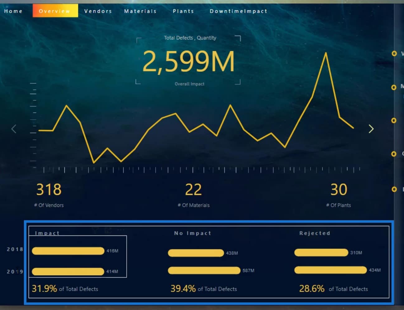
I also did that on my other reports as shown in this example. The visuals here also act as slicers. They look better than slicers, and give a lot more information.
***** Related Links *****
Recreate A Visualization In A Power BI Dashboard
Power BI Dashboard Design – An Impressive Page Turning Visualization Idea
Power BI Dashboard Tutorial – How To Improve Dashboard Design
Conclusion
To conclude, these tips that I mentioned are the things that you should keep in mind when creating or preparing a report.
The potential of dashboards in Power BI is often not fully realized due to minimal efforts being put into the final design. Keep in mind that by properly designing your dashboards, you can make the most important information stand out to your audience.
Check out the links below for more examples and related content.
Cheers!
Mudassir


