In this tutorial, you’ll learn how to easily recreate a visualization in Power BI and how to organize your dashboard to make it look more compelling.
The methods discussed in this blog will help you understand how to approach future reports that you’ll be creating in Power BI.

Copy And Paste Visualizations
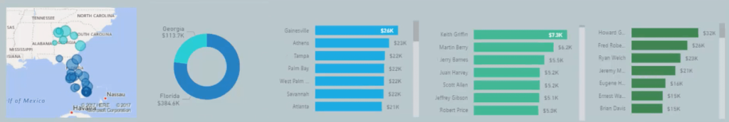
First, clean a few things in your visuals.
Remove the x-axis of the stacked bar charts to free a bit of room inside each visualization. Then, bring in additional information inside the doughnut chart.
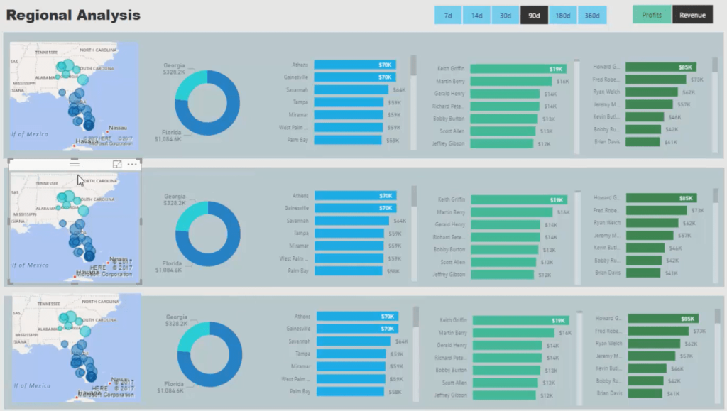
If you select a time frame and a metric, you can now see these changes in your visualizations.
After you’re done with the formulas and designs, copy all the visualizations twice and paste them in the next two rows.
Change The Content Of The Visualizations
All you have to do now is change the content of each visualization.
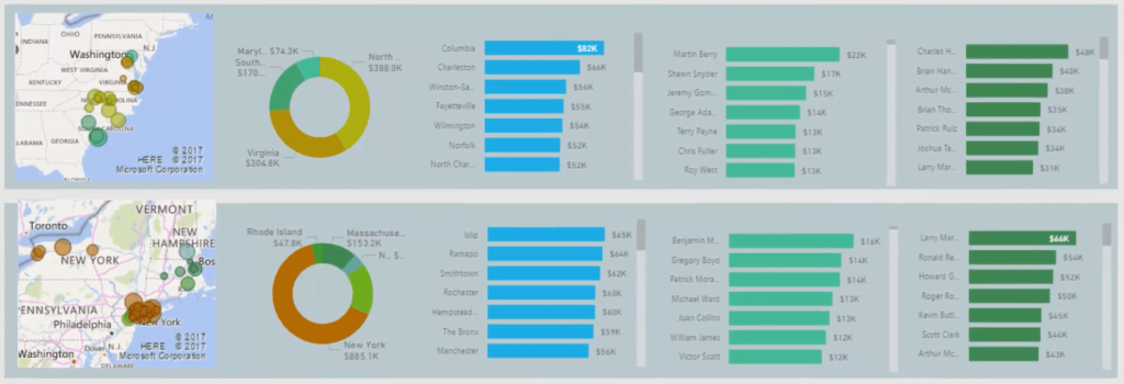
Go to the filter fields and change the State with new states. For the 2nd row of visuals, the states are: Maryland, North Carolina, South Carolina, and Virginia. For the last row, the states are: Connecticut, Massachusetts, New Hampshire, New Jersey, New York, and Rhode Island.
In this way, you can break out information and look at them with ease.

Add Titles And Labels
Another thing you need to do to make your dashboard look better is to add titles to the visualizations. So, grab a text box and place it on top of the visuals. Then, rename them individually.
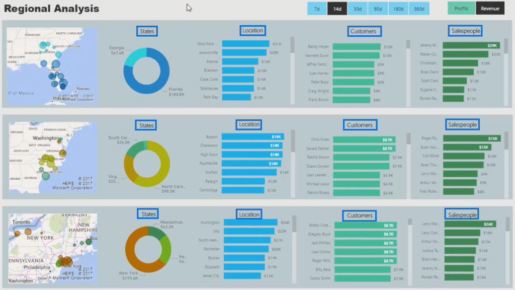
Now, if you try to select Florida, you’ll see that it changes all of the visualizations in your report. And that’s not good because only the row where that visualization is in should change.
Edit The Interactions
To solve that issue, you have to change the interactions of your visuals. Go to Format, then click Edit Interactions. Next, filter the visuals within the row of the chosen visualization. Click the None icon for those that aren’t part of its row.
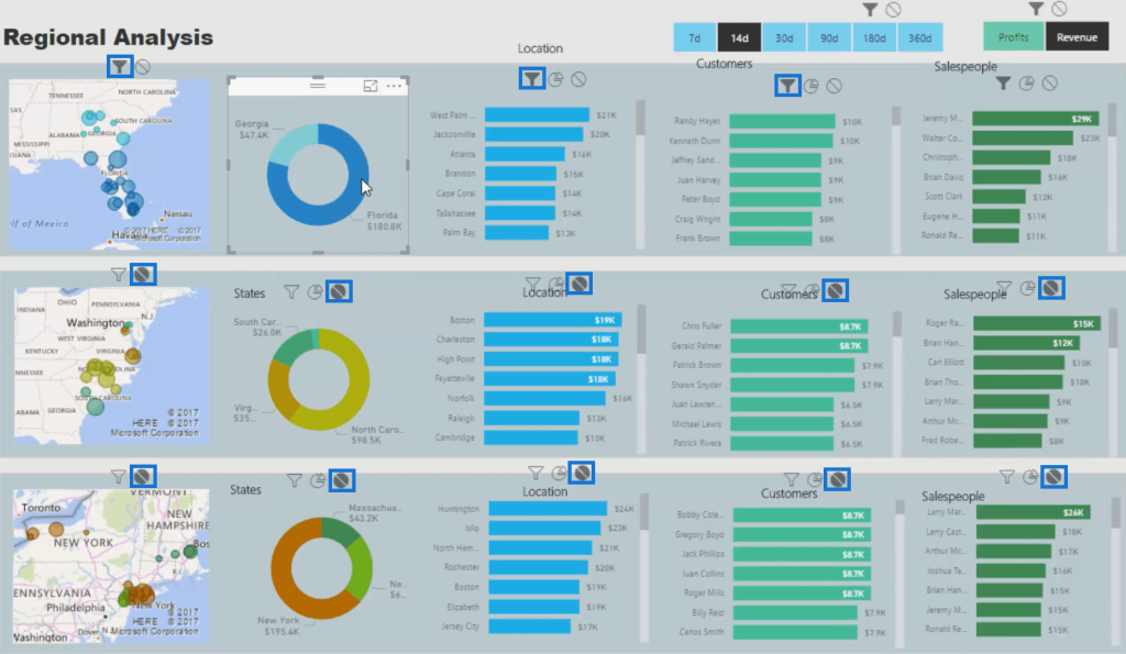
Repeat this to all the visuals so that they will function according to their row. Once you’re done with that, you can now see that if you select a value in a row, only the visualizations in that row will change.
It is highly recommended that you change the interactions in a way where your visuals are segmented.
With that, your dashboard is finished and is ready to give valuable insights to you and your customers. You can now click any retail store and see the performance of your salespeople among many other pieces of valuable information.
If you want to make it even better, you can adjust the colors of the background and even the report page size. The aesthetics is all up to you.
***** Related Links *****
How To Control The Interactions Of Your Visuals In Power BI
How To Add Custom Icons Into Your Power BI Reports
Custom Conditional Formatting Techniques In Power BI
Conclusion
The copy and paste method introduced in this tutorial speeds up your work when recreating a visualization in a Power BI dashboard.
If you want to have the same visual with a different content, you can utilize this method. However, in doing so, the interactions of each visuals will get mixed up.
So, always remember to edit the interactions so that it won’t affect other visuals that are not grouped with them.
All the best,
Sam