
I’m going to show you my most favorite visualization idea around tooltip in Power BI. I saw it demonstrated really well in a Power BI challenge submission and I just want to show you how far you can take it. It’s not that difficult at all and it can add so much value to your report. You may watch the full video of this tutorial at the bottom of this blog.
This visualization technique using the Power BI tooltip will keep your consumers engaged and it enables you to compact more information into a singular report page. You don’t need to build comprehensive reports with ten pages or more. I’m going to show you how you can do that with this great tooltip idea.

How To Create A Visual Tooltip
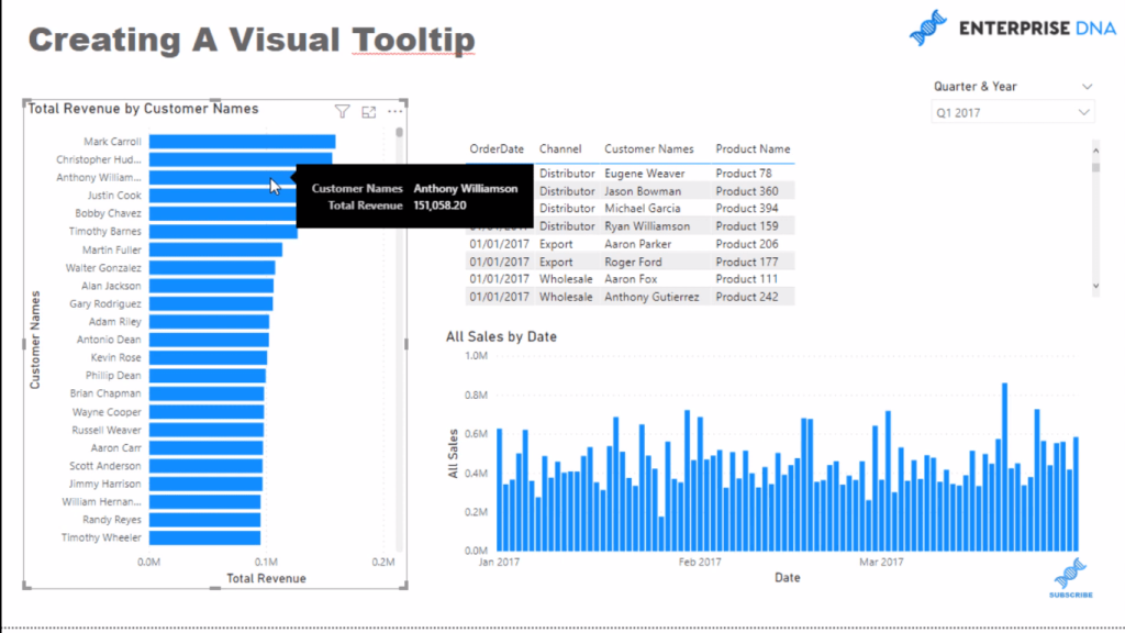
Historically, this is what a tooltip has looked like, right? But what if you could customize this tooltip and create a visual tooltip? Wouldn’t that be awesome?
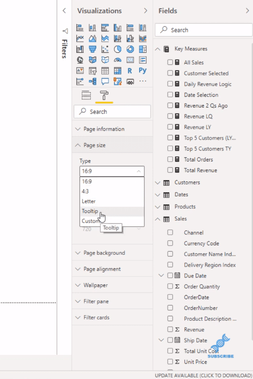
To do this, I first go to the paint roller, to the page size, and then I select tooltip.
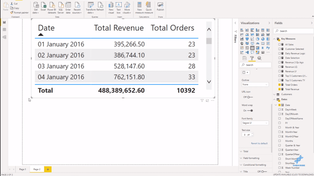
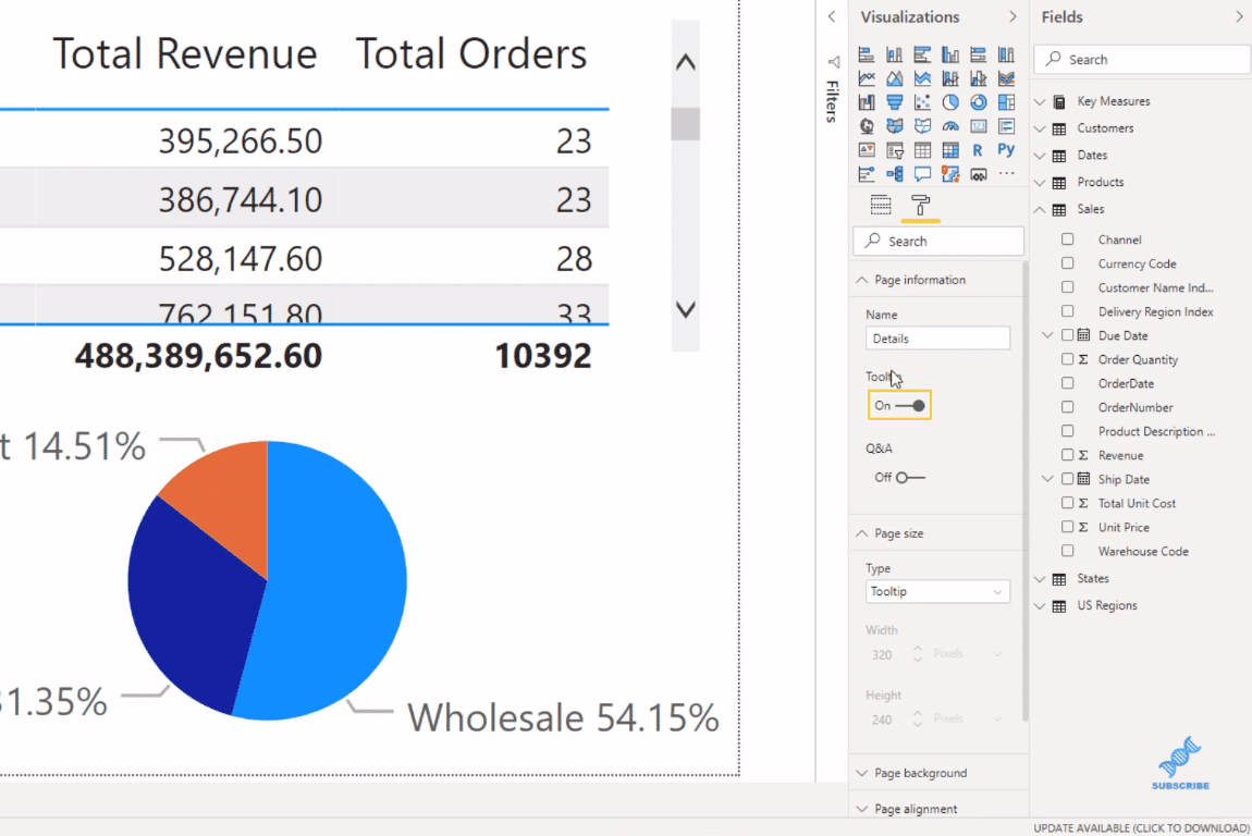
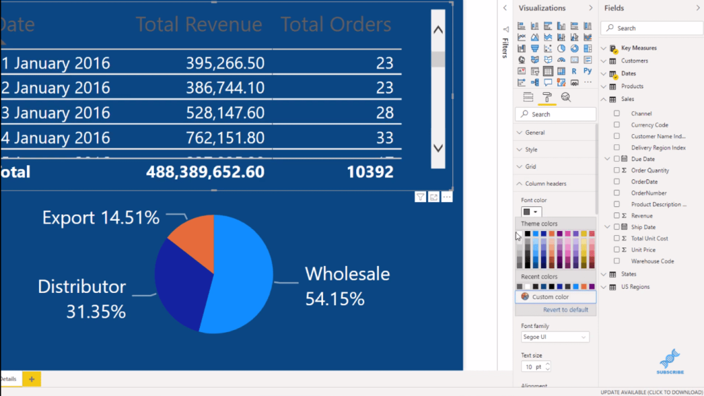
This gives me this unique page that is optimized for tooltips. I’m going to grab a table visualization and put some information in it. I want to be able to hover over a customer on my report page, which will then show me some information about the customer.
In my table visual, I put my Date table as well as my Revenue and Orders. I then adjust the table accordingly to fit the page.
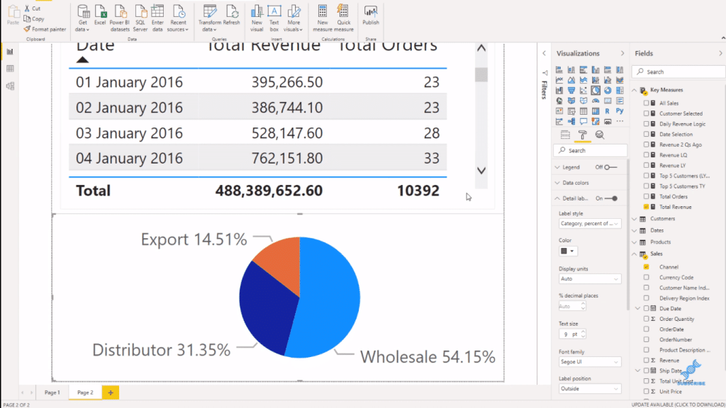
Next, I put a simple pie chart below the table. And then I’m going to grab the Channel from my Sales table because I want to see the channel in which a lot of these sales are happening. And I’ll also bring in my Revenue. Then, I just simplify this table and change the data labels into Category, percentage total.
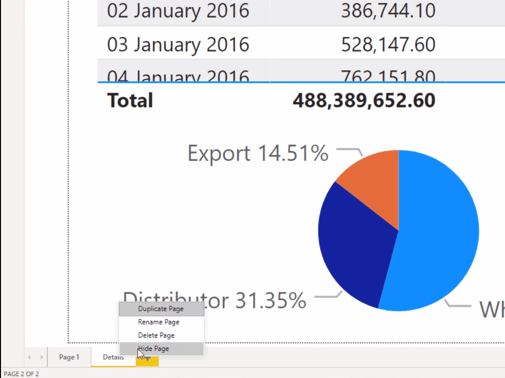
I’m just going to rename this page as Details. You can rename it whatever you’d like. And, because this is a tooltip, I’m going to just hide it because we won’t need it in the application itself.
Lastly, I turn on the Tooltip in the Page information to make this work in the report page.

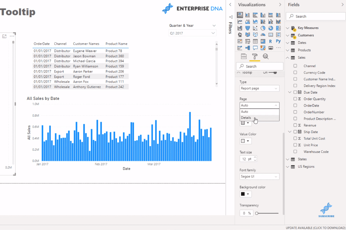
Now, I go to the report page and click on a visual. Then, I go to the Paint Roller, to the Tooltip section and click the Report page for the Type, and then Click the page I just created (Details) for the Page.
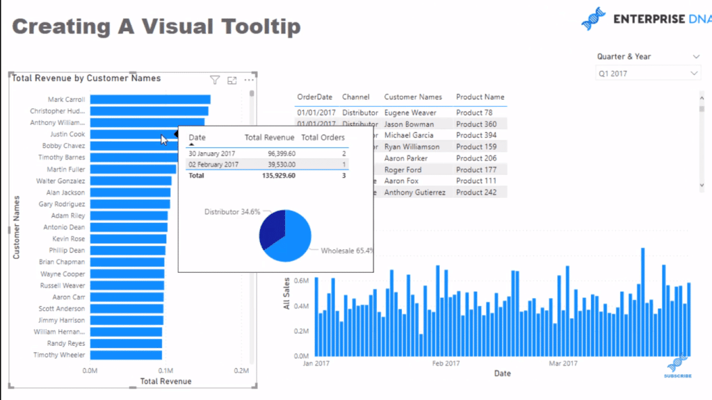
And now, when I hover over the visualization, I have this dynamic visual tooltip. I just love this idea. It’s so cool!
You can do a lot of other interesting things in the tooltip page that you’ve created. You can play around with the colors of the background, text or fonts, etc. It doesn’t need to be white. Just be creative and think about what could make the visualization pop.
***** Related Links *****
Data Visualizations Power BI – Dynamic Maps In Tooltips
Data Visualization Tips For Your Power BI Reports
How To Control The Interactions Of Your Visuals In Power BI
Conclusion
This is just another amazing idea about how you can maximize the Power BI tooltip. I don’t think there’s any other analytical tool that would enable us to do this. It’s pretty epic how a consumer is able to see all this information so quickly and easily.
There’s so much variability in report development now inside Power BI compared to what it was even just a few years ago. Microsoft has done some amazing work!
This is a great visualization feature in Power BI. I recommend that you implement this technique in your own reports. You just need to think strategically about how your model is set up for this to work.
Cheers!
Sam


