Let’s review my best practices for data visualization in Power BI.
Raw data can be difficult to read. So, visuals are made to make the data easy to understand. But visualizations can become confusing when they are made incorrectly. You may watch the full video of this tutorial at the bottom of this blog.
Visualizations are key to the consumers’ understanding.
So now I’ll discuss my best practices for data visualization to help you create a good report.
Using Grids To Section Visualizations
First, use the grids to create segments of information, so when a consumer views the report, they can easily identify them.
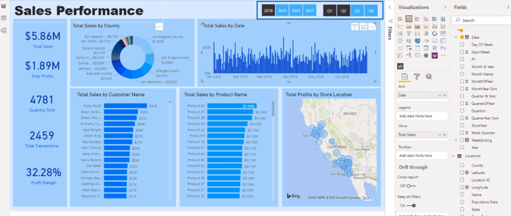
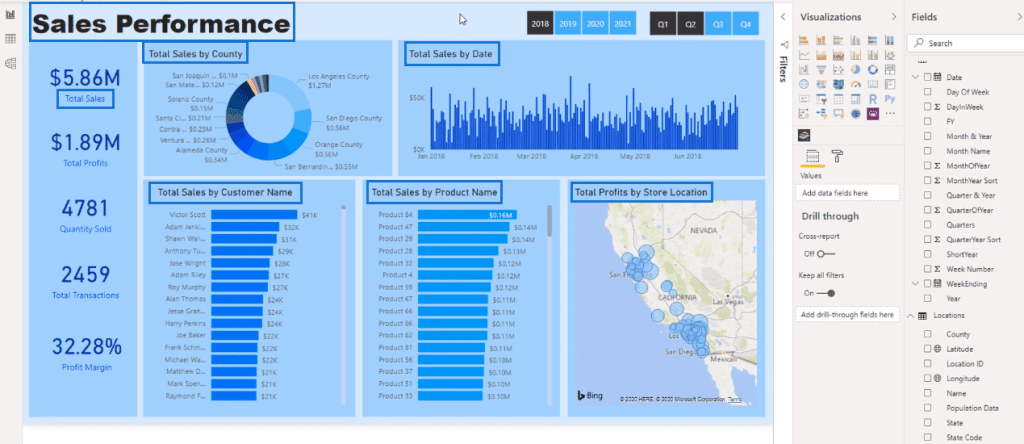
Look at the sample report below.
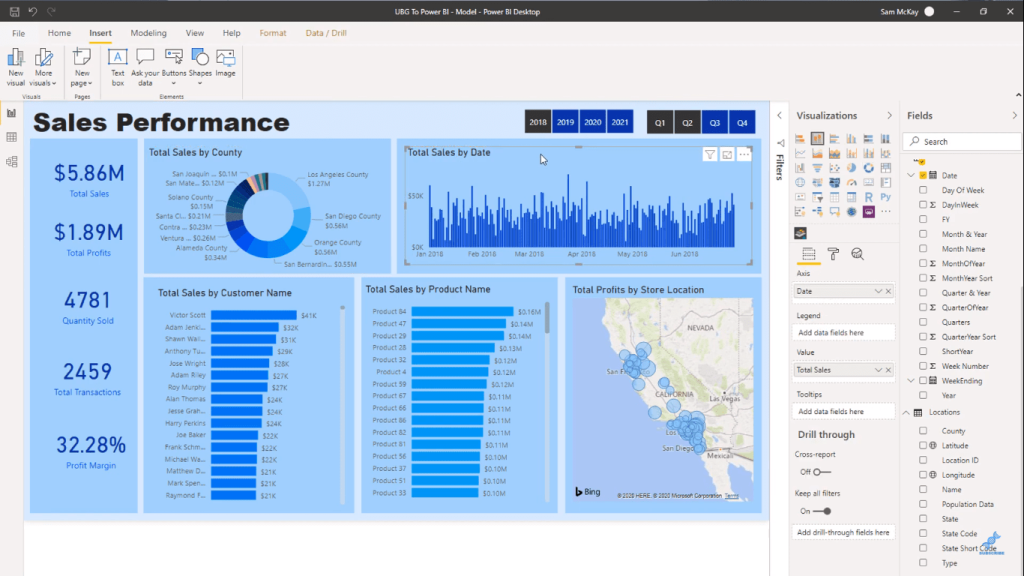
Each visual is separated by grids with small spaces between them. These spaces allow for easier navigation.
The grids are made with rectangular blocks behind the visuals.
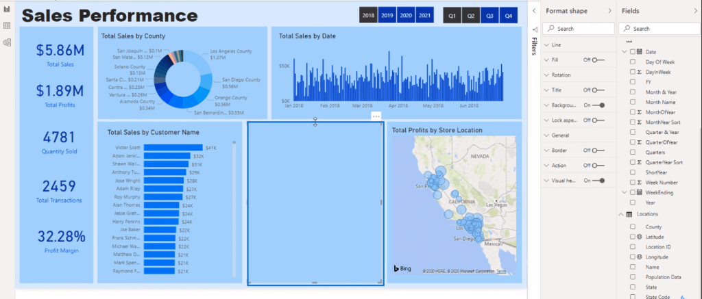
Choosing The Right Colors
Secondly, use a palette with simple color schemes.
Study the donut chart below:
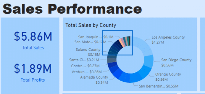
The colors aren’t blue like most of the chart. Thus, they make the chart appear off-balanced.
However, since the chart is quite far gone, the colors cannot be adjusted.
But we can adjust the slicer color. It’s in a darker shade compared to most of the report. Therefore, there is a contrast.
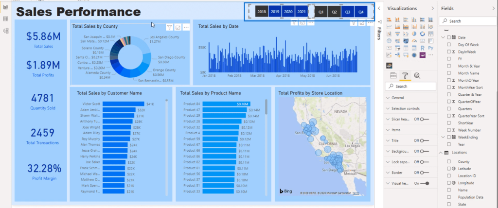
It’s better to stick to either lighter or darker shades to have more uniformity.
In this report, I mostly used lighter shades.
So, I’ll change the slicer color to a lighter shade of blue.
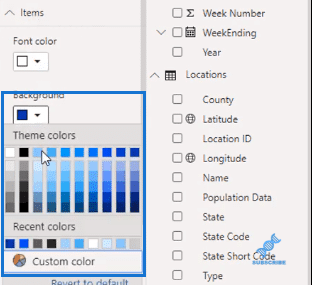
Now it looks more uniform and in line with the rest of the report.
Choosing The Appropriate Chart For Data Visualization
The third practice is using the appropriate chart and visual.
In selecting which visual to use, first identify the information you want to present. Then identify which visual is best for that kind of data.
For example, when presenting dates, present them in a column chart.
Take this chart as an example:
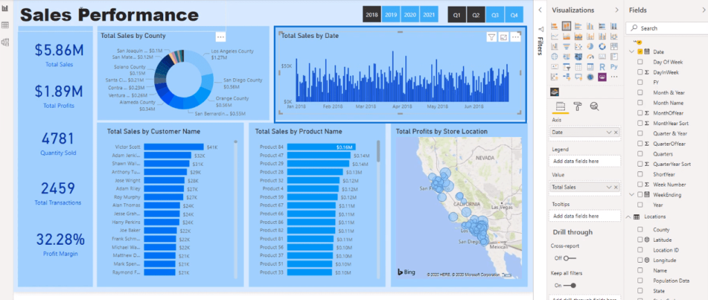
Consider what visualizations will make it easier for the consumer to understand the data.
Avoiding Clutter In The Report
You can create pages in your reports by selecting this button.
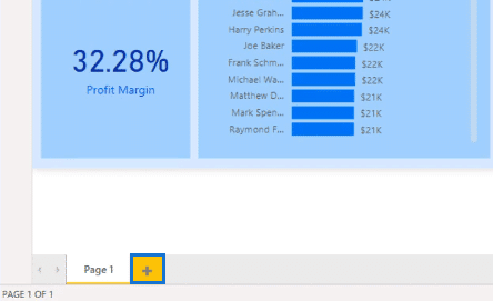
Avoid clutter in your report by spreading the information across pages.
On each page, make sure that it has a story or a point. Reports are made to present a story using your visuals.
Make key information stand out in your reports.
The key information is the main point of your reports. In other words, it is the central idea within your data. Thus, it should be the most emphasized data among all your visuals.
To have a cohesive report, use clear titles and labels for your data.
In this report, the visuals and report itself have titles that define their data.
*****Related Links*****
Tips For Power BI Report Design – Best Practices
Power BI Data Visualization Tips For KPI Trends Analysis
Power BI Data Visualization Technique: Creating A Dynamic Heading Or Title
Conclusion
Keep in mind these best practices for data visualization. To conclude, visualizations center around user efficiency.
When making reports, we might complicate things. This leads to messy reports and unclear visuals. With these best practices for data visualization, we can prevent this.
Sam


