
In this tutorial, I’m going to show you my process in building Power BI reports and how I organize my DAX measures to help me navigate my report smoothly. I will focus mostly on how I developed the Defects and Downtime analyses on this report.
I’m going to use the report I submitted as my entry for the 10th round of the Power BI Challenge. This is a series of challenges released on the Enterprise DNA forum, where everyone gets to take a shot at working on a problem using the data set and challenge brief provided.


Organizing DAX Measures Into Subfolders
I’m going to start by going into the model view in the Power BI desktop. This is how the data model view looks like with the latest Power BI update.
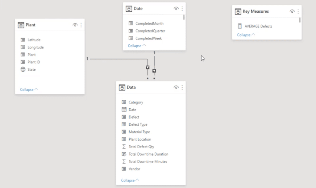
On the right, I have one table for all my key measures.
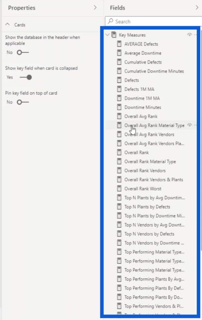
As you can see, there are quite a number of measures here. Although I’ve had models in the past that have a lot more measures in them, organizing them into subfolders will make the work easier and more efficient.
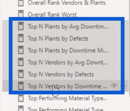
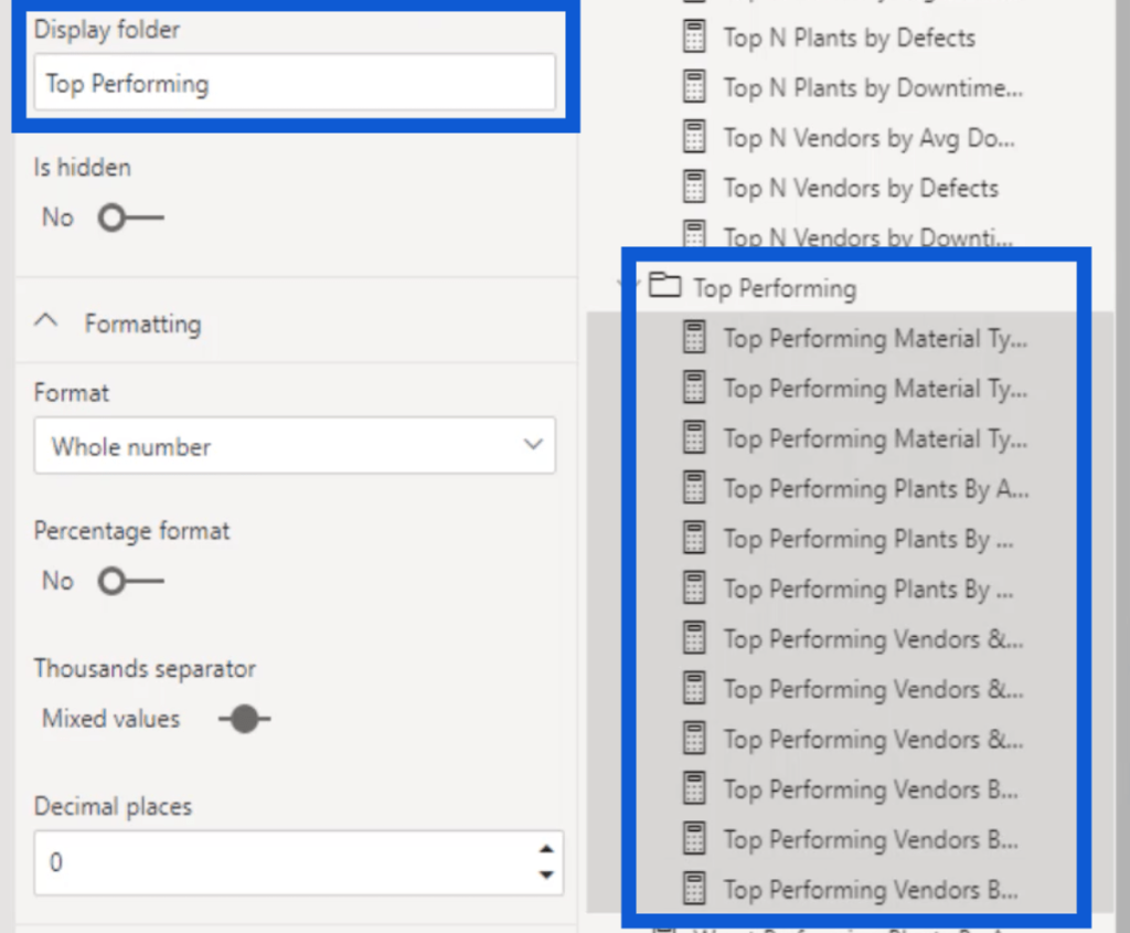
I’ll start with these Top N measures. I’m going to click on each measure while holding down the ctrl key to select the ones that I’ll put together in a single folder.
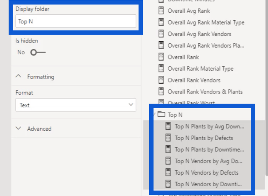
Then, I’m going to name the subfolder under display folder. To make sure that it’s easy to know what that folder is all about, I’m going to name it Top N. Once I click on the Enter key, the measures I selected earlier will be grouped into a single subfolder.
I’ll do the same thing for my Top Performing measures. I organized folders for the Overall Rank and the Worst Performing measures as well.
Now, I’m going to show you how everything looks like in the report view. As you can see, putting Power BI DAX measures together in subfolders gives me more space under the Key Measures table. It also makes it easier to look for the measures that I need.

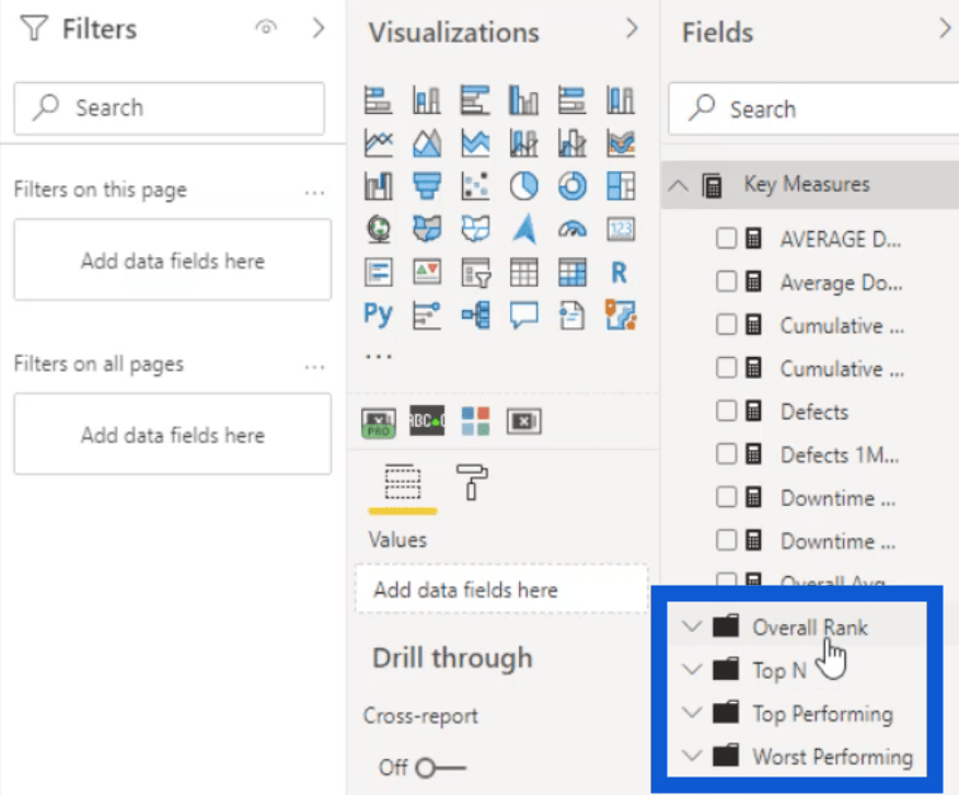
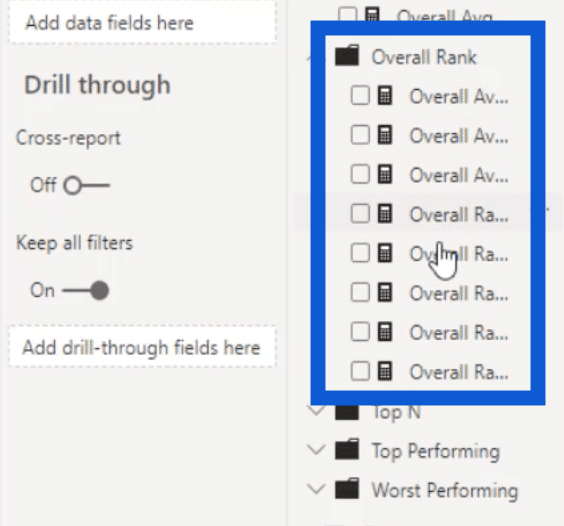
So if I open up the subfolder for Overall Rank, you can see the measures that I grouped together earlier.
This is a great technique that you can apply when building Power BI reports moving forward, especially if you’re working with a large number of measures in a single report.
Building Power BI Reports: The Defects Page
Now that I’ve organized my measures, I’m going to show you how I worked on two of the pages in my report – the Defects page and the Downtime page. Since I have a lot of slides for this report, I opted to keep things as simple as possible.
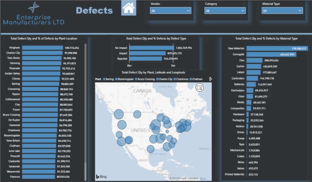
I’ll start with the Defects page. This is how it looks like.
Adding The Background
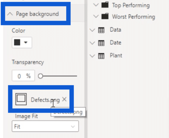
I created all of the backgrounds I used for this entire report on PowerPoint. Here’s how the image looked like when I imported it into Power BI.

You’ll see the file under Page Background in the formatting pane. Since I saved the slide as Defects.png, that’s the filename that shows up in here as well.
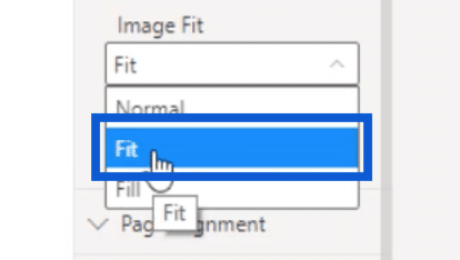
There are also a couple of options on how the image fits into the report page. Make sure that you choose Fit because this is going to give you the best view of the slide you’re using as a background.
Adding Page Navigation
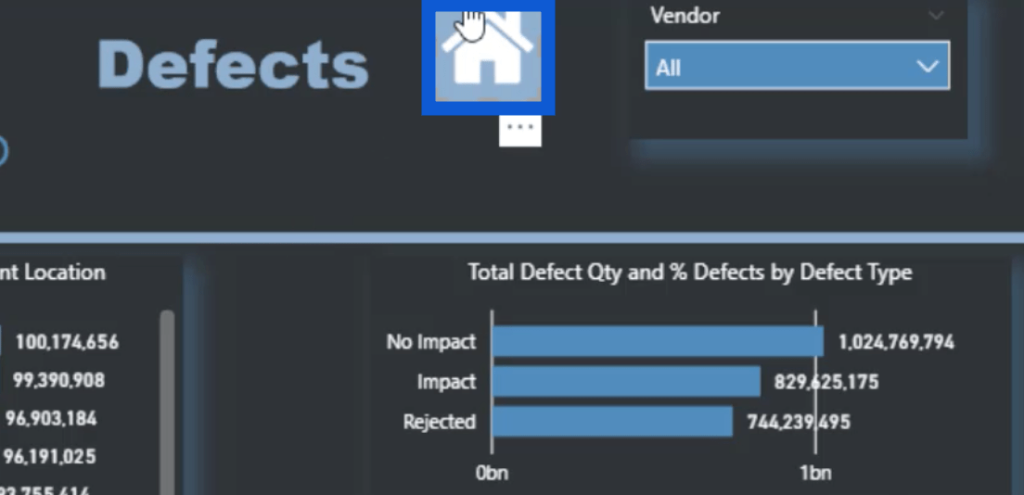
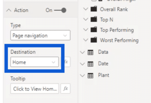
Once I had the background image in place, I started adding more elements. One of the most important elements I added was this Home icon that users can click on to go back to the homepage.
All I did was set an action for that icon. In this case, I chose Page navigation under Type.
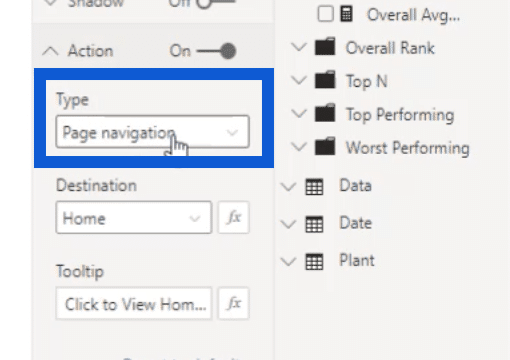
Then, I chose Home as the destination.
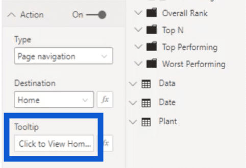
I also add a tooltip to assist with page navigation. I have set this to say “Click to View Homepage” each time a user hovers the pointer over the Home icon.
Adding Slicers
Next, I worked on the slicers on top of the page. For this report, I only used the default slicers provided with the Power BI desktop when you download it.
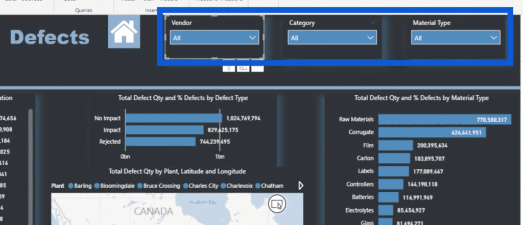
The great thing about these slicers is that they automatically apply the same color theme that I have set for the entire report, which I created on a website called Powerbi.tips.
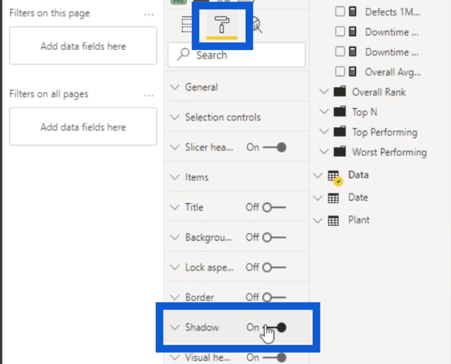
What I did set up within Power BI are the shadows that are showing up around the slicers. Staying true to the theme, they are automatically set to blue.
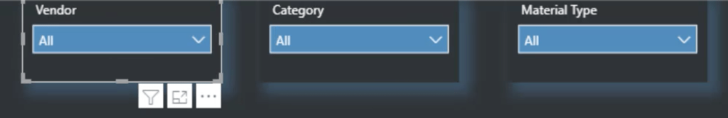
I turned the shadows on by going into the settings for the slicers and clicking on the paint roller icon. From there, I simply ticked on the switch beside Shadow.

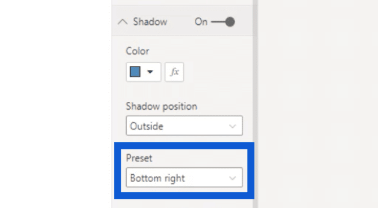
You can also choose where the shadow will show up by clicking on the dropdown under Preset. In this case, I chose to have my shadows at the bottom right.
As I mentioned earlier, I only used the built-in slicer under the visualizations pane in Power BI since I wanted to keep things as simple as possible.
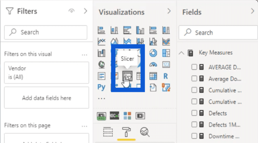
However, there are also times when you have no other choice but to create more slicers than usual. In this case, I would recommend using the Smart Filter Pro by OKVIZ.
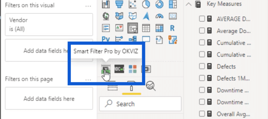
This is a paid tool meant for custom visuals, but it’s very cheap, easy to use, and adds a lot more possibilities when building Power BI reports.
Going back to the slicers, I wanted to be able to filter the data by vendor, category, and material type. I’ll show you how this affects the rest of the visuals on the page.
Charts And Other Visuals
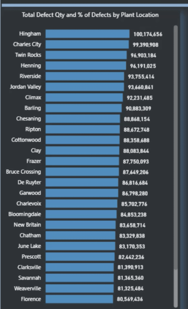
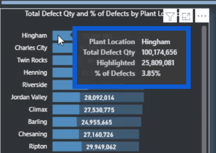
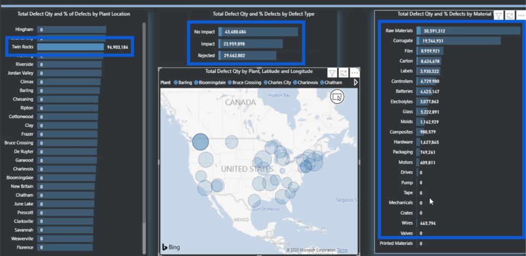
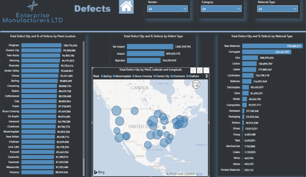
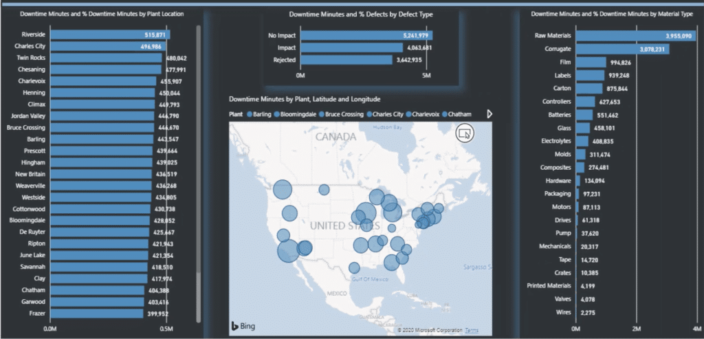
This table shows the Total Defect Qty and % of Defects by Plant Location.
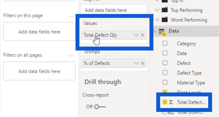
Under the Values pane, we can see that I didn’t use any Power BI DAX measures at all.
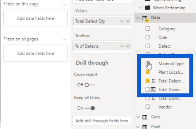
All I did was use the Total Defect Qty column and put that in the Values section.
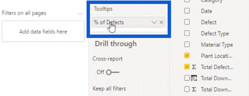
Then, I also used Total Defect Qty under Tooltips.
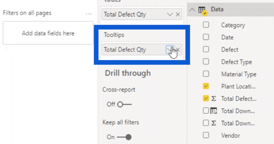
If I hit the dropdown button beside it, it gives me a number of options. In this case, I extended the menu under Show value as, then chose Percent of grand total.
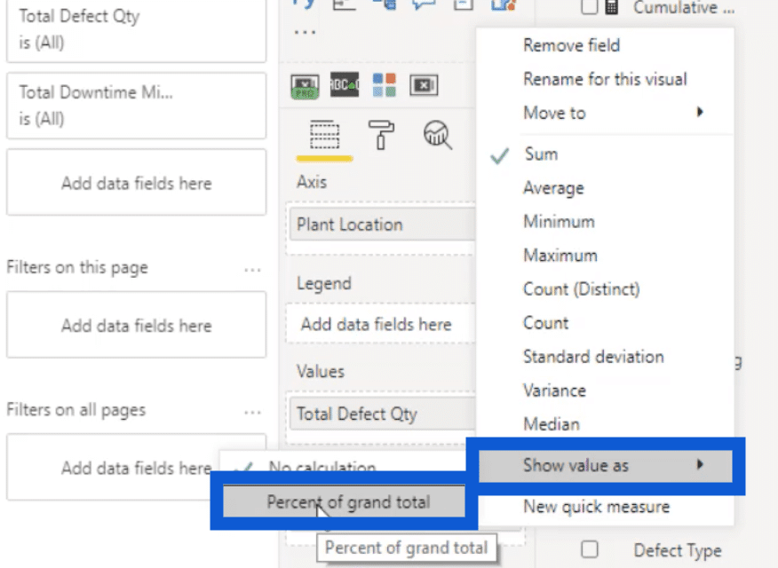
Then, I just changed the name to % of Defects by typing that in.
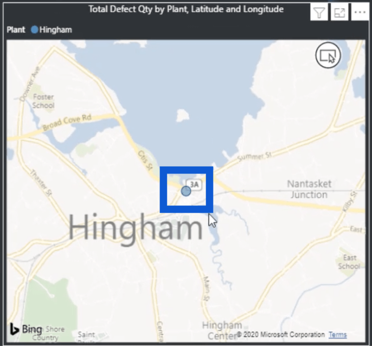
When I look at this bar chart, I can see that Hingham has the most defects in the list.
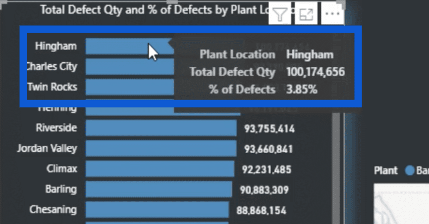
Hovering the pointer over that bar shows me the Plant Location, Total Defect Qty, and % of Defects.
I can also click on Hingham and it will automatically slice the data in all of the other tables.
It even adjusts the map visual to show you the location of this plant.
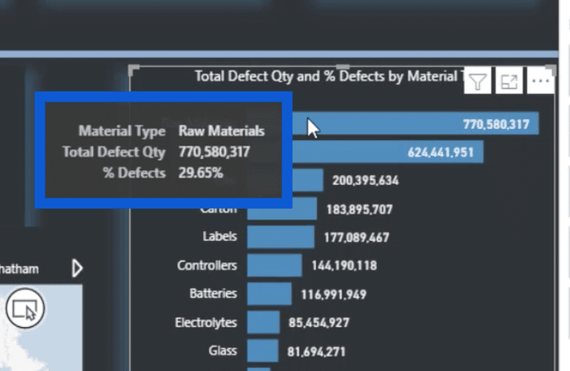
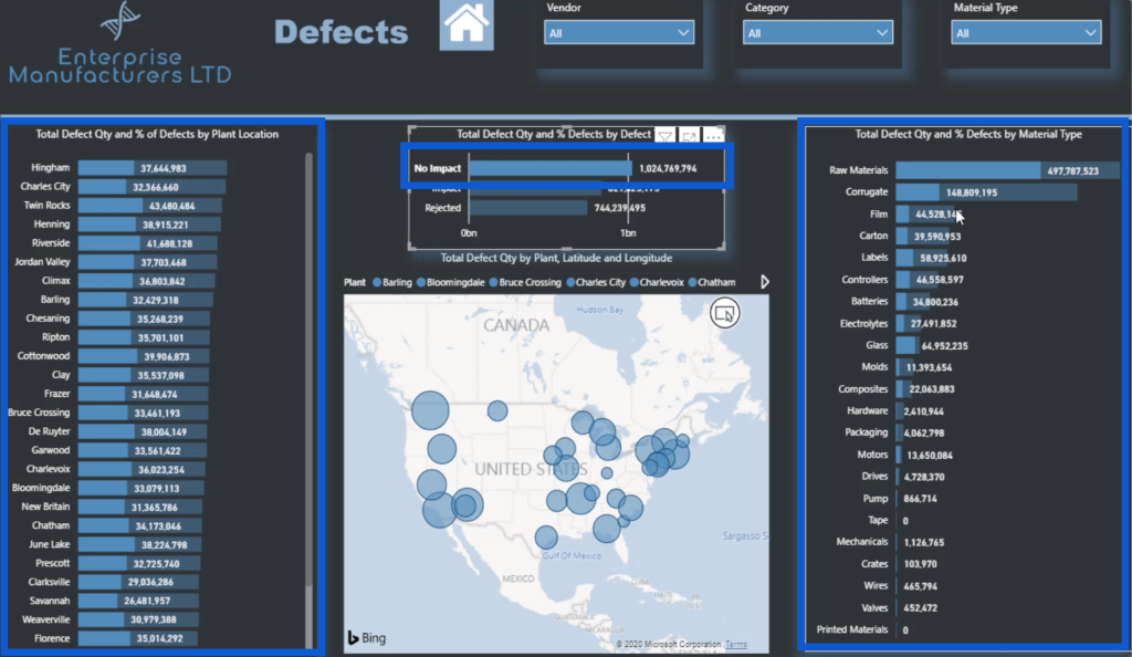
The next thing I did was to visualize the defects based on the material used. I just copied the table for the plant location and changed it to material type.
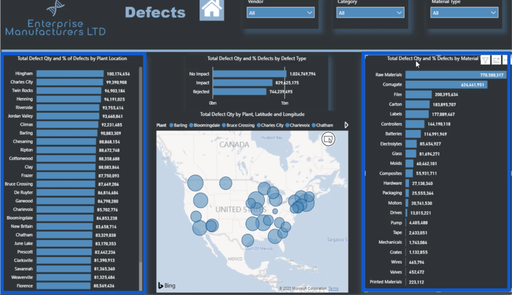
I used the same strategy that I used in the previous table. If I hover over the highest entry, it shows that this represents the Raw Materials, and it shows the Total Defect Qty and the % of Defects.
Clicking on any of these raw materials will also slice the rest of the data on this page. The only exception would be the map visual. That’s because it only portrays the plant location and doesn’t really have anything to do with the material type.
This is also why even if I click on raw materials, the map doesn’t zero in on a single point, unlike what happened earlier when I clicked on Hingham on the other bar chart.
But when I check on the chart showing the defects by plant location, it shows which part of the total is made of raw materials. The exact number shows up on the summary as the highlighted number.

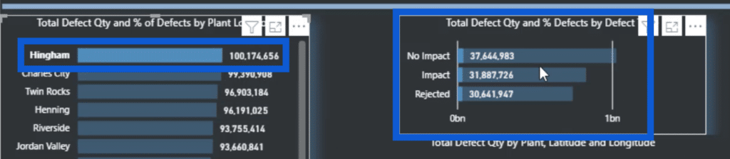
The next visual shows the Defect Type. This has less entries – No Impact, Impact, and Rejected.
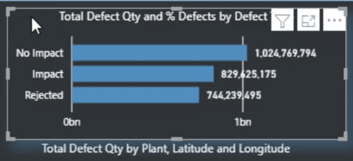
If I click on any of these three, you’ll see that it slices all the visuals except for the map. Again, that’s because the map is dependent on the plant location.
When you look at this visual, the vertical lines and the numbers at the bottom don’t really contribute to it.
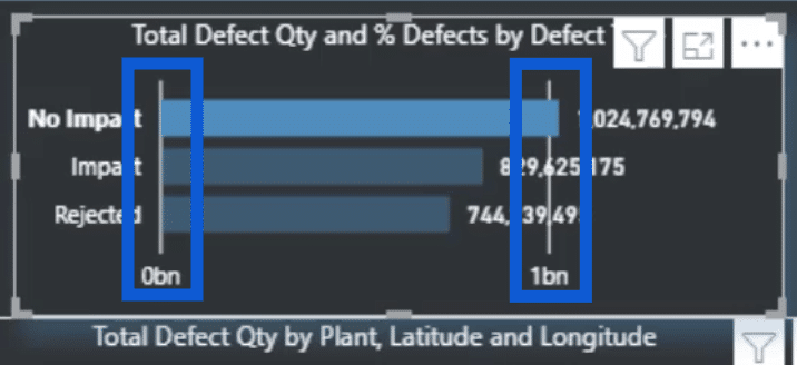
So I’ll go ahead and get rid of that by turning off the X axis. I can do that through the formatting pane.
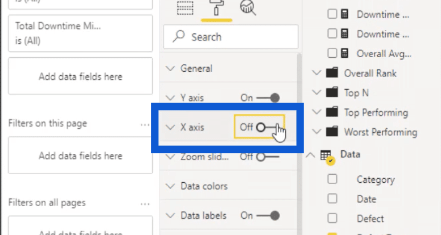
Without the X axis, the visual now looks cleaner and more appealing.

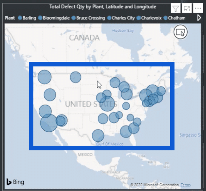
The last visual on the Defects page is the map.
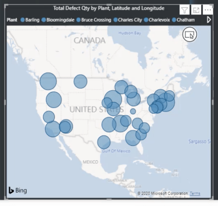
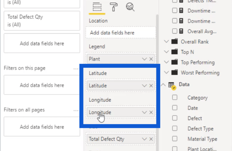
I included a legend that contains the plant locations.
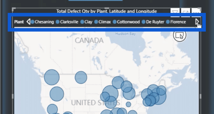
I also have the latitude and longitude to match each location to a point on the map.
I also showed how I got the latitude and longitude for each of these cities on Google Maps in a separate tutorial where I showed how I transformed all the data I used in this report.
The sizes of the circles vary because each one of these circles is based on the actual total defect quantity.
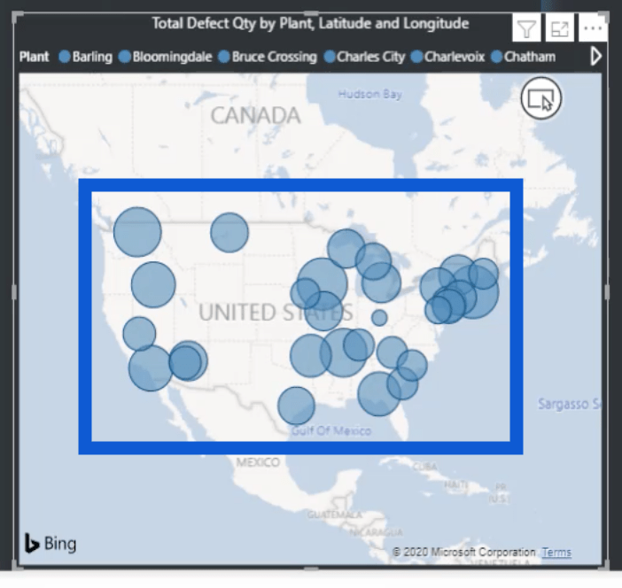
This is an interactive chart as well. If I hover over a specific point, it will show the details for that location. For example, this shows the plant location, latitude, longitude, and the total defect.
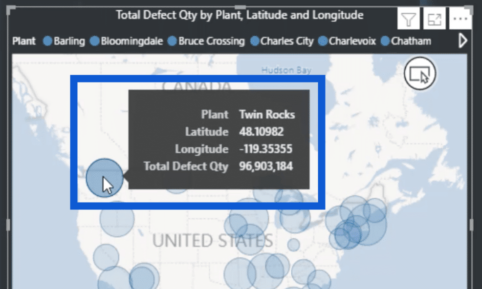
Clicking on the circle that represents Twin Rocks will also filter the data on the other visualizations. It will show the defects on the leftmost chart, the defect types in the middle, and the materials used on the right.
If I click on the location again, it all goes back to the normal view.
That’s how I created the entire Defects page. It might seem like there’s a lot going on, but I can use the same pattern for my other pages to make everything else easier.
Building Power BI Reports: The Downtime Page
To work on my Downtime page, I just need to duplicate the Defects page. Once again, I have the slicers for Vendor, Category, and Material Type on top.
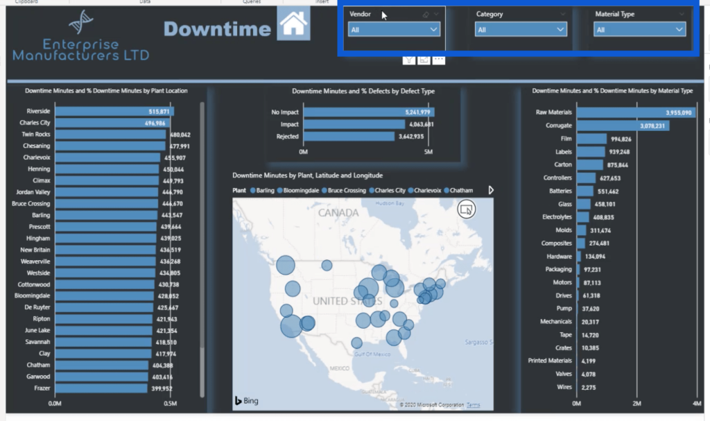
Each of the visualizations were set up similarly. But this time, I based it on downtime minutes, and not defects.
Note that I also uploaded a unique PowerPoint slide for this page’s background. Just as I copied this page and changed the basis of the data into downtime minutes, I also copied the background slide from the Defects image and just changed the title.
***** Related Links *****
Creating Measure Groups – Power BI Best Practices
Implementing DAX Measure Groups Into Your Reports – A Power BI Modeling Review
Top 3 Best Practices To Organize Your Power BI Models
Conclusion
This is one of the perks of having a clear process when you’re building Power BI reports. There’s no need to keep redoing different DAX measures and visualizations page after page. This speeds up the work that you’re trying to do, which is exactly what happened when I created my Defects and Downtime pages.
The way that I organized my DAX measures earlier contributed to that level of efficiency. Basically, the goal here is to have a detailed report that delivers amazing insights without having to spend too much time in doing so.
All the best,
Jarrett


