Power BI Dashboard Examples
In this tutorial, I want to highlight one of the most innovative page-turning visualization ideas that I’ve seen in a Power BI dashboard design. You may watch the full video of this tutorial at the bottom of this blog.
Many of you may know that we are running Power BI challenges on our Enterprise DNA forum. You can participate if you have access to our platform or you can check out our announcements.

We’ve been getting incredible submissions, and one of them was from Diana, who is one of our active members. It’s for our recent challenge that was based on HR Consultation Insights. It was a real page turner. It will enable you to visually display your report like you were flicking through a book.
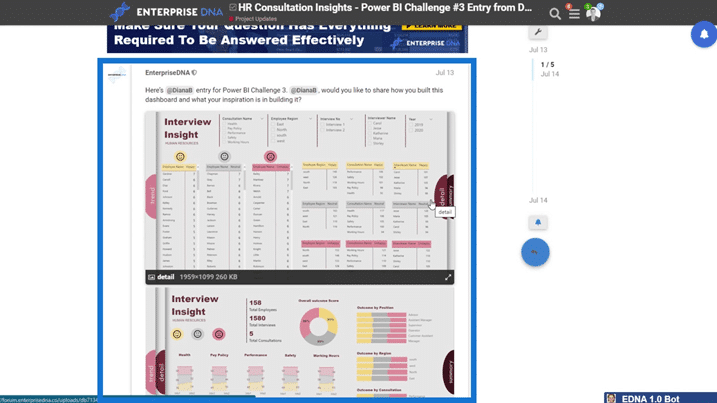
Some of you might think why we want to create something that looks like this.
Understanding The Importance Of A Creative Power BI Dashboard Design
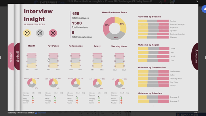
Well, it all comes down to making sure you have great insights. That’s the first one that you need to solve. Getting creative will impress your consumers and keep them coming back. I think Diana was really innovative and creative around her visualizations. The insights were of high quality and very easy to understand. This is the reason why she won the Power BI challenge.
In this example, you’ll see that there’s a lot of great things done here. There’s simplicity in colors, and the color palette works well together. The icons are also easy to understand, and you can easily know the insights that you need to consume or take away. There are also some key figures which are represented very well. Moreover, there are some grids on each aspect of the report. Generally, it follows a lot of my best practices, which I’ve been talking about for quite some time.
I’ll discuss the technique in doing the page turning look on your reports.
Analyzing How The Page Turning Visualization Works
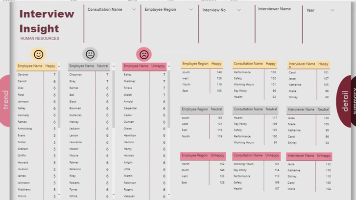
First, let’s have a look at the Power BI report itself. Here, you can look at one page and then go to another page by pressing the CTRL key + click on the next page (detail page). If you’re online, you can just click on it without pressing the CTRL key and it will work as well.
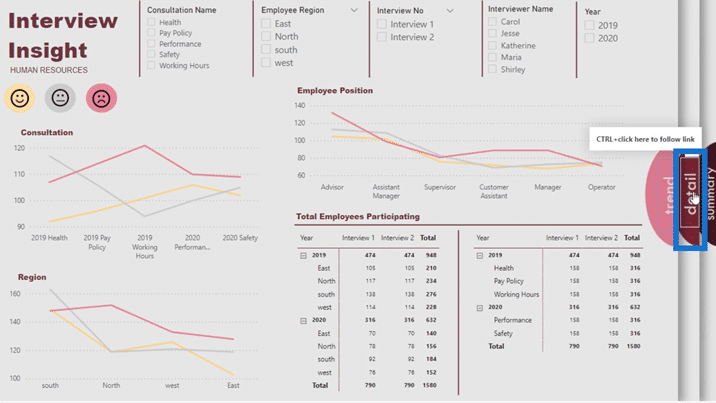
After clicking that, it will take you to a new page, which is the detail page.
If you click summary, it will also bring you to the summary page.
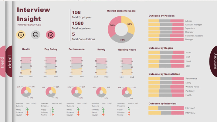
You’re changing the way your page looks every time you’re making a selection. This way, the user knows what they’re actually viewing. As you can see, it’s a great navigation feature. Sometimes, navigation features are all on one page, but this one is dynamically across different pages.
Now, how did Diana create it that way?
Creating The Page Turning Effect For A Power BI Dashboard
If we take a look at her explanation here, she said that she used PowerPoint to create the background after sketching it out on paper.
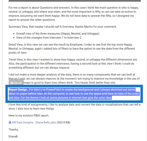
So, the results of the pages that we’re seeing weren’t built inside Power BI. She just created the background in PowerPoint, and the images of the backgrounds differ for each page. I won’t be able to click any of this here. That’s because she just embedded this image into the background from PowerPoint.
She also embedded those half circles for navigation into the image.
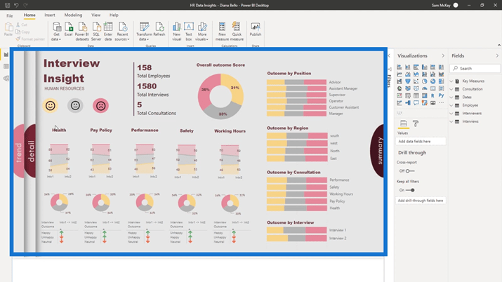
The only thing that hasn’t been embedded are these texts positioned inside the half circles. I’ll click one of these texts to show you how it was created as a navigation.
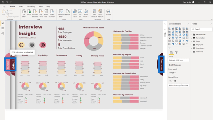
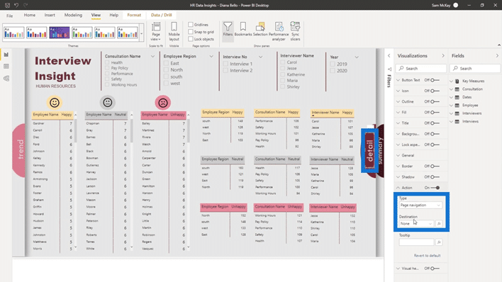
For example, if I click on the detail text, the Visualizations and Fields pane will appear.
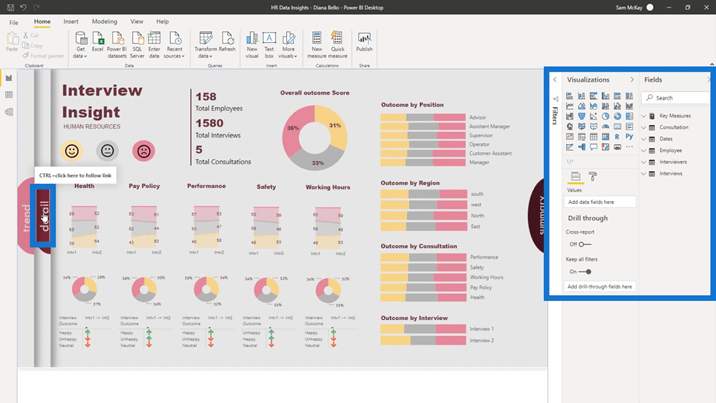
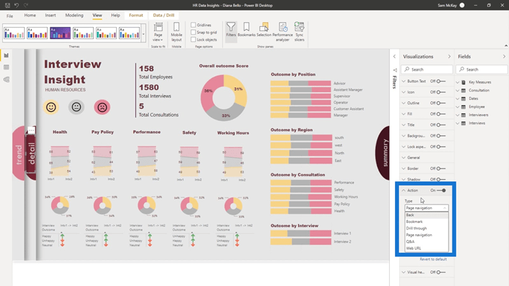
Under the Visualizations pane, I can go to the Action tab and see the list of the action types. They’ve updated this recently and added a Page navigation type. Being able to jump between different pages, instead of doing lots of fancy work around bookmarks, is a great feature.
Now, all you need to do is to create any elements like an image or a text box and set an action on that element. Diane used a text box, set its action type into a Page navigation, then set its Destination.
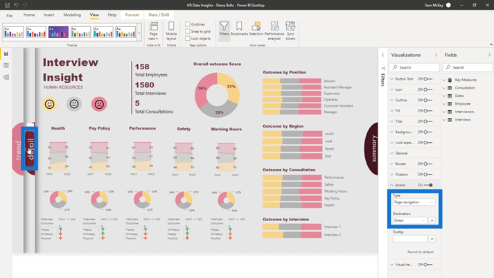
I’ll go to the detail page and click the detail text. As you can see, the action type is Page navigation but the Destination is None. This is because I don’t want to go to a particular page by clicking this text when I’m already on this particular page.
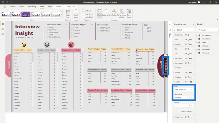
Then, if I click the summary text, the action type is Page Navigation and the Destination is Summary page.
For the trend text, it’s also set to Page Navigation and the Destination is Trend.
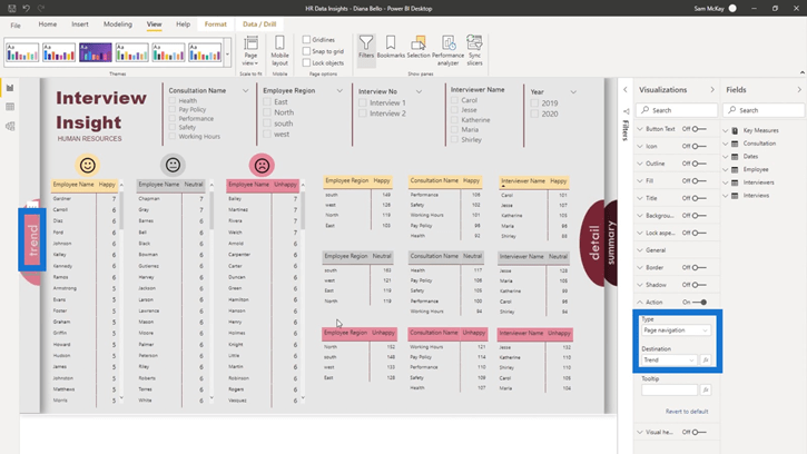
It’s very easy to do this technique once you have the background. It’s not really difficult as it’s just about creativity.
Applying Different Designs On A Report Page
I also want to show you about another Enterprise DNA member, Walter. He thought that Diana did really well in her submitted report. Furthermore, he also wanted to create the same technique by himself.
So, Walter made a step-by-step guideline on how to create these shapes and images in PowerPoint, and how to embed those into the PBIX file.
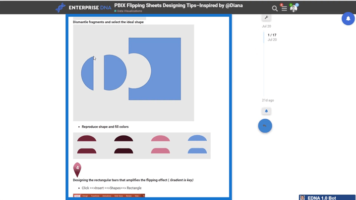
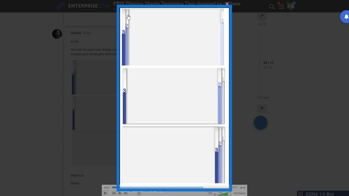
Another thing that I want to highlight here is what Diane has also done again. She created a new design idea and said that you can actually do it within Power BI itself.
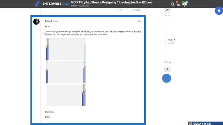
You can check this different design here as well, and you can create this particular look directly in Power BI by using rectangles, numbers, and other available elements.
Adding Visual Elements To Power BI Dashboards
Click the Insert tab; within that tab, you can select the elements like Text box, Buttons, Shapes, and Image. Just select any of those elements and put it anywhere on your report page.
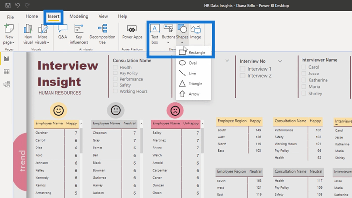
You can also utilize what’s natively inside the Power BI instead of just embedding an image. That was another cool way to utilize this technique. You don’t have to do something like this, but I think it’s an innovative idea to make your analysis really stand out.
By doing this technique, your reports will look more compelling from a navigation point of view.
Always remember that creativity in your Power BI dashboard design and reports doesn’t mean anything unless your insights are of a really good quality.
***** Related Links *****
How To Control The Interactions Of Your Visuals In Power BI
Sorting Dates By Financial Year In Power BI
How To Do Trend Analysis In Power BI Using DAX
Conclusion
Keep in mind that having good quality insights is more important in every development you do. Having this good visualization is basically just the icing on top of a high-quality Power BI report that’s going to engage consumers in your insights.
That’s a wrap for this one. I hope that you enjoyed learning about this Power BI dashboard design. We’ll continue to expand and share incredible works from the submissions in the Power BI challenges.
I’m looking forward to reviewing more of those submissions in the future.
All the best,
Sam


