We all know that data is a key part of any business. But, it is not so much the data and more what you do with the data that is the make or break in your business, and that’s where a Microsoft Power BI Dashboard comes in.
See, just having the data itself is not enough to really create valuable insights and key performance indicators; it comes back to how well you visualize the data and how well your business changemakers utilize the data.
Microsoft Power BI Dashboards, whether with a KPI or Key Insights focus, will give you the visualized data metrics you need to make changes for the better.

We have curated the ultimate collection of power bi dashboard examples from this powerful data visualization tool from tracking financial performance to showcasing relevant data, we have got you covered.
Now, let’s get on with it.
What is a Microsoft BI Dashboard?
Very simply, we are referring to a dashboard created with best practices that showcases the KPIs (Key Performance Indicators) or key data insights of a company.
That’s it.
Sound simple? Well, it can be, that’s if you understand how to use Power BI or at least know how to edit a Power BI Showcase or dashboard example.
But, for now, irrelevant of how experienced you are, let’s check out some awesome examples of how you can use Power BI dashboards to track everything from financial performance to business growth, conversion rates, and everything in between.

Remember, whatever data sources we draw from, we are always looking to take away the most actionable insights possible.
18 Incredible Power BI Dashboard Examples for Inspiration
We have 101+ Power BI Dashboards available for you to test live on our website, but for this article, we are going to show your 18 of our favorites.
Let’s jump in!
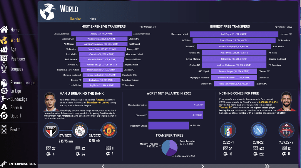
1) Football Transfer Power BI Dashboard Example
Sometimes it amazes us how a business intelligence tool like Microsoft Power BI can be used, and this is one of them. Stemming away from traditional business use, this clean and intuitive dashboard focuses on football.
Well, precisely on data related to transfers, metrics include most expensive transfers, biggest fee transfers, player stats inc age, nationality, club, fees, and position.
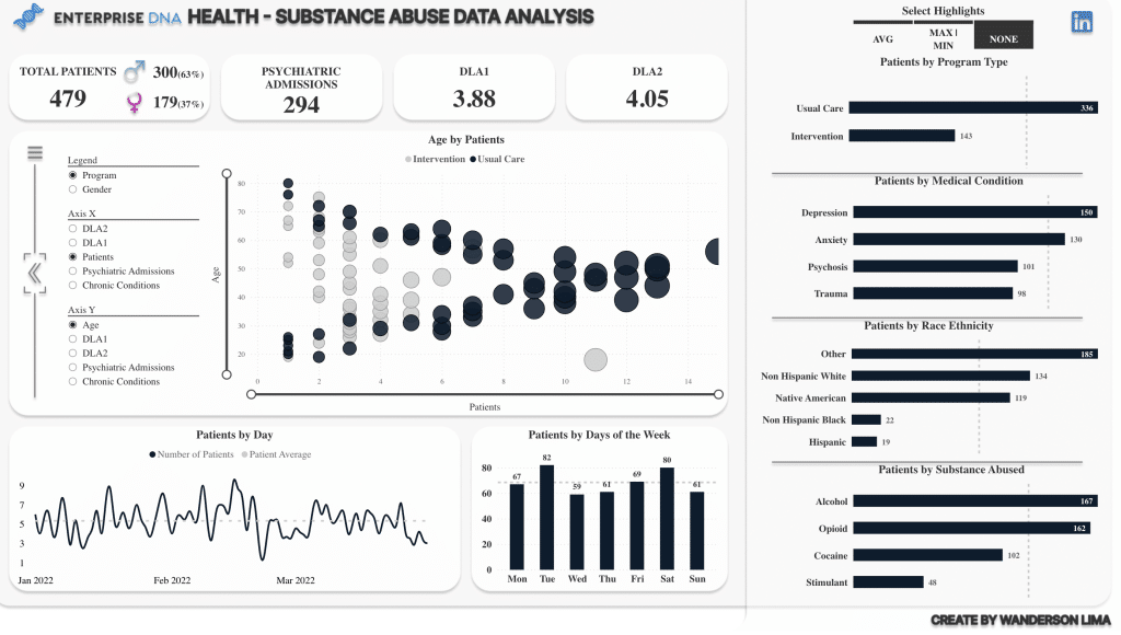
2) Substance Abuse Analysis Dashboard
The health and medical industries have huge amounts of big data to crunch; hence Power BI is present in both private and public health and medical businesses globally.
This dashboard showcases a detailed summary of patient data and goes deep into specifics, including, patients, patients by medical condition, race, ethnicity, and by substance abuse.
Although only minimal color has been used, this Power BI dashboard is clear and clean and makes data very easy to understand.
More examples of dashboards can be found in our Power BI Dashboard Gallery.
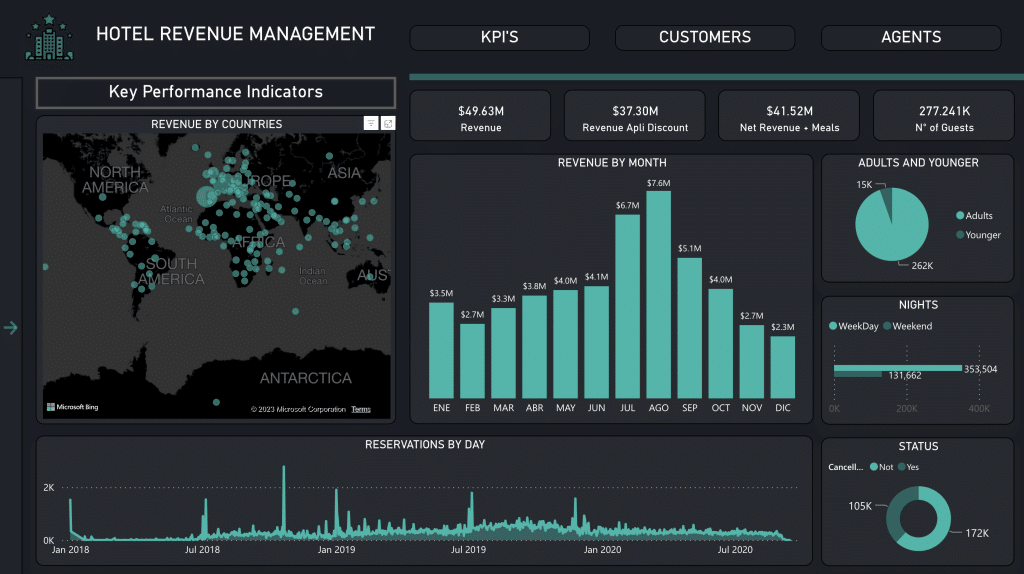
3) Hotel Revenue Management Power BI Dashboard Example
Now it’s time to round up your sales team and bring in your sales managers; this dashboard shows you very clearly the metrics of a Hotel you need to be monitoring.
This interactive dashboard enables you to both has incorporated key figures, graph styles, and visual elements to give an incredible overview.
A great element are its’ offering of visualization options. From bar charts to pie graphs and global maps.
Using a dark background can really help you showcase your business metrics in a clean and clear way.
Furthermore, multiple pages allow you to showcase KPIs alongside other key metrics.
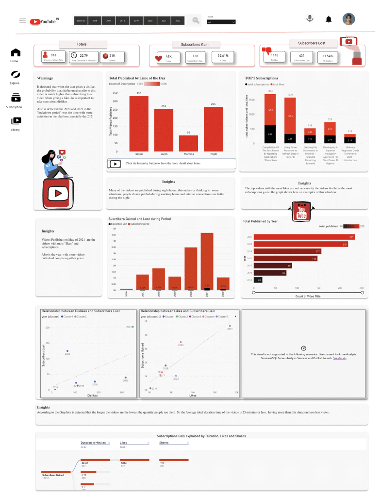
4) YouTube Data Power BI Dashboard Example
Striking, clean, and clear, this YouTube dashboard is packed full of information and gives a great overview of a successful youtube channel.
As well as showing key publishing metrics, it cleverly drills down to posting times of day and showcases the relationships between likes, dislikes, and subscribers gained and lost.

A great use of data and design, blending brand colors with generous white space to make things stand out.
This dashboard has been designed in a portrait orientation which is less common but also highly effective.
More examples of dashboards can be found in our Power BI Dashboard Gallery.
5) Sales and Production Analytics Dashboard
One of the leading uses and a great example of Power BI is sales performance and production analysis. This Power BI dashboard example showcases clear performance metrics in a clean and organized manner, plus forecasts future sales too.
Not so common, but a great addition for presentation purposes is the initial page of the dashboard.

Clicking on the “Start” button takes you through to a very well laid out dashboard with multiple sort options.
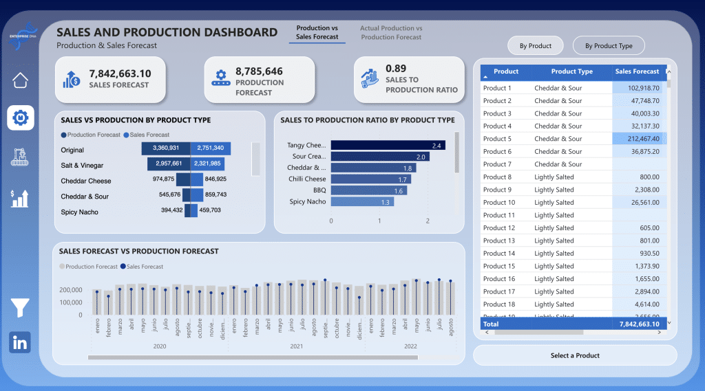
Find out more about this sales dashboard and see many more power bi dashboard examples here.
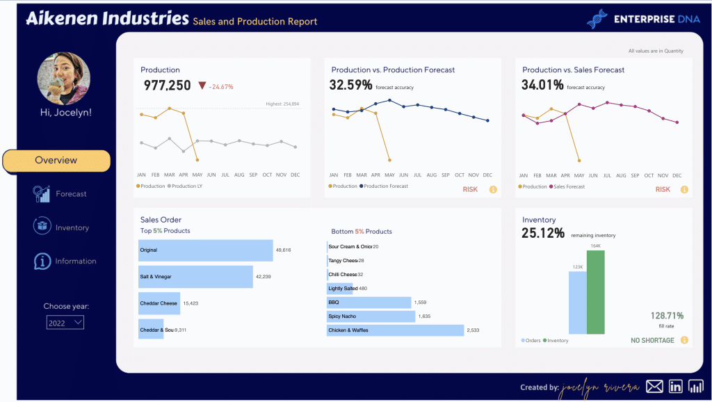
6) Sales and Production Dashboard Power BI Dashboard Example
Clear, concise, and easy to digest when presenting to business leaders, no matter the industry.
This sales and production dashboard showcases the facts clearly and incorporates a color theme that is very easy on the eye.
Designing a dashboard within a contrasting border is always effective in bringing clarity and punch to your design.
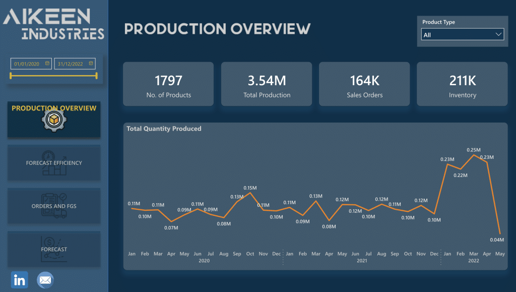
7) Sales and Production Insights
Another example of data analytics visualization at its best. This professionally designed analytics dashboard is well thought out and developed using best design practices.
It is smooth, clear, and intuitive and makes for a great dashboard for business owners in any industry.
Plenty of Power BI dashboard examples can be created with a Power BI template, from a sales dashboard to an analytics dashboard; we have plenty of BI dashboards for you to take a look at here.
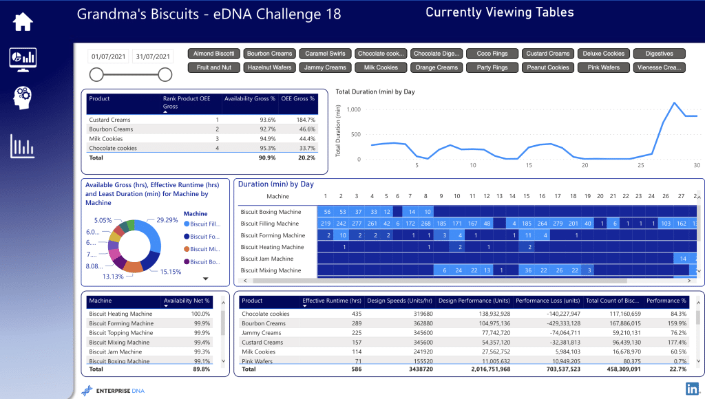
8) Equipment Effectiveness Report
One of our favorite power bi dashboard examples. A well-organized, clear, and concise Power BI analytics dashboard showcasing OEE or Overall Equipment Effectiveness with creative visualization techniques.
Again, the true power of data is shown here, making something so simple and clean for anyone in the company to understand, irrelevant of whether they are the sales manager or the CEO.
Anyone can understand and use the data shown here, showcasing important metrics quickly and efficiently.
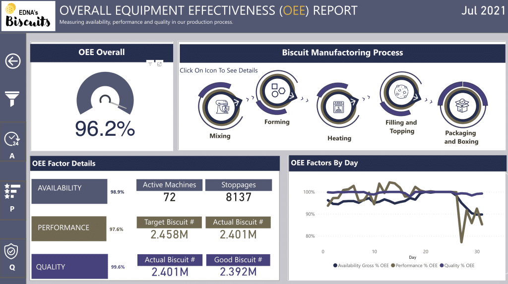
Power BI is great for OEE-type reports for all different product lines, have a look at our Power BI dashboard examples here.
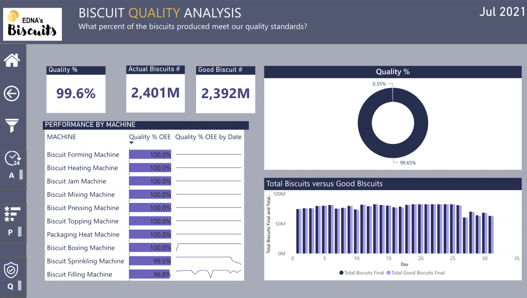
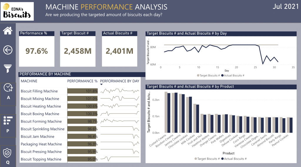
9) Overall Equipment Effectiveness (OEE)
I don’t love the term “next level”, but I am going to use it here. This design is ‘”next level”! As well as an abundance of data being displayed clearly, it is done so beautifully! Who said data is not attractive…. especially when it is about biscuits!
This is a brilliant example of taking a lot of important information and making it clear and clean, making it easy to make decisions and maximize business performance.
White is always a clean place to start, especially when against dark blue. There is so much delicious biscuit information packed in here.

Furthermore, hints of color highlight and reinforce key data points.

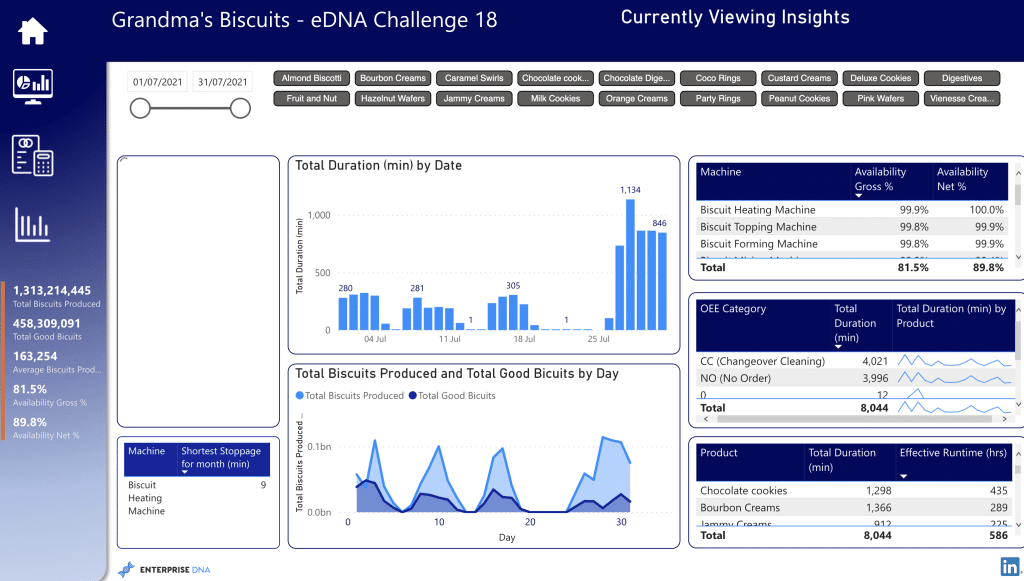
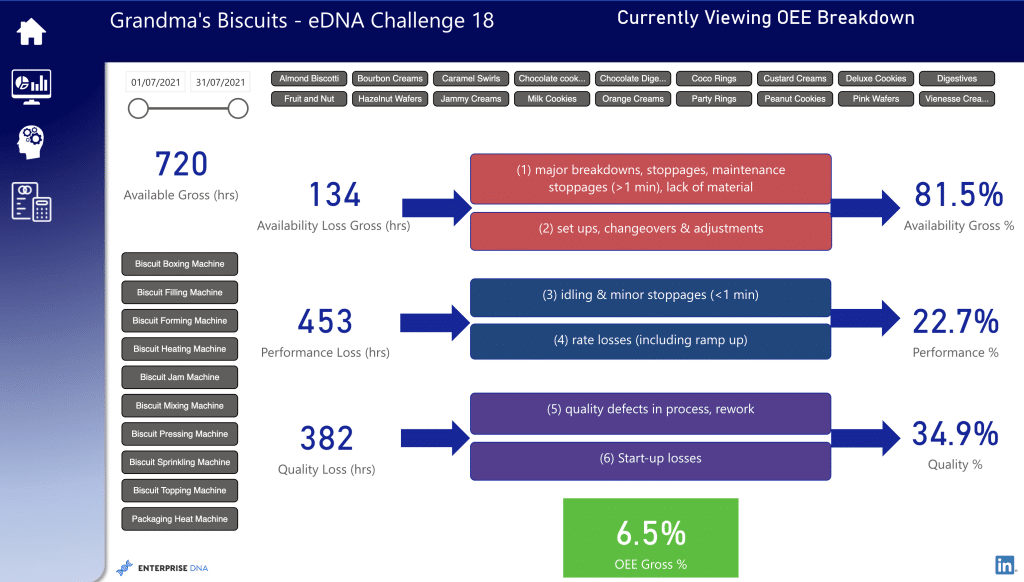
To find out more about this analytics dashboard, check out this and many other BI dashboard examples click here.
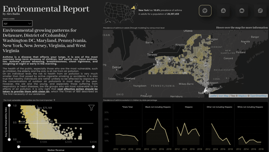
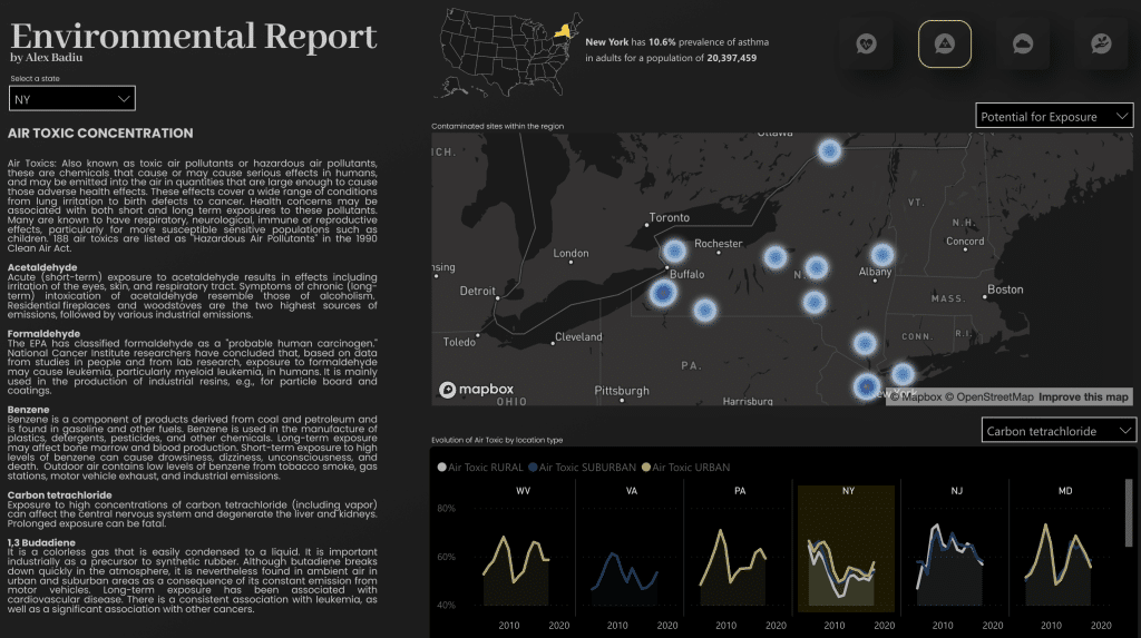
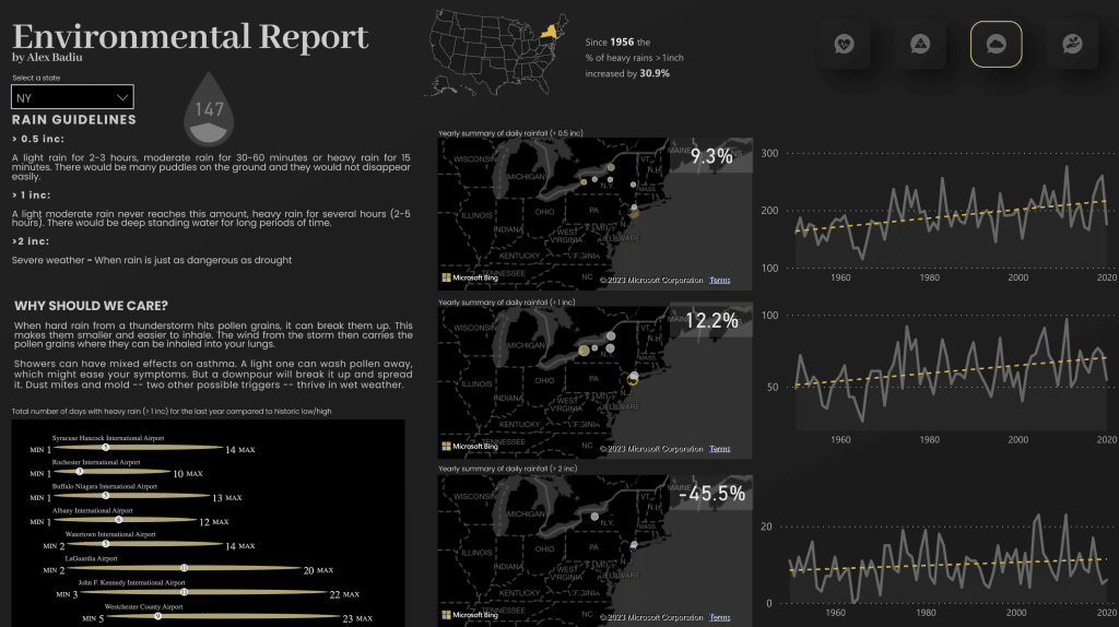
10) Environmental Insights
A simple, clean, and clear reporting dashboard brings in raw data to create a visually attractive and informative analysis.
Dark themes can be very impactful, as you will see when you start testing out different options; colors are a powerful way to capture an audience, so be daring!
11) Power BI KPI Showcase
Sometimes it is just best to keep things simple; remember the old KISS principle? This compact yet effective Power BI dashboard utilizes custom visuals and an intuitive UI.
With a solid focus on earnings, you will always know where you stand with this quality of reporting.
Adding on a moving element, such as the scrolling KPIs, can be a great way to get interaction and get people’s attention.
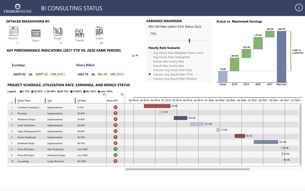
Try this Power BI Dashboard and view our collection here.
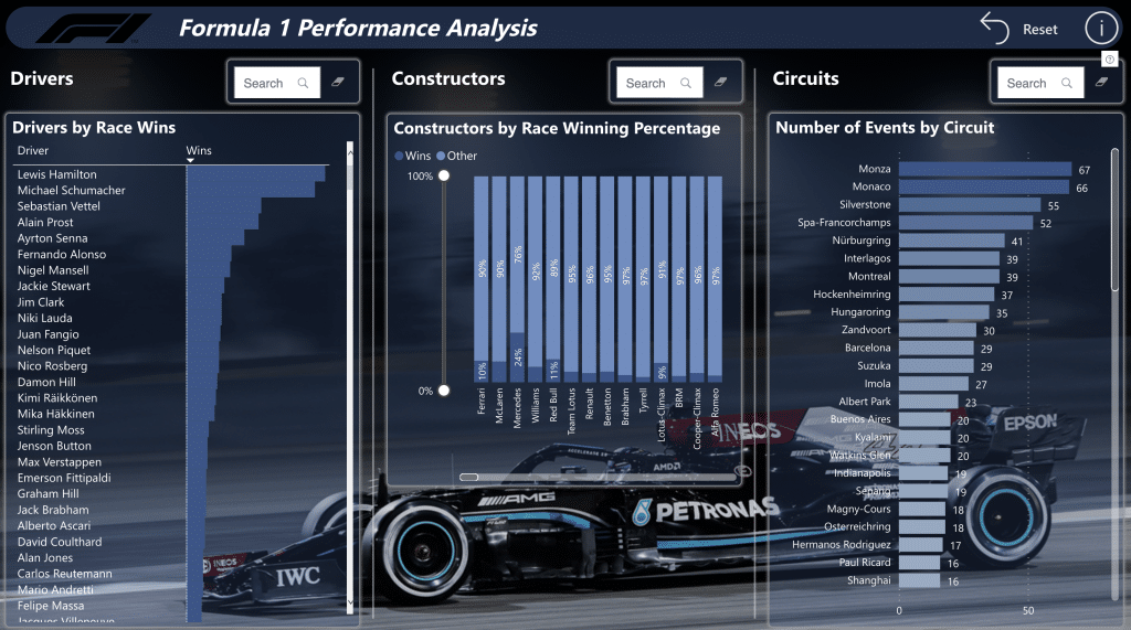
12) Formula 1 Performance Analysis Power BI Dashboard
Who said data visualization tools had to just be used for company key insights or total sales. Start your data engines, ready, set, and let’s calculate big data! Sorry, I had to.
Select your favorite driver or your favorite circuit to see facts and figures. Clearly designed by a serious F1 fan and showcases another interesting way to use custom visuals.
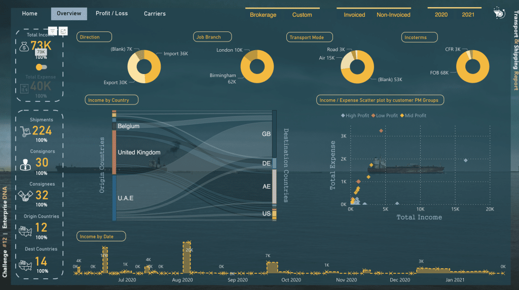
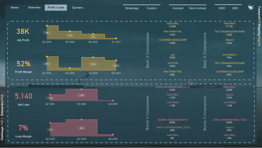
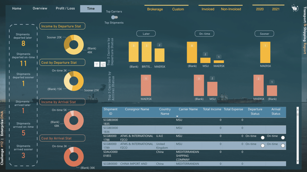
13) Transport and Shipping KPI Dashboard Example
This multipage KPI dashboard shows endless amounts of usable information and critical insight, complimented by a tasteful design that is easy to interpret.
There is no doubt that such reports showcasing crucial sales data, total revenue, and logistics are absolutely crucial to data analysis and, ultimately, business success.
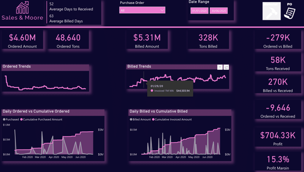
14) Purchase, Sales, and Inventory Trends Dashboard
A well-designed dashboard showcasing a dynamic narrative summary that utilizes both Bookmarks and Selection Pane to create a comprehensive data snapshot in a one-page report.
Again, great use of brand colors is shown here.
We have a large collection of Sales and Inventory dashboards you can check out here.
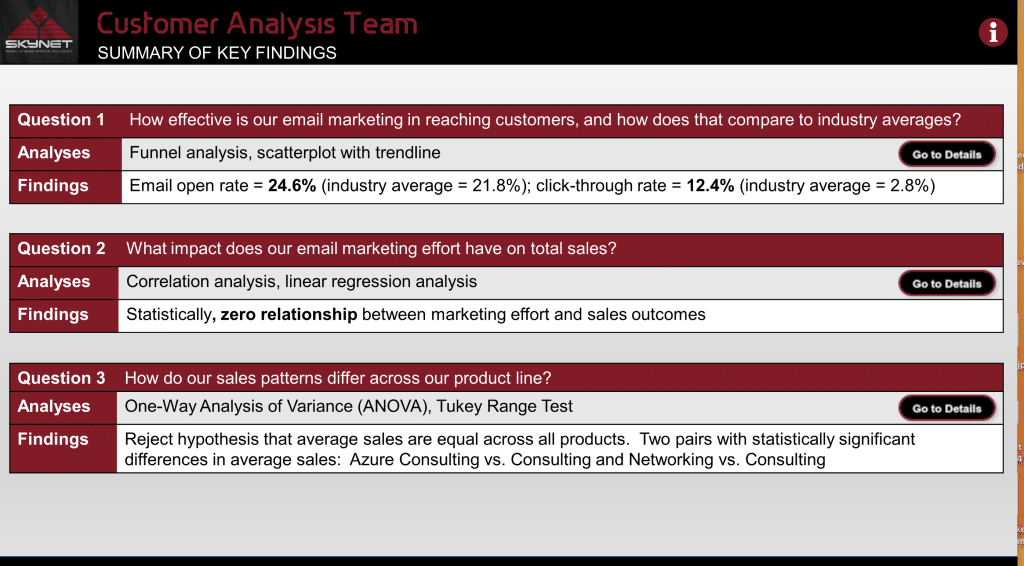
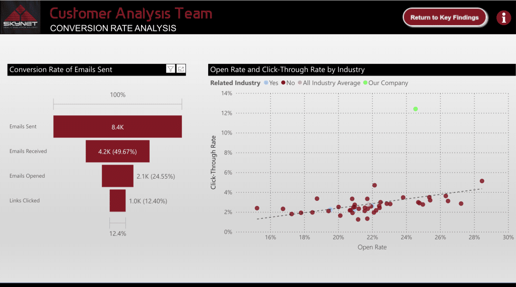
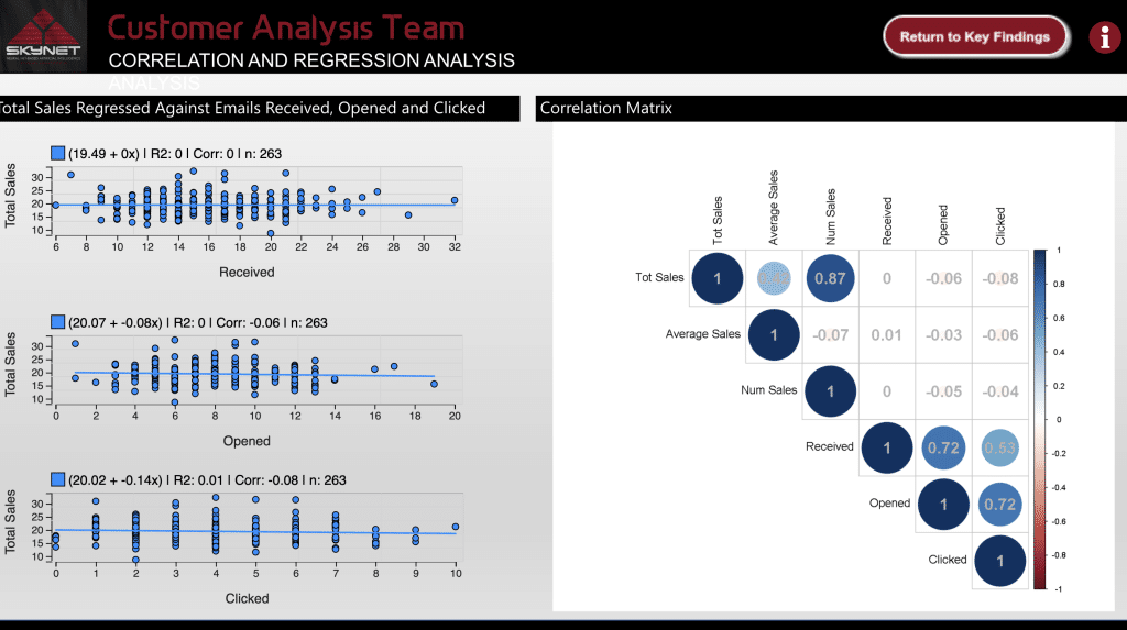
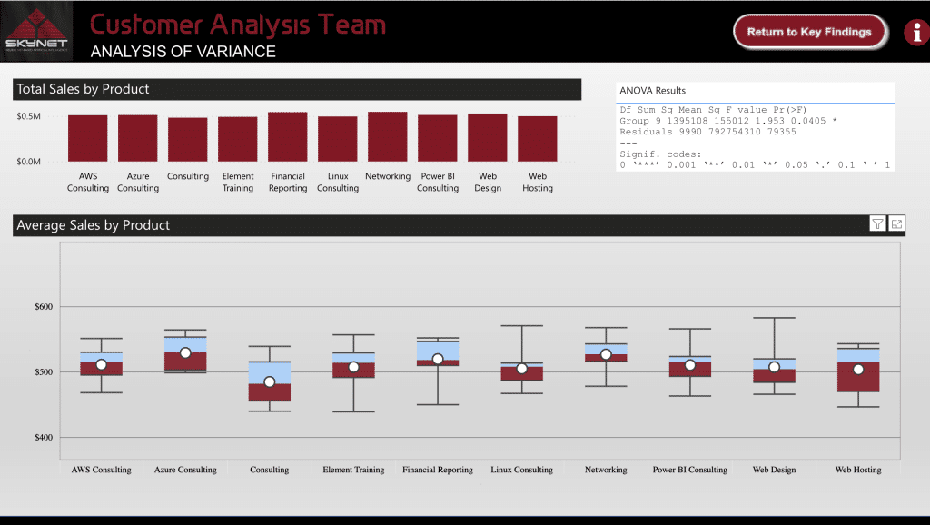
15) Customer Analysis Dashboard
Understanding customer engagement is crucial to success. This specific dashboard focuses on showcasing the relationship between customer sales and marketing engagement based on email marketing open and CTRs (click-through rates).
This report is well made and makes for one of the best ways to showcase data analytics in this type of data in a power bi report.
Structured simply and effectively, you have one main page as a menu or guide which links out to highly detailed findings.
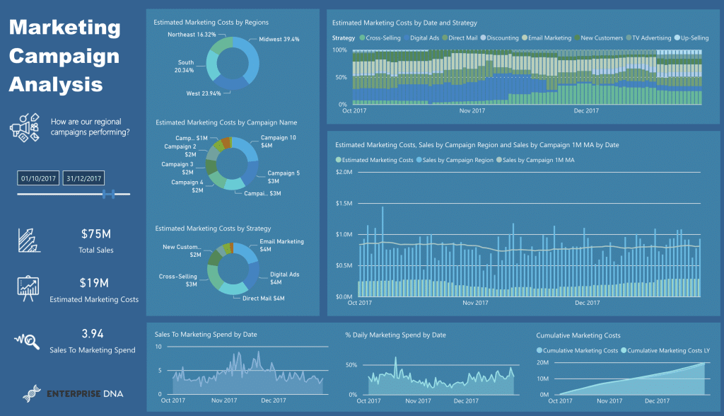
16) Marketing Campaign Performance
Power BI enables you to get clarity and showcase how your marketing budget was spent and the results you got for it are often overlooked.
But, when drilling down on product sales, total sales, and showcasing the marketing spend and split, there is no doubt you are setting yourself up for success.
This dashboard is another excellent use of Power BI and how it can help a business gain clarity and actionable insights into its data set.
We have a huge collection of free Power BI dashboard examples for you to try whether you are tracking financial performance or marketing metrics; you can check them out in our Power BI Gallery.
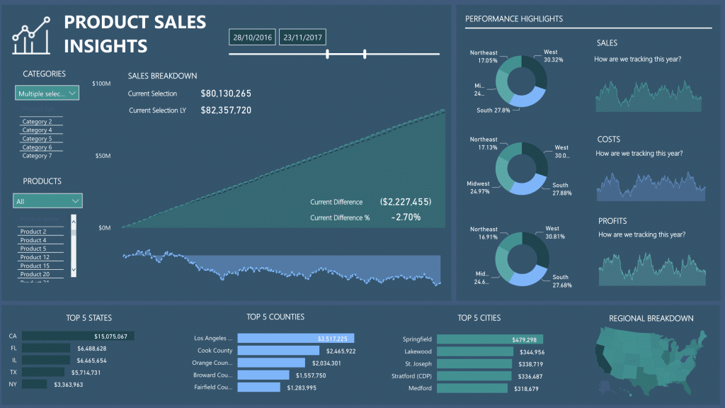
17) Product Sales KPI Dashboard
This is a perfect example of simplicity and effectiveness at its finest. Power BI dashboard examples like this are used o give your marketing team insights into more than just sales
In fact, interactive designs like this dashboard take the guesswork out of business and showcase the simple facts.
With multiple categories and products, sales performance is also broken down into Top 5 States, Top 5 CountriesTop, and Top 5 Cities
There is also a regional breakdown too.
To top it off, it features charts and line graphs to enable easier strategic decisions; this is one of the simplest and best power bi dashboard examples for a clear snapshot of the business.
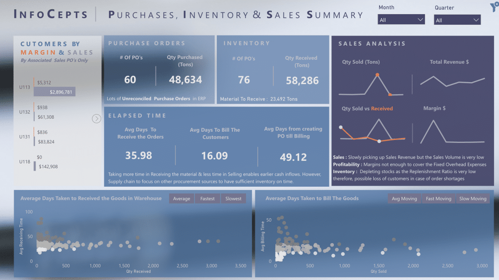
18) Purchases, Inventory, and Sales Summary
Last on our list today is this “moody” styled summary of key business metrics blending in design with data analytics
Data visualization dashboards like this featuring solid power bi elements with key metrics are critical for marketing managers and business owners to gain a clear snapshot of business health.
Many opt for solid colors to stress their points, but the option to get really creative is always there with Power BI
Click here to see our entire collection of Power BI dashboards.
Compilation Of The Best Power BI Reporting Applications We’ve Seen
Check out this video for further design inspo!
How to Access The Ultimate Collection of Microsoft Power BI Dashboards
Over the years teaching 220,00+ people real-world data skills, we have been fortunate enough to work with some of the most outstanding minds and talents in the business.
We never stop learning, and nor should you. But it doesn’t mean you have to start by yourself; we offer the largest collection of Power BI KPI Dashboards on the internet!
To top it off, we welcome you to a fun, progressive, and interactive data community to learn with.
You can check out our collection of Power BI Dashboards, test them out, and download them here.
Also, if you are just starting out in the world of data analytics, we’d love to help you on your journey.
Check out our Free Courses on Power BI; it’s a great place to start and will give you the solid foundations to get you on your way to creating awesome Dashboards and reports like the ones in this article.
Want to start learning how to create power bi reports and dashboards? Check out our Free Resources to get you started.
Got a good understanding of Power BI? You have to dive into our Advanced Power BI Course and take your data skills to the next level.