A Power BI heat map is a type of visualization that is used to show data density on a map. It is a graphical representation of data where the individual values contained in a matrix are represented as colors. In this tutorial, I’ll discuss how we can create a Power BI heat map using a matrix table.
For this demonstration, we’ll be using the insurance complaints data from Enterprise DNA’s Power BI Challenge #6. If you want to use this data, you can go to the showcases section and check out all the challenges.
This report is all about analyzing the number of complaints by regions and by years. In the matrix table, we’ll put years, regions, and a simple measure that counts the number of complaints.
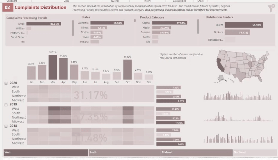
This is the measure that counts the number of complaints in the table.
Analyzing The Power BI Heat Map Data For Visualization
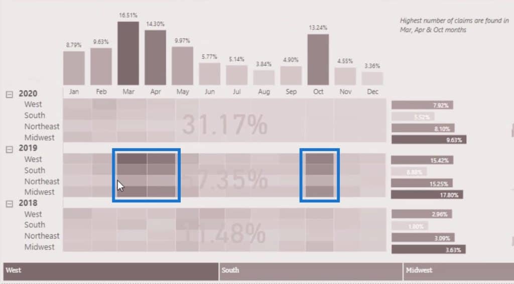
Heat maps can tell us a lot of information. For example, if we go back to the previous page, we’ll see that March, April, and October have the highest number of complaints.
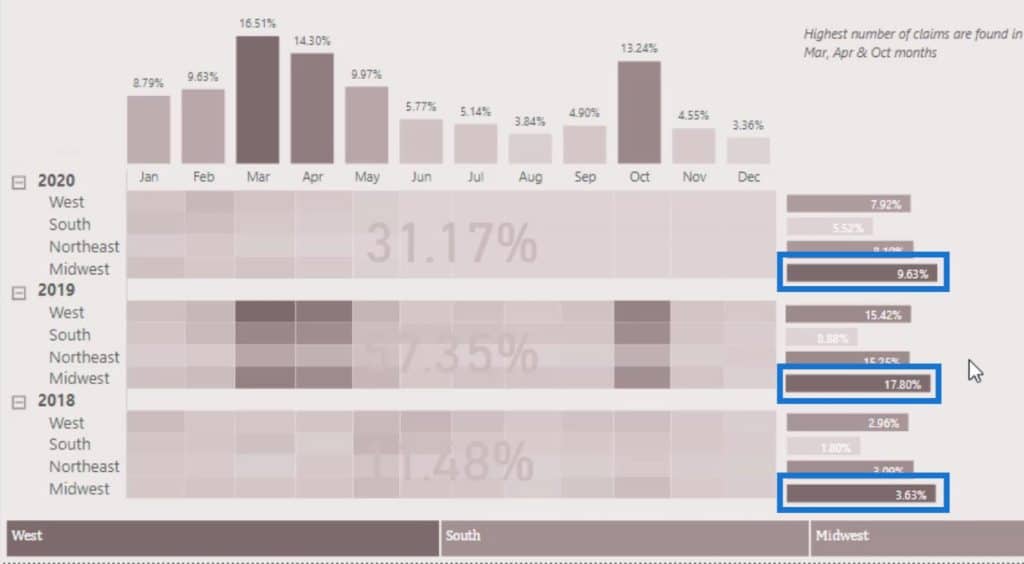
We can also see that the highest number of complaints from 2018-2020 are from the Midwest region.
The analysis that a heat map provides is very easy to understand. Now, let’s try to recreate this example in this tutorial.
Creating The Matrix Table For The Power BI Heat Map
First, bring in the Matrix table visualization.
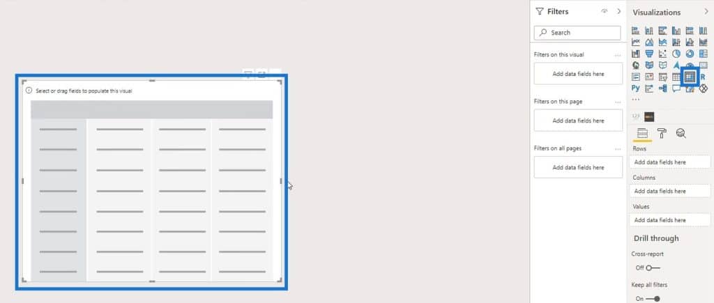
Next, put the Year and Region on the Rows field.
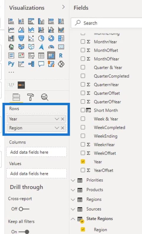
Expand the rows by clicking the + icon.
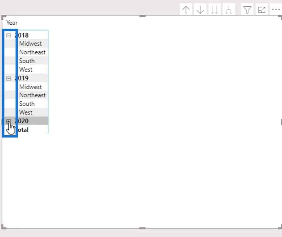
Then, disable the Background.
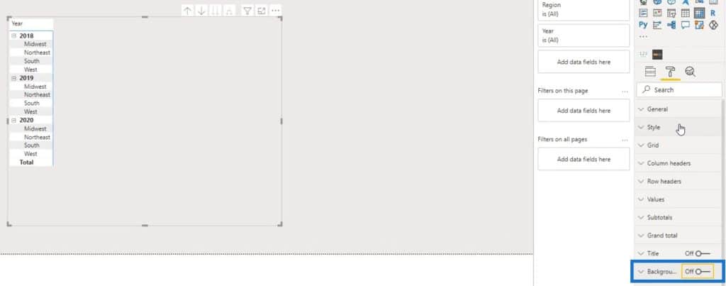
Select None under the Style selection.
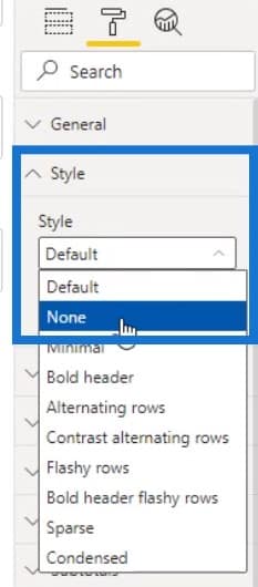
Under the Column headers, remove the outline by selecting None from the Outline selection.

After that, place the months (Short Month) in the Columns field.
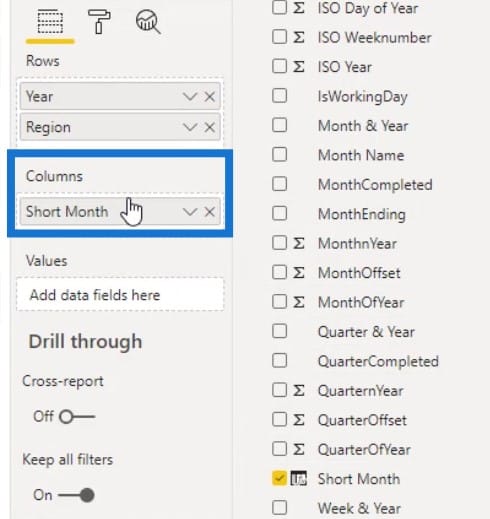
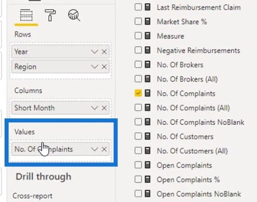
Then, put the No. Of Complaints measure in the Values section.
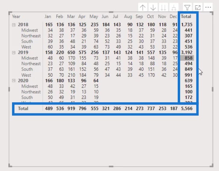
The table should now look like this. But we don’t need the Totals on the rows and columns.
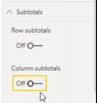
To remove that, disable the Row subtotals and Columns subtotals under the Subtotals pane.
Conditional Formatting For The Power BI Heat Map
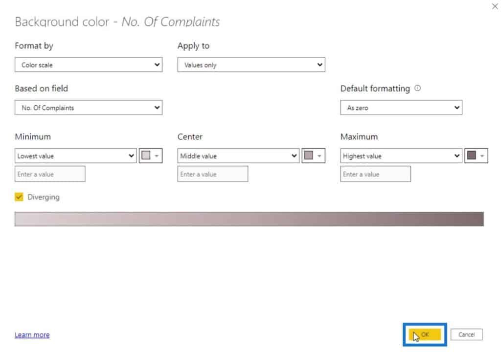
For the second part, we need to apply the conditional formatting for the heat map. We have to enable the Background color under the Conditional formatting pane.
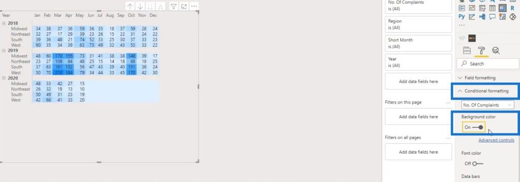
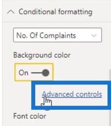
As you can see, we’re already getting the conditional formatting in the matrix table with the default colors. To change the colors, click on the Advanced controls.
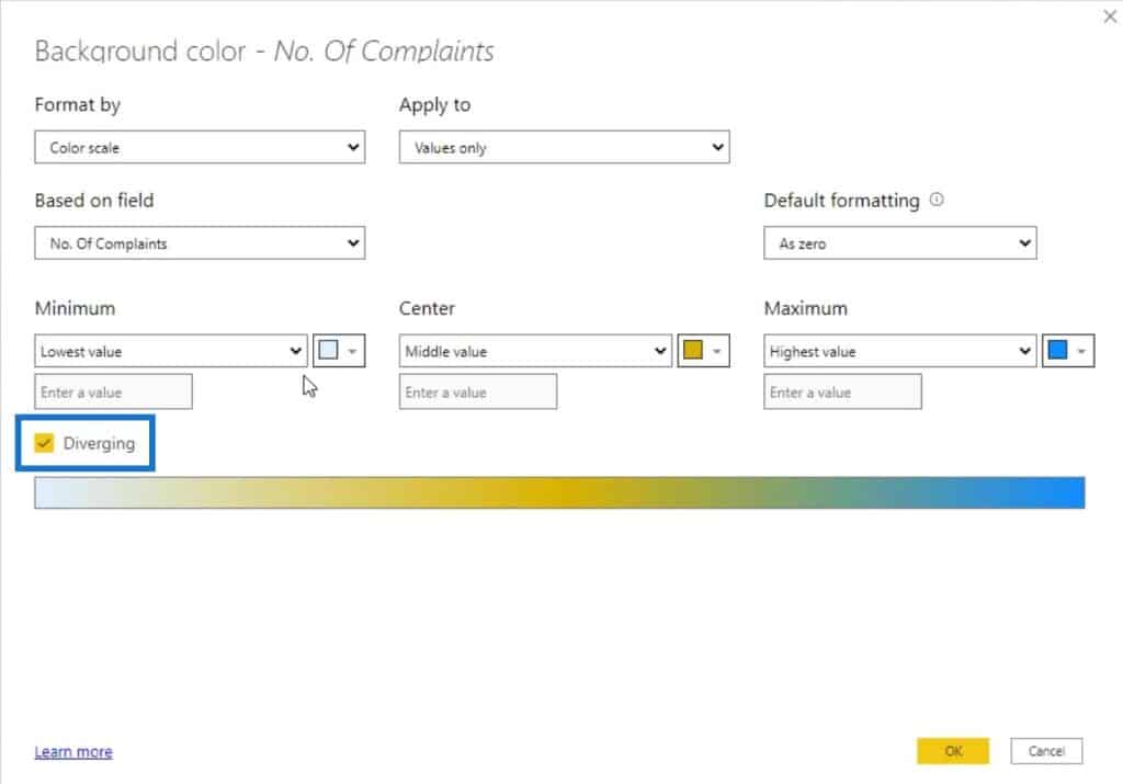
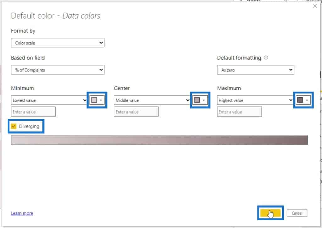
Make sure that the Diverging color is selected. This will enable us to set a color for Minimum, Center, and Maximum values.
Let’s choose a lighter color for the Lowest value, a darker one for the Middle, and the darkest for the Highest value.
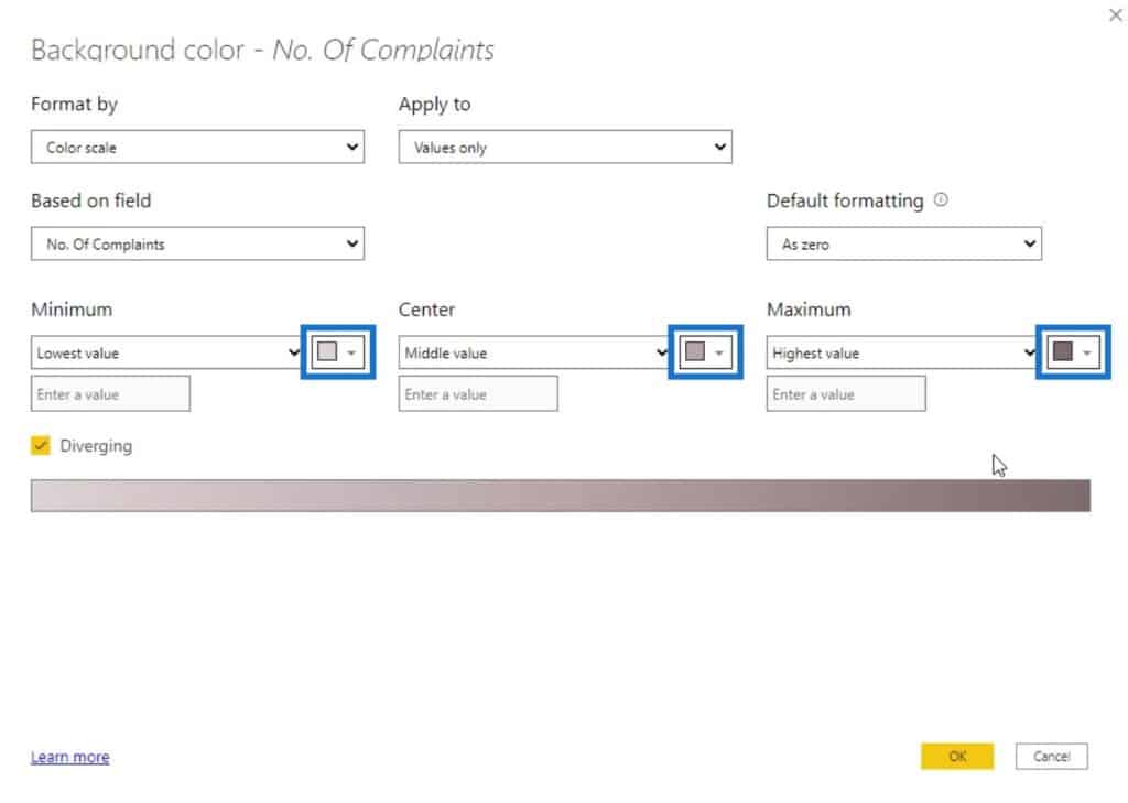
Click the OK button to apply this effect.
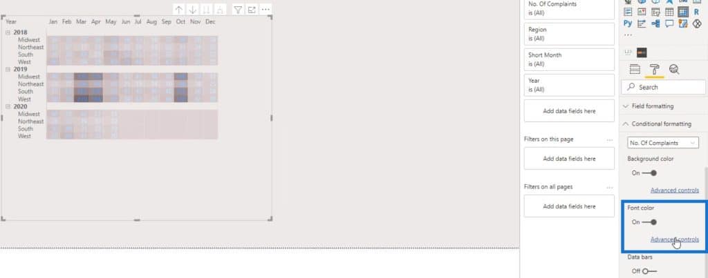
Next, let’s hide the numbers on this table. Enable the Font color, then click the Advanced controls.
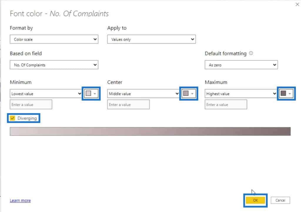
Again, make sure that the Diverging checkbox is checked. Then, set the colors for the Lowest, Middle, and Highest value. Lastly, click the OK button.
We now have this output where the rows and column numbers are hidden.
Let’s now increase the size of the cells. We can do that by increasing the Text size under the Visualizations pane.

Then, let’s remove these headers.
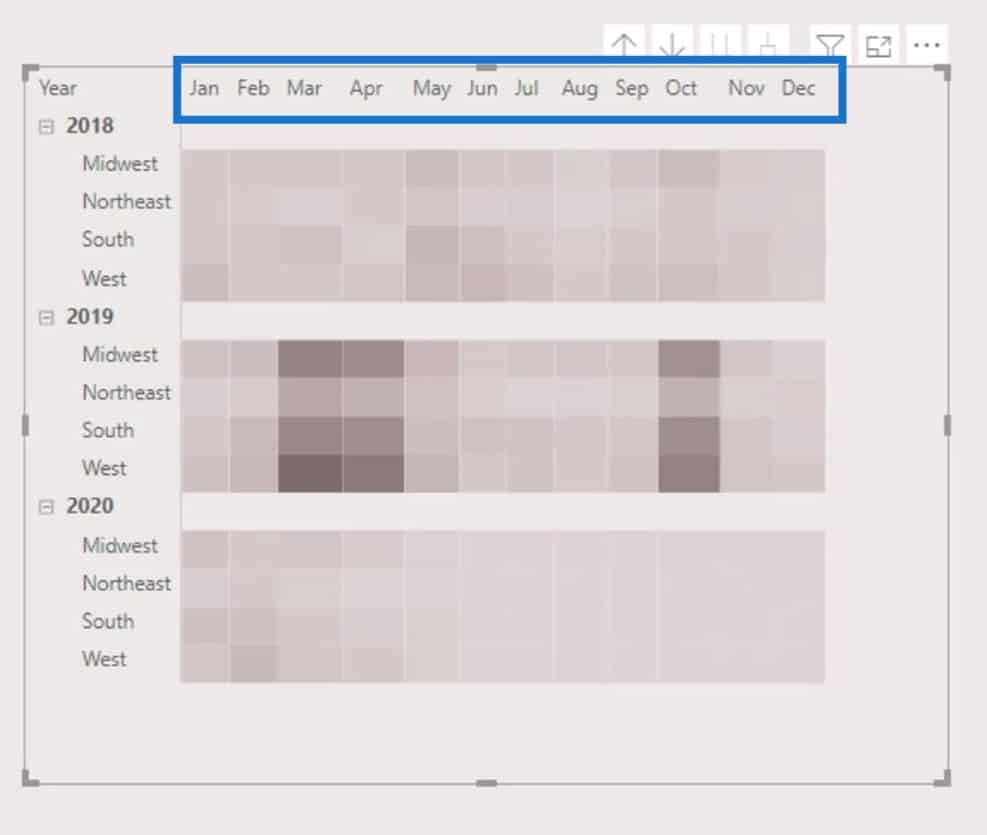
We currently don’t have the option to disable the column headers. What we can do is to change the text colors with the color of the background.
Use a color picker to get the color of the background.
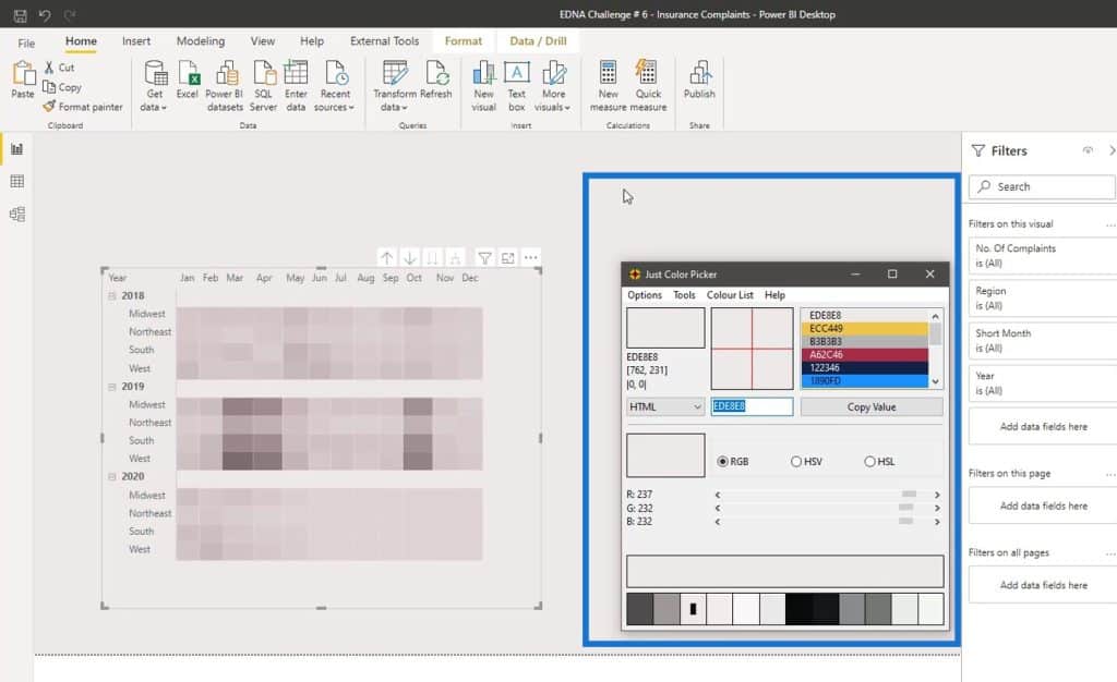
Then, change the text color of the column headers.
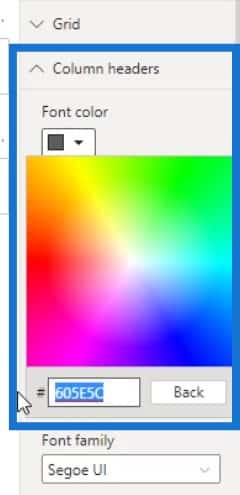
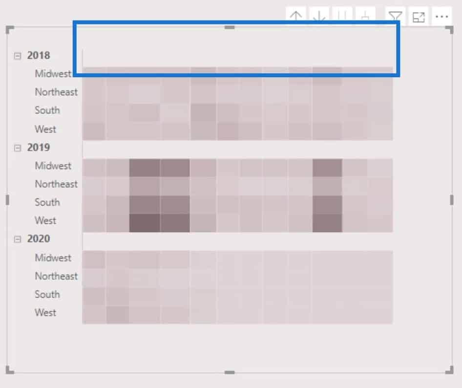
As a result, the column headers are now hidden.
Let’s then hide the visual header tooltips. Under the Visual header tooltip, set the Transparency to 100%.
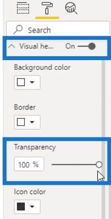
Then, turn off the Visual header tooltip.

Adding The Bar Charts
For this part, we’ll be adding 3 bar charts that will display the values for 2018, 2019, and 2020. First, let’s add a bar chart and align it properly to its corresponding row in the matrix table.
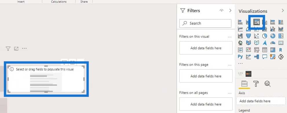
We can use either the measure for the number of complaints or percentage of complaints here. However, the % of Complaints measure will be more useful in this case.
Therefore, let’s place the measure for the percentage of complaints (% of Complaints) in the Values field.
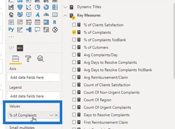
Then, place the Region on the Axis field.

However, the order of the data in the bar chart is not the same with the order of data in the matrix table. So, we need to sort it by Region.
Then, sort it by ascending order.
Now, the data from the bar chart values should look like this.
Let’s then turn off the Title and the Background for the bar chart.
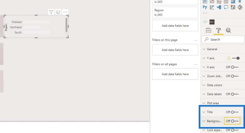
Let’s also remove the titles or labels.
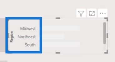
To remove them, just turn off the Title under the Y axis and X axis.
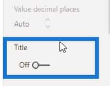
Then, toggle off the Y axis and X axis as well.


We also need to assign colors to our bar chart. Just go to Data colors, then click the effects (fx) button.
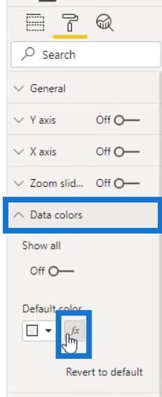
For this part, we can do the exact same steps that we did in modifying the matrix visual. Check the Diverging checkbox, then assign colors to the Lowest, Middle, and Highest values.
Then, turn off the Legend toggle.

We can also turn off the Gridlines under the X axis.
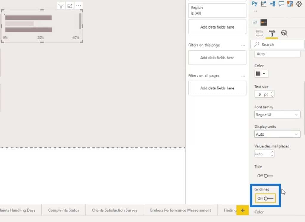
To increase the height of the bars, simply adjust the Inner padding on the Y axis.
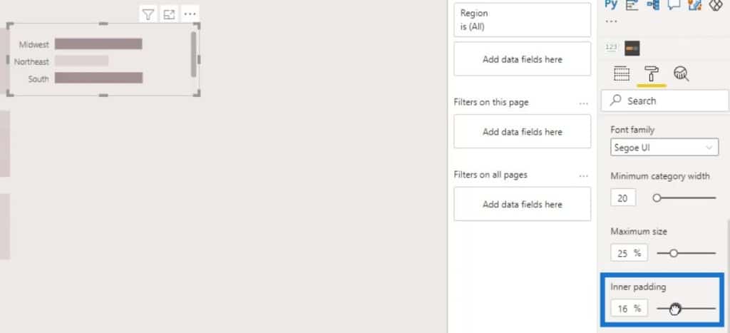
We can now align this with our grids on the heat map visual. Just go to the General pane and adjust the Y Position. It’s better to manually position the visual when we’re doing just a small adjustment.
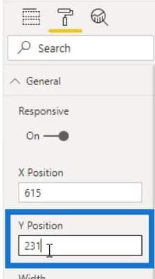
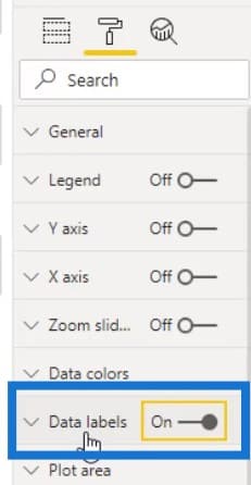
After that, turn on the Data labels for the bar charts.
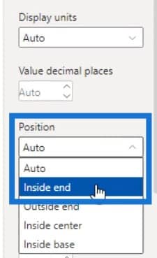
Then, position the data labels inside by selecting Inside end in the Position selection.
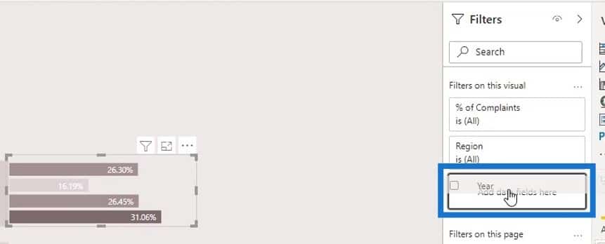
Restrict this bar chart to the year 2018. To do that, just bring the Year measure in the Filters pane.
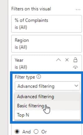
Select Basic filtering for the Filter type.
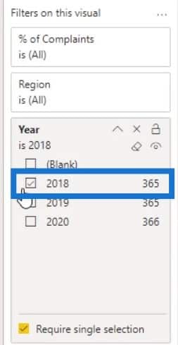
Then, set it to the year 2018.
Before creating the bar chart for 2019 and 2020, let’s hide the Visual header tooltip of the bar chart.
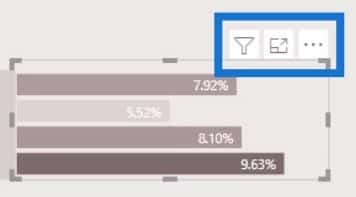
Set the Transparency to 100%, then disable the Visual header tooltip.
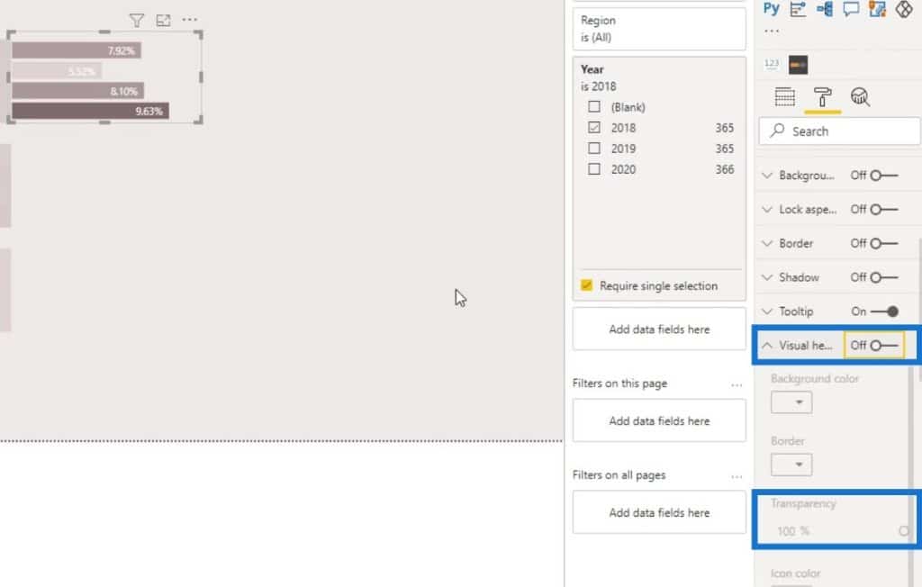
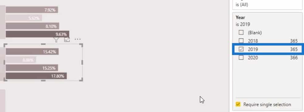
Duplicate the first bar chart to create the 2019 row.
Then, change the filter to the year 2019.
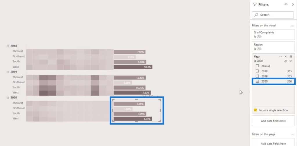
Just do the same steps to create the bar chart for the year 2020. Make sure to change the filter to the year 2020.
Creating The Column Chart
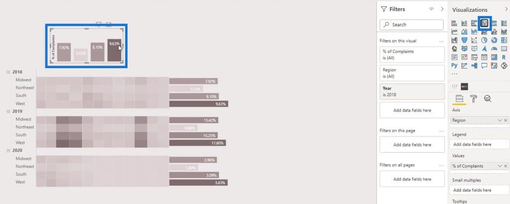
For the column chart at the top, just duplicate the bar chart that we have created.
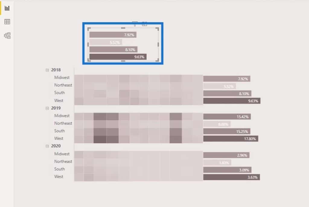
Then, change it to a column chart.
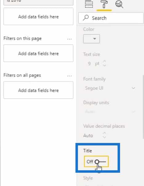
Turn off the Title for the Y axis.
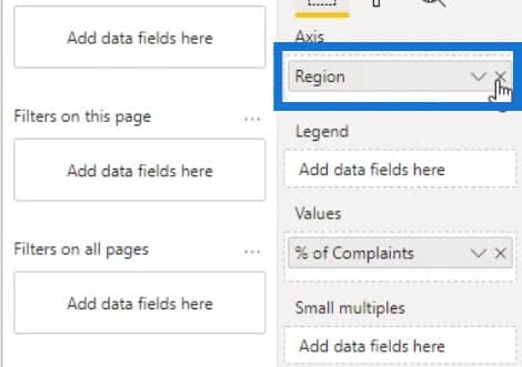
Let’s also remove the Region on the Axis.
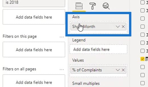
Then, place the month (Short Month) on the Axis.
For this chart, we’ll display the X axis.
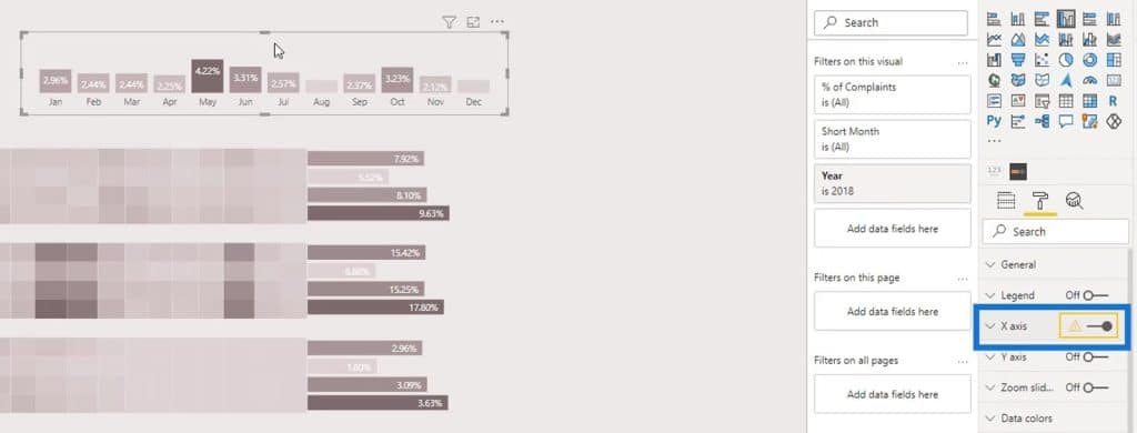
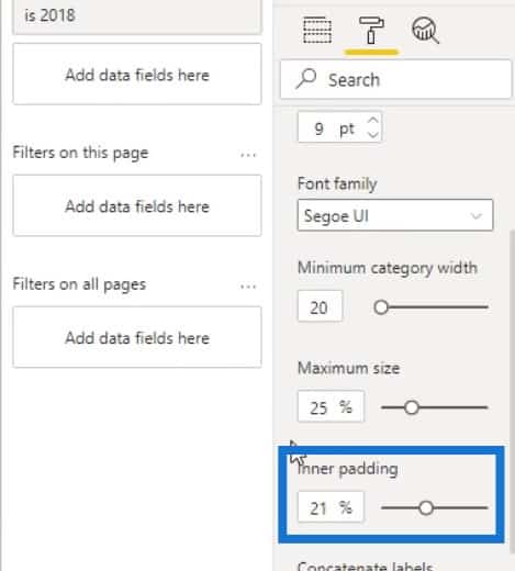
Then, decrease the Inner padding to make it look better.
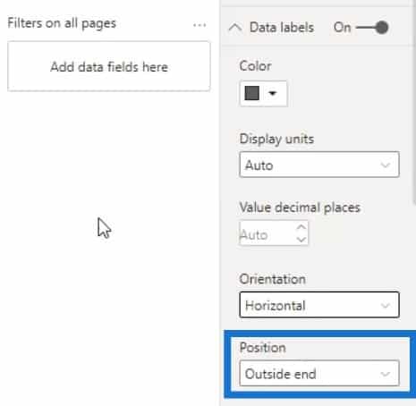
For the Data labels, change the Position to Outside end.
Then, align it properly to the matrix table.
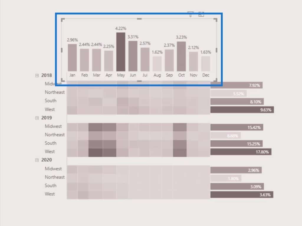
In this native heat map, the position will relatively change when we try to filter it by a particular category.
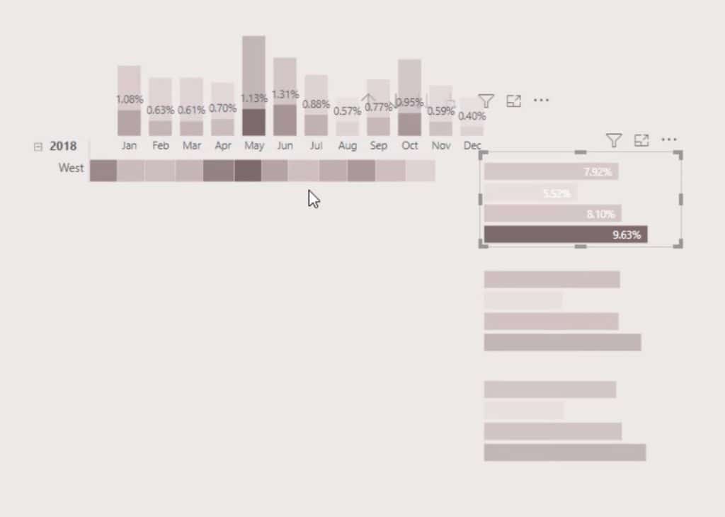
To avoid that, just go to the Format tab, then click Edit interactions.
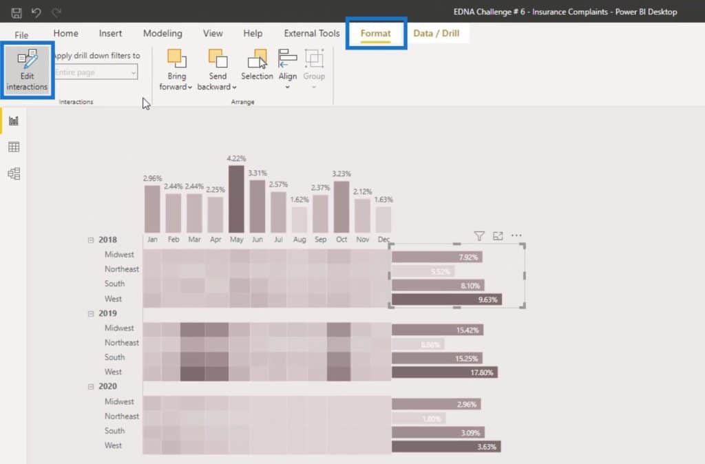
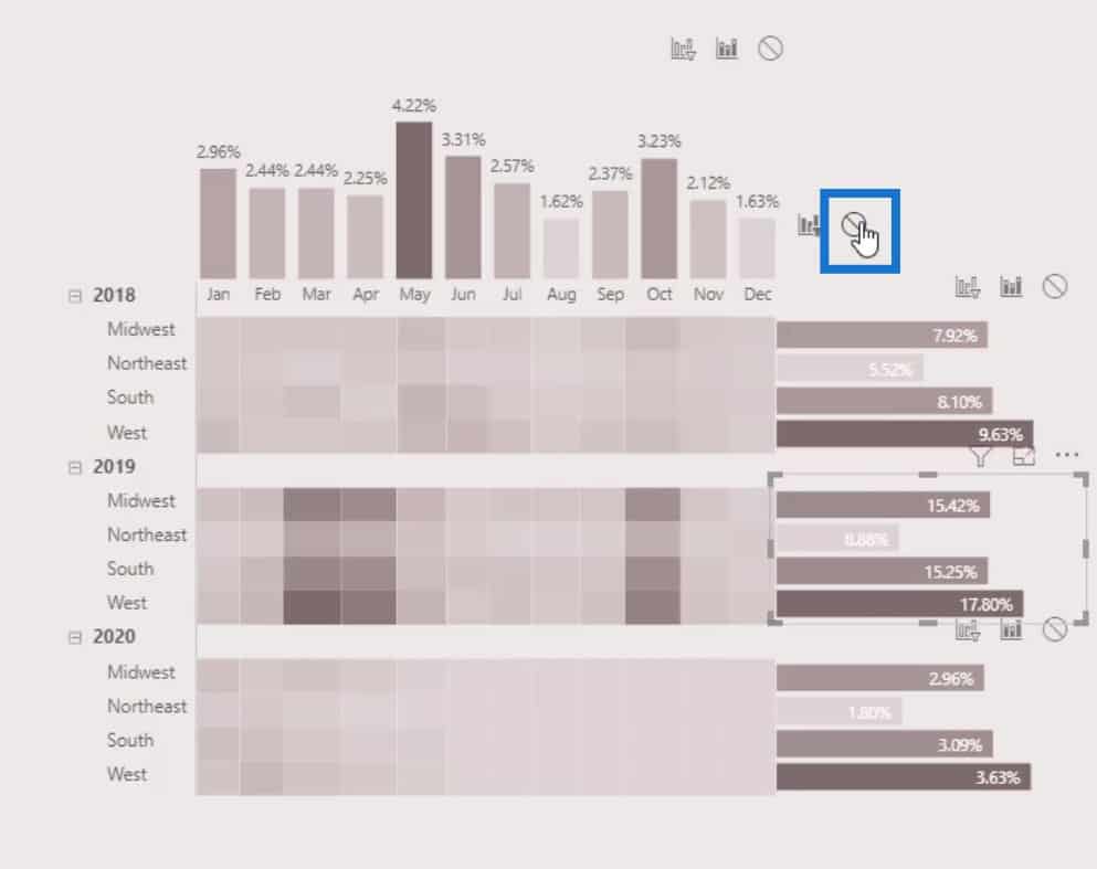
After that, disable the interactions for each of the bar charts by clicking on this icon.
Adding The Card Visuals
Another cool trick that we can do is adding a card visual.
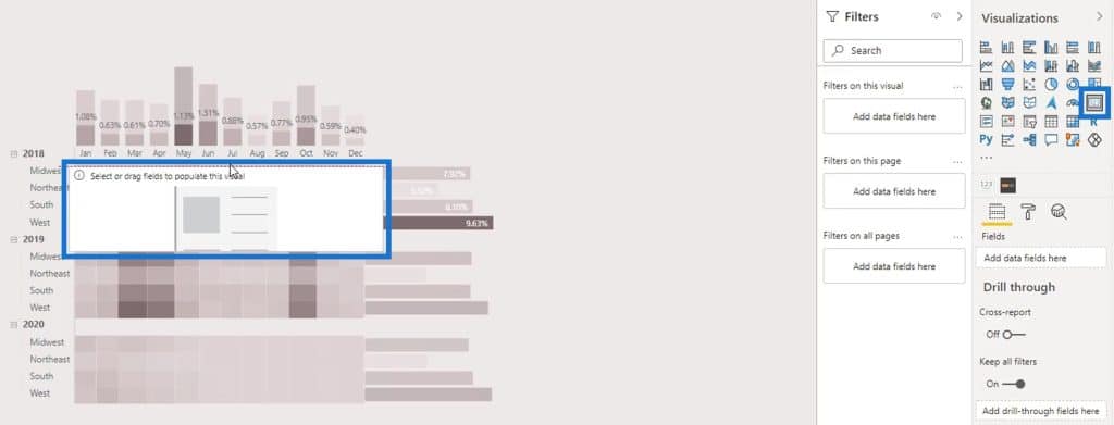
Resize and position it properly in front of the 2018 row.
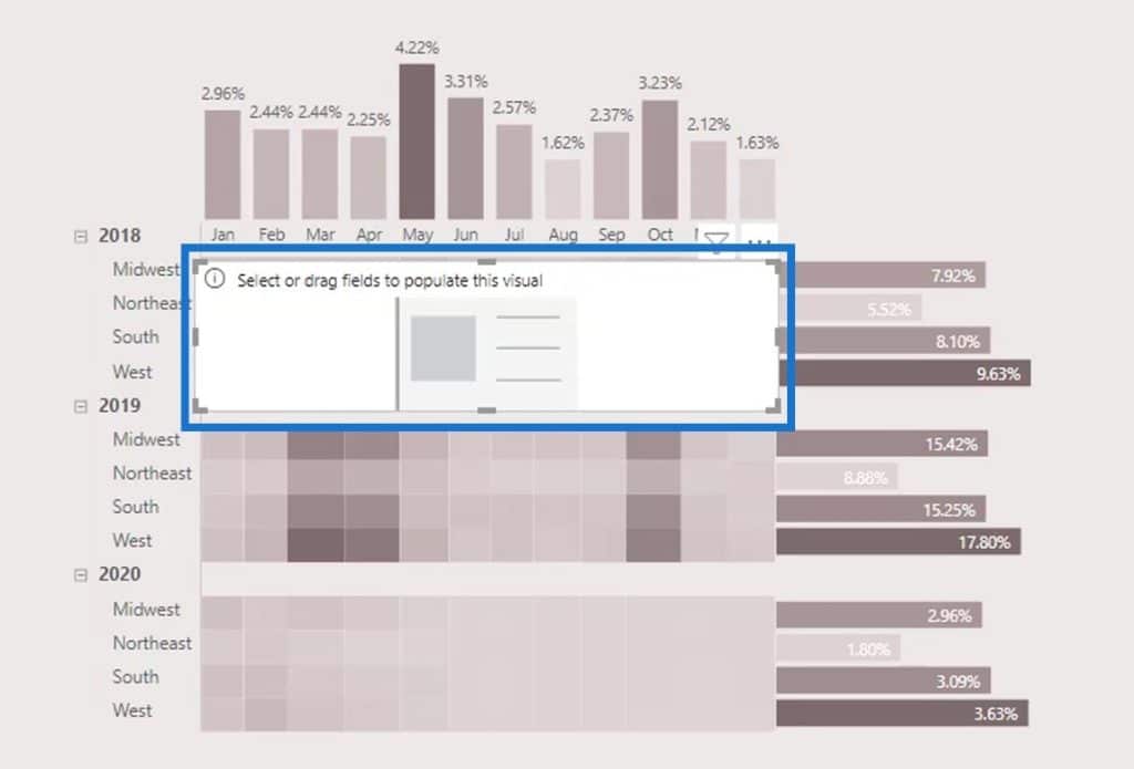
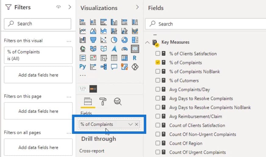
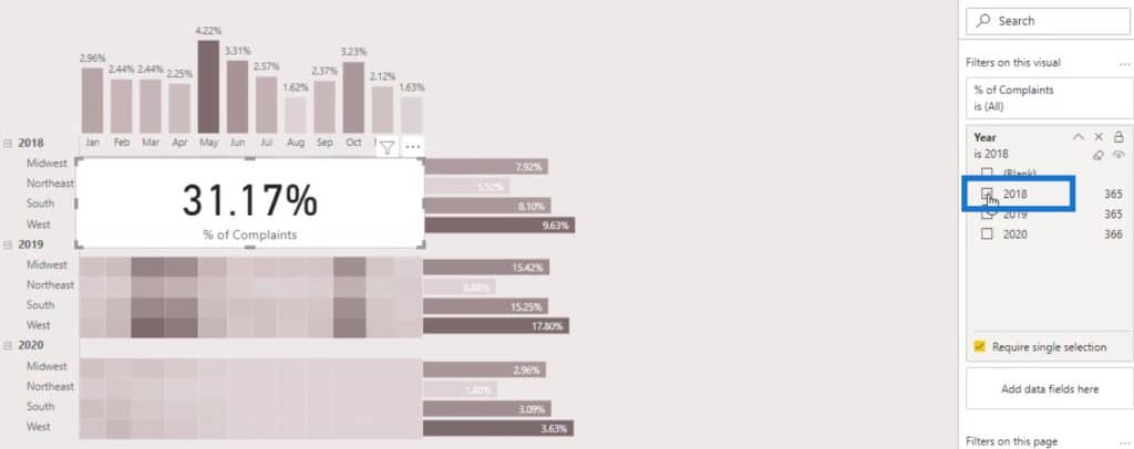
In this card visual, we’ll be showing the total percentage of complaints in 2018. To do that, just put the % of Complaints measure in the Fields.
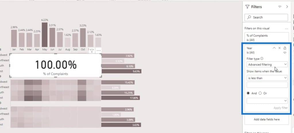
Then, put Year in the Filters pane as well.
Change the Filter type to Basic Filtering.
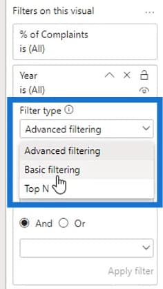
After changing the filter type, select the year 2018.
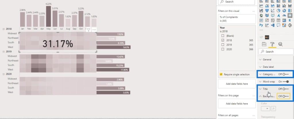
Turn off the Title, Category and Background.
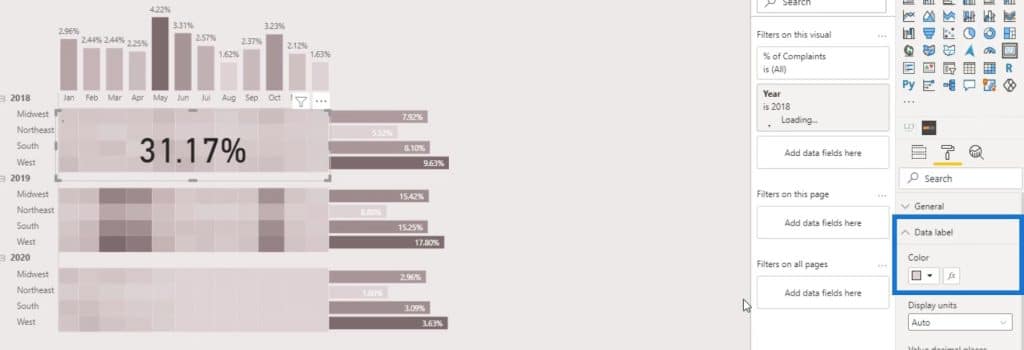
Then, change the color of the Data label.
The output should now look like this. Upon doing the previous step for the card visual, the users can’t click on this part of the matrix table. However, they can still see the total percentage of complaints for the year 2018.
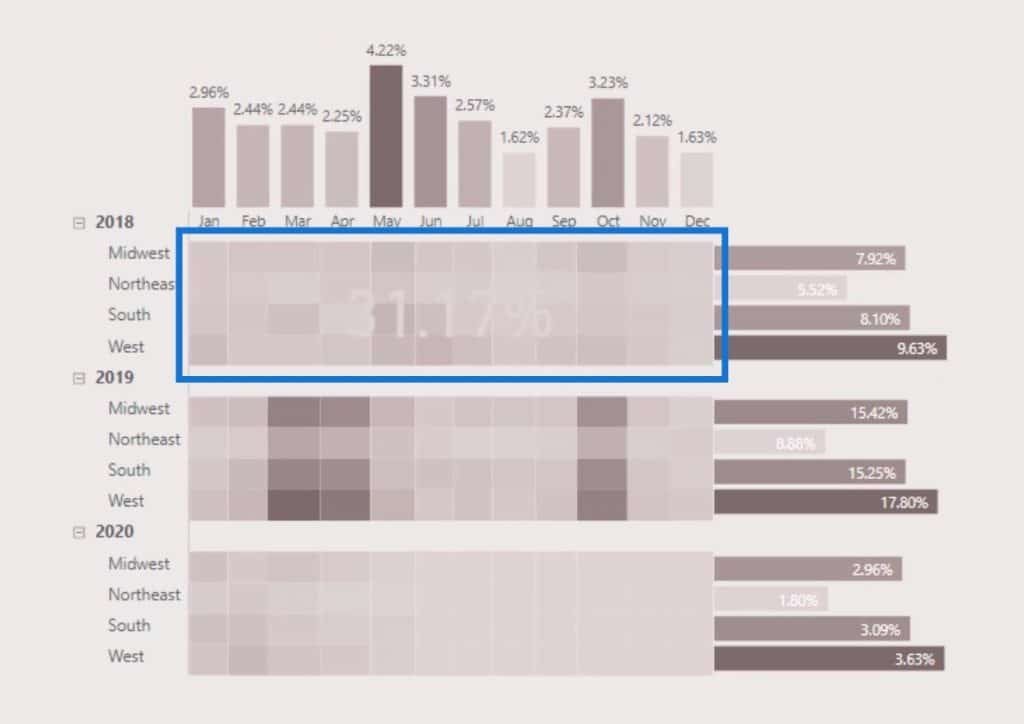
If they click on the bar chart by regions, the percentage will still change dynamically.
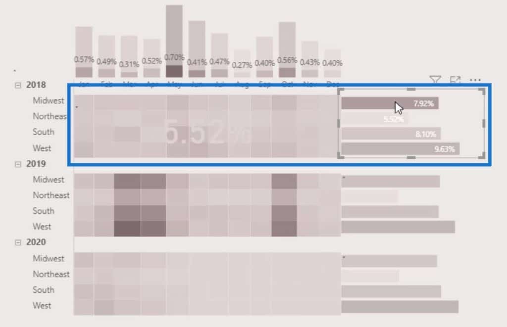
We can do the same for the 2019 and 2020 rows as well. Just duplicate the first card visual and position it accordingly.
Don’t forget to change the year on the Filters pane for the 2019 and 2020 rows.
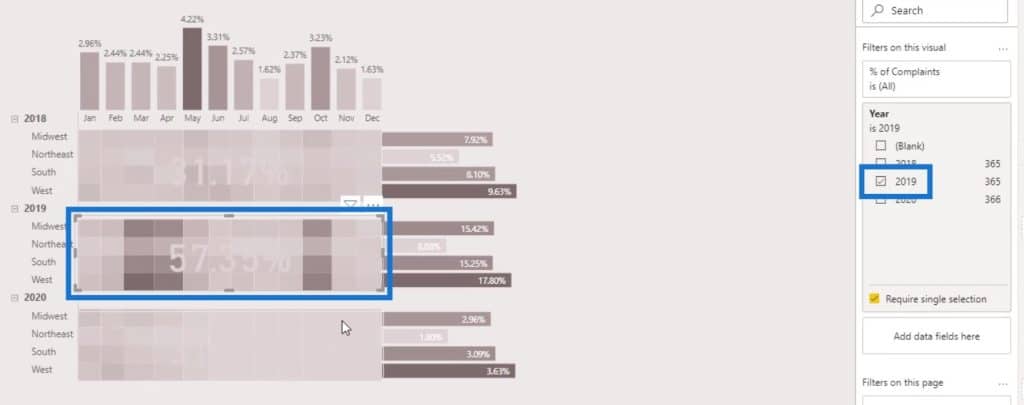
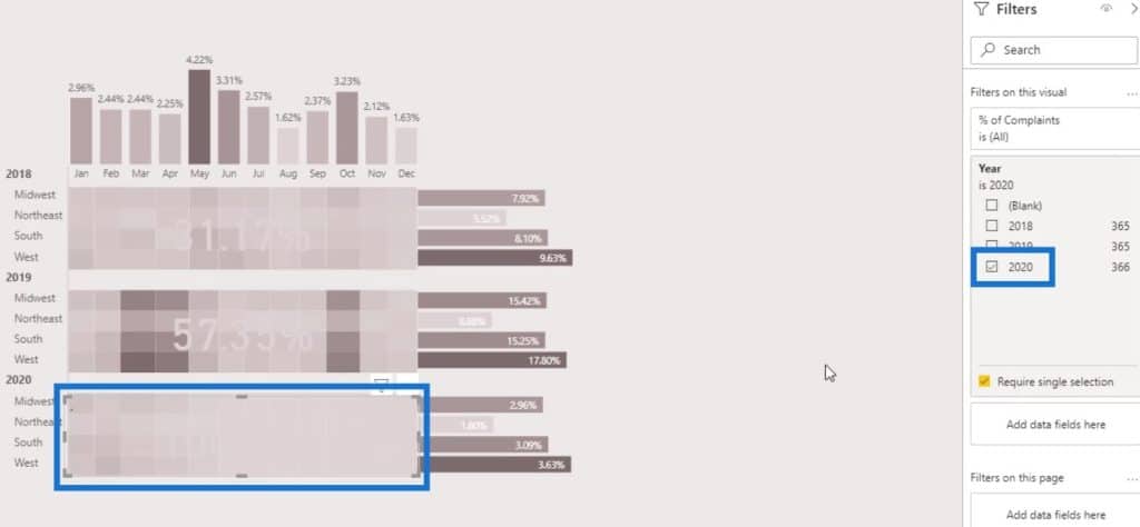
For the third card visual, adjust the color to make it more visible.
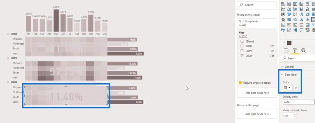
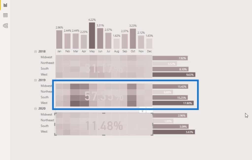
Now we can see that the year 2019 has the highest number of complaints.
***** Related Links *****
Power BI Data Bars In Table Visualisations
Power BI Conditional Formatting For Chart Visuals – What’s Possible?
Visualization Technique – Power BI Column Charts & Filters
Conclusion
That’s how you can easily create a heat map in your Power BI reports for visualization. You can also get creative by integrating the other visuals that are available in Power BI such as bar charts and card visuals. The process is not that complicated.
In fact, the whole process of creation only requires a better understanding of what output you want to achieve along with the available visualizations and custom features in Power BI. Check out the links below for more examples and related content.
Until next time,
Mudassir


