
In this tutorial, we’ll discuss how to creatively use a Power BI scatter chart. We’ll also tackle one of its limitations and how we can deal with it. A scatter chart, also known as scatter plot, uses a series of dots to represent data. This type of data visualization is used in showing the relationship between different variables.
Conditional Formatting For A Power BI Scatter Chart
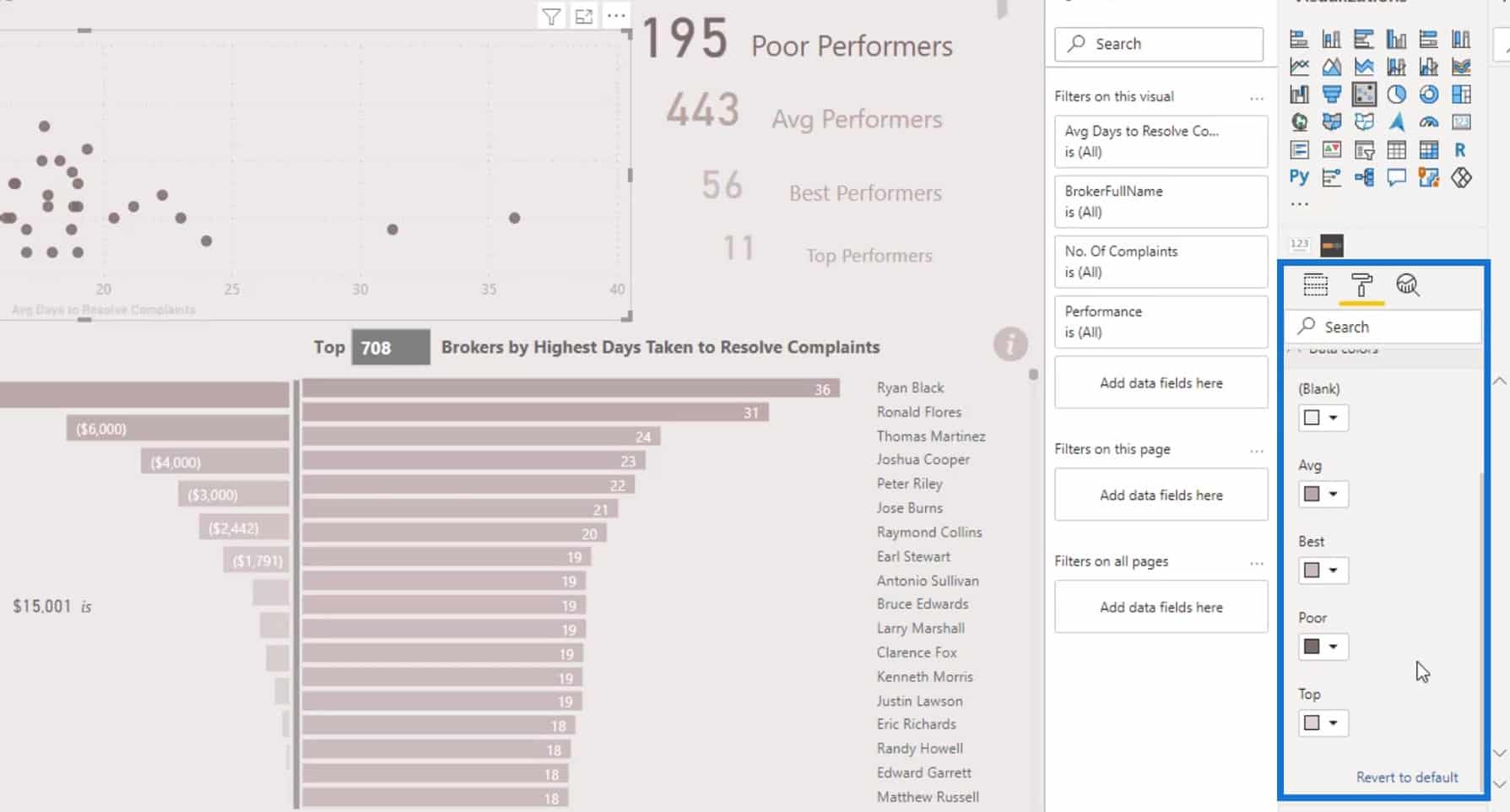
The scatter chart is almost everyone’s favorite. However, one of its limitations is that there’s no available conditional formatting for it. Let’s say we want to conditionally format the scatter chart in this report. If we go to Data colors, we’ll see that we don’t have that option.

To get diverse colors, we need to create a quite complex DAX code and a table. The pattern that is used for this certain scenario is called Dynamic Segmentation. We have a lot of videos that are related to this topic in our EDNA YouTube channel and EDNA courses. You can check those out if you haven’t yet.
We can still do the conditional formatting without having to create any complex DAX codes. But we can only do it in Charticulator and not in Power BI visual.
Getting Creative With Power BI Scatter Charts
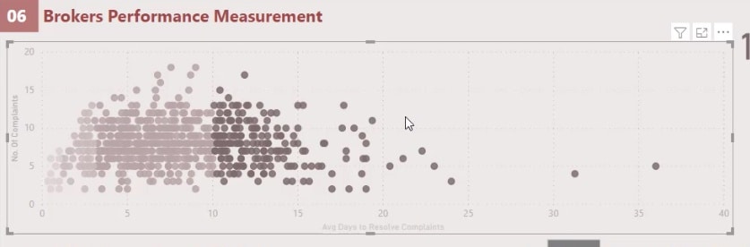
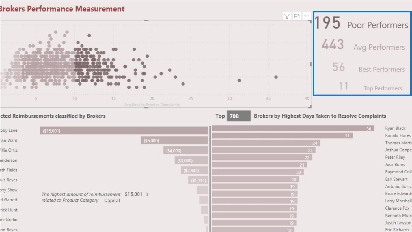
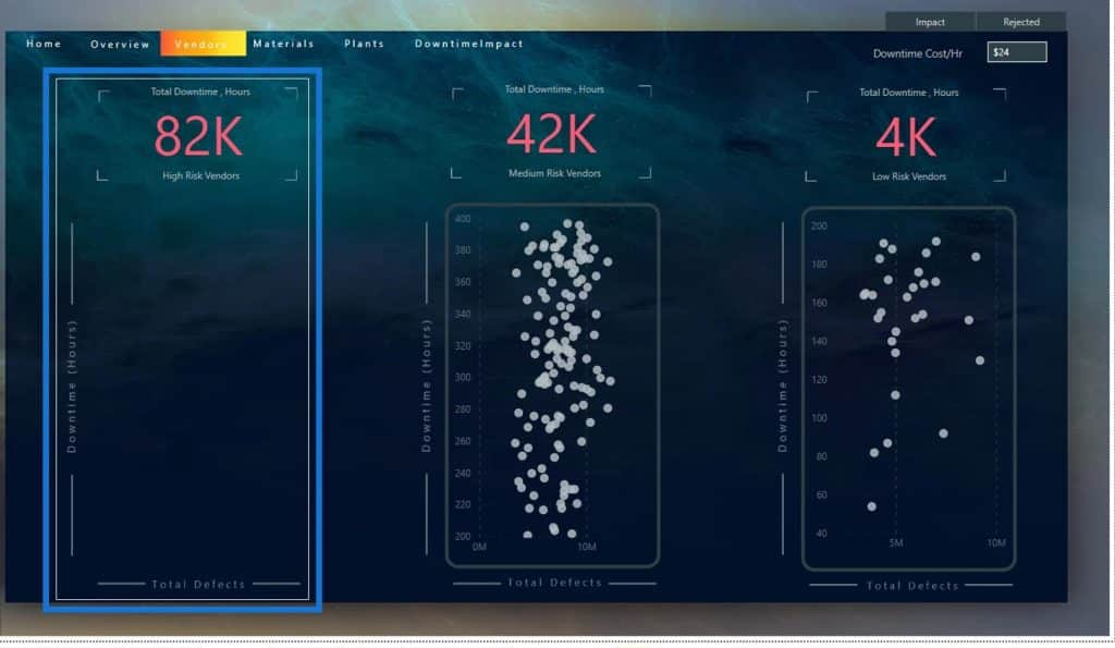
Let’s also talk about how you can creatively use scatter charts. In this report, we used a scatter chart which shows the average days to resolve complaints, and the number of complaints on the y-axis.
To give more visibility to the user, we added a card visual. This enables the end users to see how many of them are poor, average, best, and top performers.
Creating A Jitter Effect For A Power BI Scatter Chart
Scatter charts don’t have a Jitter effect in Power BI. Most of the time, the dots are in a straight line. However, the Jitter effect can also be useful as it creates spaces between the data points. We can achieve this type of visual by creating a custom visual in Charticulator, but we will not focus on that in this tutorial.

In this example, we utilized the Dynamic Segmentation technique instead. But we did it using another creative way. This is the type of scatter chart that I created in my Power BI Challenge #10 report.
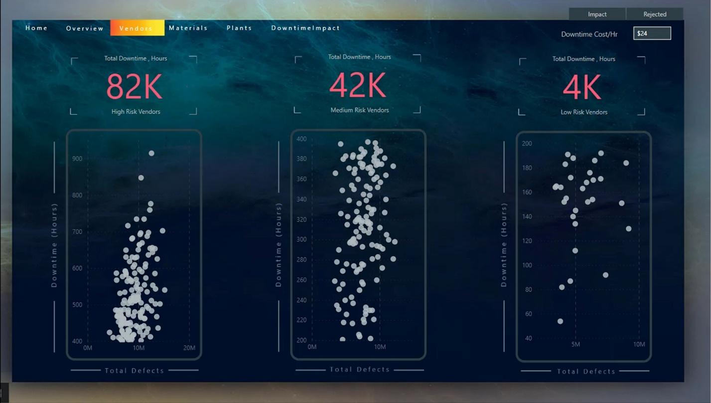
This challenge report was related to the supplier insights where we had to evaluate a total amount of defects across different criteria. We also evaluated the total number of downtime caused by the defective material from the suppliers.

1. Creating The Measures
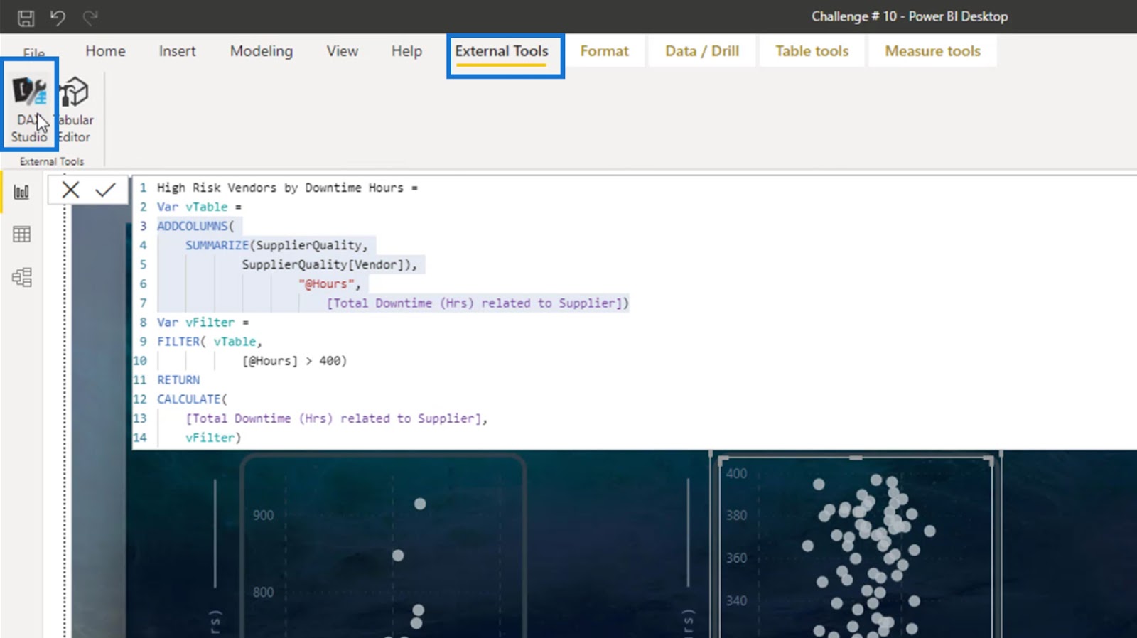
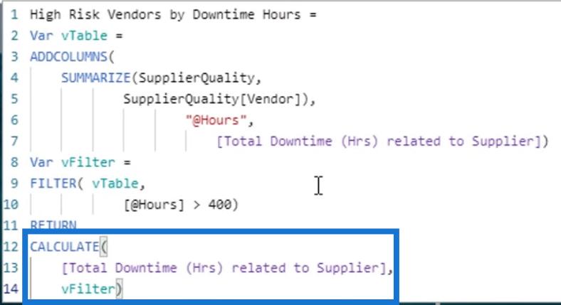
In this report, I used a measure where I placed the vendors in the high-risk area if the downtime hours is greater than 400.


I also created a measure for the medium-risk vendors where the downtime hours due to the defective material are between 200 to 400.


For the low-risk vendors, the downtime hours are less than or equal to 200.

Let’s first analyze the measures, then I’ll show you how I created the scatter charts. For the high-risk vendors, I have grouped the vendors with the number of hours.

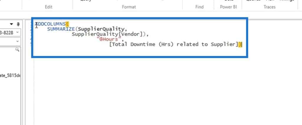
If we’re creating a table, we don’t have to create a calculated column to see the result. We can create a virtual table and test the results in DAX Studio. Now, to see the result of the previous code, just copy the virtual table code. Then, go to External Tools and click DAX Studio.
Paste the virtual table code here.
Write the EVALUATE statement.
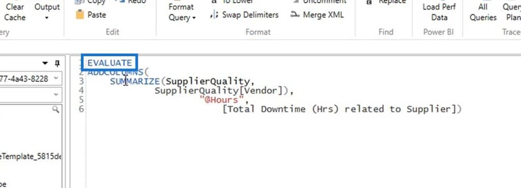
Then, run this code.
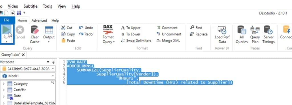
As a result, the vendors are summarized and grouped by the number of hours.
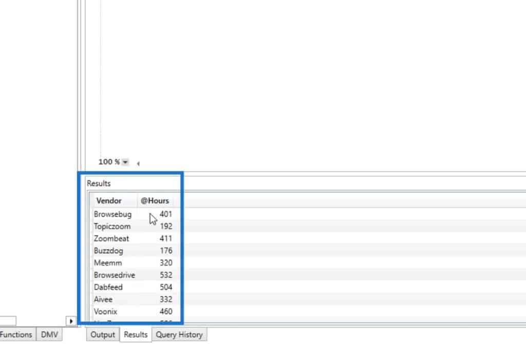
After that, I filtered out the vendors whose defective material have resulted in down time hours that are greater than 400.

Then I calculated the total number of downtime hours with this criteria.
I have done the same with the measures for medium-risk and low-risk vendors.
2. Creating A Scatter Chart
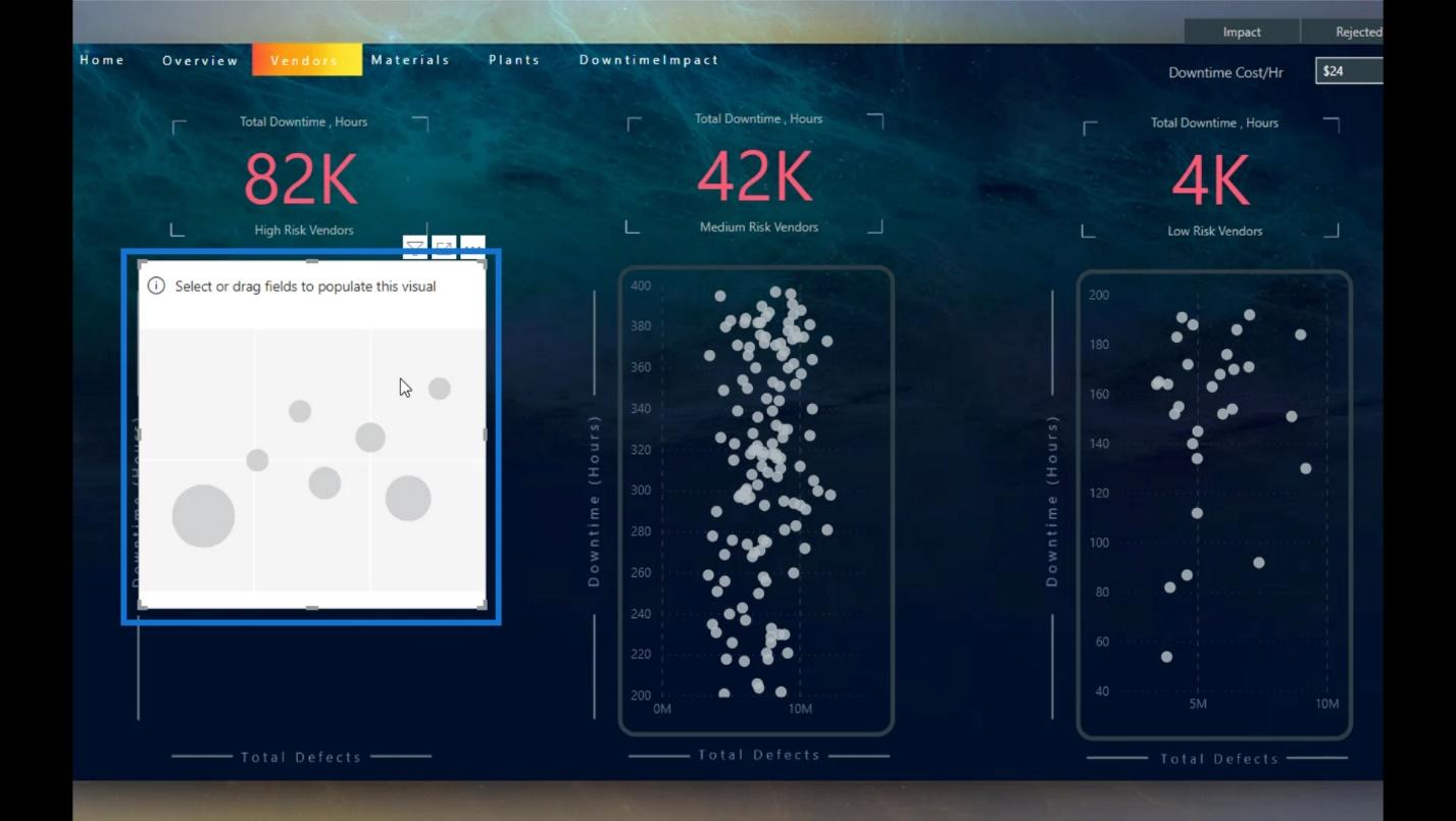
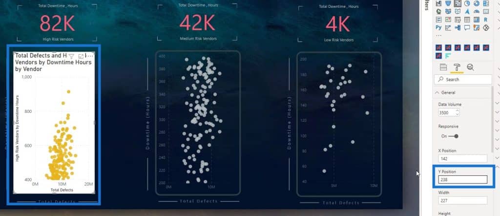
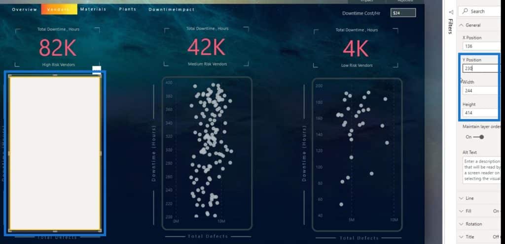
Let’s now discuss how to create a scatter chart. I deleted the existing chart for the high-risk vendors so we can create it from scratch.
First, click the Scatter chart on the Visualizations pane.
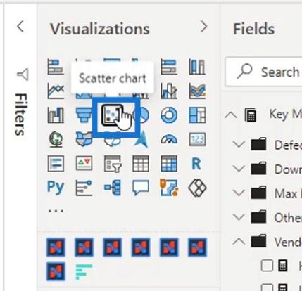
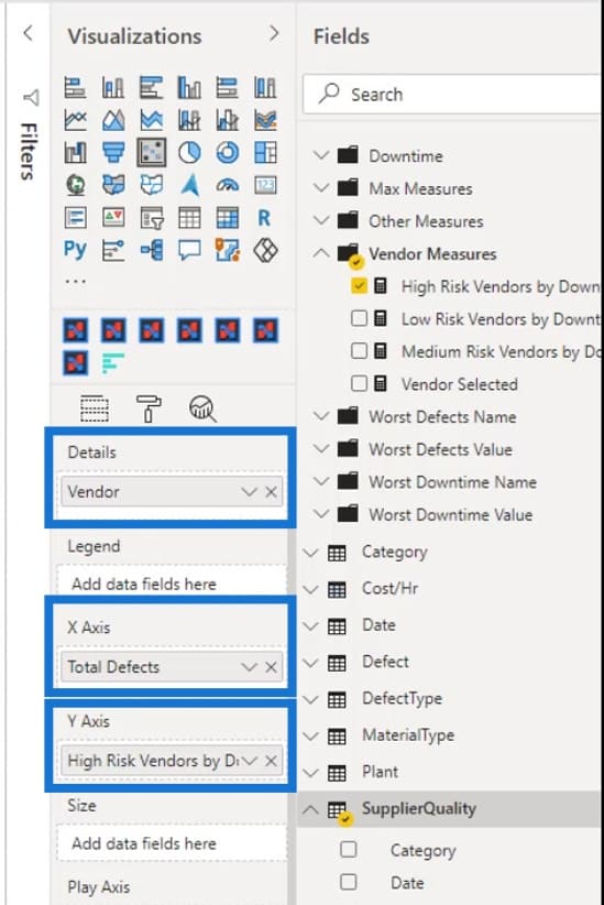
Then, add the measures first for the high-risk scatter chart. I added the High Risk Vendors by Downtime measure to the Y Axis field, Total Defects measure to X Axis, and Vendor measure to Details field.

A lot of people don’t know how to resize scatter charts. For example, we want to resize this scatter chart exactly like the scatter chart for the medium-risk vendor.
What we can do is to look at the width and height of the medium-risk vendors scatter chart.
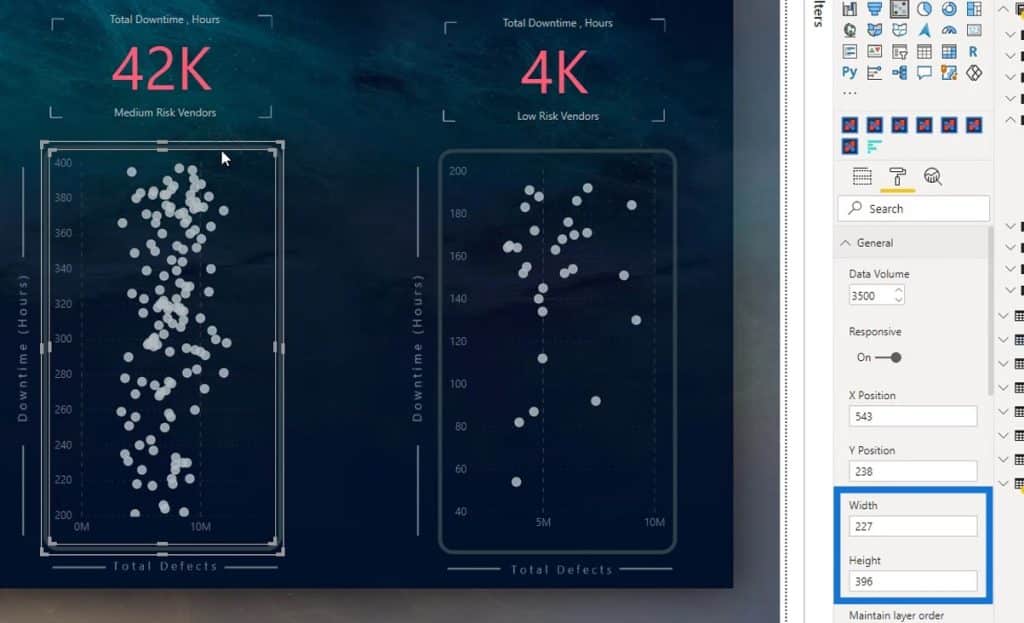
Then, enter the same values for the width and height of the high-risk scatter chart.
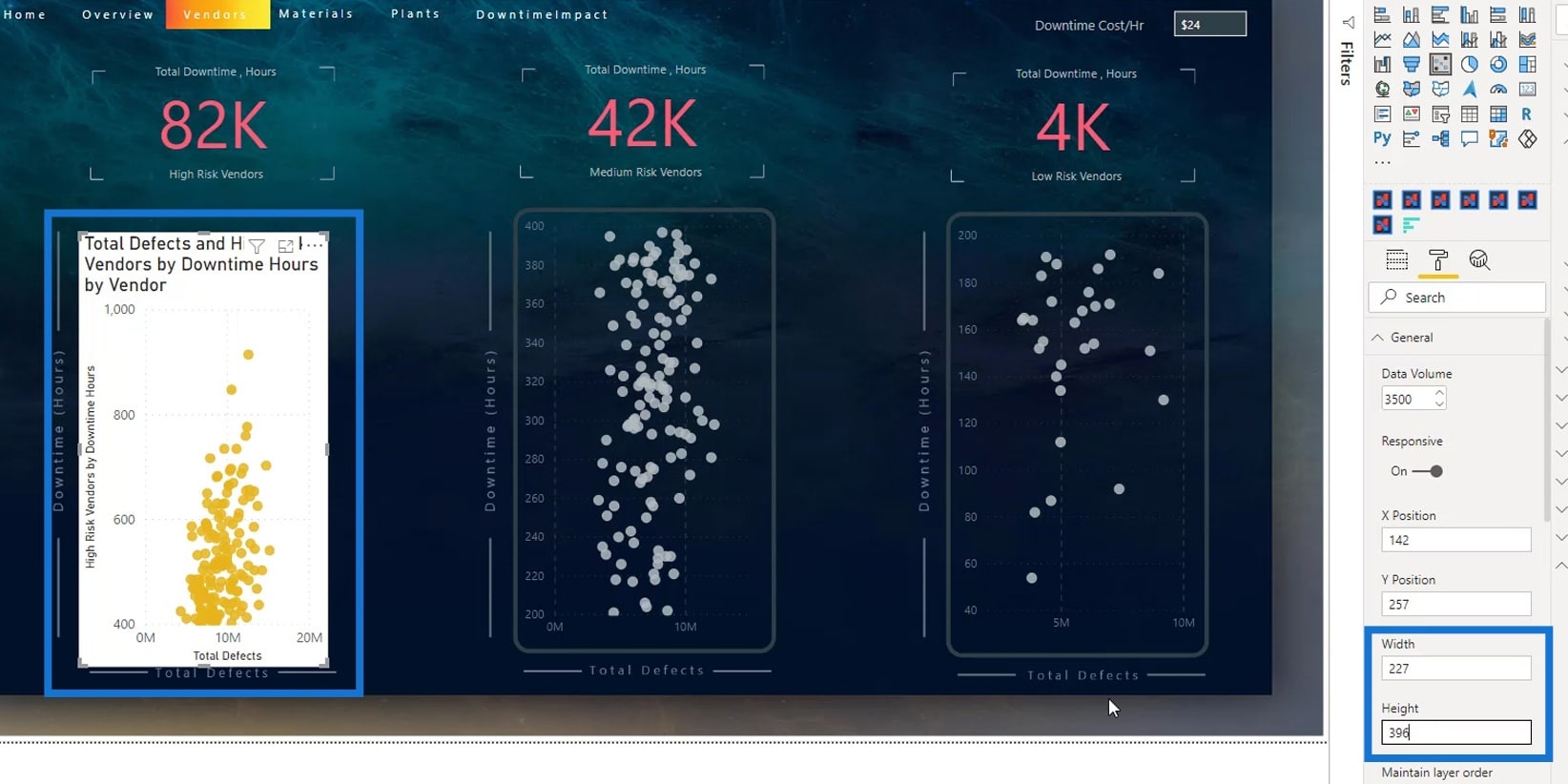
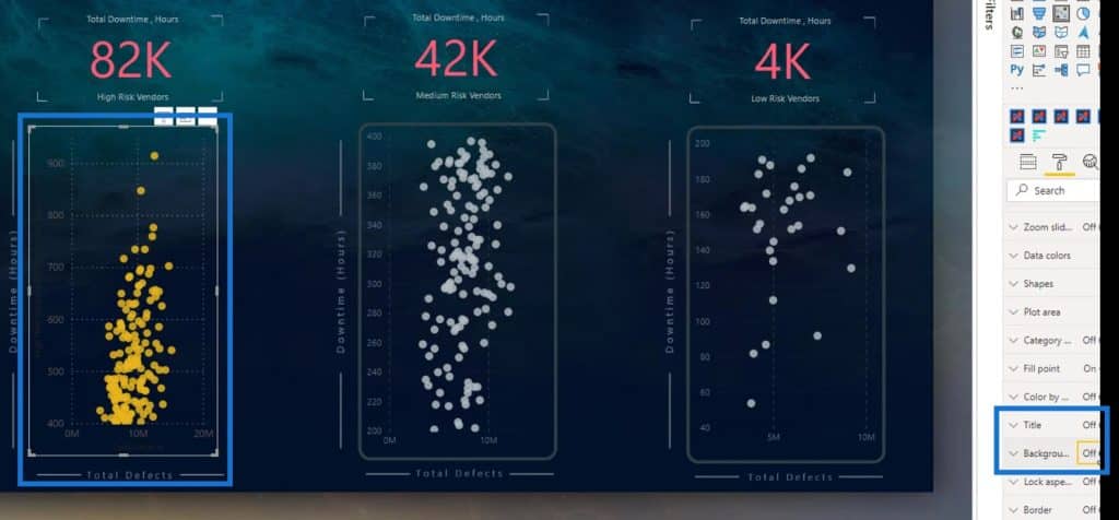
Next, place it in the same position as the other scatter charts. To do that, just check out the Y Position of the other scatter charts. As you can see, their Y Position is 238.
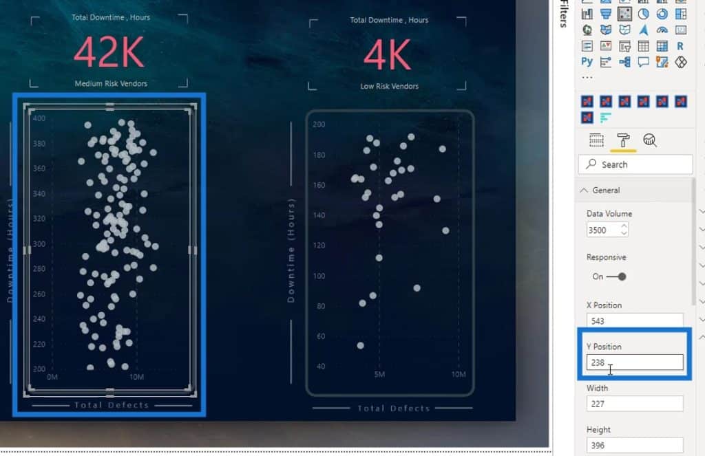
So, just use that on the scatter chart for high-risk vendors as well.
As you can see, they are now aligned with each other. After that, turn off the Title and Background so it would look like this.
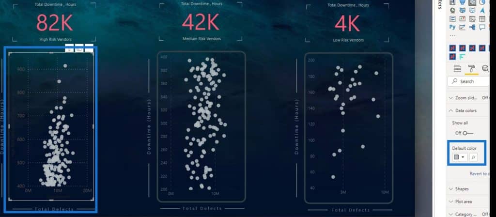
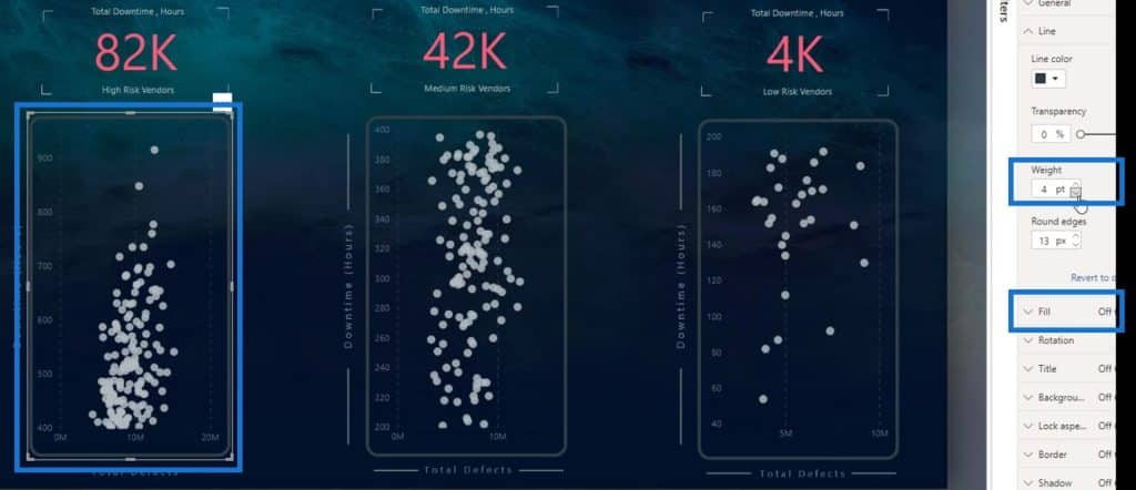
Then, change the color of the data points. Go to Data colors and select your preferred color on the Default color selection.
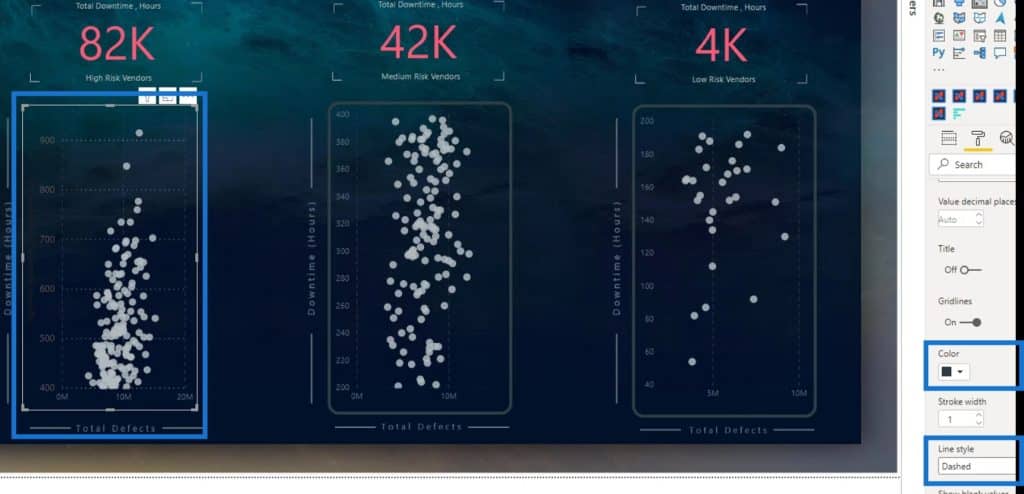
Let’s also change the color of the grid lines and the values. Go to the X axis, then change the color. There’s also an option to change the text size and turn off the title.
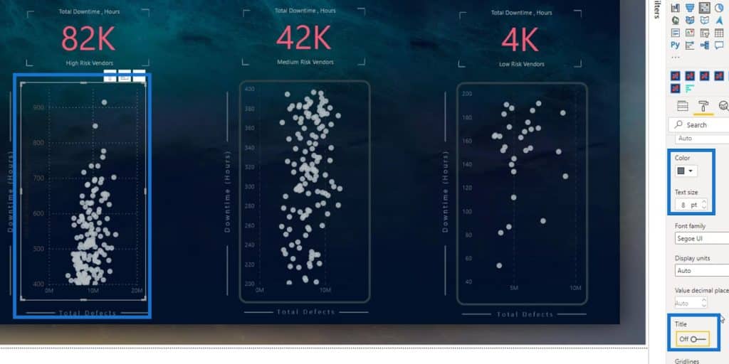
We can also change the color and style of the grid lines here. For this example, let’s change the color of the grid lines to a darker color and the line style to Dashed. Do the same modification for the Y axis.
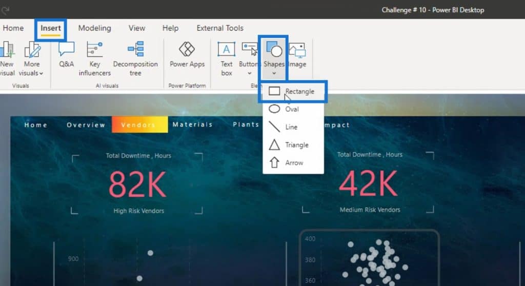
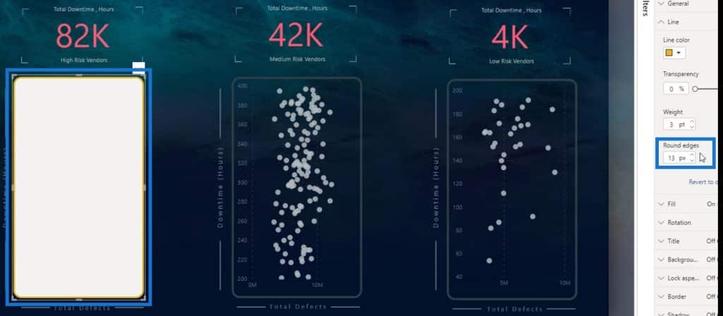
Lastly, let’s put the shape on top of the visual. Just go to Insert, then select Rectangle under the Shapes option.
Let’s also copy the size and position of the shape for the other scatter charts.
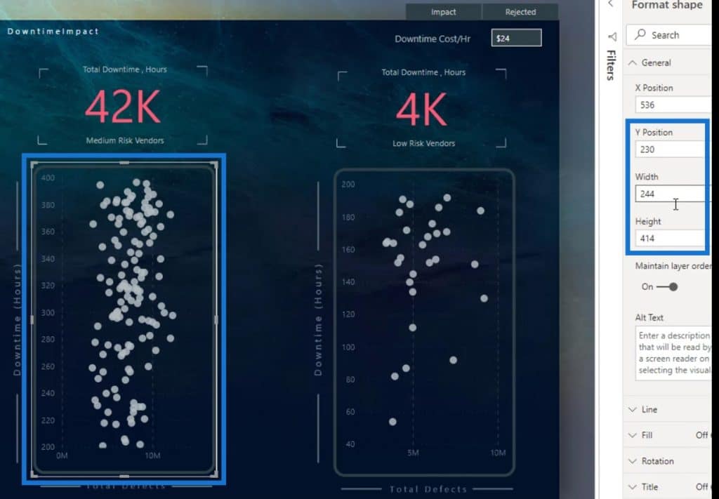
Enter the same values for this Rectangle shape.
Next is to check the Round edges value of the other shapes. For this example, I used 13 px for their Round edges.
Then, turn off the Fill color. Additionally, change the color and the Weight of the shape border.
***** Related Links *****
Scatter Charts In Power BI – Highlighting Key Points
How To Use The Built-in Analytics For Power BI Scatter Charts
Power BI Desktop Update: The Charticulator Visual
Conclusion
In summary, you’ve learned one of the major limitations of a Power BI scatter chart as well as the two solutions to fix it. You’ve also learned how to use and create scatter charts creatively.
If you want to take your learning to the next level, you can also make a dynamic segmentation in each of the scatter charts.
Check out the links below for more examples and related content.
Until next time,
Mudassir


