In this blog, I’m going to show you a high-quality Power BI report. This example came out of a Power BI challenge that we run in Enterprise DNA. I designed this one. I really wanted to challenge myself to build a superior Power BI report navigation experience. You may watch the full video of this tutorial at the bottom of this blog.
With Power BI, you can literally build the most incredible application-like reports.
I highly recommend you dive into how this can work because it can greatly improve the experience of your consumers. So, let’s get to it.
Power BI Report Navigation Features
If you have a look at this entire report, it doesn’t look like there are any separate pages within the report. It looks like one seamless web application.
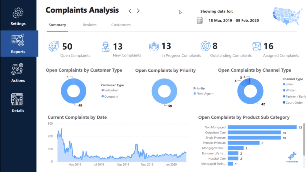
I’ve created this interesting look where, I can click within my report to different report pages, just like you would in a web application. The way I’ve set it out with really small things that I’ve done on each different page makes the report really compelling.
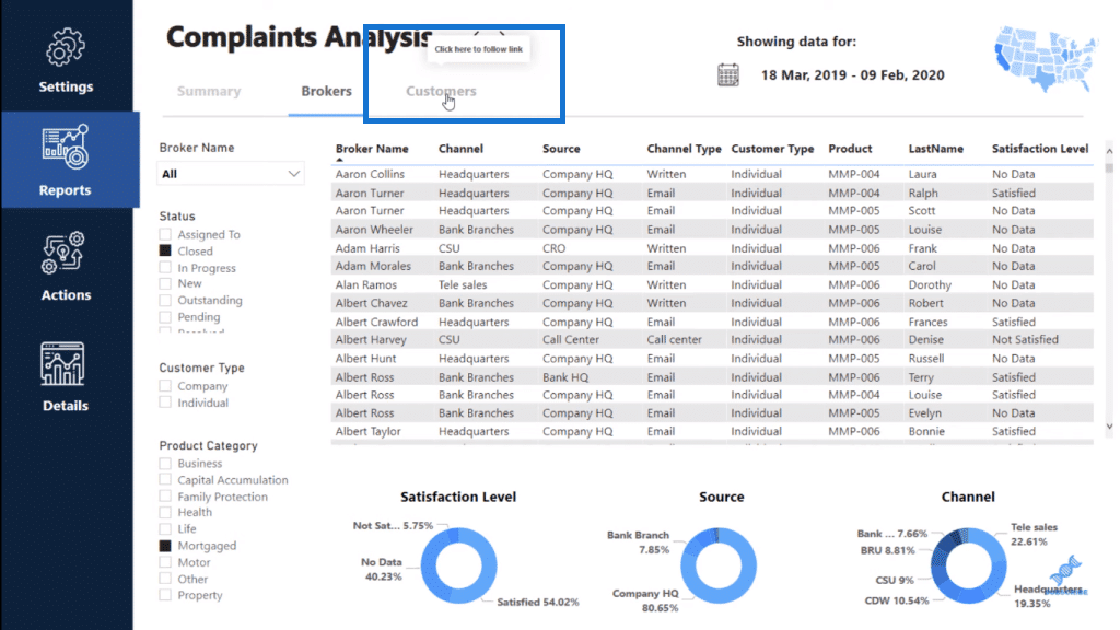
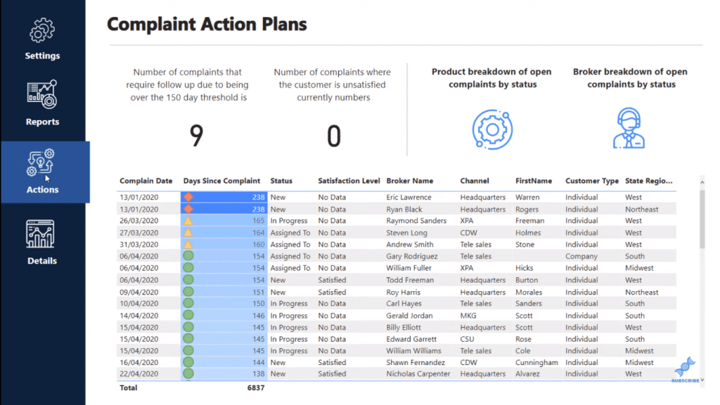
I’ve grouped sections to be able to click into different areas of my report application as well. So, I’ve created a different section called Actions.
I’ve also created a different section called Details.
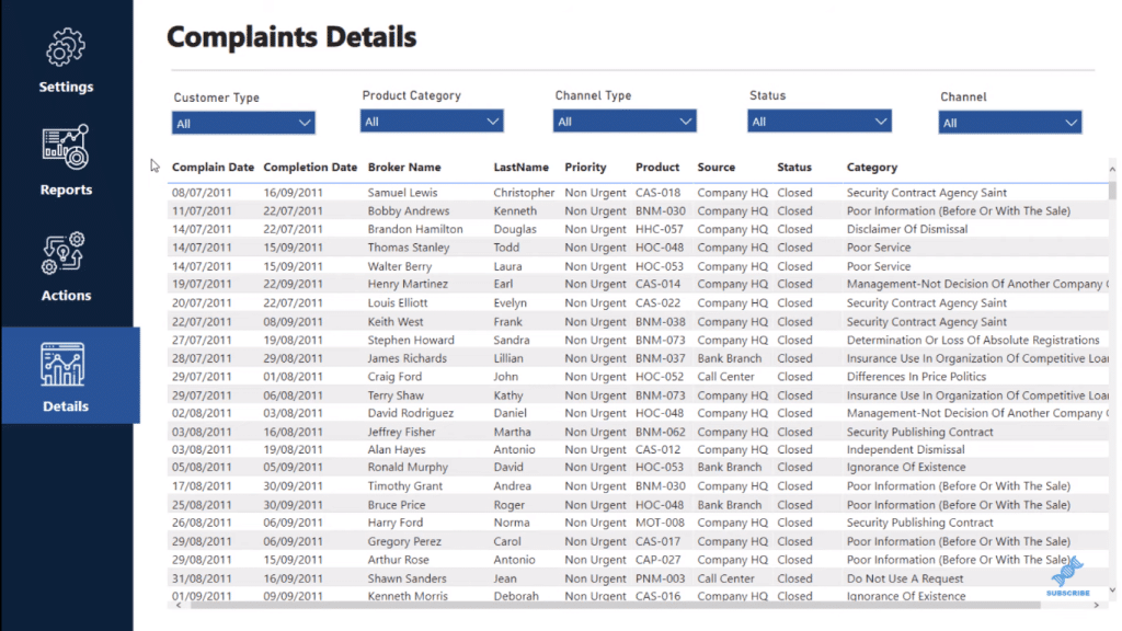
Note there are just minute things that are changing when I go to these different selections. I’ve changed the outline of the blue boxes (sections) to signify what page you’re on.
I also created the Settings area, which is unique to Power BI. You can create pages like this that look like index pages. So instead of having to change the date on every page, or state the main selection on every page, I’m going to bring it to the Settings page and I’m going to make selections like this (Northeast and South only).
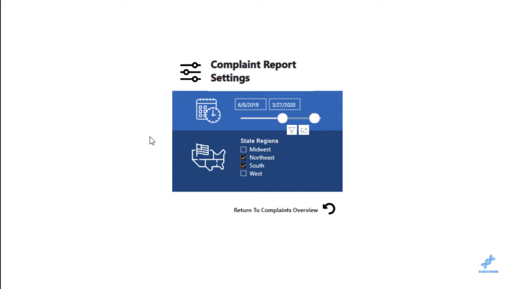
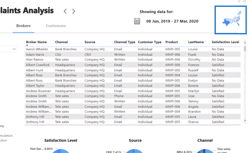
With this technique, those filters are now overlaid on the rest of this report. As you can see on the upper-right corner of the page, the map only shows the regions we chose in the Settings, Northeast and South.
Power BI Report Navigation Design
Now let’s just quickly go over some of the techniques that I’ve used here. You’ll see down the bottom that I’ve basically hidden each page.
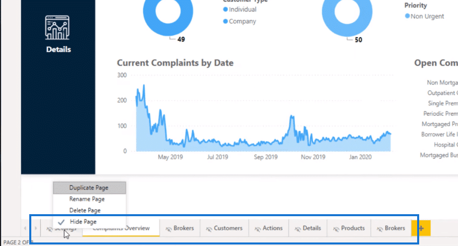
So when you view it online, it looks like there are no other pages. You can only see one page, which is the Complaints Overview.
You can set up the look of these pages with shapes or set up the positions of particular items on the page. You’ll only be making really small changes. For example, take this horizontal line here; I just added the blue line to indicate which report page I’m on.

I took inspiration from some web designs that I saw, and I just put together a range of things to make this look really compelling.
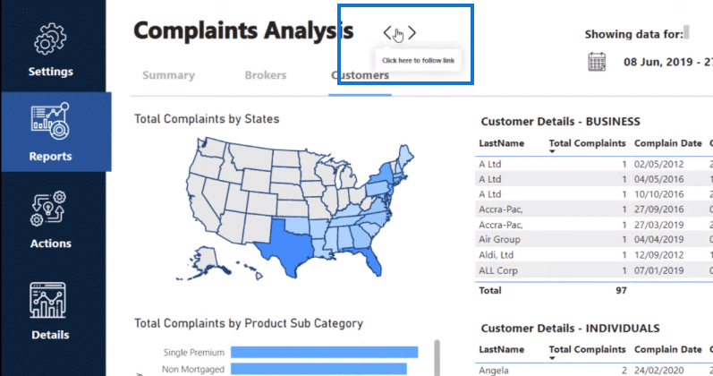
One thing I did, which I thought was a good web-type idea that I stole was I placed these two arrows here, so I can click on one to take me to different reports. This makes the Power BI report navigation experience look seamless.
Creating The Power BI Report Navigation
To set this up, just click on an item, say this little back arrow, then go to the Action area, and simply put Page navigation as Type and the page that you want to go to (Destination).
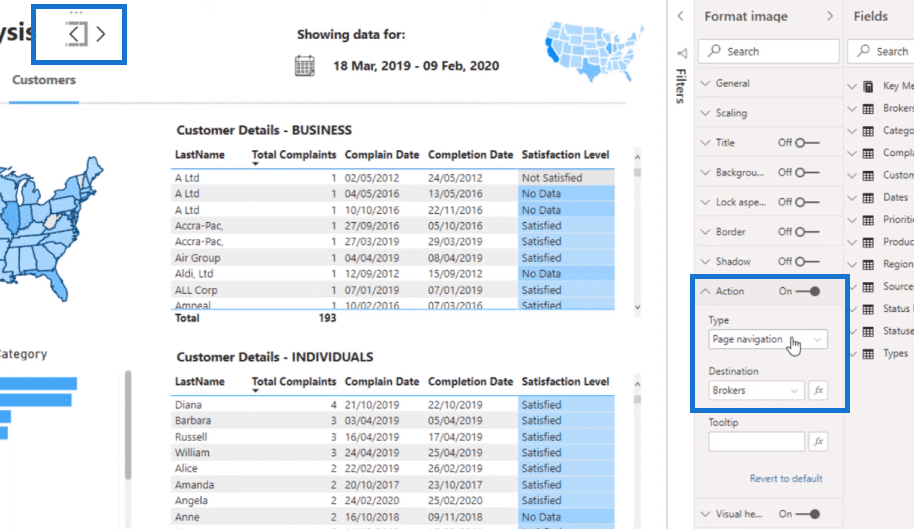
You don’t even have to create bookmarks anymore for the Power BI report navigation experience. That’s how you can create that navigation without having to show all the pages in the actual online experience.
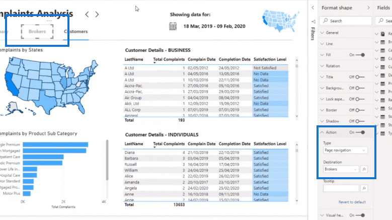
And what I did for these report names (Summary, Brokers, Customers), on each text box, I overlaid a transparent rectangle, which is then overlaid on the words. Then, I set the Destination as well, respectively.
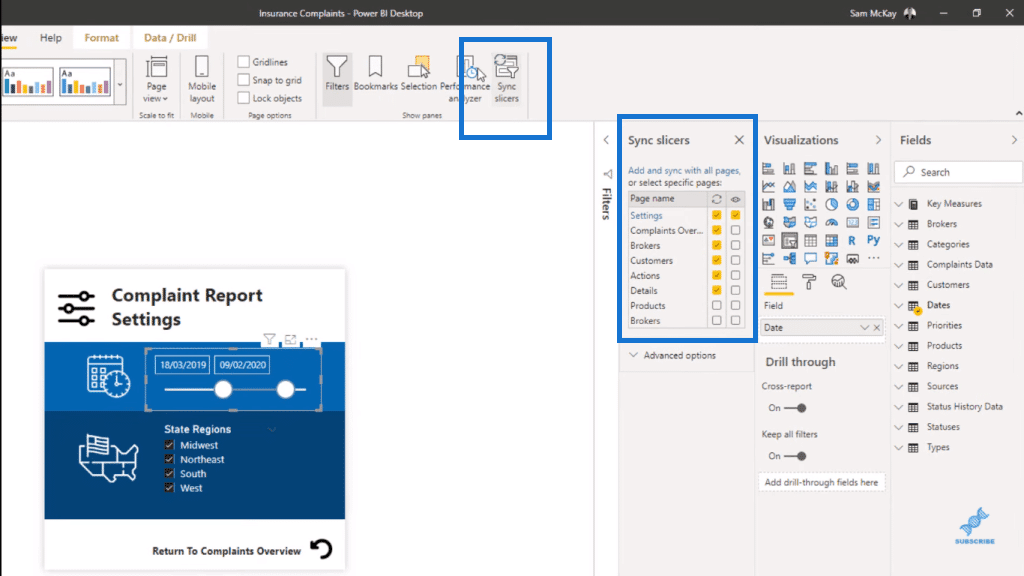
If you go to Settings, you can sync your filters across different pages. To do that, go to the View tab and click on Sync slicers. You’ll see that you can have a slicer or more on one page, but then sync them up with all the other pages.
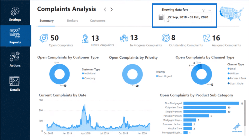
One important thing that I added on the page is the date to keep the report informative. The user or consumer still needs to know the actual date selection in the report.
Report Design Inspiration
For more report inspiration, go to our Knowledge Base (KB) page. This is where I got the inspiration for this particular Power BI report navigation design. We collect a lot of reports and ideas from anything, not just from Power BI. There’s a lot of great websites and we’ve collated them in this section: Report Design Inspiration.
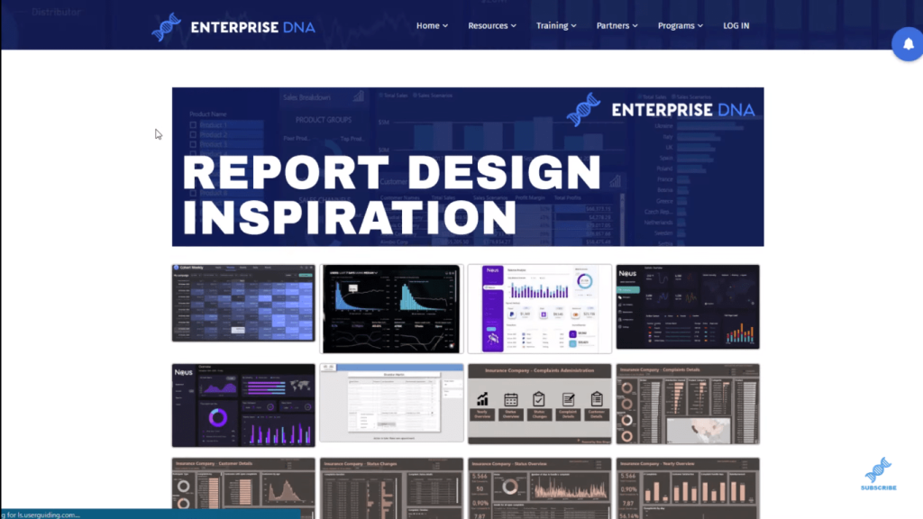
You’ll find so many amazing reports there. This is an example of a great report design, which was made by a participant in one of our challenges.
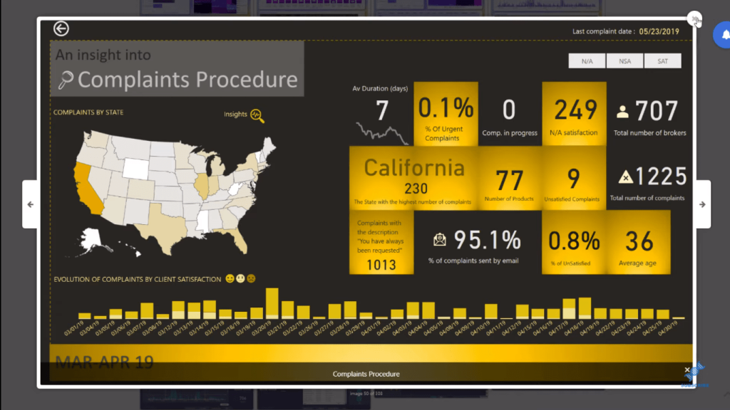
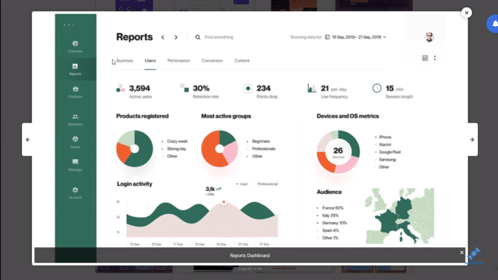
And this is the design inspiration for the Power BI report navigation example that I made. This isn’t Power BI, but you can make a Power BI report look like this quite easily.
***** Related Links *****
Building A Reporting System With Power BI
Power BI Reporting Techniques: Setting Up Application-Like Reports
Power BI Custom Visuals – Build A Reporting Application
Conclusion
This is something that you might find on a well-designed website and we can now do that within Power BI. It only takes a bit of creativity and imagination.
You could easily create reports that look exactly like this in Power BI. We have all the shapes and colors available as well as all the visualizations you need. You just need to get innovative and our Report Design Inspiration is a huge help for you.
Cheers,
Sam


