
In this Power BI Showcase, we’ll go through reports showing professional service analytics.
The professional services firm in this example engages in several contracts with clients from a range of different business functions.
We’re looking to analyze how much time is spent with each of these clients.

There are different metrics to show how that time is utilized. Professional Service firms generally charge an hourly rate. So, it’s important to look at metrics which analyze how effective the time spent on customer engagements is. You may watch the full video of this tutorial at the bottom of this blog.
Work Sessions Summary
In the first report, we’re showing the summary of the service analytics per work session for the whole organization.
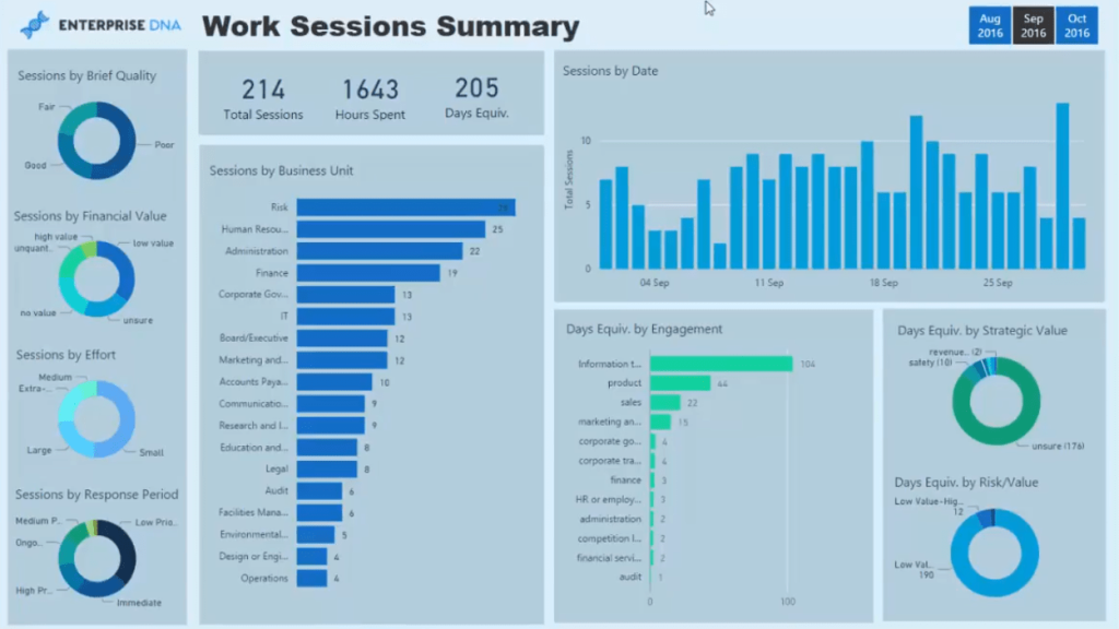
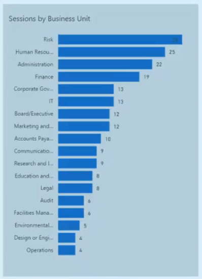
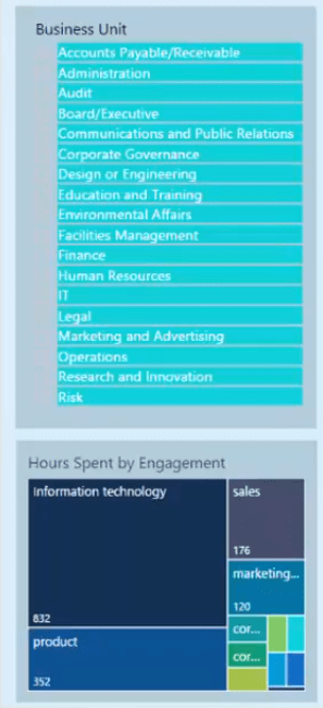
It contains an analysis by business unit.
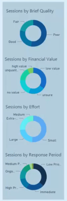
We also can analyze in terms of the quality, value, effort, and response.
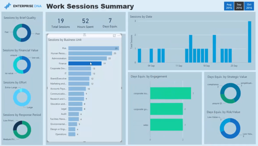
This report is also dynamic. We can click specific business units to see their analytics.
For example, if we look at the Finance unit, we can see the quality of the different briefs given and how many hours were booked per session for that specific unit.

There’s also analysis on the number of sessions through time and how much strategic value is attributed to a project.
These are all great metrics for professional service firms to analyze in real-time. We can align resources or make recommendations to clients or customers to make sure that our hours are spent as effectively as possible.
Business Units Overview
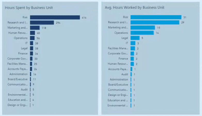
The next report shows information on our individual business units.
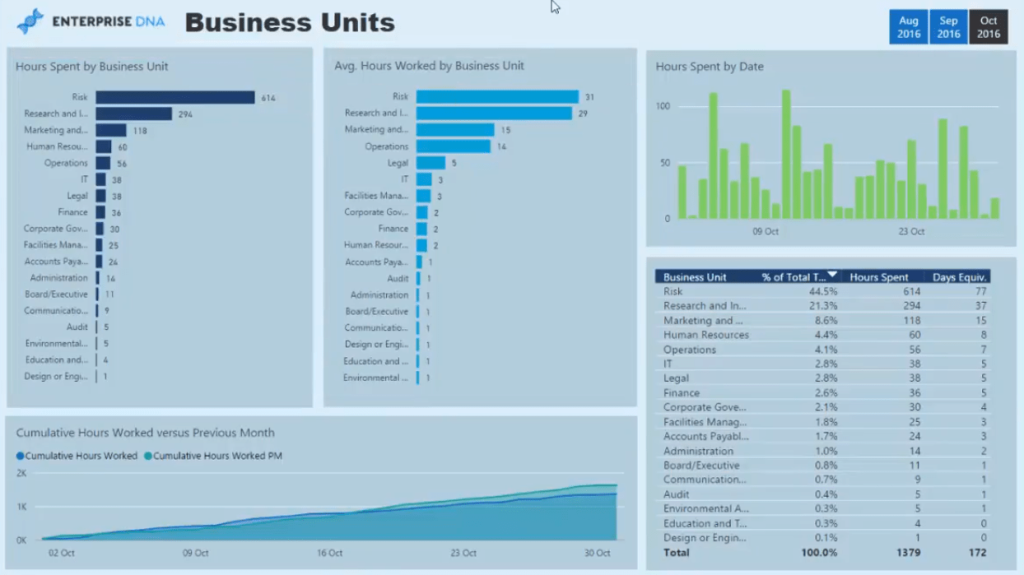
We can look at the total and average hours spent per unit. This implies who our biggest clients are.
There’s also an analysis on the total hours spent over time.
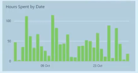
We can see what the busiest time periods are for our representatives and consultants who are working with our clients. This allows us to have a better schedule for meetings and consultations.
Similar to the previous report, we can also drill into a specific unit or department. For this example, let’s look at the Risk Department.
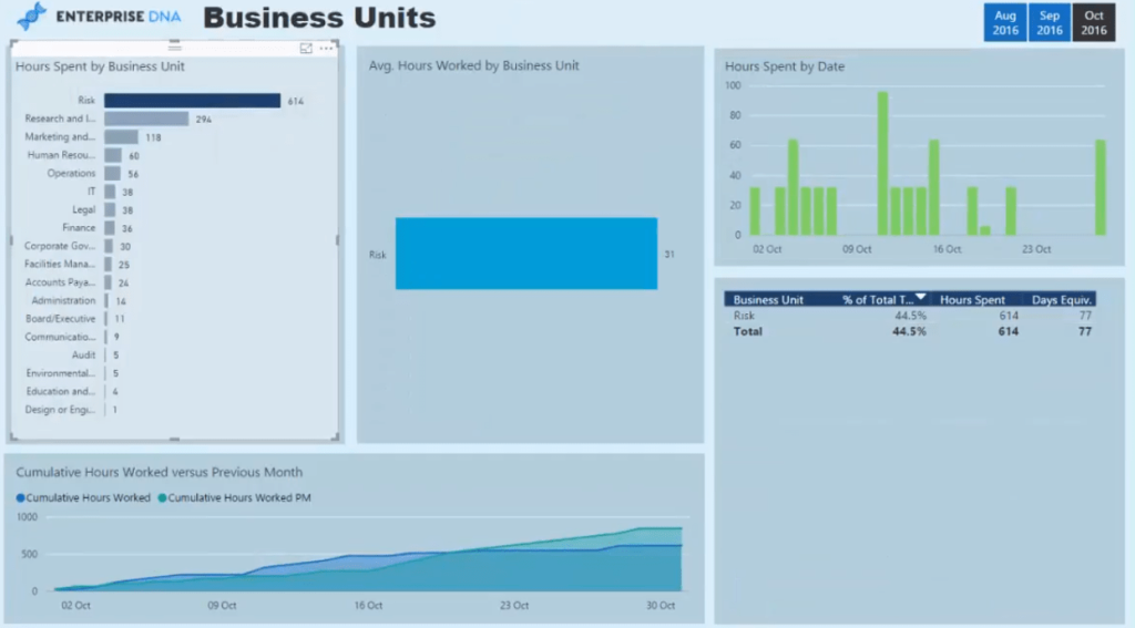
We can see how busy we were with that department by looking at their service analytics. We’re able to drill into more detailed information and see how they take up the bulk of our time. This means that they need our services the most.
Time Vs Value Assessments
The last report in this showcase assesses the time spent on a business unit versus its attributed value.
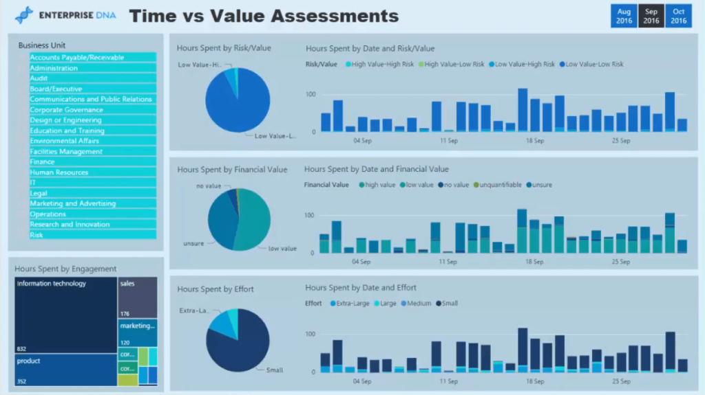
We can select a specific business unit or look at it from a holistic perspective.
After making a selection, we can see the comparison between time and value.
In this case, we can look at the comparison between risk and value and financial and value along with by effort.
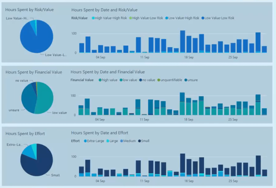
Beside the pie charts, we can see the changes through time for each specific metric.
***** Related Links *****
Driving Business Results Using Customer Data Analytics
How To Create Automated & Dynamic Power BI Reports
Creating Unique Power BI Report Template Designs
Conclusion
This Power BI Showcase presented reports showing a snapshot of the analysis we could do as a professional services firm.

We can do more service analytics if we bring in financial metrics to these reports. But in this case, we’re simply registering hours spent on specific projects to analyze the value we get by spending time with our clients during consultations.
As a professional services firm, we want to make sure that we’re getting the most value from the engagements that they’re doing with us.
All the best,
Sam


