In this tutorial, I’ll be teaching the Profit and Loss, or P&L statement, in Power BI. You may watch the full video of this tutorial at the bottom of this blog.
I’ll show you how to create a table or matrix of financial information. This technique is perfect for financial reporting, especially for those who are in the finance field such as accountancy firms.
I recommend doing this in Power BI since it can produce financial reports like P&L statements and balance sheets in a very compelling way.

Dynamic Filtering In Reports
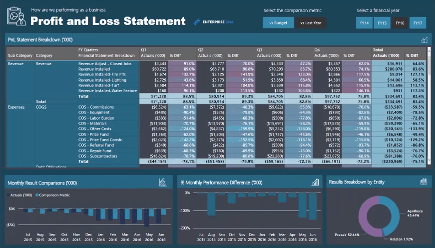
Within this matrix, you can see a comparison between Actuals versus Last Year.

But you can also change it to Actuals versus Budget because Power BI allows you to dynamically change what you’re showing inside a table.


This is just a measure, but it’s being determined in a dynamic way.
You can also jump between time frames.


This would be difficult to do in Microsoft Excel. Financial reports and analysis are best done inside Power BI because you can utilize the dynamic filtering inside your model.

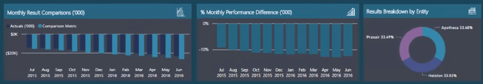
You can select different areas of your report which filters the other visuals in your report page or in your Power BI model.

Setting Up The Matrix
In making the table to showcase financial information, there are a few things that don’t automatically get created. You need to make some adjustments and changes to the formats.
But once you understand how it’s done, you’ll quickly see that you’re able to do reporting effectively for any financial report such as balance sheets, cash flow statements, or profit and loss statements in Power BI.
For the example, I’m going to create a new page and matrix.

Now, I’m going to find all the filters. By looking at the model, you’ll see that there’s a Date filter and Financial Categories at the top.

There’s also the Financial Data table where all the information and results are stored.
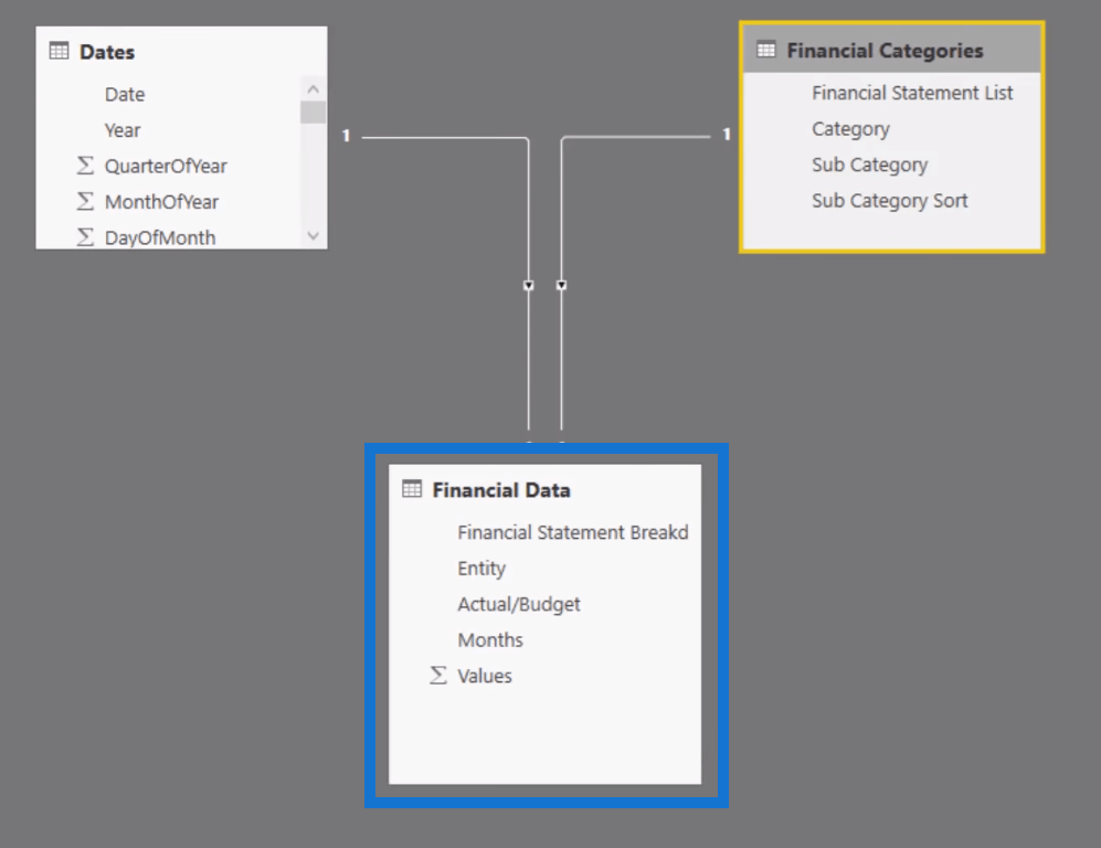
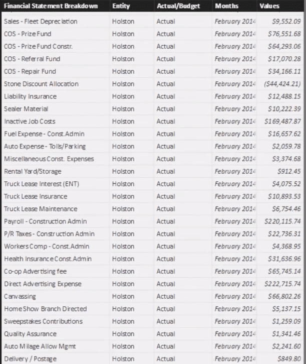
The contents of the Financial Data table show a result for each entity for every single month.
Building The Matrix
Now, let’s build the matrix.
The first thing you need to do is fill in or select the dimensions you want inside the matrix.
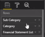
Let’s start by grabbing the Sub Category, which is the breakdown of revenue and expenses, from the Rows field. Then, I’m going to grab the Category and Financial Statement List.
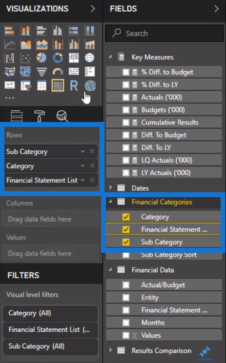
This breaks things down line by line.
I’ve already created my Key Measures. I’m going to put Actuals and Budgets into the Values field.
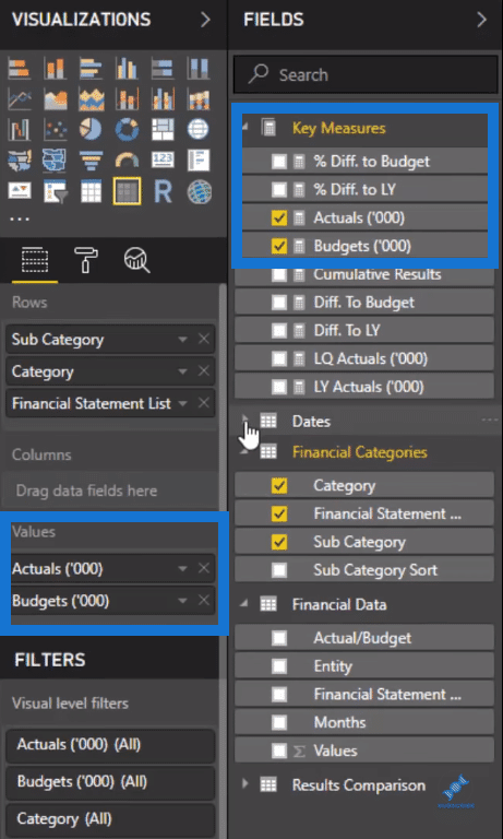
You can see that it’s possible to stick the Measures one by one next to each other.
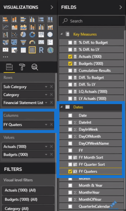
The last thing I’m going to do is put the Financial Quarters, which is located in the Dates field, into the Columns.
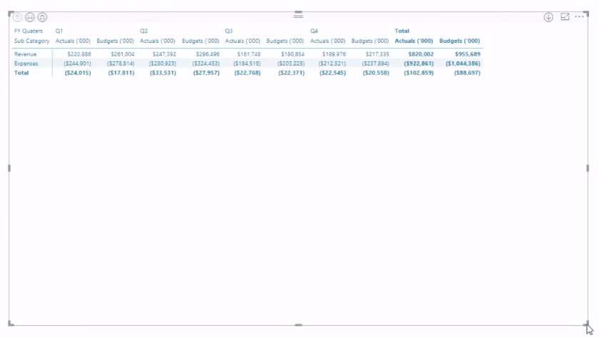
Now, you can see that the breakdown created doesn’t show all the information in one matrix or table. Currently, there’s only Revenue and Expenses.
You can go to the next level in the hierarchy by selecting the double arrow down.


Selecting it again will take you to another level in the hierarchy.

This selection in the levels of hierarchy is simply allowing you to jump between the three different dimensions you have inside the Rows field.
However, this isn’t good enough. Everything should be stacked together.
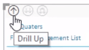
Go back to the first part of the hierarchy using the drill button or the up arrow.
Then, you’ll see this combined double arrow down.

This allows you to expand all down one level in the hierarchy. Selecting this twice makes the matrix go through all the dimensions one by one and indents them.

You can see that the matrix now has a very common look in financial statements and reporting.
Adjusting The Profit And Loss Statement
Let’s do another example. If you can recall, the first Profit and Loss statement has the Sub Category, Category, and Financial Statement Breakdown side by side and not just indented.

Here’s how to make the adjustment.
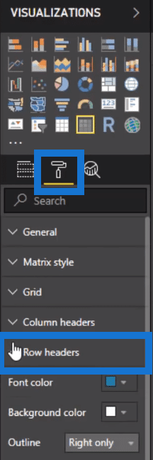
Select the matrix. Head over to the Format section and go to Row headers.
Turn off the Stepped layout option.
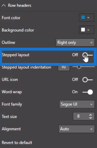
Turing this off will break up the dimensions and put them side by side. It will also change the headers of the different dimensions.

This puts things in a very chronological way. This looks the same as the Microsoft Excel pivot table, however, Power BI has an additional functionality.
***** Related Links *****
Financial Reporting In Power BI – Member-Only Training Event
Expanding On Financial Reporting Templates, Next Enterprise DNA Member-Only Event
New Financial Reporting With Power BI Official Course Launch
Conclusion
There are many applications for this technique. You can use this across any type of information that you want to put into a matrix or table.
Its filtering ability also allows you to focus on certain areas in the matrix. The selections you’ve made are also going to flow down to other visualizations thereby creating a well-integrated report.
Cheers,
Sam