This is a quick tutorial about how you can make your Power BI dashboard and app more presentable and business-themed using Power BI Online. Microsoft recently unveiled a series of updates for Power BI and it’s recommended you utilize these updates to maximize your data management. You may watch the full video of this tutorial at the bottom of this blog.
The dashboard is the key for better data insights, which is why it’s important to organize it in an effective manner.
I hope you’re familiar with the potential of apps within your organization and online service. If you want some tips on how to maximize your Power BI Online Service, I suggest you read this tutorial here.
For this tutorial, I’ll focus more on how you can update and customize the look of your Power BI dashboard.
Editing The Power BI Dashboard Or Background
Now, let’s take a look inside my sample app here. On the left side, I can easily navigate to the different reports and dashboards inside the app.

The most important thing that I want to show you is how to create a theme or background in the dashboard. For instance, changing the color of the dashboard to make it more interesting.
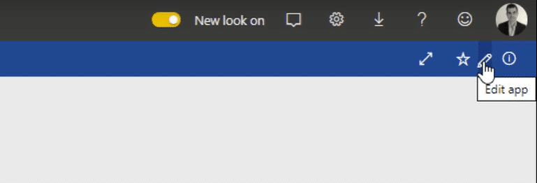
To do that, click Edit app.

After that, you’ll see the respective workspace as well as the Power BI dashboards, reports, and more.

Click the Financial Dashboard, and then select Dashboard theme to update it accordingly.

Creating The Background Image
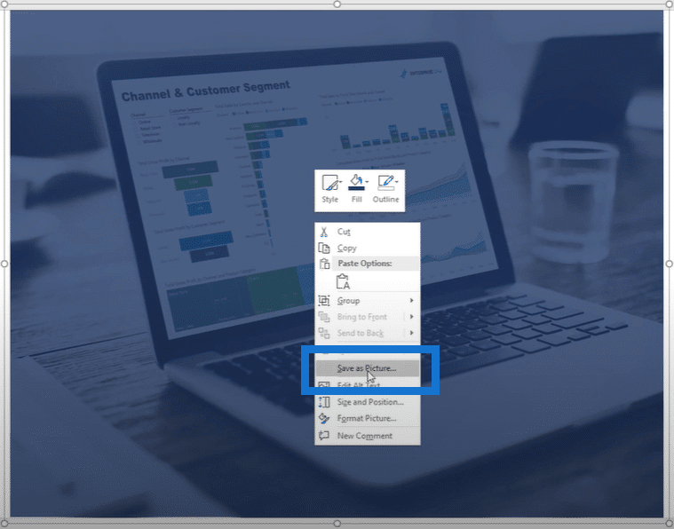
You can also embed images into the background themes. To do this, you need to create an image first within PowerPoint. It’s better if you use corporate images in your Power BI dashboard just like in my example below.

I don’t recommend images that are too light in your Power BI dashboard so you need to have a darker background image. In my example, I just overlaid a dark-colored text box on top of my corporate image. Doing this can help your lighter visualizations stand out in your reports – it’s something you can do very quickly.
After that, just group the image and text boxes together, and then save it as an image.

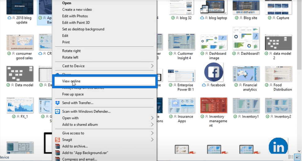
Once you save the image successfully in your OneDrive, you need to open and view it online.

Go to the image, and then click Copy image address.

Customizing The Background Image
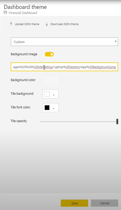
Let’s go back to our Power BI dashboard and continue to update the background theme using the sample corporate image. After you click the Dashboard theme, you can see a small window in the right where you can set up the theme.
Turn on the Background Image option, and then paste the image address in the Image URL box.

You can also update the background color, tile background color, tile font color, as well as the tile opacity, depending on what you want your Power BI dashboard to look like.
The things I mentioned are pretty simple and easy to do, but it generally adds a big value to your dashboard. It’s all just a matter of getting the right contrast for your image in the background. Moreover, you might need to consider the colors you have inside your tiles and make sure it blends well. This is how you make your Power BI dashboard more business-themed.
Once you set up your background theme, go back to your workspace, and then make sure to click Update App.

After that, click Go To App to see the updated look of your Power BI dashboard.

Finally, this is how the updated Power BI dashboard will now look like.

***** Related Links*****
Visualization Technique for Power BI: Using Dark Backgrounds
Tips For Power BI Report Design – Best Practices
How To Add Custom Icons Into Your Power BI Reports
Conclusion
This update from Microsoft is really worth trying. It really makes a big difference in the way you present and distribute your information across different teams. This is also one way to keep your consumers engaged and come back for more.
I hope you take time and enjoy finding contrasting colors that fit nicely in your Power BI dashboard.
Don’t stop learning. Until next time!
Sam


