
If you work with data, then you’re probably familiar with Microsoft Power BI. It’s a powerful business intelligence tool for data analytics that can help you make data-driven decisions.
However, if you’re new to Power BI, you may be wondering about the difference between a Power BI report and a Power BI dashboard.
Let’s clarify the differences.

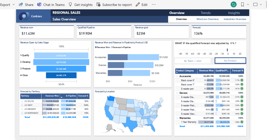
A Power BI report is a collection of visualizations and data that are organized in a specific way to provide insights into your data. Reports can take up multiple pages and are typically used for in-depth analysis.
A Power BI dashboard is a collection of visuals on a single page that can be customized to provide a quick overview of your data. Dashboards are simple but interactive and allow you to drill down into your data to gain deeper insights.
In this guide, we will explore the distinctions between Power BI reports and dashboards so you can make informed choices on which one is best for your needs. We take a look at the benefits and limitations of each, potential use cases, how to create them, and some best practices.
Let’s get started!
Overview of Power BI Report
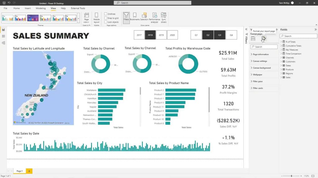
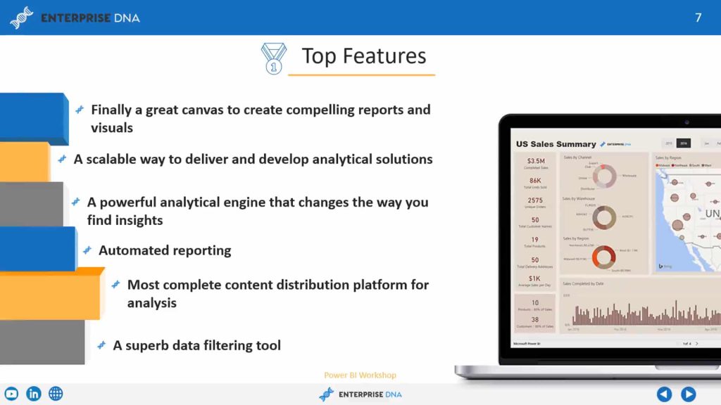
Power BI is a great tool for analyzing and visualizing data, and reports are a vital part of the Power BI suite, providing a rich set of capabilities for data analysis and visualization. Some key features and capabilities of Power BI reports include:
- Powerful data modeling and transformation capabilities through Power BI Desktop
- Interactive visualizations that allow users to explore data in depth
- Customizable formatting options to match your brand or organization’s style
- Support for a wide range of visualizations, including charts, tables, matrices, and maps
- Ability to connect to multiple data sources, including cloud-based and on-premises data
- Advanced analytics features, including predictive modeling, machine learning integration, and natural language processing
- Integration with other Microsoft tools, including Excel and PowerPoint
- Sharing and collaboration capabilities through the Power BI service and embedding into other applications or websites
- Integration with other third-party tools and platforms, including Salesforce, Azure, and others
Reports are excellent for summarizing, creating tables, and data manipulation. You can use them to create charts, tables, and other visual elements from a single dataset that make your data appealing to look at and easier to understand.

In the next section, we turn our attention to Power BI dashboards and explore what they are, how they differ from reports, and how they can be used to provide a quick overview of your data.
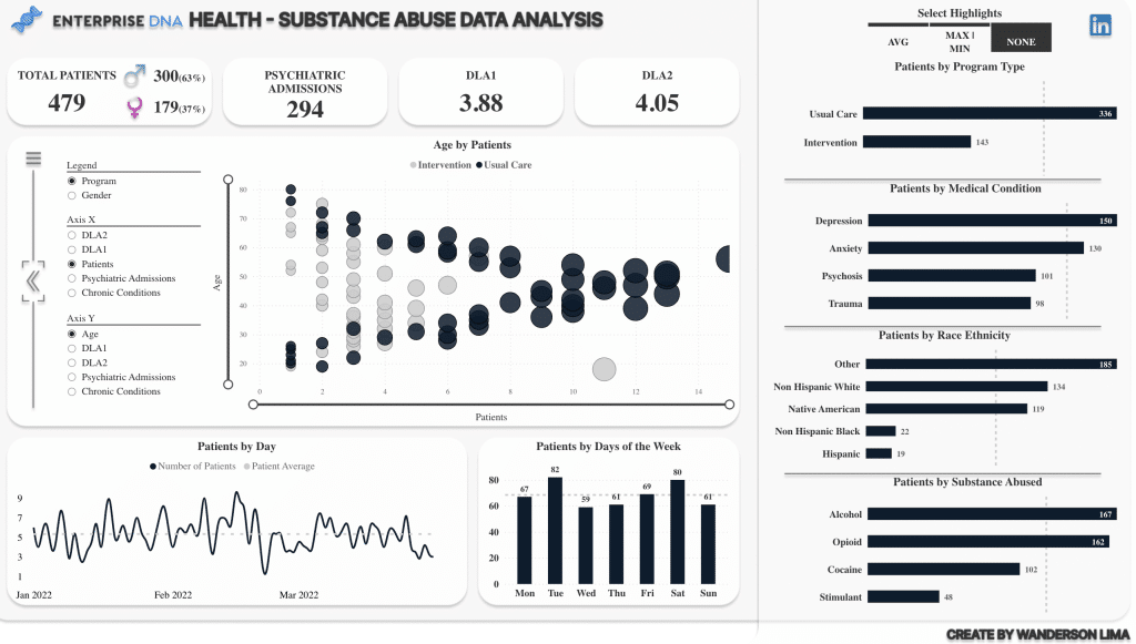
Overview of Power BI Dashboard
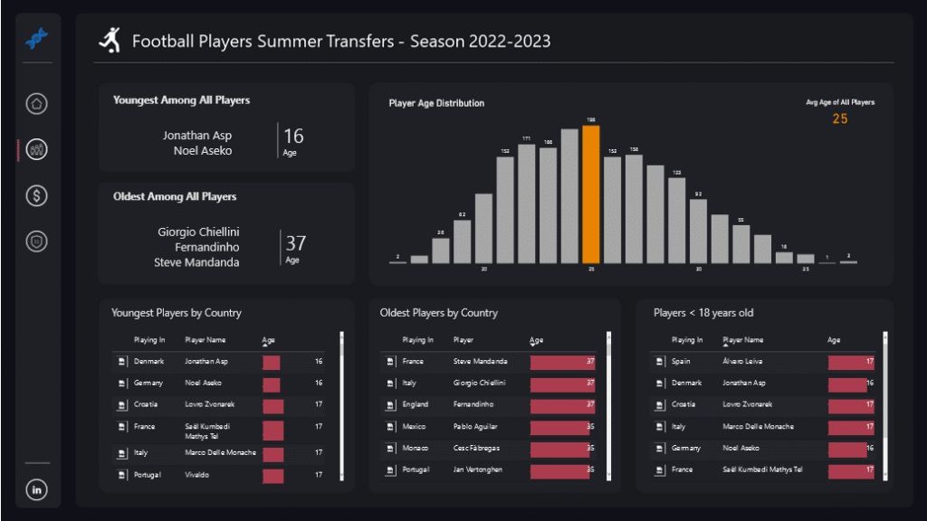
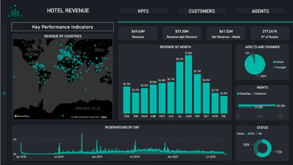
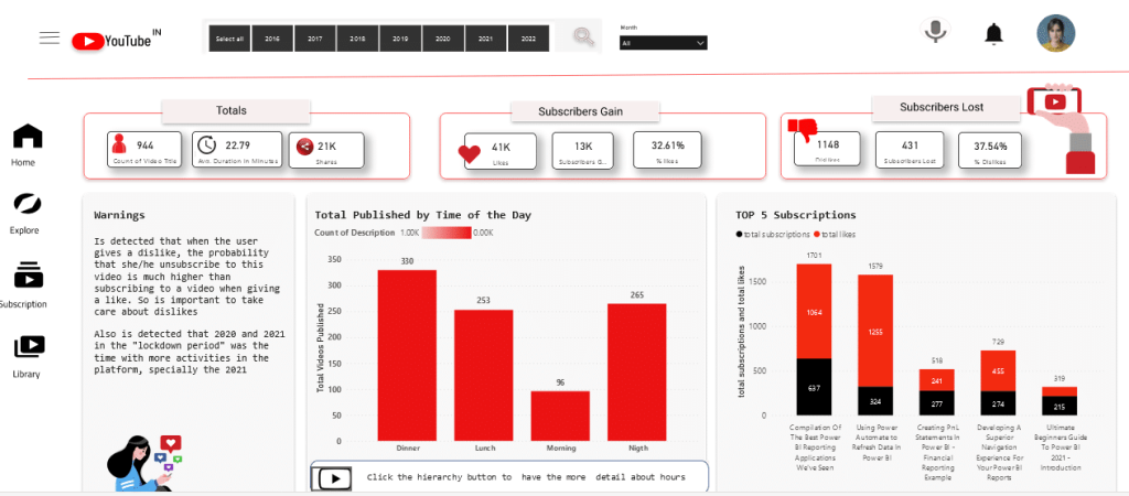
Power BI dashboards are a type of interactive visual report that give an overview of key metrics and data points. A dashboard is usually a single page and is designed to be highly visual and easy to use, allowing users to quickly identify trends and patterns.
Some key features of Power BI dashboards include:
- Customizable visualizations: Dashboards offer a range of customizable visualizations, including charts, graphs, and tables, allowing users to create a personalized view of their data.
- Real-time data: Dashboards can display real-time data, allowing users to monitor key metrics as they change in real-time.
- Mobile-friendly: Dashboards are mobile-friendly and can be accessed from any device, making it easy to stay connected to your data on the go.
- Data exploration: Dashboards allow for limited data exploration, allowing users to drill down into data by clicking on specific data points or filters.
- Integration with other tools: Dashboards can be embedded into other applications or websites and can be integrated with other Microsoft tools, such as Excel and PowerPoint.
Power BI dashboards are an ideal tool for quickly monitoring and communicating key performance indicators (KPIs) and other high-level metrics. They make it easy to spot trends, identify problem areas, and make informed decisions.
However, dashboards are limited in comparison to reports in terms of data manipulation and analysis. They have limited interactivity and filtering options, making it difficult to perform in-depth data analysis or manipulate data on the fly.
In the next section, we’ll explore the main differences between Power BI reports and dashboards in more detail.
Power BI Dashboard vs Report: Key Differences
Power BI reports and dashboards may seem similar, but there are some key differences between the two. In this section, we’ll explore those differences so you can determine which option is best for you.
1. Functionality
Reports are designed to provide detailed information and insights into your data. They allow for complex data manipulation, filtering, and drilling down into specific details.
Dashboards, on the other hand, are meant to provide a bird’s eye view of your data, with a focus on KPIs and trends.
2. Visualization
Reports are highly customizable and offer a wide range of visualization options, including dataset tables, charts, and graphs. They are ideal for presenting data from single datasets clearly and concisely.
In comparison, dashboards are all about visualization. They use a combination of charts, gauges, and other visuals to present data from one or more reports or datasets in a way that is easy to understand and interpret.
3. Interactivity
Reports are highly interactive and allow users to filter and sort into specific data points. They are great for data analysts and other power users who need to manipulate data in real-time.

Dashboards aren’t as interactive as they are designed to provide a quick snapshot of your data, with limited filtering and sorting options.
4. Scope
Reports can span multiple pages and are ideal for in-depth analysis and data manipulation, while dashboards are a single page and are better suited for high-level overviews and monitoring of KPIs.
If you need to dive deep into your data and perform complex analysis, reports are the way to go. But if you want an easy-to-access place to look at KPIs as they change in real-time, dashboards are the better option.
5. Availability
Reports are a core feature of Power BI and can therefore be created using Power BI Desktop as well as the Power BI service, which is the cloud-based version of Power BI.
In contrast, dashboards can’t be created using the Power BI Desktop and are only available on the Power BI service.
Reports and dashboards both have their strengths and weaknesses, and the choice between the two will depend on your specific use case. To help with that, we take a look at situations where you should use Power BI reports and dashboards in the next two sections.
Let’s go!
When to Use a Power BI Report
Power BI reports are an ideal tool for in-depth data analysis with a range of interactive features to help users explore data. Below are some real-world examples of when Power BI reports can be especially useful:
- Financial analysis: Power BI reports can be used to perform in-depth financial analysis, such as budget tracking, forecasting, and financial modeling. Reports can help identify trends in revenue and expenses, monitor key financial metrics, and create custom calculations to analyze financial performance.
- Sales analysis: Reports are great for analyzing sales performance, including tracking revenue, sales growth, and sales by product or region. Users can create custom visualizations to gain insights into sales trends and create custom measures to track performance against targets.
- Marketing analysis: Reports are also great for analyzing marketing performance, including tracking website traffic, conversion rates, and marketing spend. You can use them to identify which marketing channels are most effective, analyze customer behavior, and track campaign performance.
- Operations analysis: Reports can be used to analyze operational performance, including tracking production metrics, identifying bottlenecks in the supply chain, and monitoring inventory levels. They can help you optimize operations, improve efficiency, and reduce costs.
Power BI reports are useful across a wide range of business functions, but they can be overkill if you just want something simple to share insights with your stakeholders. In such cases, a dashboard may be all you need.
In the next section, we’re going to cover scenarios where a Power BI dashboard is enough.
When to Use a Power BI Dashboard
Power BI dashboards are a great choice if you want to quickly and easily monitor business performance, identify trends, and make informed decisions. Here are some real-world examples of when Power BI dashboards can be especially useful:
- Executive reporting: Dashboards are ideal for providing executive-level reports and presentations. They can be customized to show only the most relevant metrics and provide a concise, easy-to-read view of key performance indicators.
- Sales performance: You can use them to monitor sales performance in real-time, allowing sales teams to quickly identify trends and adjust their strategies accordingly. Users with permissions can access your dashboard to monitor metrics such as revenue, sales growth, and sales by product or region.
- Marketing performance: You can use them to monitor marketing performance and track key metrics such as website traffic, conversion rates, and social media engagement. They’re ideal for business users who want to identify which marketing channels are most effective and adjust their strategies as needed.
- Operational performance: Dashboards can be used to monitor operational performance, including production metrics, supply chain performance, and inventory levels. Users can identify areas that require attention and take action to optimize operations.
Whether you’re presenting to executives, monitoring sales or marketing performance, or analyzing operational data, dashboards provide an easy way to stay on top of key metrics.
In the next sections, we look at how you can go about creating reports and dashboards, so strap in!
How to Create Power BI Report
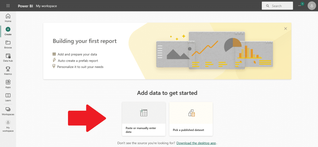
Before you can get started with creating Power BI reports, you need to download and install Power BI Desktop, which is a free desktop application, and then follow the steps below to create your first report!
- Connect to your data source: The first step in creating a Power BI report is to connect to your data source. Power BI supports a wide range of data sources, including Excel spreadsheets, SQL databases, and cloud data sources like Salesforce or Google Analytics.
- Choose a visual: Once you’ve connected to a data source, you can start creating visuals to display your data. Power BI provides a wide range of visual types, including charts, tables, and maps.
- Drag-and-drop data fields: To create a visual, simply drag and drop data fields from your data source onto the visual canvas. You can then customize the visual by selecting different formatting options and settings.
- Add filters: You have to option to include interactive filtering options for your users in your report. Users can then filter datasets based on specific criteria, such as a date range or product category.
- Create calculated fields: Power BI can create a calculated field for you that include custom calculations or new data fields. Calculated fields allow you to perform complex calculations and create new data fields based on your existing data.
- Customize your report layout: Once you’ve created your visuals and added filters, you can customize the layout of your report. The Power BI workspace provides a wide range of formatting options, including font styles, color schemes, and layout options.
- Publish your report: Finally, you have the option to publish the finished report to the Power BI service. This allows other users to access your report page and interact with your data. You can also set up data refresh schedules to ensure that your data is always up-to-date.
Creating a Power BI report is a fairly straightforward process thanks to the software’s intuitive drag-and-drop interface and robust formatting options for data visualization.
Anyone, even people without data analytics experience, can create and publish reports that provide valuable insights into underlying data and help with decision-making.
Next, we’re going to go over the steps for creating a dashboard in Power BI; keep reading to learn more!
How to Create Power BI Dashboard
In this section, we’ll take you through the step-by-step process of creating a Power BI dashboard. Unlike Power BI reports, dashboards can’t be created using Power BI Desktop; they are a feature of the Power BI service, which is the online software as a service (SaaS) version of Power BI.

Below are the steps for creating a dashboard. They may look similar to the steps for creating a report, but there are a few nuances:
- Connect to your data source: The first step in creating a Power BI dashboard is to connect to your data source. Just like with reports, Power BI supports a variety of data sources.
- Create visuals: Next, you’ll want to create visuals that will be displayed on your dashboard. You can choose from different visual types, just like with reports. You can work with single or multiple datasets and reports.
- Pin visuals to the dashboard: Once you’ve created your visuals, you can “pin” them to your dashboard. This will add them to the dashboard canvas, where you can arrange them and customize their formatting.
- Create tiles: In addition to pinned visuals, you can also create tiles on your dashboard. Tiles are smaller visual elements that can contain data based on KPIs, tables, or charts.
- Add interactivity: To make your dashboard interactive, you can add slicers and other filtering options. This allows end-users to filter data on the dashboard based on specific criteria, just like with reports.
- Share your dashboard: Finally, you can seamlessly share your dashboard with other users. They can access the dashboard on the Power BI service or the Power BI mobile app, where they can interact with the visuals and filters that you’ve created. Existing dashboards can get regularly refreshed with real-time data.
Creating a Power BI dashboard is somewhat similar to creating a report. The main difference is that with dashboards, you’re creating a single page that provides a high-level overview of important metrics, whereas reports allow for more detailed analysis across multiple pages.
Remember: Dashboards are meant to be simple and easy to understand. Avoid cluttering it with too many visuals or too much information. Focus on the key metrics that you want to track and make sure that they are easy to read and interpret.
With that in mind, let’s take a look at some of the best practices for Power BI reports and dashboards in the next two sections.
Best Practices for Using Power BI Report
Below are some best practices to keep in mind when making Power BI reports to ensure that they are effective and efficient:
- Use visuals effectively: Power BI reports are all about visualizing data, so it’s important to use visuals effectively to convey your message. Use visuals that are appropriate for the data you are presenting, and make sure they are easy to understand.
- Organize your report: Keep your report organized logically and easy to navigate. Use headings and subheadings to break up your report into sections and use bookmarks to allow users to quickly jump to specific parts of your report.
- Keep your report up-to-date: If your data changes frequently, make sure your report is updated regularly. You can set up automatic refreshes to keep your report updated or you can manually refresh your report as needed.
- Optimize performance: If your report is slow to load or refresh, there are several things you can do to optimize performance. One option is to limit the amount of data you are pulling into your report. Another is to use aggregations to pre-calculate data and speed up queries.
- Use filters effectively: Filters can be a powerful tool for exploring your data, but they can also be overwhelming if not used effectively. Make sure your filters are easy to use and understand and consider using slicers to allow users to easily filter data.
By following these best practices, you can create Power BI reports that are effective, efficient, and easy to use.
Next, we take a look at best practices for Power BI dashboards!
Best Practices for Using Power BI Dashboard
The following tips will ensure that you create dashboards that are clear and concise and provide an actionable review of your data. Here are some best practices to keep in mind:
- Consider your audience: Before you start designing your dashboard, think about who will be using it. What are their goals and objectives? What kind of information do they need to see? By understanding your audience, you can create a dashboard that is tailored to their needs.
- Tell a story on one screen: A good dashboard should tell a story with your data. Instead of overwhelming your users with too much information, focus on presenting a clear narrative that they can easily understand.
- Make use of full-screen mode: Power BI allows you to view your dashboard in full-screen mode, which can help to eliminate distractions and focus your users’ attention on the data.
- Accent the most important information: Use formatting and color to emphasize the most important data points on your dashboard. This can help to draw your users’ attention to the most critical information.
- Place the most important information: Arrange your dashboard so that the most important information is front and center. This can help to ensure that your users see the most critical data first. Plus, it’s only a single page, so how you use your space matters.
- Use the right visualization for the data: Different types of data require different types of visualization. Make sure that you’re using the right chart or graph to effectively communicate your data.
By following these best practices, you can create a Power BI dashboard that is effective, engaging, and actionable. Remember to keep your audience in mind, tell a story with your data, and use formatting and visualization techniques to emphasize the most important information.
To see some quality examples of Power BI dashboards, check out the Enterprise DNA Power BI dashboard showcase page.
Final Thoughts
Now that you have a better understanding of the differences between Power BI reports and dashboards, you can make an informed decision on which one works best for your data analytics needs.
To recap, if you need to perform in-depth data analysis and manipulate data, Power BI reports are the way to go. They offer more technical capabilities and allow for more granular control over your data.
On the other hand, if you want a top-down view of your data and want to quickly visualize key performance indicators in a tabular format, Power BI dashboards are the better option.
Both reports and dashboards have their pros and cons. Reports are more technical and require more data manipulation skills, but they also offer more control over your data. Dashboards are less technical, but they are not as customizable as reports.
Ultimately, the choice between reports and dashboards depends on what you want to do and the type of data you are working with. Consider the nature of your data, the level of detail you need, and the audience you are presenting to before deciding which option to use.
For more information and to learn Power BI tricks and tips, check out the tutorial series below:


