
In this tutorial, we go through a simple but very important visualization concept for Power BI, which is to use dark backgrounds for reports and dashboards. You may watch the full video of this tutorial at the bottom of this blog.
As you have probably seen with the Power BI reports that I create, I’m big on utilizing colors really effectively in my reports.
When you use colors in Power BI though, there are a number of considerations that you have to make and manage so that the use of your reports are still viable across the many ways you can distribute your analysis in Power BI.

In this example, I talk about dark backgrounds and some of the key things that you really need to consider.
It is important so that consumers don’t have a negative experience across other devices they use to access information or via different ways that they can view reports and dashboards.
Even with these considerations at play, I still believe making good use of colors is so essential in Power BI.
Why Use Dark Backgrounds For Visuals
I have been using darker backgrounds with fonts that are lighter in color or usually white.
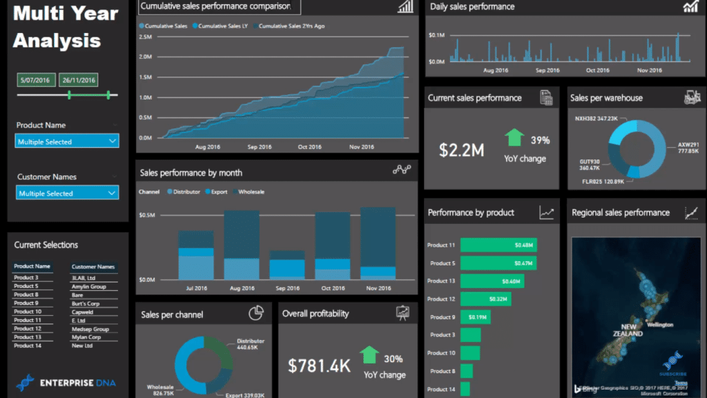
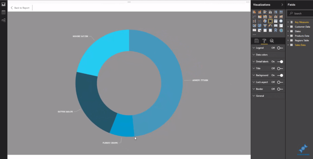
The key thing that I want to highlight is the impact of the background color to the data we want to highlight. When we drill into a visual, we need to make sure that we have a dark background. This way, we can still see the numbers coming through in our reports.
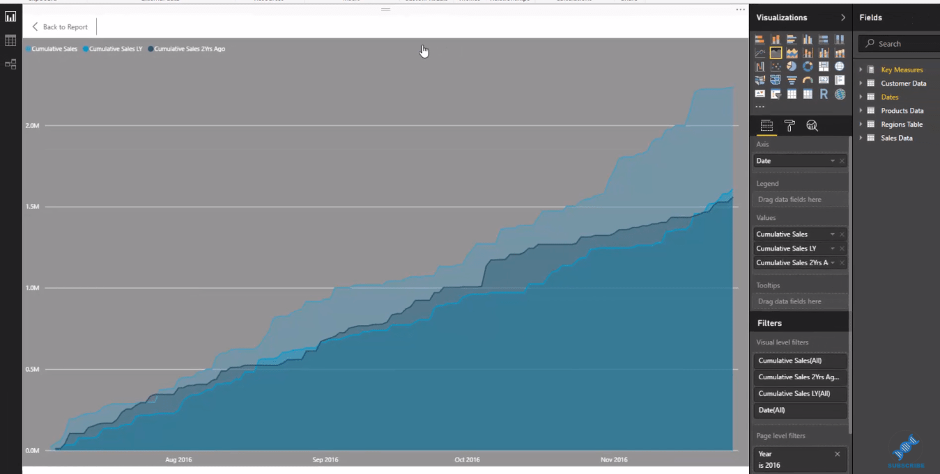
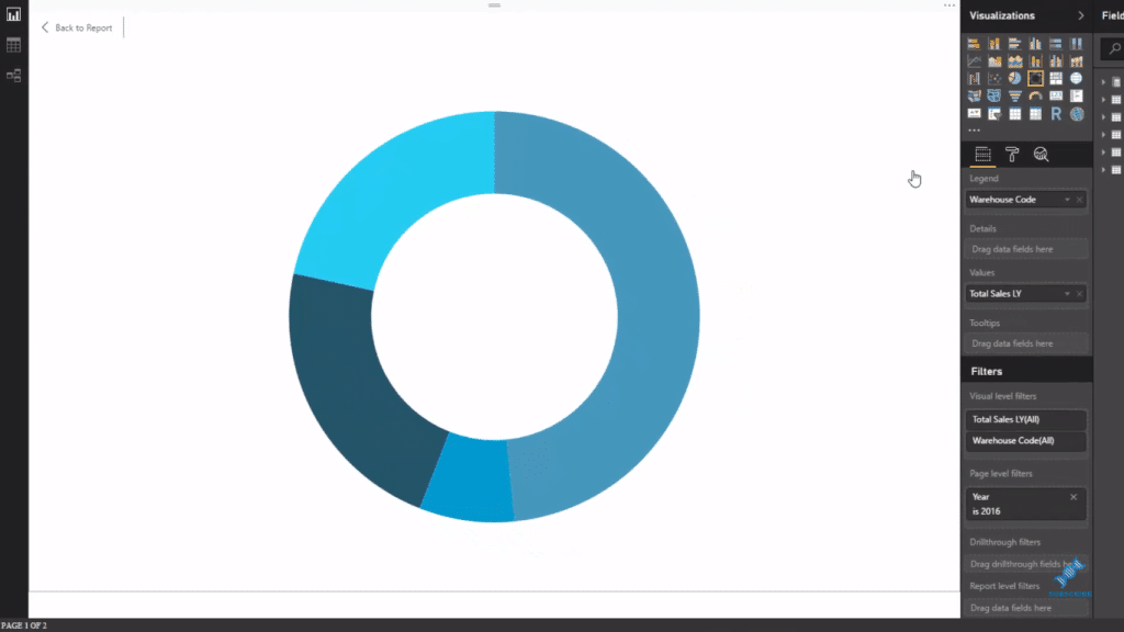
Now I’ll show you how I structure this dashboard to achieve this. Within each visualization, I have this dark grayish background with a little bit of transparency. But if I turn this off, there’s a big issue.
We can still see that the visualization is fine and it actually looks great. Nothing has really changed. However, when we expand the visualizations to drill into them, nothing comes up because there is no background.

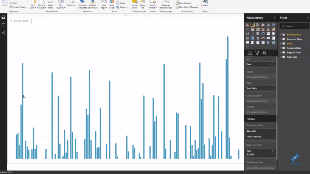
We can’t see anything in our charts. No category labels, no numbers.
This isn’t going to work for our reports, obviously. This is not going to do anything for us. That is why we make sure that our visuals have quality backgrounds.
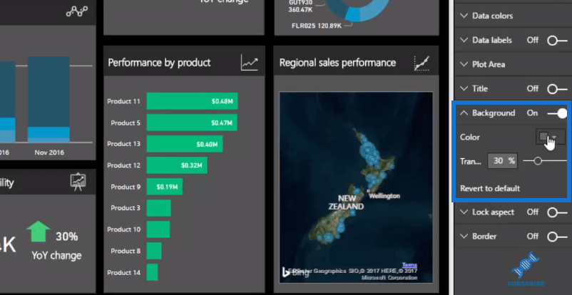
We simply turn on the individual backgrounds. Let’s use the gray shade and then we put some transparency on it. You can always do your own thing though and try to make your reports look compelling.
***** Related Links *****
Developing Compelling Power BI Reports & Dashboards – Power BI & DAX
Using Great Color Schemes In Your Power BI Data Visualization
Background Design Plates – Power BI Visualization Technique
Conclusion
This tutorial is pretty short and simple, but it has great importance for your visualizations.
I recommend that you experiment with using darker backgrounds and making your visualizations in Power BI stand out. robots not only make your reports look good, but also make them clear and effective.
Through this tutorial I’m confident that you will understand how you can manage colors to create really compelling visualizations.
Good luck and all the best!
Sam
[youtube https://www.youtube.com/watch?v=TBG91EfBTq0?rel=0&w=784&h=441]


