
Have you ever wanted to create a visualization that changes based on any ranking selection you could make? You can actually change the size of your Power BI visuals by ranking logic. You may watch the full video of this tutorial at the bottom of this blog.
Think of a scenario where you want to showcase your top 20 clients. Pretend you’re in a meeting saying, “These are the clients that are contributing the most to our profitability out of all our sales.”
But then you decide, “maybe let’s narrow down the search to our top 5 clients.”

Being able to dynamically select a slicer that changes the chart or visualization that you’re looking at, to a more specific insight based on ranking, is a very powerful visualization option.
In this video, I show you a cool visualization technique where you could use the ranking function RANKX to determine what you will show inside the visualization.
Creating The Supporting Table
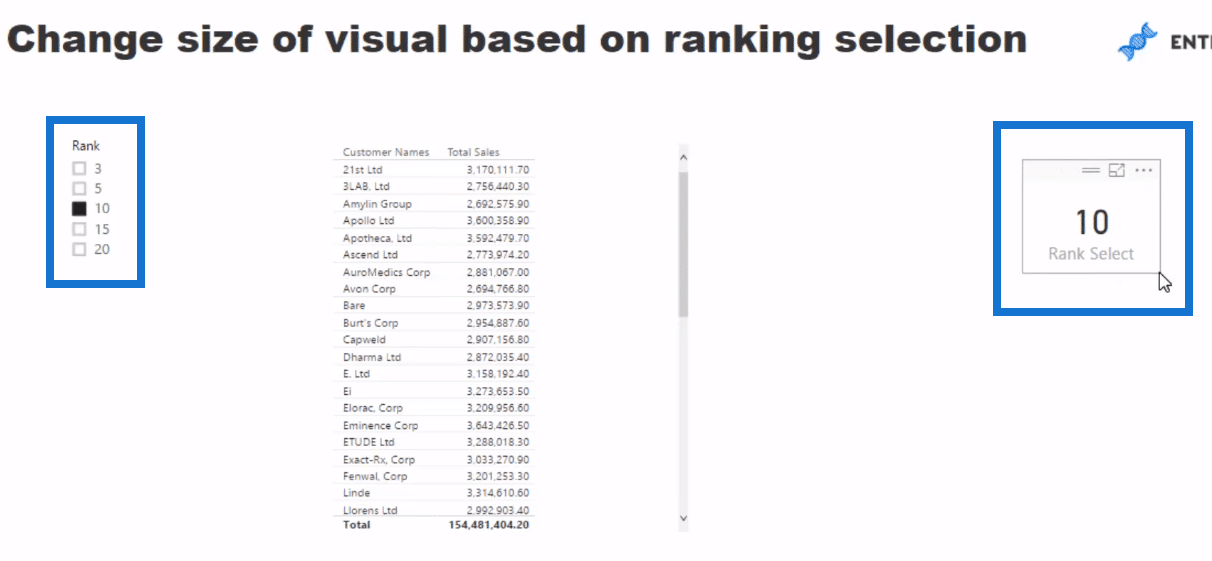
The supporting table is going to have the selections of ranking numbers for whatever ranking we might want to select. So it could be top 3, top 5, top 20, and so on.
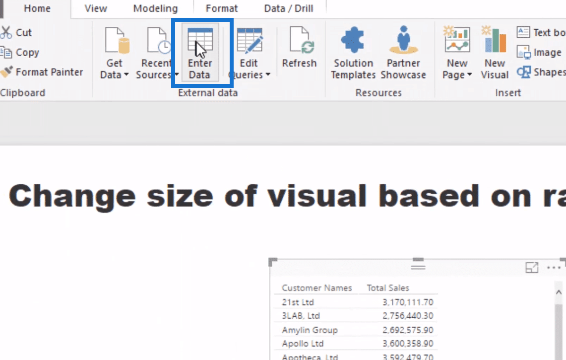
We can do this very easily. We will just make a new table by going Enter Data.
We’ll name this as Ranking Selection and we simply put rank here, 3, 5, 10, 15, and 20. Then, click Load.
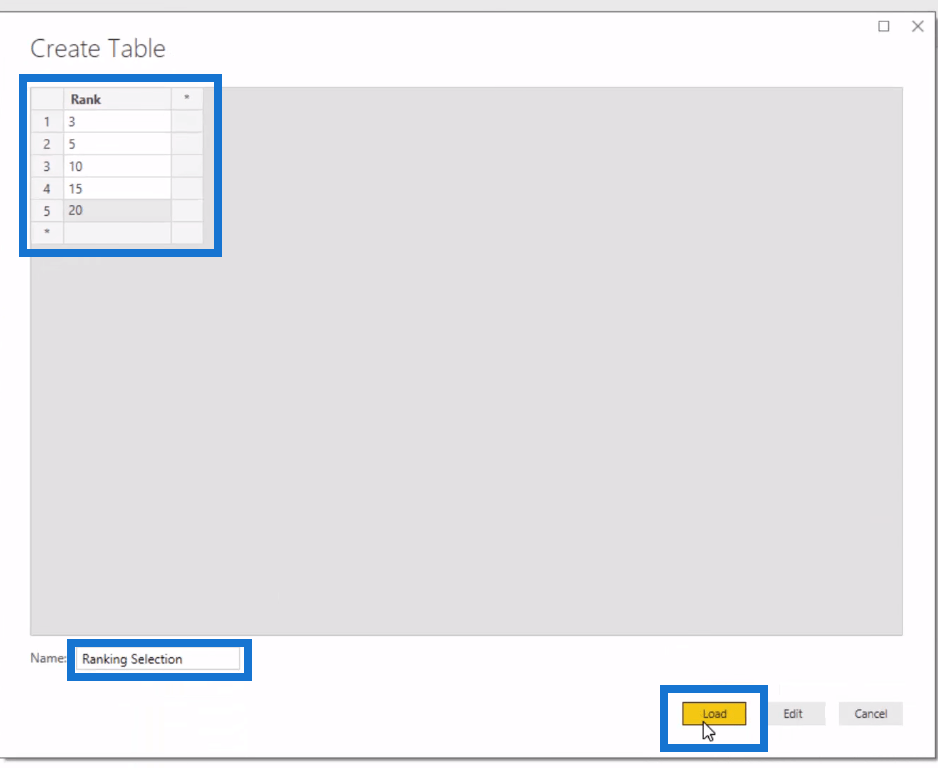
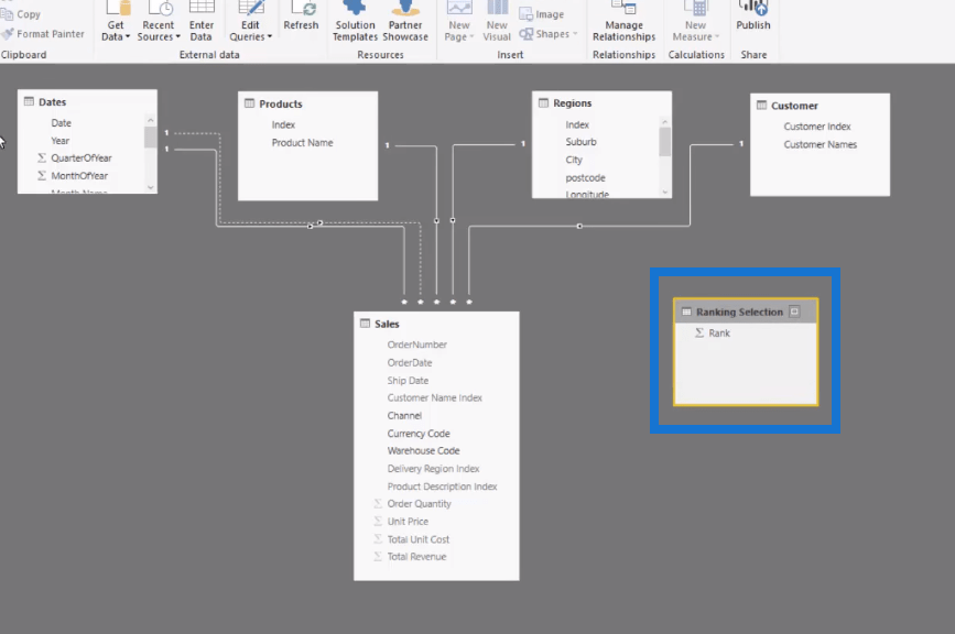
Remember that this supporting table has no relationship to anything. But, always double check your model that it doesn’t relate to anything.
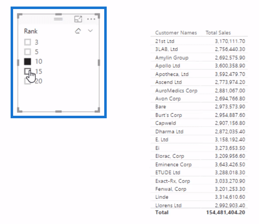
So we bring it in here and change it into a slicer, a list. And we want to capture this selection we made here, so we could feed it into our visualization.

Creating The Measures
We will use a very similar pattern that we used before.
We go to New Measure and let’s call it Rank Select. Then, equal to IF, HASONEVALUE; so if one value is selected (the Rank), then we’ll have equal to that value (VALUES, Rank).
Then, write the number of customers that you have, which in this example is 50. If you have a thousand customers, then write 1,000.

When we bring it up here, we’ll see that it now returns a result based on the selection that we made.
If nothing is selected, it brings into 50 or 1,000, depending on the number of customers you put in. As we select other amounts, we then get that amount there.
After we’ve created that measure, we’re going to have some ranking logic overlaid on a supporting table that we created.
We’re going to feed this measure into our calculation to create a dynamic visualization.
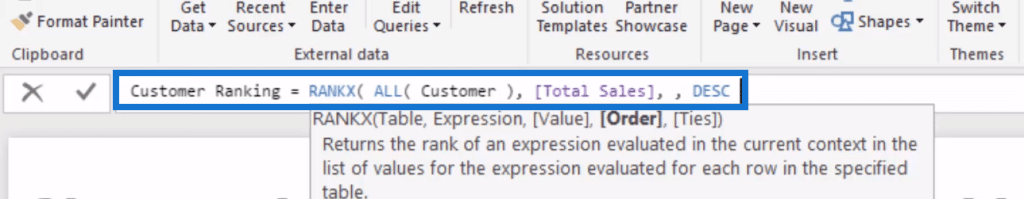
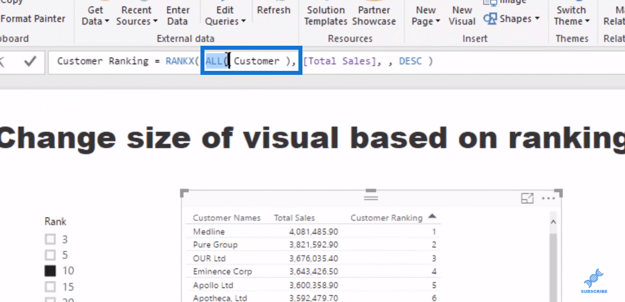
But first, we need to work out what’s a customer rank. How do we do it? We use RANKX.
So once again, we go to New Measure, then name it Customer Ranking. It shall be equal to RANKX with table that has ALL the customers or customer names because you want to look at the entire table and not being filtered into its current context.
The expression is Total Sales because we’re gonna rank by sales. We don’t need a Value in this case and we’re going to rank by Descending order.
Now when we drag this measure in, we will see that the highest selling customer is now ranked number one.
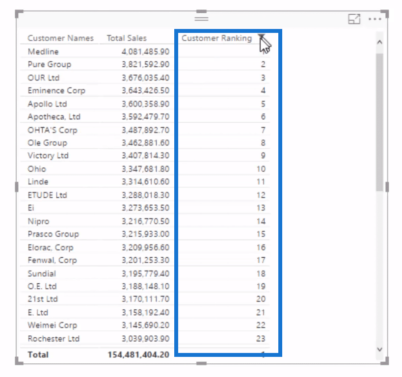
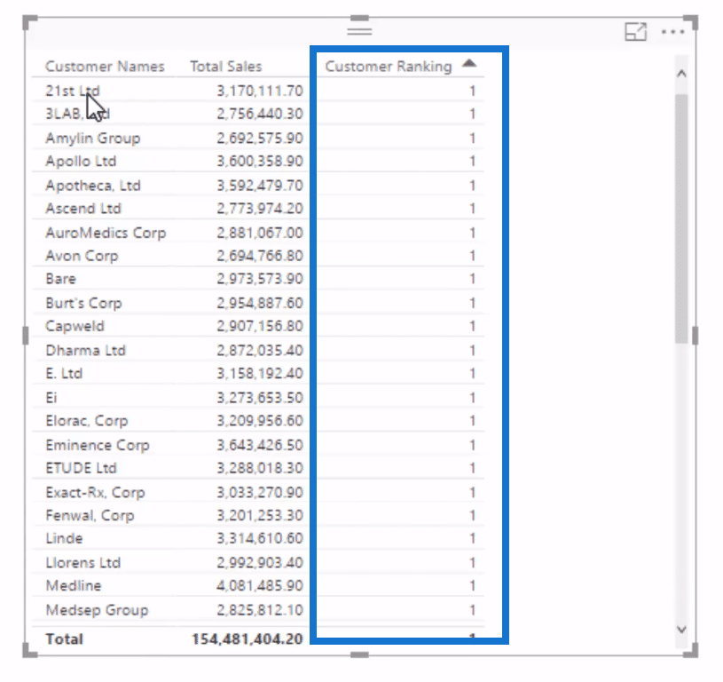
As I mentioned in other videos, if you do not go ALL here, everything will calculate to one. That’s because everything is filtered in its table in the data model.
If there’s only one customer, then that customer is always going to rank the highest and it’s the same with every single row in this table.
So when we removed the filter context from that table, we can get the ranking for all the customers.
Incorporating Measures Into The Calculation
We now write our calculation, Sales by Customer, where we incorporate the two measures we’ve created (Ranks Select and Customer Ranking).

For our ranking logic, we go IF the Customer Ranking is less than or equal to the Rank Select, then we want to make Total Sales. If not, then we just go BLANK.
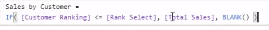
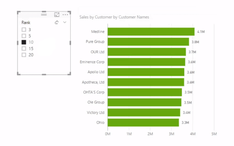
What BLANK does is it’s going to return nothing if it’s under this number (10, for example). See what happens here:
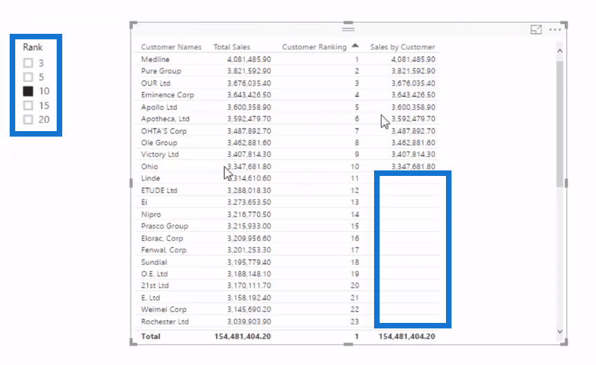
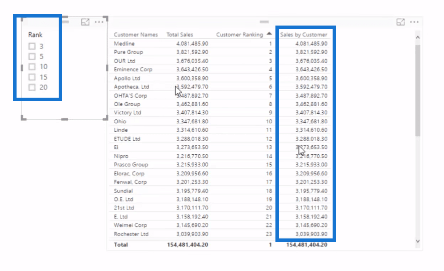
It’s only returning the top 10. Since this is dynamic, we can change the amount like if we go 15, 20, it returns accordingly. If we go none, it’s going to return everyone.
We can also turn this into a visualization. Just get rid of all those intermediate calculations and perhaps add some data labels.
Again, since this is dynamic, we can select our desired number of clients to compare or check out. Simply select the slicer, and our visualization automatically changes.
With this technique, we can filter any calculation, such as total profits or margins by that ranking selection.
***** Related Links *****
Deep Dive Into RANKX – DAX Formula Concepts In Power BI
Using Dynamic Visuals On Ranking Based Parameters In Power BI
Creating Dynamic Ranking Tables Using RANKX In Power BI
Conclusion
There’s seriously so many different ways that you could utilize this technique in your models.
You could use it on your products, regions, salespeople, or any other filter or dimension you have inside your data model.
It’s a matter of just trialing it out, seeing how it works within your current models, and then trying to embed the technique into your mind so that you can very quickly see how it could be used in other ways.
I used this very same technique in many of the Power BI models at the Enterprise DNA Showcase. Check this out if you have some time, and really try to imagine what’s happening underneath ‘the hood’ of these models – you will learn a lot.
Cheer,
Sam
[youtube https://www.youtube.com/watch?v=S7eMccO1_bE?rel=0&w=784&h=441]


