In this tutorial, I’ll talk about the Power BI donut chart. Most people don’t like donut charts and there are valid reasons for their dislike. First, you cannot put many categories on a donut chart. They also don’t look good at all, and can be inconvenient to use.
However, as I was playing around with donut charts, I came across one cool trick that can make a Power BI donut chart look good.
This visual represents the number of complaints we received from different regions. The regions are defined as West, South, Midwest, and Northeast. Let’s put the No. Of Complaints measure in the Values section.
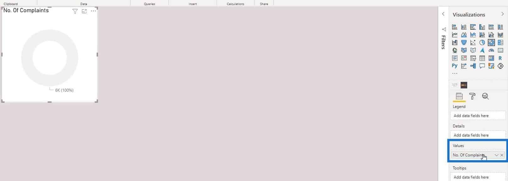
Then, put the Region measure in the categories.

Obviously, it doesn’t look presentable yet.
Moreover, we can’t turn off the legend. Otherwise, we won’t know which category belongs to which region.
There are two tricks that we can do to make it look better even without the legend and the labels. The first one is by using the half donut chart. Let’s first clean this by removing the title, background, data labels, and legend.
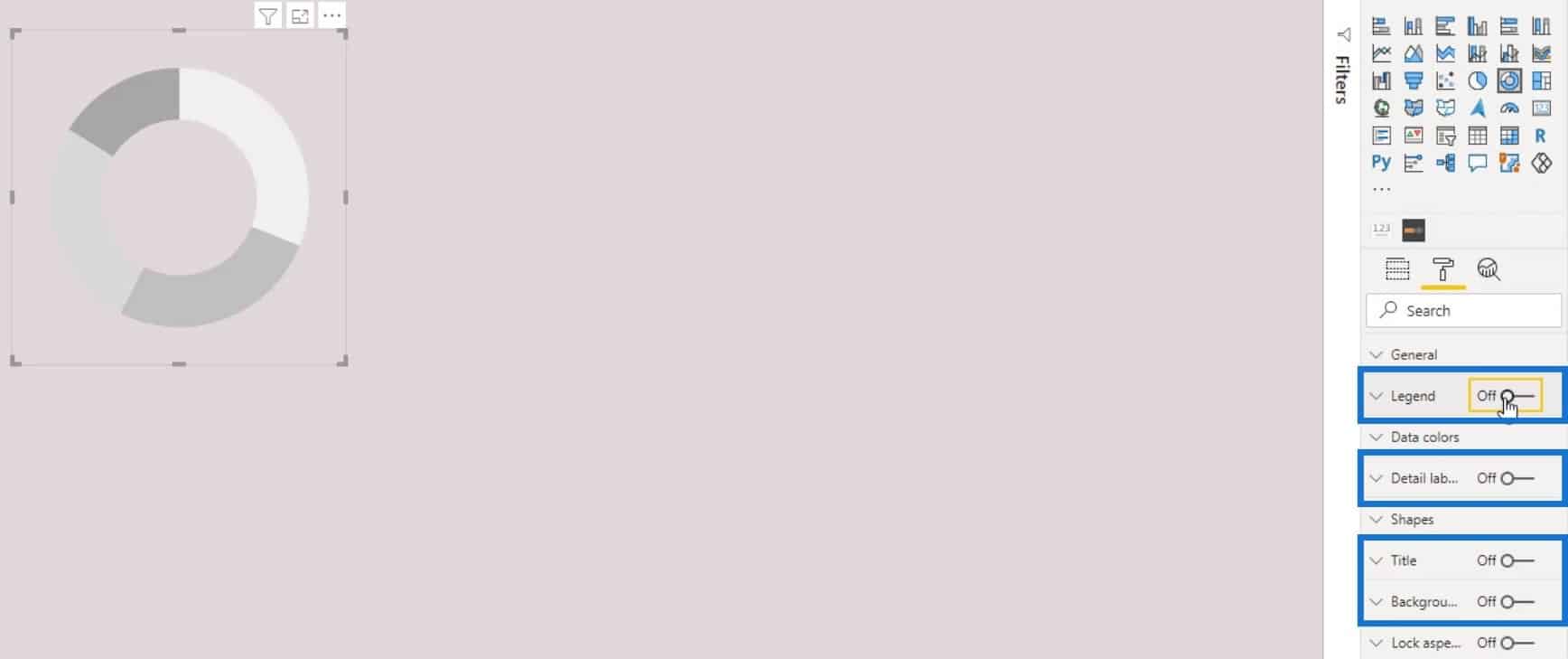
Creating A Half Donut Chart in Power BI
We’ll now turn it into a half donut chart. For this example, let’s use the color of the background for the South, Midwest, and Northeast regions. This is to make them look invisible or non-existent. We can use a color picker application to pick the color of the background. Then, copy the hex value of the selected color.
Go to Data colors to change the color of the regions.
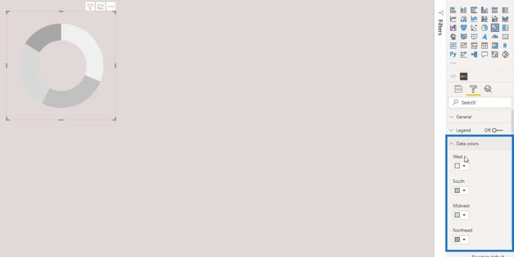
Apply the selected color to the South, Midwest, and Northeast regions. To do that, click the dropdown arrow icon in the color selection of the 3 regions, then click Custom color.
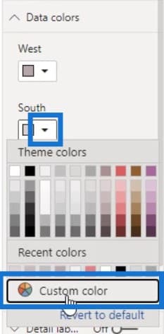
Paste the value into the hex value input box.
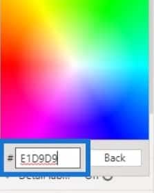
As a result, the other data in the chart look like they don’t exist at all.
Another cool thing that we can do is to reduce the value of the Inner radius.
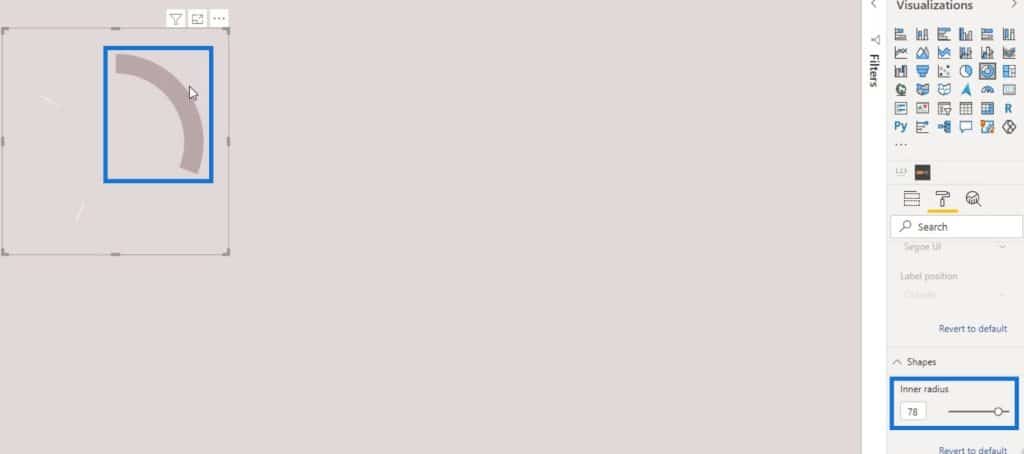
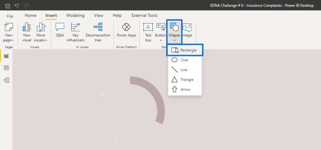
Additionally, we can hide the two white division lines using a shape. First, go to the Insert tab.
Next, click Rectangle under the Shapes option.
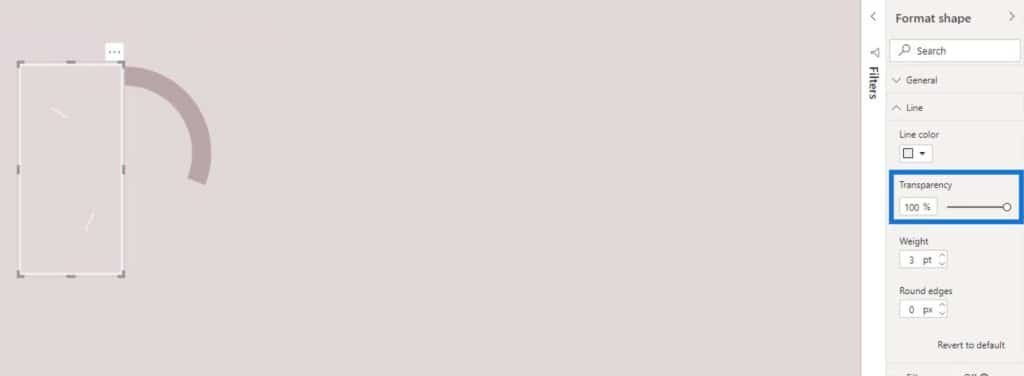
Resize the shape until it covers the two division lines.
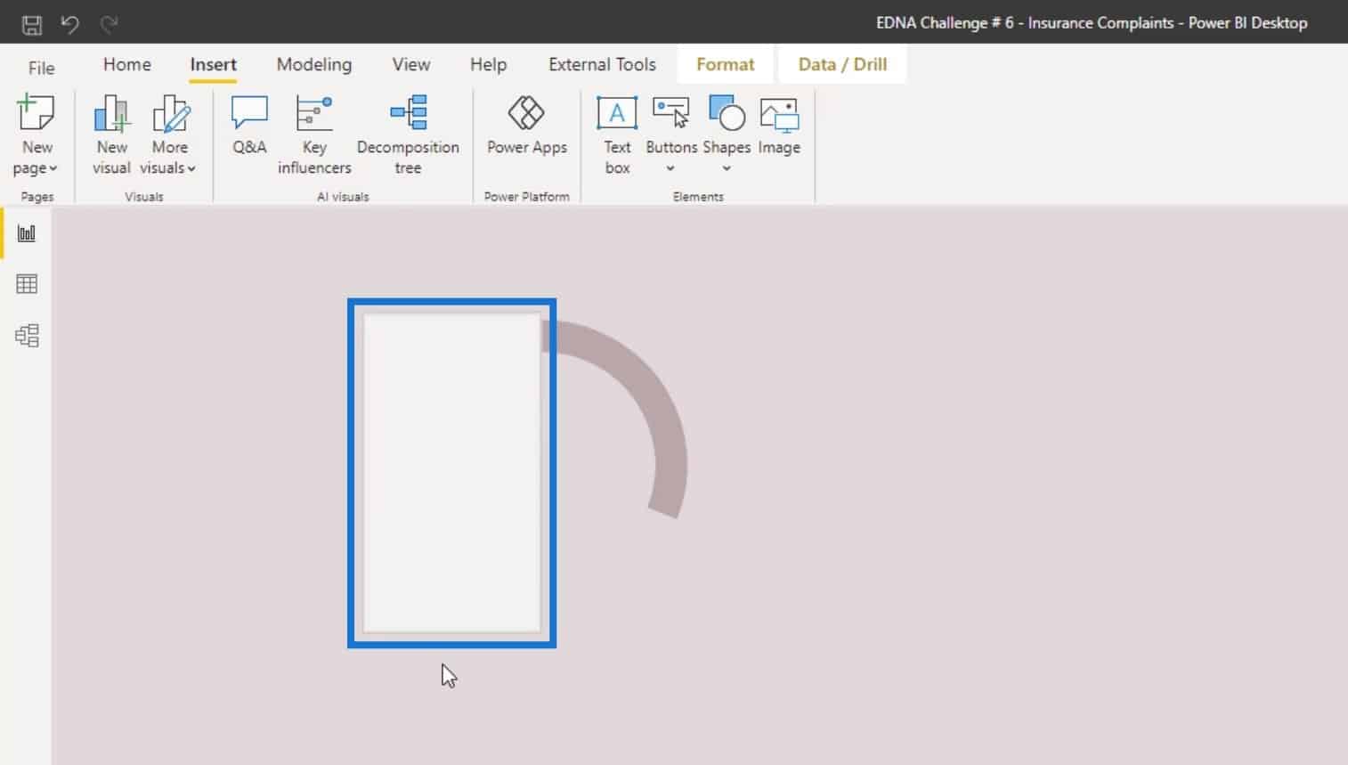
In the Formatting pane, click Line, then set the Transparency to 100%.
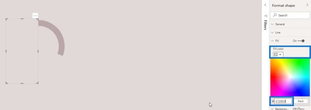
After that, click Fill and set the color to the same color that we previously selected for the South, Midwest, and Northeast regions.
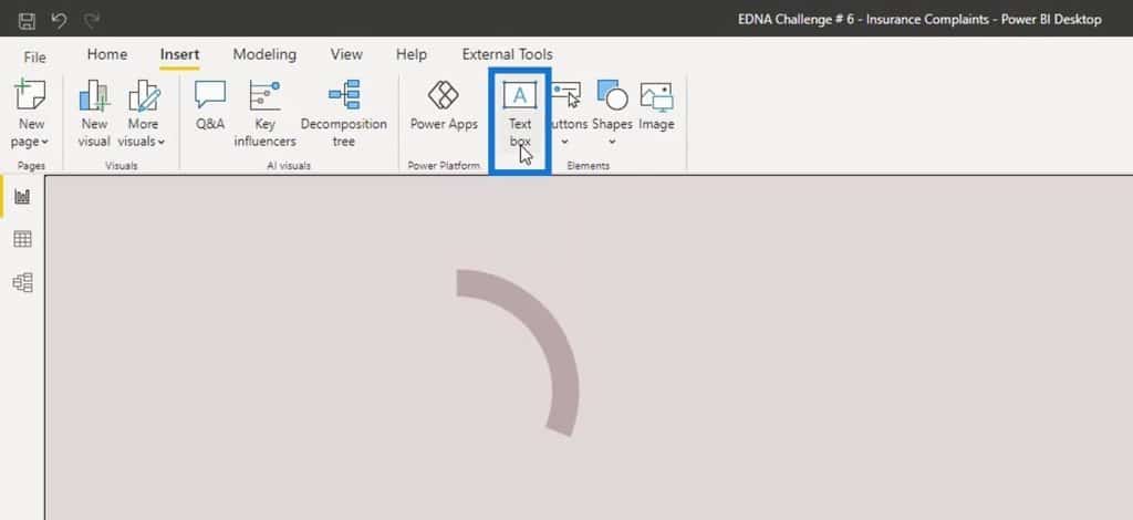
Let’s now add a text box.
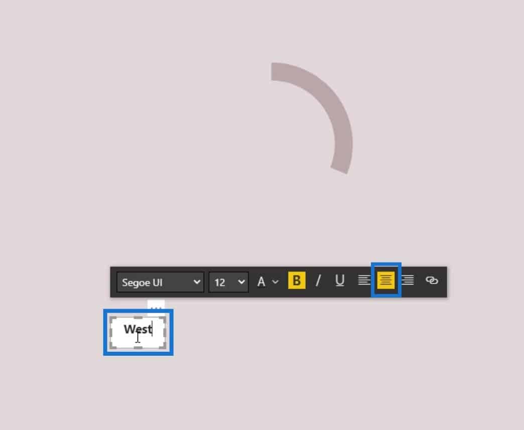
In the text box, type “West”. Make it bolder and set the size to 12.

Resize the text box and align the text in the middle of the textbox.
Remove the white background of the textbox by setting the Background toggle to Off.
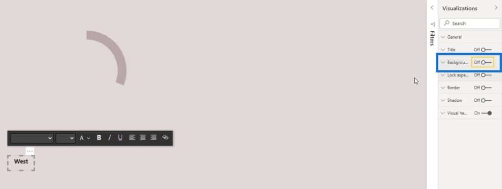
Position the text label on your desired location.
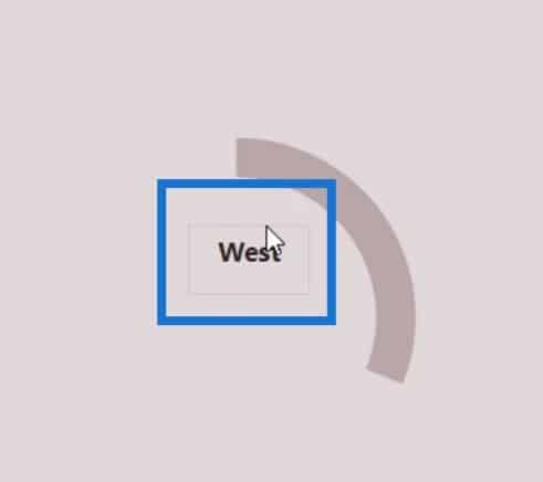
We can also place a measure in a card visual. First, add a card visual.
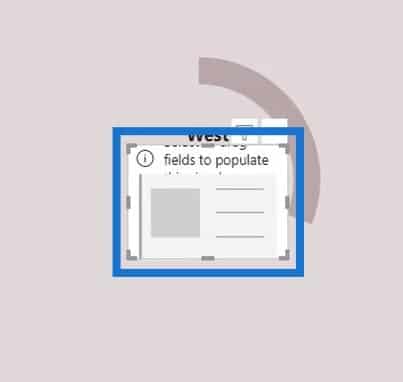
Then, place the measure into the card visual. Let’s put in the No. of complaints measure as an example.
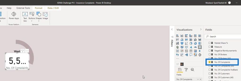
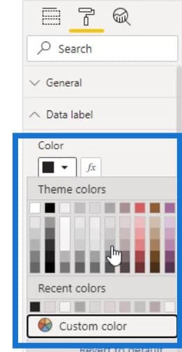
Click the formatting icon, then change the color of the text.
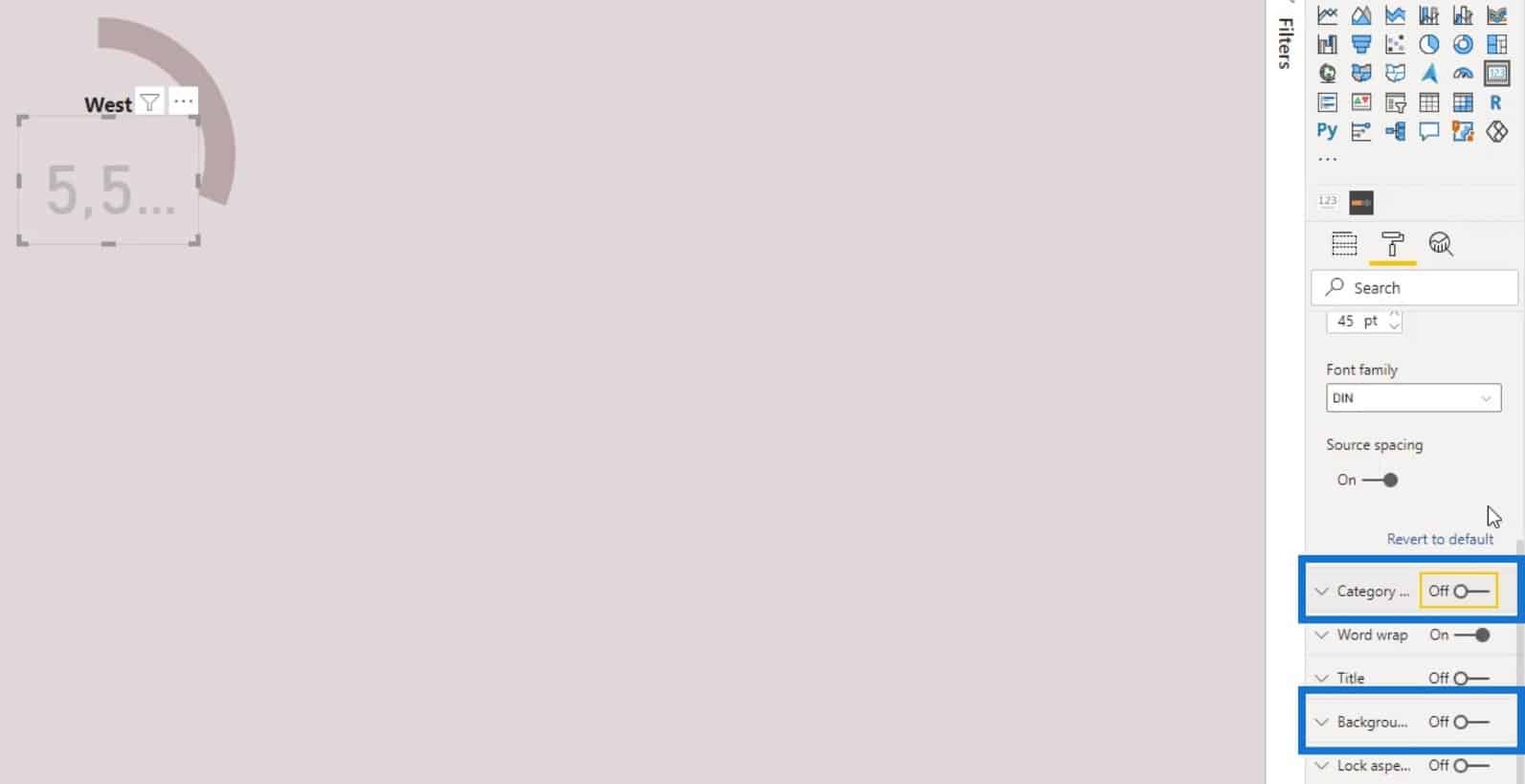
Turn off the Background and Category as well.
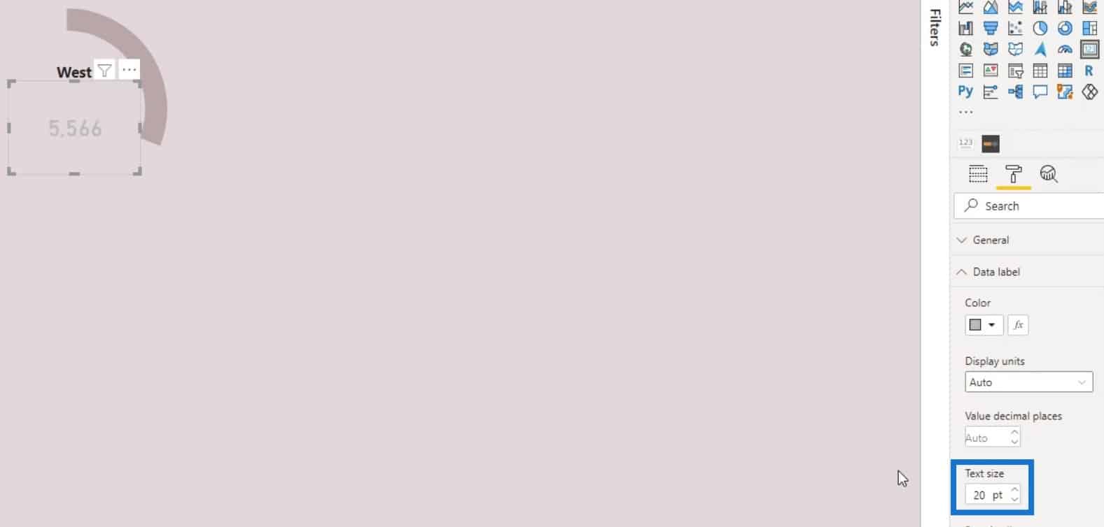
Then, change the Text size.
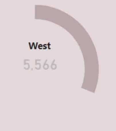
As a result, we have created a half donut chart that definitely looks better than the previous donut chart we had.
Slicing The Power BI Donut Chart By Category
Now, let’s try to slice it by category. For this example, let’s choose Customer Name as the category.
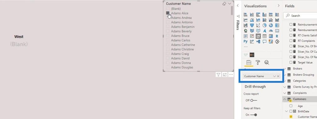
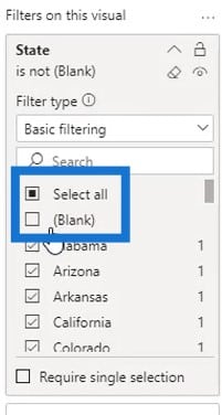
Check Select All and unselect Blank.
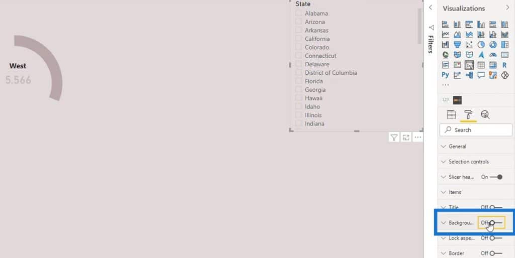
Then, remove the background.
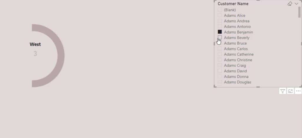
After that, we can now filter it by category.
Creating A Full Donut Chart In Power BI
Moving on, let’s create a full donut chart. But for this one, we’ll only give a specific value to the region that we want to highlight.
First, remove the rectangular shape that we previously added. Then, apply a single color to the other regions.
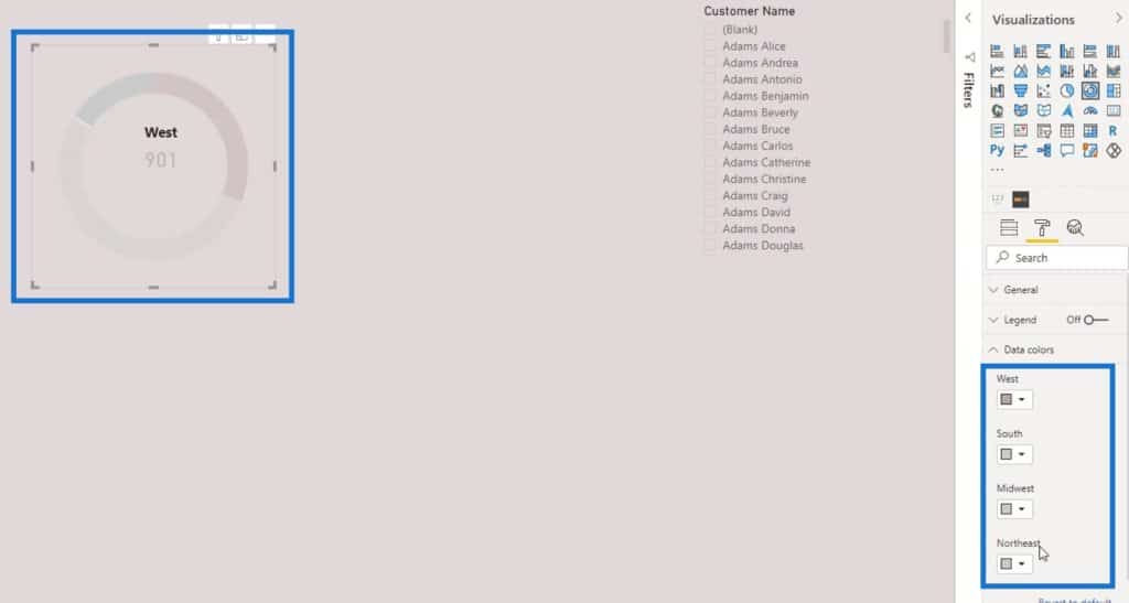
As you can see, the data for the West region is highlighted, and stands out from the rest of the regions in our donut chart.
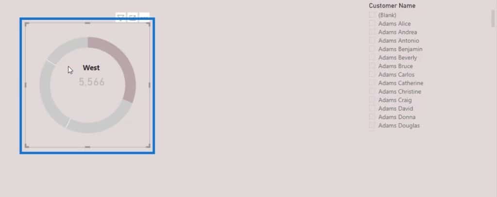
Let’s put the label and the card visual in the middle.
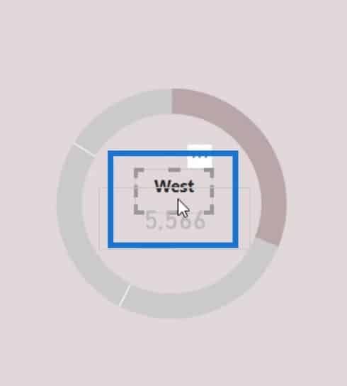
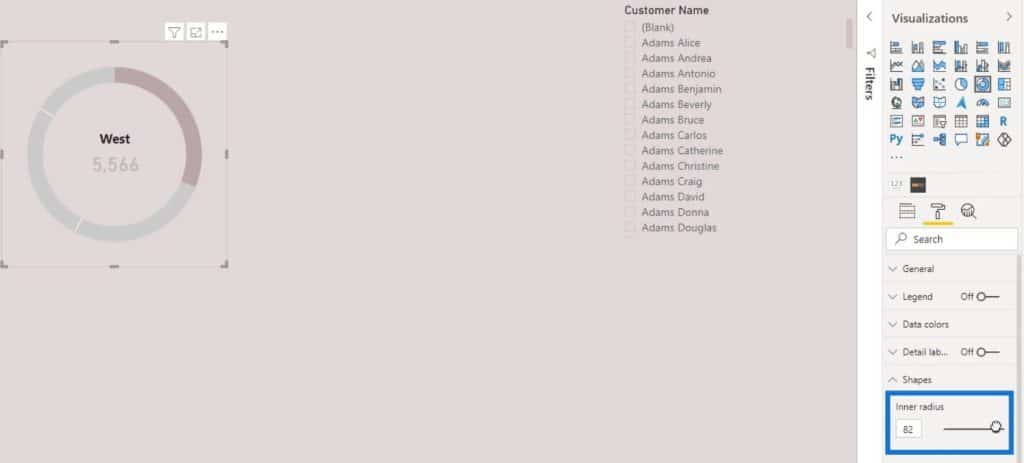
Then, increase the Inner radius to make it look better.
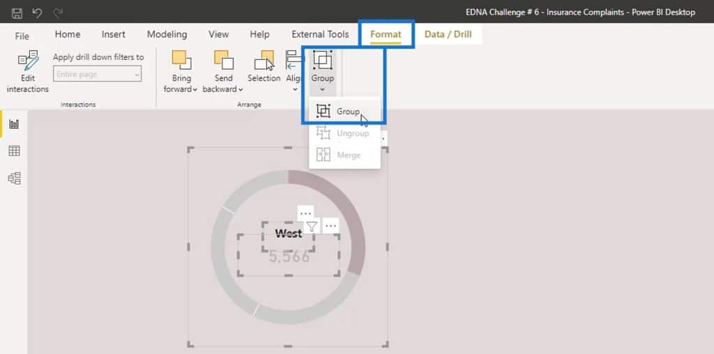
After that, let’s group the visual. Select the three visuals. Go to the Format tab, then click Group.
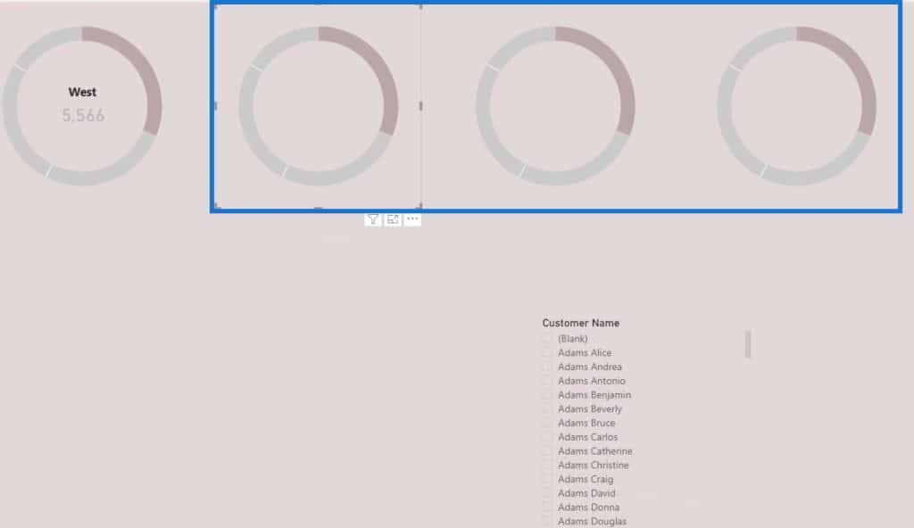
We can now duplicate this donut chart to create the other regions.
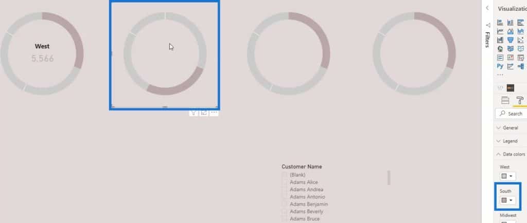
For the second chart, highlight the South by changing its color.
Let’s specify the first chart to West in the Filter pane.

Duplicate the text box and card visual of the first donut chart for the second chart, and select the South on the Filter pane.

Let’s do the same thing for the third and fourth donut chart. For the third chart, change the filter to Midwest, and filter the fourth chart to Northeast.
Then, change the labels for the other 3 donut charts to South, Mid West, and North East. Lastly, change the highlight of the third and fourth charts by changing the color of the Mid West and North East.
***** Related Links *****
Utilizing Custom Visuals For Power BI
Visualization Technique – Power BI Column Charts & Filters
Dynamic Tooltip In Power BI With Embedded Charts
Conclusion
That’s it for this tutorial. We’ve successfully made the visual look presentable.

Generally, these are some of the things that you can do to make a Power BI donut chart look visually pleasing. There are still other ways to make it look better. You only need to allot some time to explore the formatting options that are available for your visual.
Check out the links below for more examples and related content.
Until next time,
Mudassir


