
In today’s blog, we’re going to discuss a question that was recently posted on the Enterprise DNA forum about Charticulator. David Joy, one of the members of the forum, had a question about one of Mudassir’s videos from his data visualization course. He wanted to know how to format charts and conditionally highlight the MAX value of something in a bar chart when all the other colors of the other bar charts were of a different color. You can watch the full video of this tutorial at the bottom of this blog.
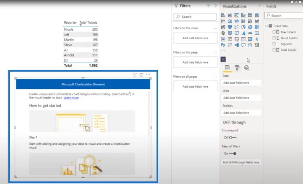
Let’s look at David’s PBIX file and go to Power BI. This is what the dataset originally looked like.
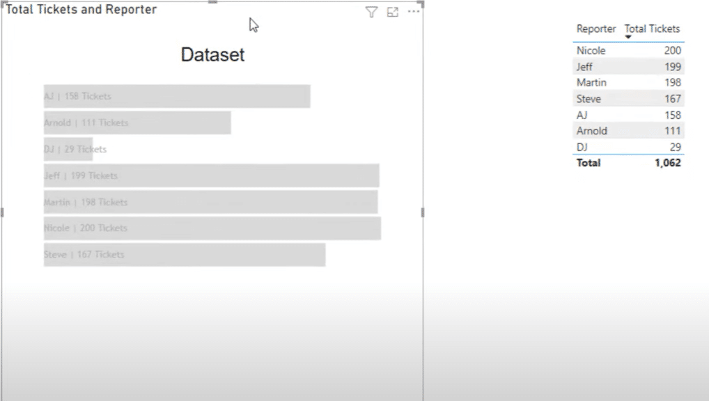
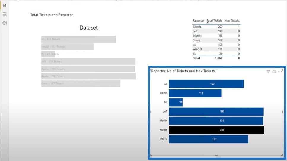
If you highlight the Total Tickers and Reporter table, you can see that this measure is bringing in the total tickets and the reporter from one table.

What I like to do when building my own reports is to visually see everything that’s happening on the screen. This is why I created this chart where we can see all the tickets and all the reporters.
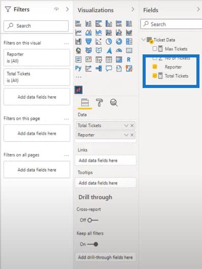
What David wanted to do in his report is to bring in the max value from his measure for Max Tickets into Charticulator.
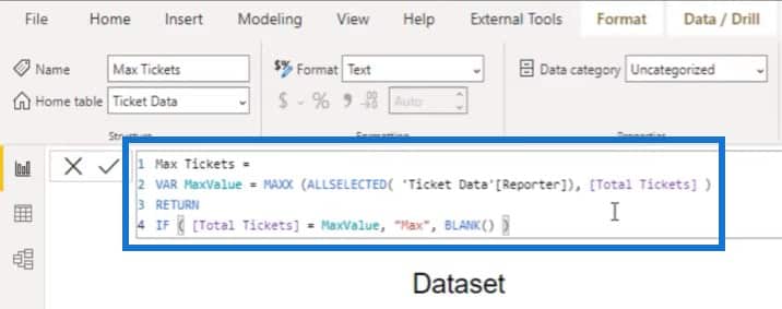
But for some reason, the Charticulator app within Power BI desktop does not like a text value for this measure. I’ll show you why it doesn’t work.
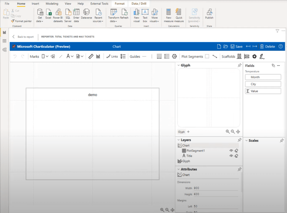
Creating A New Charticulator
We’ll create another Charticulator by clicking on the Charticulator icon and making it bigger.
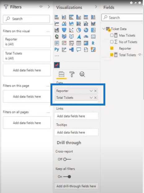
We’ll bring in the reporter and total tickets dimensions into the table again.
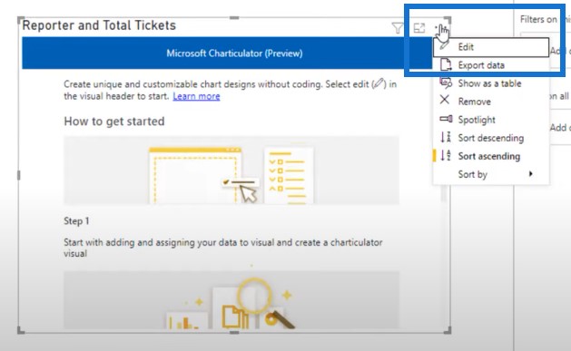
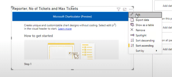
We’ll click on the three dots here, then click on Edit.

However, if I bring in the max tickets into the picture, it will allow me to create a chart but once I click on Create chart, I will get an error message.
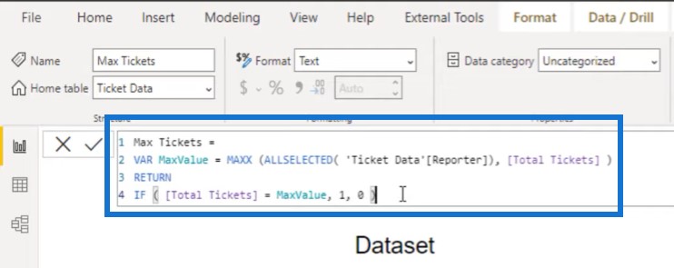
In order to make this work, I changed the Max Tickets measure by replacing Max to 1, and replacing blank with 0.
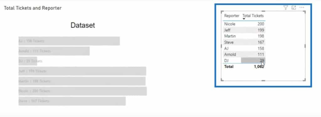
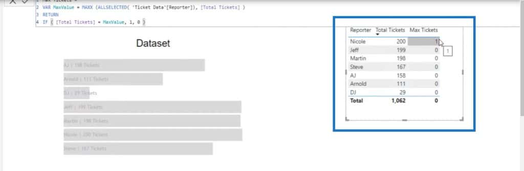
Once I bring in my Max Tickets measure into that table, we can see that Nicole is the top reporter that has the max tickets, which is why she has the value of 1.
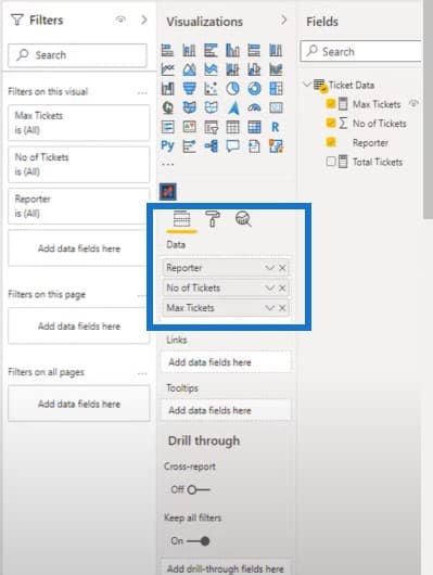
The next step is to bring this into the Charticulator. So let’s create a new one and bring in the needed fields. Instead of bringing in the measure for total tickets, let’s bring in the actual value of No. of Tickets and then the Max Tickets measure.
Click on the three ellipsis and then click on Edit.
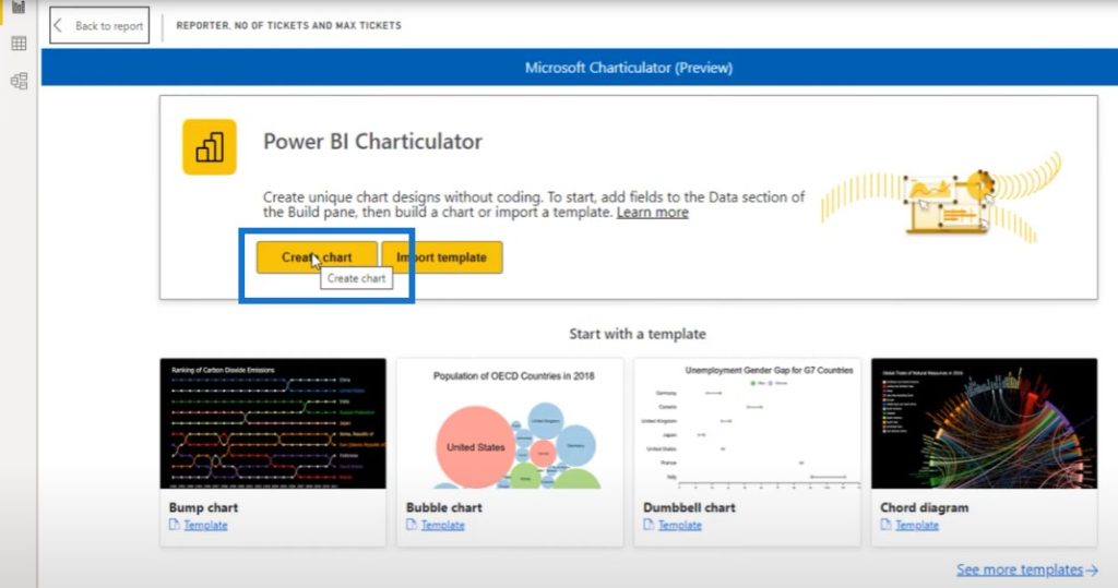
Then click on Create chart.
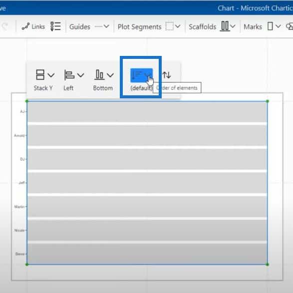
We can now start building our chart from here.
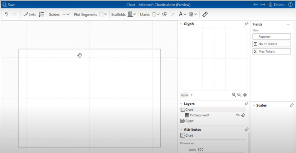
Let’s choose a mark and throw it on the glyph.
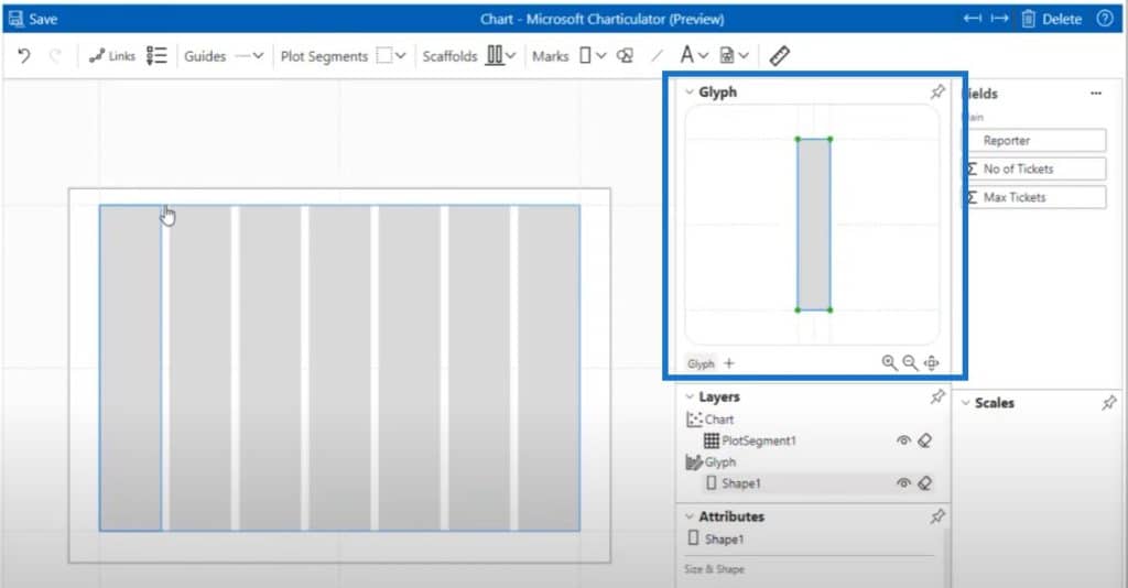
And then we’ll click on Stack Y and put our list of reporters in the stack. I like the way that it’s set up right now where the reporters’ names are from A to Z. But you could definitely change this order if you wanted to with some of these options right here.
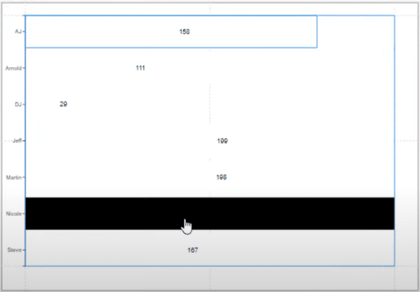
The next step is to bring in the number of tickets to get our width. Now we can see that we have differently-sized bars for each of the reporters.
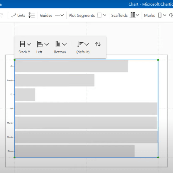
The next step in this process is to bring in the text to the Glyph and align it to make sure the text is inside the bars. Obviously, you can adjust it the way that you want to.
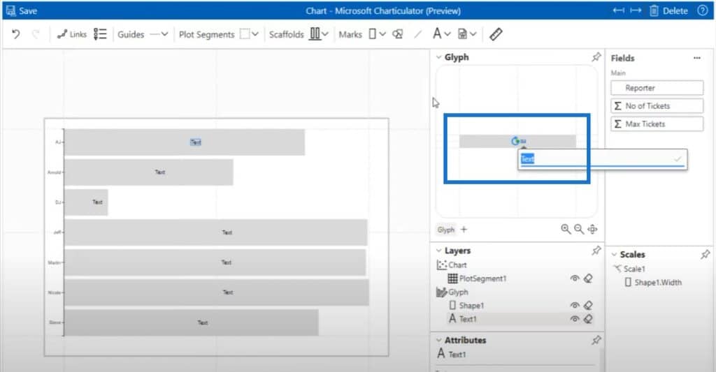
Let’s click on the pin beside Layers, expand the window a little bit, and bring in our No. of Tickets.
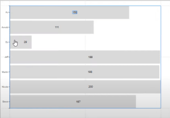
We can now see our values on the bar charts.
How To Conditionally Format Charts
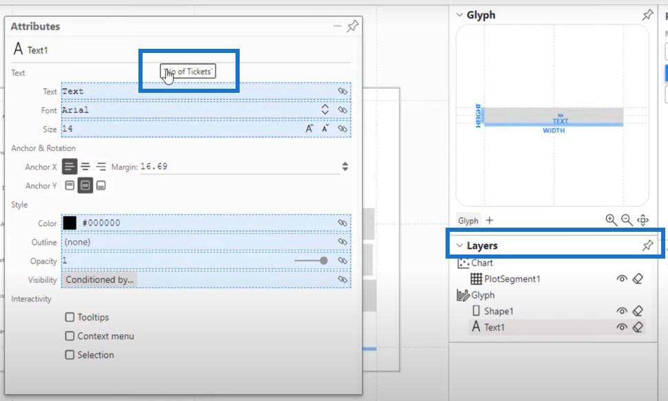
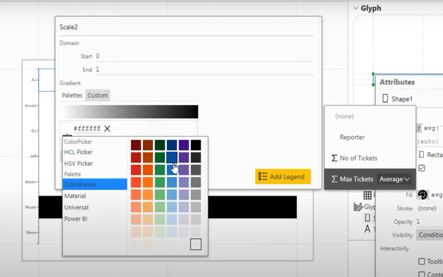
And the next thing to do to format charts is to click on Shape. This is where we can adjust the screen so that the bars will be one color for all the values, except for the max value. The max value will have a distinct color.
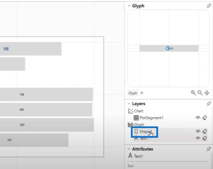
We’ll click on the pin beside Shape, and make the window larger, so we can see everything.

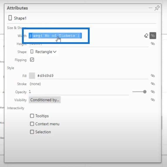
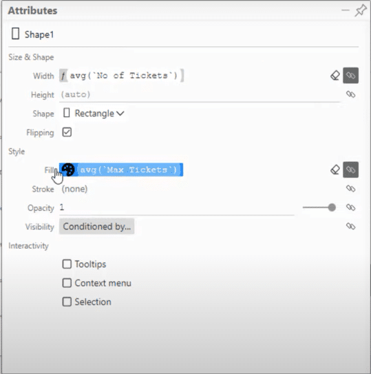
We already have the average number of tickets placed on the width of the bars, so the next step is to bring in our Max Tickets measure and drop it in the Fill.
Currently, almost all of these charts are in white, while the max is in black.
Click on the little pallete icon and go to Custom. Change all the whites to a nice little blue color, and then the black max will stay the same.
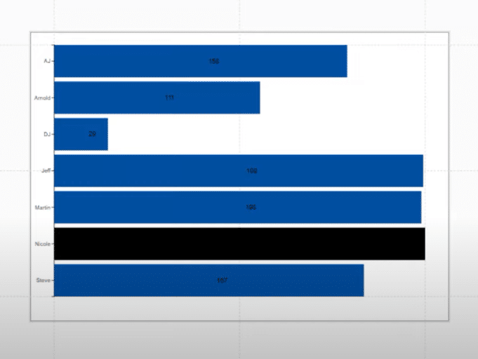
This is the result of the conditional formatting in the bar chart.
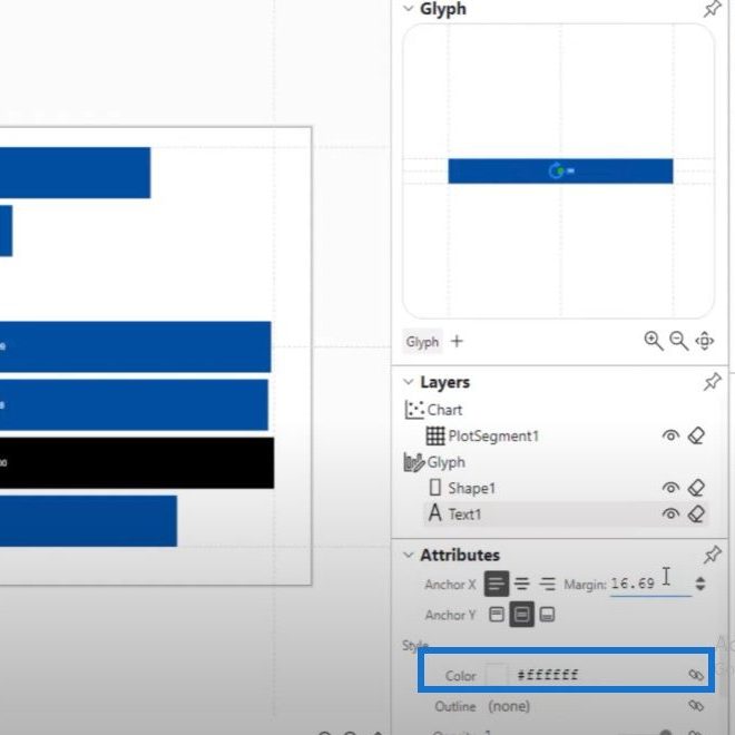
Now let’s go back to our text and shrink it down a bit. Since we’re using darker colors, we can’t see the text in the bars. Let’s change their color to white.
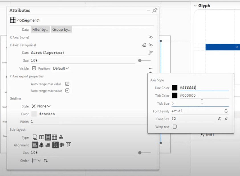
The next step is to make these dots beside the reporters’ names less noticeable. When we click on the plot segment, we can obviously see that this is on the Y axis. If we click on these three dots right here, it will bring up the line color.
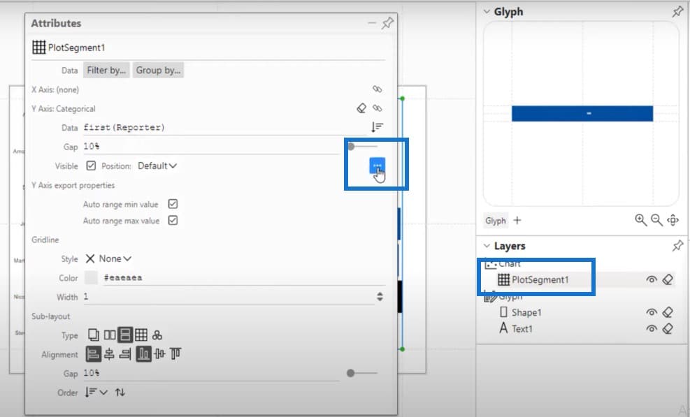
Let’s change the line color to white.
If we hit on Save and go back to the report, this is what we will see.
***** Related Links *****
The Charticulator: Power BI Alternative Visualization Tool
Comparison Bar Charts With Charticulator In Power BI
Charticulator: A Visual Creator For Power BI
Conclusion
This blog post shows you how I solve a question on the Power BI forum. David was making a bar chart and wanted to highlight the max value in a different color. This tutorial showed how I was able to answer his question and conditionally format charts using Charticulator.
If you encounter a similar problem to David’s, I highly recommend that you become a member of the Enterprise DNA forum to get support from your fellow Power BI experts and users.
If you enjoyed the content covered in this particular tutorial, please don’t forget to subscribe to the Enterprise DNA TV channel, and check out the rest of our website for more learning resources.
Jarrett


