This tutorial will show you all the available Power BI charts and visualizations in Charticulator that you can use and recreate for your Power BI reports. You’ll learn a lot of visuals that will help you display your data in a more efficient manner.
Viewing Power BI Charts And Visualizations In Charticulator
If you go to charticulator.com and click the Gallery tab, you’ll see videos of all the visuals that you can create.

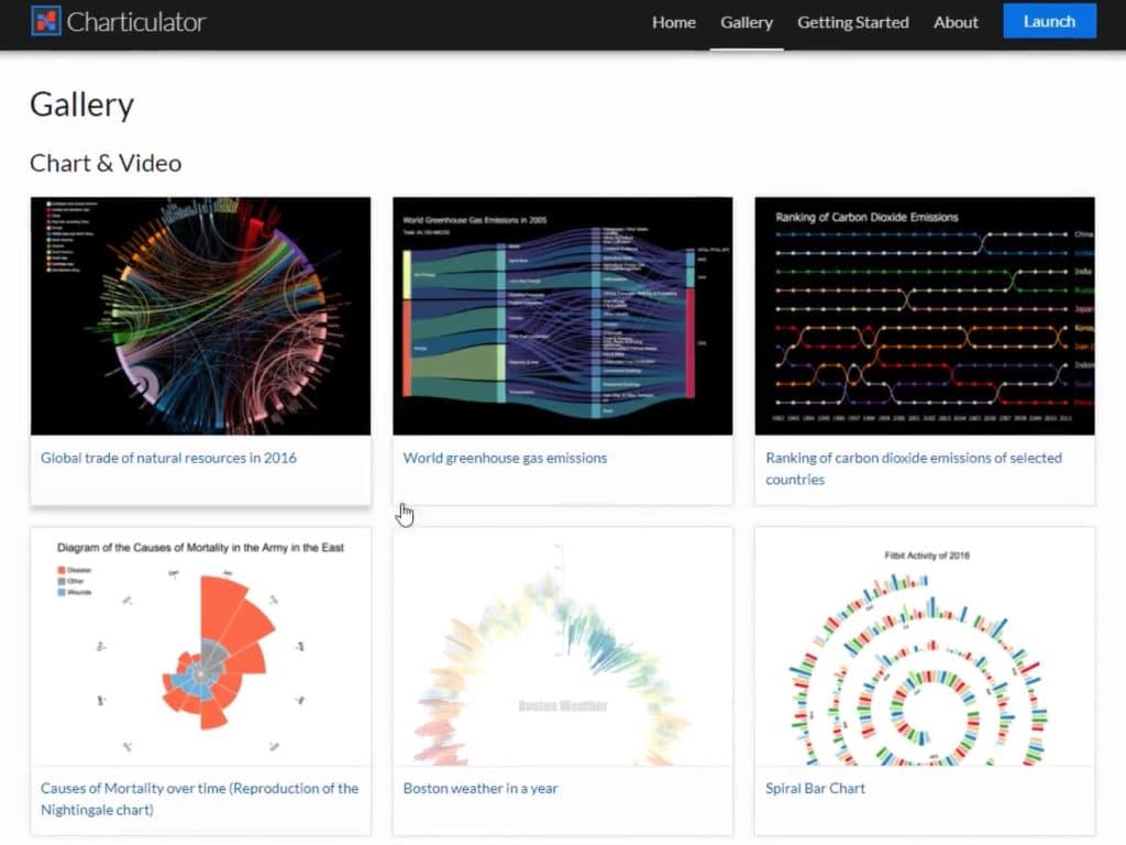
This is one of the videos in the Gallery section.
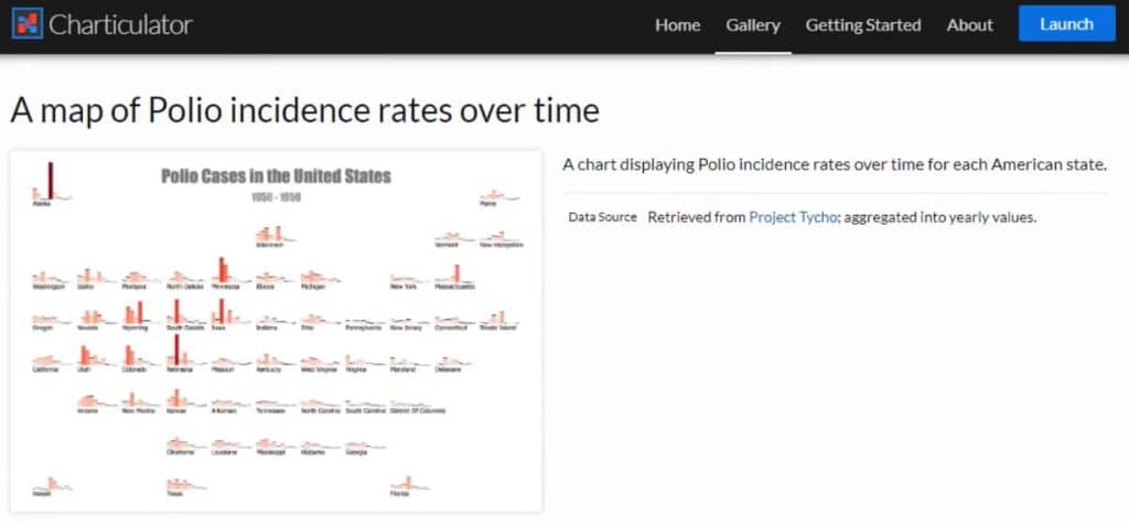
You can see the dataset used to create the visual in the Creation Process.
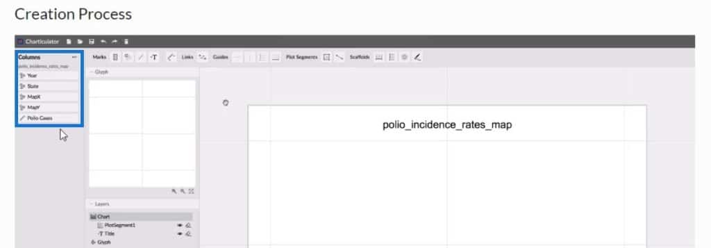
With those data, you can try and recreate the visual with the help of the video.
Creating A Visualization For Only Categories
You’ll see and learn how to create another chart using only categories.
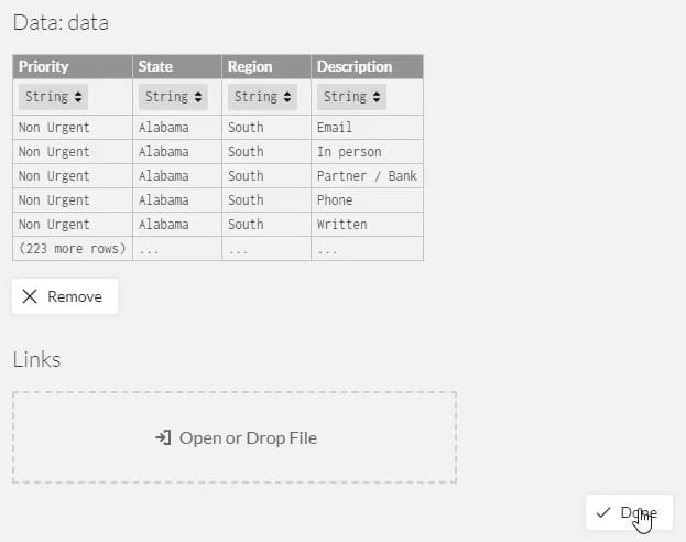
First, create a dataset and export it to Charticulator. This is the dataset that will be used as demonstration.
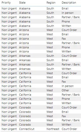
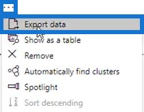
Click the ellipsis of the table and select Export Data.
Go to charticulator.com and click Launch Charticulator.

Locate and open the exported dataset and then click Done. After that, you’ll be redirected to the Charticulator where you can start creating the chart.
Designing The Grouping Chart
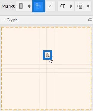
Bring a circle from Symbols into the Glyph canvas.
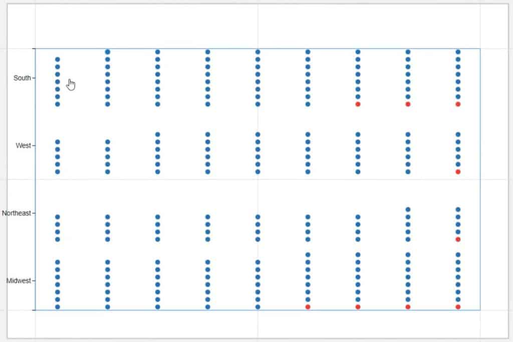
Next, place Priority in the Fill section of Symbol1’s Attributes to add colors to the circles. The colors define a category’s priority status if it’s urgent or not urgent.
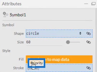
You can change the colors of the priority status depending on what you prefer. For this example, red is set for urgent and blue for non-urgent statuses.

Bring Region in the Y-Axis of the actual canvas. You’ll then see that the circles are properly categorized by region.
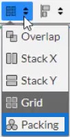
Next, change the stacking of the circles to Packing.
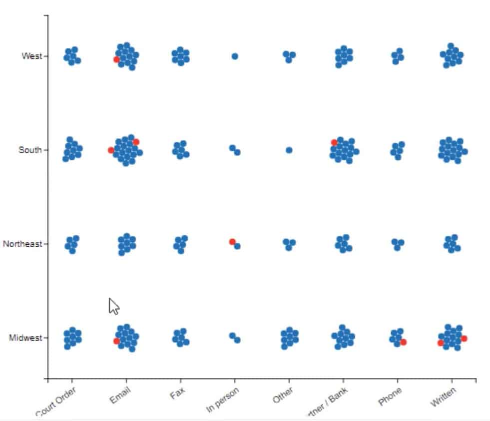
The circles in the chart will group together according to the regions. All circles represent the number of complaints. You’ll also see that there are 3 urgent complaints in the South region, 4 in the Midwest, and 1 in both West and Northeast.
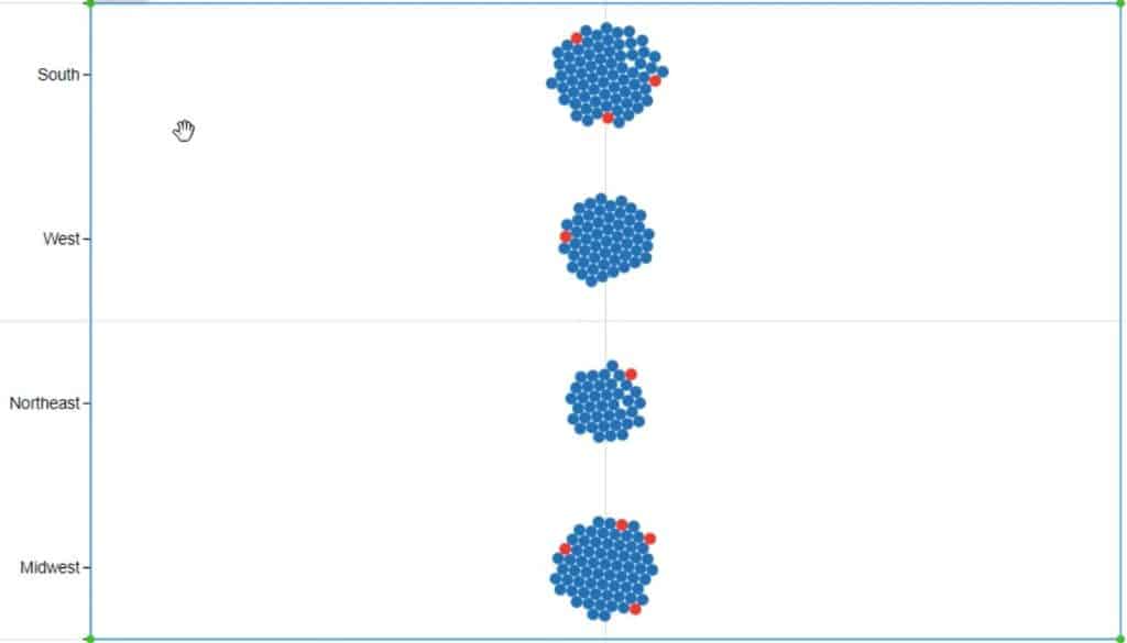
You can validate these charts in the dataset in Power BI. You’ll see that the number of urgent complaints matches the number of red circles in each region.
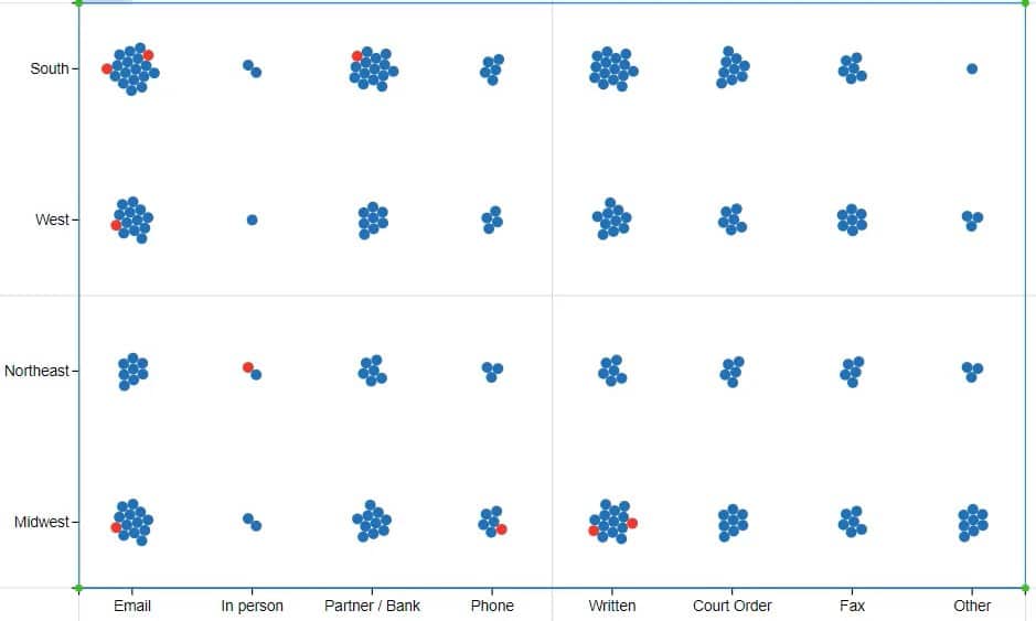
Now, if you place Description in the X-Axis, you’ll see the complaints being categorized by description or by how it was issued.
Exporting The Chart File To Power BI
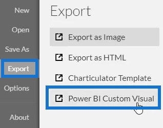
Save the file and export it to Power BI Custom Visual.
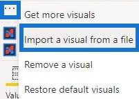
Open Power BI to import the visualization or chart file. Click the ellipsis below Visualizations and select Import a visual from a file.
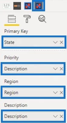
Then, click the Charticulator link with the visual name of the file and place the corresponding data in the Fields section.
You’ll then see the chart in the Power BI dashboard.
Creating Interactions Among Visualizations
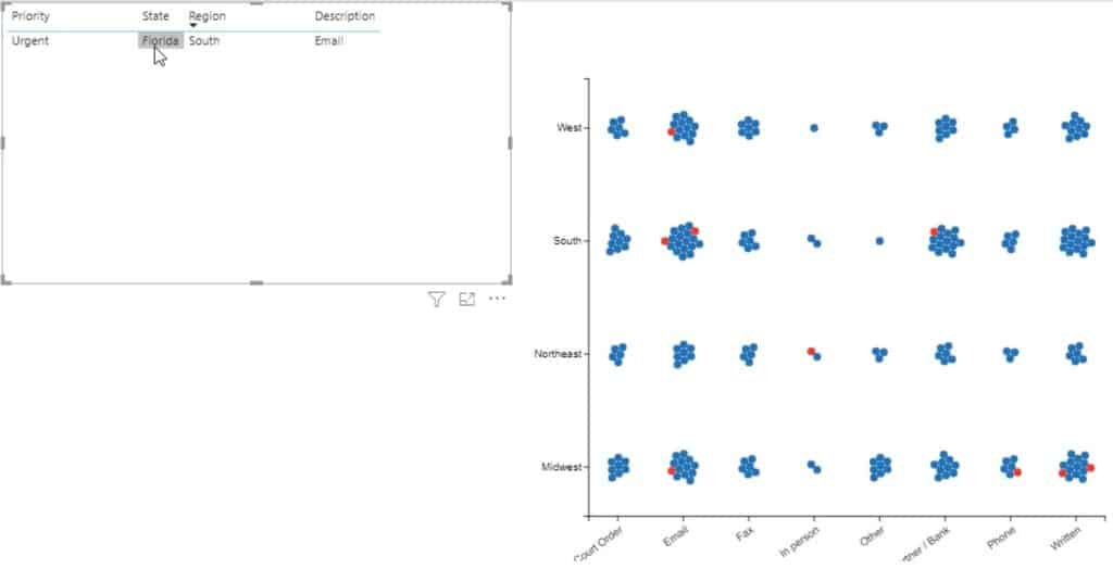
Lastly, create an interaction between the chart and the dataset table. Go to Format tab and click Edit Interactions. Then, click the interaction button of both visuals.
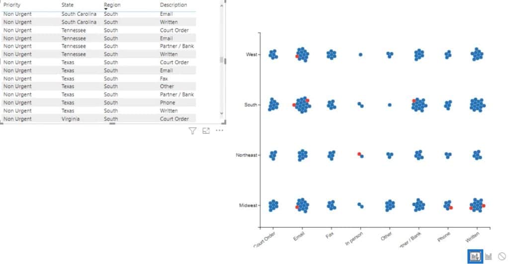
If you click a circle in the chart, the table will show you the data and information of that circle.
***** Related Links *****
Power BI Best Practice On Reports & Visualizations
The Charticulator: Power BI Alternative Visualization Tool
Charticulator: A Visual Creator For Power BI
Conclusion
There are plenty of visualizations in Charticulator that you can use and recreate. In the Gallery tab, you’ll find tutorials on how to create and maximize different charts to build the best visual for your Power BI reports.
Learn more about data visualizations by viewing and practicing all available charts inside the Charticulator.
Mudassir


