
In the world of data visualization, charts speak louder than numbers. If you’re looking for a way to visualize how an initial value is affected by a series of positive and negative changes, then the Power BI waterfall chart might be just what you need.
A Power BI waterfall chart is a special type of visualization that helps in understanding the cumulative effect of sequentially introduced positive or negative values.
Often used in financial analysis, it illustrates how an initial value is affected by various factors, leading to a final value. The bars in the chart represent the increases and decreases.

This article aims to provide a comprehensive understanding of the Power BI waterfall chart, its benefits, how to create one, and practical use cases.
Let’s get started!
Step-by-Step Guide for Creating a Power BI Waterfall Chart
Creating a waterfall chart in Power BI is a process that combines data preparation, chart building, and customization.
In this section, we’ll walk you through the process step by step, ensuring you have the tools to create compelling visualizations.
Step 1: Data Preparation
The first step is to ensure your data is structured appropriately. Your dataset should have columns representing different categories and their corresponding values, including positive and negative values for changes.
For example, let’s consider a company’s monthly revenue data for the first half of the year:

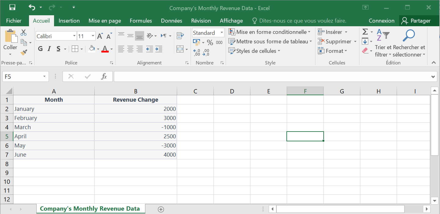
In this example, we have two columns in our Excel spreadsheet:
- “Month” column represents the total value for the different months of the first half of the year,
- “Revenue Change” column represents the positive and negative changes in revenue for each month compared to the previous month.
Step 2: Opening Power BI
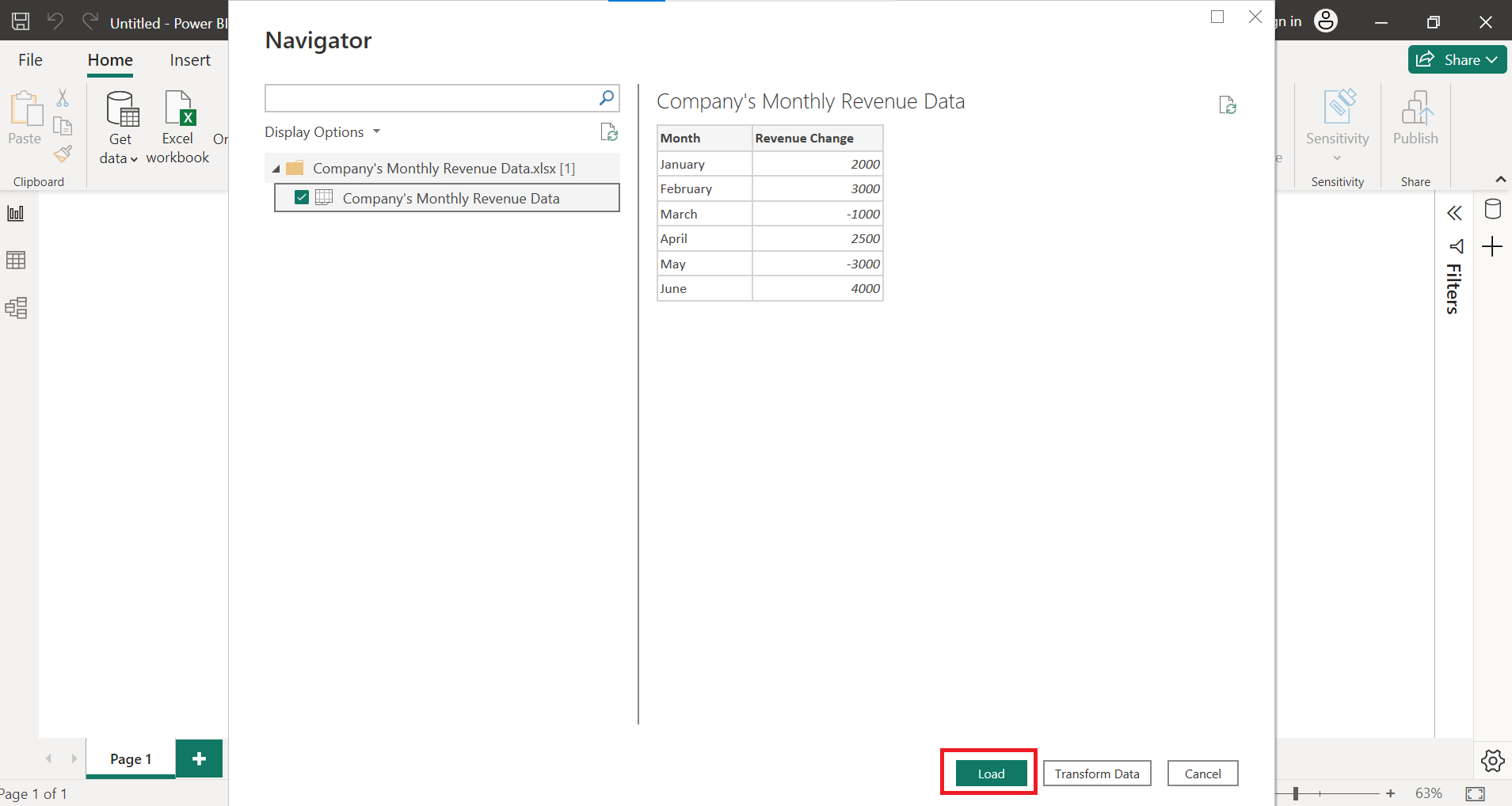
Now that you have your dataset prepared, you can open Power BI and load the data.
- Open Power BI Desktop, go to the “Home” tab, and click on “Get Data.”
- Select the appropriate data source, which in this case is an Excel file where the revenue data is stored.
- Click “Load” to import the data into Power BI.
Step 3: Creating the Waterfall Chart
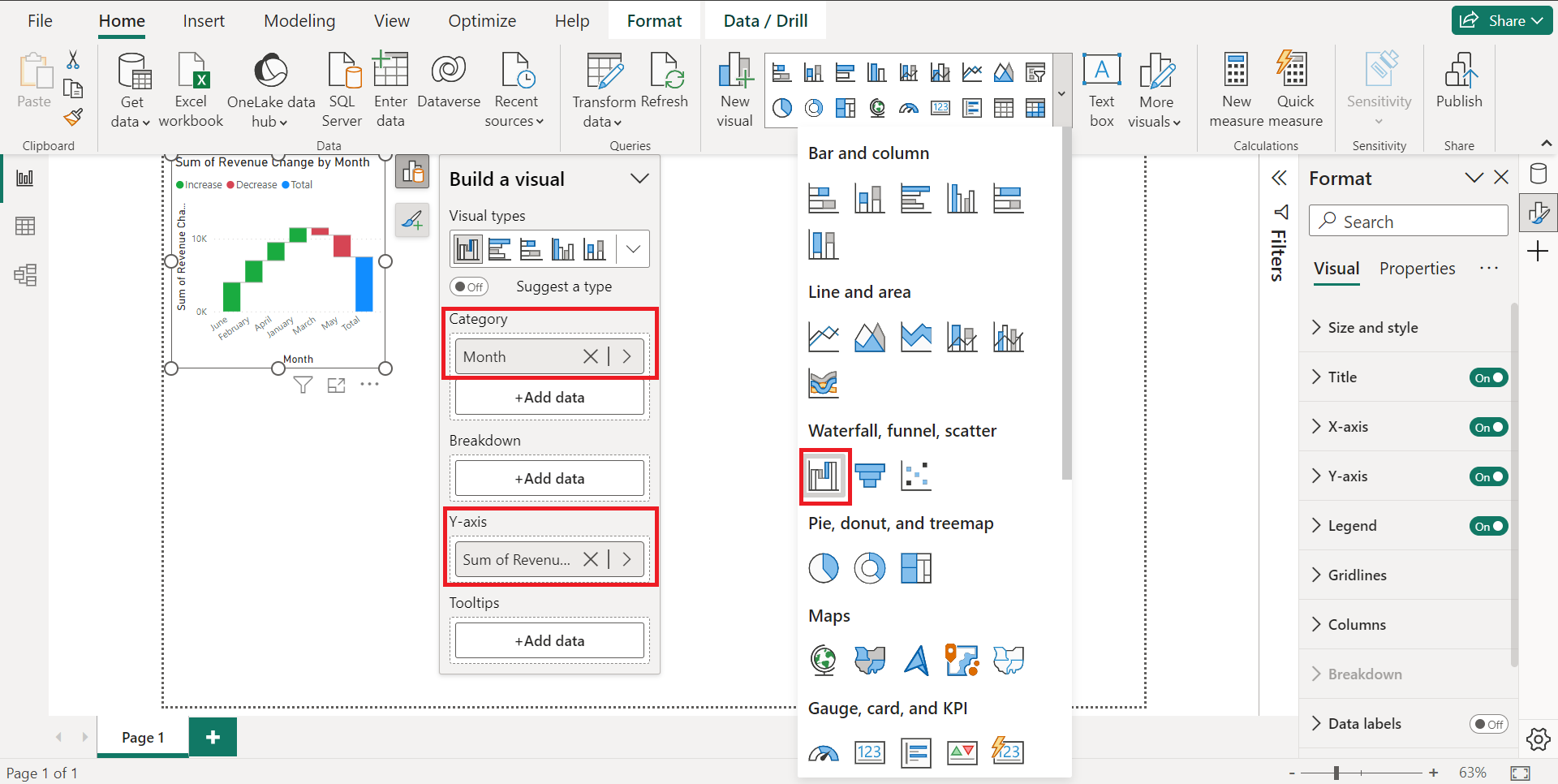
Once you have loaded your data, follow these steps to create a Power BI waterfall chart:
- Select “Waterfall chart” from the “Visuals” section.
- Click on “Waterfall Chart” to create a blank chart.
- Drag and drop the “Month” column to the “Category” field.
- Drag and drop the “Sales” column to the “Y-Axis” field.
Step 4: Formatting the Waterfall Chart
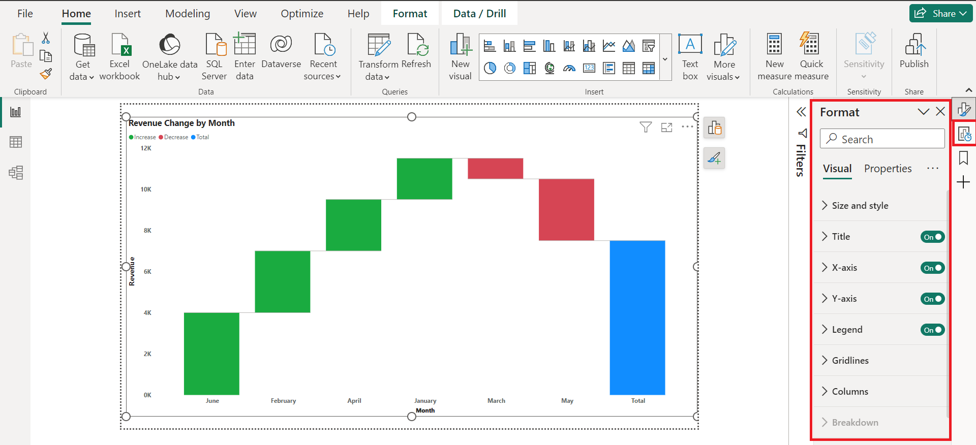
To further customize the waterfall chart, you can play around with colors, font size, and other formatting options.
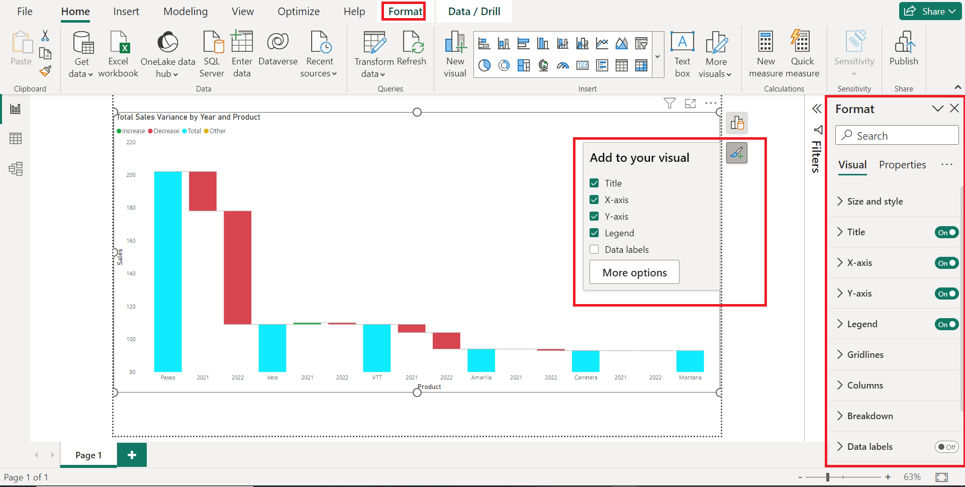
- Click on the “Format” option.
- Customize the appearance of the chart by changing colors, font size, etc.
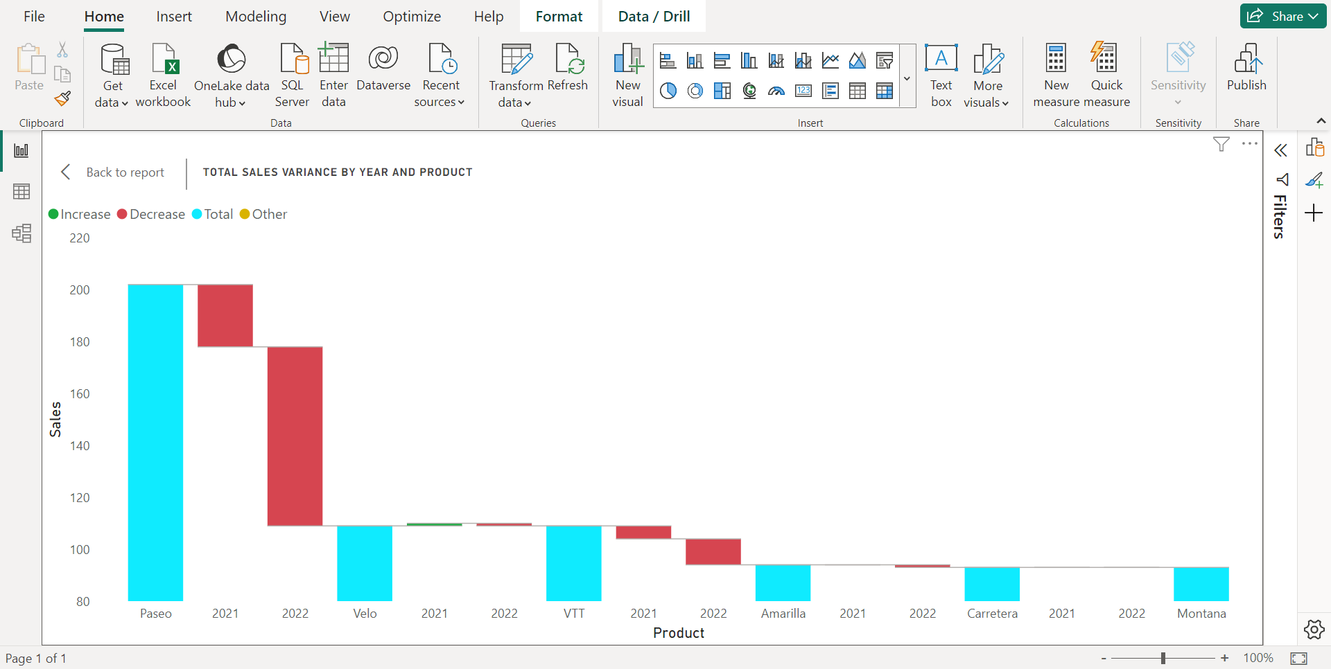
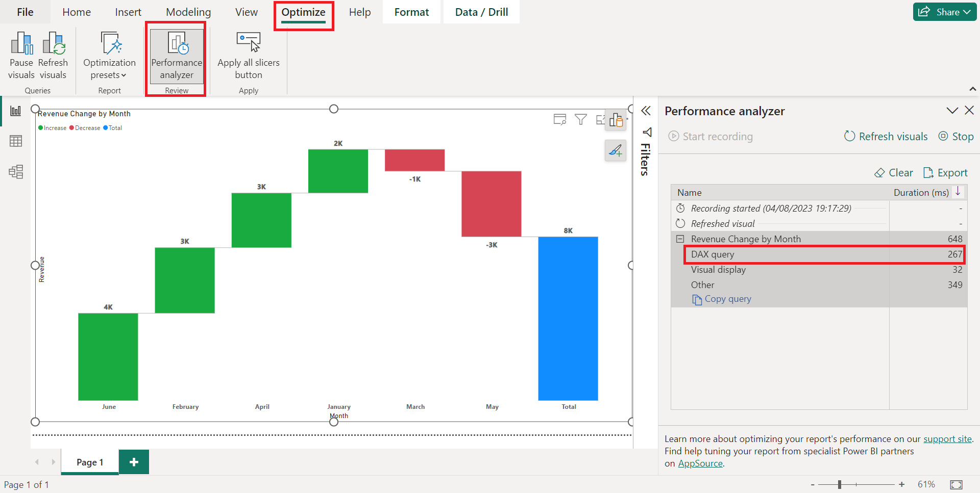
Step 5: Analyzing the Waterfall Chart
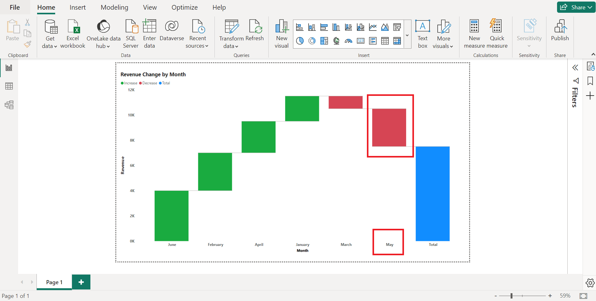
Now that your Waterfall Chart is created, let’s interpret the data.
The chart will show bars going up and down, representing the changes in total sales variance from one month to another.
The initial bar represents the starting value, and each subsequent bar shows the incremental change in total sales variance. If a bar goes below the baseline, it indicates a decrease, while bars above the baseline represent an increase.
In our example, let’s assume that the company implemented a cost-saving initiative in May, which resulted in a significant decrease in revenue.
Step 6: Adding Contextual Information
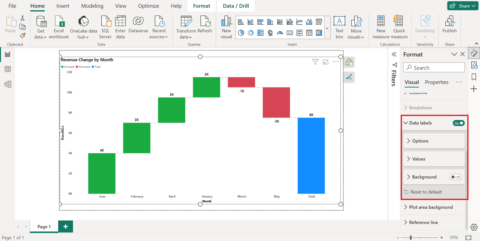
To make the waterfall chart more insightful, use data labels to provide additional context for each data point.
- With the waterfall chart selected, go to the “Format” pane on the right side of the screen.
- Find and click on the “Data labels” option.
- Choose the appropriate orientation for the data labels.
- Adjust the font size and color to ensure the data labels are easily visible.
Choosing suitable colors for your chart will make it easier for you to interpret the data and make data-driven decisions.
Now that we’ve gone over the basics, we’ll go over some tips to help you use waterfall charts effectively in the next section!
Tips for Using Power BI Waterfall Charts Effectively
Power BI’s waterfall charts are more than just a visual representation of data; they are a versatile tool that can convey complex information in an easily digestible format.
However, to unlock their full potential, it’s essential to know how to use them effectively.
In this section, we’ll explore expert tips and best practices that can elevate your waterfall charts from good to great, ensuring that they not only look appealing but also serve their intended purpose in your data analysis and reporting.
1. Understand the Purpose

Before diving into creating a waterfall chart, it’s crucial to understand the purpose and insights you want to create and convey.

Waterfall charts are best suited for showcasing the cumulative effect of positive and negative values, enabling stakeholders to comprehend how individual components impact the final result.
2. Formatting Data for Waterfall Charts
Proper data preparation is key to building an accurate and meaningful waterfall chart. Ensure that your dataset is well-structured with clear labels and values, as this will streamline the waterfall chart creation process and minimize errors.
3. Labeling and Annotations
To make your waterfall chart more informative, provide clear labels and annotations for each data point. This practice ensures that readers can quickly identify the various components and understand the significance of each change.
4. Managing Negative Values

Dealing with negative values in a waterfall chart requires thoughtful presentation. Consider using different colors or patterns to show negative differences and distinguish positive and negative values, making it easier for the audience to interpret the chart.
5. Utilizing Drill-Down Features
Power BI offers drill-down capabilities, which can enhance the user interactivity of your waterfall report page or chart. Allow users to explore deeper insights by clicking on specific data points to see the underlying details.
6. Highlighting Significant Changes

Emphasize crucial changes in your dataset to draw the readers’ attention to specific events or developments. Applying distinct colors or callout annotations to exceptional values will make the chart more impactful.
7. Customizing Colors and Styles
Power BI allows you to customize the color-coded appearance and bar colors of your waterfall chart to match your brand or presentation theme. Experiment with different color palettes and styles to create a visually appealing chart.
8. Performance Optimization
Large datasets or complex calculations may impact the performance of your Power BI waterfall chart or report. Optimize your Power BI waterfall chart by refining your DAX measures and utilizing filters to enhance loading speed.
Final Thoughts
The Power BI Waterfall Chart is a valuable tool for visualizing data and enabling businesses to gain valuable insights into their operations. It shows data in a smooth and flowing way, like a story of small changes adding up to big ones.
By using this chart, businesses can learn important things from their data and make smart decisions.
Remember, the key to mastering the Waterfall Chart lies not only in understanding its components but also in employing it wisely. Keep the design simple, the data accurate, and the insights clear.
If you’d like to learn more about creating customized tables for dynamic and effective financial data presentation, watch the full video below and uncover the secrets to elevating your financial reporting skills:
Frequently Asked Questions
Can I create a waterfall chart with multiple data series in Power BI?
Yes, Power BI allows you to create a waterfall chart with multiple data series, making it even more versatile in data representation.
Are waterfall charts suitable for displaying discrete data points?
Waterfall Charts are best suited for showing continuous data and changes over time. For discrete data, other chart types may be more appropriate
How do you prepare data for a waterfall chart in Power BI?
To prepare data for a waterfall chart in Power BI, you need to have a column that represents the initial value, followed by columns that represent the positive and negative changes that occur over time.
Each column should be labeled with a category, such as “Revenue,” “Expenses,” or “Net Income.” The final column should represent the total value after all changes have been made.
What is the difference between funnel chart and waterfall chart in Power BI?
A funnel chart in Power BI is used to represent a process of elimination, where each stage of the process reduces the number of items or customers.
A waterfall chart, on the other hand, is used to show how an initial value is affected by a series of positive and negative changes over time.
What is the other in the waterfall chart in Power BI?
The “Other” category in a waterfall chart in Power BI represents any changes that are not included in the other categories. This can be useful for showing the overall impact of smaller changes that might not be significant enough to warrant their own category.
Does Power BI offer pre-built Waterfall Chart templates?
While Power BI provides various chart templates, it does not have specific pre-built Waterfall Chart templates. However, you can customize existing templates to create waterfall charts.


