
I’m going to show you the ultimate technique for data visualizations in Power BI. I know that there are many, but this is just one that I think is pretty epic. Back in the day, this wasn’t even possible, but with these updated tooltips, we can now create these incredible reports in Power BI. I’m going to walk you through it and show you how it’s done! You may watch the full video of this tutorial at the bottom of this blog.
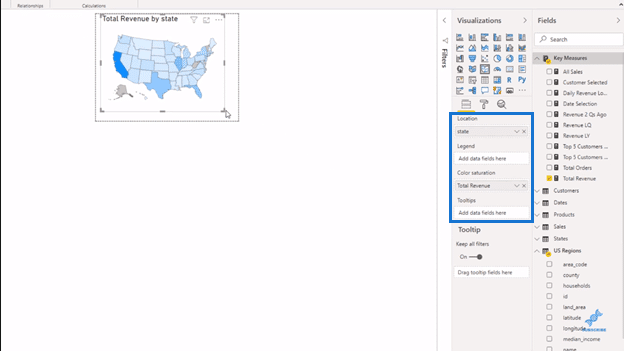
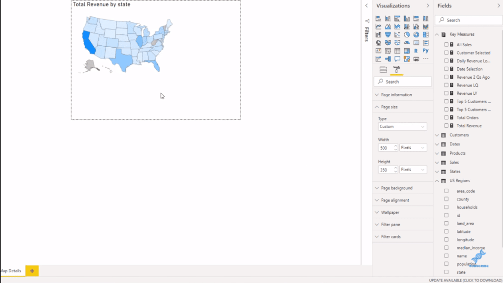
In the past, if we wanted to show things spatially, we would usually have to place the visualization by itself in the report page, right? And so in this example (below), I’ve used the shape map.
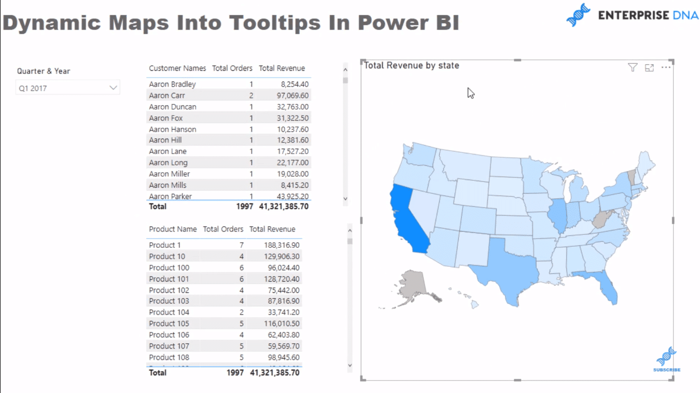
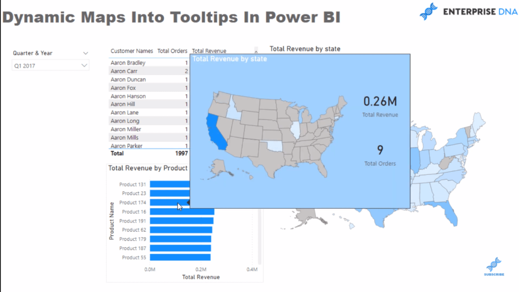
I have some demo data that has given me information by state and I have my Total Revenue. Here I’ve built some tables where I can filter by like Products sold and by Customers.

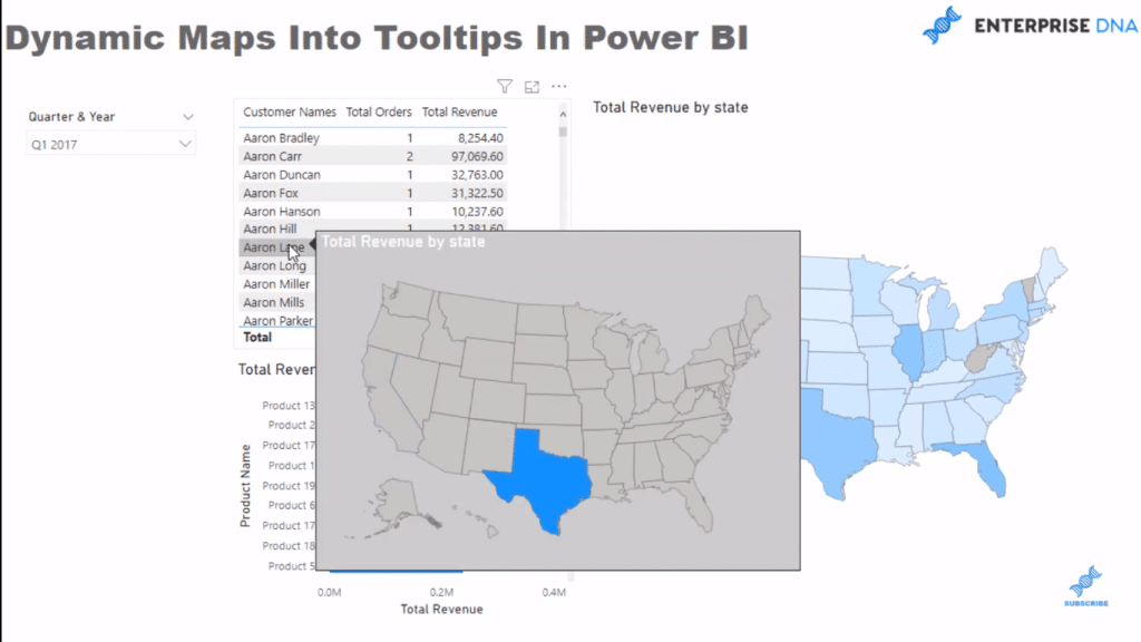
Using Power BI, we can now embed something like this into a tooltip. So, instead of seeing the generic tooltip, we can see a dynamic map visualization in a tooltip. I think it’s just incredible!
Creating A Map Data Visualizations
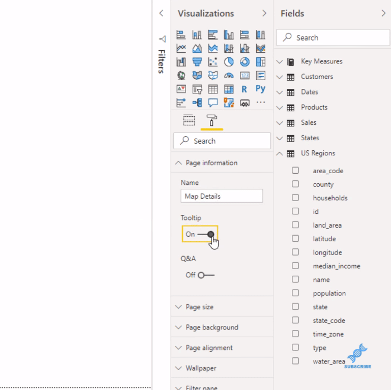
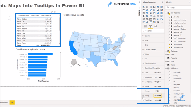
To do this, you need to create a new page. Go to Page information, change the name (let’s name it, Map Details, for this example), and then turn the Tooltip on.
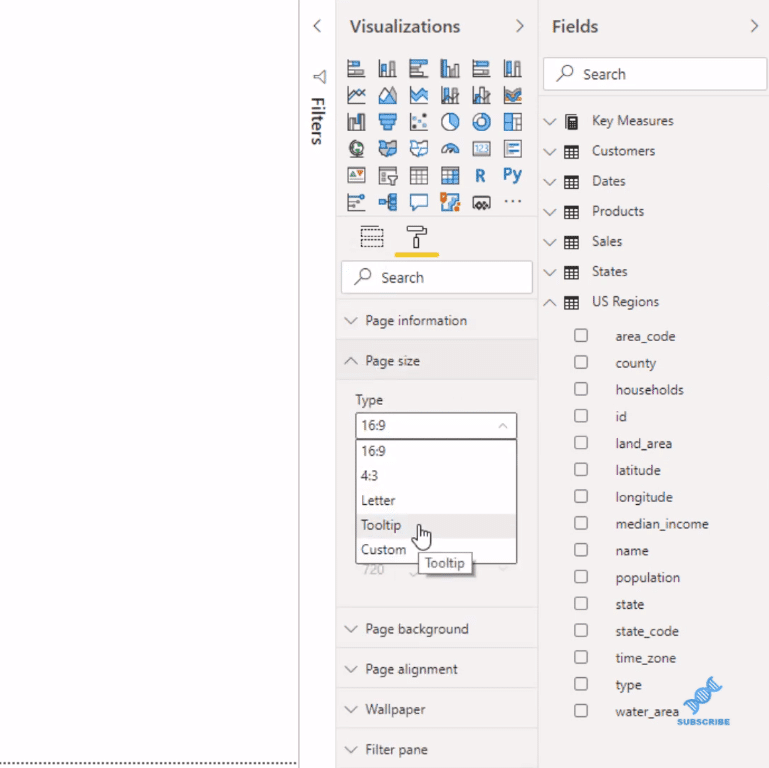
Next, you go to Page size and turn this into Tooltip.
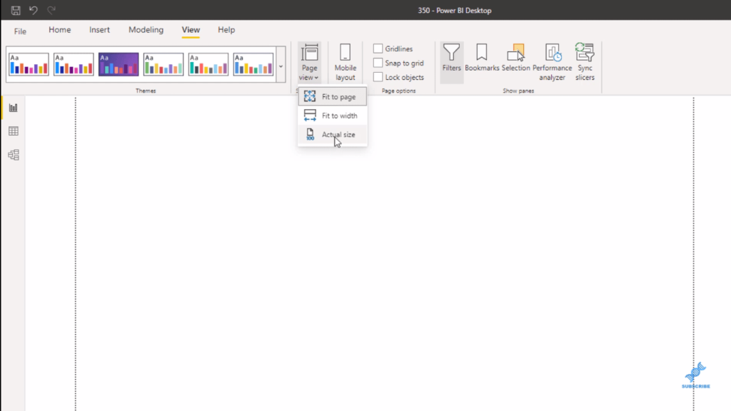
Now here’s a tip for you – go to Page view in the View ribbon and click on Actual size – this will make it a bit bigger.
Then, click on the shape map visualization, add States in the Location and grab Total Revenue as well.
You can do more here. You can also do a custom size to your map visual as well. It doesn’t have to be this size.

Placing Map Visual Into Tooltips
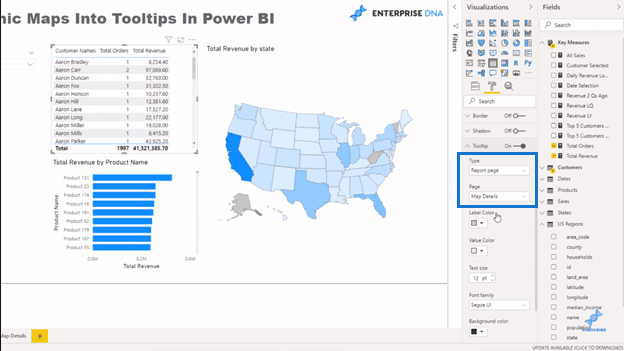
Now that that’s done, you can probably hide this page. Then, go back to your report page. Select your data visualizations and then go to the Format section and turn on Tooltip.
And then with the Report page, select the Map Details, which is the page you’ve just created.
So now, when you scroll through the table, the map is embedded into the tooltip.
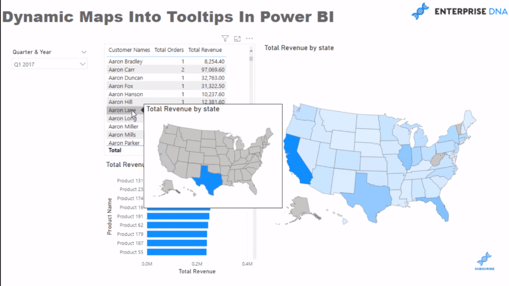
From a consumption experience perspective, that is pretty cool, right?
More Techniques for Data Visualizations
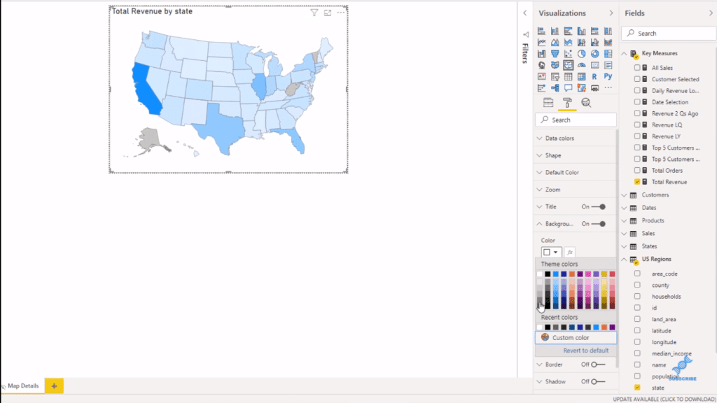
You can customize the shape map you’ve created in any way you want. For example, if you want to change the size, just click on Page size. Select Custom for the Type, and enter the width and height you desire.
Or, if you want to have a darker background, just click through the color options. You can change the color of the title text as well.
And of course, whatever changes you made in the map visualization, they will be reflected in the tooltip within the data visualizations in your report.
You have full flexibility over how you manipulate what you put into this tooltip. You can change the colors and you can even add another visual inside, say a couple of card visuals. Then, change a few details to make it compelling.
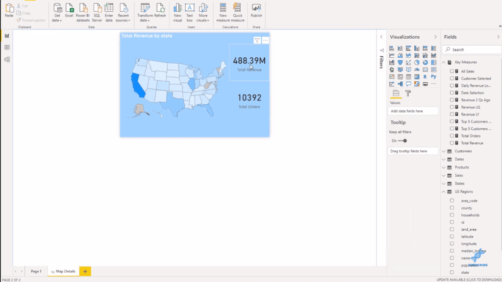
And you can see the changes reflected in the visualization tooltip.
***** Related Links *****
Data Visualization Tips For Your Power BI Reports
Power BI Shape Map Visualization For Spatial Analysis
Using Filter Fields & Visual Interactions To Create Compelling Visualizations In Power BI
Conclusion
This is such an amazing technique around data visualizations. Hopefully, you’ll be able to see that it’s not difficult to do at all.
This is just a demonstration of how to place dynamic maps in tooltips. Be creative and use this to engage your customers.
Think of the variability. You could have one page with lots of different information, and then use these tooltips, which enable the user to drill through the different aspects.
I definitely recommend you trying this in your own reports.

All the best!
Sam


