I want to inspire your creativity with brilliant navigation ideas for Power BI applications through the outputs made available in our amazing Enterprise DNA community. You can watch the full video of this tutorial at the bottom of this blog.
We’re seeing some of the highest quality Power BI reports and development happening hands down, so I want to show you how they’re done and perhaps you’ll then be able to implement certain aspects of these reports yourself.
In this blog, I’d like to highlight this pandemic report and dashboard made by Alex, one of our Enterprise DNA experts. He created this for one of our recent Power BI challenges. There are so many amazing features baked into this report.

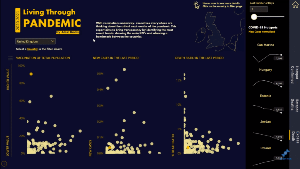
This data set was around COVID-19 and we’re trying to evaluate the status of individual countries in terms of the pandemic. We are looking at individual countries versus the entirety of the data universe. So here, we’re looking at the United Kingdom, which is represented by a yellow dot on the charts, versus all the other countries (white dots).
You can create stories like this quite easily in your Power BI reports by adding filters and slicers. But if you can get a bit more creative, you can make the navigation experience much more superior, and that’s what Alex has done in this report.
Creative Navigation Ideas For Power BI Applications
There are so many ways to slice and dice the data and information here and be able to view it in so many compelling ways, but you’ll be amazed that this is all in one report page.
Power BI has all these different looks and feels and insights that you can generate so quickly and easily.
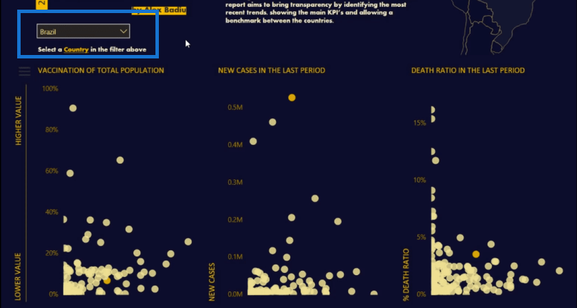
Now say we want to look at a different country, we can choose from the dropdown menu here. For example, we choose Brazil, you’ll see that the results on the visualizations change. They are now showing how Brazil is going in the pandemic.
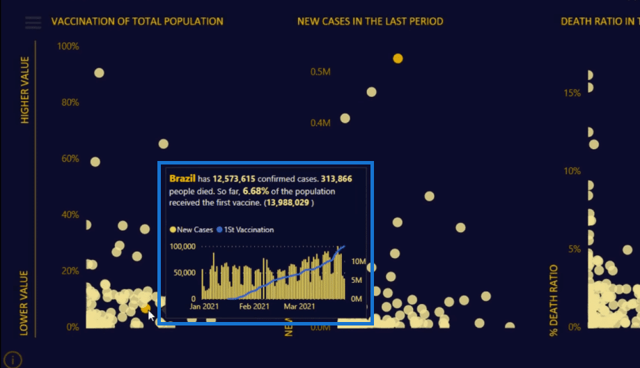
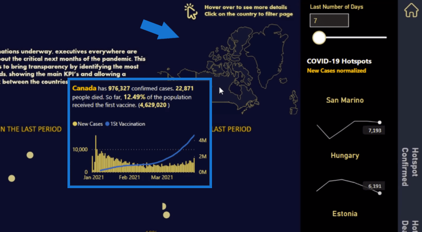
The tooltip here is amazing as well. Look how detailed it is. It’s drilling down into all the data around vaccination in Brazil.
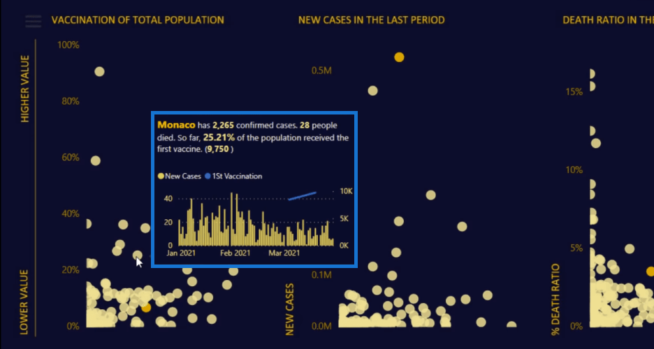
We can also look at other countries (white dots) here and see who’s doing well. We can make a comparison among countries.
Another navigation experience that I love here is the ellipsis. These three lines always signify application development.
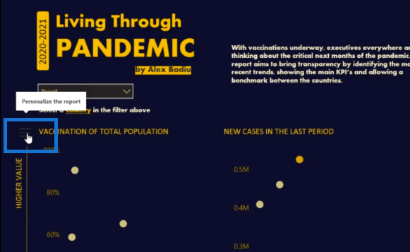
When we click on that, something pops up, which is just brilliant. Instead of having this information available on the report page, having it pop up within a box like this, which you can then x-out seamlessly, is a superior experience.
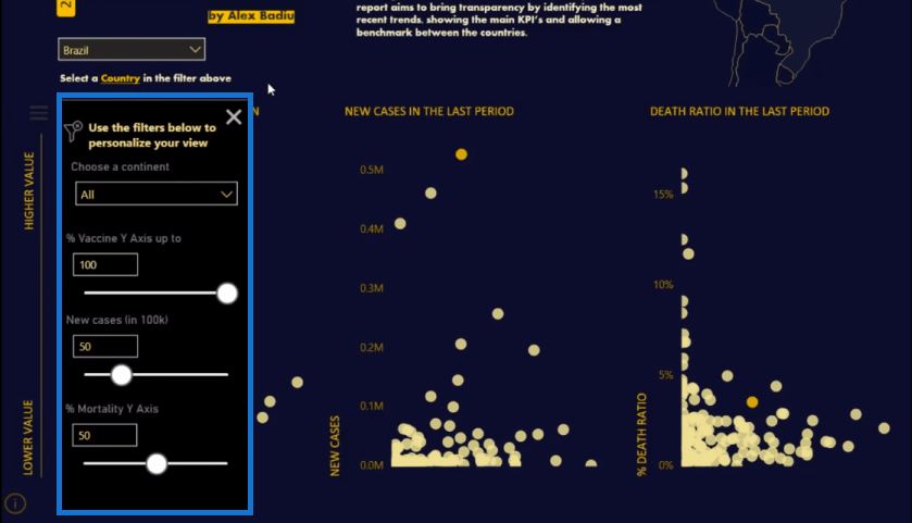
It’s like a navigation bar. I really like it because it’s not taking up any real estate on the report page. It’s just this little area that we can click in and out.
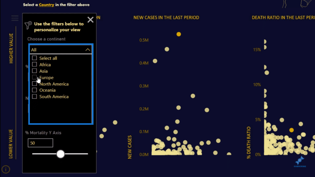
Here, we can drill into more data further. We can choose a continent and put all these additional filters on very easily. The visualizations on the report will then change and show the results based on those selections and filters.
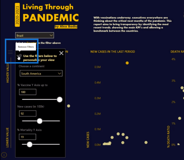
One great feature that I love here is the ease of removing the filters. We can just click on this funnel-like button and we can get back to the initial state. This was purposely placed here for ease of use and ease of navigation.
Furthermore, Alex hasn’t used the standard axes that are available. He’s done some customization on the charts by having this bar down the left side of the page, and it just takes up less real estate on the report.
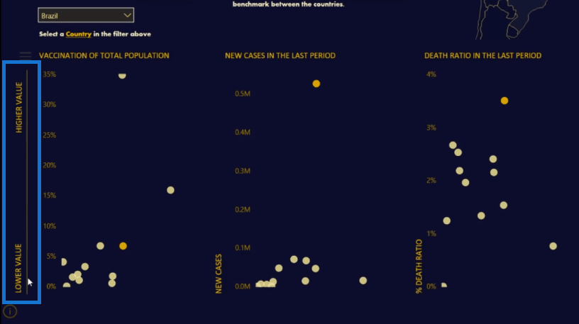
Everything done here has been positioned in a way that can make everything fit in well together and it looks really compelling.
In addition to the filter above, we have another great navigation too on this report – the filters on the side. Here, it is using the real estate on the right-hand side.
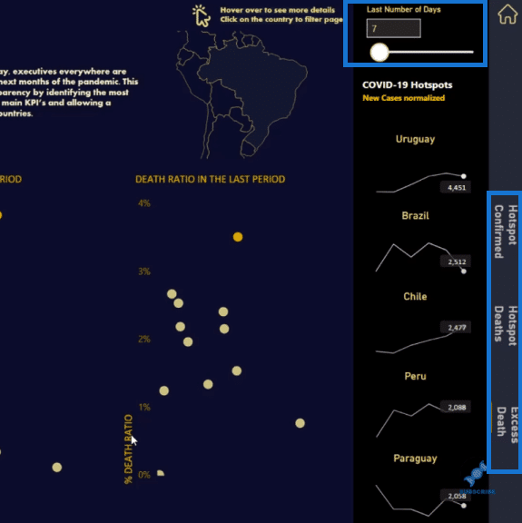
We can click through these filters and they open a new box, which shows more information. You’ll see here that we’re not going to a different page. We’re literally on the same page, but it’s giving new and interesting insights.
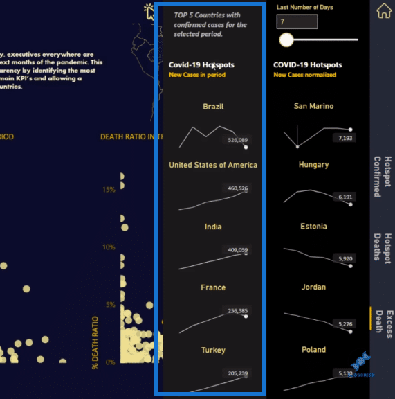
If we want to go back, we can just click on this Home button in the upper right corner of the page.
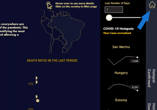
And then we have this map visualization, which also changes as we select a country. I love the way that this shows us the country geographically and it has tooltips embedded as well. Here, er can dive into insights about countries.
The Data Model Structure
Now let’s have a look at the data model and see how these Power BI applications are created.
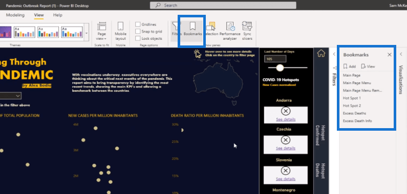
Alex made this amazing report simply with bookmarks. On the Power BI desktop, you can go to the View tab, where you can find Bookmarks. You can see that all these things are laid out via bookmarks, so it’s all on one page.
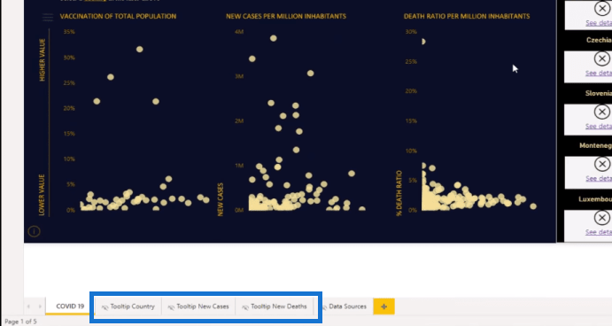
The tooltips, on the other hand, are on different pages, which are so easy to set up as well.
So, I click through the bookmarks, you’ll see that we have the Main Page. This main page menu only shows up when we’re on the Main Page Menu, and then we have another bookmark that works with all the filters.
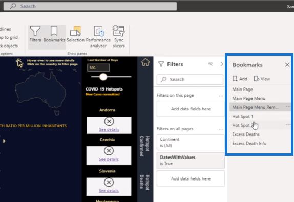
We don’t need to create multiple pages for everything. We can easily create a one-page seamless navigation experience using these bookmark features. We can always set a bookmark that takes us back to stage one if necessary.
The other interesting thing here is the tooltip. This is a great way to represent data in so many new and different ways. You can just click on a visualization and then you can add the tooltip.
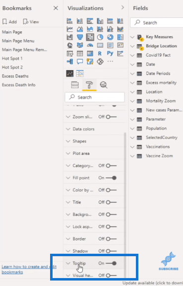
These tooltips have been added to all visualizations in the report. It is quite a seamless process.
***** Related Links *****
Power BI Bookmarks To Change Views On Report Page
Creating A Visual Tooltip In Power BI
Power BI Reporting Techniques: Setting Up Application-Like Reports
Conclusion
This is one of the best Power BI applications I’ve seen developed on the Power BI desktop. It’s indeed very impressive in terms of navigation, information, and visual appeal. It’s packed with data and details, yet everything is laid out neatly and effectively.
You can easily achieve this high-quality one-page report by using bookmarks and tooltips. It’s not difficult to do at all.
If you want to learn more about Power BI bookmarks and tooltips, check out the links below.
All the best,
Sam


