In this tutorial, I’m going to show you how the Power Apps forms and data cards within the detail screen work.
One of the biggest benefits of using Power Apps is its ease of use on your end as the one building the app. But an even bigger benefit is having control over how efficient the experience will be for the users of your app. That’s something that this tutorial can address.
Exploring The Detail Screen
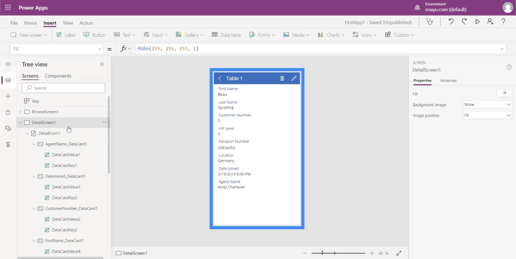
First, let’s go to the details screen. Just go to the left pane and choose the right item under Screens.
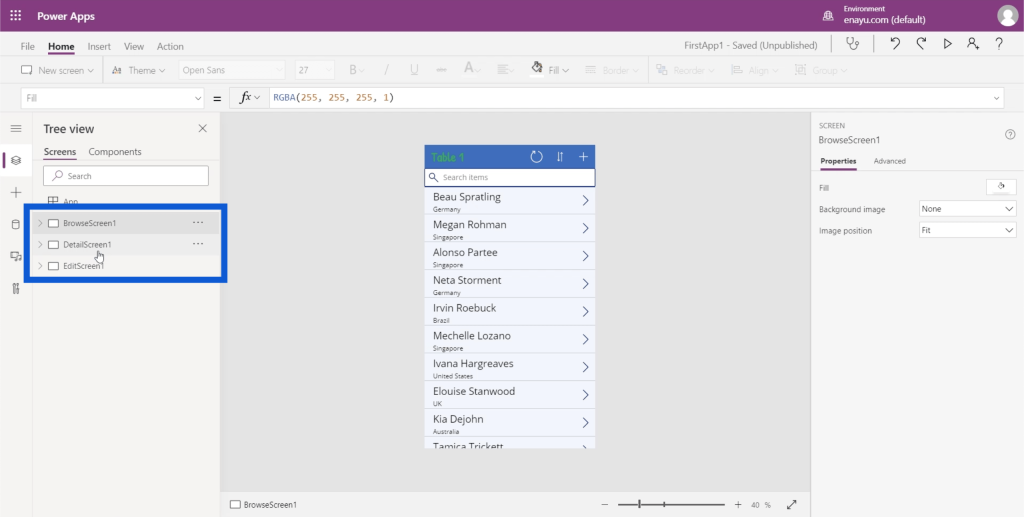
Once you’re on the detail screen, you’ll see a number of elements showing up under it. In this case, there’s a detail form showing up. This form covers the big rectangle on the app containing all the information.
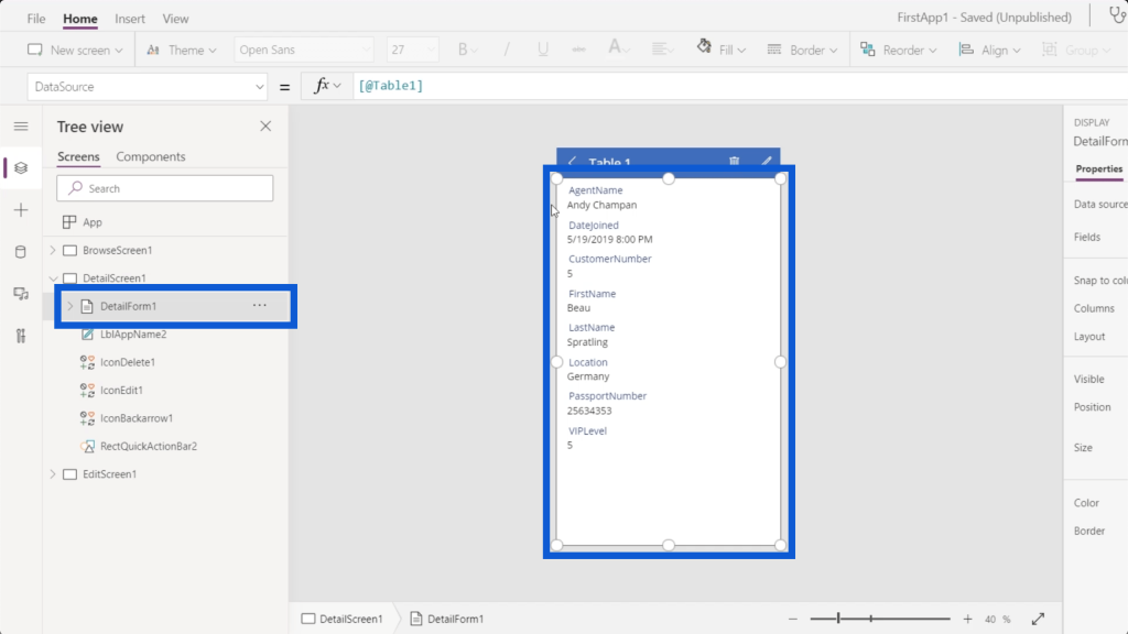
The title of the page is also an element within the detail screen, which is called LblAppName2. On the actual app, this is where it says Table 1.
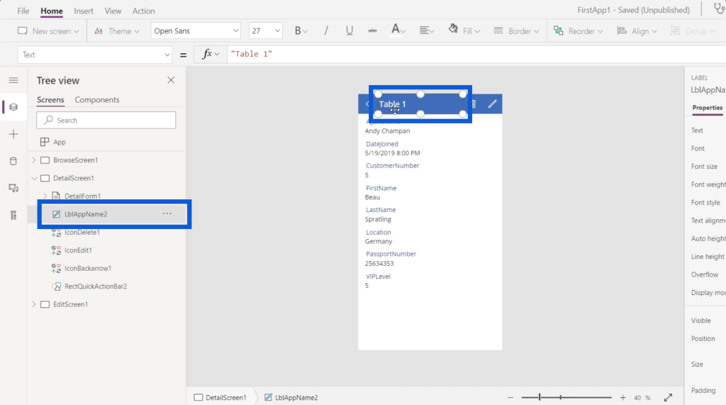
The app also shows a number of icons like the left arrow, the trash icon, and the edit icon. As you can see on the left pane, each icon is also represented by individual items under DetailScreen1.
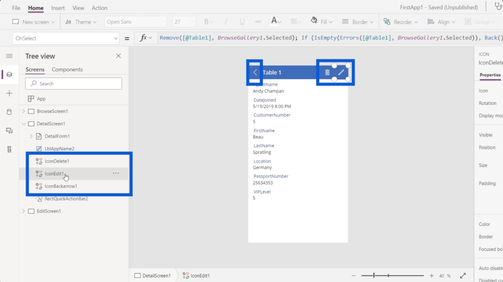
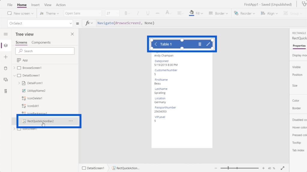
There’s also an action bar at the very top where the title and the icons are found. Looking at the list on the left, this is represented by the item RectQuickActionBar2.
When I click on the detail form on the left, you’ll see data cards showing up underneath it. Each of these cards have a value and a key.
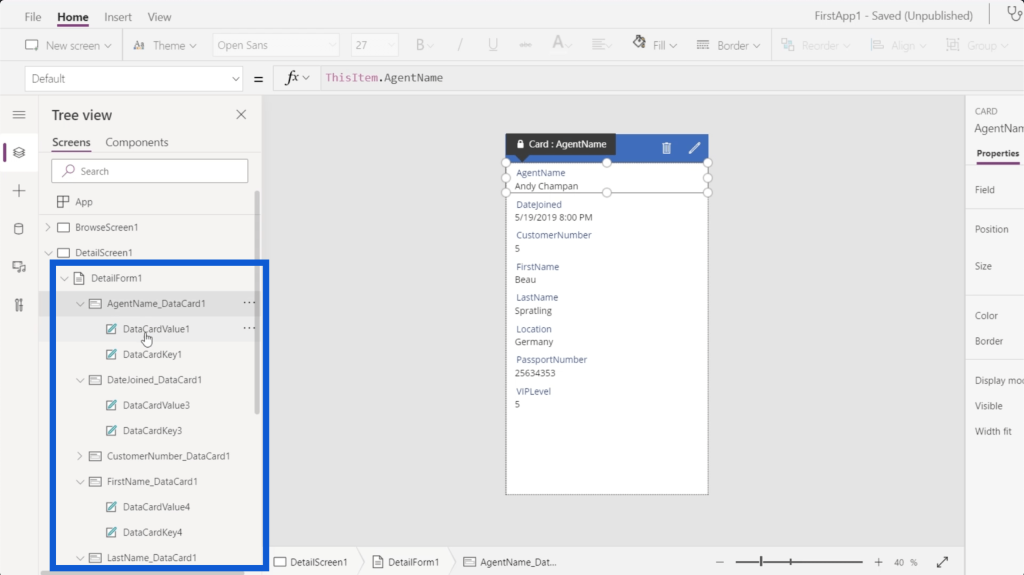
The key represents the column name on the data source, while the value is the actual record in the column.
Power Apps Forms Properties Pane
Every element in your Power Apps forms has a set of properties that you can tweak as needed. These properties are simple enough to understand and can go a long way in terms of improving the way your app looks and works.
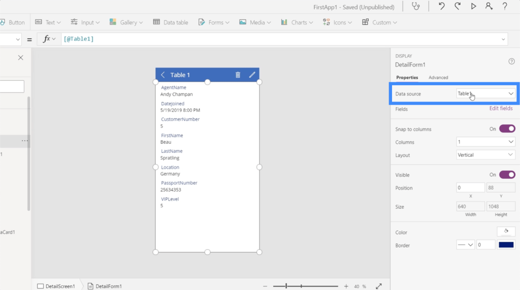
Right on top of the Properties list, you’ll see the data source. Here, it shows that we’re getting our app data from Table 1. I also discussed how to add a data source to your Power Apps in a previous tutorial.
The next item on the list is called Fields.
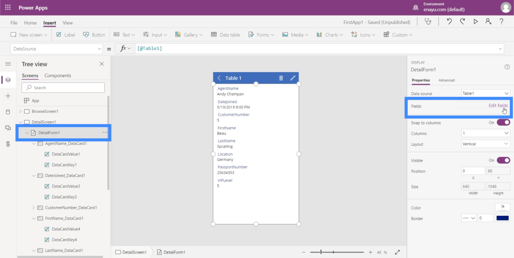
When you click on the button that says “Edit fields”, it shows you an entire list of the different fields on the app.
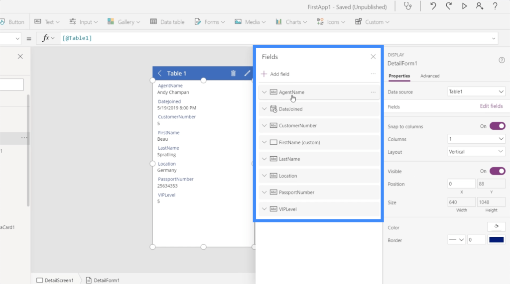
You can easily move these fields around. So let’s say we want the First Name and Last Name on top, for example.
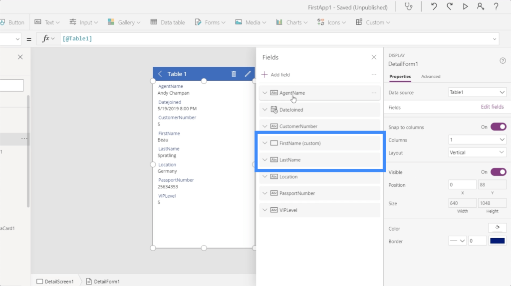
Just select the field and drag it across the list until it reaches the place where you want it to be. As you can see, the order of the fields on the app itself automatically changed, too.
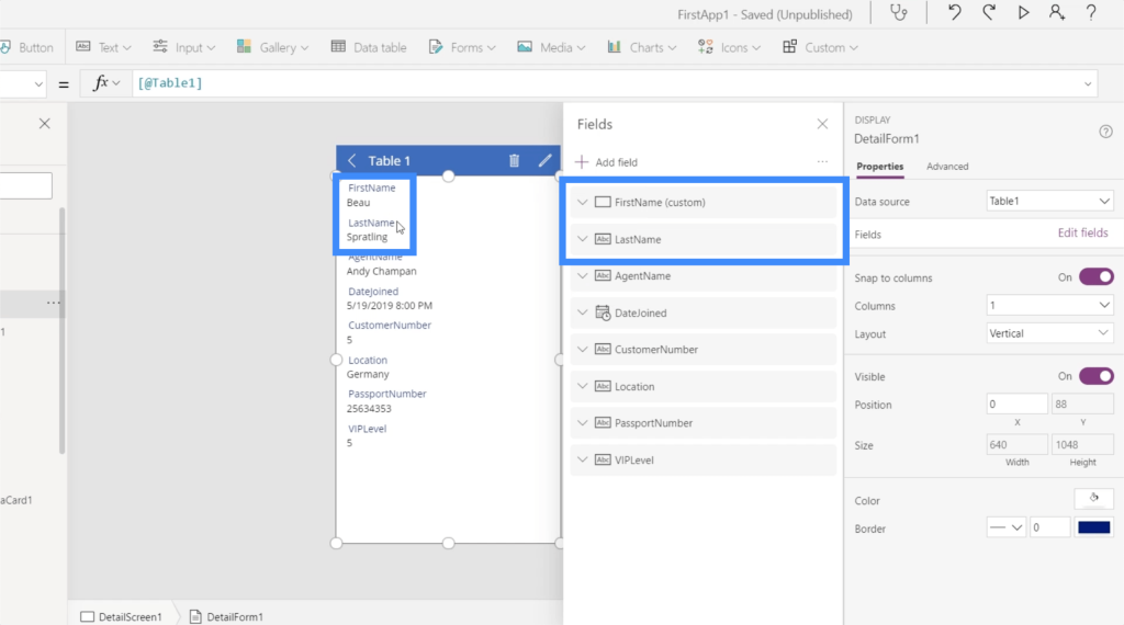
This is another great thing about Power Apps. You don’t even need to do any coding. Everything is intuitive. You just need to drag and drop elements around and toggle some things on or off.
To make the fields on the app more logical, I’ll put customer number, VIP level, passport number, location, date joined, and agent name after the first and last names.
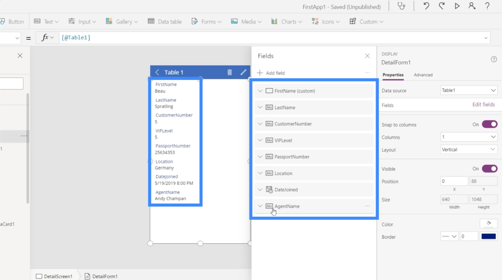
You’ll notice that each field gives you the option to further expand each item.
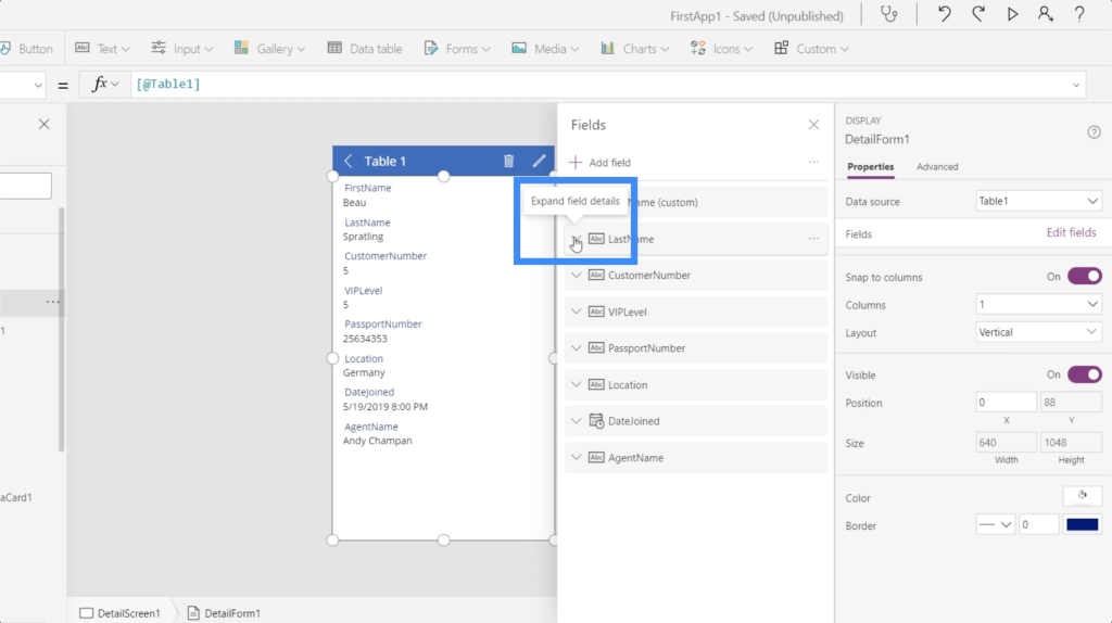
This opens up even more options on how each field can be customized.
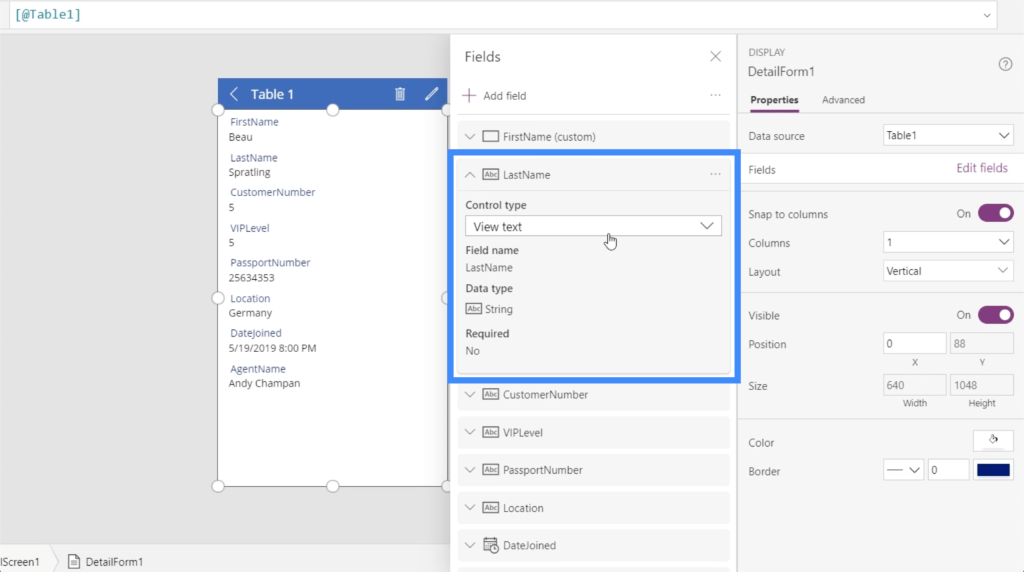
Looking at the Last Name, for example, it gives you the option to view that specific field as text, as a phone number, as an email, or as rich text.
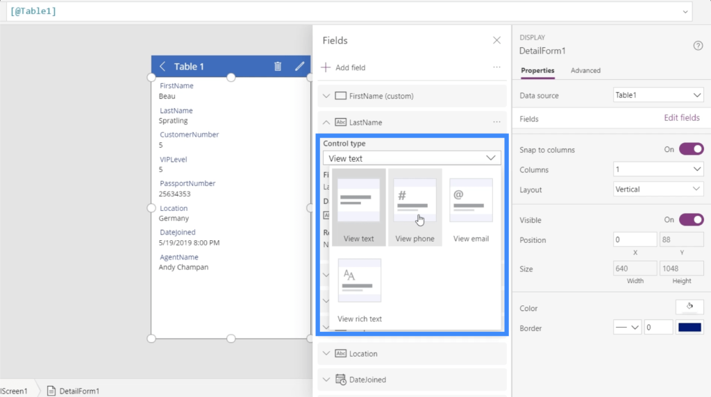
Let’s go to the passport number to try that out. I’m going to change the control type and make it a phone number.
The moment I do that, the passport number changes into a link that automatically dials the number when I click on it.
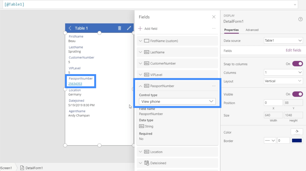
This means that when this app is up and running, you can directly contact each person right from inside the app as long as you have their contact number in the form.
Going back to the Properties pane on the right, there are a number of other options for customization available.
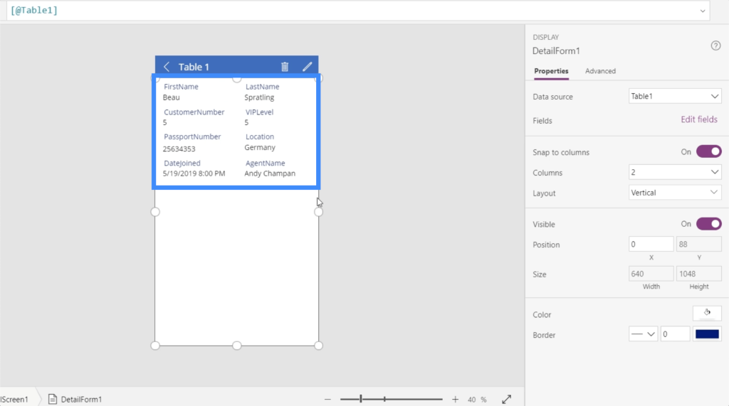
For example, I could split the data in the form into multiple columns through this dropdown.
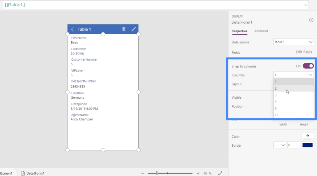
So if I pick two columns, it splits the fields on the detail screen into two columns.
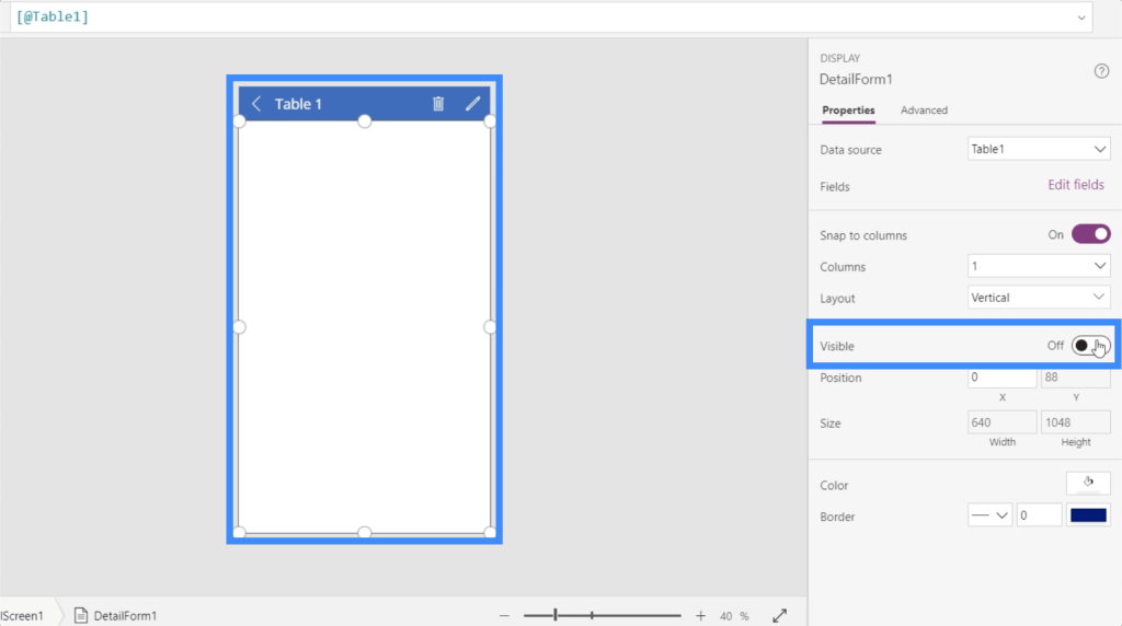
There’s an option here to make specific fields visible or invisible just by toggling this item on or off.
Other things that can be changed under Properties would be the colors and borders, among other things.
Changing Display Names In Power Apps Forms And Data Cards
This time, let’s take a look at the display names on the app. Notice that there are no spaces in between the names. So we see FirstName, LastName, CustomerNumber, etc.
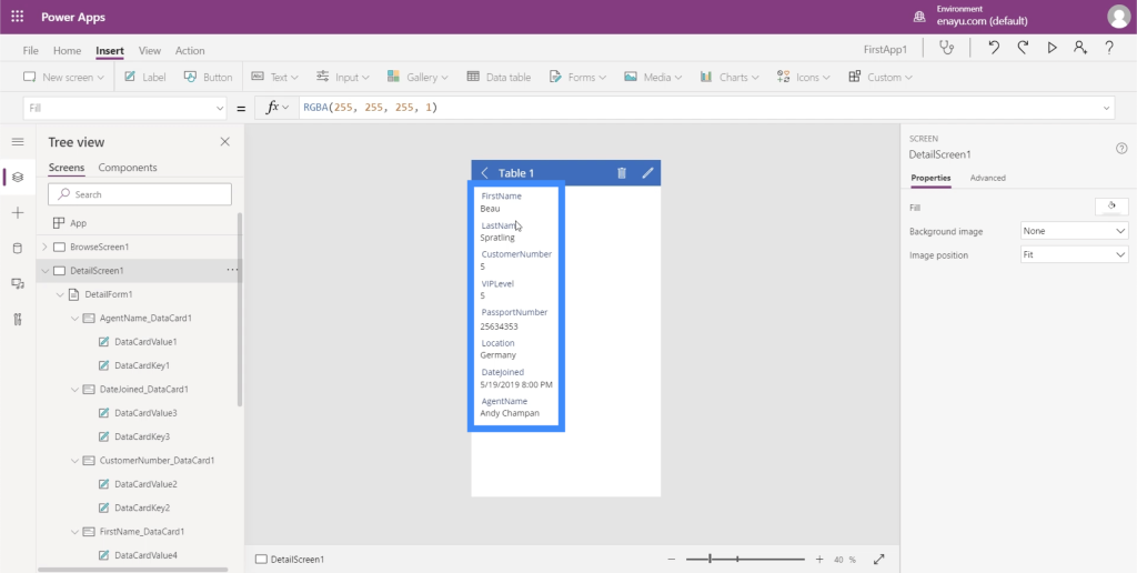
That’s because each of these names corresponds to their column names in the Excel file here that serves as the data source.
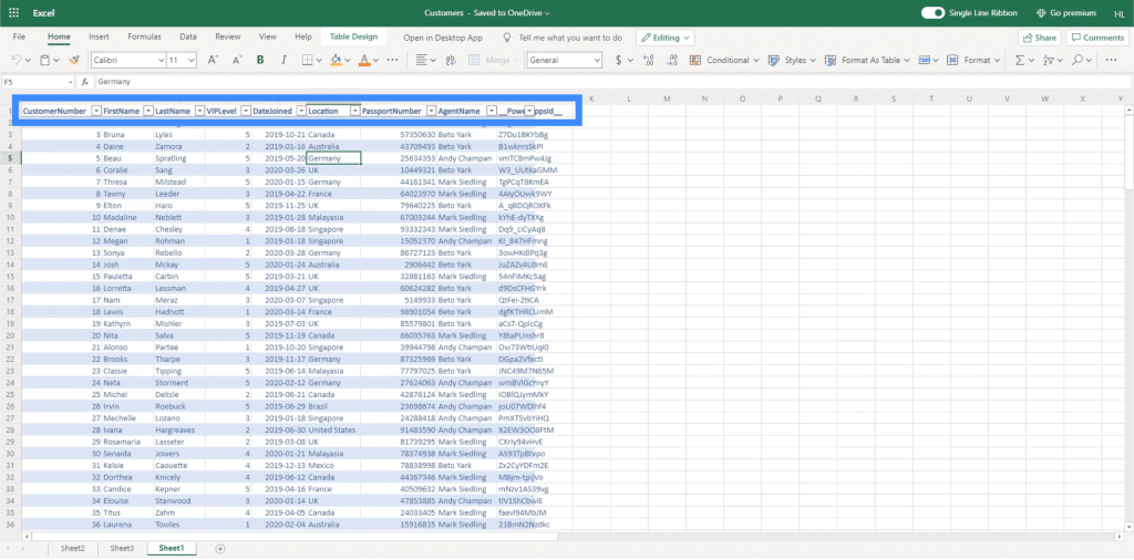
Of course, we don’t want users to see the display names like this. To make everything easier to read, we’re going to change these display names and write them in the proper format.
First, click the corresponding data card. I’m going to start off with FirstName. Again, we see that there is a value and a key within this card.
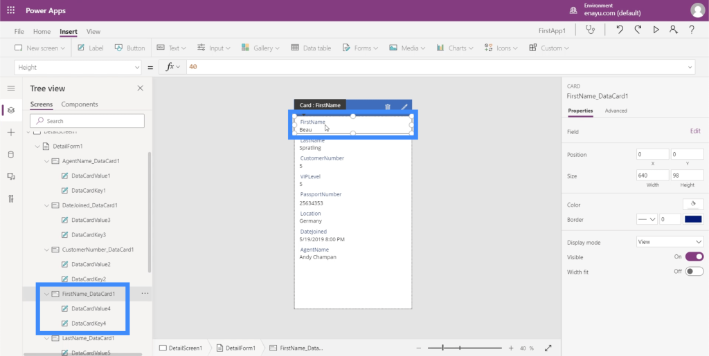
As mentioned earlier, the key is based on the column name on the data source.
Once the right element is highlighted on the app, click on Advanced on the right pane.
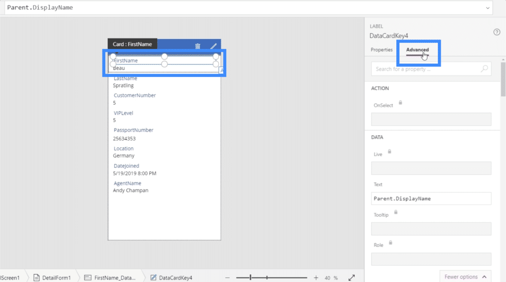
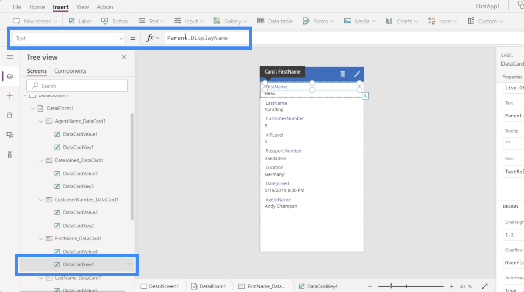
Here, we see that the Text shows Parent.DisplayName.
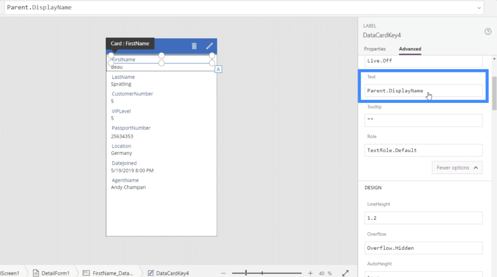
This tells us that it’s basing this on the parent field, which is FirstName_DataCard1. If we check on the Display Name, it shows the value “FirstName”.
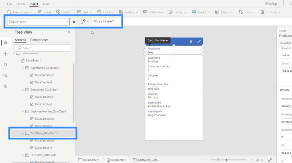
In other words, the data card key is taking whatever display name is being dictated by the data card itself.
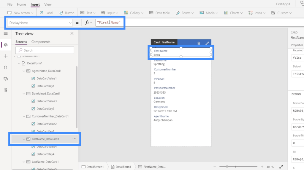
There are two ways to change this. The first and easier way is to simply highlight the parent data card and add a space on the display name. As you can see, this automatically changes the name on the app itself. It now shows “First Name” instead of “FirstName”.
The second way of doing it involves replacing the dynamic formula on the data card key into a static formula.
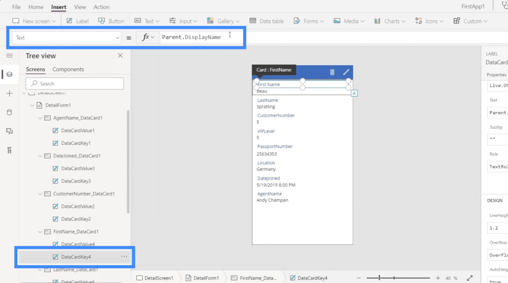
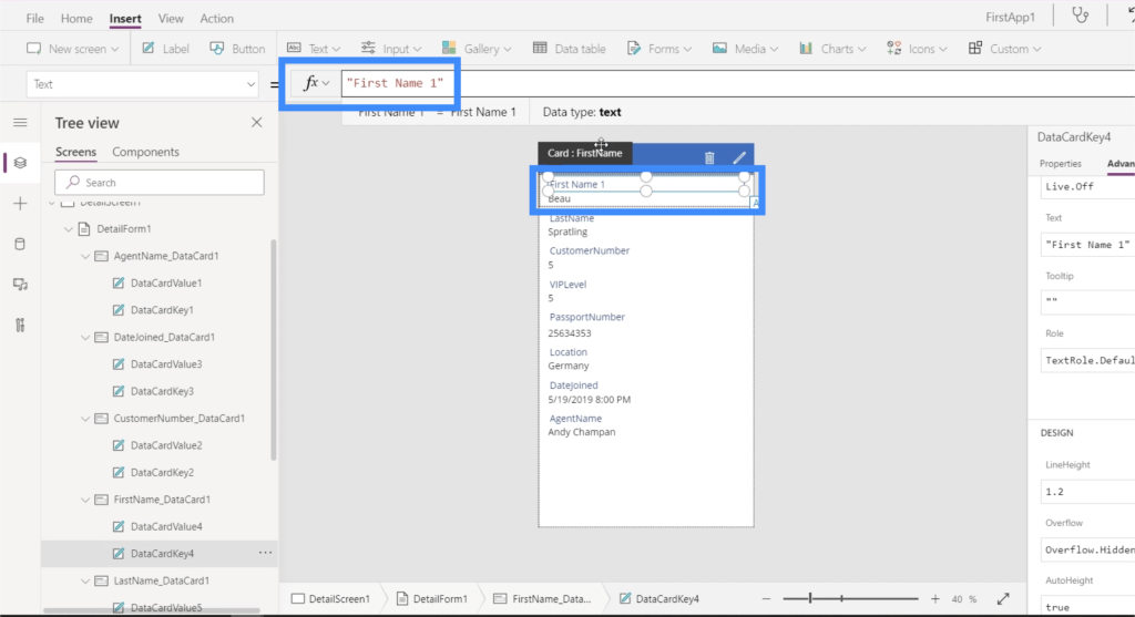
Making sure that DataCardKey4 is highlighted, which is the key under the data card for the First Name, I’m going to delete the formula Parent.DisplayName and change it into “First Name 1”. Again, this automatically changes the display name on the app itself.
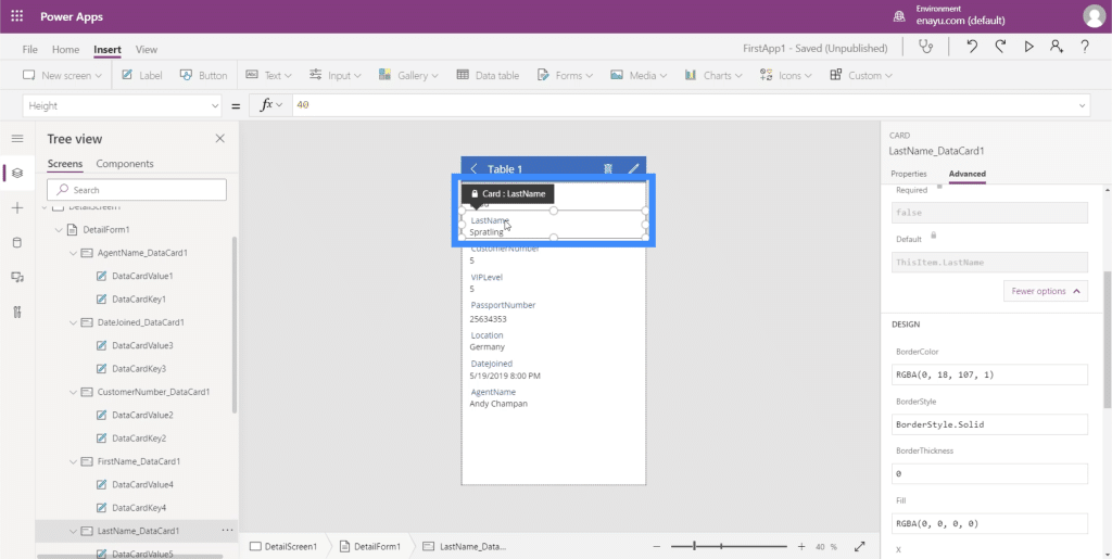
There will be times when the cards are locked and you won’t be able to change anything. You can check whether a card is locked by looking for the padlock icon.
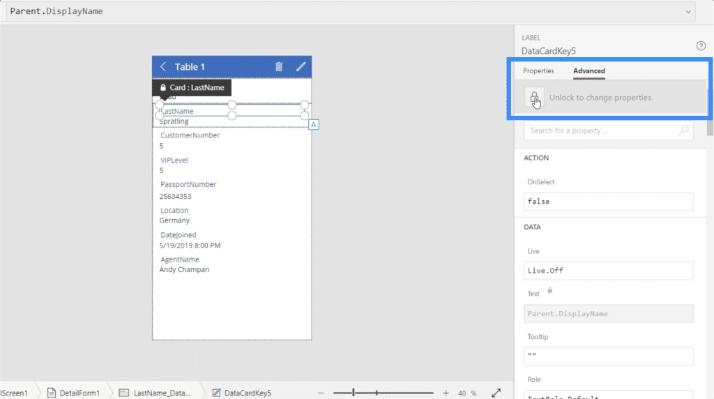
Since the LastName is locked, I’m going to highlight that card and go to Advanced. There’s an option here that says “Unlock to change properties”.
Once I click on that, it will now allow me to change the LastName and add a space in the display name. Again, I’ll do that by going to the parent card and changing the display name.
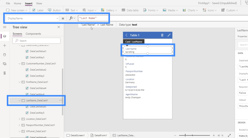
I’m going to do the same thing for all the other fields. Once all of those have been changed, you’ll see that the entire detail screen is now easier to read.
***** Related Links *****
Power Apps Introduction: Definition, Features, Functions And Importance
Power Apps Environment Setup: Connect To OneDrive & Google Drive
Power Apps Environments: Setting Up The App Elements Properly
Conclusion
Power Apps truly is a great platform anyone can use to make data more accessible to different users. The ease of use you saw here does not just apply to the Power Apps forms and data cards. The same thing can be said to all the other functions that this platform has.
I have created other tutorials that could help you master Power Apps step by step. Once you learn the ins and outs of this platform, you can appreciate yet another great way to deliver data to your intended audience.
All the best,
Henry


