
In this tutorial, I’m going to show you how to properly lay out your Power Apps Environments.
One of the biggest advantages to using Power Apps is the amount of customization options, allowing you to decide how to lay everything out. The goal here is to help you become more familiar with every part of the Power Apps environment so that you can maximize your app’s use.
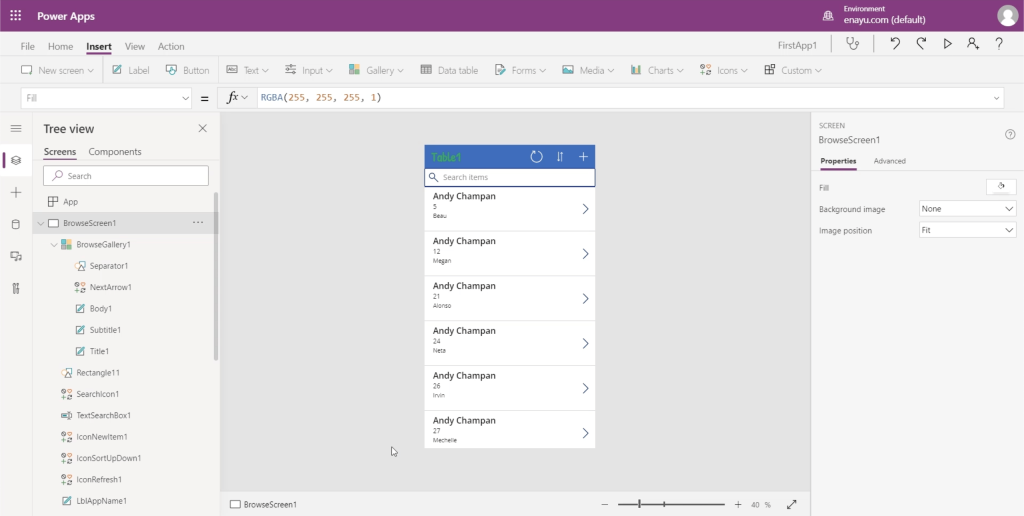
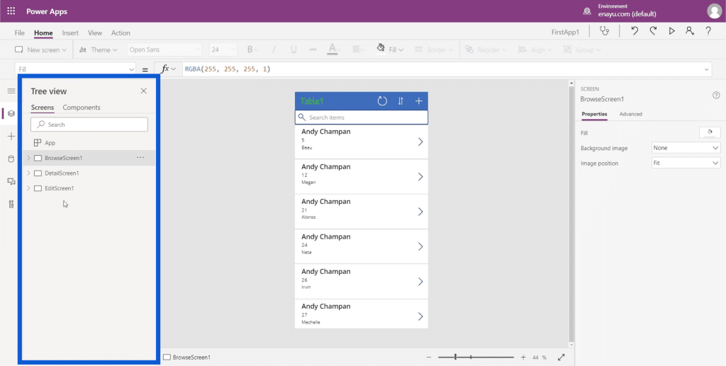
This is how your Power Apps development environment looks like.

I’ll create separate tutorials that will describe and demonstrate in detail how each part works. But for now, I want to concentrate on what these different parts do and what they’re responsible for.
The Middle Pane Of Power Apps Environments
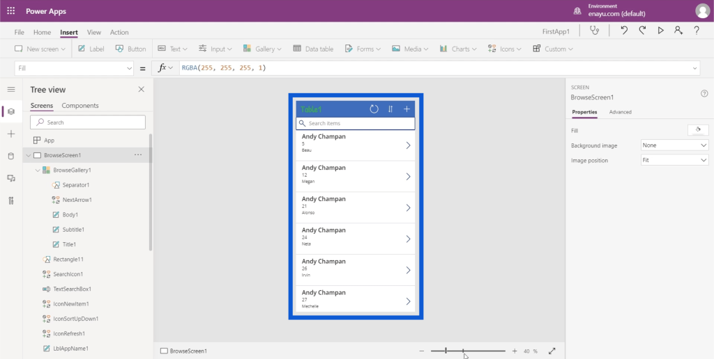
Let me start with the middle area. This is where you can see the app you’re building.
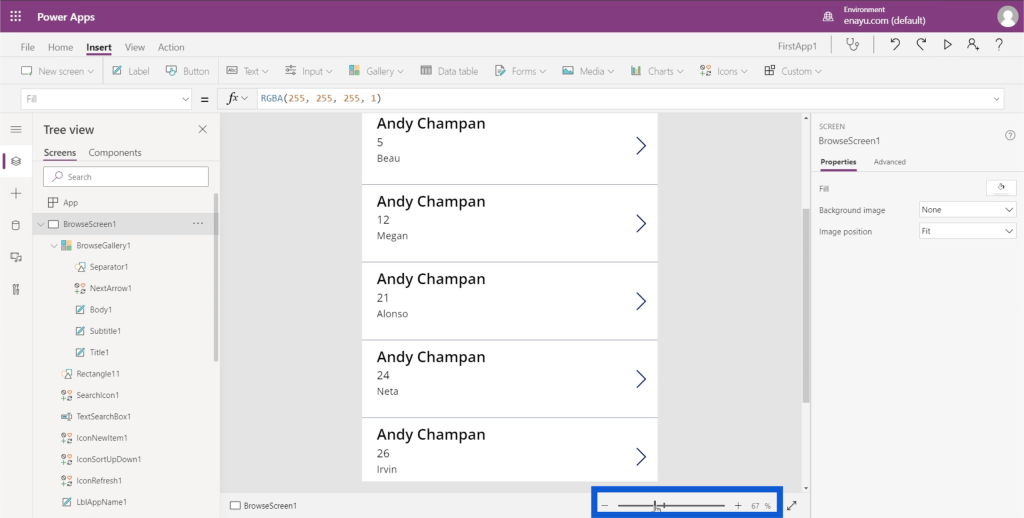
There’s a zoom slider at the bottom that you can use to change your view and allows you to zoom in and out of the app.
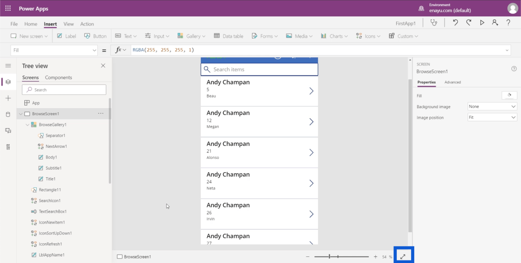
There’s a double-headed arrow right beside the zoom slider, which allows you to expand the app screen so that it fits the entire window.
Screens, Elements And Sub-Elements
The left pane shows the different screens within the app you’re working on. At the moment, it’s arranged in “Tree view”, which is the most commonly used view. It shows you how each screen branches out into smaller elements.
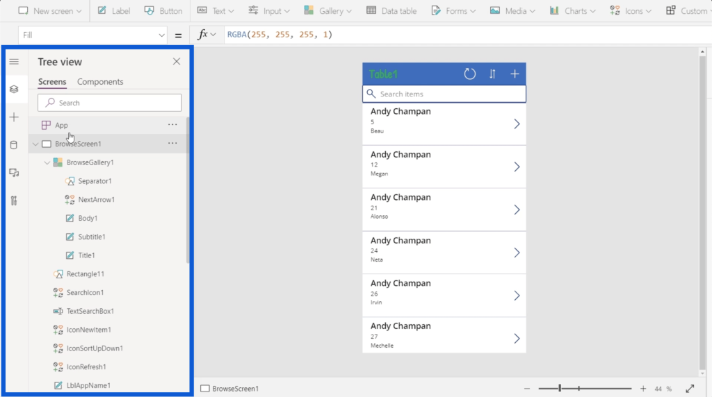
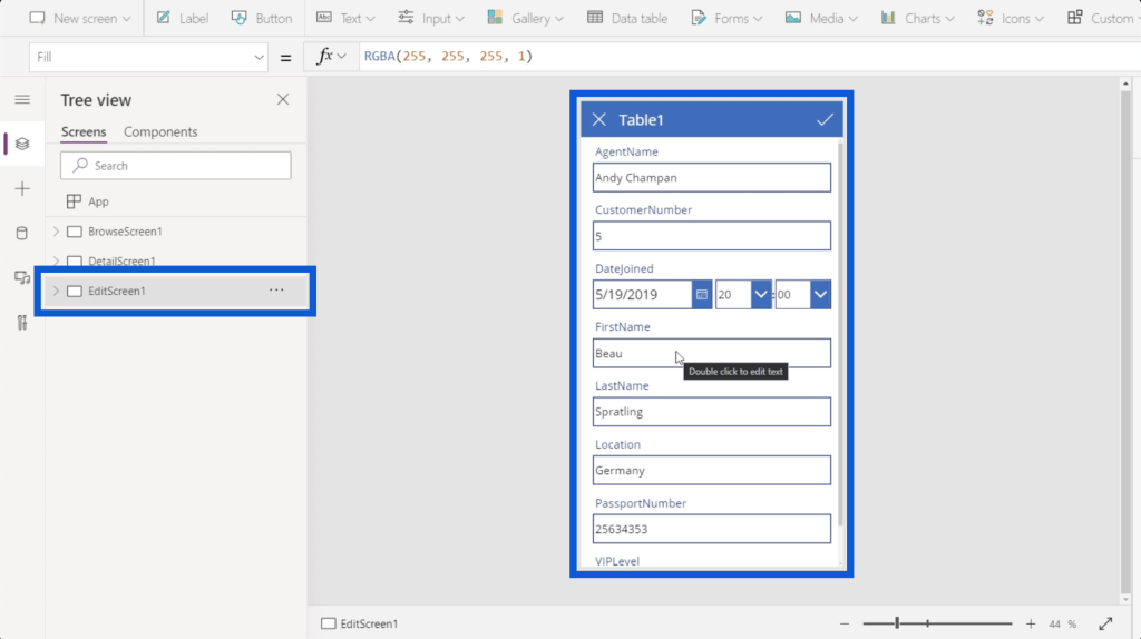
So if I collapse some of the lists here on the left, it tells us that there are three screens on the app I’m currently working on — BrowseScreen1, DetailScreen1, and EditScreen1.

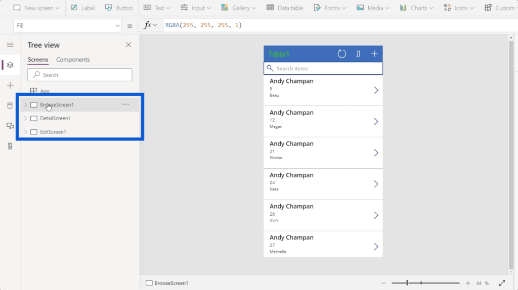
If I click on the first screen on the left pane, it shows me the app’s browse screen. This screen just shows a list of entries coming from my data table.
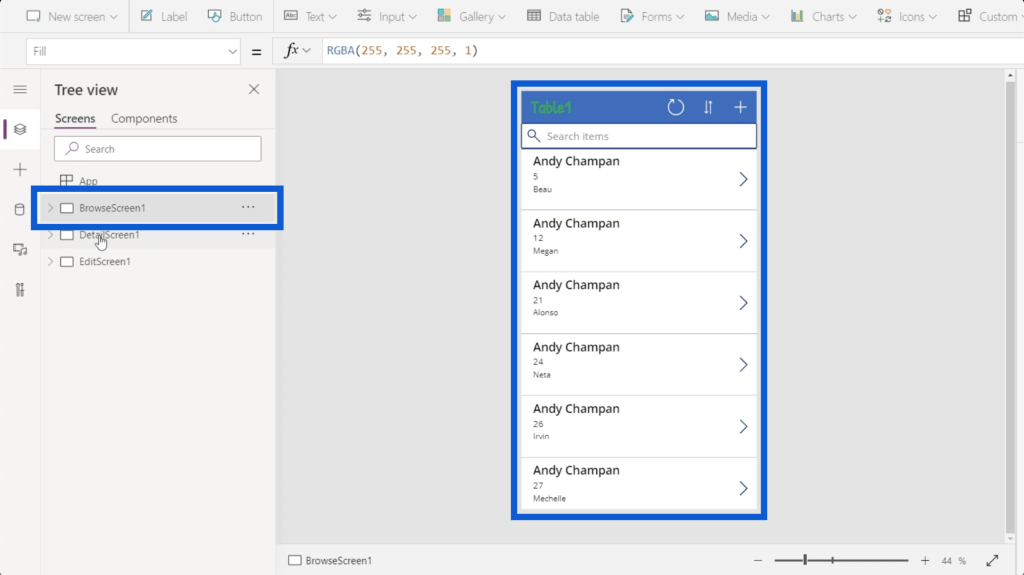
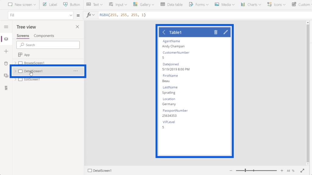
The second one is for my detail screen. This shows the details for each entry on the list on my browse screen.
The last screen is for my edit screen, which allows me to edit specific records or create a new one.
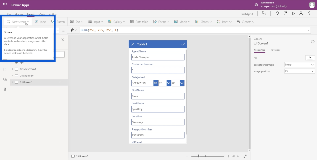
If these three screens are not enough, it’s possible to add a new screen. I’ll go through that in detail later.
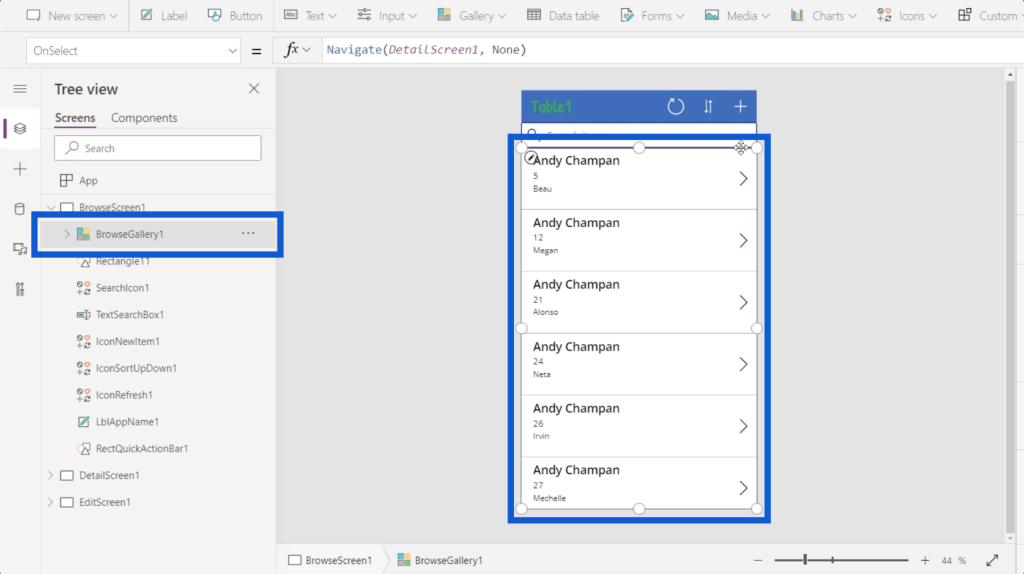
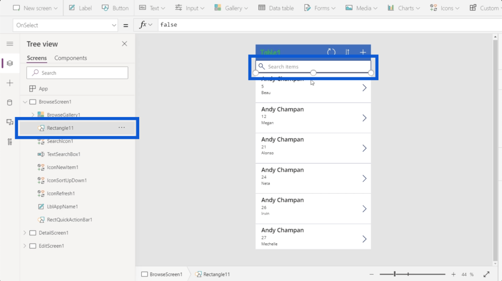
Let’s go back to the browse screen. If I click on the dropdown, it’s going to show a list of all the elements present on my browse screen.
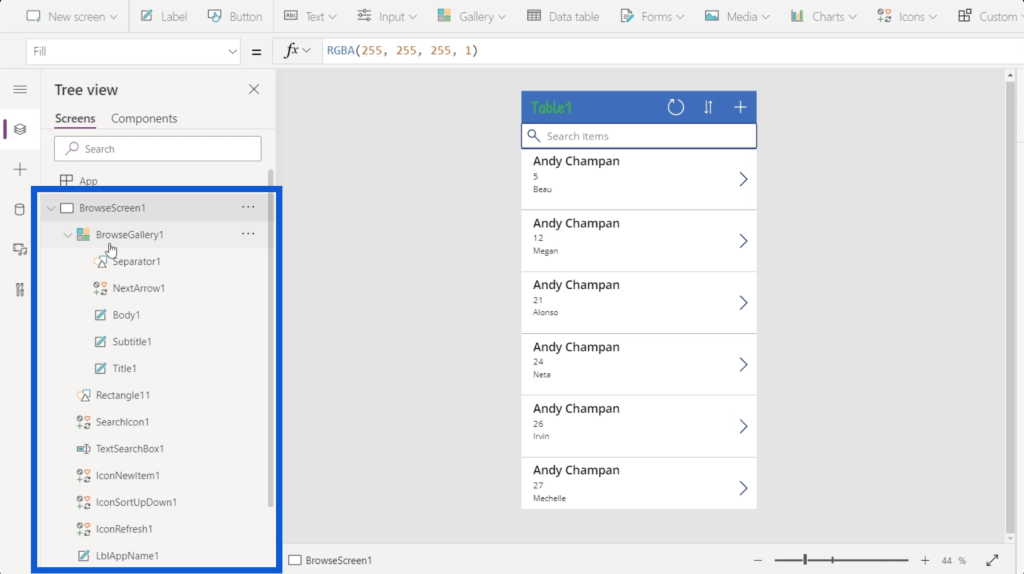
The first element here shows a gallery, which is basically just a list of records. When you look at the app in the middle pane, you’ll see the gallery covers this list of scrollable records.
There’s an object here tagged as Rectangle11, which is just a simple rectangle between the search bar and the gallery.
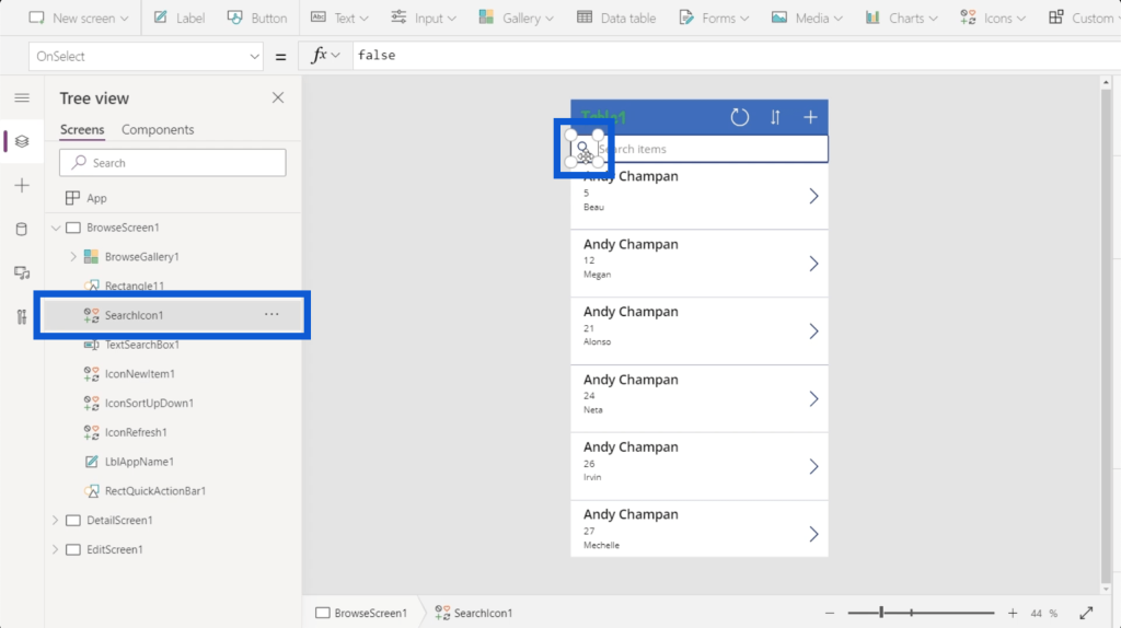
There’s also a search icon which is just an image of a magnifying glass.
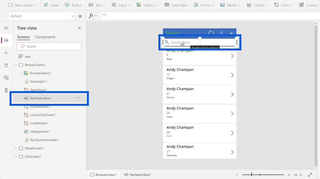
There’s a text box, which is where you can type in text when you search for an item.
There’s a lot more under that, with a long list of elements that stand for every part of the app that you’re building. Microsoft usually builds their tools for intuitive use, so each element is represented by a symbol to show what they are or what they do.
For example, a gallery will be different than a rectangle. A gallery is a list of records, so it’s represented by an icon that shows different windows. A rectangle is a shape, so the icon representing it shows a collection of shapes. A text box allows you to write text in it, so the icon shows a pen.
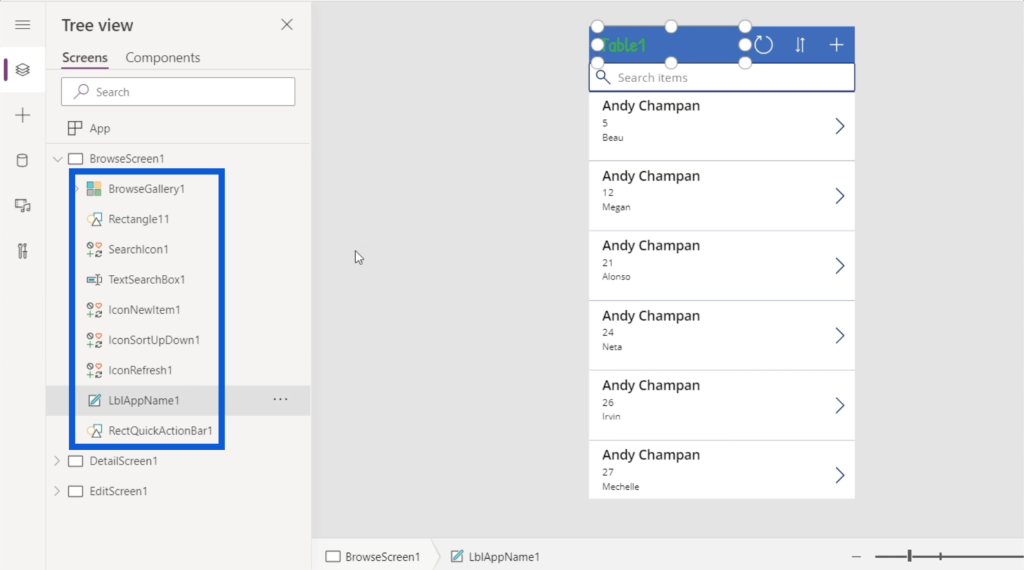
Elements can also have sub-elements. For example, BrowseGallery1 has other elements listed under it. This makes sense knowing that the gallery has a lot of things going on in the app.
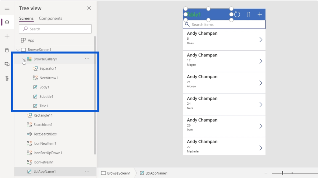
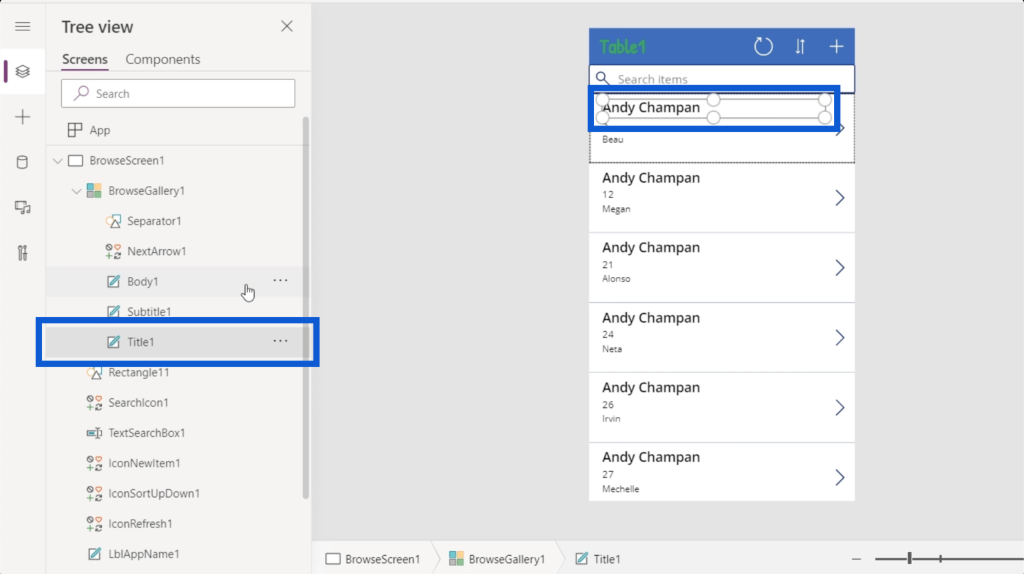
The gallery has an element called Title1, for example, which is the name on top of the gallery record.
Aside from Title1, the gallery record also has a subtitle and a body, as well as a next arrow and a separator that goes in between records. All of these are represented by the sub-elements on the left pane.
When you go further left, you can access a new set of options by clicking on the three lines.

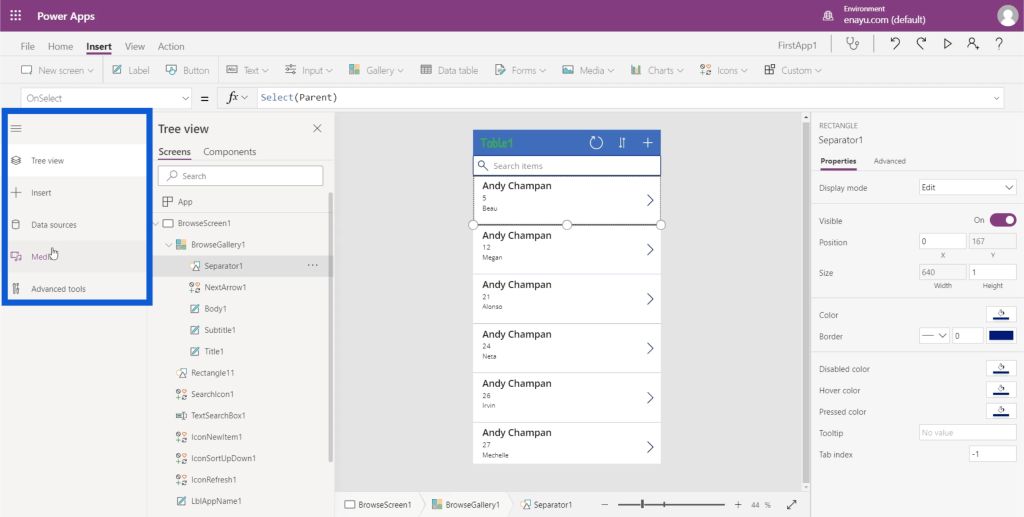
As you can see, the first entry on the menu is the Tree view that we’ve been looking at. It also allows you to Insert other elements.
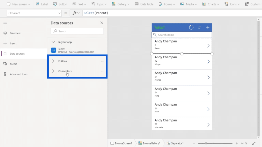
It shows the data sources used on the project as well. In this case, there’s only one data source that’s integrated into the current app. This one comes from OneDrive.
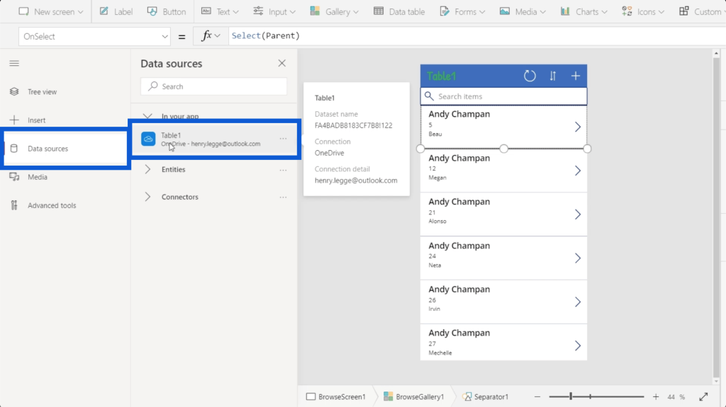
You can also integrate different entities and connectors under Data sources, but this is a more advanced topic that will be discussed in other tutorials.
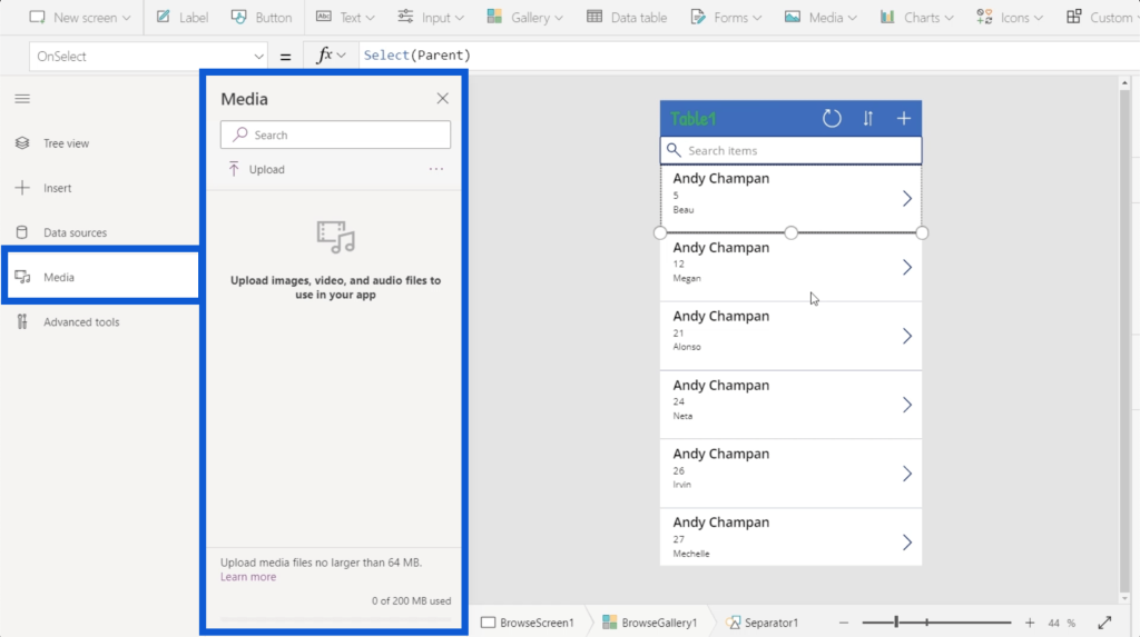
The menu also shows the media used in the app. This is where you can upload images, videos, and audio files.
To collapse that menu, just click on the three lines again.
Ribbons Used In Power Apps Environments
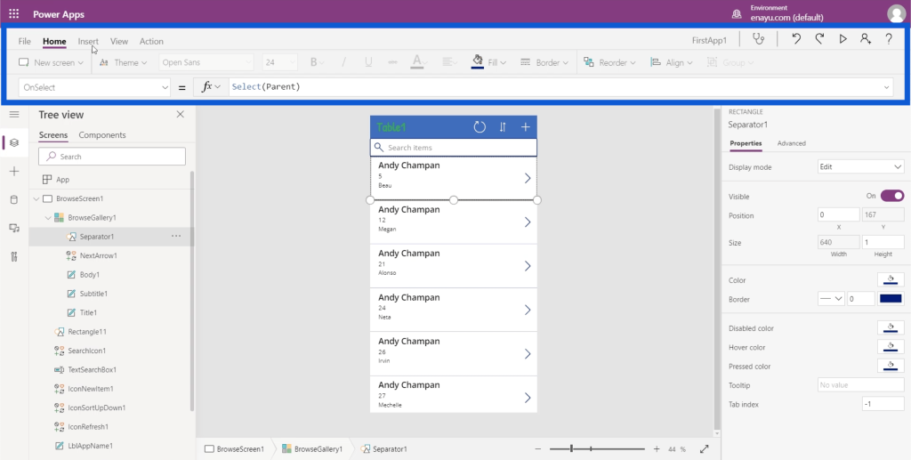
As with any other Microsoft program, the top part usually consists of ribbons. These ribbons offer different actions categorized into different menus.
Let’s start with the Home ribbon.
One of the actions available under the home ribbon is creating a new screen. Just like Powerpoint, there are templates for you to choose from. If you think none of these templates are applicable to the app you’re creating, you can start with a blank screen.
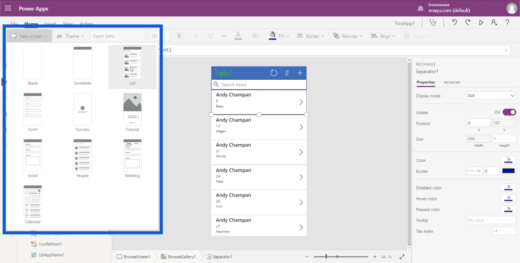
Once you’ve chosen a template for your new screen, you’ll see it added at the bottom of your Tree view.
There are also Themes, which we’ve talked about in a recent tutorial.
You can also select any text on your app and change the font, font size, and font color, or have it in bold, italics, or underlined.
You can also choose how you want your text to be aligned. You can have it left-aligned, right-aligned, or centered.
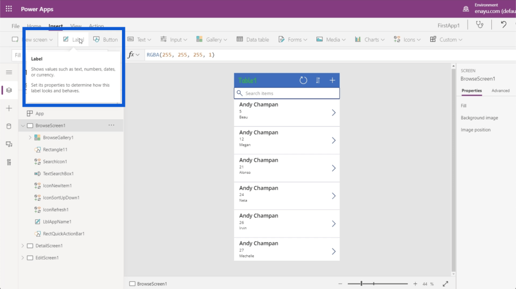
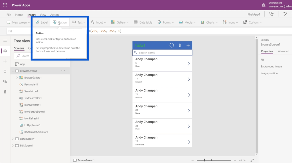
The insert ribbon allows you to add or insert things into Power Apps environments.
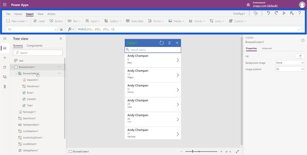
For example, if you want to insert a label element, you can just click the button that says Label and it will insert that element for you.
It also allows you to insert a button.
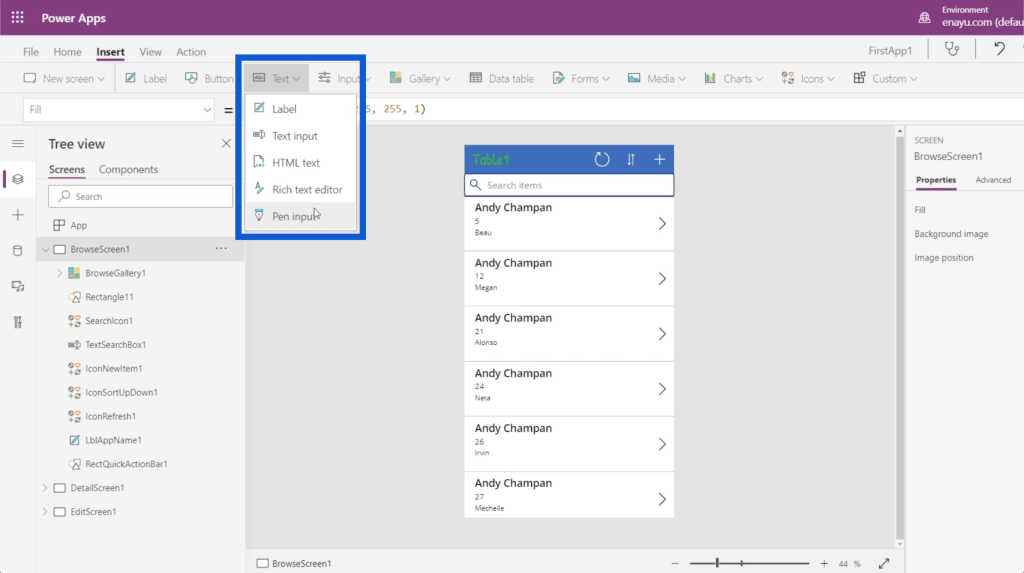
There are different types of text boxes that you can use here. Just click on the dropdown under Text and you’ll be able to insert text inputs, HTML text, pen input, etc.
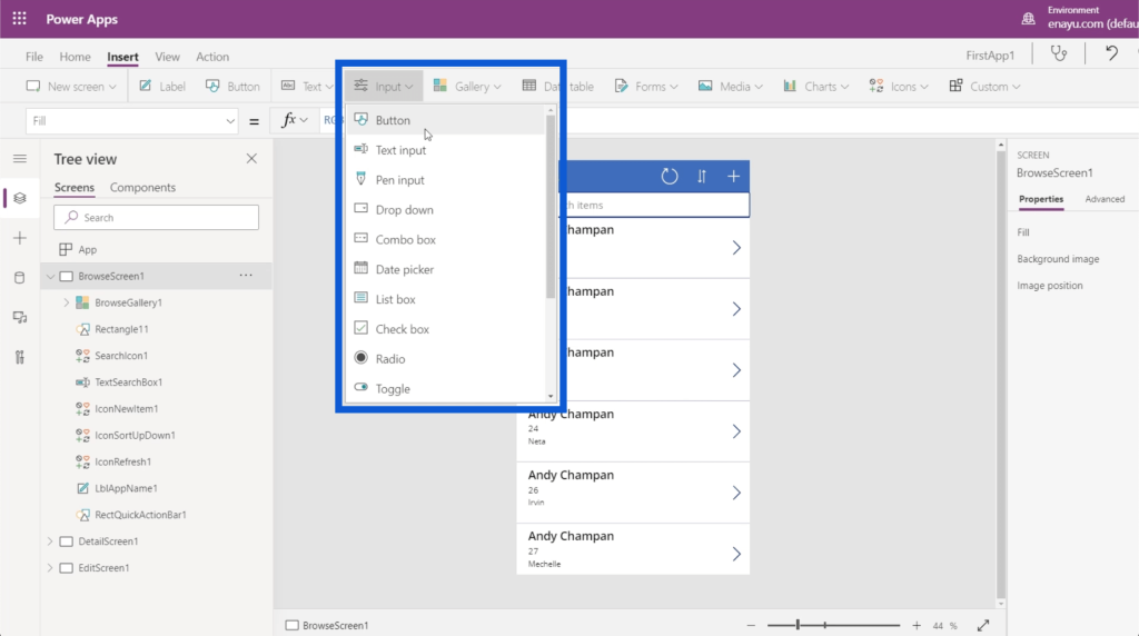
There are also different types of inputs, such as combo boxes, date pickers, lists, boxes, check boxes, and sliders.
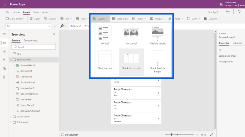
You can choose different types of galleries. Right now, we’re using a vertical gallery for our app. But you can also have a horizontal gallery and could even insert images on the screen.
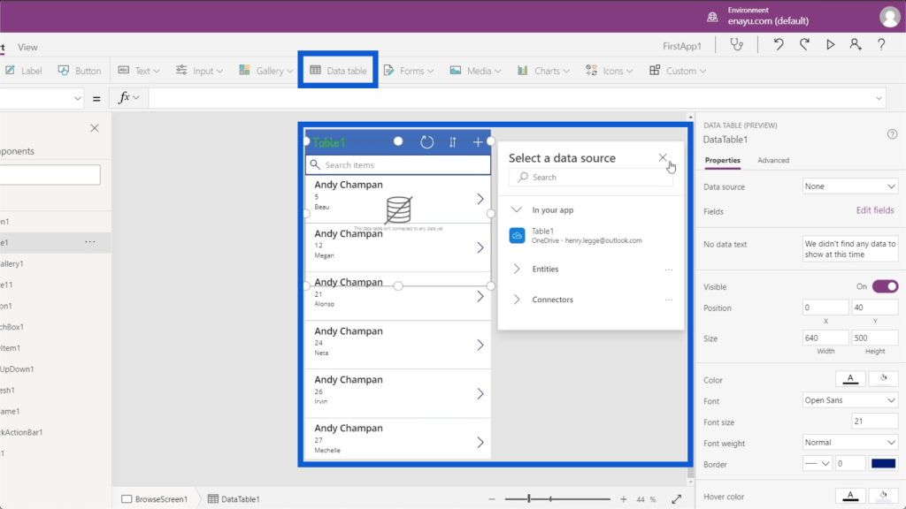
The Insert ribbon also allows you to add data tables, which will be thoroughly discussed in another tutorial.
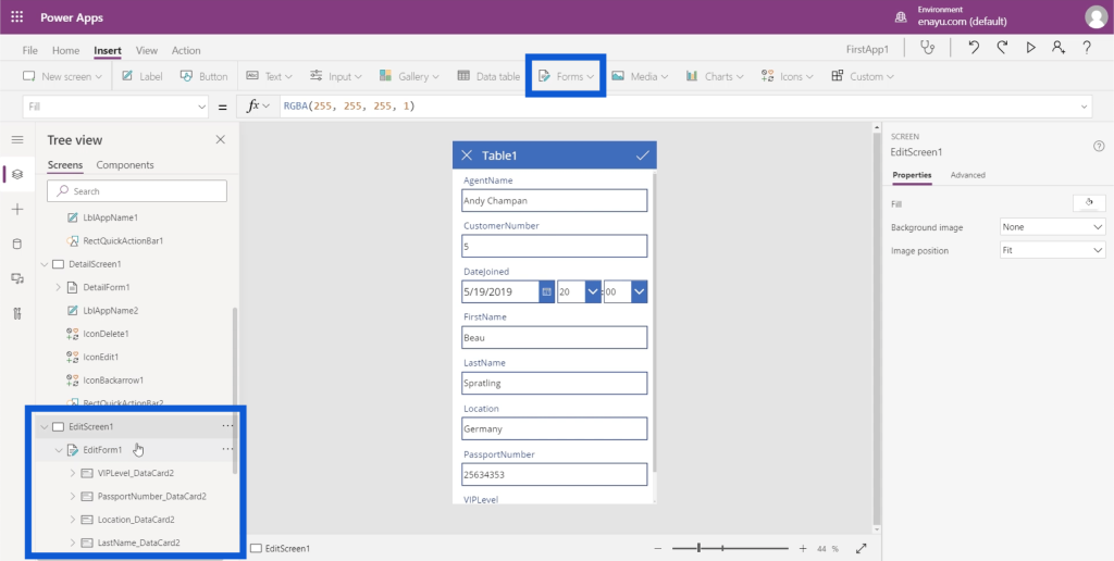
This is where you can insert forms as well. If you remember the Edit screen on the app we’re making, it provides a form where users can manually add data into the app. So just click on Forms under the Insert ribbon, and you can add another form under your screens.
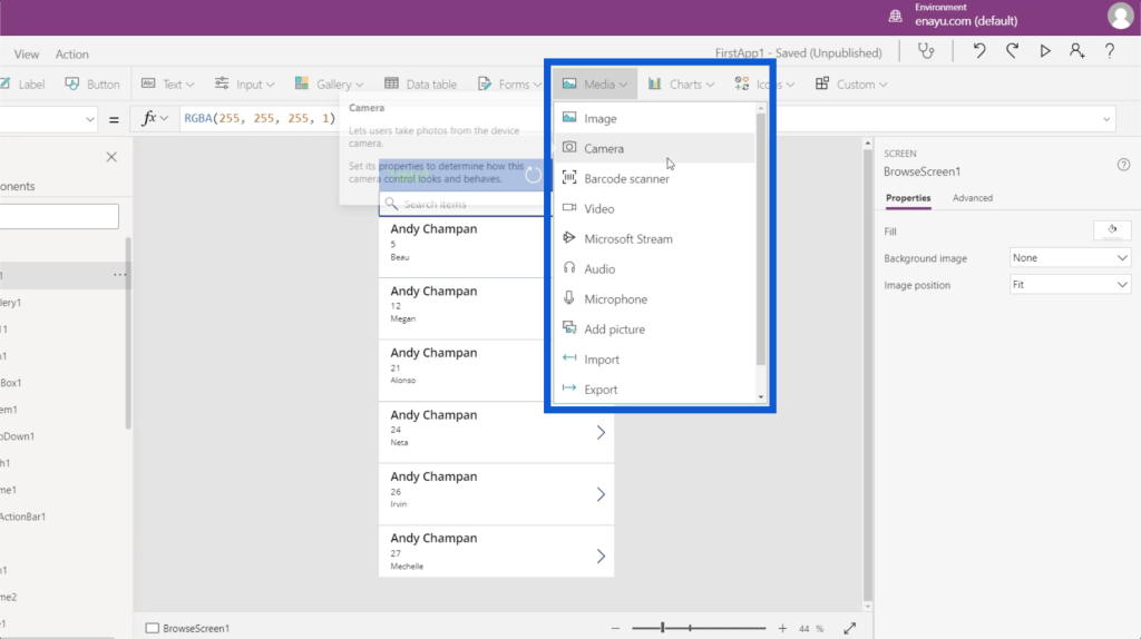
As for media, you can insert images, barcode scanners, videos, and audio. This is also where you can give the app the ability to activate the user’s camera, microphone, and other features.
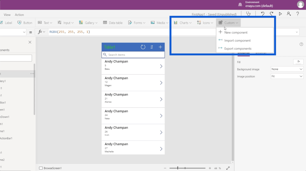
Other things you can add using the Insert ribbon are charts, icons, and custom objects.
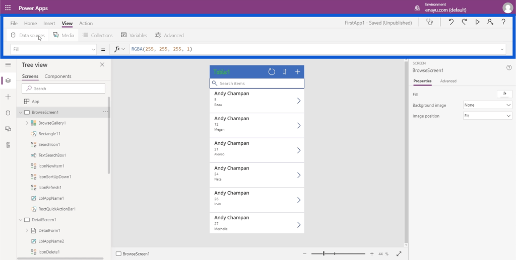
Let’s move to the View ribbon. This allows you to view variables, data sources, and other things relevant to your Power Apps environments.
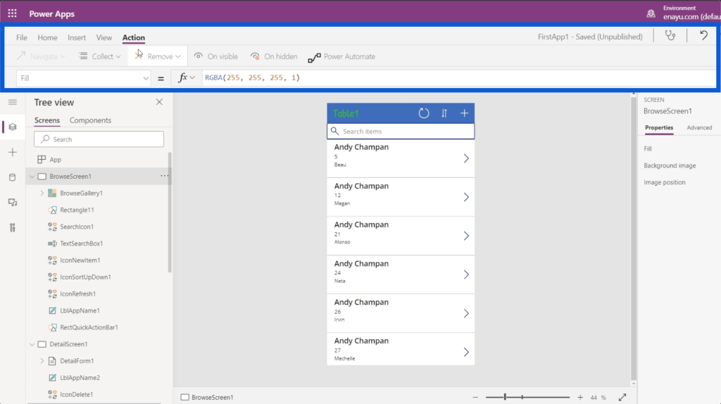
Finally, the Action ribbon allows you to do various automation. Since this is a more advanced part of the topic, we’ll go through that in a different tutorial.
Changing Properties Of App Elements
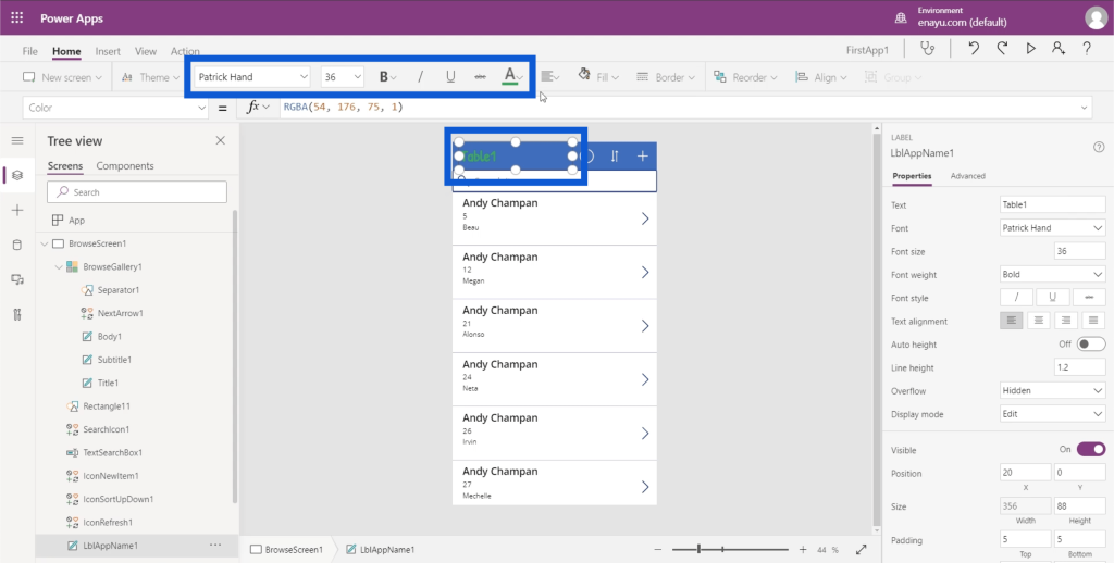
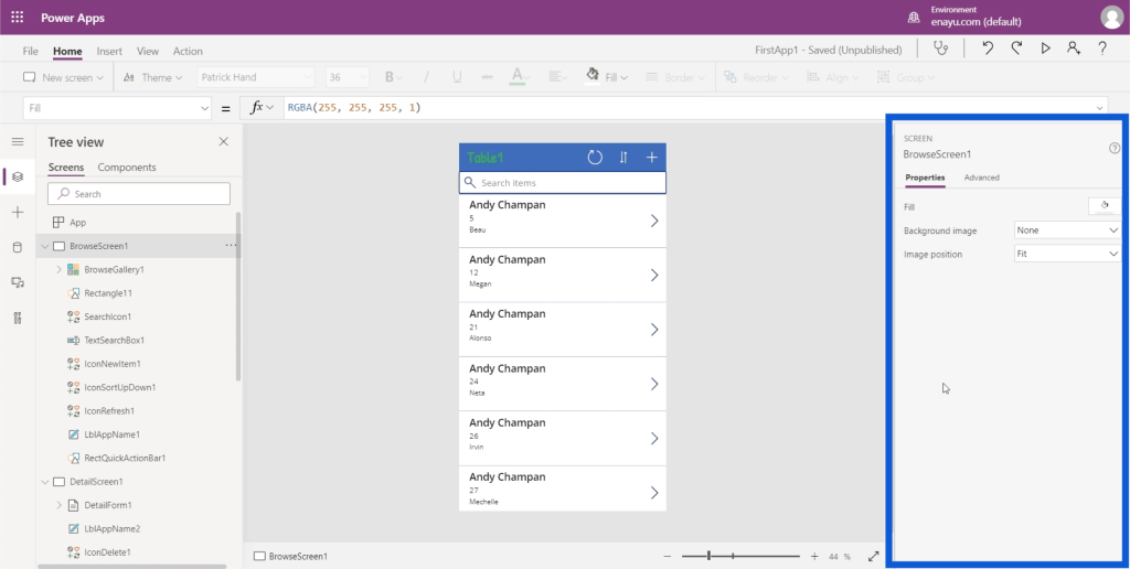
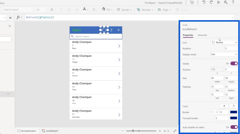
The final thing that I want to talk about is the right-hand side of the screen, which shows the Properties pane.
Each element used in the app has corresponding properties. Let’s say we want to change the heading on the app that says Table1. You can either click on the specific element here on the left pane for LblAppName1 or click on the element itself on the app to highlight it.
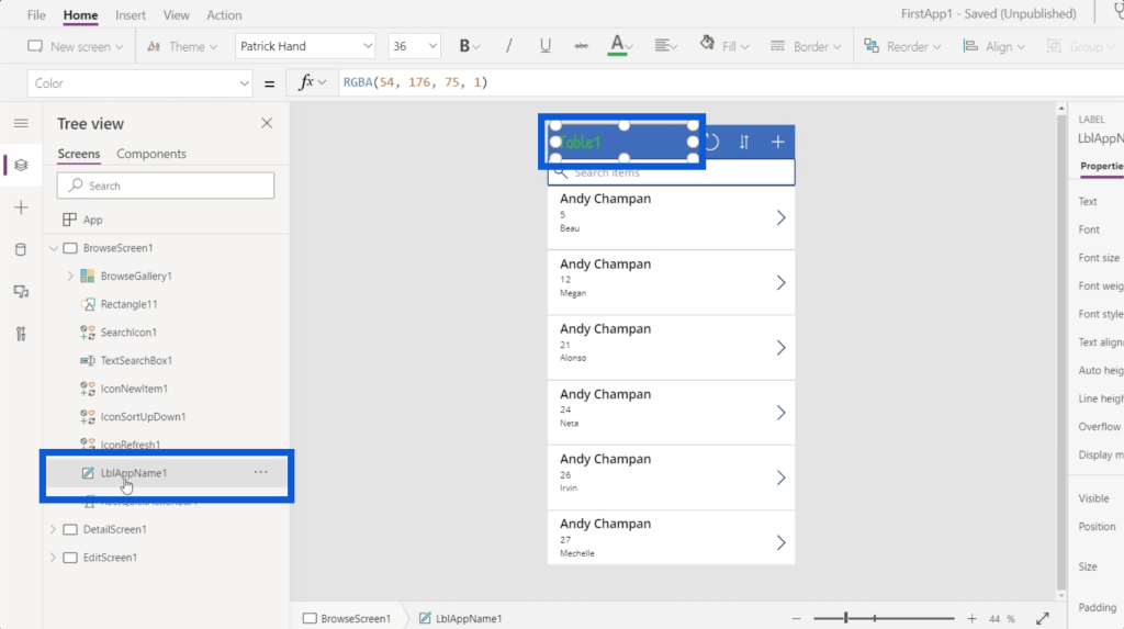
Once the element is highlighted, you’ll automatically see that item’s properties on the right-hand side.
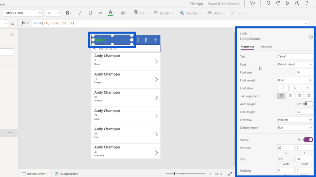
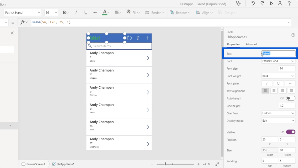
Each element has a different set of properties. When you look at the LblAppName1, it’s categorized as a Label as stated over the element name. This has a text property where you can change the text appearing on the app. You can also edit the text directly on this space.
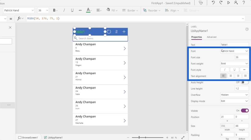
You can choose the font size, font weight, font style, etc.
Different types of elements also have different sets of properties. Let’s look at the refresh icon here on the app. If you look at the Tree view, this is the element called IconRefresh1.
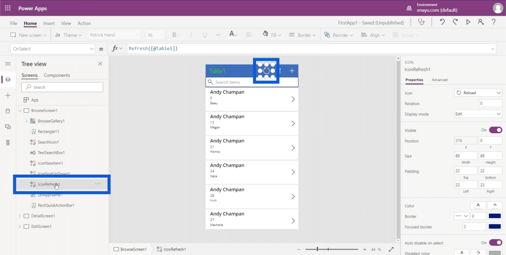
When you look at the properties pane, you can see that it is categorized as an Icon. It also has a different set of properties like the icon used, the rotation, the display mode, etc.
The cool thing about Microsoft Power Apps is you can actually edit these properties in two ways. You can either have them statically set or dynamically set.
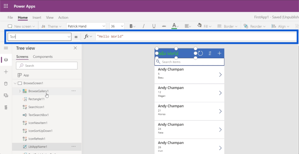
If we go back to the Table1 element and go to the Text property, I can edit it directly and change it to something like Hello World. That’s going to automatically change what appears on the actual label on the app.
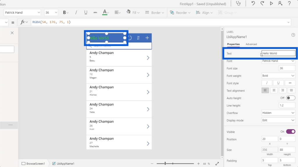
What I just did was to change the property statically.
Now, if you look at the top where the formula bar is, you’ll see that you can also choose different properties from the dropdown menu on the left side.
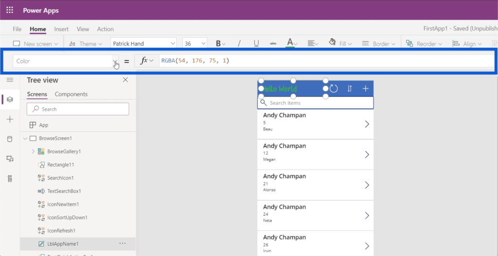
So if I choose the text property and type in Hello World, it does the same thing.
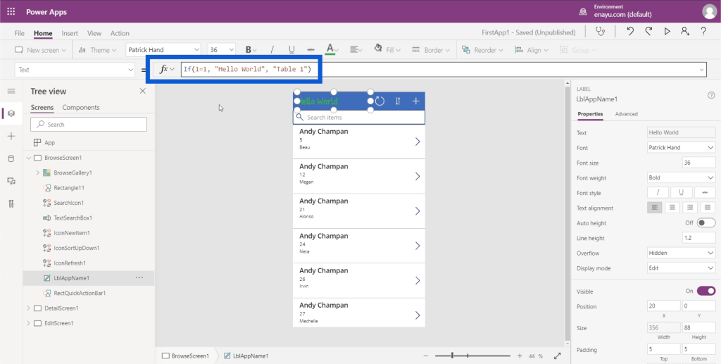
This is where you can dynamically change it. Although there are many ways to create a dynamic change, I’ll show you a simple example using the IF function.
On the formula bar, I’ll type in IF(1=1), “Hello World”, “Table 1”). This basically means that if the statement is true, then make Hello World appear on the label. If not, make it show Table1.
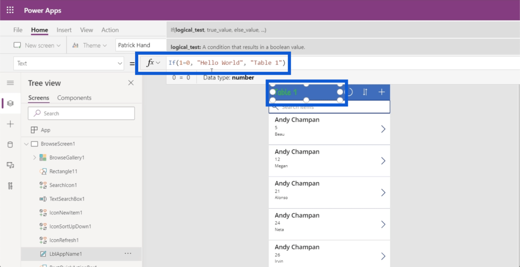
Since this is dynamically set, I can also make this condition false. So if I change this and write 1=0, then it will automatically change the label to Table1.
Making properties dynamic means that your users can change these properties based on certain parameters. For example, you could allow users to edit the titles by themselves, then have those changes stored into a variable. Then, this formula could call that variable to set the title of this text.
You can change other things as well. For example, if we click the top entry on the gallery for Andy Chapman, I can go ahead and check on how this entry’s height is measured.
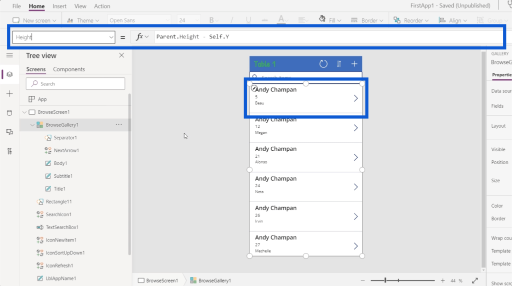
You can see that the height of this gallery is dynamically set to be the Height of the Parent minus the Y position of the actual gallery. This means that the size of this entry is equal to the height of the application from top to bottom minus the Y coordinates of the actual element itself. So if the height is 100 from top to bottom, and the Y point is at 10, then it is dynamically setting the height to be 90.
This concept is important because I could simply go to properties and manually change the size.
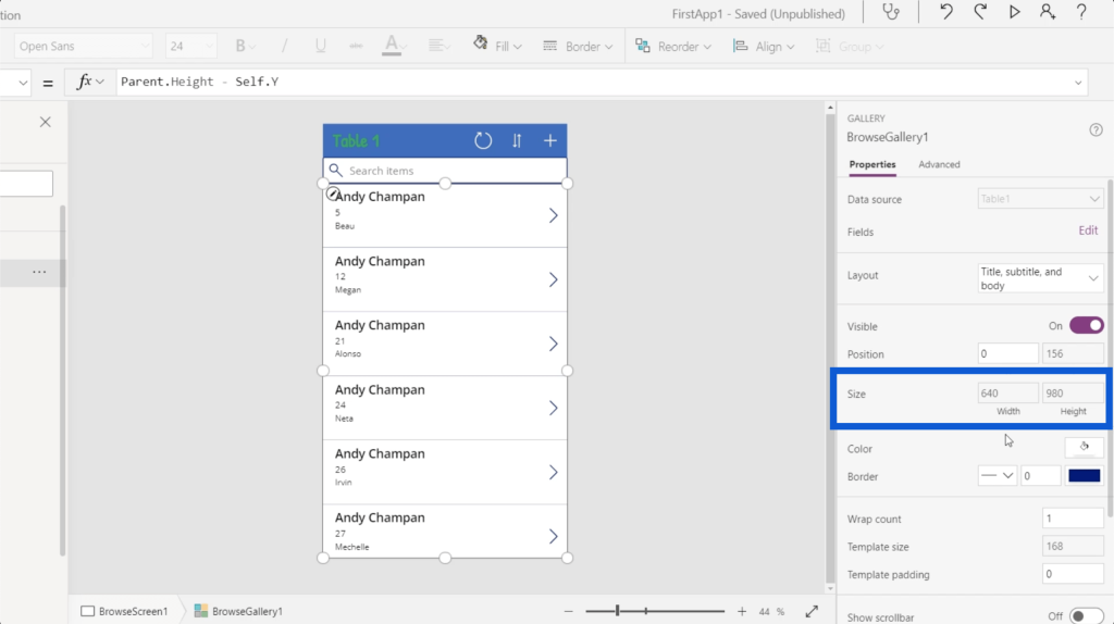
But different apps have different sizes. The different elements will also have different coordinates. If I set a static height, it will mess up the entire app the moment I change anything else.
***** Related Links *****
Power Apps: Getting Started With This Revolutionary Tool
How To Create A Power Apps Account | Power BI Tutorial
Power Apps Introduction: Definition, Features, Functions And Importance
Conclusion
Seeing how everything is laid out in Power Apps environments further shows how intuitive and user-friendly this tool really is. From the way each element and screen is displayed to the ease of changing every property for every element, these Power Apps environments definitely empower anybody to create their own app and make their own processes a lot more efficient.
Of course, Power Apps is not just for beginners who are just starting to discover how helpful apps can be in their field. There are also a lot of advanced functions that more advanced users would enjoy. I’ll cover those in other tutorials.
All the best,
Henry