
Power BI offers a group of native visuals that we can use to build dashboard visualizations. In this tutorial, we’ll discuss how to use native visuals in Power BI creatively. We’ll be focusing on how to use the three basic charts (Bar Chart, Comparison Bar Chart, Line Chart) in Power BI along with their limitations.
Native Visuals In Power BI: Bar Charts
First, let’s learn about bar charts.

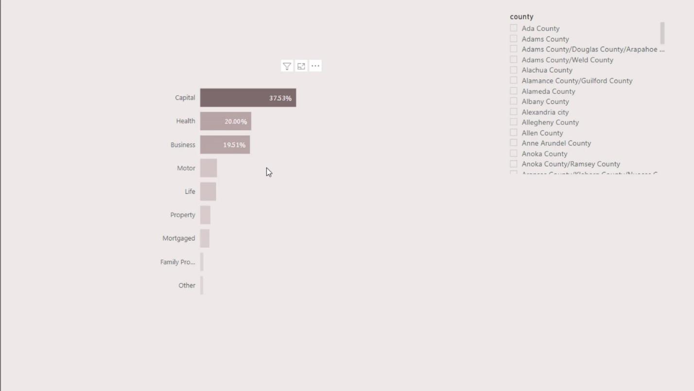
The good thing about a native bar chart is that it offers conditional formatting. This can be used to highlight important insights in the report and make it dynamic.
I also want to talk about the limitations of the bar chart. For example, if I wanted to save some space on the left side and wanted my Y axis to be inside the bar, I won’t be able to achieve it in the basic Power BI visual.
Secondly, whenever I slice and dice the data, the Y axis and X axis automatically aligns the visual. For example, if I select an option in the slicer, it will look like this. It would have been good if Power BI had given us the option to turn on and off the auto alignment.

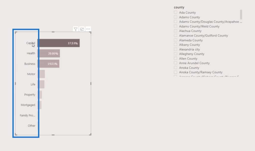
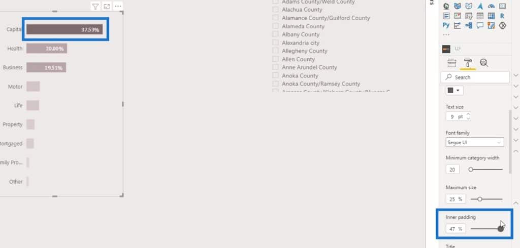
Another important thing many people don’t know about is the option to adjust the bar size.
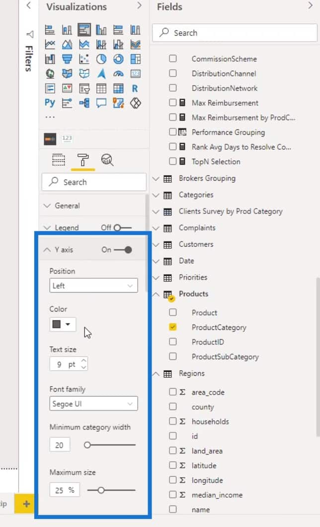
We can do this by changing the Inner padding of the Y-axis.
That’s it for bar charts. Obviously, there’s not much we can do with a basic bar chart visual.
2 Ways To Create Comparison Bar Charts
Now, I’ll discuss two ways to create comparison bar charts in your report.

1. Putting Two Bar Charts In The Report
The first one is where we have to put two bar charts in the report.

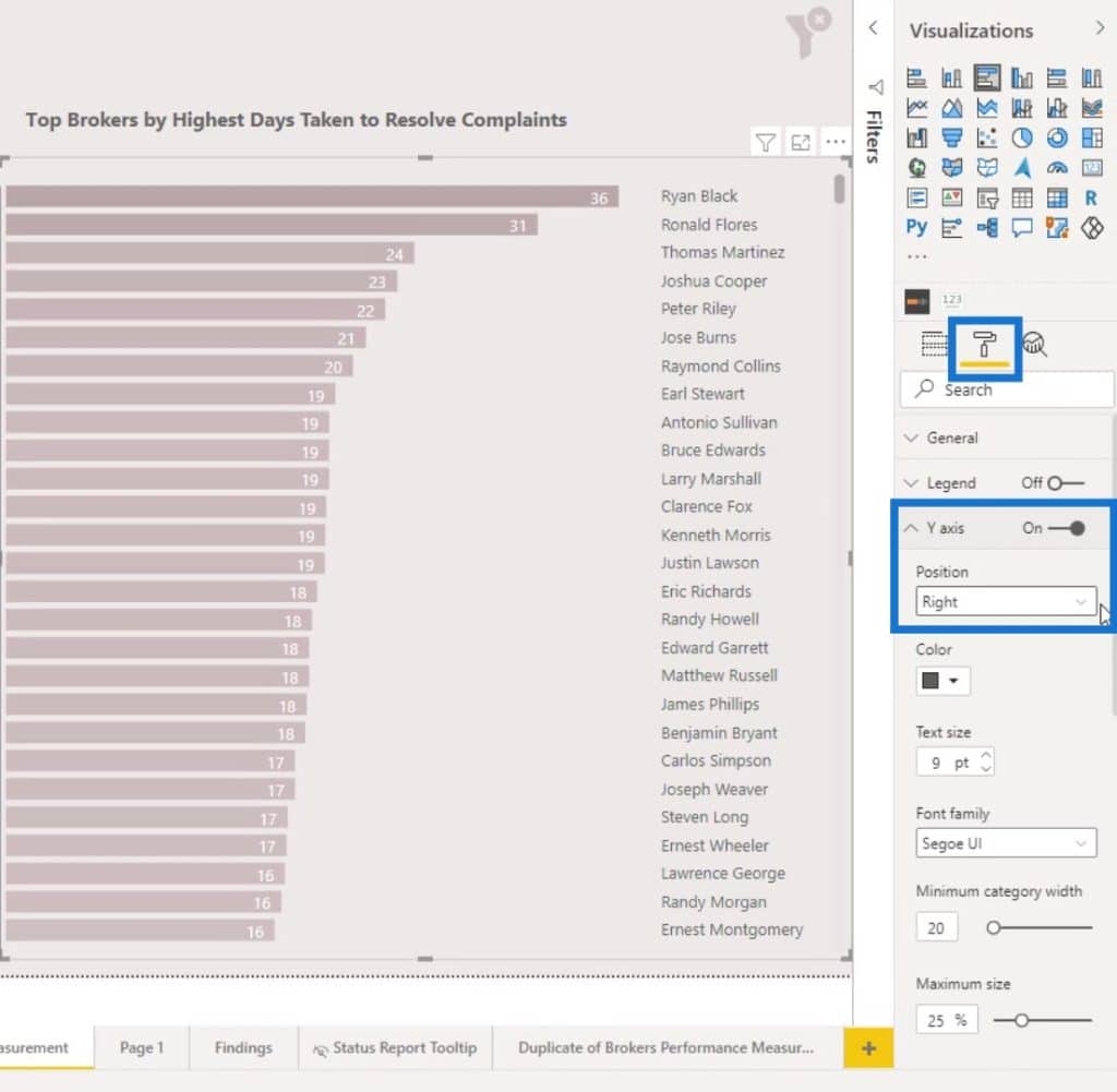
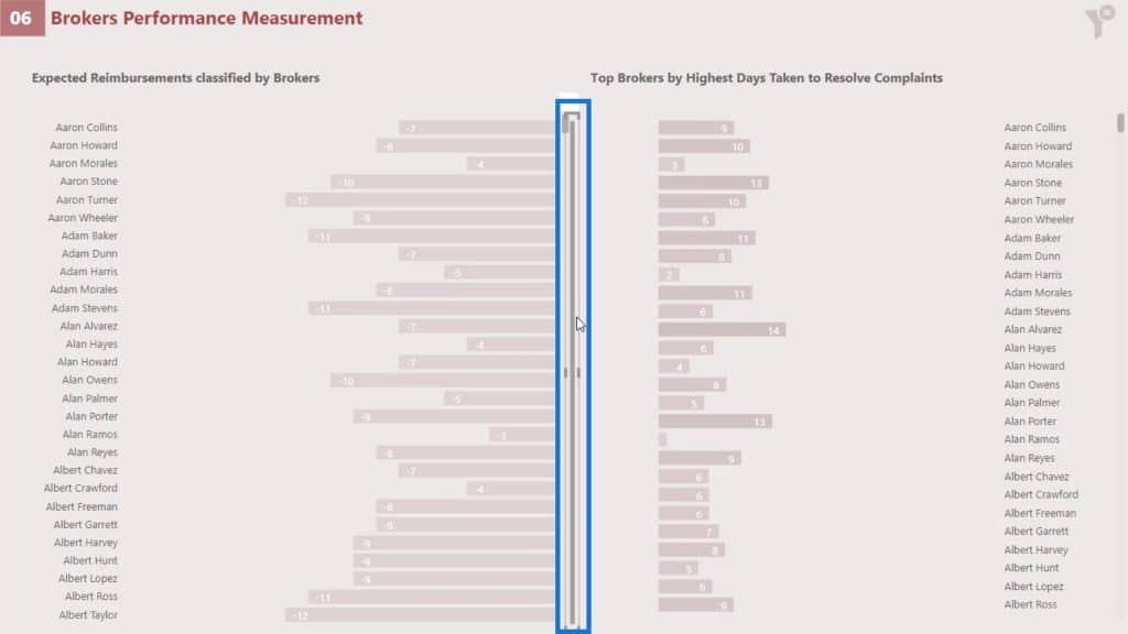
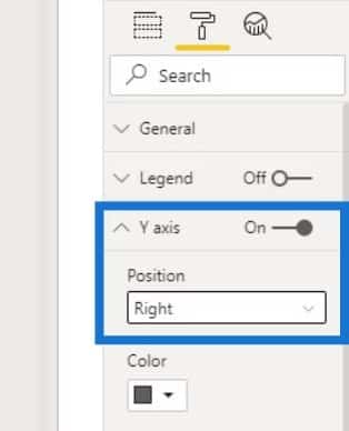
The first bar chart is the same as what we normally create. The only difference is that I changed the position of the Y axis to the right side.
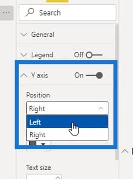
Just go to the Formatting pane, enable the Y axis, and set the Position value to Right.
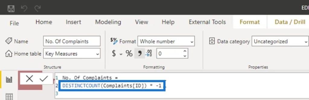
To modify the position of the bars from left to right, change the value or sign from positive to negative.
To do that, I multiplied the measure that I’m using (Avg Days To Resolve Complaints TopN) by – 1.
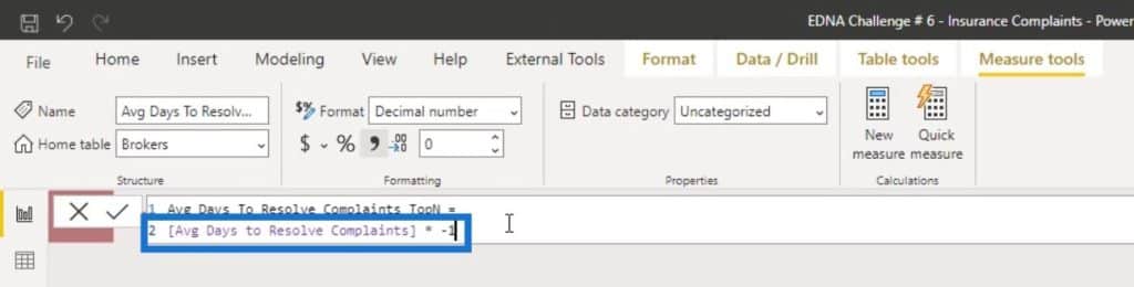
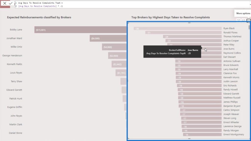
We’ll see that the bars are now aligned to the right.
2. Comparing Two Bar Charts For The Same Entity
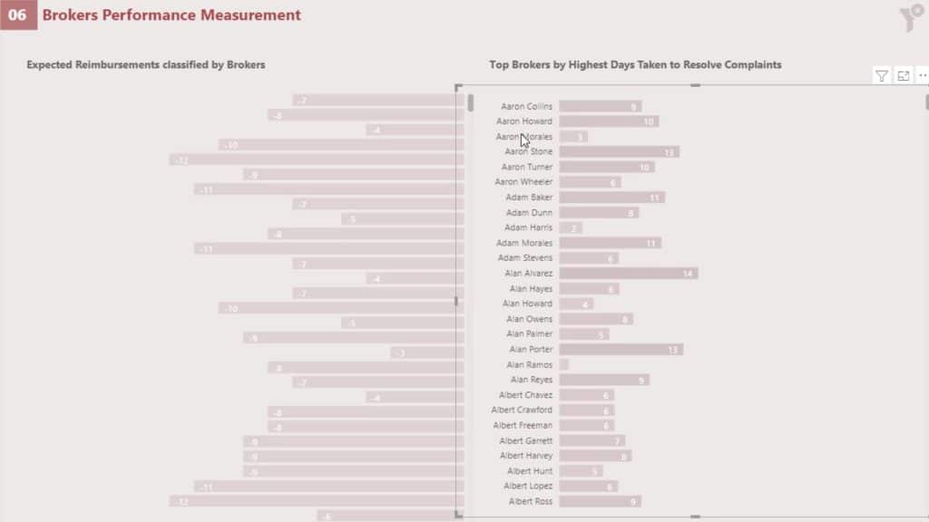
Another example is if we want to compare the average number of days to resolve the complaints to the number of complaints for the same broker.
We can apply some tricks to get that kind of visual. First, bring the bar charts back to their original position.

For the first bar chart, change the reimbursement to the No. of Complaints measure.
Then, change their values to negative by multiplying them by -1.
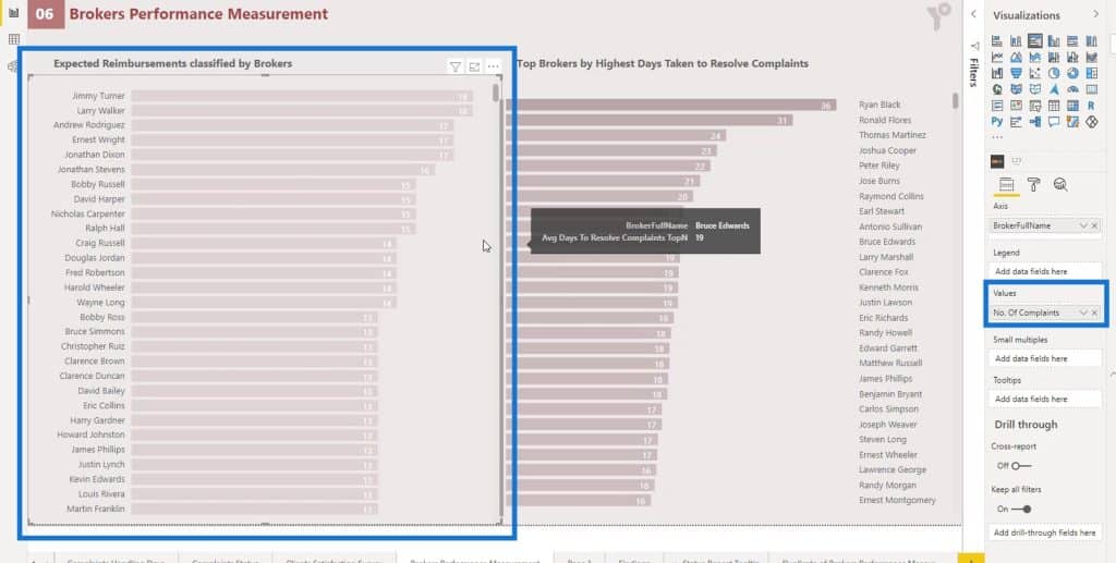
To align the names of the bar charts, change the sort order of these 2 bar charts to BrokerFullName.
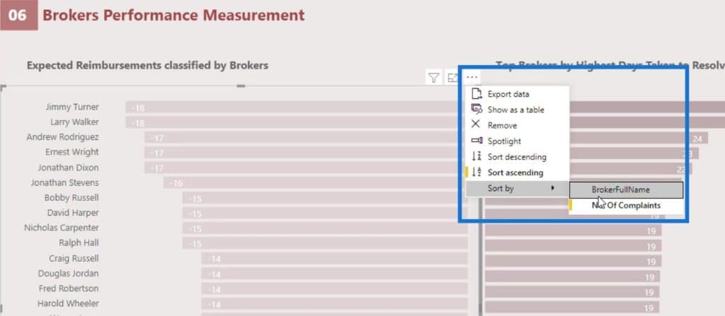
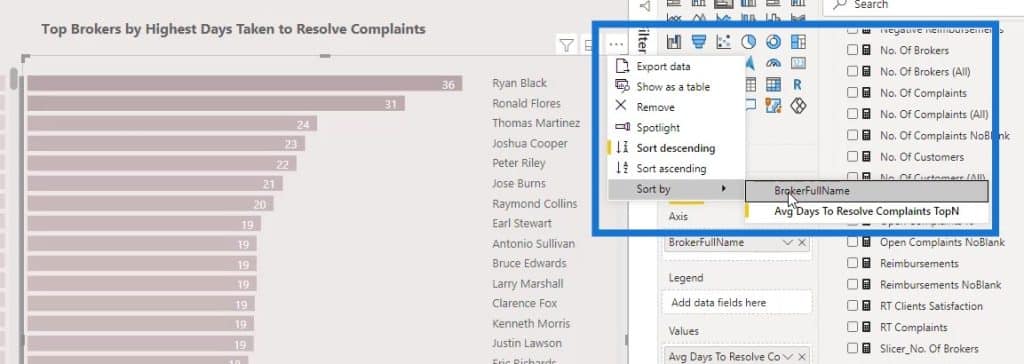
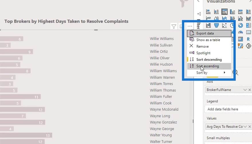
Change the sorting of the second bar chart to ascending as well.
The names in the bar charts are now similar and aligned.
There might be an instance where we don’t want to have the names on both bar charts because they are the same. For example, we want to display only 1 list of names in this report and put it at the center.
First, let’s delete this line here.

For the first bar chart, change its Y axis position from Left to Right.
For the second bar chart, change the Y axis position to Left instead of Right.
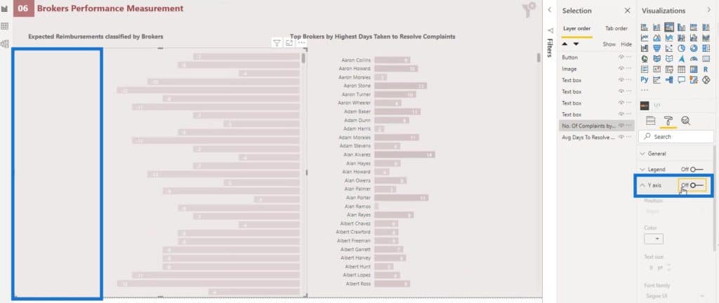
Then, for the first bar chart, disable the Y axis to hide the list of names.
Now, position the second bar chart properly as shown in the image.
On the Selection pane, make sure that the layer of the first bar chart is on top of the second bar chart.
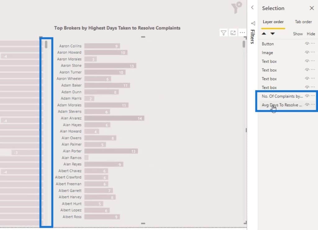
This is because we want to be able to scroll down the first bar chart properly in case it is overlapping with the second one.
With this, we can now analyze every individual broker by the average number of days they have taken to solve the complaints and their number of complaints.
Native Visuals In Power BI: Line Charts
Now, let’s talk about the line chart. There are some limitations with line chart. One example is that conditional formatting is not available in this type of chart.
We can’t also get the name of the categories in front of the line as shown from the image.
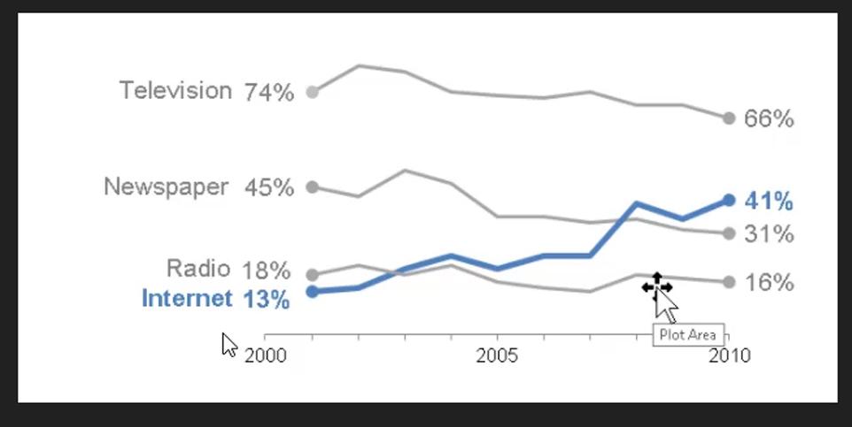
What we can do is to have a legend to display the category name on top, left, or right side of your visual. However, in my own opinion, it doesn’t look good. We can’t also get values at the end of the line as shown from the image above.
In Power BI, some people will say that they can get the value at the end of the line. However, they need to write some complex DAX codes for this to work. And even if they can write complex DAX codes to do this, they won’t be able to get the category name in front of a line.
Native Visuals In Power BI: Conditional Formatting For Line Charts
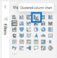
One thing that we can do with the line chart to get a conditional formatting is to convert it first into a Clustered column chart. For example, let’s convert this line chart here to a clustered column chart.

As a result, it will look like this.

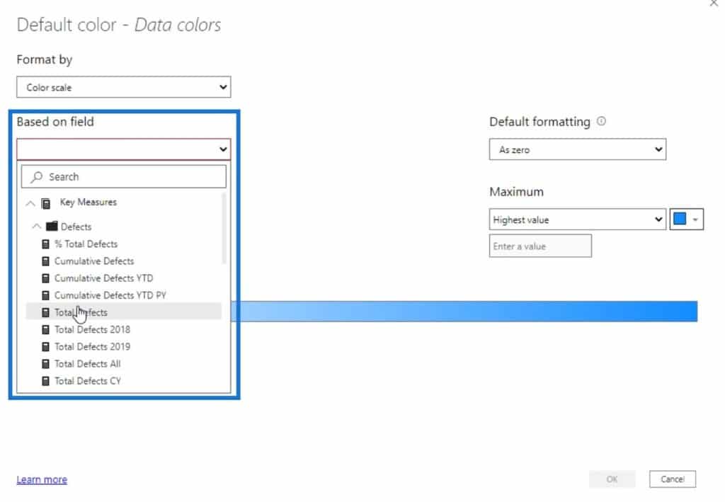
Then, go to the Formatting pane and click this button under the Data colors.
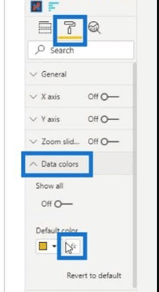
We can then apply the measure for conditional formatting here under the Based on field selection.
Next is to set the color of the Minimum value and the Maximum value. Then, click the OK button.
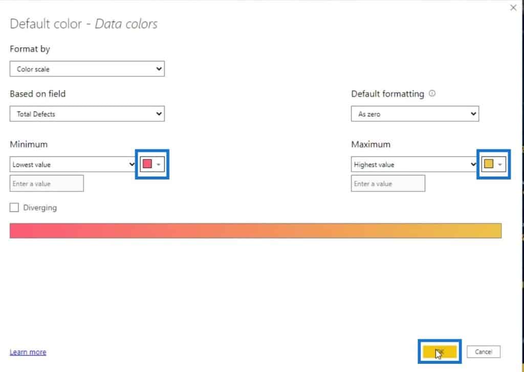
The chart will look like this. We can now convert it again to a line chart.

Then, it will look like this. Now we can see that the points with lowest values are colored with red and the highest value is yellow.

The problem here is that we still didn’t get the gradient colors on the line. Instead, it showed the points on the line, which doesn’t look good at all.
Another problem is that we want to obtain the category name here. Without the category name, we won’t know which category that line belongs to.


It would be really good if we have the option to display the category in front of the line as shown here.
The solution for this is to use the Charticulator instead. With Charticulator, we can also have conditional formatting. You can find the tutorial regarding Charticulator via this link.
***** Related Links *****
New Enterprise DNA Course: Advanced Visualization Techniques
Visualization Technique – Power BI Column Charts & Filters
Utilizing Measures And Visualizations In Power BI
Conclusion
These are things that you can do with the three native visuals in Power BI – Bar Charts, Comparison Bar Charts, and Line Charts. Each of them has advantages and disadvantages when it comes to using them for your visualizations.
Keep in mind that it’s always important to consider various factors such as clarity and creativity when deciding what to use for your Power BI reports.
Check out the links below for more examples and related content.
Until next time,
Mudassir


